The creation of a map begins with an idea.
In the case of my most recent project, CS_MUSEUM, I needed a basic look which would resonate with players immediately. The thought of making a Museum worked… it was a simple one, it had been done before (although this wouldn't be a re-make of the classic DE_MUSEUM by Theropod-X). Players would understand a Museum environment, and it fit in the Counter-Strike world.
Forming a map’s final look is complicated, though, and requires thought about what kind of architecture, colors, and lighting you – an artist or level designer – will pursue.
I’d been playing a lot of the classic map CS_OFFICE, which requires players to storm into close quarters for indoor combat. That kind of game-play is fast and unforgiving, I dig the kind of matches it creates. CS_ASSAULT, I shouldn't forget to mention, is another great map that defines the "siege a building and rescue the hostages" genre. Actually, most of my favorite CS_ maps including Militia also foster similarly dynamic games that challenge you to be sneaky but also use brute force to accomplish your objectives.
So, I set out to make a hostage rescue map like Office and its kin. Studying prior maps is a good way to establish what works well, and avoid what doesn't.
One other map that influenced my thinking: CS_CABARET by Alex Roycewicz.

Cabaret is a great map — it got Alex a job at Infinity Ward long prior to that illustrious studio being kicked in the nuts super hard by mega-publisher-that-will-remain-unnamed.
It was from Cabaret that I basically ripped off the front of Museum... with a few changes.
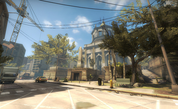
In truth, though, I had some bones to pick with Cabaret.
Unforgivably, there was no sense of vertical space on the outside of the strip club. Also, while the building exterior is convincingly rendered, the overall space is too geometric: everything seems to face the viewer on an imaginary grid, which is no coincidence, that’s how the Hammer editor encourages people to make maps.
Cabaret on the grid:

Museum screws the grid:

If this analysis is starting to sound harsh, it’s worth noting that Cabaret was one of the best custom maps of its time, so this is more of a modern critique of older game art.
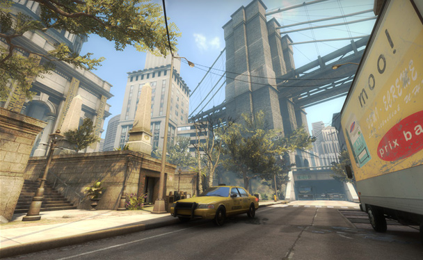
As is often the case with older game art, most of the limitations or flaws obvious to modern eyes were not the creator’s fault: Hammer around the era of Counter-Strike: Source (for which Cabaret was made) did not have all the technology I made use of for Museum. One example is “instances” (the pale green elements in the overview above) which are brushwork more akin to models than typical brushwork, because they can be rotated “off the grid” and not cause compilation problems normally associated with brushwork which is off the grid. Thanks to instances, I was able to rotate buildings to achieve a more natural, organic look — such as this bridge:
In order to actually create the specific buildings in the map, concept art and photographic references were key.
Here's an explanation of the Museum front.
End product:

First iteration:

Reference photograph:
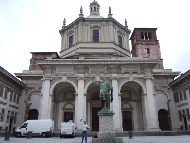
The most pertinent point to make here is the difficulty of knowing when a photographic reference is valuable, and what makes it valuable. To explain this in extreme detail might be delving into an area of “talent”... or it might be worth the subsequent explanation I’ll now provide. In any case, this should explain my process.

The best photographic references share one crucial element: readability. Complex buildings such as the one above, if they are to be useful for our purposes, must be able to be broken down into clean, clear shapes. I was confident using the logic explored in the line-work above (I did this part in my head), that the building could be broken down and translated successfully.
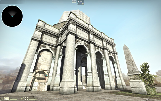
The building begins to take shape, with the red lines becoming props. When using Hammer, what becomes a prop and what remains brushwork largely comes down to the default assets you have to work with.
Talented 3D modelers have their choice of creating new content, but their time is precious and each art asset is an investment, so even then it’s best to think about default materials and their role in your work.
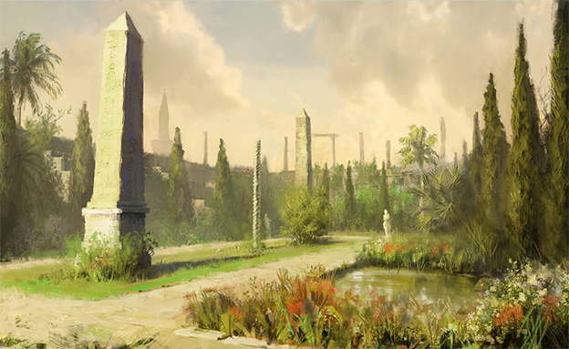
This lovely picture inspired the placement of the obelisks, and secondarily the pond on the right of the Museum.
Using concept art and photos in conjunction with my imagination, I had derived a basic visual identity for the map:

Obvious reference: the Brooklyn bridge; non-obvious reference, this lovely piece from Deviant Art:
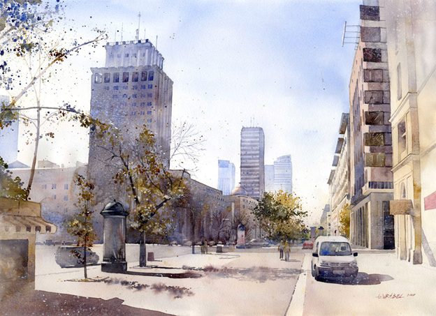
Making a map is about looking at the world around you and seeing something inspiring enough to create a desire within you to render it and mold it for your own purposes.
By this point in time you may be shouting IT’S A MAP – TALK ABOUT THE GAME-PLAY, TALK ABOUT THE GREY-BOXING YOU FOOL! …and, while the playability of Museum ended up better than I could have imagined, there is no glory in my process for that particular aspect of the map. Uh oh, he’s gonna say he didn’t grey-box it, isn’t he…
First, the excuses: previously, I'd recreated the Natural Selection 1 map NS_VEIL for NS2, based solely upon my own literal eyeballing of the geometry, without any scale-guide, in a different editor and a different unit system. To put all that gibberish into other words, I’d done nothing for two months other than study the rigid grey-boxery of another mapper, then spent another 10 months making that geometry fit into the context of a new game and engine. I’d worked with fastidiously organized layers, done everything by the book, guv, I swear.
While important for a commercial product, that experience had temporarily tired me somewhat of the (smarter) formalistic approach. As a result, no substantial grey-boxing would take place for Museum. Manic energy took the place of “rules” and “common sense”:
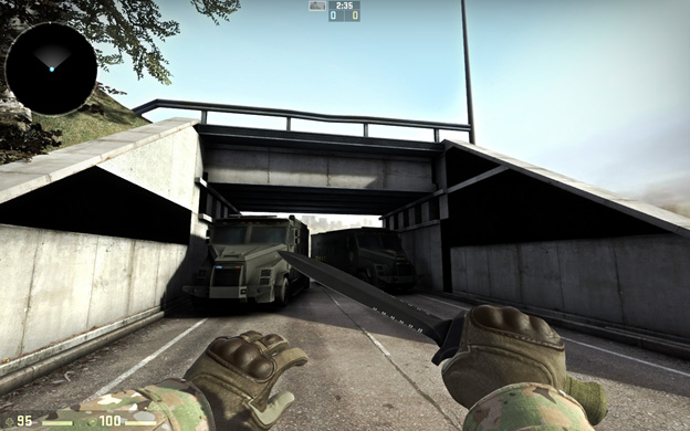
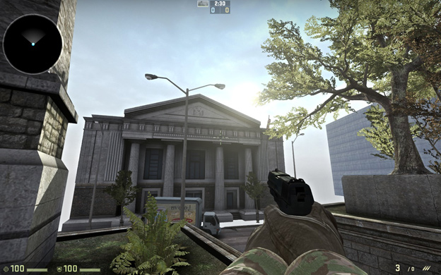
Basically, I was creating stuff I thought looked cool, not getting terribly fussed about what direction it would all head. This is the way newbie mappers work, or idiots, or both… but it can be done if you’re smart about it.

Certain things can’t be bullshitted around, though: your map must be in proper proportion to the players, and it must maintain sensible sight-lines considering the game type. You need to know the game you’re making the map for, and know it well.
So working free-form has its advantages, creating a whimsical sense of liberation in the budding mapper. It comes at big costs to him, though, in other aspects. This open doorway, and the entire route it signified, never made it into the final product. People have noticed its conspicuous absence, however, to the point that it may make it's return soon enough.
Working toward a result, with certain restraints in mind, but willing to cut: my method for Museum.
Mistakes were made. Certain areas violated basic good-practice principles, such as this one:

I call this piece of modern art “Abstract Red Light Number 48.” So… this elevator shaft was painful for a few reasons: too noisy inside, not clear enough about what it was meant to be, and the idea of it having a purpose seemed impossible given the amount of crap stuffed into the scene.
I believe I settled on a better, cleaner result:

Which was based off of this reference:

This shipping area was another idea that got cut (considering that it was over-dark, this was not too sad):

Based on:

Everything else seemed to go swimmingly, however:
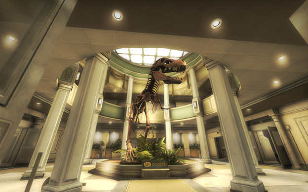


My biggest advantage when working with these references is my ability — and perhaps your ability as well — to discern from them what elements are most relevant and work best geometrically. These judgements influence what makes it into the map. While you may be able to follow a similar protocol by examining the pictures, you would be doing so in hindsight; it was quite necessary during this project for me to be able to sift through literally thousands of images in order to find those which, at first glance, provided the requisite inspiration.
References must be clean, they must convey a certain tone, and the architecture they illustrate must be plausible among the rest of the map geometry. This process of looking through seemingly endless references is a task which must be begun anew with every new map.
Back on topic: a month or two after starting out on the map, I recruited a talented 2D artist named penE who had a style congruent with mine. With his help, rooms like this began to form their own identity:
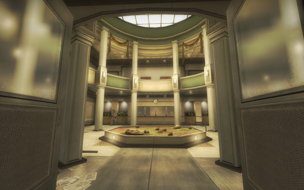
The map began to develop a sense of humor. We based the name of the museum on HURG — Hero of MapCore! (Don't ask.)
PenE brought his full enthusiasm to the project, getting almost all of his work done in a month or so, a rapid pace which would be a major motivator for me while I was working with (read: waging war against) the Hammer editor.
Here is a sample of penE's work for the map:
Nevertheless, the map did seem to require more art…
I had envisioned a T-Rex in the above room, and had designed the room around that eventuality. I was concerned that such a 3D model might not fit well (it’s a relatively cramped room), or might not be appropriate looking, but I put out a call for a talented 3D artist.
3Dnj answered that call with a stunning T-Rex model based on square-shaped geometric restraints. I basically stacked a bunch of cubes on top of one another and said, “OK now make me a T-Rex that fits inside the squares.” Seems hopeless, right? Thankfully, Valentin, as 3Dnj is known, e-mailed me this bad boy:
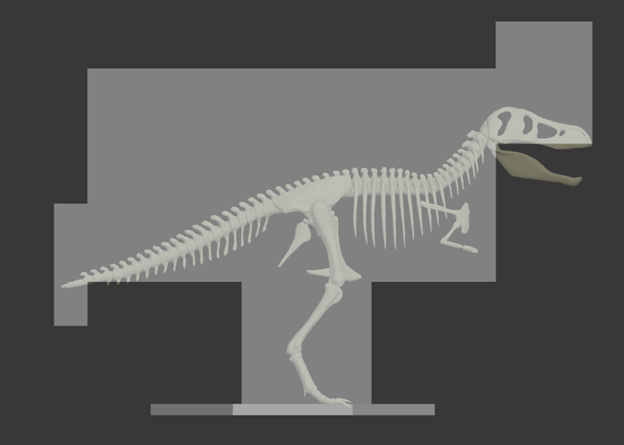


Owns right? Imagine waking up and seeing that first image of the T-Rex with that brilliant sheen, I was ecstatic.
At that point I realized I’d found a true collaborator and not just a “prop guy”. Valentin would go on to help me optimize the map, and reform a lot of my map geometry into more sensible models. Here’s how crazy things had gotten:

Hammer is unlike a modeling program in that it is “brush-based”, and things that are not literally six-sided cubes give the editor trouble. Trying to create an interesting shape out of a single brush? Take a hike.
So it’s obvious why a more extensive collaboration was needed: it was never going to be realistic to proceed in such a manner and expect an optimized result which would (ugh) compile. Hence, the logic of making a map which looks the way Cabaret does, unfortunately all the same limitations applied more or less in 2012, with just a few exceptions like instances.
So there were technical challenges, but four months on, most of the major lessons of the map were learned and my vision for the map was realized almost exactly as it existed in my brain.
My workflow can be best summarized as: find a fitting photographic reference, get a basic interpretation of the geometry into the game, and then polish with aesthetics and navigation in mind (lead players with lights and colors).
Phase 1:

Phase 2:
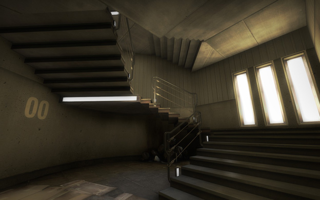
Phase 3:

Rather than attempt to convince you I pursued the traditional level-design approach of iterating a grey-box, I hope this document serves to explain the approach I actually took: a risky and improvisational one that I know I’m lucky was successful. It’s good to state how lucky: a layout that emerged without argument, finding two brilliant collaborators with a lot of faith in the project, etc. Hopefully anyone looking to duplicate my exact method will be given pause, but at the end of the day there will always be logic in working hard and having a well-formed mental image of your goal.
As for Museum, I can promise you one thing: if you load up the map, and I hope you will, I think you will enjoy it. (If only for the giant, motherfucking Tyrannosaurus Rex.)
Thanks for reading.





![[CS:GO] Shore](https://www.mapcore.org/uploads/monthly_2023_04/2955084102_preview_20230404120655_1.jpg.77b7071d4e9db1625414c7ad26720f8f.jpg)

Recommended Comments
Join the conversation
You can post now and register later. If you have an account, sign in now to post with your account.
Note: Your post will require moderator approval before it will be visible.