1. Forums
  2. Discord
  3. About Mapcore
  4. Patreon Supporters
  • Login
  • Register
  • Search
Everywhere
  • Everywhere
  • Articles
  • Pages
  • Forum
  • More Options
  1. Mapcore
  2. Members
  3. Michael Greenwood

Posts by Michael Greenwood

  • CS:GO - Link

    • Michael Greenwood
    • January 6, 2016 at 4:48 PM

    Seconded on the presentation being very well done. This is one of the first maps I've seen where I immediately just click with the layout and I want to see where this goes. Really the only things that stand out to me would be that mid and A have some really long site lines that could prove to be very annoying to deal with. I also think the A site is potentially too compact in the corner and could make retakes weird. I also think B site could be really hard to take as there are a lot of angles that would be nearly impossible to smoke off and both entrances can be watched very easily by one player. Having the raised area connect directly with the bomb site just causes some concerns, but I'd like to see how it plays first.


    This map actually has some stuff in it that inspires me with fixes for a project of my own, so I doubly appreciate the posting of it!
  • de_relict Project Thread

    • Michael Greenwood
    • October 19, 2015 at 9:33 PM

    The theme feels a little odd to me. I think the first 3 images look amazing but I think they have a very different feel than the rest of the pics which feels off to me. I'd have to walk around to give more feedback

  • [WIP][CSGO]de_tango

    • Michael Greenwood
    • October 19, 2015 at 5:03 PM

    @jackophant I appreciate the feedback, without it there wouldn't be any way to improve. I've been holding back on doing any texturing and I'm glad I did. I would like to take you up on the offer at some point! Thank you very much.

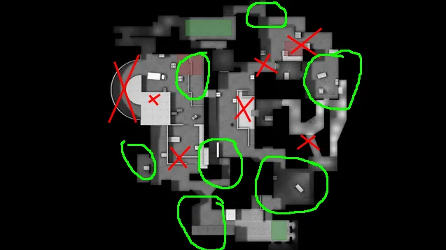
    I am currently DMG level so I have a decent knowledge of the game, but not anything amazing. I illustrated my current concerns here with red for bad/concern and green for where I like it:

    Starting from T spawn and going clockwise:

    I like the ramp down from T spawn into the path to Bsite (arch site). I like the alternate entrance into mid to give another angle to peak/rotate for Ts. I don't like the current entrance to B site as its REALLY tight turns and only exists because of the balcony over the entrance to the curved ramp. My big X over the curved ramp is because I was initially finding that it was likely to be too easy to pincer B site as T's from the main entrance and curved ramp. This is why I made the balcony room over it, but my concern that this would be too strong an answer was correct. Is the curved ramp worth keeping? I also do like the main platform/balcony over the Bsite. It may be too restrictive for vision (which can be fixed) but I like the elevation of it and how it can be used offensively or defensively.

    Moving on to CT spawn, I like the options you get right form the start including the path to A site. I do like the raised area behind the site, but the connector through to mid and the site itself not so much. The drop area with the room to the left is way better, and I could move the site to there if you think it looks better and make it like a combo of A site and B site on mirage. Apartments are mostly fine in my mind, though the angled path I added probably makes it too confusing and easy to be flanked.

    I've had a lot of concerns with mid from the start, but they were actually that I was concerned T's could smoke connecter to B and sniper nest and have full control over the mid and map. Apparently it was a mid that overly favoured CT? I do like how I timed the upper area on mid so that both teams rushing it get up their ramp at the same time.

  • [WIP][CSGO]de_tango

    • Michael Greenwood
    • October 19, 2015 at 3:39 PM

    I'm not one to give up easily and have been plugging away at this for a few months now (obviously on and off with the majority of time spent getting familiar with all the functionality of the sdk), but when the feedback is saying that every area but the spawns (which are probably unmentioned because they don't serve much purpose) needs some major reworking, I would say that is time to go back to the drawing board. I hold no ill will towards bearers of bad news, it just means I need to do more planning on my next project.

  • [WIP][CSGO]de_tango

    • Michael Greenwood
    • October 19, 2015 at 3:03 PM

    That sounds about as close to 'scrap it' as you can get without saying it. It's too bad that my plan didn't work out how I envisioned it, but since it was my first project, I can't say I am very surprised. I do apologize that the testing doesn't sound like it was very enjoyable and I'll put this experience to mind when trying again and hopefully avoid the mistakes made thus far.

  • [WIP][CSGO]de_tango

    • Michael Greenwood
    • October 18, 2015 at 10:38 PM

    Now that I've decided on a name and it's been playtested, it seemed a good idea to make a finalized thread for it. Please leave any ideas or feedback here, I'd really appreciate any help before I do major/minor re-paths, scrap it or go ahead with texturing.


    Description:[/b]

    - Large B-site with a main entrance onto site with a path to continue around and up a set of stairs to enter the site from the rooftop balcony. Entrance to site at back right for CTs and behind building from mid.

    - Mid is either entered by CT through A or B with no direct path from CT. CT gets to mid about 1 second before Ts can peak from their path from A (which is raised up with cover provided by a series of archways.

    - A-Site has 1 main entrance with the meeting point between teams at the two horizontal barriers in the room before the site. The room is set up so if T's are stymied in that room, they can smoke and run across into mid.

    -A-site is a large covered structure with 4 main pillars. The site is overlooked by a manor house with a semicircle balcony up front and a small side balcony. The strong sightline from the balcony is mitigated by timing making it so T's can get onto the site area at the same moment the CT would be getting onto the balcony. There are also multiple smokes over the walls.

    - Tspawn -> B: 17s, engagement happens at 14s; Tspawn -> A: 13s; Tspawn-> B through mid: 15s; CT-> B: 6s; CT-> A: 8s, 13s to door; rotate through CT: 14s; rotate through mid: 12s

    -Theme will be based on south american coastal towns: http://www.digitaljournal.com/img/6/8/7/0/1/…t_La_Popa_1.jpg https://adventuresinfoodandculture.files.wordpress.com/2014/01/cartag…lombia-008a.jpg

    Overview

    [Blocked Image: http://i.imgur.com/FCjeWSE.jpg]

    Pics:

    T-Spawn. Minor thematic additions to give first idea of how I want it to look.


    Rest of Images

    Quote

    [Blocked Image: http://i.imgur.com/OmWQlbL.jpg]

    Looking into A site from T.

    [Blocked Image: http://i.imgur.com/fIwvMFS.jpg]

    Looking at A site just within the entrance

    [Blocked Image: http://i.imgur.com/7KymGjn.jpg]

    B site from CT

    [Blocked Image: http://i.imgur.com/G68tBrG.jpg]

    B site from T

    [Blocked Image: http://i.imgur.com/yngsXOC.jpg]

    Mid from T

    [Blocked Image: http://i.imgur.com/1BYkNkn.jpg]

    Mid from CT A site.

    Display More
  • MapCore CS:GO Playtesting 4.0

    • Michael Greenwood
    • October 18, 2015 at 4:16 PM

    For my submission I forgot to add my mapcore thread:

    http://steamcommunity.com/sharedfiles/fi…s/?id=525117410 Its an updated version (still quite similar) to the map in that thread. I've also added some more images to the workshop page for your perusal.

  • MapCore CS:GO Playtesting 4.0

    • Michael Greenwood
    • September 22, 2015 at 6:58 PM
    Quote from El_Exodus

    It's way too dark and you rely too much on pointlights. Raise both of the light values and recompile. Visibility in such dark maps isn't really good. Imagine a poor guy playing the map on a cheap LCD. He couldn't see shit.

    Thanks, this is the sort of feedback I like to get! I don't notice any issues with visibility when I've been testing it, but I have a pretty nice screen and wasn't thinking about how it could turn out on cheaper/darker screens.

  • MapCore CS:GO Playtesting 4.0

    • Michael Greenwood
    • September 22, 2015 at 6:00 PM
    Quote from El_Exodus

    Please... light settings..

    https://developer.valvesoftware.com/wiki/Light_environment

    I don't understand what you are asking, it has one of those, are the settings wrong?

  • MapCore CS:GO Playtesting 4.0

    • Michael Greenwood
    • September 22, 2015 at 5:08 PM

    I have a final update with optimization(nodraws), a fixed radar and proper formatting tonight, but otherwise would this map be at a far enough state to test it out?


    http://steamcommunity.com/sharedfiles/fi…s/?id=472758098

  • Active map pool rotation/travel times

    • Michael Greenwood
    • September 16, 2015 at 5:14 PM

    Is there resource out there with all the timings for rotations, T/CT to bombsites etc for all the major maps in the active map pool? Thanks!

  • [CS:GO][WIP]de_story

    • Michael Greenwood
    • September 15, 2015 at 3:45 PM

    [Blocked Image: http://imgur.com/0kGbWlv.jpg]


    http://steamcommunity.com/sharedfiles/fi…s/?id=472758098

    I think there are a couple holes in walls and incorrect texture overlaps, but right now I'm getting the layout and timing all right first.


    Updates

    -Removed path directly from T-spawn to mid to both reduce number of stairs, slightly increase T times and remove T head peek advantage.

    -Re built B site to be a 2 tier taking process and remove the long angle from site to entry doors. Also gave T's ability to smoke main entrance to B and come in from left, but leaving themselves open to sniper room.

    -Removed path from CT to lower A. Made door from upper A onto balcony over lower A to give CTs better defense against an A split push.

    -With strength of mid push by T's, made line of site from couple OK B spots to be able to see any T's going up mid ramp.

  • [WIP] de_diversion

    • Michael Greenwood
    • September 14, 2015 at 4:48 PM

    The biggest thing I see when looking at the layout is both sites have a very narrow opening to get into them as the only path except mid. This means mid control is by far the most important strategy and the layout you have would most likely end with it being very CT-sided.

  • [CS:GO][WIP]de_story

    • Michael Greenwood
    • September 8, 2015 at 6:56 PM

    Made some minor updates recently to improve some issues I foresaw in the initial playtesting I've done with bots, friends and running timing tests myself. I've removed the majority of long sightlines or gave the ability to go around them/ smoke them off as needed. I have also changed it to all dev textures (other than a few props).

    The main tweaks are rearranging B-site to remove the super long/dominant angle from site to the upper right tunnels. From site you can only see the right entrance and a smoke from the left door can allow an easy flank to take down the sniper. I'm still fiddling around with B, but I like the idea of having combat viable near the drop down AND around site.

    The other major change was the staircase from CT to the room under A site now is one way only (but boostable). A site has a lot of angles of attack and removing this tunnel as an easy T route is a needed change. Making it one way also gives the CTs the ability to push the Ts from both sides or the Ts can use it through boosting but will put themselves in a vulnerable situation.


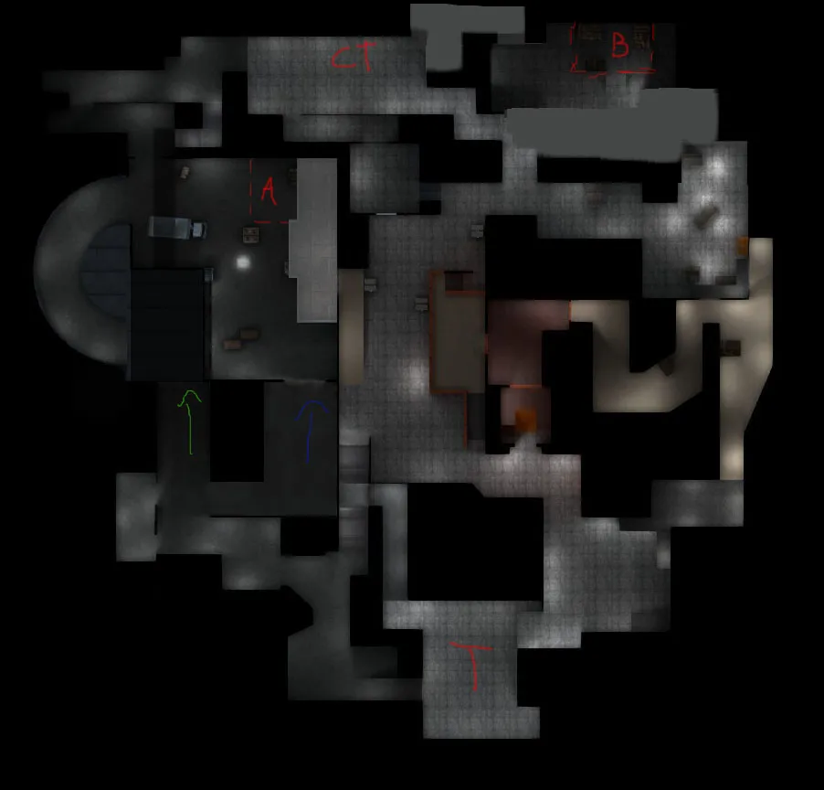
    The green arrow is a ramp down into the room under A which enters A site up the curved ramp. The blue arrow is a ramp up into A site (A main). The T's have 2-3 different rush routes that can be very powerful but also are high risk with pre-designed crossfires to make coordination key.


    My biggest issue at the moment is coming up with a theme. I really want to avoid the typical warehouse/eastern europe/middle east theme. The curved path and lower room, however, require some sort of decently urban/developed architecture. The 3 tiered nature of A site in general makes the most sense as some sort of industrial parking garage/shipping floor/parking area/receiving area. My best thought at the moment is go with an urban theme but have an overarching theme that implies a different locale than generic 'west/eastern europe' such as south/central american, south/south east asia or likewise. It's really holding me back at the moment.


  • CS:GO Vertical maps

    • Michael Greenwood
    • August 5, 2015 at 5:02 PM

    Awesome discussion so far - a lot of really interesting points.

    I do like the idea of the outdoor mall, or a combination of indoor and outdoor ( or ever outdoor and covered ). Currently I have a long A that looks like:

    [Blocked Image: http://mapleterrazzo.com/wp-content/uploads/galleries/post-7/full/Fairview-Mall-3.jpg]

    With the upper right laneway cutting through a maintanence room onto a walkway above a bombsite, while the main lower walk way enters the bomsite through a main archway. The left upper walkway crosses between stairs into mid, which rather than a long rectangular area (like mirage, dust2, cache, inferno etc), is a polygonal atrium with dividers and a walkway along the right hand side connecting to the previously mentioned one.

    The approach to B site I was thinking of making it a combination of driveway, shipping area and maintanence areas with T's staring outside the main entrance and CTs starting back in the food court or something.

  • CS:GO Vertical maps

    • Michael Greenwood
    • August 4, 2015 at 5:55 PM

    I've been working on a second project based on a mall for a defusal map and have been having a concern as I build it out.


    Most malls are built on having multiple floors (most are probably 2) with the upper level being wider with walkways on both sides of the main path. The problem with this in my map creation is a) it causes a need for many stairs and b) creates lots of angles where people on the upper floor can shoot the lower floor revealing very little of themselves.

    What I mean by this is shown here: https://upload.wikimedia.org/wikipedia/comm…ls_interior.jpg

    Like the main hall area of the aquarium of de_zoo


    I'm not really sure of how much of an issue this is, but I'm under the impression most players like to minimize the amount of dominance getting the high ground gives. My main thoughts to fix this issue are:

    1) Use the walkways very sparingly to add strategic depth rather than make the lower paths super risky to be in.

    2) Have the mall be in a state of disrepair/destruction to clip off many sections of walkway with debris.

    3) Find a new theme.

    Thoughts?

  • [CS:GO][WIP]de_story

    • Michael Greenwood
    • July 16, 2015 at 7:16 PM
    Quote from jackophant

    Oops! Double post!

    imo, I can't tell what the elevations are at all right now with that lighting. fullbright isn't necessary anyway, just something to consider, but for lighting as low as this it may have been a good idea.

    You could also have edited the image more, black out the areas people can't access. That whole area on the bottom left of the overview is defunct as well, it serves no purpose other than to extend an already long corridor as it just links back up to where it splits off from.

    The whole map looks far too open, and has a lot of long sight lines which means that people are going to predominantly use scoped weapons. You should want your map to have more mixed engagements.

    I hear what you're saying about the dev textures, but seeing it like this is visually distracting, it looks more half arsed than half developed. The lighter colour of the dev textures make visibility a lot better as well.

    [Blocked Image: http://i.imgur.com/r8TGyy4.jpg]


    Been muddling with the layout in photoshop and I want to see if this looks like it's going in the right direction. I removed the extraneous path in the bottom left. Made B-site more of a 2 stage takeover (like A long doors -> site on dust 2 or mid/doors -> a site on inferno) while also giving options for avoiding long lines of sight and giving SMG/aggressive players more options. The only really long lines that remain are A site down A-main and lower tunnels down to T area in the bottom left, both of which are super easy to smoke without revealing yourself. The only other long sight line remaining is sniper nest towards stairs at mid, but that's intentional. It is supposed to be a high risk area to go at the start for T's.

  • [CS:GO][WIP]de_story

    • Michael Greenwood
    • July 16, 2015 at 3:32 PM
    Quote from jackophant

    I'm not saying it is half arsed, I'm saying that's how it looks. It's fine in thinking that's what you want to do, but this is coming from a spectator. If I think it, others will too, and that's the feel you could be conveying. What you think or want isn't necessarily how the public will view it. The development textures were made for a reason... Take it from someone who used to do the same thing.

    A popular method for showing different heights in the map is coloured shapes outlining the path with transparency. You could show a key and say what's low/high accordingly if you don't think it's clear enough.

    Ok, I see where you are coming from. It may be that it is on the spectators/testers/whatever to think of it as half-assed, but at the same time my entire objective is to sell my idea to other people so I need to follow the standards so they know I'm willing to commit fully and do it right.


    From that, everyone seems to have a dev texture that is very light grey, almost white that looks really sleek. I have tried every dev texture I can find (filtered by 'dev') and haven't found any but the dark grey walls and the orange walls. Is it a lighting issue? Am I just missing it? Or do I have to edit the texture or something?


    I've also updated the overview. The darker area on A site is a room below the main site which connects to the tunnel to CT and the bottom of the curve up to A site. The balcony is highlighted with the lighter grey. I removed some roofs as well to better show paths. The left entrance to mid from T is stairs up and NOT a really long line of sight. It is meant intentionally to be the quickest way through mid but also the riskiest.

  • [CS:GO][WIP]de_story

    • Michael Greenwood
    • July 16, 2015 at 3:15 PM
    Quote from laminutederire

    Pointlights make very weird effects, try to put them less close to the wall or tweak their attenuation.

    In addition, it doesn't seem like your skybox is doing anything, do you have an env_sun in your level for instance?

    I do have a light environment and it does work as A site and mid dont have many light objects but are far brighter than anywhere else.


    I'll respond to Jackophant later when I fix up the overview. I don't disagree with the comments except the one regarding textures. If I state from the start that is how I prefer doing it and you see it as half assed rather than incomplete, that's on you - not me.

    When it comes to the overview, how do I best indicate a site has a main floor, a room underneath it (that curves up and around on the left) and a balcony over it on the right. How do I indicate that the platform at mid is raised up and the path from T to CT on B side has the T's dropping down from higher up?

  • [CS:GO][WIP]de_story

    • Michael Greenwood
    • July 16, 2015 at 1:11 AM

    So this is my first attempt at making a defuse map. I prefer using filler textures over dev textures and am well aware that I need to add way more/better lighting. What I'm looking for at this stage is any glaring flaws you may notice in the layout.


    My biggest concern at the moment is A site as T's have the main entrance, the curved alt entrance, the balcony in through mid and the tunnel beside the alt entrance that gets out near the CT spawn (colored path where the truck is). The tunnel was originally supposed to be a way for CTs to get in behind the T's who are pushing hard/on the curve, but if they don't send someone to do that/watch it, it gives the Ts the ability to come onto the bombsite from 3 sides without exposing themselves. I don't know if it will, but I dont want to have to force CTs to watch an otherwise uninteresting staircase/tunnel on the rounds they dont rush/push it.

    Overview:


    [Blocked Image: http://i.imgur.com/uzVpRAE.jpg]

    Album: http://imgur.com/a/Wh0nR


    All feedback and criticism welcome


    I'm also aware I did the overview wrong. I prefer the non fullbright as it shows the elevations better.

Discord

The Mapcore Discord is our lively IRC channel of the 2000s reborn. Chat about level design, gaming, and more.

Latest Posts

  1. Custom Gamemodes Contest

    Angel
    July 20, 2026 at 11:46 AM
  2. FAQ

    Angel
    July 20, 2026 at 10:14 AM
  3. Tangerine

    Harry Poster
    July 18, 2026 at 11:10 AM
  4. Any of the old guard still around? D:

    Warby
    July 12, 2026 at 8:23 PM
  5. About our archived forums

    Thrik
    June 30, 2026 at 2:12 PM
  6. Mapcore Discord

    mason_fan123
    June 24, 2026 at 8:52 PM
  7. [CS2] Valley

    Serialmapper
    June 22, 2026 at 11:56 AM
  8. Free Music / SFX Resource - Over 2500 Tracks

    Eric Matyas
    June 18, 2026 at 12:32 PM
  9. Pango [WIP]

    Elowen
    June 11, 2026 at 10:13 AM
  10. [CS2] Dvina

    Jeremy Rivera
    June 11, 2026 at 10:03 AM
  1. Privacy Policy
  2. Contact
Powered by WoltLab Suite™