

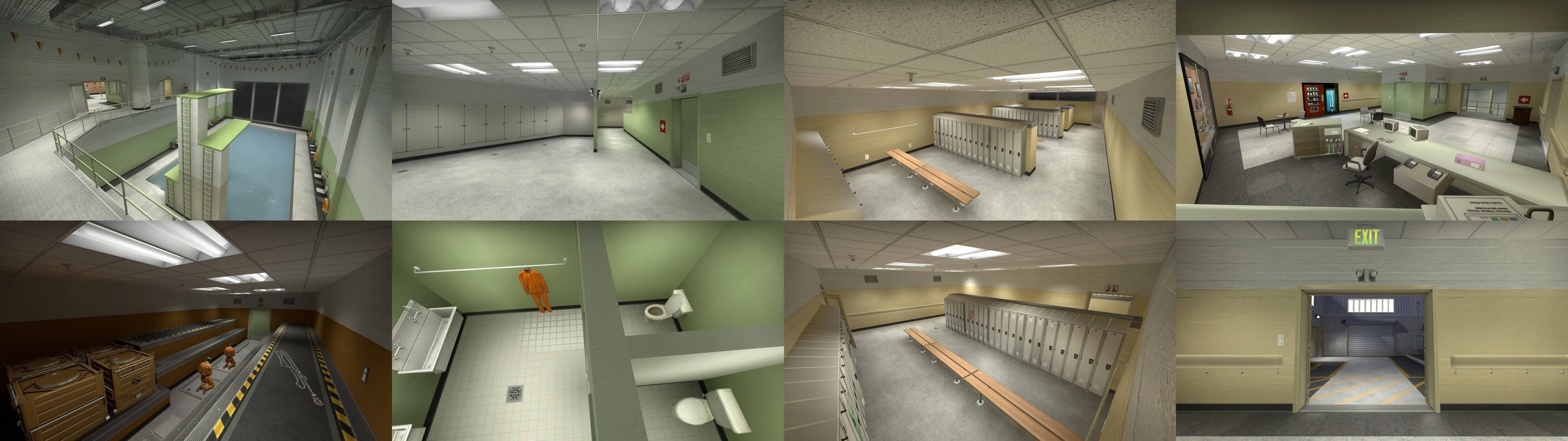
Edit 24.07.2020 - Now it's a cs_sauna_legacy.
https://steamcommunity.com/sharedfiles/fi…/?id=2042332498https://gamebanana.com/maps/205813
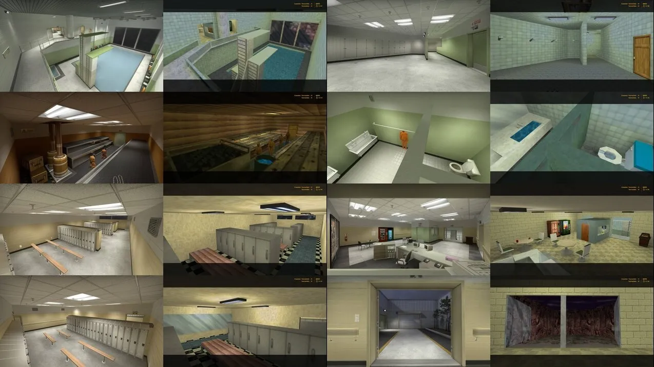

Edit 24.07.2020 - Now it's a cs_sauna_legacy.
https://steamcommunity.com/sharedfiles/fi…/?id=2042332498https://gamebanana.com/maps/205813
Hi @Mamorex, your stuff looks pretty cool!!
I know writing text is pretty boring, but a little explanation could go a long way in communicating your though process here! Design is all about decisions and intent... images don't communicate that as well as words.?
The diving board jump onto catwalk / baby pool drop thing is crazy and original, but I'm wondering how it's gonna play out in a real match. I think it would be fine if this was a niche side thing, but here it's one of the two routes to the hostages! Also it took me a few minutes to understand the baby pool drop thing, so I think a lot of players will be confused at first... and I don't think bots can do any of these jumps btw
In the pool room again, the "concrete pillar on catwalk" part is weird... I know I'm supposed to walk on the railing next to it, but it doesn't feel great for both gameplay and fiction.
There's a lot of awkward, dead-end little rooms packed with props... it's cool to add spaces for storytelling, but I think they shouldn't be playable (e.g. door is locked, we see a cool thing through a window, and that's it)
A thing to keep in mind with interactible objects, is that as soon as we use one it creates the expectation that the next identical object will behave the same way. This isn't the case with doors in your map (green door interactible on T-spawn, green door non-interactible on CT-spawn...) I'd say make the interactible doors have 1 consistent appearance, and non-interactible doors have a different one.
There's a few more props that encroach navigation space, like the benches in the locker room for instance... I suggest having a single row instead of 2 per section, to simplify it a bit, and moving them a bit further away in the alcove, not aligned with the lockers, to make it less likely to accidentally bump into them while moving across the room.
This wall is at the awkward height of "Is jumpable question mark???" (it actually isn't). I'd make it a bit higher so it's visually clear
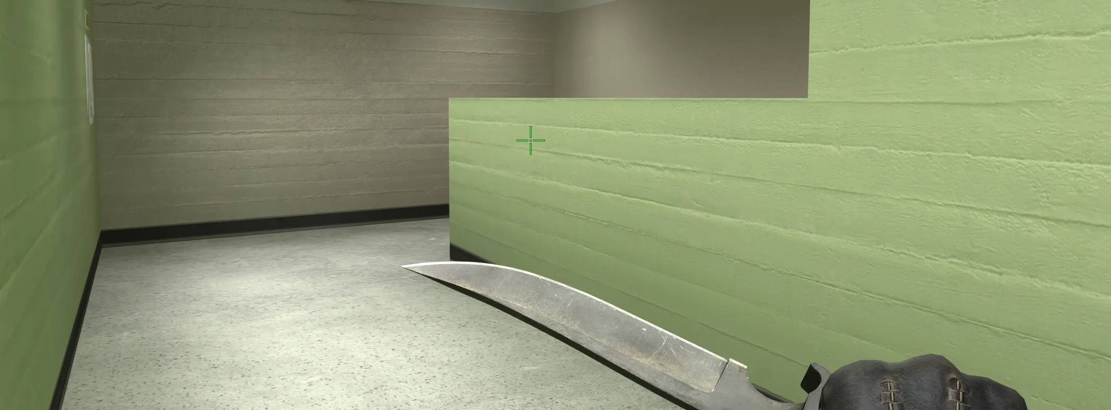
There's also a lot of snagging on small collisions. Disabling collisions on small props and adding clip brushes will solve that (large window by the pool, railings in the staircase, doorframes, etc.)
Overall it's looking pretty nice! Keep up the good work ?
I want to keep the defects of the original 1.6 map, like rounder pillar, but I made some changes.
Don’t have an account yet? Register yourself now and be a part of our community!