1. Forums
  2. Discord
  3. About Mapcore
  4. Patreon Supporters
  • Login
  • Register
  • Search
Everywhere
  • Everywhere
  • Articles
  • Pages
  • Forum
  • More Options
  1. Mapcore
  2. Members
  3. Interfearance

Posts by Interfearance

  • The random model thread!

    • Interfearance
    • September 13, 2019 at 11:07 PM
    Quote from WD

    5 hours ago, WD said: It's part of the workflow max has, most, if not all of modifiers are non-destructible so that you can always come back to tweaking the starting values of that primitive where you started off.

    Though there are very few cases while modeling where you need to do that but it becomes much more handy when doing scenes with lots of repeatable stuff.

    I thought it was so hilarious that it was a modifier that I didn't bother to look for other ways to do it. There seems to always be one extra step in 3ds max but I was wrong this time . How has blender been for you VS max? I don't really use any crazy workflows or features, I just use vanilla addons to make a model here and there.

  • Counter-Strike: Global Offensive

    • Interfearance
    • September 13, 2019 at 11:04 PM
    Quote from Vaya

    Just now, Vaya said: what? not following

    The Dust 2 has been glorified to the max, and the reference isn't even "dirty". To clarify my use of the word dirty, I mean overgrown vegetation out of map, a sewer water leak here and there, normal mapped mud with reflections. Pretty much everything that can make a dirty map look equally pleasing to the industrial/sterile maps without looking too clean to be true. Source has problems with most of these things. No jabs, just what I have noticed.

  • Counter-Strike: Global Offensive

    • Interfearance
    • September 13, 2019 at 10:54 PM
    Quote from Vaya

    4 hours ago, Vaya said: Dust2?

    5[Blocked Image: https://d1mt9jmphk9kik.cloudfront.net/teamdignitas/image1521719717.png][Blocked Image: https://luxeadventuretraveler.com/wp-content/uploads/2016/08/Luxe-Adventure-Traveler-Morocco-Telouet-3.jpg]

    Come on now

  • The random model thread!

    • Interfearance
    • September 13, 2019 at 4:29 PM
    Quote from PogoP

    2 hours ago, PogoP said: In Max? You can just press flip in editable poly.

    Rip I always applied modifier. Why is editable poly a thing? What is the benefit of having primitives start as uneditable.

  • Counter-Strike: Global Offensive

    • Interfearance
    • September 13, 2019 at 4:27 PM

    Give me an example of a really dirty theme that is at the same standard of Nuke, for example.

  • The random model thread!

    • Interfearance
    • September 13, 2019 at 12:16 PM

    Welcome to 3ds max. One cannot simply flip their normals. They need a MODIFIER.

  • de_santamarta [WIP]

    • Interfearance
    • September 13, 2019 at 2:10 AM

    It is difficult to modify areas separately and see them together. You might find weird sightlines forming, and the map could also end up feeling like a bunch or separated areas.

    As you probably know, the classic process is to make the whole map and then make all the areas fun and balanced through personal observation and then playtesting.

    The reason this tends to work better than mapping in a modular fashion is that you can see how areas transition into each other more easily, and create a map that feels more natural.

    This method can certainly work, but is it worth the risk? Also, the concept looks cool, and I think you can pull off all the colors if they are not too strong.

  • de_zenith

    • Interfearance
    • September 12, 2019 at 10:38 PM

    Your prop design image needs to be pushed up from last on the workshop... it is so sick:


    Where would one make the "chalk" effect sketches?

  • Counter-Strike: Global Offensive

    • Interfearance
    • September 12, 2019 at 9:00 PM

    In source, clean modern, and minimal themes are often the best looking. Everything you see on the workshop is super clean nowadays, because grunge looks bad in source.

  • [CS:GO] de_aldebaran [WIP]

    • Interfearance
    • September 11, 2019 at 3:35 AM

    Very cool colors and cave section. This map really came a long way.

  • [WIP] Dune

    • Interfearance
    • September 10, 2019 at 9:09 PM

    are those gaps I see in the ground? Be careful with the vertex tool, it can create concave faces that seem flat. These faces create errors and mangle your shapes. As a rule of thumb, always manipulate adjacent vertices.

    If you can't make the desired shape with quad geometry, split in to triangles and the errors will go away.

    Also, if you still cant get the shape looking good, use a model or displacement created from a valid brush.

  • Counter-Strike: Global Offensive

    • Interfearance
    • September 10, 2019 at 7:49 PM

    I had a friend who would grind for top hundred squads every season. The players were usually mediocre, but of course you would always have bush wookie who ruined your game, the circle that killed you, the water that drowned you, your own car running you over, and getting American sniped by an m24 in orbit. You will enjoy csgo.

  • Counter-Strike: Global Offensive

    • Interfearance
    • September 10, 2019 at 12:28 PM

    The akm in pubg uses camera shake as part of its main recoil penalty. This, and many other things, are why I never broke 1k hours in pubg. Random loot games with fun sniping but cancerous qcb, driving and looting are not fun to me anymore.

  • Free themes! And my failed graybox stories.

    • Interfearance
    • September 8, 2019 at 8:18 PM

    I have come a long way in about a year of videogame mapping. I have an extreme passion for level design and I want to turn it into my career. I don't think I would still be here if I didn't love doing it, because damn I failed a lot and learned a lot. Even though it has only been a year, believe me, if you don't persevere, mapmaking will turn you off fast. Here are a few themes that I have messed up in my mapping noobishness that you might actually want to use if you are stuck. For some I have screenshots, most others are lost. Also, many of you may know me for my rant based, unstructured writing, so bear with me. One day I will plan a post.

    De_olympus

    The OG. The first ever map idea I had. It was this space station where the terrorists had docked with a ship. There was this whole lookout tower extension that was gonna have a glass bubble over it. There was a one way drop to B. Very cheeky design choices.

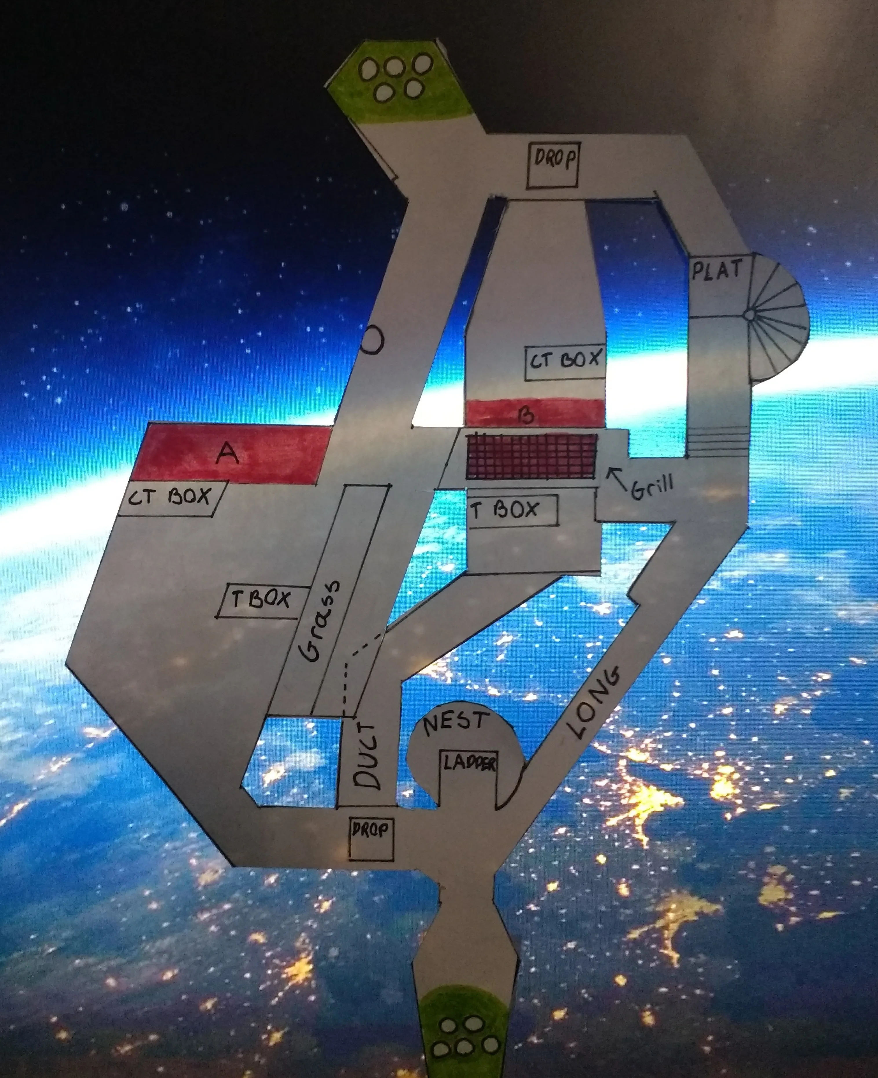
    As my first project I have decided to make a defusal map based in space. The terrorists are attempting to detonate explosives in the two bio centers on space station Olympus. Look how much I planned this:

    Spoiler

    Grill Fight[/b]

    On Olympus, winning the fight for Grill is going to be critical for taking B site (T) or preventing it from being taken (CT). I predict that the fight for grill will have 2 T's and 1 CTas the T side can afford more players since CT players will probably have 2 players per site leaving one to go plat. Even with this lost player, the engagement on B would have 4 T's and 2 CT's. Winning grill quickly means killing the planter on CT or killing the defuser on T. To stop either of these scenarios the player(s) would need to smoke site (although the player grill will probably know where the defuser is in the smoke). Alternatively, players can counter by engaging the player in vents in an unfavorable battle or rotating all the way to long to kill them.

    B Site[/b]

    B is intentionally easy to take as it is difficult to hold. T's dropping duct cannot get back up unless they do a 4 man boost making it possible to put a max of 1 player duct. If a CT player wins the grill fight and fails to kill the planter (smoke on site) they can rotate duct along with CT's on A. In duct they have a vantage over site due to its height and can attempt a retake that is much easier than the defense. Before rotating the grill fight winner (CT only) can go plat to get a vantage of B! That's right, B sites right wall will be glass, a key feature on Olympus. Due to the high angle, picks on players behind t box will be the easiest, while T players pressed against the glass would be the only other vulnerable players on site. This makes plat balanced later in the round. Also note that plat is elevated and the stairs go up but because I am an idiot kid I neglected to put stair direction in.

    A Site[/b]

    A is intentionally hard to take as it is easy to hold (notice a theme?). Ct and T players enter the site at around the same time. If CT players hug the left side of A long (which I also neglected to label. Idiot!) they will be out of T's sight and hearing. They can proceed to walk (to trick T's into thinking they stacked B), or run behind grass to boost. Grass has two steps: a low one on the side facing the wall, and a high one on the T side preventing them from performing a similar boost. Once boosted you can either headglitch with your teammate under you, or jump on grass as your buddy flanks all the T's focused on you. The real power of grass is that you can boost on it at any point making you position unpredictable and less susceptible to T's pre-aiming where your head will be. If there is a 1v1 scenario CT's can easily smoke ct box if bomb is planted there and defuse relatively safely. Ct box is good cover for sneaky CT's to kill the unsuspecting planter and buy time for rotating CT's

    Tower/Nest [/b]

    More balanced than you think. T's who opt to leave the rush to go tower leaving their team a little weaker will benefit them greatly seconds later. They have a view of all the glass covered areas on this map. This includes the roof of a long, a section of glass roof on the CT side of B, the left wall of long ( excluding certain parts where rotating CT's can hide to avoid being spotted), and A's glass roof. This will make the CT's feel like they are playing metal gear solid and wonder why they are still here. The catch is that the dome on nest is not penetrable (dang!). Its space guys what did you expect? I predict that good T's will either stay in tower for the duration of the match to watch for rotations, or rotate back to it quickly after a successful rush to find CT rotators.

    CT/T Spawn[/b]

    As a way to spice up the map, T spawn will be inside of a space pirate ship and CT spawn will be in a ship for space police featuring coffee cups, doughnuts, and a lot of monitors.

    "Cool" Detail ideas[/b]

    The whole map will have a clean aesthetic with no pointless background noise except for (possibly) in the spawn to aid players who are saving and mistakenly switch weapons. The glass will have steel strips to support it except for the wall of glass on the right of B. I might add more glass than was mentioned in the Nest section to remind players that they are in space! I want to incorporate nylon into the walls and ceiling in some tight corridors to replicate the feeling of the ISS (international space station). There will be a few blocked passages to give this otherwise tiny map some volume. One of the blocked passages will have an airlock with a window where a torn of section of the station will be visible.Also the spawn ships will have little portholes in them. Is this idea cool or stupid? I am most eager to hear your thought on the map design rather than the planned aesthetics.


    I didn't know much about level design and my ideas were very idealistic and badly implemented. I am thoroughly surprised that I planned my first map rather than jumping into it

    Even from the get go I was tired of centrally placed mids, and how safe and generic they were in maps.

    I didn't allow T's enough room to setup and navigate. THERE WAS LITERALLY NO WAY TO GET OFF B ONCE YOU COMMITTED.

    De_underground

    A completely underground historic subway system. Nade implementation has to be creative.

    This was my third blockout (?)


    De_golden

    A san Francisco bay area mansion with a variety of indoor and outdoor engagements with a 2 level exotic car garage and a wine cellar. One of the sites was a golden bughatti on a pedestal. Some very pretentious mapping ideas I had.

    De_hydro

    Behind CT spawn was a massive hydroelectric dam. Middle was a stepped water path, but most parts were drained. A was this power generation plant with turbines. One of them was removed and you could drop down into a pipe (formally known as a penstock), and then exit in a spot where it was burst. I got super obsessed about dams when I made this one because they are frigging awesome.

    De_nordic

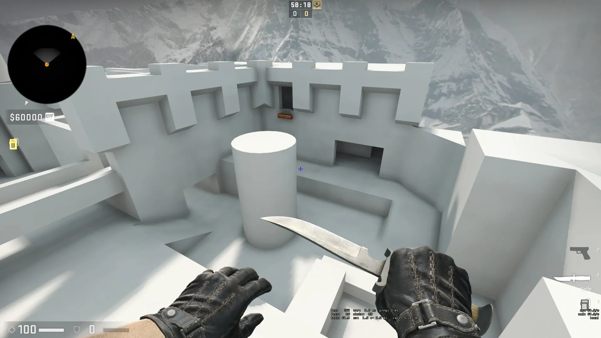
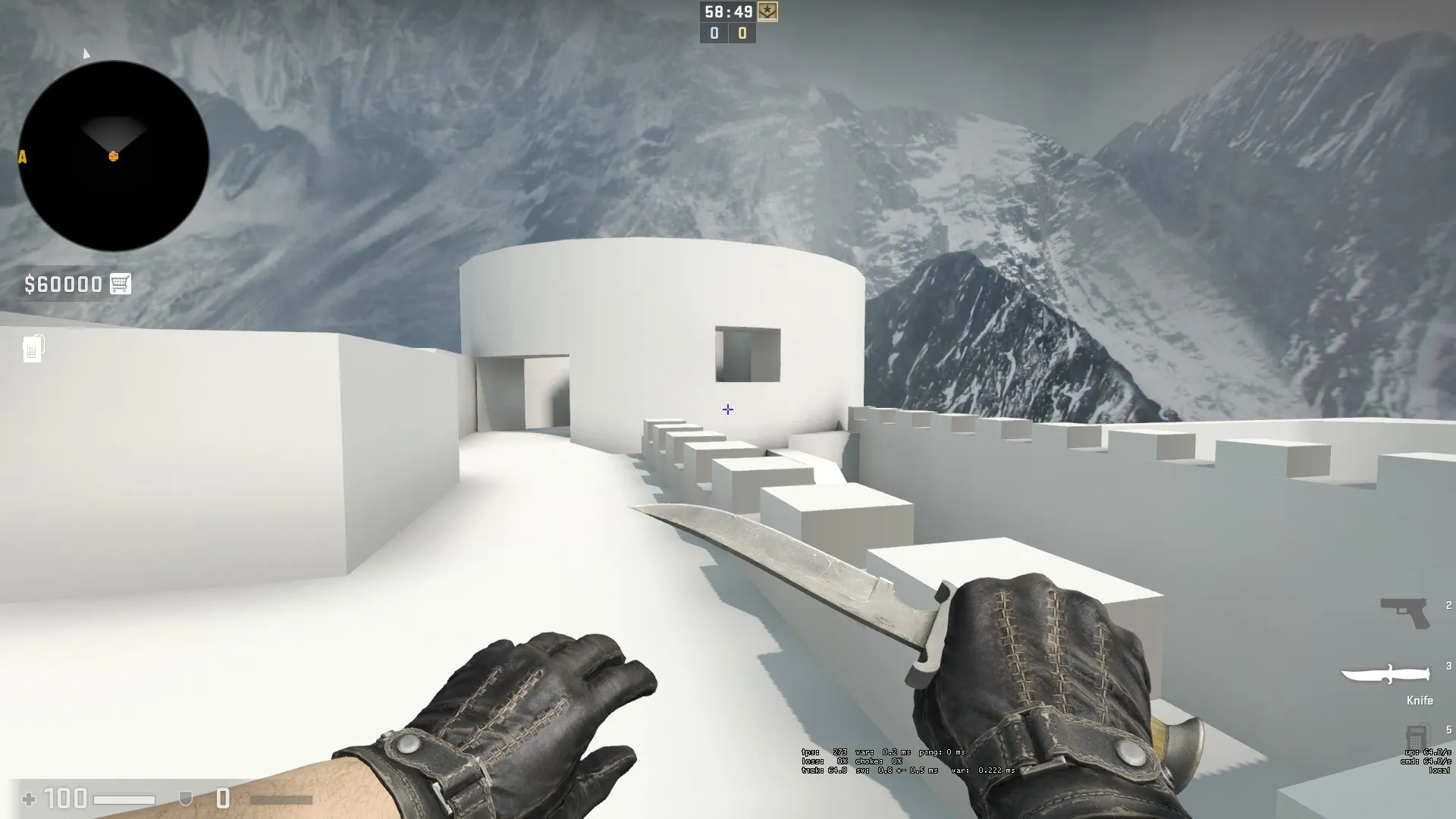
    A big Nordic castle with tons of snow, a Rapunzel tower. Situated on a mountain with one side of the map facing a sheer cliff. T spawn was half of a crumbled bridge. I think my brushwork was improving, but I feel I actually got more ignorant in terms of pathing.

    De_petrol

    A collab map I was going to do with another mapper. It was set to be in an abandoned overgrown petrol refinery, but it was like my second map so it flopped horribly. He wasn't really a layout "expert", and it is hard to give feedback about a layout that seems like it could never be good so I don't blame them.

    De_station

    Kinda like subzero except with the theme of an Antarctic research base and not nero. One site is a geodesic dome and the other is a habitat on stilts. Middle was this underground experiment area akin to nuke underground in hallway scale.

    De_sandstorm

    A city in dubai covered in sand dunes that create interesting elevations and allow you into second floor buildings and the such. My skill in hammer was not really there, I didn't get far.

    De_palace

    An area of sidewalk near a middle eastern palace caves in, exposing a sewer system for gameplay. I imitated other maps too strongly and ended up with an ugly child of 5 maps. Don't do this beginners.

    De_silo

    A missle silo on a military base that serves as one of the sites. The other is explosives storage. Middle is a service route through the base.

    De_databunker

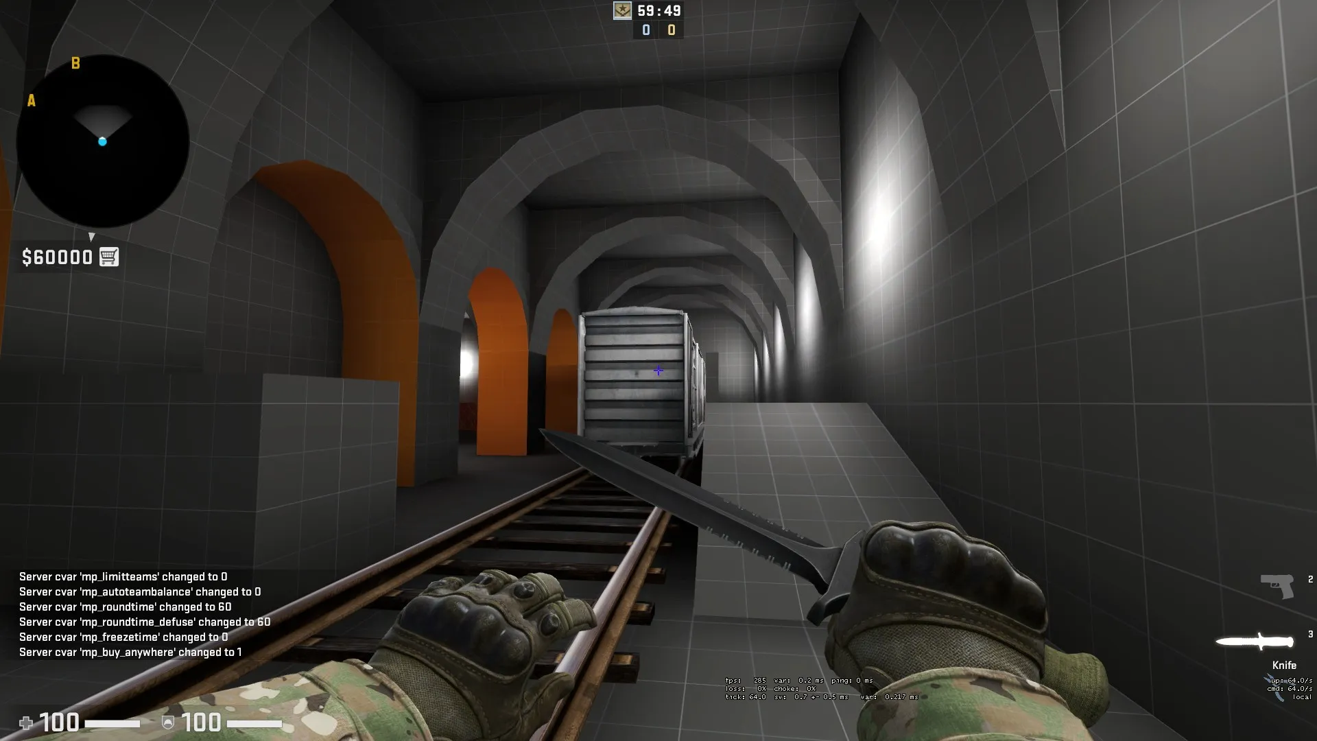
    A map that taught me a lot through failure. I didn't have a strong enough grasp of what everything was going to be and the whole map ended up suffering thematically and gameplay wise. There was a train that would block you for 3 seconds to fix timings before rolling away. very cool stuff, bad planning and execution.

    You can only start reliably freestyling your maps when you have a good idea of what makes maps tick and have experience with the editor. Do not be ashamed to extensively plan early on. You need to be very lucky to create something fun and competitive with a solid them the first time around.

    De_bunker

    The predecessor to databunker, based around artillery emplacements in the rockaways. There was not a very large variety of areas and I was not too happy with the scale of the end result considering that it could not be changed due to the real life size of certain objects that the layout rested upon.

    De_bucha

    Kind of a "we don't talk about that" map. The theme was Old Town Bucharest. One site was a palace and the other was a castle museum. There were a host of inherent gameplay issues because I was too devoted to ideas that would not work. Sometimes you have to throw away ideas that are not competitive but are very cool. This is the point where I started to learn about func detail. Before, I pretty much looked up how to put in spawns, a light_env, and brushes, and I went ham making maps. A little cringe, but at least I wasn't distracted by things I didn't really need yet. There is a mapcore post if you really care about seeing it, The visuals in graybox were o.k.

    De_kowloon

    My first map that I am proud of but also a little disappointed with. While it does have a 4 square design like every map today, it includes verticality in every section, but not in an awkward way. Also the whole map is on rooftops so I was inspired by the heights to make it like this. Maybe don't take this one until its truly dead in my hands like all my other projects.


    If you need want to use any of these themes I can give you specific ideas that I used within the map that might help or inspire you.

    I have been trying to help a bunch of people through exhaustive feedback and teaching lately. I even got a rando in mm interested in mapmaking and start his own map. I might make a basic beginners series that takes into account the things I didn't like about the existing tuts and fixing them. There will be planning and structure, and I love teaching so it will be great. I think giving a taste of the tools first and then introducing planning maps would keep people interested.

    I will eventually release the first video format and see what you guys think. Also I will not say things like:Making of de_sparity - Part 1_ Planning.mp3

    Files

    Making of de_sparity - Part 1_ Planning.mp3 310.55 kB – 131 Downloads
  • [WIP] De_Luau

    • Interfearance
    • September 8, 2019 at 5:35 AM

    Mapcore plugs seem a little too big an out of place. Something more subtle like the one on the building in breach, the TV in subzero, or the bus stop in zoo would work better.

  • de_neighbors

    • Interfearance
    • September 8, 2019 at 5:24 AM

    The idea of using form (refrence) to create function (layout) is intriguing. This resulted in a more believable theme that feels natural rather then forced.

    Here are a few thematic things I noticed:

    -The transition from wood flooring to A site seems to abrupt and is not believable. I think a transitional strip of wood with a darker color between the areas would help. It is also worth mentioning that the colors don't completely work together. Maybe a lighter tone wood or darker carpeting would fix this.

    -The hole in the wall at B is not very believable. The cinder blocks seem too large to fit in the wall, and all parts of the broken wall are perfect except for one corner. I don't think adding more sticking out, rotated, and broken blocks would be bad as long as they are out of sight lines when you are standing or crouching.

    -The orange tarp on the scaffolding looks out of place and fits better in a large construction site.

    -The checkered carpet in your earlier screenshots isn't tiling right, or is unaligned.

    -I would experiment with replacing the planks leaning on the tree with a tree gaurd or something else natural and believable like the bags you see around trees to protect them:

    -The road (noticably) lacks central lane lines.

    -The garden overlooking drainage should have a larger variety of species and slightly denser. It looks really dead right now.

    Csgo maps are really lenient with this stuff, but I feel like maintaining the realisticity in the details will help set the map even further apart.

    As for actual gameplay, everything looks well thought out. Only playtesting can tell (assuming you haven't had it already or recently).

    Edit: Your radar looks like it can use a custom gradient. The height variations are hard to make out.

  • Counter-Strike: Global Offensive

    • Interfearance
    • September 8, 2019 at 3:02 AM

    @fewseb Frankly it does not really matter what pros think, so long as it is not balance related. Valve has never cared, and I have never cared. The game doesn't ride on their shoulders; they go where the community goes. Furthermore, this would not change the scene at all, it would be just as balanced.

    If valve changes movement values between two engines, it doesn't mean that it is the physics engine's fault. The Dota 2 port was almost unnoticeable, and was completely for performance gains. Nothing changed at all, and it had no reason to. Honestly I wouldn't care if everything changed, but it seems unnecessary.

  • Zelda: BotW - Open World level design

    • Interfearance
    • September 7, 2019 at 10:18 PM

    I loved this game so much, and the level design was incredible. It was a pleasing middleground of "fuck I am missing everything, where am I", and "follow the blue line to objective". The item breaking system could be frustrating at times, and didn't really make sense from a gameplay perspective. Also, the framerate really took away from the experience for me, because I kinda got this feeling of nausea (like when the movies have those choppy shots of treelines). Anyway, I don't really blame them, they had to work with rudimentary hardware and make the game look as great as it did. Definitely a 9/10 if these things weren't present.

  • Counter-Strike: Global Offensive

    • Interfearance
    • September 7, 2019 at 10:09 PM

    Valve is comprised of professional blue ballers. They give you something great, but it is limited in such frustrating ways, and you cant complain because it was only $15.

  • Counter-Strike: Global Offensive

    • Interfearance
    • September 7, 2019 at 5:45 PM
    Quote from fewseb

    13 hours ago, fewseb said: The tac-21 predates any coop gamemode, the others are all very easily just cut survival weapons. But I also dont see how a spatula will really mess with the cs formula if it was in the base game.

    As much as im sure everyone here would love to work with something from this decade, a source 2 update in reality just results in less features for us the mappers (do to valves failure to port over entities or code that isnt used in the main part of the game) and more bugs for the player base to deal with. That ontop of the physics and lighting changes that would completely change the way the game is played in the pro scene.

    I doubt lightning changes would do anything to the visibility. There are already many competitive games that have dynamic and realtime lighting. Also, inclusion of physics props is completely up to the mapper. The piss poor source materials push map makers towards modern and/or minimalist styles if they want their map to look presentable, while truly grungey and dirty themes are almost impossible to pull of and look like they were made in this decade. Just because there are some uncompetitive features doesn't mean you are forced to implement them.

    Working ingame Lighting Preview Faster/Improved 3D Preview Importing feature for VMF files (Maps from old Hammer) Undo-History New Chooser for Models and other Assets (Asset Browser) Map size is no longer limited to Grid size Maps dont have to be closed to work Clipping tool preview Moving and Transform functions for Brushes are now more like in "real" 3d modelling Programs like 3DS Max. For example: You can specify the pivot Point of a brush [/list] If you have ever touched hammer, this would probably make you excited. Also, the engines capabilities are all around improved, mainly because of vulkan, and its astounding ability to actually use your gpu.

    Frame differences between a 1080ti and a 1050 running csgo with an i7-8700k are around 10 on average in my rig. This means that source 2 can actually afford to look better because it will retain its framerate due to the gpu being used. It is still by no means impressive or cutting edge, as there are other engines like Anvilnext that can do all of this with realistic destruction and maintain insane fps. Better than a 15 year old piece of shit ?


    Edit: Acceleration and velocities can pretty much be replicated in source 2 while feeling just as if not more responsive.

Discord

The Mapcore Discord is our lively IRC channel of the 2000s reborn. Chat about level design, gaming, and more.

Latest Posts

  1. Building a Huge Library of Free Images for Everyone

    Eric Matyas
    August 10, 2026 at 1:52 PM
  2. Any of the old guard still around? D:

    Chunks
    August 7, 2026 at 11:08 PM
  3. CS:S | cs_manoir | Map creation process by D'artagnan

    Thrik
    August 3, 2026 at 10:42 AM
  4. Custom Gamemodes Contest

    Angel
    July 20, 2026 at 11:46 AM
  5. FAQ

    Angel
    July 20, 2026 at 10:14 AM
  6. Tangerine

    Harry Poster
    July 18, 2026 at 11:10 AM
  7. About our archived forums

    Thrik
    June 30, 2026 at 2:12 PM
  8. Mapcore Discord

    mason_fan123
    June 24, 2026 at 8:52 PM
  9. [CS2] Valley

    Serialmapper
    June 22, 2026 at 11:56 AM
  10. Free Music / SFX Resource - Over 2500 Tracks

    Eric Matyas
    June 18, 2026 at 12:32 PM
  1. Privacy Policy
  2. Contact
Powered by WoltLab Suite™