


Cool idea, but like Wintrius said, corridors are way too narrow. Try to widen them up a bit
Posts by Apeyou
-
-
Congrats! Well deserved!
-
Hi everyone!
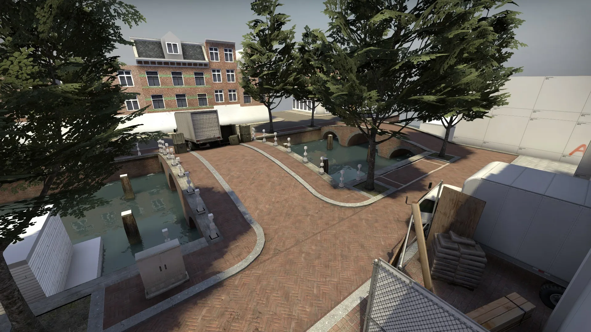
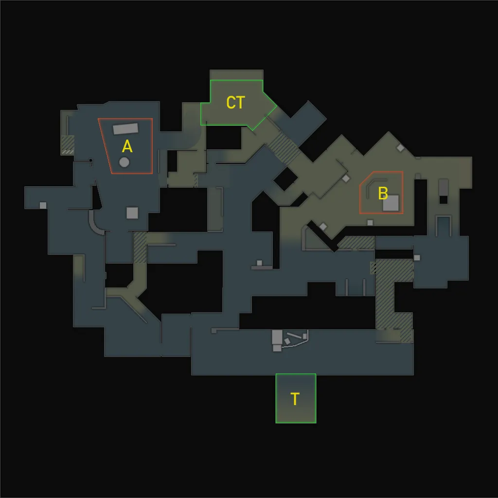
I'm working on a de_ map set in the Netherlands, loosely based on Amsterdam. Since the layout is finished I'd like some feedback on how it plays. At the moment it's probably lacking some cover, but I'd like to hear what you guys think.
Workshop link: https://steamcommunity.com/sharedfiles/fi…/?id=1701361043
And yes, I did a first art pass on T spawn, I couldn't help myself
Radar:
If you'd like to see more screenshots, I've made an Imgur album: https://imgur.com/a/FIyMo
-
 Quote from zastels
2 hours ago, zastels said: You're a pipsqueak and you talk like a Liberal, so many people on Mapcore are always calling people trolls because they're unable to understand a concept or disagree with it. You know you're pathetic when you call something theft that isn't theft, and suck the fucking joy out of sharing art and helping beginners improve their craft.
You're probably a President Trump hater. You probably think President Trump is "trolling." Lol one of the greatest Presidents ever, but he is a troll, right?
Is this necessary? If you really want to talk about politics (although I think you're a troll), please don't do it here. I'm all for a nice discussion but this is getting ridiculous.
-
First thing I noticed is the lighting seems very dark. I'd recommend this website for the right light_environment settings. The layout itself looks a little uninspired, based purely on the screenshots. I'll try to give more in depth feedback after I played the map. Good start though

-
I personally like to start with a little sketch, just to make it easier for myself to block things out, but after that it all comes down to playtesting. The thing I notice a lot with beginners is that their layout basically consists of random walls/blocks with no purpose. Try to think of what these blocks do, "is it a house, does it make sense to put a house there" etc. Blocking out a map is way easier if you already have a theme in mind.
-
Your normal map is inverted on the right side of the model. Also, are you using any reference? That'll make it much easier to make a model seem realistic. But off to a good start!
-
Congratulations to all of the finalists! Looking forward to seeing the final, polished versions of the maps!
-
 Quote from Andre Valera
7 hours ago, Andre Valera said: Are you on discord?
Maybe someone there can help you answer any question about optimization?
I'm not, but thanks for the suggestion!
-
Now that the contest is over, a lot of maps are left unfinished. Is it possible to move the topics (or at least the maps that are still being worked on, like mine) to the 3D-section of the forum?
-
Hi everyone! I wanted to give an update on the progress. Since this is my first CSGO map, I had quite a hard time figuring out how everything works (especially optimization-wise) and I ended up underestimating the effort I had to put in. Because of this, I wasn't able to finish the map on time, which I was pretty bummed out about.
Although the deadline came a little too soon for me, I want to continue working on this map, simply because I love to do it. I'd also like to say that I absolutely love this community, it's so awesome seeing all the projects people have been working on!
I'll keep you guys posted!
-
The transition from the walls to the floor seem a bit harsh on the last screenshots, maybe try some sort of trim? You really know how to set a mood in these corridors, good job!
-
Hey everyone!
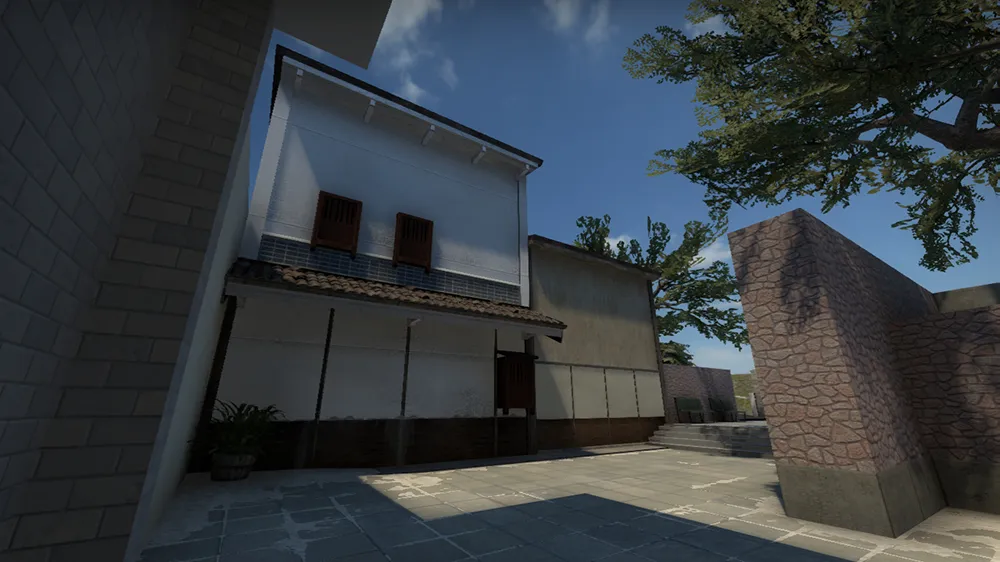
I've started working on long B. This part of the map exists of older Japanese architecure to clearly distinct itself from the rest of the map. Obviously still WIP, but it's getting there.
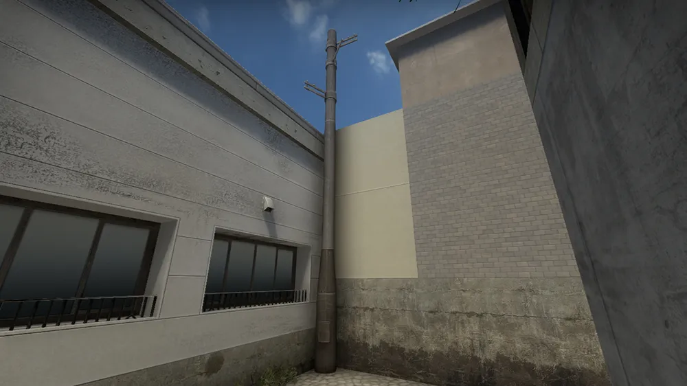
I also made (actually still working on it) a custom utility pole with the top parts being separate models. This way I can make as many powerlines as I want, which is convenient since Japan's power grid is almost entirely above ground.
-
Sunrise has been updated again! For those interested:
-
Maybe you could use floodlights to brighten up the sewer. That way it doesn't seem like your ceiling lights are unrealistically bright. I'll take a look at your updated map as well!
-
Looking great but seems a little dark at some places, especially the sewer area. Good job so far!
-
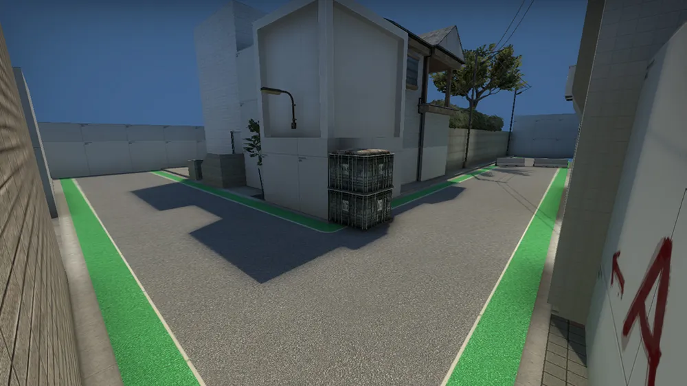
Been working on T-spawn/long A. I'm having some trouble with making the road look more realistic; it just looks too clean right now. I'm problably going to try a blendmodulatetexture to paint some dirt on the road or something. The crate is a placeholder btw, meant to break up the line of sight.
-
Looks great, although the yellowish texture makes the map feel 'warm', while it should feel cold because of the setting you're going for. Maybe try a less vibrant color or play around with some color correction. Keep it up!
-
It's time for an update! (FINALLY) I've been working on detailing A site for a while now. Since most models don't fit the theme I'm going for, I worked on some custom models as well. Oh, and don't mind the obvious seam in the geometry on the first screen ok thanks
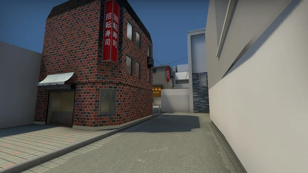
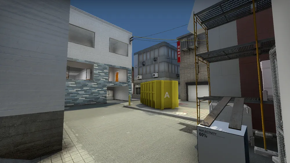
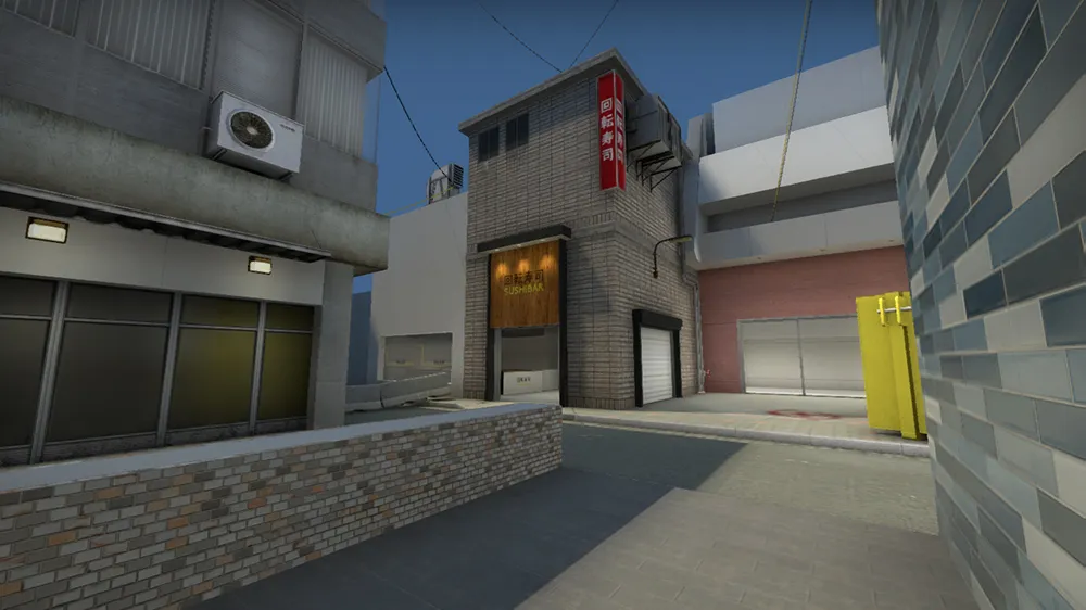
I'll try to post updates more regularly from now on!
-
Detail sprites are still pretty buggy in CSGO, I wouldn't recommend using them to be honest.