


Note: If I opened the same file that we exchanged via dropbox the entities worked fine and I was able to compile. So it seems to be not a problem with a corrupted file, the editor itself seems to be the problem.
Posts by Shibou
-
-
i like the potential B-Site on your pic. the rest of the map looks a bit to open for my taste. Yet that says nothing abou the ways you'll create your map.
That half-dome in Hammer looks quite impressive, yet a bit messed up. ow did you create it ?
-
The layout lloks even more comlex to me, but Bombsite B still looks better than A.
Somehow i liked the pevious version of A a bit more tbh.
-
 Quote from will2k
9 minutes ago, will2k said: "Welcome to the H.E.V. mark IV protective system, for use in hazardous enviro... oh wait, wrong game

[Blocked Image: http://i.imgur.com/c30pkqu.jpg]
Friday bonus pic
I want to play that map so much. When will you finally release it?

-
I got the strange feeling that I've to do something against all the claustrophobic interior parts of the map. Bright surfaces and glass seem to be the solution. Between Bombsite B and CT-Part of Mid is now a room (just decoration) that allows to look from Mid into entrance of B. The sightlines will be more blocked by other stuff. I am trying to let it look like an office.
Yet i like the idea that careless players rushing through Mid might be seen from B and catch a hit from there.
[Blocked Image: http://i.imgur.com/t0YPmNz.jpg]
[Blocked Image: http://i.imgur.com/CWybqAe.jpg]
-
 Quote from MrRuck
53 minutes ago, MrRuck said: Some recent footage of my map de_throne

The content cannot be displayed because it is no longer available. That Bombsite looks like it'll be hard to defend from these OP spots but the architecture is nice!
-
Architecture looks great! That will be a very interesting project! Please give us a complete layout and a workshop version to check it out! [Blocked Image: https://migrationtest.mapcore.org/uploads/emoticons/default_mapcore_smilies/emot_wink.gif]
-
Quote from untor
57 minutes ago, untor said: Waterfall was release!
Thank You for that awesome Map with its refreshing and unconventional Layout
great work.
-
Thx to @JustFredrik I've been able to solve some minor lighting issues and concentrate a bit more on blocking.
Spoiler
[Blocked Image: http://i.imgur.com/mZVEJUB.jpg]
[Blocked Image: http://i.imgur.com/Atcqe3I.jpg]
[Blocked Image: http://i.imgur.com/Mtaymu2.jpg]
The colour for player guidance on Bombsite B will be orange. Maybe that orange right now is a bit intense but its a nice contrast to the rest of the surroundings.
-
Bombsite B has been reworked to look a bit friendlier. The low ceiling gave a realy depressing a clautrophic feeling. For comparisson reasons I attached images from before and after.
Spoiler
old version:
[Blocked Image: http://i.imgur.com/ZMVckn4.jpg]
[Blocked Image: http://i.imgur.com/SKE0GwX.jpg]
[Blocked Image: http://i.imgur.com/xXJSRhW.jpg]
new bombsite B:
[Blocked Image: http://i.imgur.com/fMkawXb.jpg]
[Blocked Image: http://i.imgur.com/OrDKCcf.jpg]
[Blocked Image: http://i.imgur.com/VkOAMUx.jpg]
-
 Quote from JSadones
On 20.5.2016 at 10:34 PM, JSadones said: Thank you!
Haha nice spotting on that flag, it's a placeholder for now. Re-texturing would be easy on the model, but I don't know if I'm allowed to edit Valve their models. That was orignally indeed glass, but I decided to take it away because of the sightline on balcony. Was a bit lazy and just re-textured it [Blocked Image: https://migrationtest.mapcore.org/uploads/emotic…/emot_smile.gif] I'll move the bushes more so you don't get the impression that it's walk able.
And finally, I know the fences make no sense. It was again a placeholder, but players are not supposed to go there. Did a bit of detailing, and this is sort of what I want to achieve.
[Blocked Image: http://i.imgur.com/XMR2z9k.png] Obviously needs more work, but this is the sort of thing I wanted to achieve
Thats awesome in 2 ways:
1. the pure awesomeness of itself
2. the speed you are working and creating that awesome stuff.
-
trying to bring in some colour...
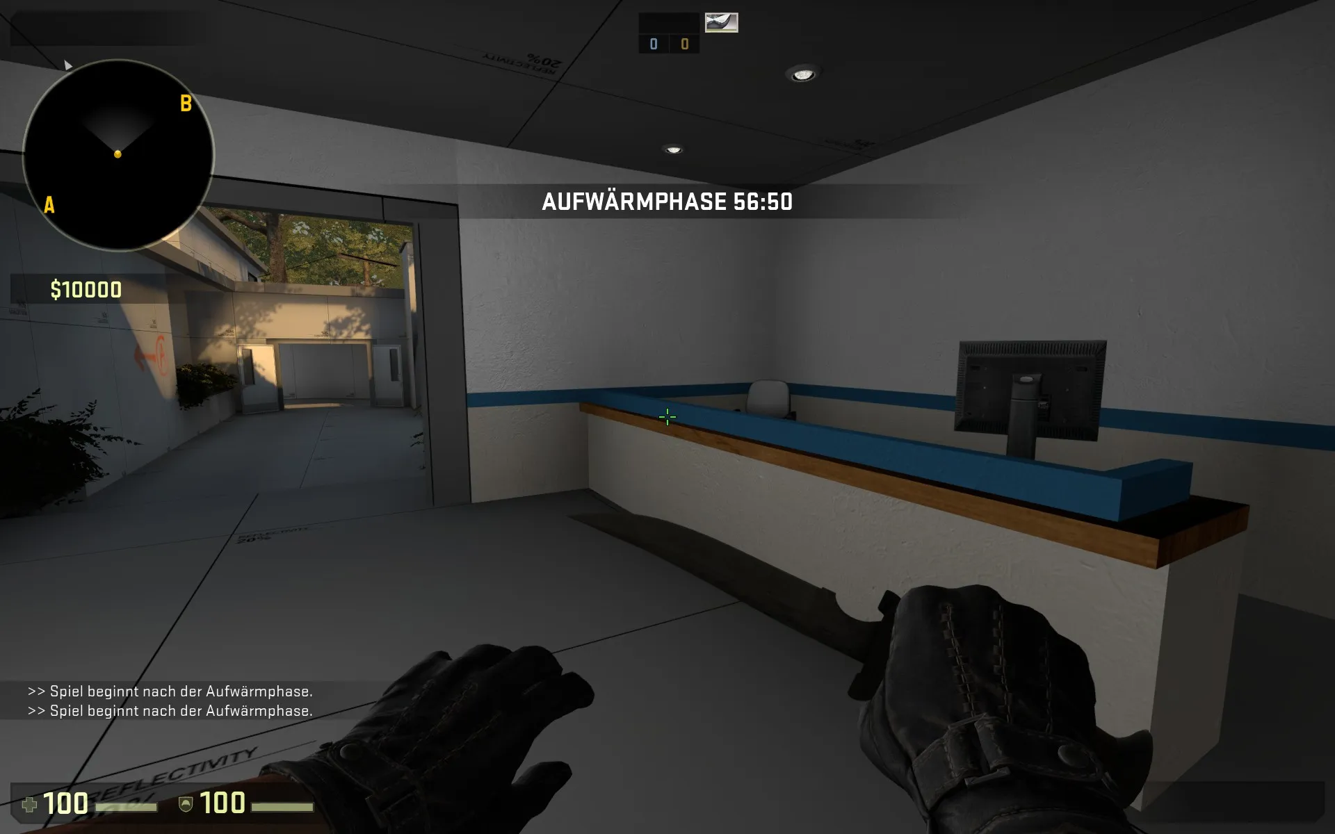
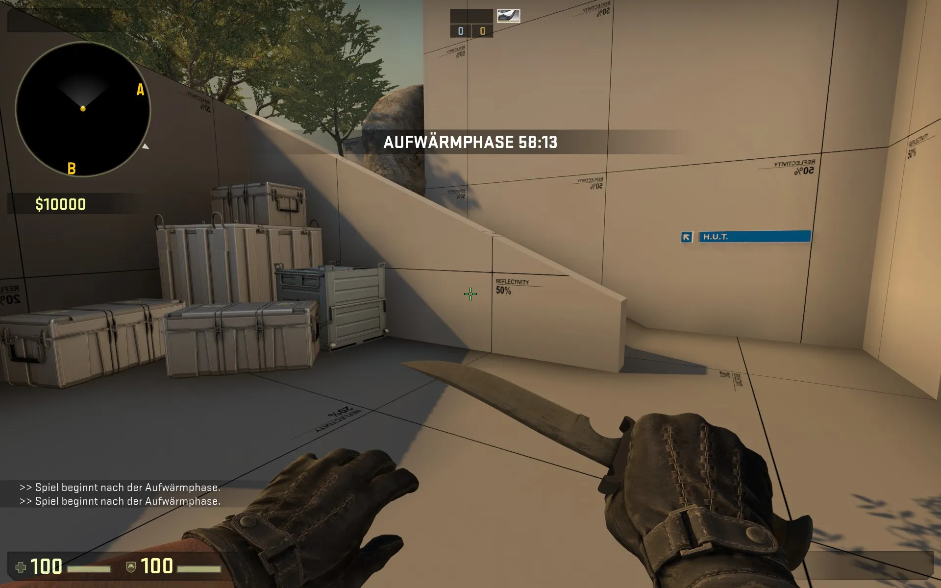
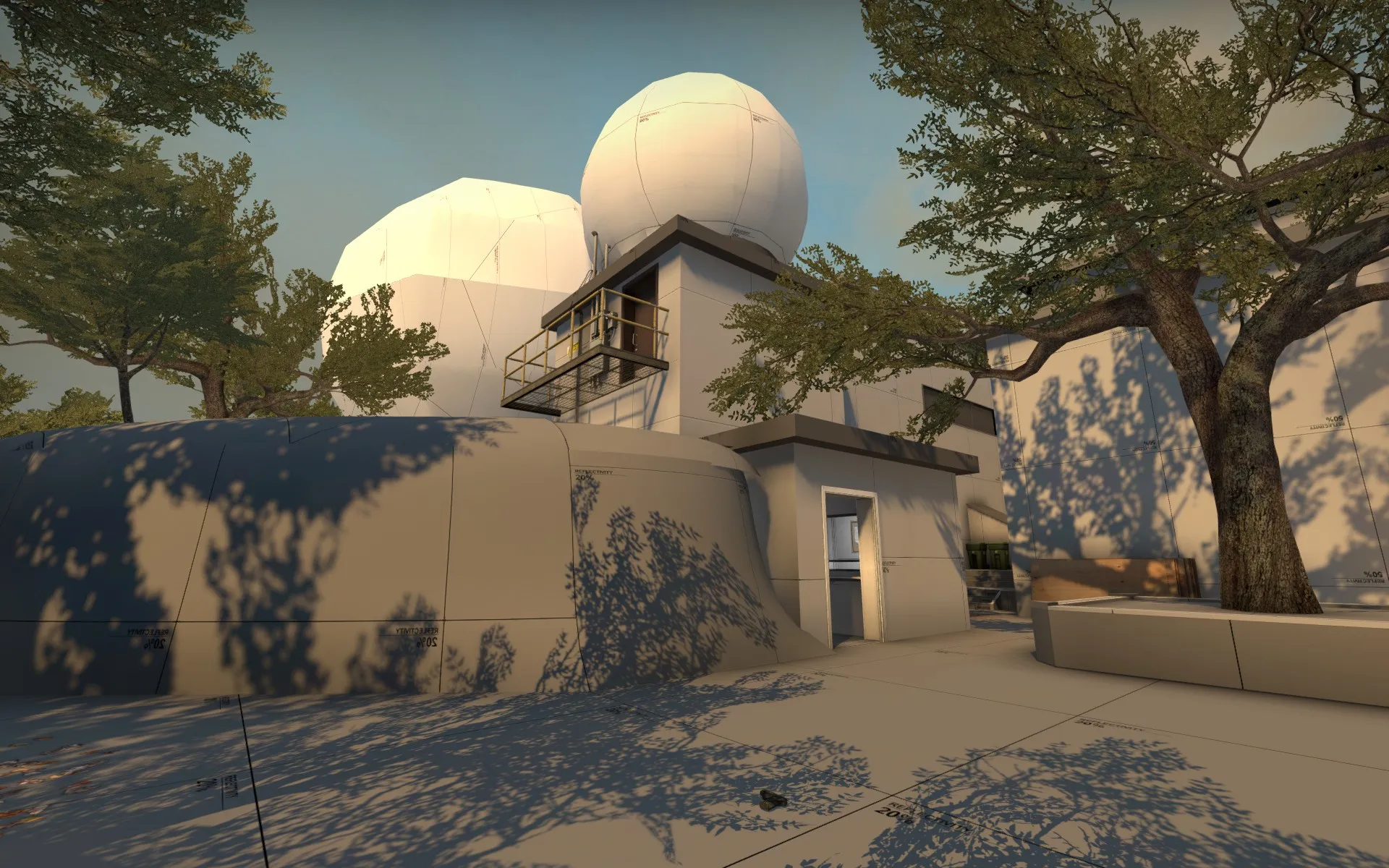
-
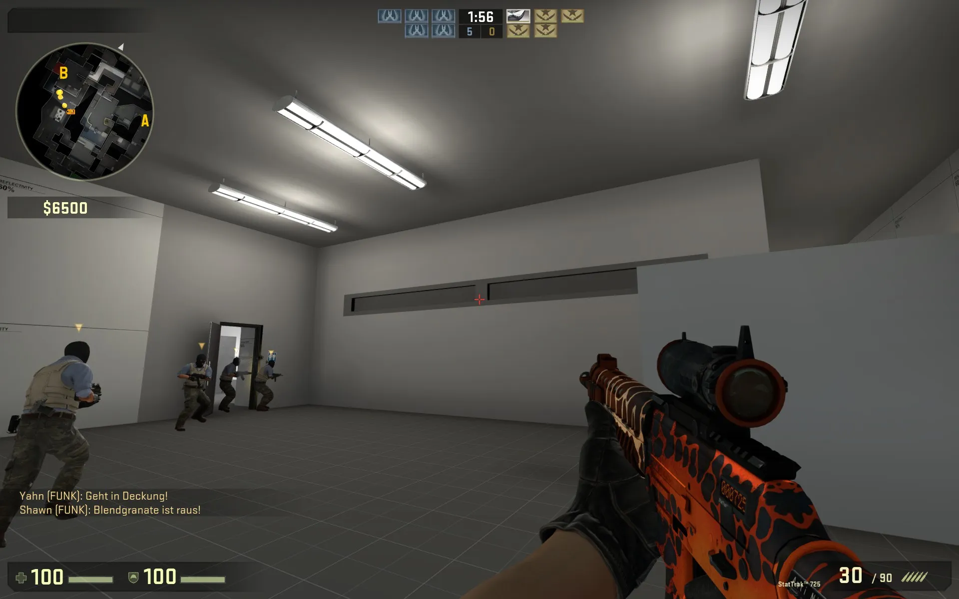
I have been runing around it a bit. So far I wouldnt call it a playtesting as bots dont count in my opinion. The map made a huge progress and is hardly to be recognized. It is allready very detailed and awsome to look at. I like your clean yet very saturated colour set you use for accentuation here and there.
(The flag on your CT-Spawn look italian not spanish to me.)
Just some minor thoughts:
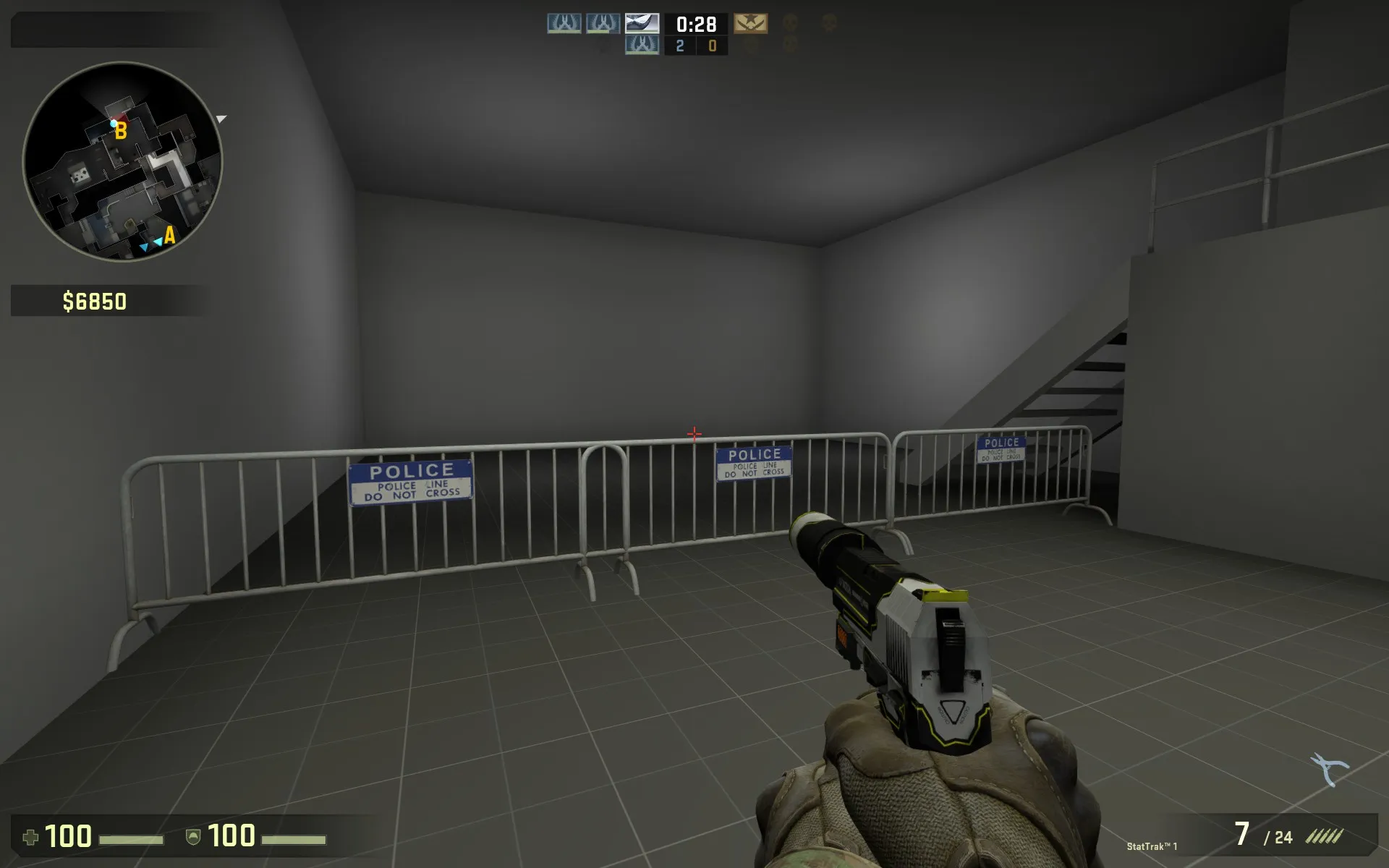
These fences make no sense to me. The block the player from an empty room. Are you going to add something here that's going to tell me why I am not allowed to pass ?
This looks like a window and sould be made of glass imo.

that area looks like i should be able to walk infront of that foliage.
-
We are going through a series of multiple iterations on the map Layout. Hopefuly they'll turn out as beneficial ones...
there are 3 major changes:
1. To add some more verticality to the map whole bombsite A is now lifted 1 floor up.
2. The path from A has been completely redesigned. There is now a river/water that flows into a canal which is the Terrorists new path to A. From that canal they can use 2 stairs up to the Bombsite A.
3. Rotation path between A and B called "safe" has been removed, Its only purpose was to be able to rotate without beeing visible whilst passing mid. For that purpose we now added a small building at the end of mid that blocks visibility. For the same reason, and to tweak timing CT-Spawn has been moved closer to mid. (its now right from the new building)
some pictures:
Spoiler
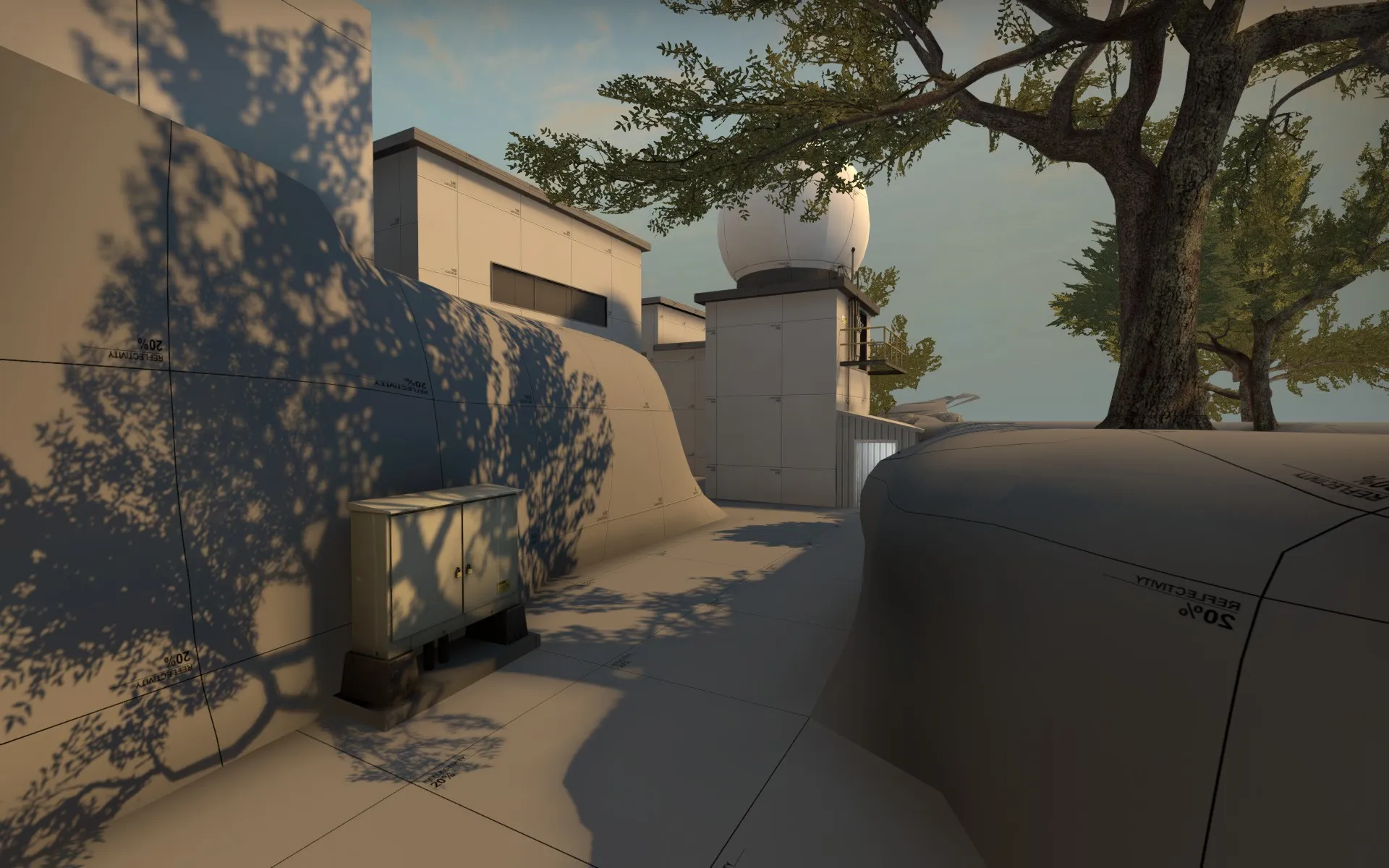
View from "hut" to mid showing the new implemented Building infront of "mid".
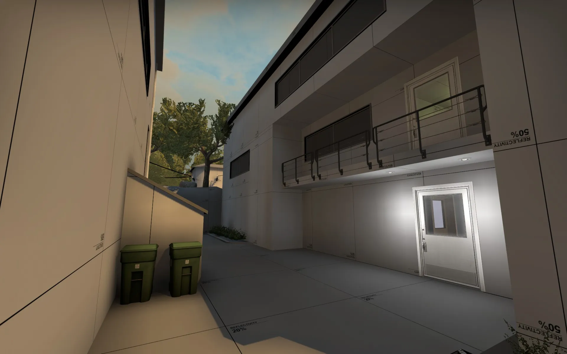
View into CT-Part of Mid, standing infront of the new building.
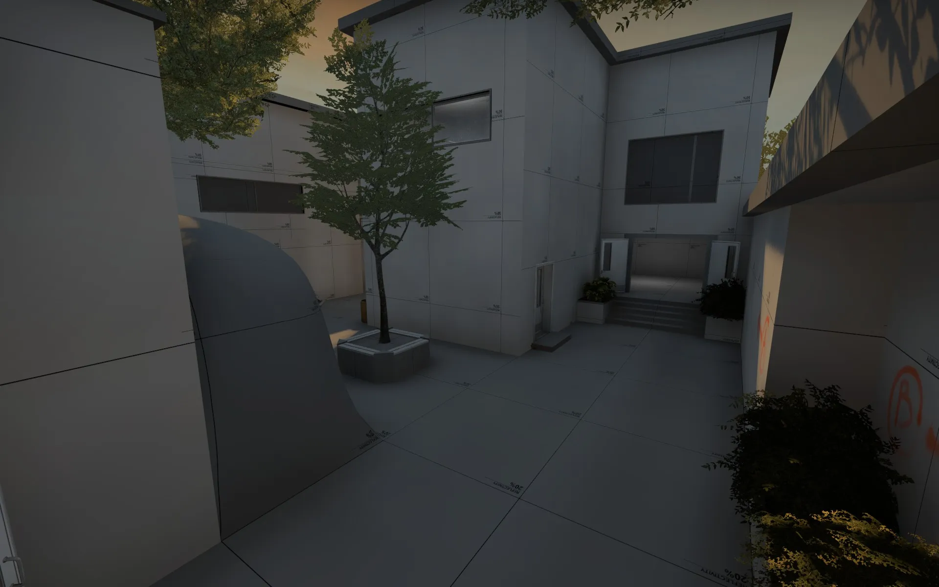
View into T-Part of Mid: on the left: way to CT-Spawn and B; on the right: path to A over "reception"
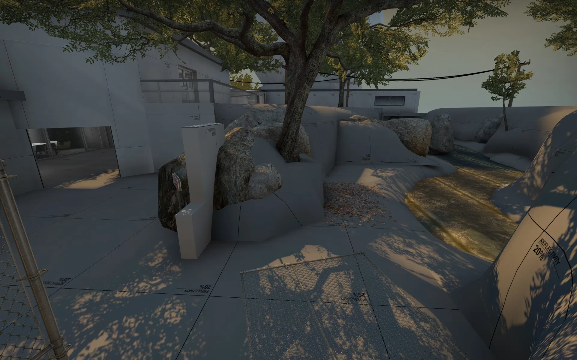
The new path to A. On the left: the T-Lobby. On the right: the water that was to be passed. In the baground the elevated Building which hosts Bombsite A.
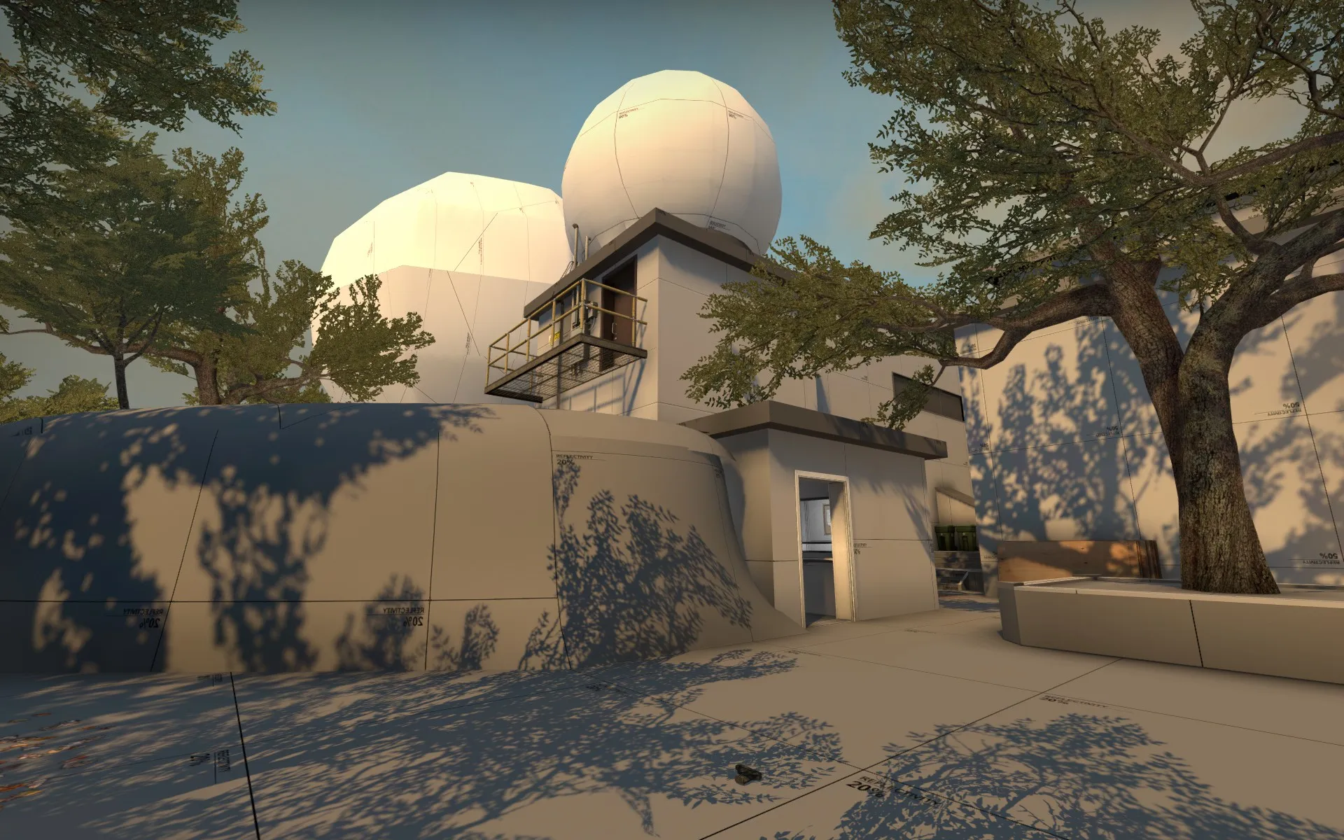
View onto the new Building from shifted CT-Spawn.
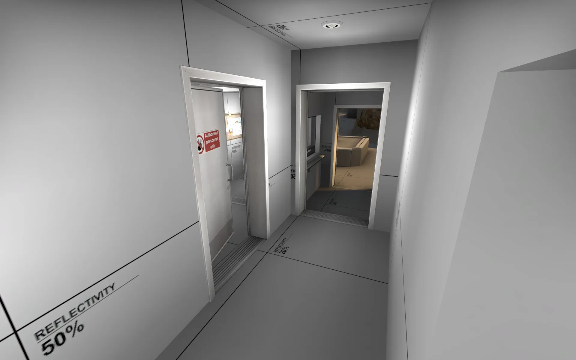
Inside-View of the new Building (We dont have a Name for it yet.) which is supposed to be the safe rotation path.
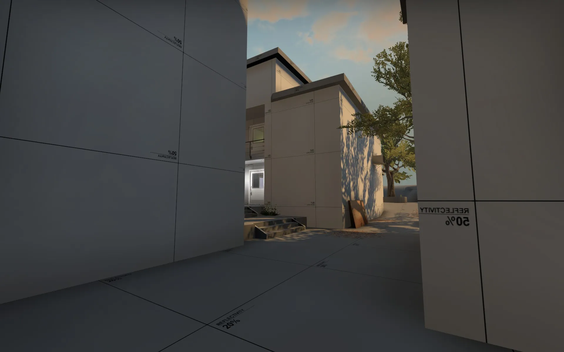
Mid entrance (CT-Side).
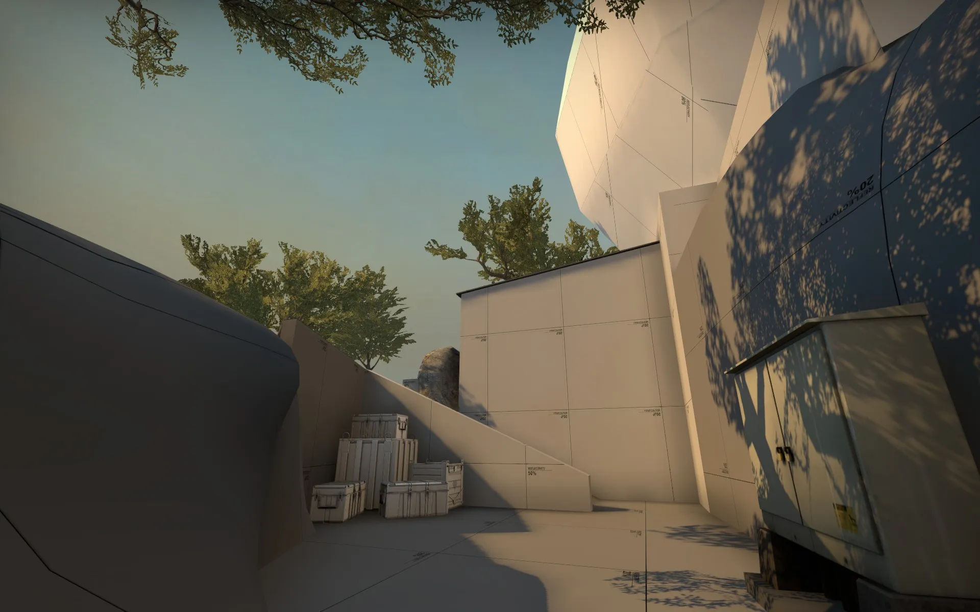
View on the path to A from CT.
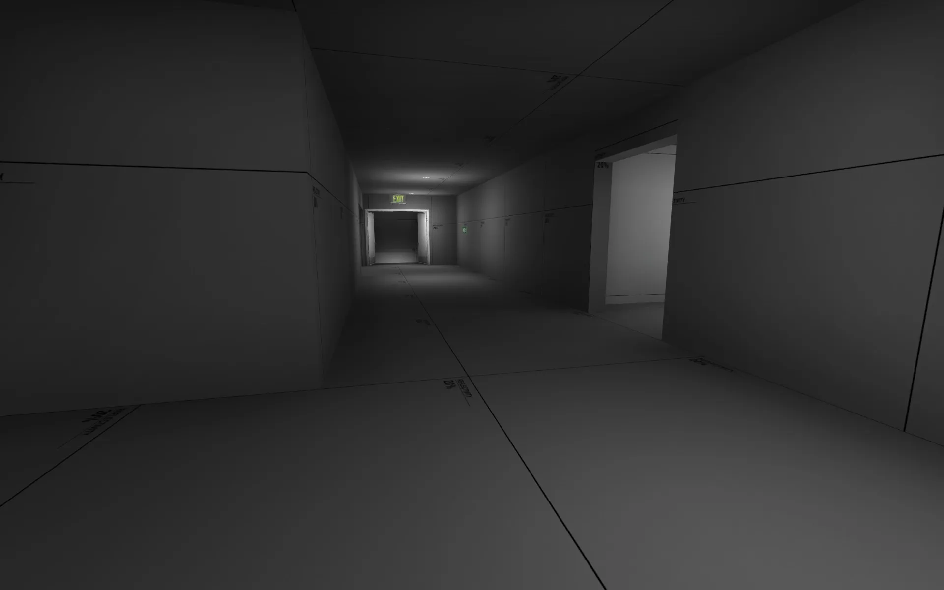
The Hallway (A-Main) where the two stairs, coming from the river/canal underneath lead to. Bombsite A is just behind the Wall on the left side of that picture.
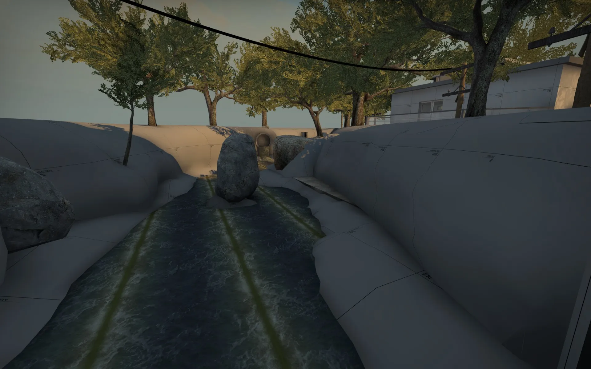
View onto the river from A/Canal entrance.
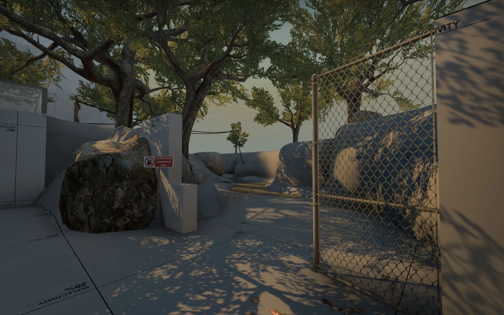
View onto the river coming from T-Lobby: The evil terrorists broke a fence to get to the canal ...
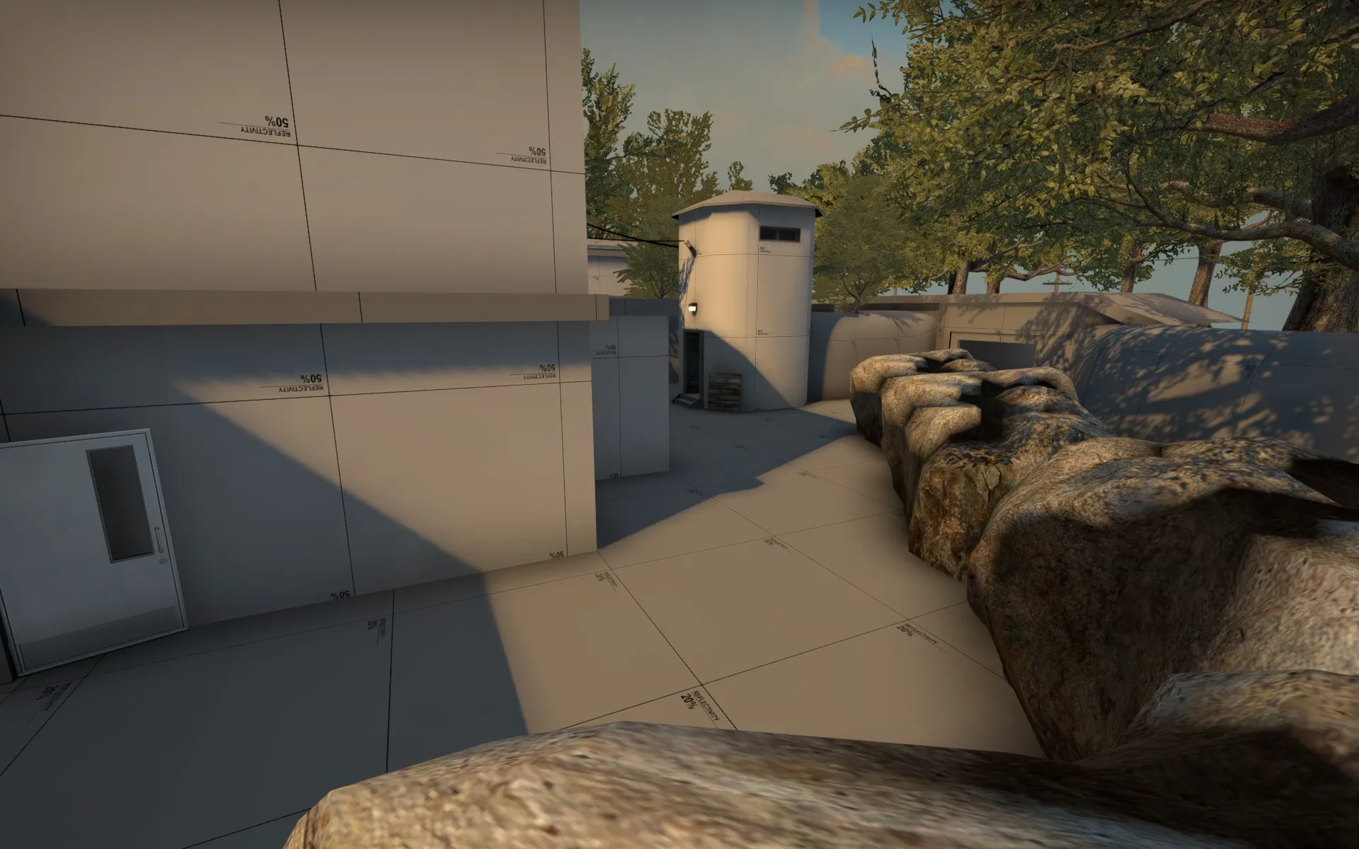
View from B Trafo-Building/Connector.
I hope you like it. Feedback is highly appreciated as usual.
-
 Quote from Squad
20 hours ago, Squad said: Your shadows are too harsh, considering the skybox. Increase ambient lighting a bit.
Also, make sure to check "ignore surface normals" on the tree props (and other foliage props in the map).
Maybe sun spread angle would help here too.
-
 Quote from Phetelys
On 6.5.2016 at 8:42 PM, Phetelys said: I added windows and cover
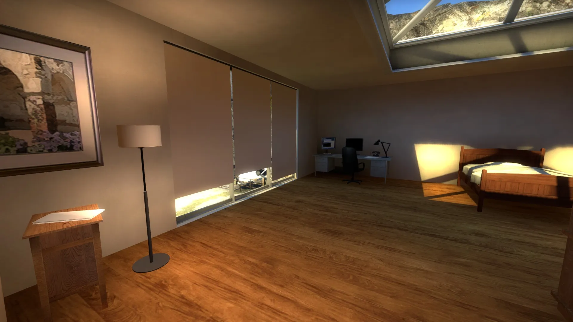
I left some space between the covers out of visual reasons, because of that i added a gap at the bottom so that cts can easily see ts when the ts are trying to peek between the covers so that it isn't a viable spot for ts to camp.
Also added this skylight to get a less cramped feel
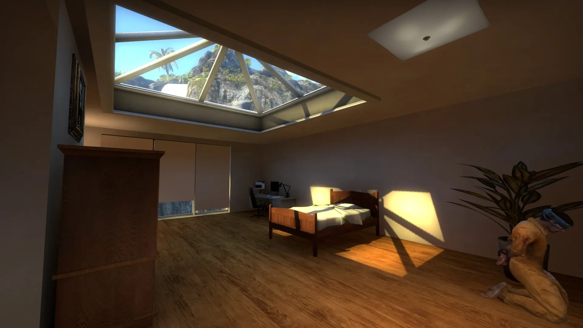
The Windows are a huge improvement on the map. The interior is now less claustrophobic.
Keep the good work up!
-
 Quote from Aztk
On 2.5.2016 at 11:22 PM, Aztk said: That vase thing near the tree doesn't fit there in my opinion.
Not unless its an explosive vase!
Besides that i like what i see so far. Second mid apears a bit boring due to its simplicity.
-
Even if there are some simillarities about dust 2 i like Site B a lot. The big number of possible entries will make it hard to defend. Are there any different vertical levels planned ?
-
 Quote from Corvus
6 hours ago, Corvus said: Ok, sorry didnt realise that) Anyway im rebuilding the A site complitly to avoid any similarities with dust 2. Will post the new overview soon.
plese try to fix the long sightline JSadones mentioned earlier aswell.
-
 Quote from Logic
On 29.4.2016 at 9:52 AM, Logic said: It looks good so far, but the map feels very claustrophobic, mainly because of all the low angle screenshot's you've provided.
I'd prefer it if you presented screenshots taken from a few meters up, looking down at an area at a slight angle instead
I have to agree with Logic. Judging from the Overview it looks a bit small. But that doesnt have to be a problem, it can generate a fast paced gameplay.
So far the theme looks quite nice, i like the scene showed on your third screenshot the most.