

I can't get enough of these movies... Interstellar and now this! Prometheus is also a worthy mention, although a bit tad more fictional.
Can't wait.
I can't get enough of these movies... Interstellar and now this! Prometheus is also a worthy mention, although a bit tad more fictional.
Can't wait.
 Quote from Vorontsov
@TheGuma Nah it just doesn't feel the same without countryballs etc, I'll wait for the official
There are countryballs, enable skins! 
Anyways, if you guys are waiting for an official version of Agar.io for smartphones/tablets you can enjoy this one meanwhile (that is if you have an Android device).
https://play.google.com/store/apps/det…licial.nebulous
I can no longer take a shit without taking my phone.
Also, more coolio stuff. This game has its own subreddit!
First of all, yes, it's a bit "sensitive" to bigger companies like Valve but not to an extent not to make it.
By entering this competition you should aim solely for it and not an operation.
It might sound harsh but I see more and more people making maps just to get them into an operation, it's not what it's about. Valve rewards people who work for what they love, and mapping scene has been here for a looong long time.
Map making is an art, and art is freedom of speech, so whatever you make is up to you. Don't let that put you down! I have made many horrible maps in the past. Some guy even made a map set in his school (although he got expelled).
Of course, I'll be honest here, In my opinion the theme is a bit boring. Apartments, offices and anything along those lines are a common sight in many maps.
You should try making a setting, for example, in Egypt. Have some pyramids in the background. Noone has done it yet, as far as I am aware.
Good luck!

You might want to upload screenshots from in-game and not from Hammer window.
I don't know... I'm getting mixed opinions about this but I still wanted to try it out. Let me know what you think!
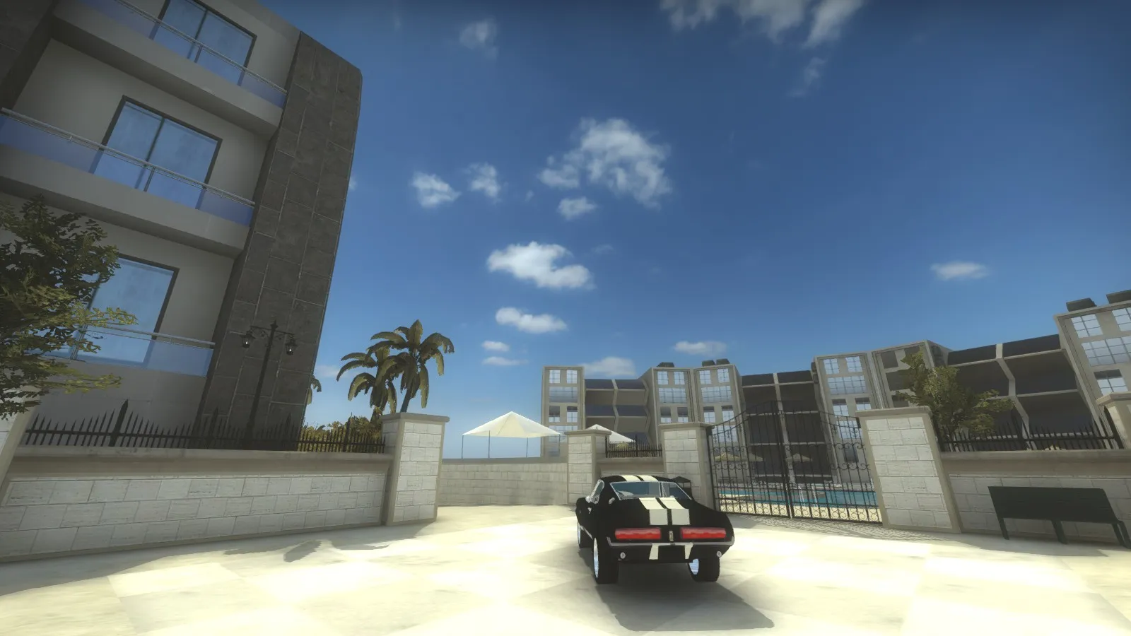
Congrats! Great map.
I lol'ed at this post though:
I also found Resort to be really beautiful in its simplicity and looks.
Also, did Season get a minor graphical upgrade, or am I just seeing things?
Quote from VorontsovAvoid reddit discussions like it's the fucking plague, people whining and crying because apparently our competitive map-pool is not oversaturated enough alredy, I thought people at Legendary Eagle and higher would atleast understand what I was trying to tell them but nope they were as oblivious as anyone else, either you make a dust2 clone or get shit on and labeled as a cod map for trying to bring something new to the table
So far I haven't seen any complaints, maybe you are looking at the downvotes oblivion A.K.A bottom of the Reddit comments?
Congrats every1, happy to see the new maps.
Yeah, I agree about the size.
Also, you should playtest and work on the layout before you do the details and theme. I see you already started off with the theme before even posting here, so you're just making things harder for yourself.
Okay, so here's a few flaws with the aesthetics...
First of all, it's a bit repetitive. It seems like every building in the block is nearly a copy paste of the other. They don't variate.
Maybe add some color changes, different scale / form?
The buildings also seem to be a bit bland... Maybe add some depth to them, trims.
It seems like the wall is completely flat. Adding some shape to it might help. Add pipes, try to have colors more uniform on the buildings.
The buildings also lack lamps and objects around them such as garden tools ETC.
I also suggest changing the crates. The metal construction bag props don't seem to fit in an area that has no visual clues that an construction is going on.
The wooden white/brown boxes are also a bit ugly. My suggestion is that you would pick one type of wooden crates and use it throughout the map.
 Quote from FMPONE
The forums crashed yesterday before I could metaphorically shower you with my money. This shit is EPICCC
They crashed because of awesomeness
Okay, so here's some of my feedback. First of all, the map looks great. But you want to make a name for it, as it helps identify your map better (especially when playtesting) and give more attention to it.
It seems like T's get a very LONG long angle to bombsite A from which they can move out of the spawn with an AWP and snipe CT's disabling the ability to get on the other end of the bombsite to prepare for T rushes.
In general, the map feels more AWP sided and nearly impractical for different playstyles (rushing, for example).
I've also noticed that the cover on bombsite A is very lackluster (not allowing for cover from bigger angles) while the cover on B is very clustered.
You might want to consider moving crates so that they provide a safe angle from main paths but not overpowered so that they could still get killed.
I see you tried to go for a bit of a different approach, which I understand, but the map feels a bit big.
Good luck
Looks amazing!
 Quote from dsillman2000
Sorry if this sounds stupid, but according to your overview, the super long and straight connection between T spawn and B site is so open. An awp on CT side will instantly end all of the T's! Are there well placed doors/walls that I can't see from the overview, or is this the most obvious flaw that no one has questioned? Pics pls!
Yes, there are doors. If you look closely there's a shadow, on the small doorways on Long B. I don't think I have time to take a pic, but I'll let you know when I do. I'm thinking of turning the intersection on Long B where the mid meets into an either elevated or descended area with stairs. This would provide choice on whether the T's want to engange mid or not, as of right now if there is a 5 player push on Long B the CT's rushing mid can barely catch the last player by foot.
I don't want to add additional doors as I follow the principle of max. 2 doors per map, they are not the best gameplay addition and can happen to be very awkward and confusing from time to time. Mainly, the focus is on having the map simple, so I think I did an overkill with long B. As you can see mid is also a very open area, however, CT side is provided with a choice of a building and T's get a nice container inspired by the old Mirage.
I'll see what I can do, obviously, overview doesn't give small insights like the doorways, but now that you mention it I'll try to make it more obvious, I'll add more angles, make the map more interesting and of course tactical.
Thank you for noting me on this one!
Got some cameras installed in the studio today...
[Blocked Image: http://images.akamai.steamusercontent.com/ugc/34119782383707468/F90774A2DC657AE46E2D12FFF6E93F2D1D2C517B/]
Also, thanks to Leplubodeslapin for this awesome cloth model! He's helping me out quite a lot!
[Blocked Image: http://i.imgur.com/sBDYSuW.jpg]
 Quote from El Moroes
You put a lot of work in this map, it's fully detailled and clean but I agree with what dsillman2000 said ; add some landmarks and sometimes be careful with the readability in some areas.
Detailed? Yay.
Clean? Nay.
That's my point here, it seems like simplicity was overlooked by detail which is the props. Sometimes having too many "warehouse" details cramped into one area look bad, makes the fade in more obvious from distance (and if there's no fade in - rip fps).
 Quote from Chtonnnder
A great exchange of information.
First spambot in Mapcore, or am I missing something?
