


1. Forums
  2. Discord
  3. About Mapcore
  4. Patreon Supporters
  • Login
  • Register
  • Search
This Thread
  • Everywhere
  • This Thread
  • This Forum
  • Articles
  • Pages
  • Forum
  • More Options
  1. Mapcore
  2. Discussions
  3. Off-Topic

System Shock Remake

  • -HP-
  • February 28, 2021 at 2:27 AM
  • -HP-
    • February 28, 2021 at 2:27 AM
    • #1

    External Content www.youtube.com
    Content embedded from external sources will not be displayed without your consent.
    Through the activation of external content, you agree that personal data may be transferred to third party platforms. We have provided more information on this in our privacy policy.

    BETA Demo download

    https://store.steampowered.com/app/482400/System_Shock/


    https://www.alphabetagamer.com/system-shock-remake-beta-demo/

    Quote

    Quote

    A new demo for the upcoming System Shock[/i] remake has been released, with around an house worth of gameplay as you fight mutants and robots aboard a space station that’s been taken over by a self-aware AI.

    Previously featured on Alpha Beta Gamer a year ago, the System Shock[/i] remake is a from the ground-up remake of the 1994 classic cyberpunk horror adventure that is a spiritual precursor to the Deus Ex[/i] and Bioshock[/i] games. In the game you take on the role of a hacker who awakens from a six month healing coma following surgery, but when you wake up you find the space station to be filled with dead bodies, mutants and hostile robots. The station is now ruled by an AI called SHODAN, and it doesn’t take kindly to your intrusion!

    The previous demo build of the System Shock[/i] remake was very impressive, but this build is a much more polished experience, with superior audio design and better lighting effects, re-recorded dialogue and a lot more audio-logs. It isn’t perfect (it’s prone to crashing and there are no auto-saves), but it’s shaping up very nicely. It manages to take the classic 26 year old gameplay and update it for the modern era, while still maintaining the vibe of the original. Highly recommended.

  • blackdog
    • March 18, 2021 at 3:12 AM
    • #2

    External Content www.youtube.com
    Content embedded from external sources will not be displayed without your consent.
    Through the activation of external content, you agree that personal data may be transferred to third party platforms. We have provided more information on this in our privacy policy.

  • FMPONE
    • March 19, 2021 at 1:24 AM
    • #3
    Quote from blackdog

    22 hours ago, blackdog said:

    External Content www.youtube.com
    Content embedded from external sources will not be displayed without your consent.
    Through the activation of external content, you agree that personal data may be transferred to third party platforms. We have provided more information on this in our privacy policy.

    I'm gonna buy this because it's a high resolution version of a good old game, but man this has the worst lighting. "Using every color at once" is not art direction...

  • dux
    • March 19, 2021 at 1:54 PM
    • #4

    I'd also argue that the System Shock 2 Trailer was far superior in terms of audio as well. The remake trailer has too many pauses. It sounds janky.

    External Content www.youtube.com
    Content embedded from external sources will not be displayed without your consent.
    Through the activation of external content, you agree that personal data may be transferred to third party platforms. We have provided more information on this in our privacy policy.

  • Buddy
    • March 20, 2021 at 11:31 AM
    • #5

    You can't compete with SS2 audio, it is a true masterpiece.


    They did pick some weird ass clips to showcase gameplay tho :D

  • will2k
    • July 4, 2021 at 3:22 PM
    • #6

    External Content www.youtube.com
    Content embedded from external sources will not be displayed without your consent.
    Through the activation of external content, you agree that personal data may be transferred to third party platforms. We have provided more information on this in our privacy policy.
    @FMPONE Not sure if my eyes are deceiving me, but it looks like they toned down the lighting color variation to shades of blue and red, or it's maybe only this particular map?

  • FMPONE
    • July 4, 2021 at 4:25 PM
    • #7
    Quote from will2k

    1 hour ago, will2k said:

    External Content www.youtube.com
    Content embedded from external sources will not be displayed without your consent.
    Through the activation of external content, you agree that personal data may be transferred to third party platforms. We have provided more information on this in our privacy policy.
    @FMPONE Not sure if my eyes are deceiving me, but it looks like they toned down the lighting color variation to shades of blue and red, or it's maybe only this particular map?

    The lighting does look better but the environments still seem like a massive weakness. There just isn’t the kind of character you’d fine in Bioshock 1 or 2, it’s painfully generic and claustrophobic, geometric (block rooms) with noisy tech-walls, slow moving and anemic seeming enemies. It doesn’t feel like a real place at all.

  • blackdog
    • July 5, 2021 at 10:57 AM
    • #8

    I feel it looks better in this lates video.

    It’s one of those projects where you can never win as a developer.

    You’re gonna be harshly judged by the nostalgia brigade.

    At the same time, so much time has passed that you could slap a completely different name on and it would be just as fine. Swap criticism for how “not right” it feels for a System Shock game with “how too much inspired by” System Shock it would be.

  • text_fish
    • July 5, 2021 at 12:14 PM
    • #9

    I really like what they've done with the aesthetics so far. I want it to feel like a game space rather than a real place. I feel like the Bioshock games over-relied on visually impressive set-pieces which is fine because it's a different IP, but I wouldn't like to see SystemShock's design focus move in that direction.

  • Buddy
    • July 5, 2021 at 12:29 PM
    • #10

    Nightdive is good people.

  • Radu
    • July 5, 2021 at 1:50 PM
    • #11

    Love the atmosphere so far!

  • dux
    • July 5, 2021 at 2:56 PM
    • #12

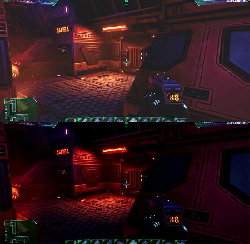
    I'm having a real hard time with the lighting and contrast coupled with the environment's detail/business. All together it comes up as a really busy setup that I find hard to concentrate/focus on and slowly start to get a headache. :( Feeling this way often with new games or hd remasters. Halo master chief collection is a good example. TAB is AWESOME but playing halo 1 and halo 2 then switching between OG and remaster, it demonstrates perfectly how you lose readability and composition when you jam in a load more detail and contrast the lighting too much. I think SS has the same issue. This is of course subjective and many people love it, that's great. Pass me the paracetamol.

  • text_fish
    • July 5, 2021 at 4:57 PM
    • #13

    I guess it's a Marmite issue! I feel like the original SS already had very busy visuals with its repetitive tiled textures and cramped environments. Looking at screenshots of the original I can see why the lighting could be causing you readability issues. Maybe Nightdive should allow users to toggle some sort of readability mode that makes the environments full-bright (or at least more simplistic lighting) and gives items and monsters a very slight shadow around their edges to make them pop.

  • Pampers
    • July 5, 2021 at 5:40 PM
    • #14

    sponsored by Corsair RGB

    like the music though

  • -HP-
    • July 5, 2021 at 8:51 PM
    • #15

    Dunno if you noticed, but there's heavy use of screen motion blur in this game, for these kind of environments you can afford to stick to object motion blur man. Also the look of the game goes from blurry to overly contrasty sharp look in less than a second as you play, that doesn't help either and it's head ache inducing. Specially where there's so much strong red and green, one trick I often use to get away from deep red is to just slightly hue it back towards deep orange, your mind still registers as red and it has a much softer and natural read to it.

    I've noticed they slowly started to introduce fogged lights into the environments, which helps giving the sense of depth a little bit, but it's not enough imho, they could have fogged it up a tad more, it really helps reading farther away stuff a bit better.


    \


    Alien isolated nailed this, environments are really dark but usually soft on the eyes and they never get any pixel get to pure black through good post tweaks.

    [Blocked Image: https://assets.vg247.com/current//2014/01/Alien_isolation_42.jpg]

  • dux
    • July 5, 2021 at 11:43 PM
    • #16

    HP in one gif just made the game better.

    [Blocked Image: https://reactiongifs.me/wp-content/uploads/2021/07/Long-Live-Automation.gif]

  • FMPONE
    • July 6, 2021 at 12:49 AM
    • #17

    I'm a little skeptical that allowing players to see more of the levels would actually help resolve the issues with the levels. The issue is that the levels are boring boxes.

    If anything, seeing more of them is going to reveal how squared off and dull they are (i.e. bad architectural design).

    A fundamentally key part of remaking an older game that had a lot of small boxy rooms is to reimagine those or repackage them in a way that is palatable, and they have a long way to go there.

  • dux
    • July 6, 2021 at 1:15 AM
    • #18

    I think just make the lighting cleaner and it'll be fine. Good lighting makes everything look better. Over contrasted dark lighting just contributes to further issue.

    Quote from FMPONE

    32 minutes ago, FMPONE said: I'm a little skeptical that allowing players to see more of the levels would actually help resolve the issues with the levels. The issue is that the levels are boring boxes.

    btw disagree levels are faithful remakes, which is what they said they wanted to do and I'm happy they did that and I think they look good. Asset quality and materials look really nice. What's spoiling this direction (for me) is the lighting and contrast. You of all people shawny boi should know that good lighting makes everything look 10x better. ;)

  • FMPONE
    • July 6, 2021 at 1:23 AM
    • #19

    To each their own, it's kind of a turn off for me that they didn't even attempt to re-contextualize the levels into a plausible futuristic space station (ala the example of Alien: Isolation, which did a great job at that.)

  • dux
    • July 6, 2021 at 1:27 AM
    • #20

    I might be wrong, but I think they initially set out in that direction but people weren't too thrilled at the look of it? But I'm possibly confusing it with just the tech change.

Participate now!

Don’t have an account yet? Register yourself now and be a part of our community!

Register Yourself Login
Discord

The Mapcore Discord is our lively IRC channel of the 2000s reborn. Chat about level design, gaming, and more.

Latest Posts

  1. Tangerine

    Harry Poster
    July 18, 2026 at 11:10 AM
  2. Any of the old guard still around? D:

    Warby
    July 12, 2026 at 8:23 PM
  3. About our archived forums

    Thrik
    June 30, 2026 at 2:12 PM
  4. Mapcore Discord

    mason_fan123
    June 24, 2026 at 8:52 PM
  5. [CS2] Valley

    Serialmapper
    June 22, 2026 at 11:56 AM
  6. Free Music / SFX Resource - Over 2500 Tracks

    Eric Matyas
    June 18, 2026 at 12:32 PM
  7. Pango [WIP]

    Elowen
    June 11, 2026 at 10:13 AM
  8. [CS2] Dvina

    Jeremy Rivera
    June 11, 2026 at 10:03 AM
  9. Bridges 2.0 by NEXSIDE, MAP SHOWCASE. ( Steam Workshop )

    MrTrane18
    June 1, 2026 at 7:46 PM
  10. Classic Maps Reborn For CS2

    SillySpaceCat
    May 31, 2026 at 10:33 PM

Users Viewing This Thread

  • 3 Guests
  1. Privacy Policy
  2. Contact
Powered by WoltLab Suite™