

I'll have to take a look at this. The design looks unique

-
-
So I've tried making the skydome tinted orange to make the map look like it's set in the evening. I've still got to adjust the sun position to back this up, but how does it look so far?
The content cannot be displayed because it is no longer available. -
Orange skies and pink trees? I'm not trying to discourage you from using the same time of day as I am (oh I definitely am trying) but that's got to look weird. Blue sky is overrated but Pink trees aren't common at all.
-
 Quote from Karthoum
2 hours ago, Karthoum said: Orange skies and pink trees? I'm not trying to discourage you from using the same time of day as I am (oh I definitely am trying) but that's got to look weird. Blue sky is overrated but Pink trees aren't common at all.
The trees are pink because they are cherry blossom trees ? Though if you're trying to say that the combination of pink and orange wouldn't be the best looking, then I could always change the time back to what it was. I'm really just trying to find a color scheme that feels "Japanese", if you catch my meaning

The content cannot be displayed because it is no longer available. -
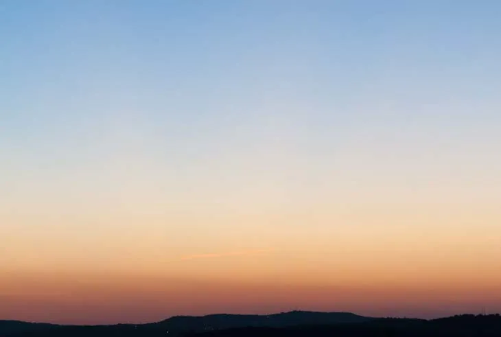
The problem IMO is mostly with the sky, it looks very desaturated and the sky should have a gradient of color, not a uniform color throughout. I believe it would look somewhat like this.
-
Yes the combination of trees and skies like that is what I meant and I'll be honest, it doesn't look pretty in that picture. Why not try it first with players and see what they think, maybe it's not that harsh on the eyes in motion?
-
Quote from Karthoum
5 minutes ago, Karthoum said: Yes the combination of trees and skies like that is what I meant and I'll be honest, it doesn't look pretty in that picture. Why not try it first with players and see what they think, maybe it's not that harsh on the eyes in motion?
I suppose it's back to tinkering with light_environment for me! I'll try out a few different times of days and try to get feedback on each one. Who knows, perhaps this map will end up looking like that dream I had about walking along a forest path at night ?
-
That brownish sky looks a bit depressing imo. Did you try using a color scheme tool like paletton to get the color rights? When I look at pictures of japanese blossom trees online I mostly find examples using colors from a tetrad pink trees/green grass/blue sky, but if you're aiming for an evening feel you are better off using a gradient like Ben suggested, and perhaps toning down the saturation on the pink flowers a bit:
[Blocked Image: https://allthatsinteresting.com/wordpress/wp-content/uploads/2015/05/cherry-blossoms-national-festival.jpg]
-
So I'll be sure to try some experiments with the lighting. But in the meantime, here's a little show of the map at night. It's unlikely I'm gonna keep it this way, but I just wanted to test it. I'll get to work on the refined lighting now.
The content cannot be displayed because it is no longer available. EDIT: After a few experiments, I've finally decided to re-use the lighting from an old canceled map I was working on. How's this?
The content cannot be displayed because it is no longer available. -
Layout is #1. This is why i made the graybox. Continue da legacy
-
 Quote from Interfearance
29 minutes ago, Interfearance said: Layout is #1. This is why i made the graybox. Continue da legacy
That's true, I suppose I should stop worrying about the lighting right now and get the layout to a state where I feel it's ready for another playtest.
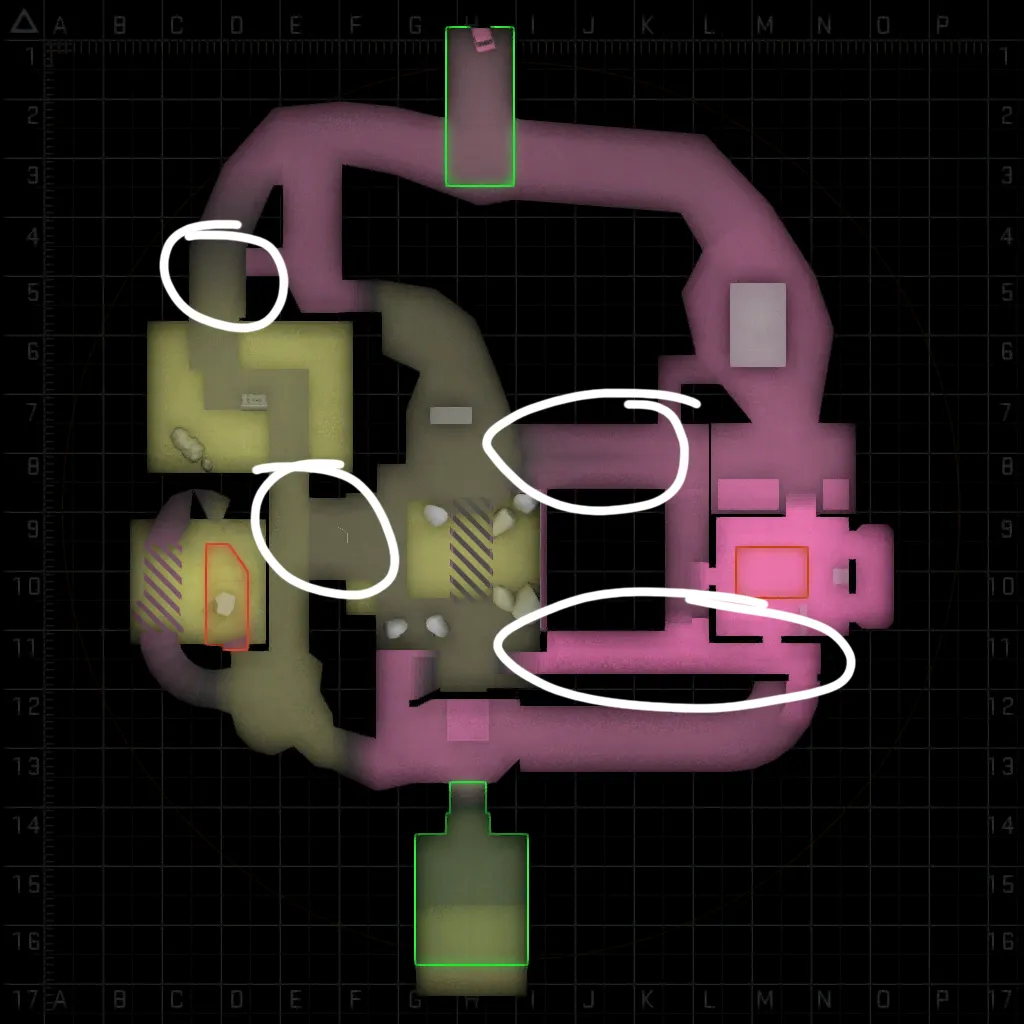
Speaking of the layout, the most common thing I've heard from people I've given tours to is that the map lacks negative space/it's too small. So I've stretched the A-Site away from the center of the map and plan to do the same with B-Site. Once both are ready, I'll see what cool new changes I can make with the newfound space.
(Also, new radar colors! Yay!)
The content cannot be displayed because it is no longer available. -
I can definitely see why youre getting that feedback. Your connectors kinda look like corridors that only exist because the layout needs them to. They look like they are only meant to be walked through, not played in. In the game however these serve as vital areas to attack or defend mid and the bombsites. Try to flesh them out to be their own proper areas. Doing that will probably require them to grow a bit in size, giving you a bit more negative space and map size as a bonus.
-
After way too much procrastination (A.K.A. Me playing way too much GTA 4), I've decided to add a few more changes.
1. B-Site now has 2 entrances for terrorists. Before, 1 smoke could end their whole career.
2. B-Site has been moved further from middle for more negative space.
3. A-Site has a new entrance from the T-Side to the balcony. This is the change I'm most excited about.
I'd show some screenshots, but it's not even added yet ? Time to get to work!
-
I love how visually strong this map is regarding identifying where in the world you are just by the screenshots of the greybox. Now textures have started to be thrown into the mix it's really looking great!P.s. I swear I've seen a post on my forum travels recently that was from you about a mall map idea?
-
 Quote from DazRave
On 11/1/2019 at 11:36 AM, DazRave said: I love how visually strong this map is regarding identifying where in the world you are just by the screenshots of the greybox. Now textures have started to be thrown into the mix it's really looking great!P.s. I swear I've seen a post on my forum travels recently that was from you about a mall map idea?
Heh, that mall map ideas was actually 2 ideas.
1 was called Retail, set in an American shopping mall under renovation, it's still in the works but it's on hold because of the contest.
2 was called Dixon, this was is set in an abandoned Canadian shopping mall that's in a severe state of decay. It was originally thought up because of the contest, but it's too big a project to be done in the short timespan I have left.
I'm sure I'll get them both done one day though. And thanks for the compliments on the visuals, this map was the first that I really put a focus on identification

-
yeah, keep going!
-
Participate now!
Don’t have an account yet? Register yourself now and be a part of our community!