

Already fixed, thank you for noticing!

-
-
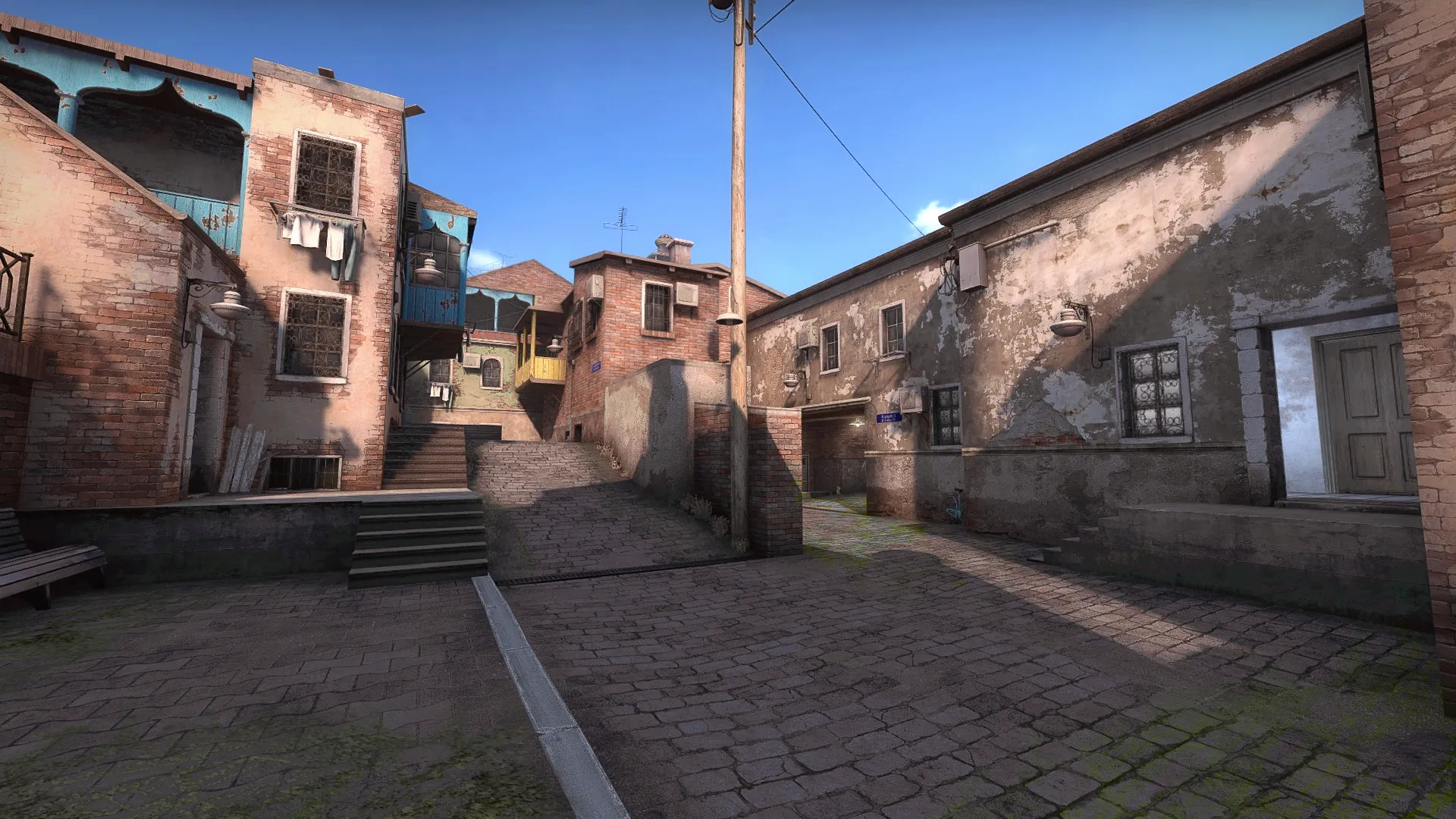
[Blocked Image: https://i.imgur.com/EKJDzoS.jpg] The shadowy parts looked a bit dark, maybe a subtle tweak to the light environment or shadow control? added a little bit of moss for green or whatever but would be cool if it ended up looking like:
-
This definitely has to be my favorite entry in terms of visuals. I can't tell precisely which assets are custom but the overall choice of high quality textures and models makes for an almost photo-realistic aesthetic. The shadows also contribute to that by adding quite a lot of contrast, but I agree with RadimaX that they might be a bit too dark, relative to the sky.
Perhaps it's just me, but I feel like in general picking photo-realistic textures and high quality models really opens up more opportunities for all sorts of color combinations, because such textures have a natural harmony.
In terms of the layout, I think it's pretty solid from the experience I had playing with bots. The only thing that felt a bit off was that some of the connectors were a bit too zigzaggy, but I guess it might make for more interesting angles.
-
Uploaded some fun comparison sliders to my website - Check out the progress done between the last playtested version and the final result: http://www.paulstangl.com/feast/
-
Participate now!
Don’t have an account yet? Register yourself now and be a part of our community!