1. Forums
  2. Discord
  3. About Mapcore
  4. Patreon Supporters
  • Login
  • Register
  • Search
This Thread
  • Everywhere
  • This Thread
  • This Forum
  • Articles
  • Pages
  • Forum
  • More Options
  1. Mapcore
  2. Vault
  3. Past Contests
  4. [CS:GO] Exotic Places Mapping Contest

de_Vice

  • sir goober
  • June 5, 2019 at 10:58 PM
  • sir goober
    • July 20, 2019 at 5:04 AM
    • #21

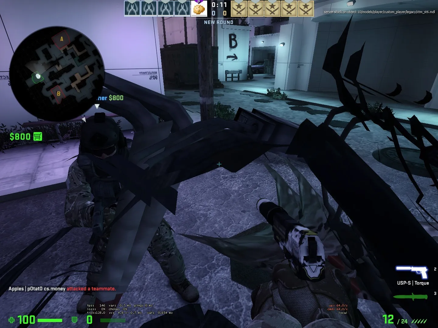
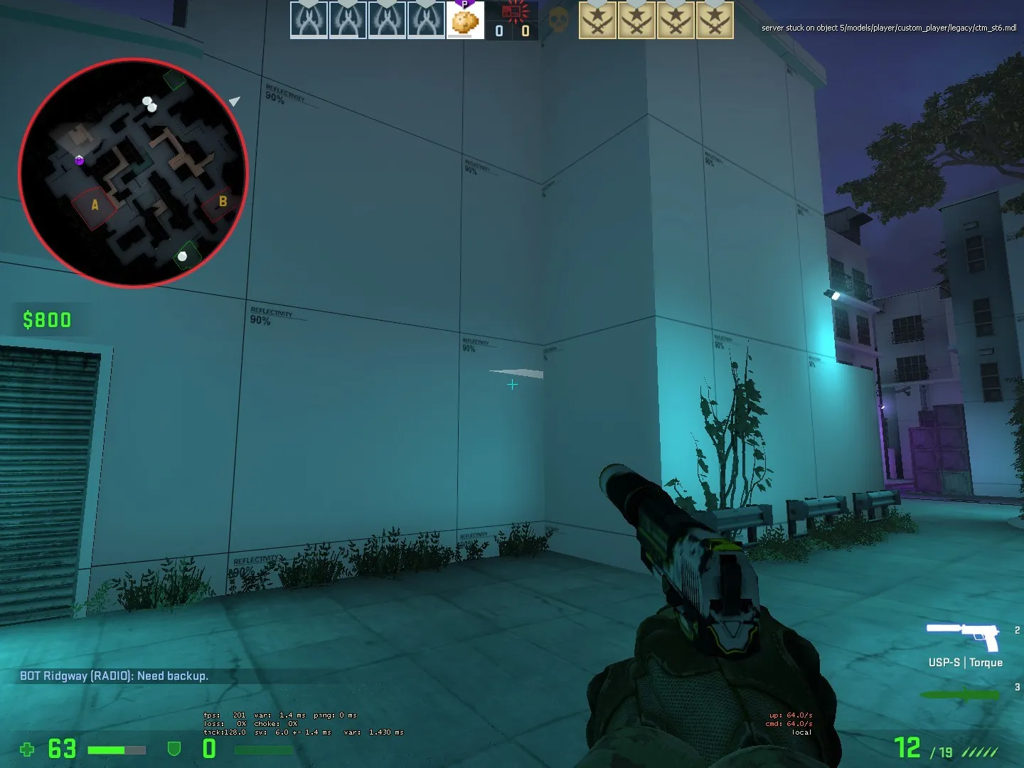
    Realizing that it's been some time since the last update, just making a little one to wrap up some concerns.

    - Yup, I've done some rework on the lighting so it isn't burning your eyes out. (Always make sure the lighting looks good in a normal compile instead of the fast option)

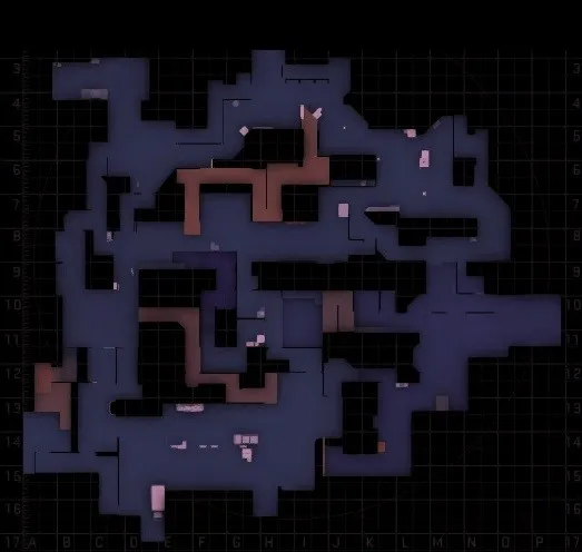
    - The Radar is fixed after some odd bug messed it up slightly

    Radar:

    Spoiler
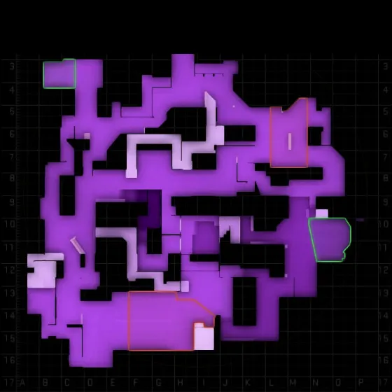
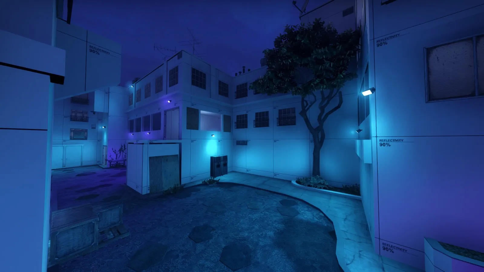
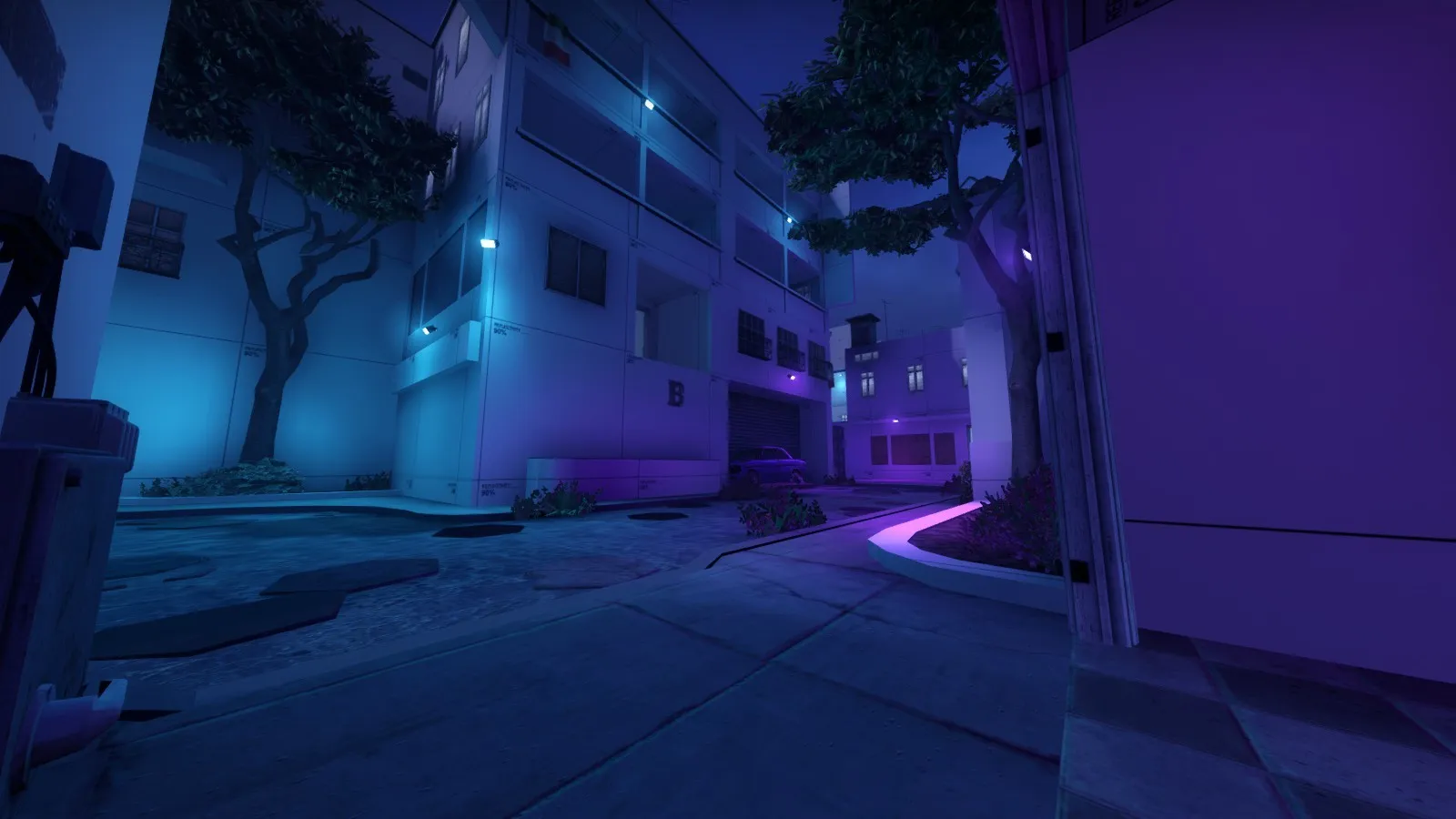
    - And I've detailed 2 parts of the map so I can get an idea of how the map will look and feel

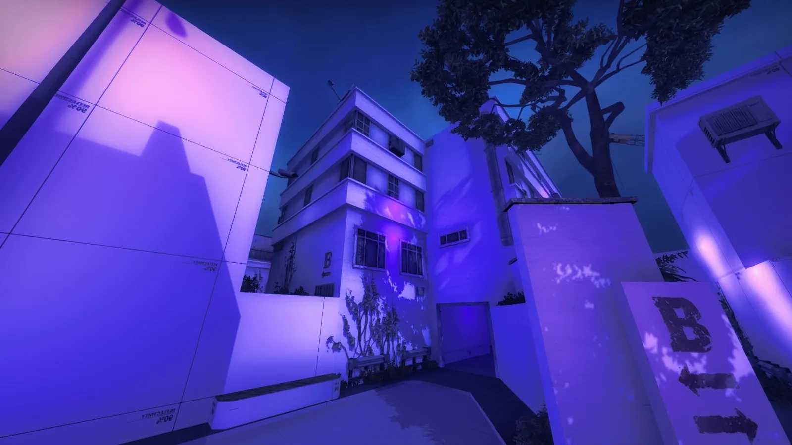
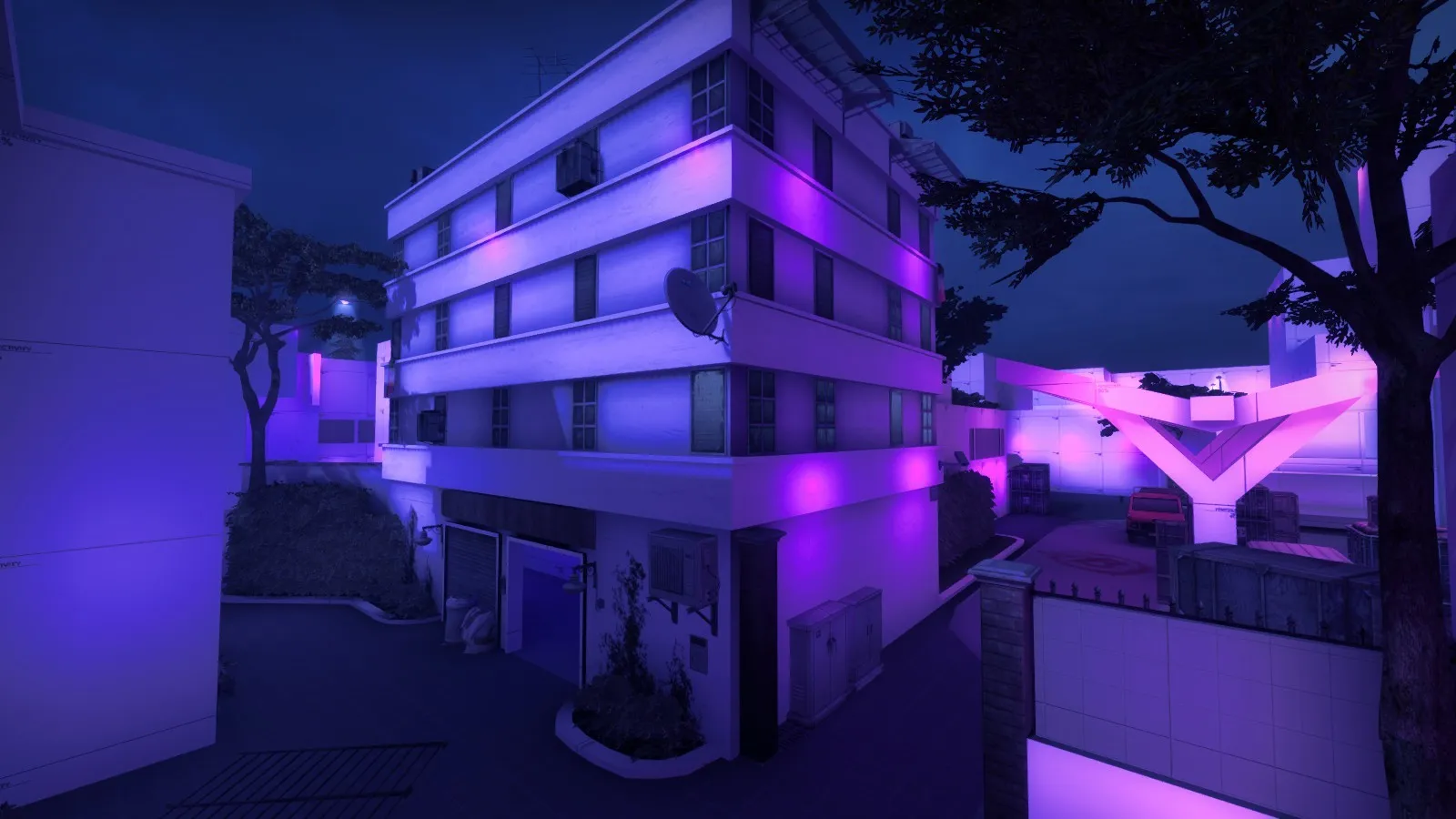
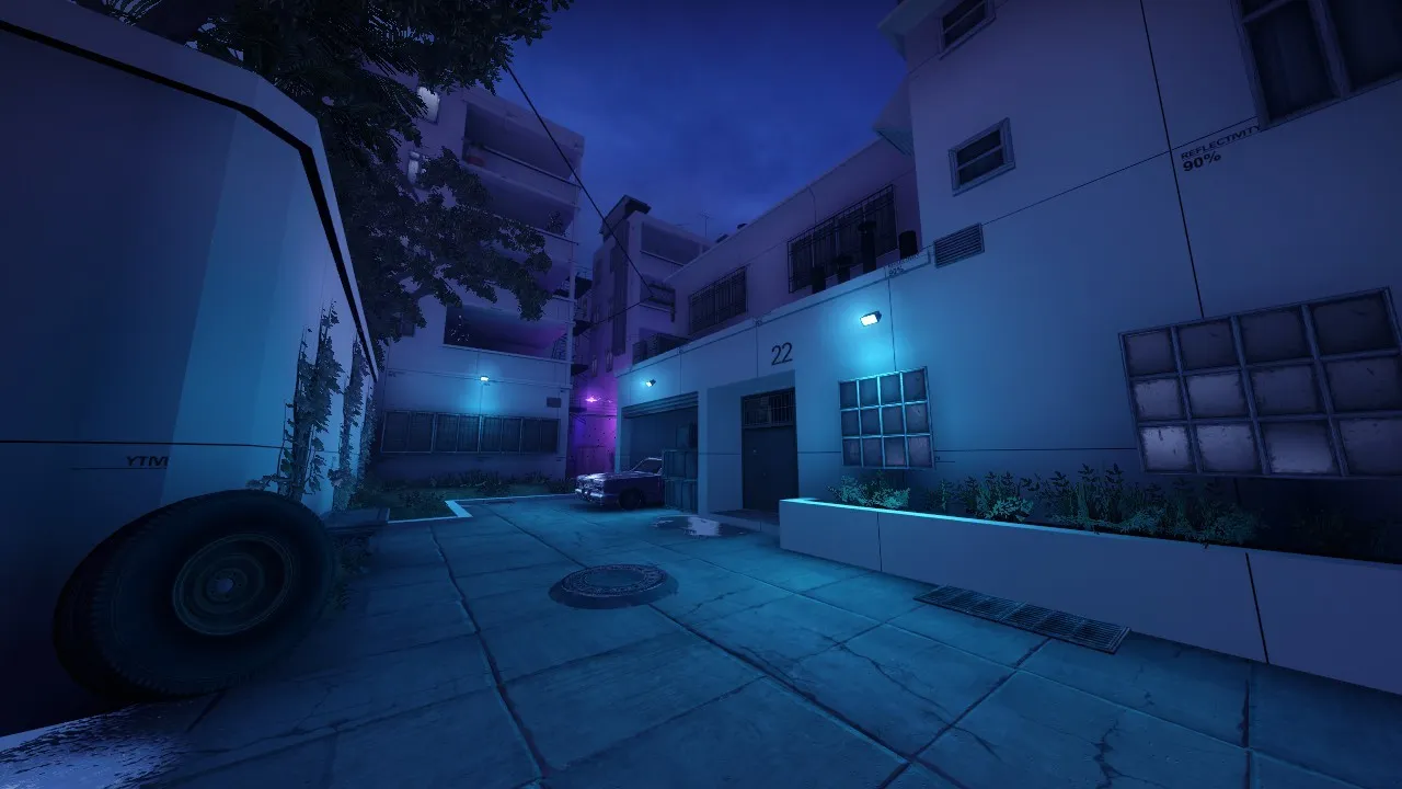
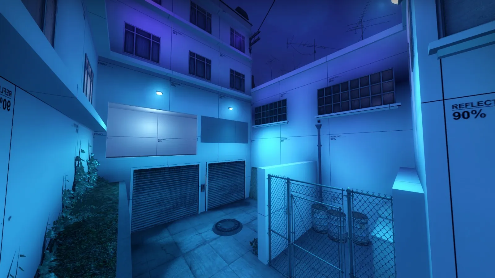
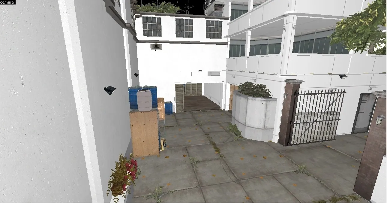
    Chokepoint at B:

    Spoiler
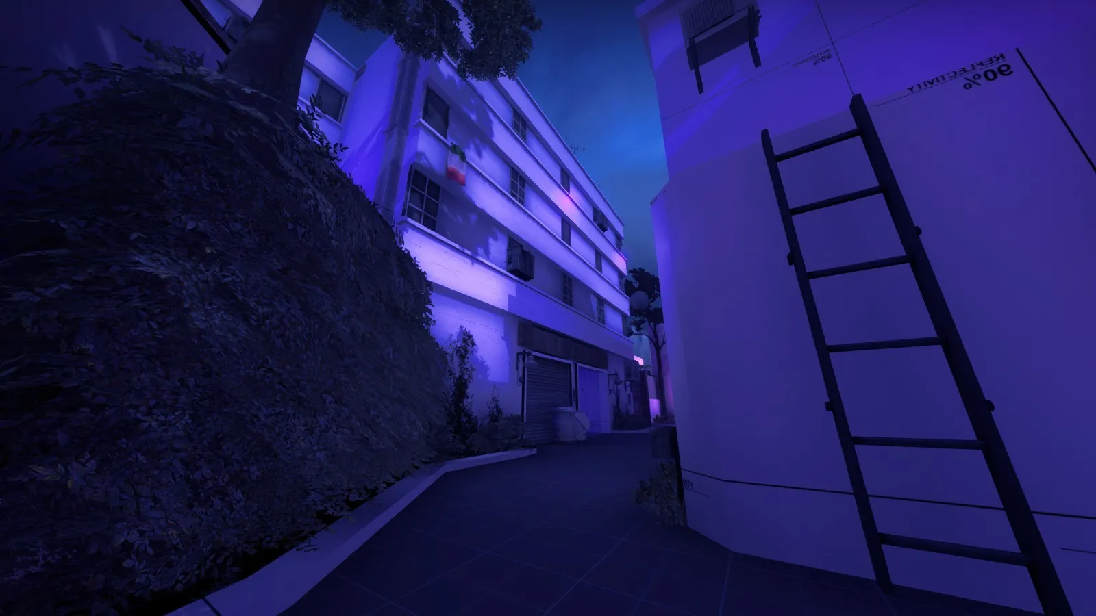
    (Yes, I forgot to get rid of those few extremely bright spots)

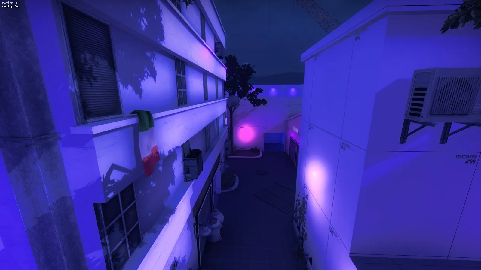
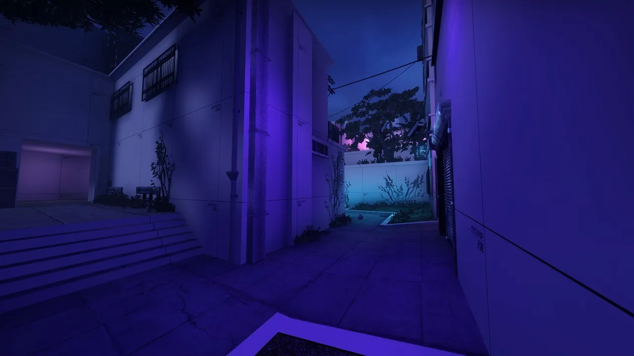
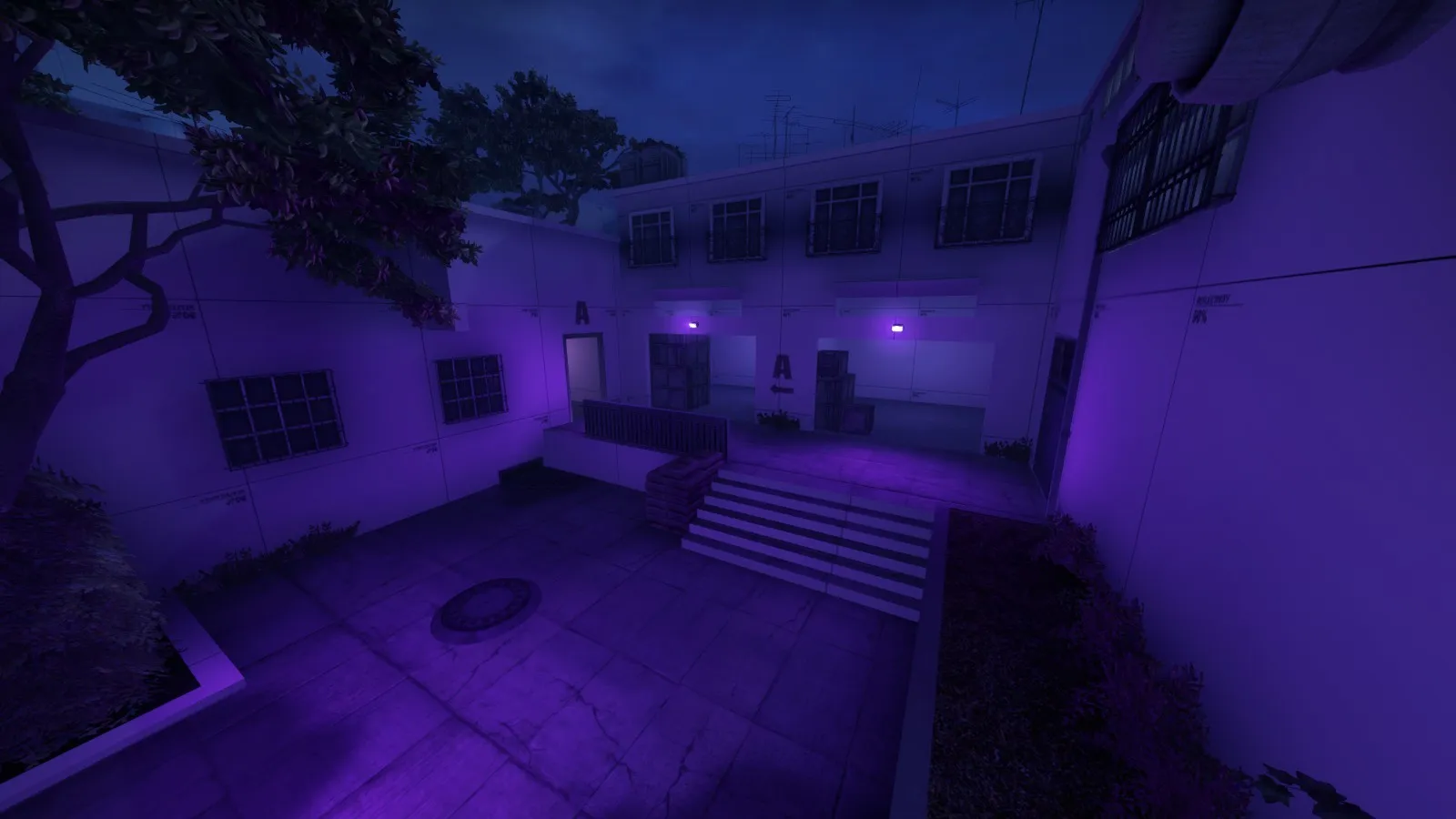
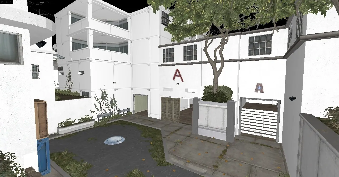
    Chokepoint at A (I'm too lazy to compile the map and wait 2 hours to get a few screenshots):

    Spoiler
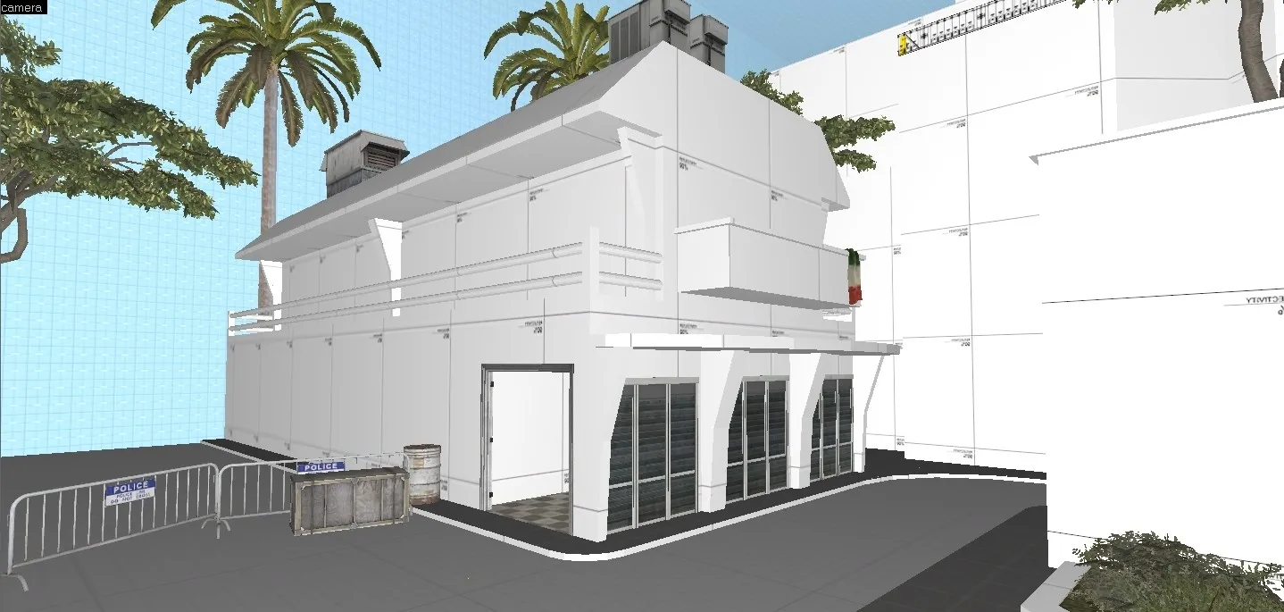
    So not that exciting of an update...

    ...

    But!

    The workshop version of the map will be updated very soon, so you all can play without getting your eyes burnt by the lights!

    https://steamcommunity.com/sharedfiles/fi…/?id=1802024714 Here's the workshop =-]

  • El_Exodus
    • July 31, 2019 at 12:01 AM
    • #22

    Man the lighting still hurts my eyes.

    Try to get a natural lighting with light_environment going first. And only when that's natural, start adding your neon lights to the map. Right now I wouldn't want to load up the map ingame tbh.

    Use your references properly and analyze why they look the way they look.

  • Interfearance
    • July 31, 2019 at 6:23 PM
    • #23

    Your map is already taking 2 hours to compile and its not even detailed? Func_details might make the portal flow faster!

  • sir goober
    • July 31, 2019 at 8:43 PM
    • #24
    Quote from El_Exodus

    20 hours ago, El_Exodus said: Man the lighting still hurts my eyes.

    Try to get a natural lighting with light_environment going first. And only when that's natural, start adding your neon lights to the map. Right now I wouldn't want to load up the map ingame tbh.

    Use your references properly and analyze why they look the way they look.

    yea, im fully aware of the lighting issue, it'll be fixed upon the next big update ?

  • sir goober
    • August 1, 2019 at 5:10 AM
    • #25

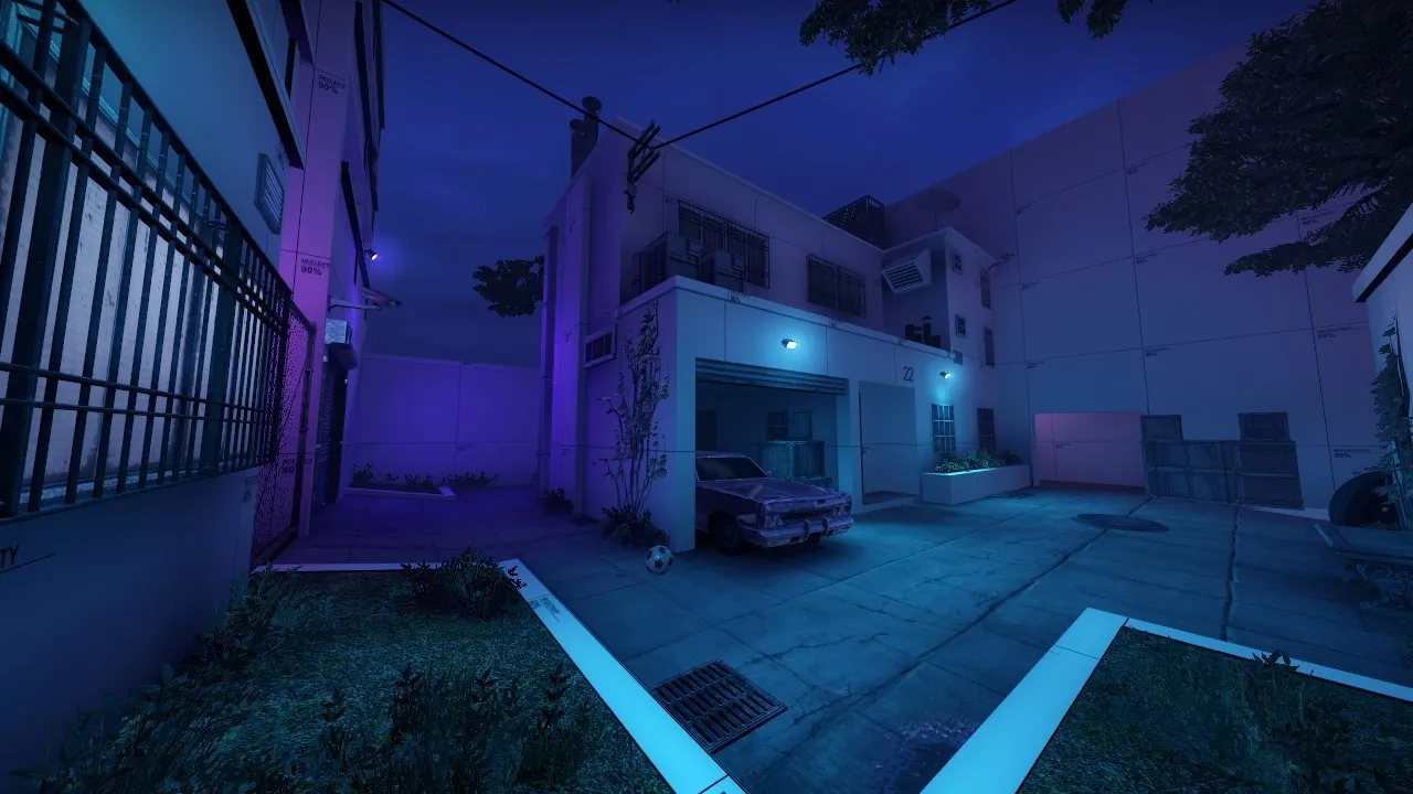
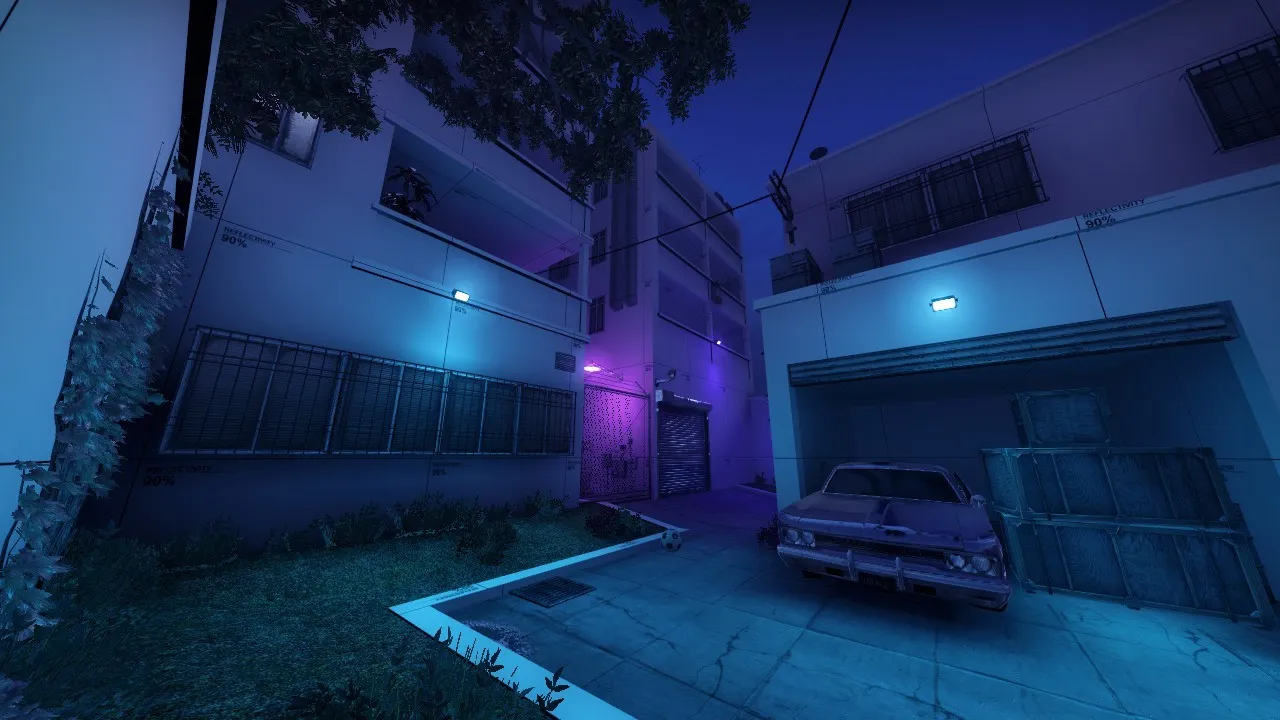
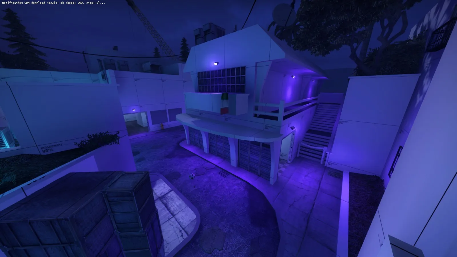
    So I'm working on the lighting issue, and I believe I have made some great improvements!

    but before I go fix the entire map, I worked on one spot to see if it would look good. Gotta say, I'm liking it!

    Spoiler

    So I made one spot with a very clear and nice cyan color, while one part is that a e s t h e t i c deep purple color (combined with some detailing)!

    Should I continue using this combination? I think it's a lovely fit! =-]

  • Interfearance
    • August 1, 2019 at 6:10 AM
    • #26

    This is so much better man. Before it felt like an outdoor nightclub, this is much more atmospheric and is still unique.

  • sir goober
    • August 5, 2019 at 3:54 AM
    • #27

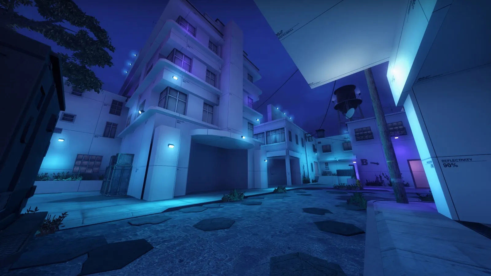
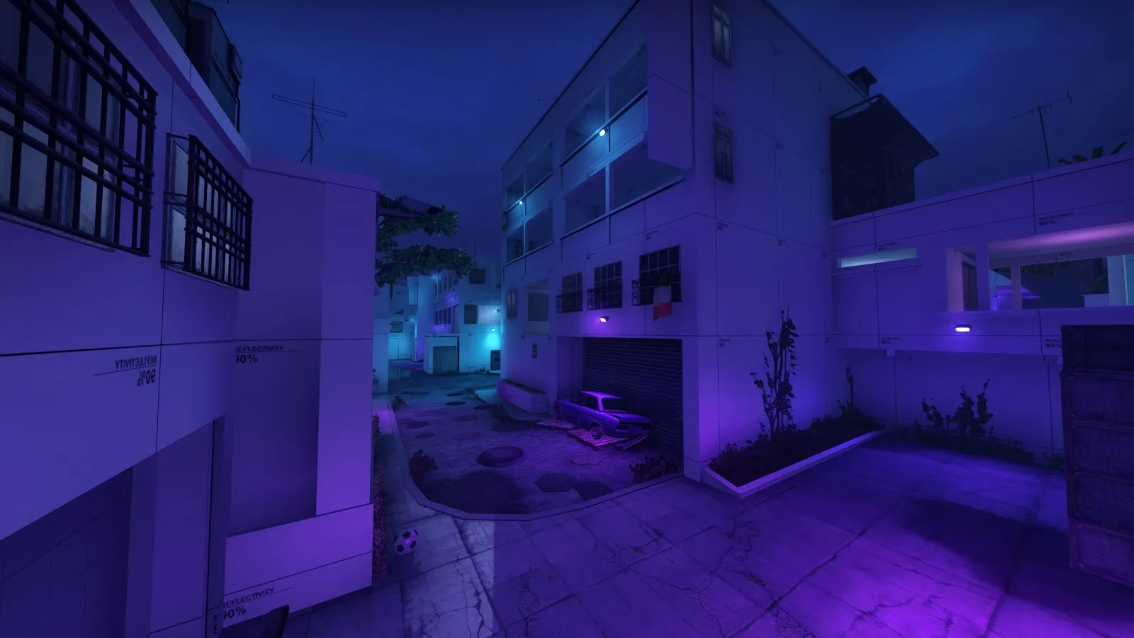
    Alright fellas, it's been too long.

    W a a a y too long without a new update.

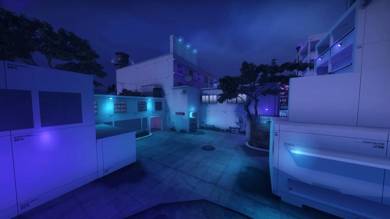
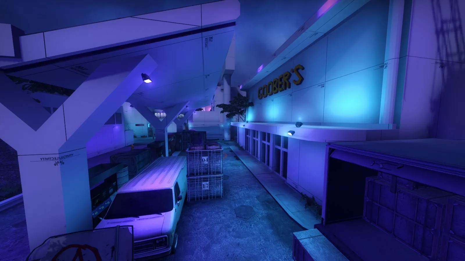
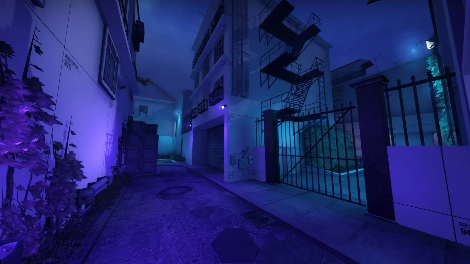
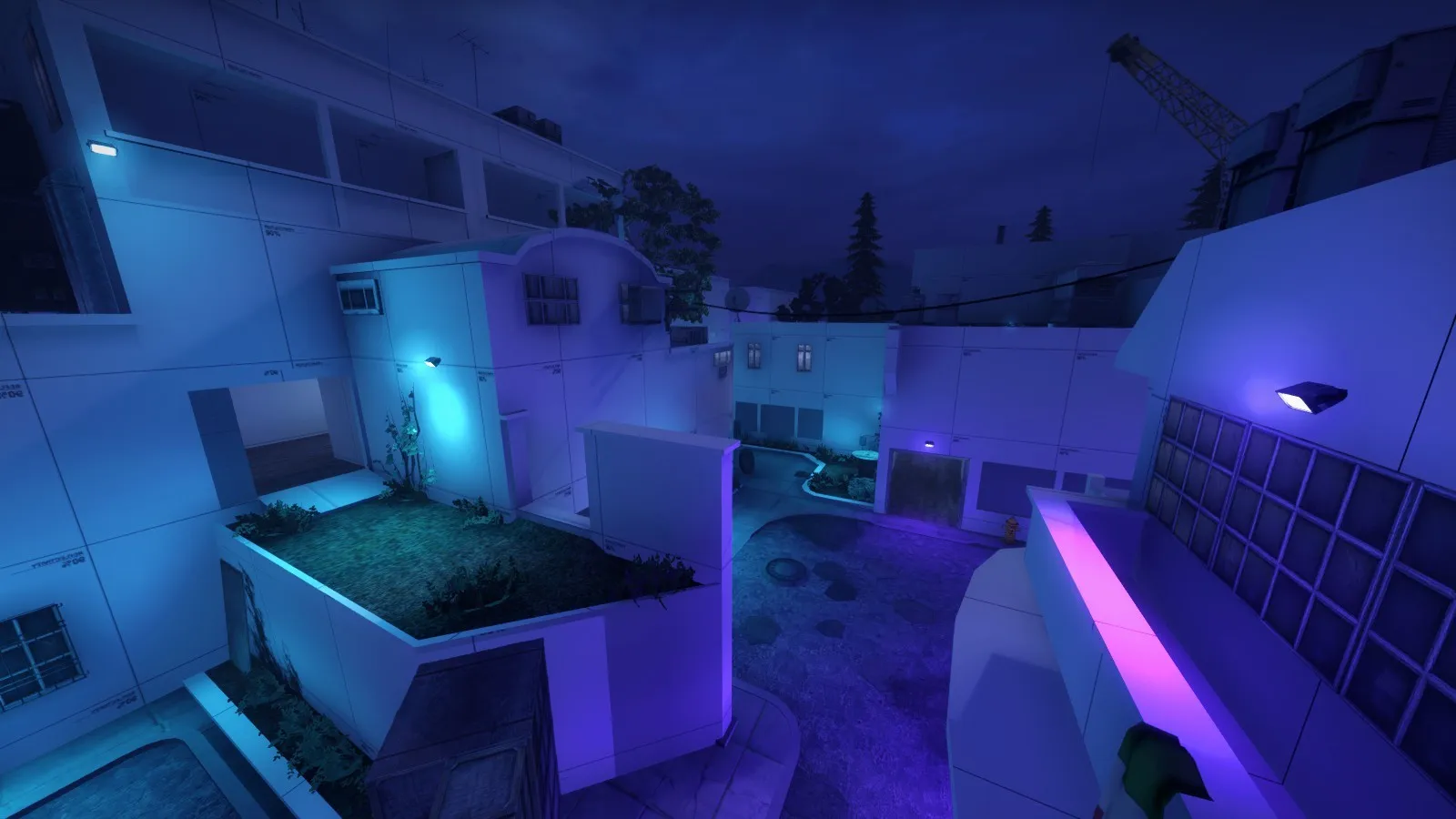
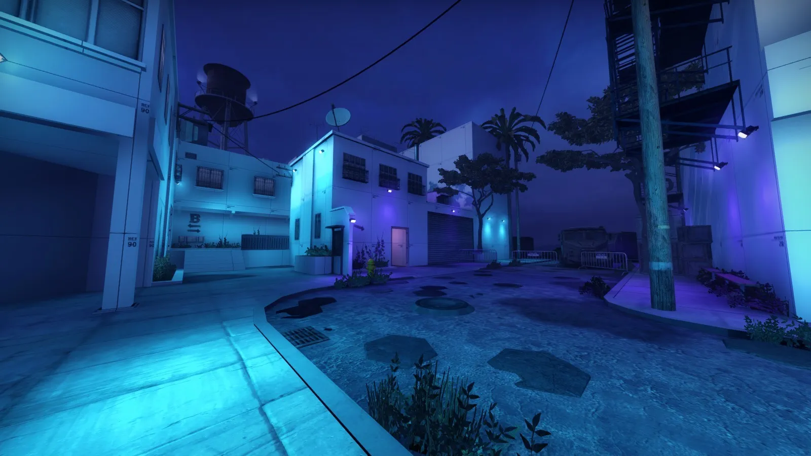
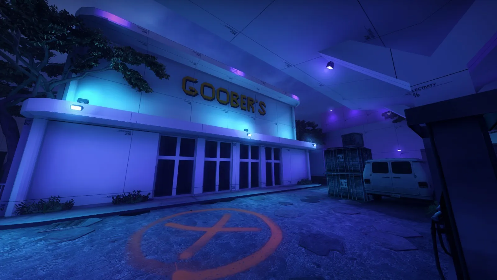
    The map looks completely unrecognizable (for the better). The lighting has been fixed, now emitting a cool cyan/purple glow throughout the map, instead of the blinding pink (no idea what I was thinking when I made that).

    1 last thing before showing you all the screenshots, I usually test on the fast compile, meaning lights aren't as powerful. So when I compiled with HDR, the lights may be a lot brighter than I intended... But shouldn't really affect things!

    So here ya go.

    Spoiler

    So a bunch has changed, hopefully these lovely screenshots will encourage you to test this map out =-]

    oh, and how could I forget? Here's the link: https://steamcommunity.com/sharedfiles/fi…/?id=1802024714

  • Mvllsk
    • August 12, 2019 at 7:00 PM
    • #28

    Those blue lights are so much easier on the eyes

  • Squinky
    • August 12, 2019 at 7:05 PM
    • #29

    I disagree, I really don't like the lighting. It looks unnatural and is very hard on the eyes. Couldn't imagine looking at this for a full competitive match.

    On a positive note though, the geometry is quite nice.

  • Interfearance
    • August 12, 2019 at 8:40 PM
    • #30

    0 341 0 -35 201 211 224 45 68 72 115 100

    Its for a night effect

  • sir goober
    • August 12, 2019 at 8:49 PM
    • #31
    Quote from Interfearance

    7 minutes ago, Interfearance said: 0 341 0 -35 201 211 224 45 68 72 115 100

    Its for a night effect

    mine is actually very close to that

    0 341 0 / -35 / 213 200 223 38 / 78 87 126 25

    guess I gotta bump up the ambience

  • Squinky
    • August 12, 2019 at 8:52 PM
    • #32

    It's not your light environment settings that are garrish, it's your lights and light spots.

  • Interfearance
    • August 12, 2019 at 8:55 PM
    • #33

    IMO the map would still have a unique feel if you swapped the blue lights for their real colors.

  • sir goober
    • August 12, 2019 at 9:04 PM
    • #34
    Quote from Interfearance

    9 minutes ago, Interfearance said: IMO the map would still have a unique feel if you swapped the blue lights for their real colors.

    what do ya mean by real colors?

  • Squinky
    • August 12, 2019 at 10:29 PM
    • #35

    Yellows and blues, low saturation is key.

    Have a look at this:

    External Content www.youtube.com
    Content embedded from external sources will not be displayed without your consent.
    Through the activation of external content, you agree that personal data may be transferred to third party platforms. We have provided more information on this in our privacy policy.
    Basically, use natural light colors for the sun/moon and the lights that are providing actual light for your map. To get that 80s neon look, use spots of color like neon signs, bright trims around things or colorful props.

  • gordonfeetman
    • August 13, 2019 at 10:54 AM
    • #36

    I keep spawning like this ?

    Also I found this, dunno if you're already aware though:

  • That50'sGuy
    • August 20, 2019 at 1:07 PM
    • #37

    I think a good idea for getting the vibe your going for is to play around with the colors of objects and brushes. Pick a base color like light grey or so, and have splashes of blue on things like the walls and some objects. And throw in some purple here and there to contrast.

    Don't take my advice too close though, 'cause at the end of the day, it's your project and I probably don't have the same idea of what you want XD

  • sir goober
    • September 17, 2019 at 10:54 PM
    • #38

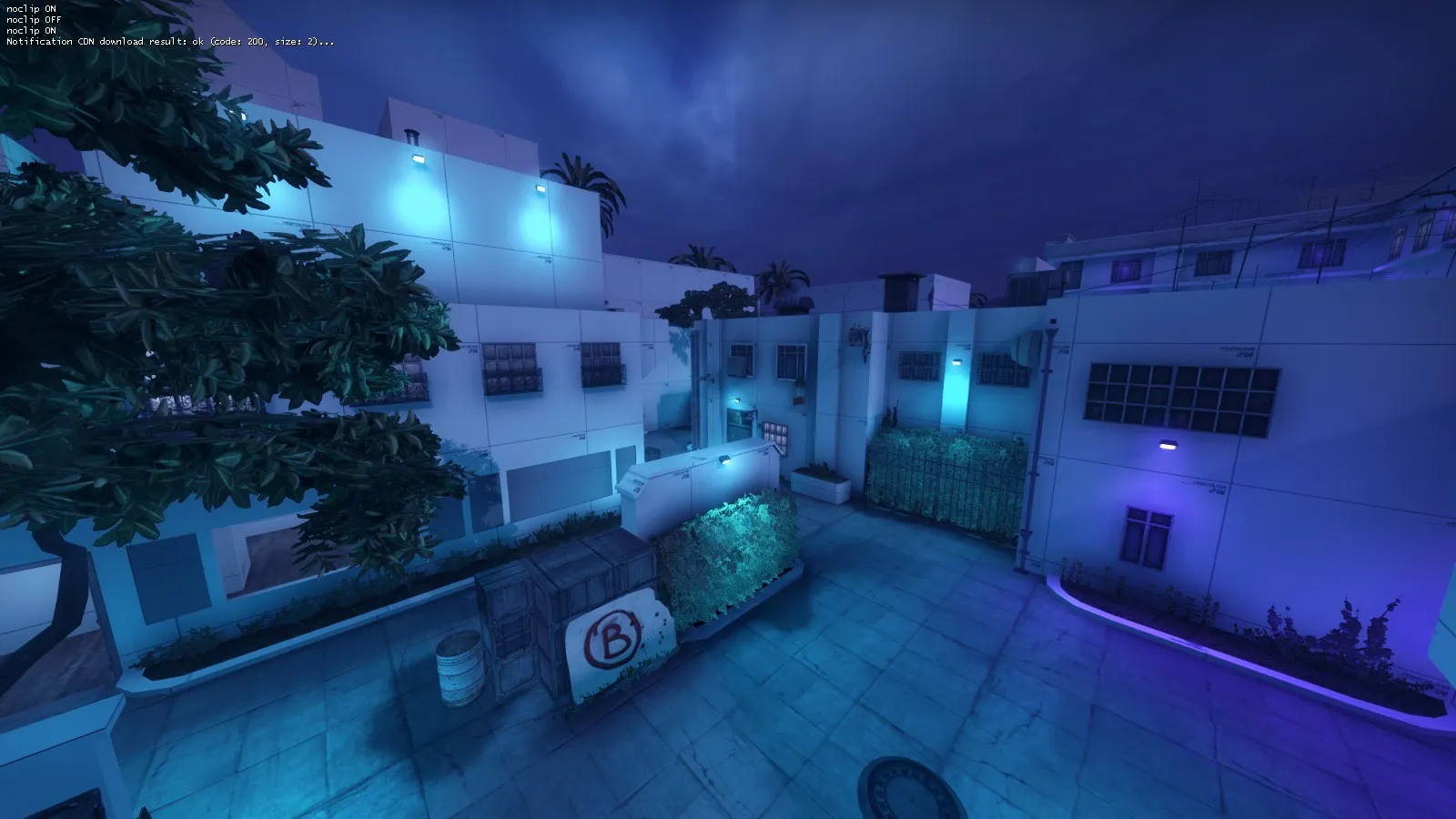
    Jeez, it's been a while since I last made any update... But development on the map is not dead!!!

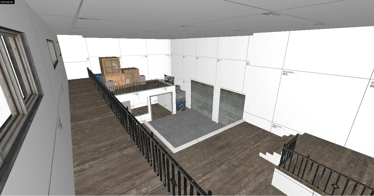
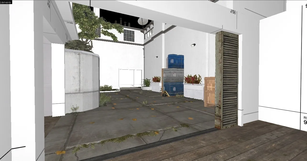
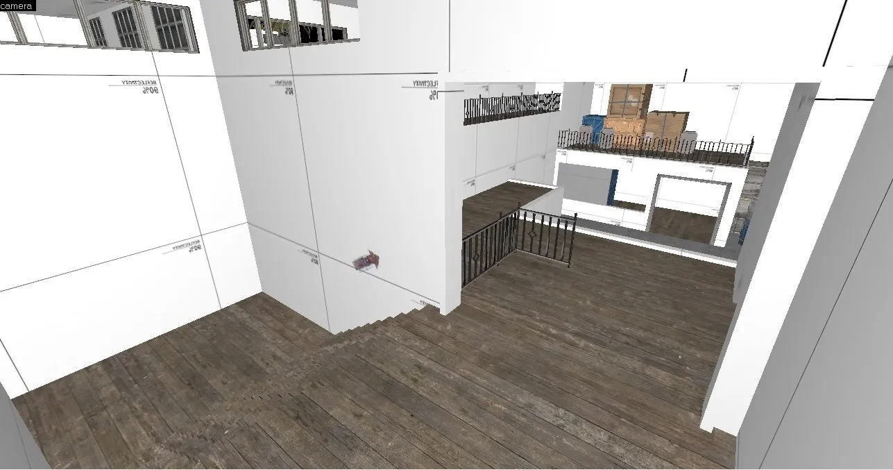
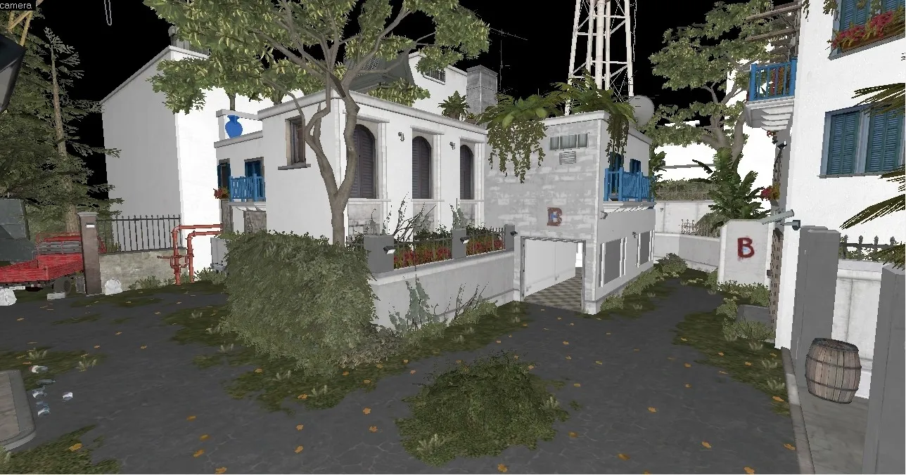
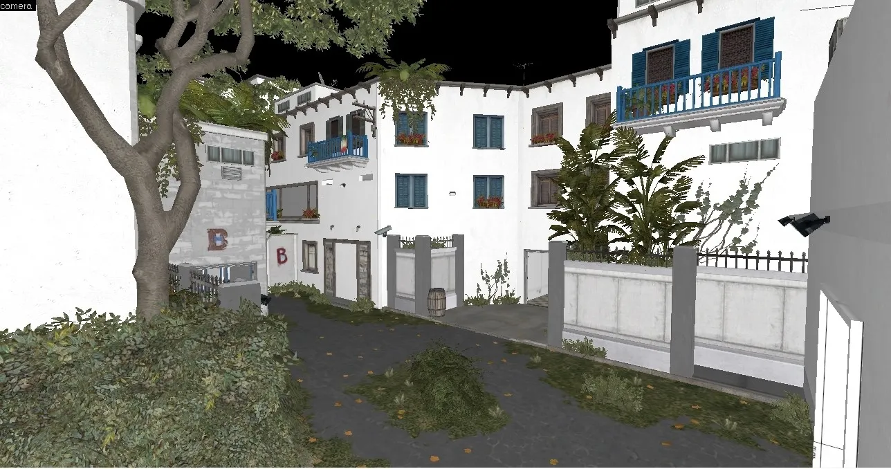
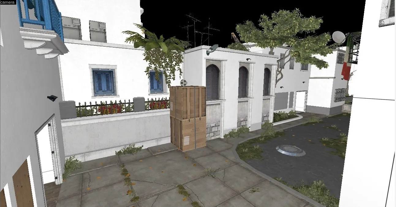
    I've been slaving away on this map for a Long time, and now it's time to finally show what I've done.

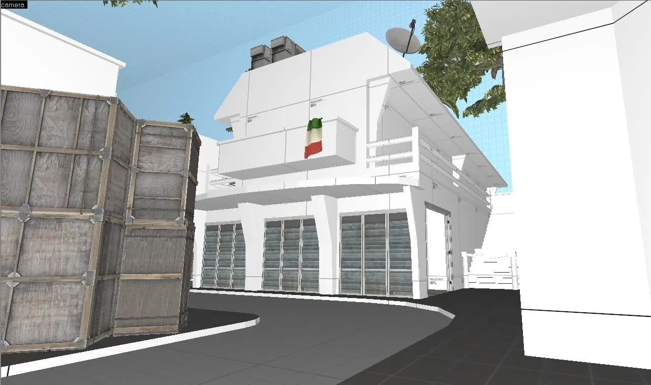
    I took the screenshots in hammer itself, but it'll still look pretty.

    So 2 Major things were changed!

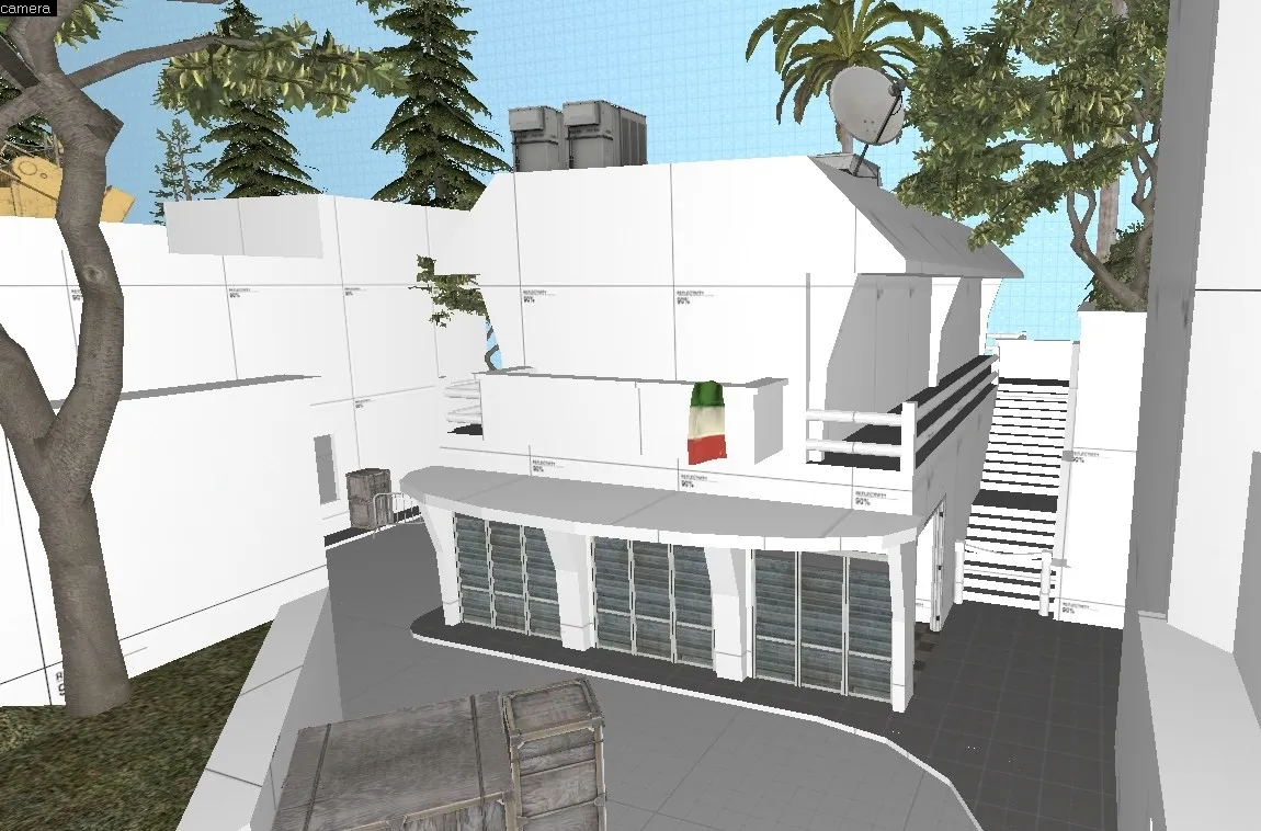
    A ) I reworked the chokepoint at Bombsite A since I wasn't too happy with it because I lazily put it together and it all looked messy (it was the last part of the layout that was made)

    B ) I've done some detailing on a few parts and focused on it to really nail the theme that I wanted, and I believe it worked out nicely!


    Here's the re-worked chokepoint for Bombsite A:

    Spoiler

    So it flows waaaay easier than the previous version, there's still the one-way drop in the last image, but everything is overall much better than before!

    If it's hard to imagine what the changes are layout-wise, here's the radar (bottom left portion)

    Spoiler


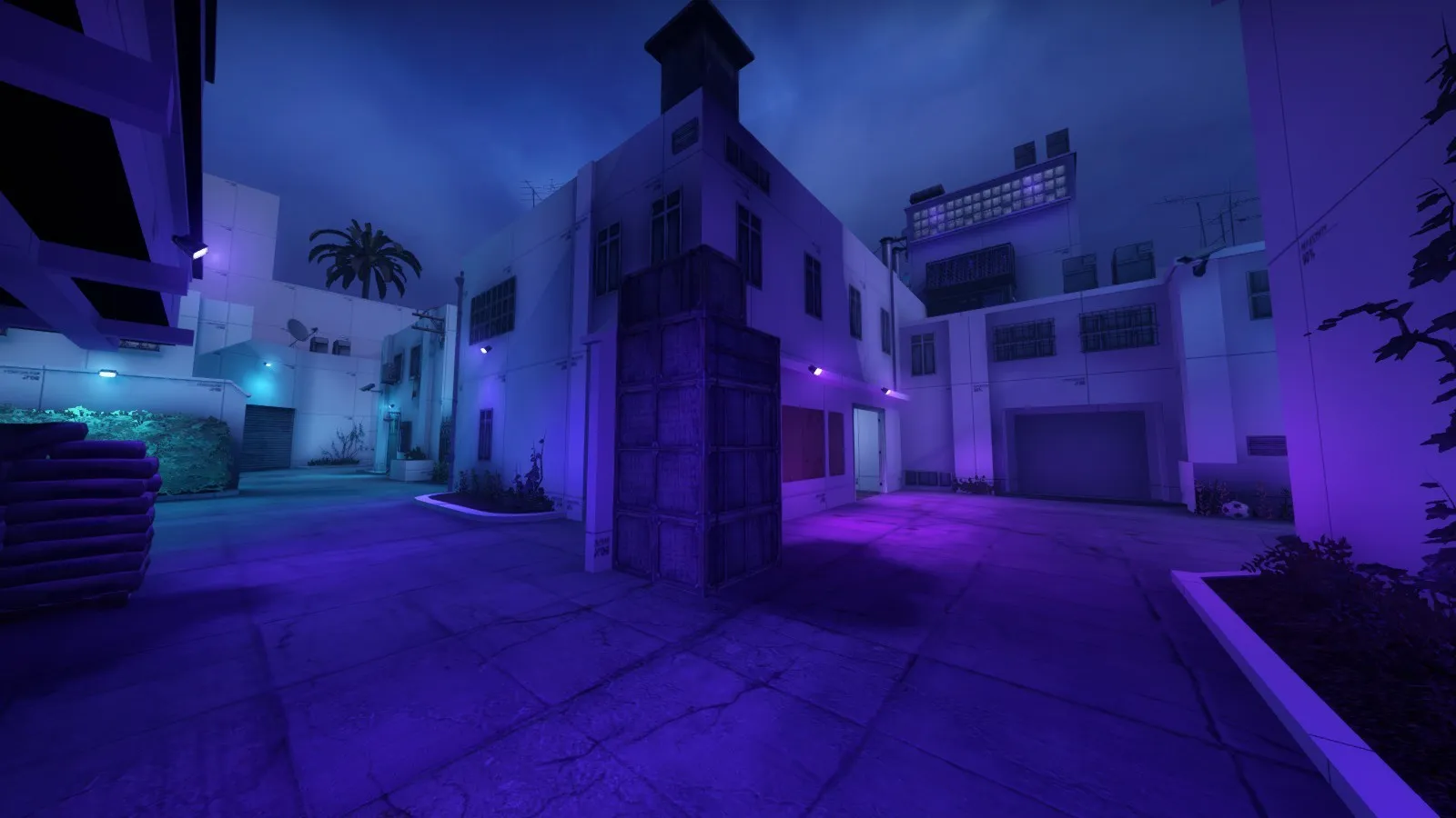
    After the chokepoint was re-done, I worked on detailing a few spots on the map, and I'll let the images speak for themselves!


    T Spawn:

    Spoiler

    CT Mid:

    Spoiler


    Overall, I'm starting to get way better at detailing without sacrificing gameplay! Recently I realized that playing on this map was a little dull, so I've been working at trying to make it fun, and the update at Bombsite A is the result of it!

    P.S. the new assets are from FMPONE's de_santorini (they work really well with this map =-])

  • xsanE-
    • September 18, 2019 at 5:14 PM
    • #39

    Keep going dude!

Participate now!

Don’t have an account yet? Register yourself now and be a part of our community!

Register Yourself Login
Discord

The Mapcore Discord is our lively IRC channel of the 2000s reborn. Chat about level design, gaming, and more.

Latest Posts

  1. Tangerine

    Harry Poster
    July 18, 2026 at 11:10 AM
  2. Any of the old guard still around? D:

    Warby
    July 12, 2026 at 8:23 PM
  3. About our archived forums

    Thrik
    June 30, 2026 at 2:12 PM
  4. Mapcore Discord

    mason_fan123
    June 24, 2026 at 8:52 PM
  5. [CS2] Valley

    Serialmapper
    June 22, 2026 at 11:56 AM
  6. Free Music / SFX Resource - Over 2500 Tracks

    Eric Matyas
    June 18, 2026 at 12:32 PM
  7. Pango [WIP]

    Elowen
    June 11, 2026 at 10:13 AM
  8. [CS2] Dvina

    Jeremy Rivera
    June 11, 2026 at 10:03 AM
  9. Bridges 2.0 by NEXSIDE, MAP SHOWCASE. ( Steam Workshop )

    MrTrane18
    June 1, 2026 at 7:46 PM
  10. Classic Maps Reborn For CS2

    SillySpaceCat
    May 31, 2026 at 10:33 PM
  1. Privacy Policy
  2. Contact
Powered by WoltLab Suite™