

Hello Everyone im currently doing my dissertation on guiding players using level design. Im needing some research and was wondering if any of you kind people could tell me some tips on how you guide players in your levels, eg like lighting, colour etc and maybe give a example's of when you used it and how. have a nice day and thank you for anyone who answers.

Tips on guiding the player with level design
-
-
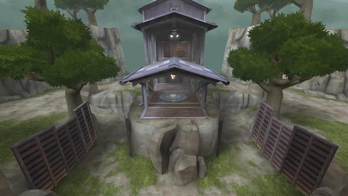
For koth_brazil, the main element of the map is the control point.
The purpose was to lead the players to the control point as easily as possible, and also to make it looks like the main goal of the map.
For the first version I've created a simple barn, I wasn't sure about the direction I wanted to take for the control point at that moment, I just knew I wanted to make a jungle map.
After the playtests, and when I became happy with the layout ( Yyler helped me on that) I started to make a full artpass on the map. Here you can see the greybox on the spawn, the main goal to achieve here was to show to the players the 3 options they had to choose a path.
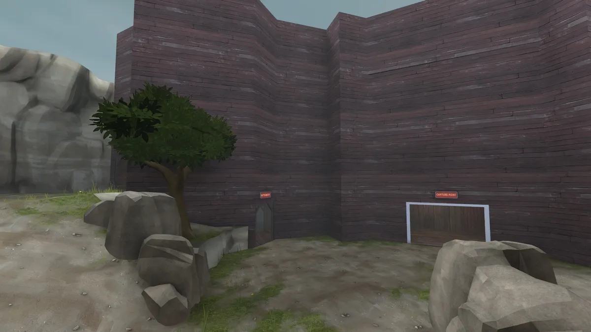
After the artpass
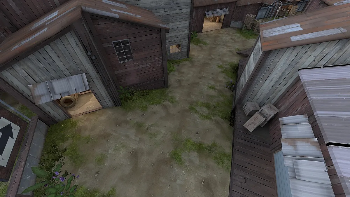
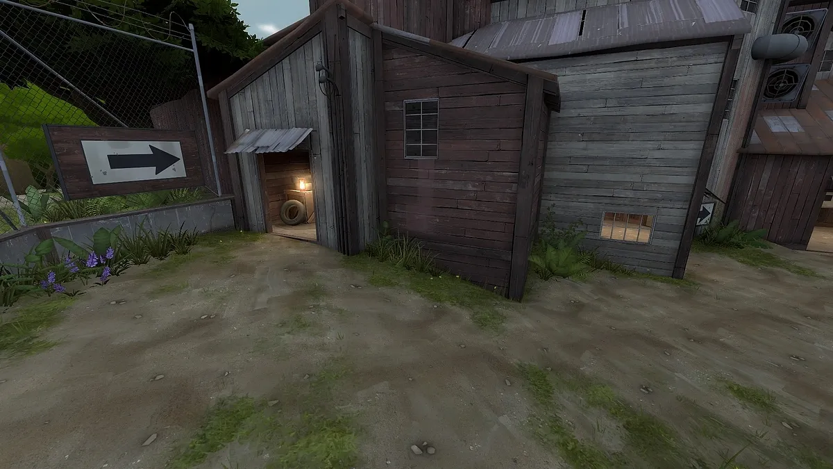
I tried to make a bright yellow lighting to try to catch the player's eyes, putting more details at the door spots helps to show the options.
Below you can see the snipers deck, it's the main road on the map which is the fastest way to go to the control point. You can clearly see that it's hard to see where is the objective here.
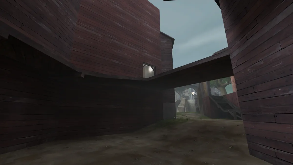
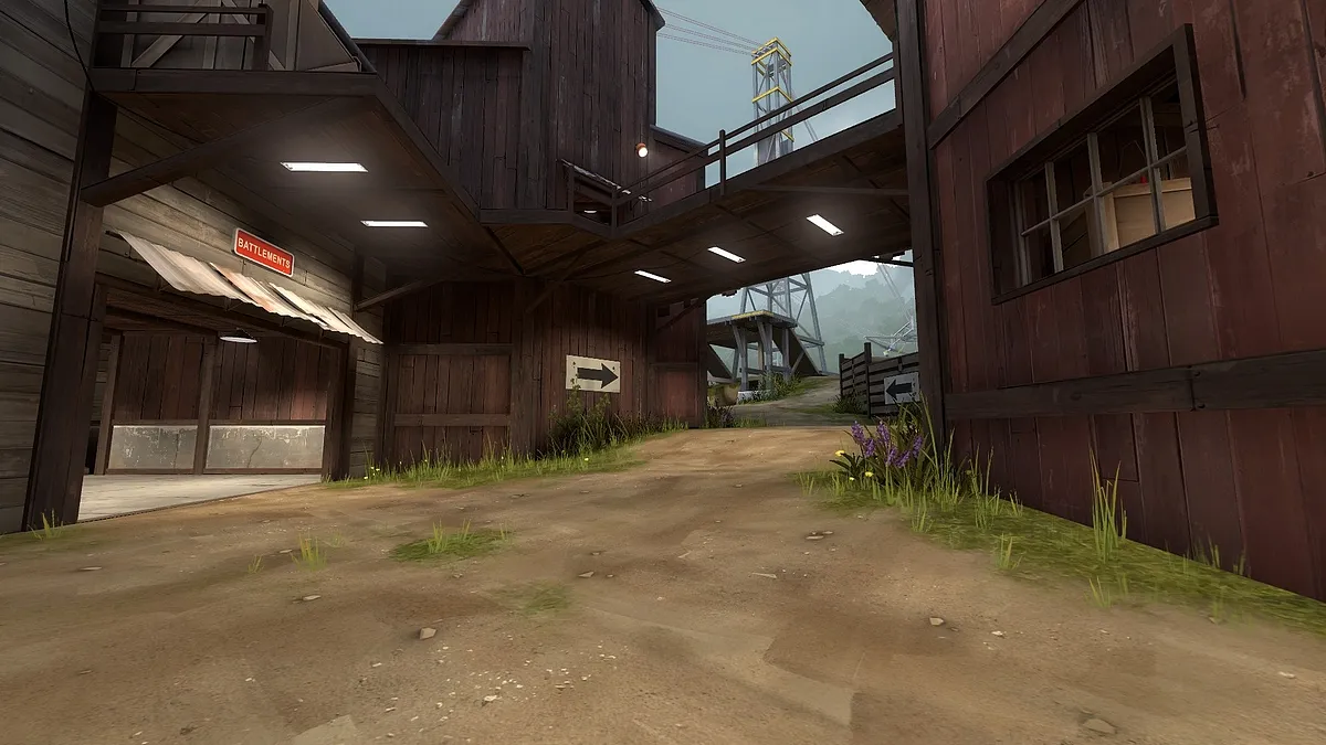
Here's the result after the artpass, I added a path to go to the snipers deck on the left, I added lamps to put some focus on the important areas, and more important, I changed the whole control point area.
During the artpass, I wanted to create something that was standing out from the map, on a koth map, the control point is the main element, and you want to lead the players to it as naturally as possible. That's why I decided to work on a radar dish, like the one on tc_hydro, but instead of having a dish on the gameplay area, I decided to work on the pillar, which was fitting more on the current layout and design, and then put the dish on the background to create an awesome atmosphere.
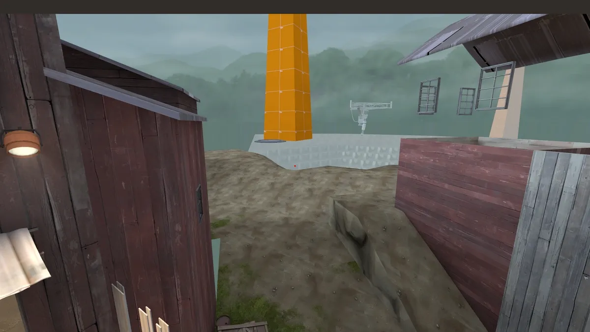
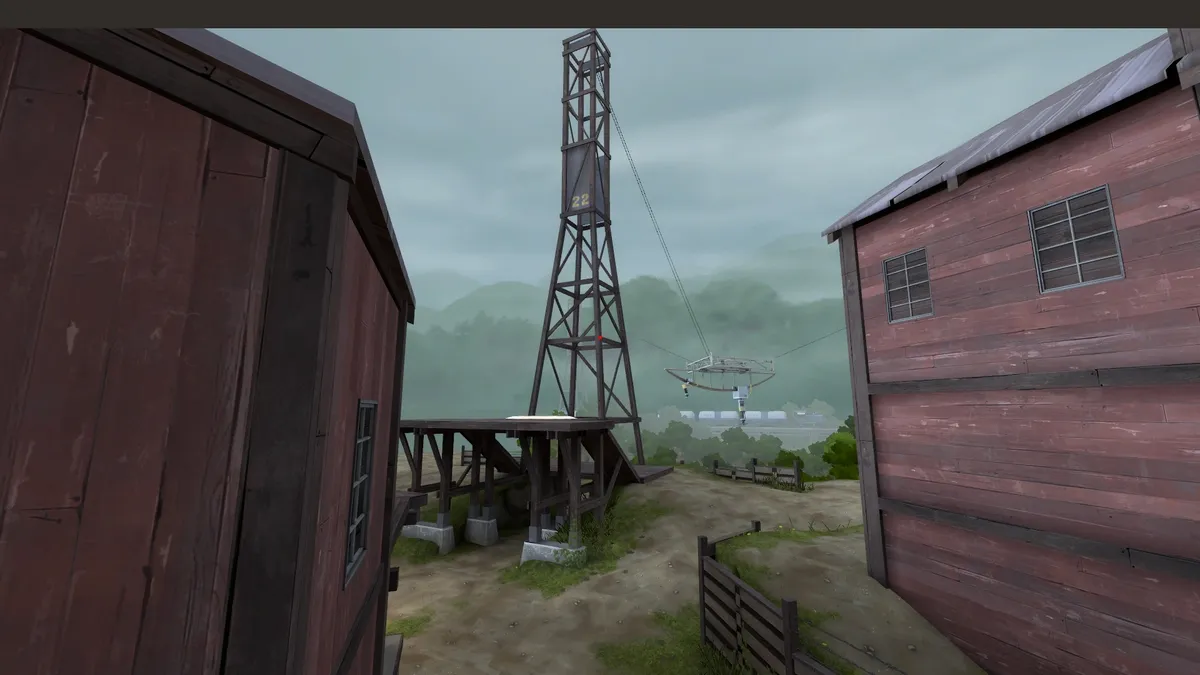
This site is shite, I can't upload more pictures :<
After some texturing work
[Blocked Image: https://i.imgur.com/80Dtaur.jpg]
I decided to put yellow stripes on the beams, it's making the tower even more standing out this way.
The final result
On the picture below, notice the lack of detailling on the left building, that way you put the emphasize on the tower. Sometimes adding details is not the best choice, instead, you just need to decrease the amount of details on the less usefull areas.
[Blocked Image: https://steamuserimages-a.akamaihd.net/ugc/4777522505…FA85C4358EF0AA/]
[Blocked Image: https://steamuserimages-a.akamaihd.net/ugc/4777522505…87D99F10C61D88/]
[Blocked Image: https://steamuserimages-a.akamaihd.net/ugc/4777522505…B2A139E6C336B9/]
[Blocked Image: https://steamuserimages-a.akamaihd.net/ugc/4777522505…38A31BFA20778C/]
Check these articles
-
 Quote from RaVaGe
21 hours ago, RaVaGe said: Check these articles
thank you very much my friend

-
Prof. Clem wrote a paper on the subject: http://www.clement-melendez.com/portfolio/arti…l/introduction/
-
This video but you might have seen it already :x
External Content www.youtube.comContent embedded from external sources will not be displayed without your consent.Through the activation of external content, you agree that personal data may be transferred to third party platforms. We have provided more information on this in our privacy policy. -
-
Thank you everyone for your comments
Participate now!
Don’t have an account yet? Register yourself now and be a part of our community!