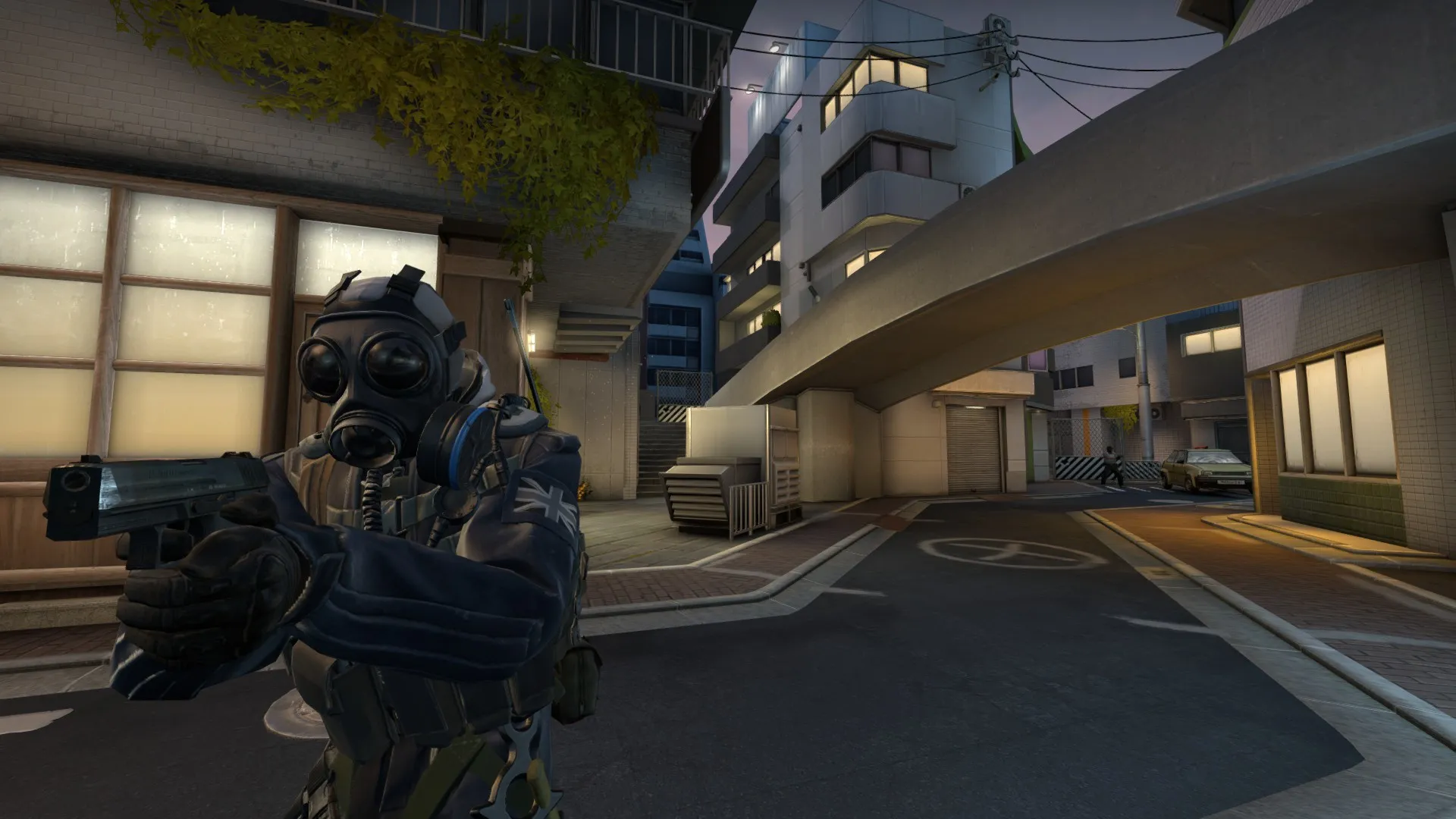
KAIZEN UPDATED!
We went from night to day with this one just before deadline
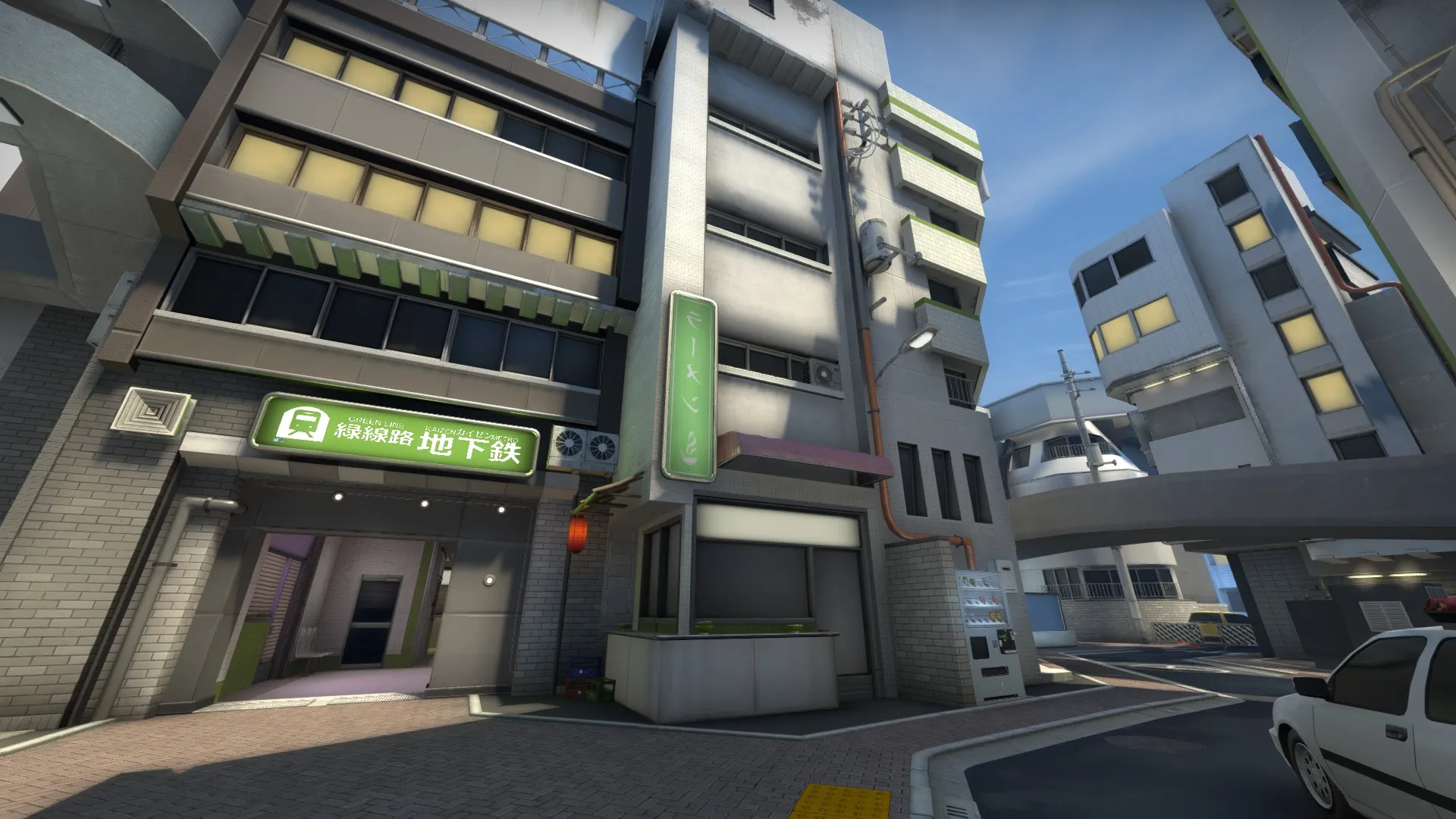
KAIZEN UPDATED!
We went from night to day with this one just before deadline
This is a strong entry, it has a unique theme, some well-realized connections between different areas, and the cherry blossoms are a visual win.
So I haven't gotten as much of a chance to play this map as the others, however one thing I've heard from many people is that the map seemed to have a bit more of a unique identity and satisfying feel when it was a night map. Here's why I think that criticism makes sense: a lot of your assets are a bit "unfinished" in the detail-mapping (remember that detail maps can add a lot of visual interest to textures) and also the use of white space seems like a consistent trend in the textures of this level. In a night map, you're less likely to notice those in a prominent way, and in fact you almost appreciate the contrast to the dark sky. Overall, finer-detailing is an area where it seems like there is potential for improvement on this level.
Lastly, I think the bombsites could use some more well-defined plant-zone markers. It's difficult to tell sometimes where the bombsites begin and end. Overall, definitely a strong entry that I can see improving a lot more over time.
Quote from Andre Valera27 minutes ago, Andre Valera said:
External Content www.youtube.comContent embedded from external sources will not be displayed without your consent.Through the activation of external content, you agree that personal data may be transferred to third party platforms. We have provided more information on this in our privacy policy.
Visibility here seems really reduced. Black seems like the predominate wall color now... Not sure if this change is advisable.
I would keep your dark skybox but revert much of the level lighting, readability is important for the gameplay to be fun.
 Quote from FMPONE
11 hours ago, FMPONE said: Visibility here seems really reduced. Black seems like the predominate wall color now... Not sure if this change is advisable.
I would keep your dark skybox but revert much of the level lighting, readability is important for the gameplay to be fun.
Agreed, adding some more light would really help 
Agree with posts above, first area is very dark, rest a bit better but I don’t think ideal for playing.
One thing I always noticed is you have “backdrop” lighting (light surfaces like windows) but not “downward” lighting (lampposts) – i mean you have it, but they don’t create pools of light as I would expect.
Thanks, agree completely on the lighting. We're trying to go through with a cleaner approach now, relying more on big key lights like the light poles or shopfronts.
Lighting is definitely the primary concern right now, but I'm pretty optimistic about it. Here's a recent screenshot from some tests:
[Blocked Image: https://steamuserimages-a.akamaihd.net/ugc/931561028383891067/AB3F3A4D177F3F894DF9594089BEF53A5AE2B103/]
 Quote from jakuza
On 5/12/2018 at 1:27 AM, jakuza said: Thanks, agree completely on the lighting. We're trying to go through with a cleaner approach now, relying more on big key lights like the light poles or shopfronts.
Lighting is definitely the primary concern right now, but I'm pretty optimistic about it. Here's a recent screenshot from some tests:
Just keep in mind that you want it to be about 2X brighter than you think, because some people play with no alpha boost in he video settings. Alpha boost washes out your lighting but you want the map to be playable for people who haven’t tweaked any settings and are playing default.
Quote from FMPONEOn 5/18/2018 at 10:33 PM, FMPONE said: Just keep in mind that you want it to be about 2X brighter than you think, because some people play with no alpha boost in he video settings. Alpha boost washes out your lighting but you want the map to be playable for people who haven’t tweaked any settings and are playing default.
Ah that's a great point. Thanks for the tip
A bit unrelated I know, but I do want to say that you sure do a great job at buildings!
On 5/31/2018 at 10:49 PM, I ♡ The 1950's said: A bit unrelated I know, but I do want to say that you sure do a great job at buildings!
Thanks! Much appreciated
Il like all the detailling and stuff but I'm really bothered by the lighting. Like there is too many light sources and different colors that make everything hard to read and understand. 
You know what, it would be nice if you could mark it somehow where the bomb zone starts and ends on top of the bridge. For example, with light poles so that it can be seen from underneath.
Spoiler
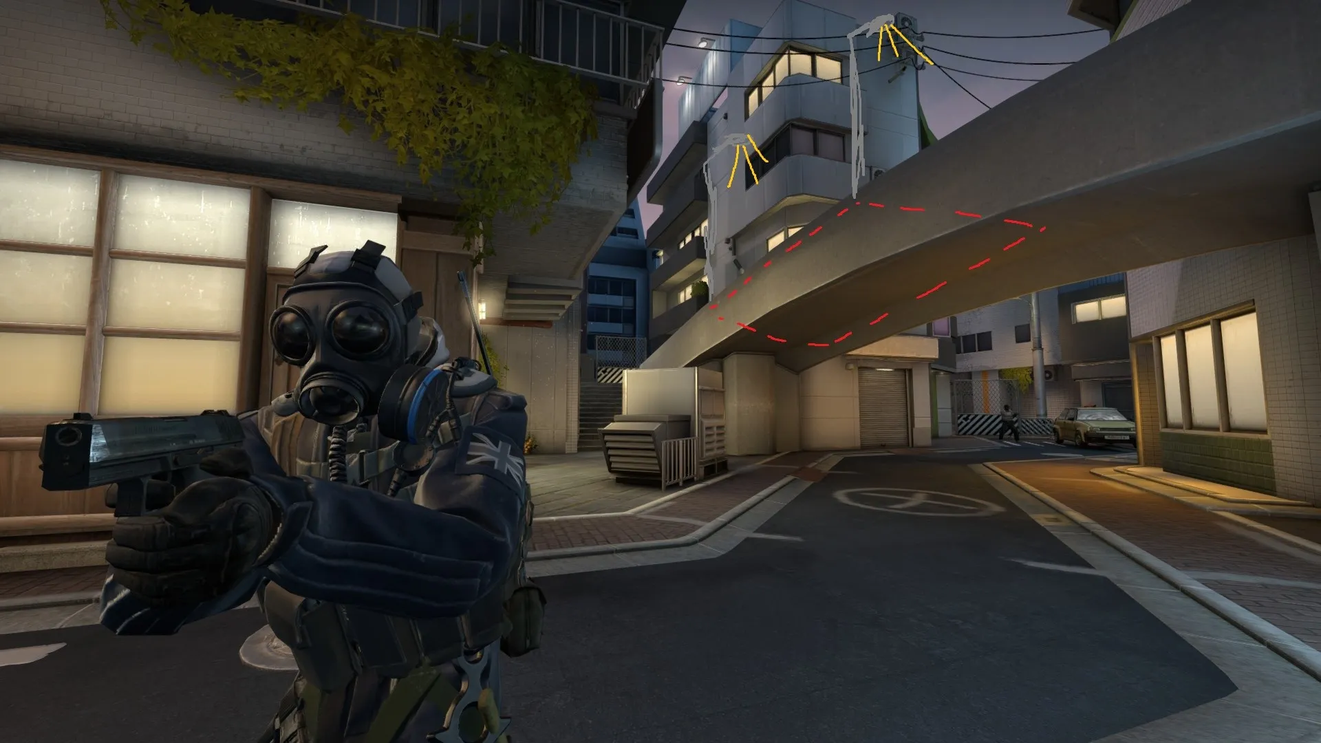
Otherwise if you've planted the bomb on top, CTs can just smoke it and it's very difficult to tell where you've planted the bomb if you're on the lower level or at long. There are different situations where this could be useful, or maybe you want it to be this way so that it's very difficult to defuse without a smoke, whereas, with a smoke it's much easier, idk.
Otherwise it's starting to look really sick visually, you're almost there.
I think you need to re-evaluate the upper plant area itself. As i remember from playing Kaizen, it felt really annoying once the bomb is up there. Maybe some little higher railings/cover up there could make after-plants more interesting. Liking Nikios idea though
@NikiOo Definitely a good idea to place visual indicators of where the bomb area is from the perspective of anyone off or around the bridge
are you planning on covering some areas with signage? I like the way the map is heading but it's sooo clean just now.
also fine with the bridge as an idea but can't help but think that
A) it's thematically a little awkward with no hardrails etc.
B) curves make some weird angles. I think it would play better flat with some areas blocked off?
etc. also known as constant updates, bug fixes, sleepless nights wondering "Why?" and the simple solutions that follow.
Great update! I like the vegetation.
The map could use some more enviorment sounds to make the city feel more alive. Maybe a radio or television background sound coming out one of the appartments, a car driving by, a plane flying over and etc
Looking great!!
One thing I noticed by watching the video is that every area feels a bit similar, which makes the map harder to navigate for first time players. One way to solve could be by color coding some areas, or having strong themes in specific areas, restricting specific props only to those areas. Let's say, CT spawn has majorly blue signs/lighting, Bomb sites are mostly red/orange, maybe the middle of the map has a lot of vegetation, the subway could have green walls etc... so you know exactly where you are without having to think about it.
You have an incredibly solid base and with some minor readability/navigational/lighting tweaks, this map will be really special!
Here's an example of how we did this in Lijiang Tower in Overwatch:
Spoiler
As soon as you come out of the spawn you see the pig sign. The lighting here is mostly blue/purple.
[Blocked Image: http://thiagoklafke.com/images/thiagoklafke_lijiang_02.jpg]
Then you walk through a food court:
[Blocked Image: http://thiagoklafke.com/images/thiagoklafke_lijiang_03.jpg]
Then the same theme is applied to the indoor area. These are the same props but inside they have a different feeling. The lighting here is darker than the exterior (so you go from light to dark and back to light once you come out again)
[Blocked Image: http://thiagoklafke.com/images/thiagoklafke_lijiang_04.jpg]
Then you go through another courtyard, this one with statues (this is the only place in the map these statues are used, and the red lanterns weren't used in other parts either)
[Blocked Image: https://assets.tentonhammer.com/articles/attached_images/000/025/045/medium/LiJiangTower.jpg?1468378059]
Then you go through a garden. The lighting gets warm. This is the only area in this point with grass.
[Blocked Image: http://thiagoklafke.com/images/thiagoklafke_lijiang_06.jpg]
And then you are inside the tower (doesn't really have a specific theme, but this art kit is only used here, making this feel unique). The lighting is the warmest here.
[Blocked Image: http://thiagoklafke.com/images/thiagoklafke_lijiang_05.jpg]
Hope that helps 
Don’t have an account yet? Register yourself now and be a part of our community!