

Hi, This is my latest piece of work.
It took me a lot of time but it's finaly completed.

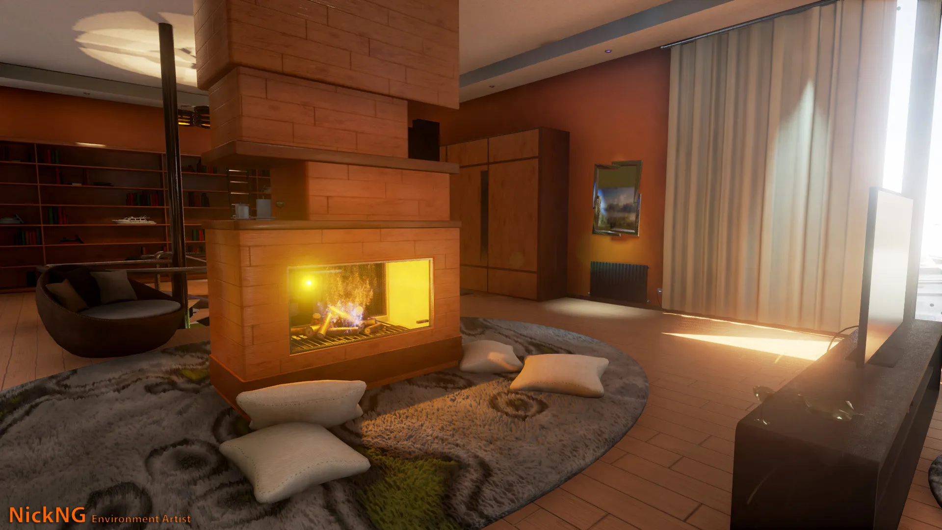
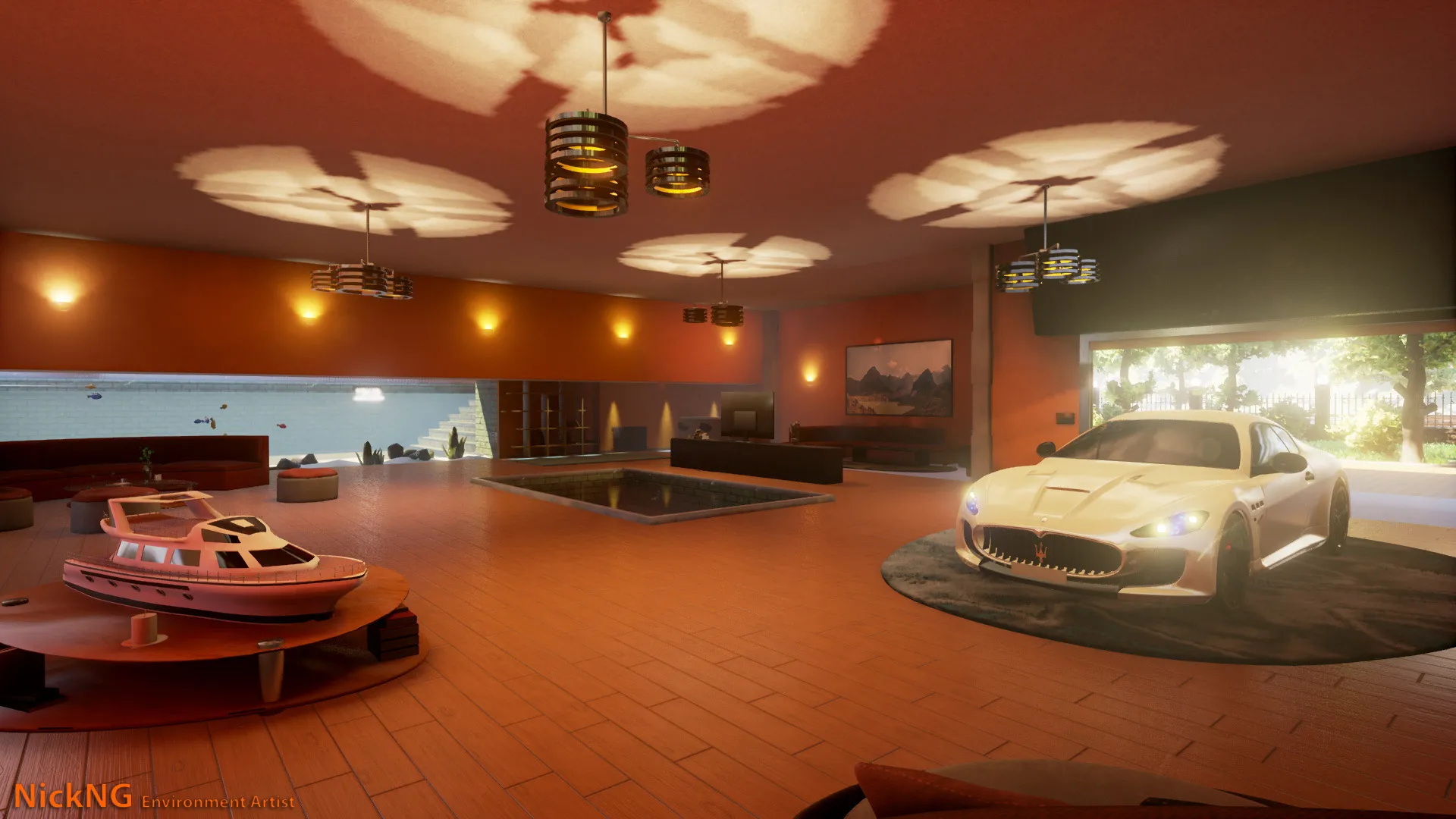
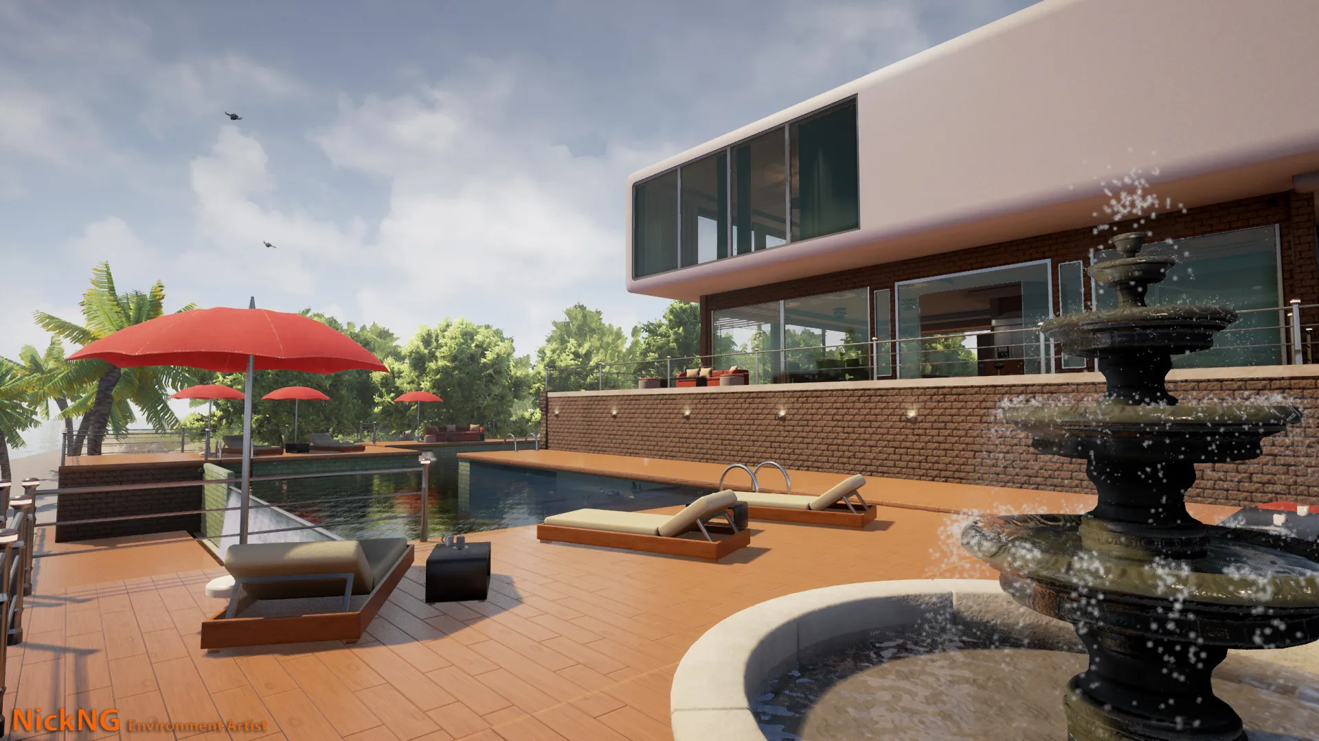
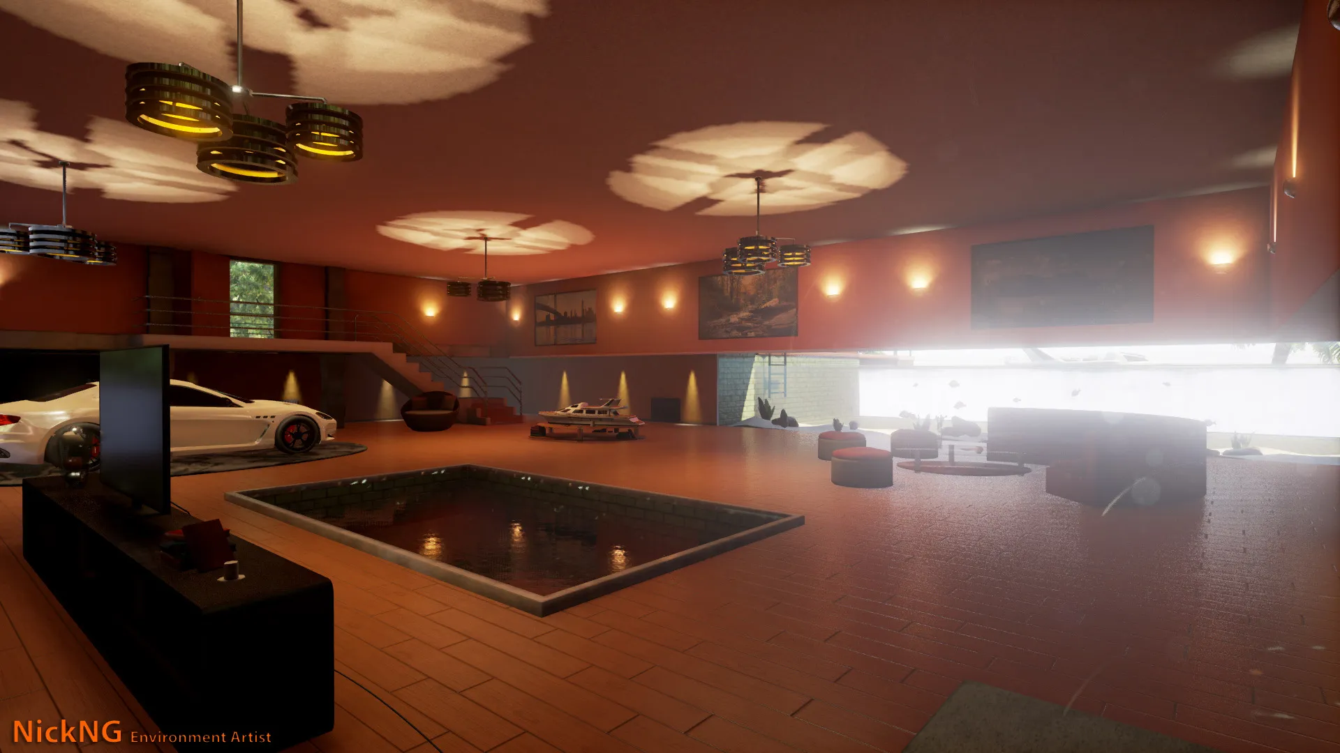
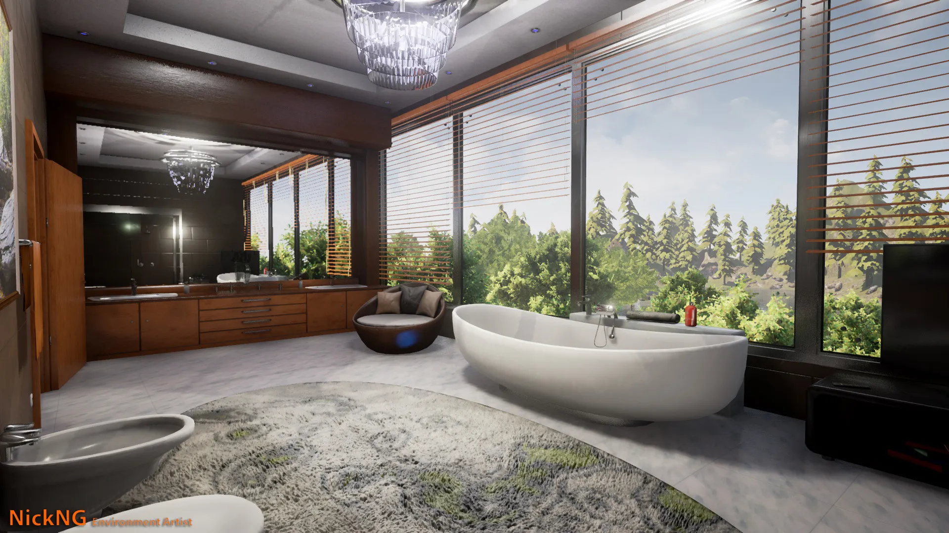
Thanks to episcura for their awesome textures and images.

Hi, This is my latest piece of work.
It took me a lot of time but it's finaly completed.
Thanks to episcura for their awesome textures and images.
I don't like the car presence in the living room, that room is also so wide that feels very oppressing (low ceiling); but other than that, it's beautiful under all aspects.
Well, in fact there is another living room(not in photos). This one started as a garage, but i wanted to combine the aquarium with something relaxing. This one was not planned good from the blockout stage, but i'm satisfied with the result.
Looks really nice, but I'd tone down the post processing a bit, every screenshot screams UNREAL 4 
Overall everything feels too bloomy and a tad contrasty. The light cookies on that third shot look repetitive and I can see the compression of the mask. You could easily loose these so your eyes naturally flow towards the scene and not a flat ceiling. Remenber our eyes tend to focus on the brighter spots of the image first, if the first thing I look at in an image is a compressed light cookie it's never a good sign.
I'd love to see some more refinements to the lighting, specially the light bounce and light contribution. It feels like the outdoors is really bright, but it's not leaking inside the interiors like it should, if Unreal's bounce isn't good enough, you can always give it a hand by hand placing some lights near the windows. Overall, I feel the lighting is lacking gradients, everything is the same brightness and it's very spoty with no natural places for you to rest your eyes on.
Is there a reason you went with noon for your lighting? I'd love to see a twilight setting, I'm sure it would make everything a lot more apealing. Either that, or I'd work on the sky a little more, bring back some of the blues, right now it's very hazy white.
Also, i'd work on the background a little further, I can pick out individual trees. Right now, either bring the trees closer to the windows or move them much further in the distance to add a epic backdrop, this would help scale a lot.
Congratulations on this, very good work.
Nice!
The composition of the architecture in your rooms is a tad boxy. More than is even necessary for modernist stylings. Try to mentally address your straight lines, see if they're necessary.
Thanks everyone for your inspiring critique, it means alot to get advice from professionals.
Post processing / Lighting I must admit that i didn't put much time on this(i know, huge mistake):(.
Before the final light bake i tried a night setting and i really liked it, still don't know why i left it as it is. Also i built with preview lighting because of the long build time.
To be honest, i never thought that this is a final version, I NEEDED THAT CRITIQUE to push it more.
You gave me tons of courage and inspiration to get back in this.
Don’t have an account yet? Register yourself now and be a part of our community!