1. Forums
  2. Discord
  3. About Mapcore
  4. Patreon Supporters
  • Login
  • Register
  • Search
This Thread
  • Everywhere
  • This Thread
  • This Forum
  • Articles
  • Pages
  • Forum
  • More Options
  1. Mapcore
  2. Discussions
  3. Level Design

Valley [CSGO]

  • Vaya
  • April 24, 2016 at 3:48 PM
  • Vaya
    • April 24, 2016 at 3:48 PM
    • #1

    http://steamcommunity.com/sharedfiles/fi…s/?id=580106862


    A defuse map set in Palo Alto/'silicon valley'- the targets are a companies server farm or electrical substation to cause disruption to the companies operations (or something)


    Some of you will remember version 1 of this map. I was never really happy with the layout and had progressed way too far to make the required changes. The detailing was also pretty off what I wanted- too many different styles and too piecemeal

    I think (hopefully other agree) the new version I've been working on has a much more solid layout and is also visually stronger overall- I want the map to be bright, colourful and pleasant to play on.

    [Blocked Image: http://i.imgur.com/GLI6kuR.jpg]

    [Blocked Image: http://i.imgur.com/D6gERo5.jpg]

    [Blocked Image: http://i.imgur.com/Snu4tLj.jpg]

    [Blocked Image: http://i.imgur.com/lAbOG6j.jpg]

    [Blocked Image: http://i.imgur.com/IACpnej.jpg]

    [Blocked Image: http://i.imgur.com/LsDWHa7.png]

    Feedback on how to progress this - what people think needs more work or changed is important at this point - I've been building 'in the dark' for a couple of months now so might need to amend course :) (the super bright red lighting in the last screenshot will be changed+ the word wall decal is placeholder- just wanted to get that idea down ASAP for a full build)

    Yes it's using a lot of nuke assets. I'm sorry.

  • Lizard
    • April 24, 2016 at 4:23 PM
    • #2

    Will give it a try later today :)

  • spa
    • April 24, 2016 at 7:53 PM
    • #3

    This looks very nice! A fresh take on a theme and nice clean execution. I wish i had better comments than maybe reduce the brick size since it gives the facade a slightly toony/miniature feel as is now. Keep it up!

  • will2k
    • April 24, 2016 at 8:36 PM
    • #4

    The walls in the first screenshot definitely need a floor level and ceiling level trim to break the blank wall up (like in nuke or office for example)

    I like the outside shot's color and architecture; it screams hi-tech quirky start-up :D. Maybe another lighter brick texture could suit better (from train)?

    Readability should be very nice in this one, keep it up :)

  • jakuza
    • April 24, 2016 at 9:38 PM
    • #5

    Was fun playing, like I said in the feedback, no route felt like an afterthought, they were all really nicely balanced and felt appropriate.

    Funny that you chose a theme right around my area after I chose Edinburgh for royal :D (and completely botched it at that).

    Some areas still feel very blocky, but the nuke materials help with that. I think the next step is to "frame" your surfaces like you do with the floor trims on the interiors.

    A few other nitpicks:

    Spoiler

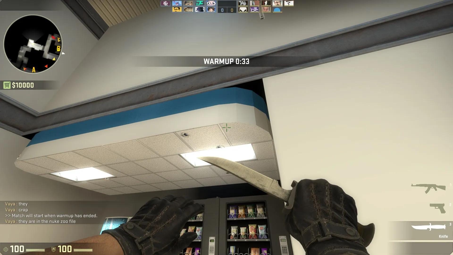
    This overhang on the vending machine area just looks weird to me.

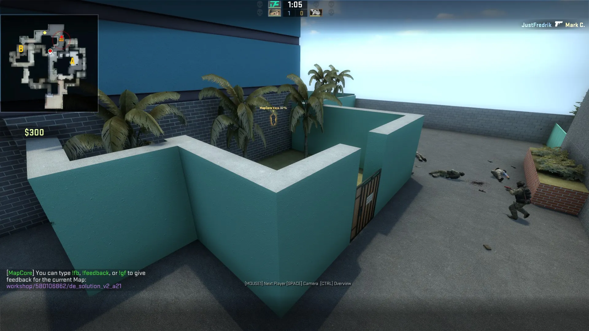
    These walls are the only parts of the map that feel maze-like and like leftovers from a grey box stage. Everything else felt natural.


    Good luck, I really like the direction it's headed!

  • Vaya
    • April 24, 2016 at 9:44 PM
    • #6

    thanks guys :) Going to spend a while collating feedback from the playtest and work out the next steps

  • Lizard
    • April 24, 2016 at 10:24 PM
    • #7

    Ok here are my thoughts.[Blocked Image: http://i.imgur.com/t3pgftV.jpg]

    [Blocked Image: http://i.imgur.com/V41byRs.jpg]

    Those vents are not connected to anything. There are few places on the map like this.

    [Blocked Image: http://i.imgur.com/pYkK9Df.jpg]

    You can work on the lighting here to guide the players.

    [Blocked Image: http://i.imgur.com/cQFfGO5.jpg]

    Stretch the texture in y axis so you have the edge on the bottom.

    [Blocked Image: http://i.imgur.com/Ju1c7Bq.jpg]

    Smooth this and also do something with lightbleed there.

    [Blocked Image: http://i.imgur.com/UNihEWP.jpg]

    Head bumb. Disable the collision.

    [Blocked Image: http://i.imgur.com/RJ1iz4B.jpg]

    Floating tv. Noticeable.

    [Blocked Image: http://i.imgur.com/0MdfXKl.jpg]

    Self explanatory.

    [Blocked Image: http://i.imgur.com/b9iISxs.jpg]

    Move the frame so it covers the texture change.

    [Blocked Image: http://i.imgur.com/HfNbp3K.jpg]

    The light is too strong.

    [Blocked Image: http://i.imgur.com/k6sCGtR.jpg]

    I would change the doors and frames on the ones from nuke.

    [Blocked Image: http://i.imgur.com/XzXTfAQ.jpg]

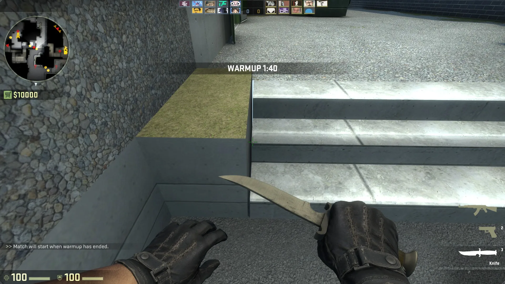
    It would be nice to have some kind of "step" texture here.

    [Blocked Image: http://i.imgur.com/zqCQ8qI.jpg]

    Work on texture alignment.

    [Blocked Image: http://i.imgur.com/5gRYhvs.jpg]

    Self explanatory.

  • Pumbliss
    • April 25, 2016 at 5:24 AM
    • #8

    The map looks amazing, besides a cartoony feel in T-Spawn.

    Pros:

    • Great modern feel, bringing the correct textures to fit era.
    • Fast and smooth play with good corners/angles.
    • Sensical fashion and navigation creation.

    Cons: (I don't want to sound like a broken record; this map has many small corners that are flawed, so I'll mention more general flaws)

    • A site breakable windows shouldn't all shatter at once, to make visability hard, more tactical.
    • Many boring areas outside of the map that cause players to be less interested in the design of the level.
    • Boring potential: spawns have not many paths/features, not many boosts, and not many practicable jumps.
  • Vaya
    • April 25, 2016 at 8:54 AM
    • #9

    thanks for the feedback :)

  • blackdog
    • April 25, 2016 at 10:44 AM
    • #10

    This looks very good. Is the layout already pretty final? You've detailed quite a lot.

    Holding on specific comments for when you consolidate a bit more.

    ps: some steps seem bit too tall

    *sigh* have basically the same idea for a map (more like the name I'd use)… I really like that these companies have modern, clean and colourful hq

  • Vaya
    • April 25, 2016 at 11:03 AM
    • #11

    All steps should be the correct size but I've fucked some of the texturing on them. Might be a perspective thing but I'll review it :)

    overall I'm happy with the layout but some areas will be getting added to for the next build. Mid needs tweaking too.

  • Vaya
    • May 30, 2016 at 9:18 PM
    • #12

    https://drive.google.com/open?id=0BzPwe…WVFOQVMzTE12OTg

    an up-to-date BSP (no radar)

    I've had a bunch of good feedback already from this one:

    [Blocked Image: http://i.imgur.com/piiUpSe.png]


    [Blocked Image: https://i.gyazo.com/e6573797d49a050f76db517a08f1b377.png]

    Pending changes:


    -lower fire alarms/extinguishers :|

    - kill a pixel angle into B main

    - sort a couple of dodgy clips out

    - outside B needs fixed to stop weird boosts into CT spawn.

    - mid needs some sort of cover to make CT pushes more risky

  • Lizard
    • May 30, 2016 at 10:19 PM
    • #13
    Quote from Vaya

    1 hour ago, Vaya said: https://drive.google.com/open?id=0BzPwe…WVFOQVMzTE12OTg

    an up-to-date BSP (no radar)

    I've had a bunch of good feedback already from this one:

    [Blocked Image: http://i.imgur.com/piiUpSe.png]


    [Blocked Image: https://i.gyazo.com/e6573797d49a050f76db517a08f1b377.png]

    Pending changes:


    -lower fire alarms/extinguishers :|

    - kill a pixel angle into B main

    - sort a couple of dodgy clips out

    - outside B needs fixed to stop weird boosts into CT spawn.

    - mid needs some sort of cover to make CT pushes more risky

    Display More

    DANK

  • Vaya
    • June 14, 2016 at 2:45 PM
    • #14

    http://steamcommunity.com/sharedfiles/fi…s/?id=580106862


    update posted a couple of days ago. I've now applied a bunch of feedback from this version (mainly vis and clipping issues) and will be compplaytesting a slightly newer version this week. I'd appreciate more feedback before then though :) focus is on layout still but thoughts on detailing would be cool

  • Vaya
    • June 15, 2016 at 11:32 AM
    • #15

    http://imgur.com/a/JYgO1

    A batch of screenshots from last night. Testing different colour options so some stuff is a little mismatched at the moment. I think a little muted works better than super bright?

    http://steamcommunity.com/sharedfiles/fi…s/?id=580106862

    Workshop link updated again- I'm going to try have a playtest tonight and I've made the massively retarded move of submitting it for a reddit playtest :)

  • Logic
    • June 15, 2016 at 5:25 PM
    • #16
    Quote from Vaya

    5 hours ago, Vaya said: I'm going to try have a playtest tonight

    I demand a set time for this playtest!

  • Vaya
    • June 21, 2016 at 9:49 AM
    • #17

    https://drive.google.com/open?id=0BzPwe…c2I0Wmw3cW9odlE


    Another dropbox update. trying to make the T-entrance more visually inviting.

  • Logic
    • June 21, 2016 at 10:03 AM
    • #18
    Quote from Vaya

    13 minutes ago, Vaya said: https://drive.google.com/open?id=0BzPwe…c2I0Wmw3cW9odlE

    Another dropbox update. trying to make the T-entrance more visually inviting.

    We need pictures man!

  • Vaya
    • June 21, 2016 at 10:06 AM
    • #19

    [Blocked Image: http://1.bp.blogspot.com/-q_BeiLk89nw/TZwBLEIQKLI/AAAAAAAAAHk/HI7tKr_1RPU/s1600/1302066522536.jpg]


    External Content www.youtube.com
    Content embedded from external sources will not be displayed without your consent.
    Through the activation of external content, you agree that personal data may be transferred to third party platforms. We have provided more information on this in our privacy policy.


    ...will get some tonight. or you can see it with moving pictures if you're about

  • Vaya
    • October 3, 2016 at 1:29 PM
    • #20

    I never did upload those pictures....


    Anyway! This map will potentially be descended on tomorrow night as part of the reddit playtest. This is technically an old version of the map as @Bevielis is working on improving the architecture in the main VMF. Come join and play 'spot the nodraw!' with a couple 100 picky redditors :)

    http://steamcommunity.com/sharedfiles/fi…s/?id=580106862

Participate now!

Don’t have an account yet? Register yourself now and be a part of our community!

Register Yourself Login
Discord

The Mapcore Discord is our lively IRC channel of the 2000s reborn. Chat about level design, gaming, and more.

Latest Posts

  1. Tangerine

    Harry Poster
    July 18, 2026 at 11:10 AM
  2. Any of the old guard still around? D:

    Warby
    July 12, 2026 at 8:23 PM
  3. About our archived forums

    Thrik
    June 30, 2026 at 2:12 PM
  4. Mapcore Discord

    mason_fan123
    June 24, 2026 at 8:52 PM
  5. [CS2] Valley

    Serialmapper
    June 22, 2026 at 11:56 AM
  6. Free Music / SFX Resource - Over 2500 Tracks

    Eric Matyas
    June 18, 2026 at 12:32 PM
  7. Pango [WIP]

    Elowen
    June 11, 2026 at 10:13 AM
  8. [CS2] Dvina

    Jeremy Rivera
    June 11, 2026 at 10:03 AM
  9. Bridges 2.0 by NEXSIDE, MAP SHOWCASE. ( Steam Workshop )

    MrTrane18
    June 1, 2026 at 7:46 PM
  10. Classic Maps Reborn For CS2

    SillySpaceCat
    May 31, 2026 at 10:33 PM
  1. Privacy Policy
  2. Contact
Powered by WoltLab Suite™