

your latest screenshots look great! Please go on with that amazing work.

de_contract
-
-
New Update:
Started to texture the mid to B connector and colour code. I also added a window for smokes and to boost to look out of. I have also moved the door across and widened the top area.
[Blocked Image: http://images.akamai.steamusercontent.com/ugc/294231582571611858/FD9BB792A2EAAC35C864EF8761FCB8E0E673CF88/]
[Blocked Image: http://images.akamai.steamusercontent.com/ugc/294231582571612124/D73C141A6349A30A925454C182920BAC29745531/]
[Blocked Image: http://images.akamai.steamusercontent.com/ugc/294231582571612259/1A44FE70B184A28D1121CEE5851BE5876A5CF666/]
-
Add some colors dude, that's really bland right now, some brown/grey will do the trick
 /emoticons/[email protected] 2x" title=":)" width="15">
 -
This is starting to look really nice, although as RaVaGe said, it could use some more colors on the walls/floors and such, and maybe a non white lightning.
For reference, I suggest maybe you to take more looks at Nuke, which has some blue on the walls on the outside among other things (found an album here : http://imgur.com/a/bfN7S).
-
 Quote from RaVaGe
35 minutes ago, RaVaGe said: some brown/grey will do the trick
/emoticons/[email protected] 2x" title=":)" width="15">But it's already almost completely grey already! In my opinion it just looks way too clean. The fact that the lights are white too doesn't help.
-
Quote from RaVaGe
52 minutes ago, RaVaGe said: Add some colors dude, that's really bland right now, some brown/grey will do the trick
/emoticons/[email protected] 2x" title=":)" width="15">Are the highlights of red not enough? I may try add a second highlight colour but I fear it may be overwhelming.
 Quote from Lykrast
14 minutes ago, Lykrast said: This is starting to look really nice, although as RaVaGe said, it could use some more colors on the walls/floors and such, and maybe a non white lightning.
For reference, I suggest maybe you to take more looks at Nuke, which has some blue on the walls on the outside among other things (found an album here : http://imgur.com/a/bfN7S).
I haven't really messed around with the lighting, will look at doing so.
I have collected over 40 images of nuke as reference (mentioned in an earlier post). I may try incorporate some of the style choices of nuke such as the bands of colour into my map.
Edit: Album - http://imgur.com/a/hEwkY
 Quote from Wrakke
14 minutes ago, Wrakke said: But it's already almost completely grey already! In my opinion it just looks way too clean. The fact that the lights are white too doesn't help.
Is it really too clean? Nuke has little to no weathering and looks great. I don't want to turn it into you average dirty warehouse map.
Thanks guys for the feedback. These are the kind of discussions that will really benefit the map.
-
You dont have to add dirt to the walls to add some variation - not necessarily.
Some coloured details, like railings, fences, steam beams or just colour to the walls in adition tothe colour you allready added to the ground (which are realy awesome) will do it. In combination with some lighting you'll achieve a nice a nice clean map with high readability and enough variation!
Go on like that and please update the workshop regulary.
 /emoticons/[email protected] 2x" title=";)" width="15">
 -
 Quote from Shibou
17 hours ago, Shibou said: You dont have to add dirt to the walls to add some variation - not necessarily.
Some coloured details, like railings, fences, steam beams or just colour to the walls in adition tothe colour you allready added to the ground (which are realy awesome) will do it. In combination with some lighting you'll achieve a nice a nice clean map with high readability and enough variation!
Go on like that and please update the workshop regulary.
/emoticons/[email protected] 2x" title=";)" width="15">I will have a go at adding some colour to the ceilings and such today as well as messing with the lighting. I want to update the workshop but I keep having issues with it. Will also try get fixed. Thanks again.
-
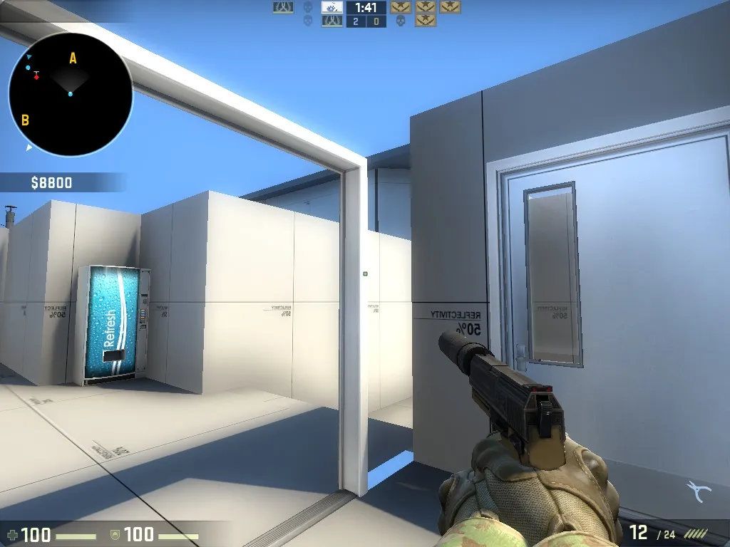
THX for fixing the workshop version I played a round with bots it was pretty fun,also you have a nodraw texture which is highly visible near CTspawn
-
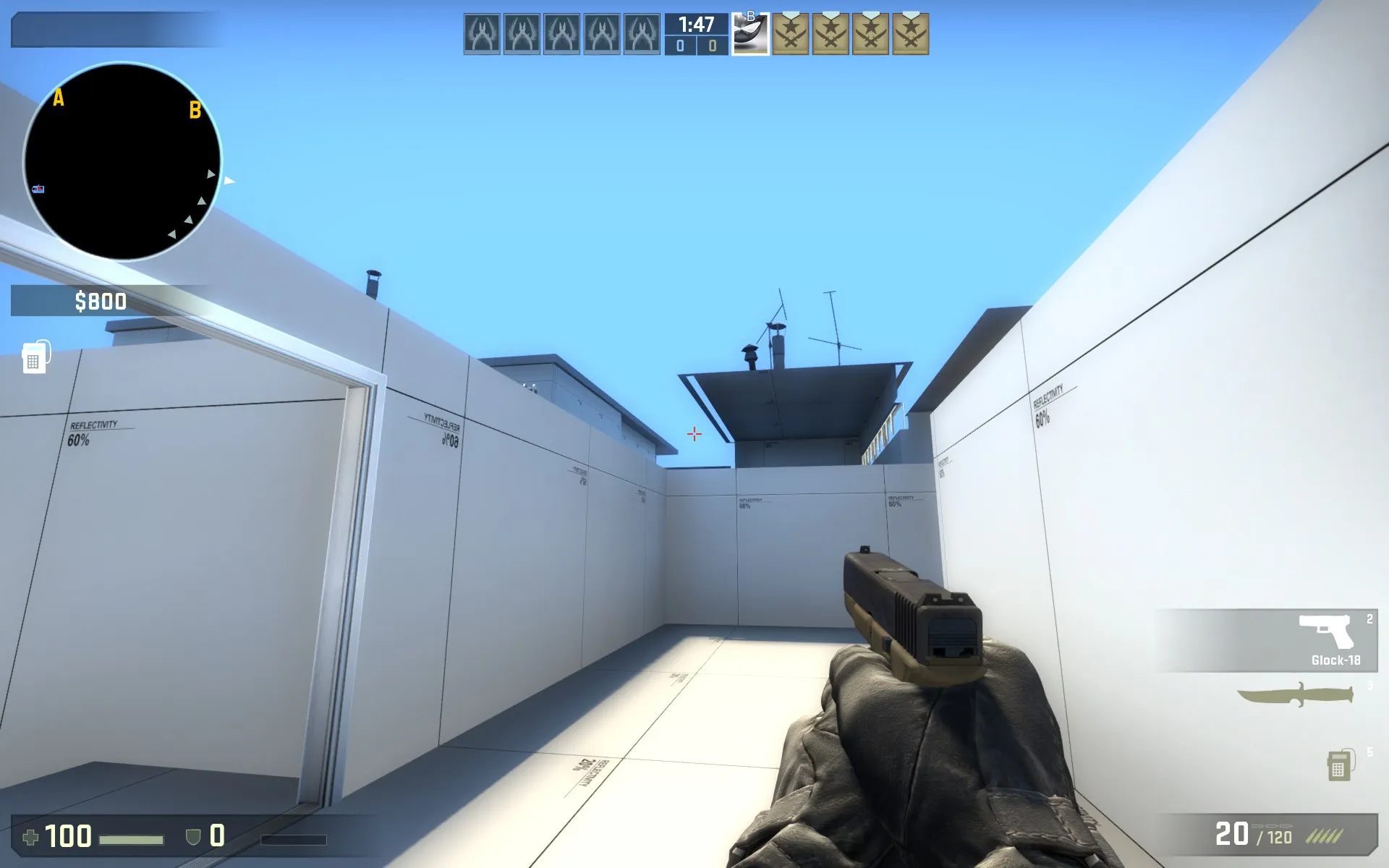
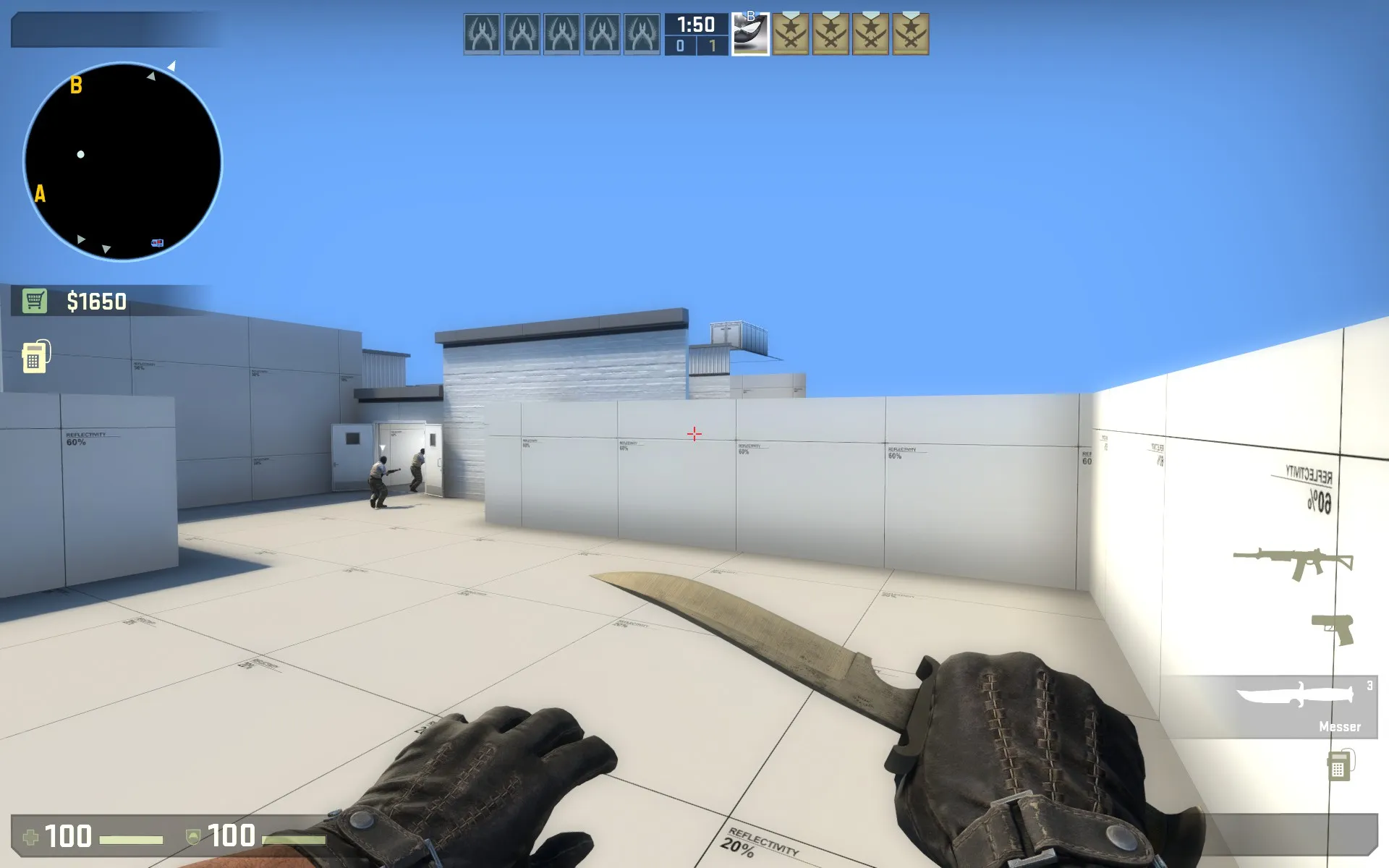
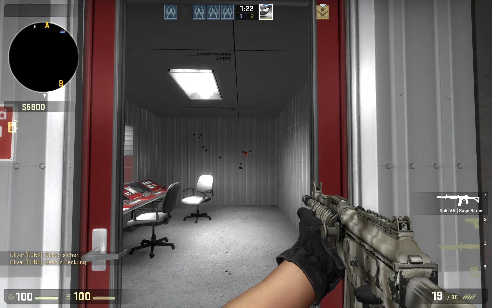
That Version is realy nice now. You can see how it is developing to an exelent map. Right now ho are having some visible nodraws.
The redesigned small roumd looks very nice, just the door has no glass in it, so it is looking even more accessable.
-
Quote from Shibou
2 hours ago, Shibou said:
 Quote from Ruthlesswill
3 hours ago, Ruthlesswill said:
Thanks guys for checking the map out! I am aware of a lot of issues with the workshop as it is fairly outdated and a lot have been fixed, the version on there right now was really just for my friends to see. Thanks though for checking it out and you kind support, it really motivates me to keep going!
-
Progress has been slow. I realised I needed to extend the scope of the map for it to improve visually so I have decided to try make the map feel more alive by adding a greater number of unreachable areas. With such additions also come several new points to take into consideration such as separating playable areas from inaccessible ones. I hope to improve this over time.
The only area I have started with this mentality so far is the T route to A site. I am happy with the initial block out and like how the many building heights and layers create a busy and interesting visual above the players head.
All feedback is taken into consideration so please share any of your thoughts!
Pictures:
Spoiler [Blocked Image: http://images.akamai.steamusercontent.com/ugc/278470593322934895/D26EAA695B2C590A3980DA193B69D5FB39186780/]
[Blocked Image: http://images.akamai.steamusercontent.com/ugc/278470593322934782/F7BC912BDCE7E1C28EE14FC21C508EB4EA7BC804/]
[Blocked Image: http://images.akamai.steamusercontent.com/ugc/278470593322934437/6BB6086D02FACB0C9C49962B8BB0BE56CF6EA423/]
Video Before/After:
External Content www.youtube.comContent embedded from external sources will not be displayed without your consent.Through the activation of external content, you agree that personal data may be transferred to third party platforms. We have provided more information on this in our privacy policy. -
Quote from QuotingmcDisplay More
On 26-3-2016 at 8:45 PM, Quotingmc said: Are the highlights of red not enough? I may try add a second highlight colour but I fear it may be overwhelming.
I haven't really messed around with the lighting, will look at doing so.
I have collected over 40 images of nuke as reference (mentioned in an earlier post). I may try incorporate some of the style choices of nuke such as the bands of colour into my map.
Edit: Album - http://imgur.com/a/hEwkY
Is it really too clean? Nuke has little to no weathering and looks great. I don't want to turn it into you average dirty warehouse map.
Thanks guys for the feedback. These are the kind of discussions that will really benefit the map.
Well some extra highlights or some textures that break up the pattern would be cool.
But on the other side I like clean buildings and estethics we can mess up with blood spatter all over it.
-
Visually something to love already
-
 Quote from Tomato
2 hours ago, Tomato said: Well some extra highlights or some textures that break up the pattern would be cool.
But on the other side I like clean buildings and estethics we can mess up with blood spatter all over it.
Looking at it now, I agree, some areas have a lot of repetition with nothing to break it up. I will try my best to make it look a little more colourful with less repeating grey metal while still being clean enough to easily see your enemies. Thanks for the feedback!
EDIT: Just realised I never showed the updated B connector, will post next update as that looked to improve on some of those areas from the screenshots posted earlier.
 Quote from blackdog
2 hours ago, blackdog said: Visually something to love already
Thanks! Glad you like it.
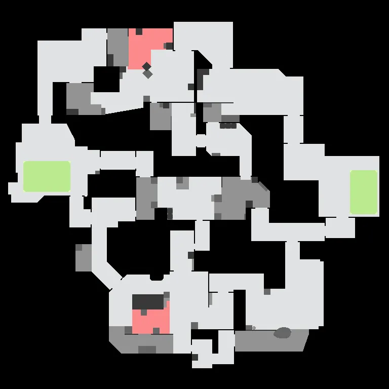
New Radar:
-
Participate now!
Don’t have an account yet? Register yourself now and be a part of our community!