1. Forums
  2. Discord
  3. About Mapcore
  4. Patreon Supporters
  • Login
  • Register
  • Search
This Thread
  • Everywhere
  • This Thread
  • This Forum
  • Articles
  • Pages
  • Forum
  • More Options
  1. Mapcore
  2. Discussions
  3. Level Design

[CS:GO]de_corp

  • spa
  • February 14, 2016 at 11:46 PM
  • spa
    • February 14, 2016 at 11:46 PM
    • #1

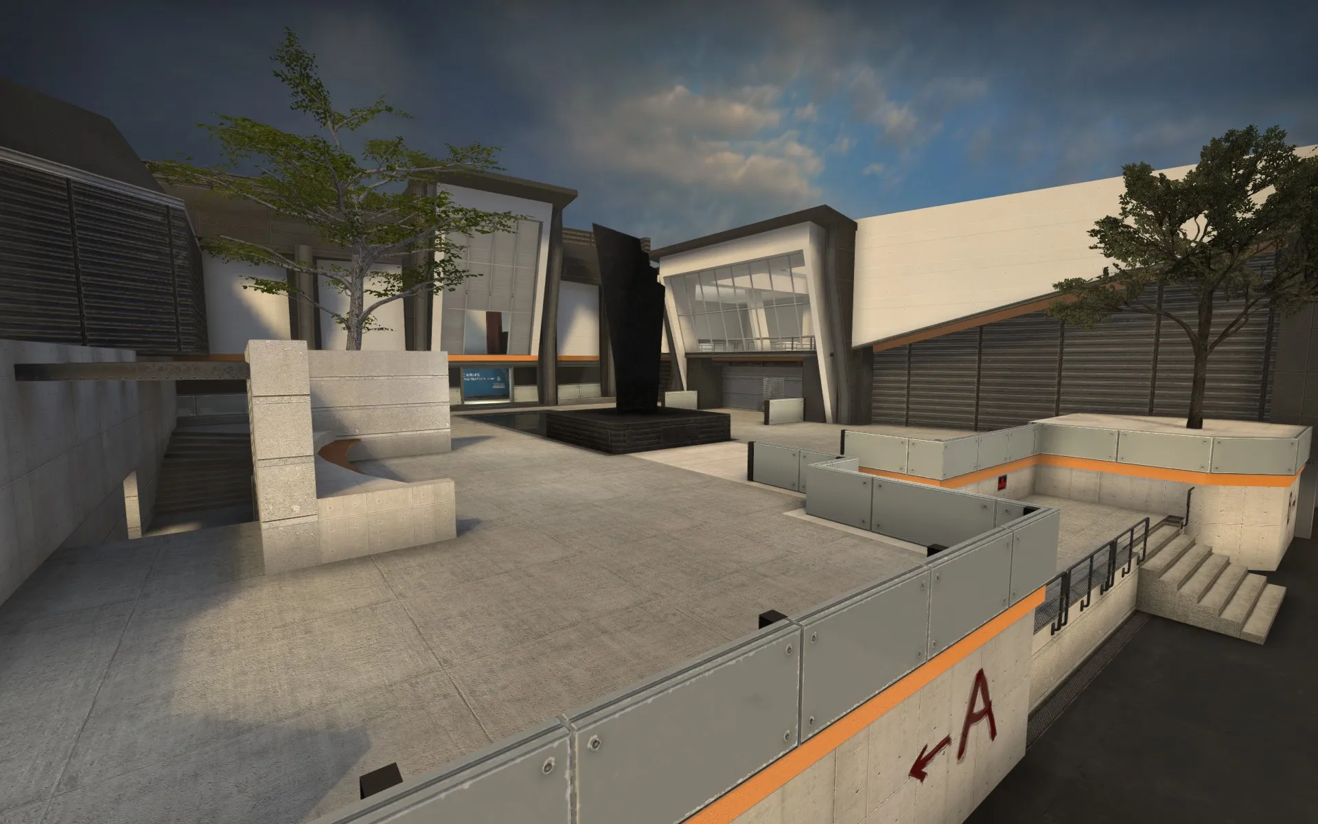
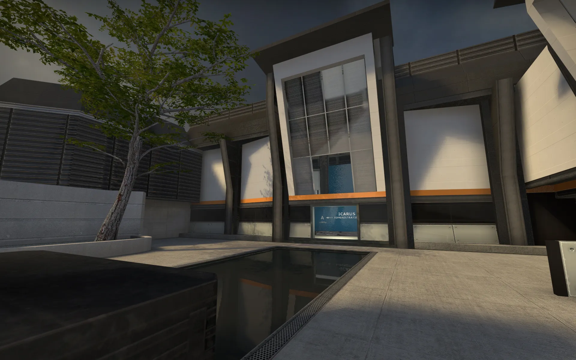
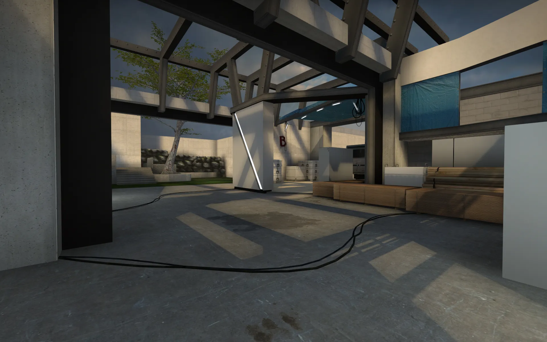
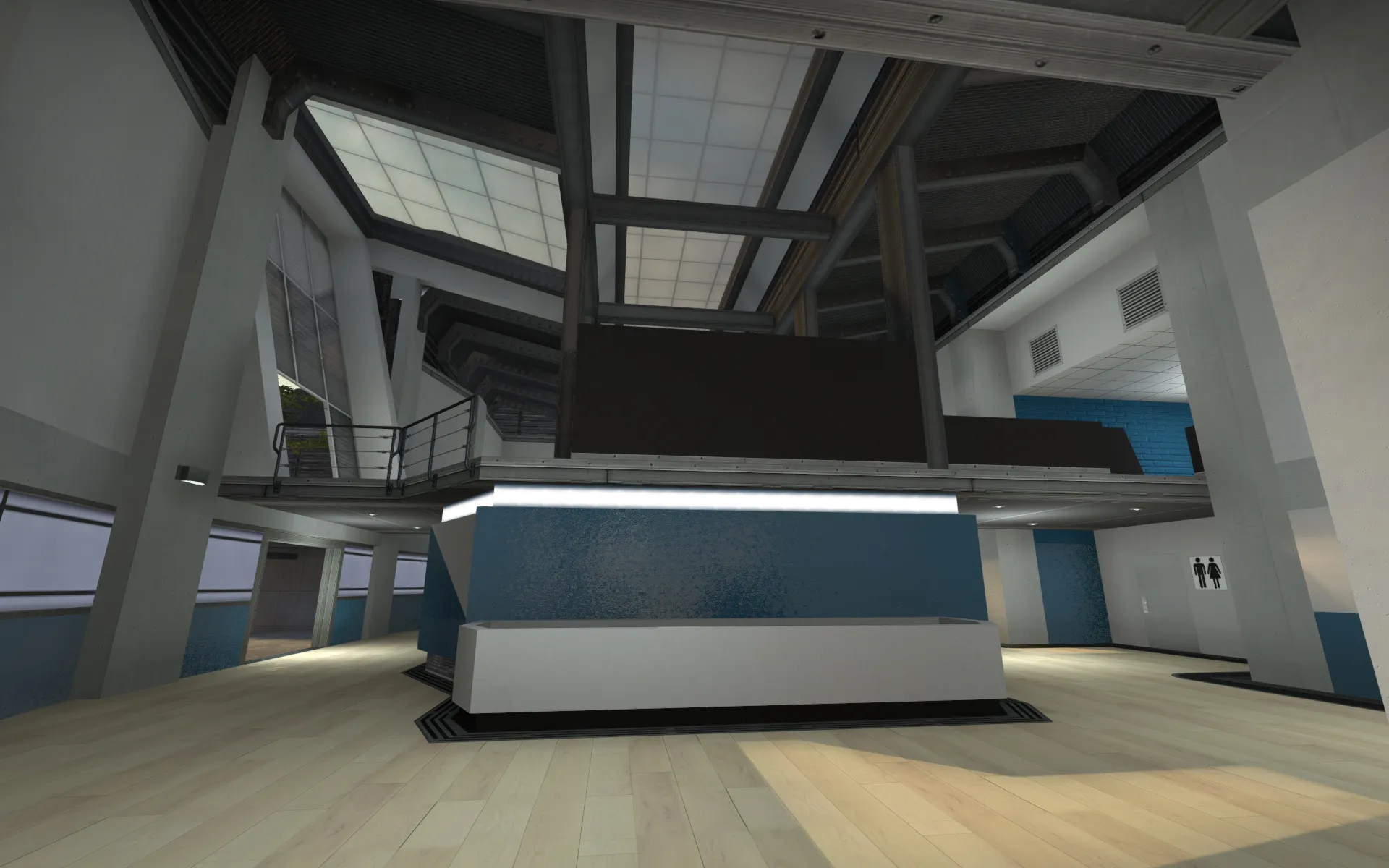
    Hi guys, im working on a competitive CS GO map and i would love some feedback and comments on what you think in terms of layout and overall gameplay:
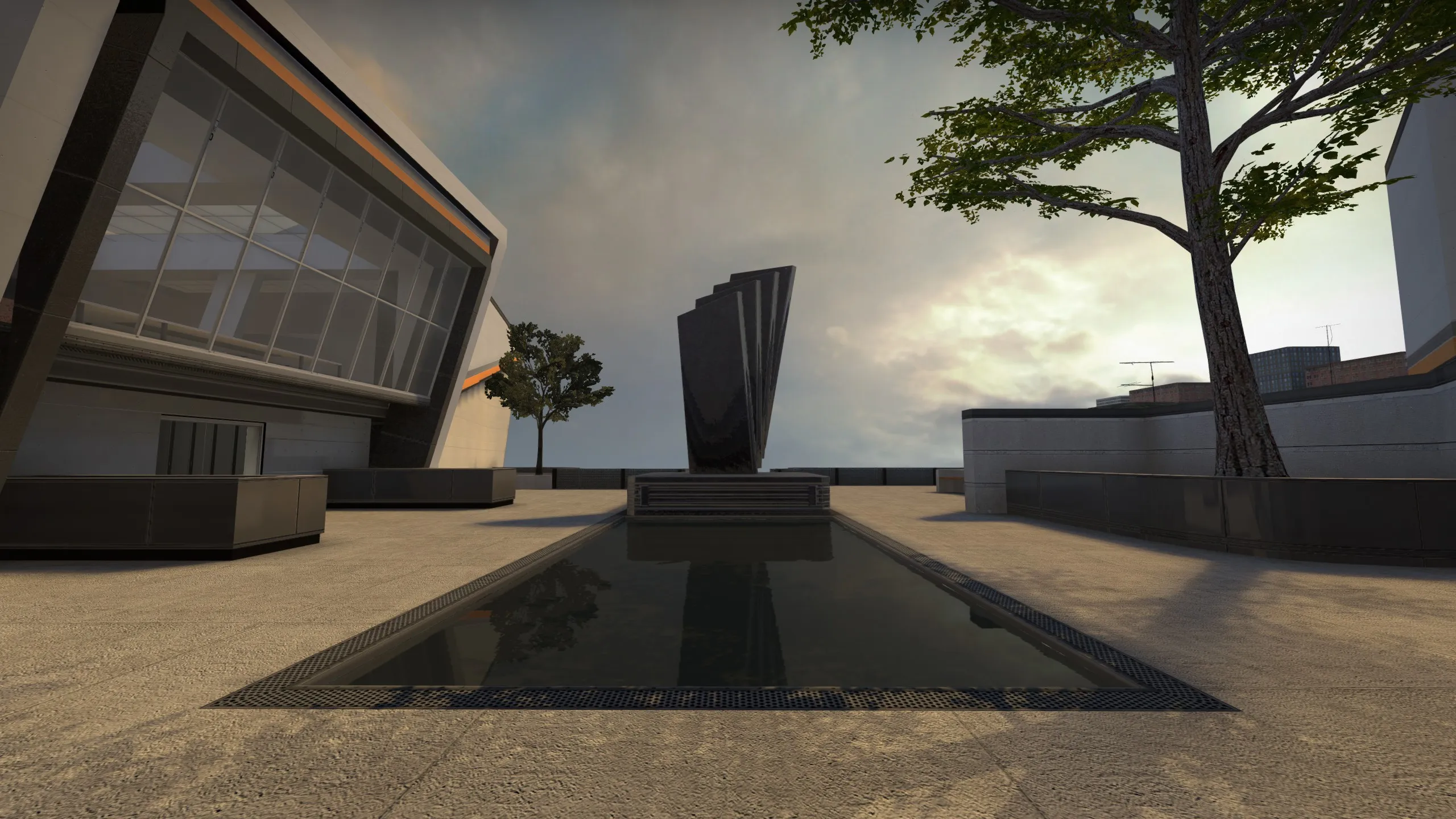
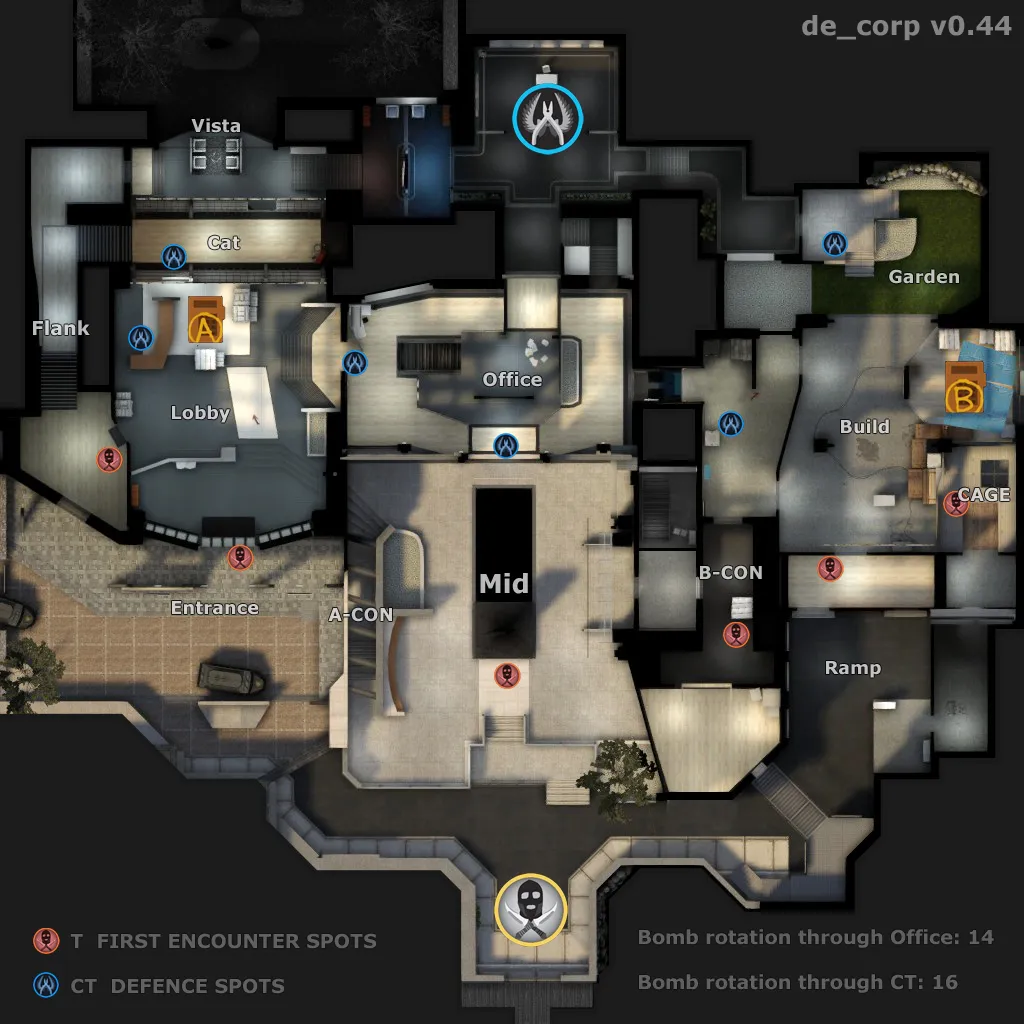
    (updated image to v0.49)

    de_corpA holding company has seen involvement in a major embezzlement scheme. Large amounts of illegally acquired cash are being evacuated from the newly build headquarter.

    Counter Terrorists are on site to defend the assets from insurgents.

    Terrorists have arrived to destroy the money, fight the power and bring down the 1%.


    Whats missing:

    - Better overall polish and custom textures/props like furniture, corporate art, construction site props.

    - Improved skybox (buggy water)

    - Embezzlement theme: chart on walls, and "Embezzlement for Dummies" book

    - Money crates on sites and a money trail between A and B site where the cash is being moved.


    Workshop link: (with more pics)

    http://steamcommunity.com/sharedfiles/fi…s/?id=585501542


    Map overview (with approximate timings)

    The content cannot be displayed because it is no longer available.

    The map is still in early alpha and the art obviously need a lot of polish.

    Thanks a lot for any feedback and comments in advance!

    And credit to de_agency props and TopHATTwaffle's realworld texture packs!

  • baem123
    • February 16, 2016 at 8:53 PM
    • #2

    Hi Søren!

    Same as de_outback: i thought that its sad, that you got no feedback, heres mine: (maybe you can also give me feedback, when i am able to create a thread for my map ^^)

    I cant tell you much about the gameplay, because i tested this map alone, but i liked many ideas you had and i would have liked to play a match on this map. it looks like it could be fun.

    Quote

    After i played the map, i read that you are a professional level designer, so maybe my points are nothing new to you, but i hope i can help you a little bit.

    [Blocked Image: http://i.imgur.com/eCUiV1g.jpg?1]

    it looks very awkward to use such a long steel beam. id try to change the direction.


    [Blocked Image: http://images.akamai.steamusercontent.com/ugc/312242235177251151/39C9101BAD15B323E8B96B81F85074953E366018/]

    I thought i could enter this area, when i first saw it. you need to add sth, to make the glass more visible and change the rotation of the glass. it looks awkward combined with the floor.


    [Blocked Image: http://images.akamai.steamusercontent.com/ugc/312242235177250769/2EBAA719DD8661FD93ACCC2C2056E0303D32D58B/]

    add window frames to all windows.


    [Blocked Image: http://images.akamai.steamusercontent.com/ugc/312242235177251905/7B302912F0B52E4B91A33701921F54052D7830D6/]

    a reserved pattern could help the carpet


    [Blocked Image: http://images.akamai.steamusercontent.com/ugc/312242235177250270/1806F847D4D427A48929C50C8042F37FD731F557/]

    this logo should be as high res as possible, because players like to jump around it and it catches the eye


    [Blocked Image: http://images.akamai.steamusercontent.com/ugc/312242235177349336/80D7E49F887EBF2F51B8527EABE951B8858D0859/]

    the curve of this bench needs more points, it looks blocky


    [Blocked Image: http://images.akamai.steamusercontent.com/ugc/312242235177250493/D31850A70CF1B4033757D37825E1AC9EA886F9BE/]

    this brushwork is awkward, but im sure youll find a better solution here and for these shadows in the water


    [Blocked Image: http://images.akamai.steamusercontent.com/ugc/312242235177250964/5302A5880787E5793F3349E79EA0F6E0505FE541/]

    this corner at B is bad, you dont fit in as a player but youll try to hide there, because there are only some pixels missing for you to fit in


    [Blocked Image: http://images.akamai.steamusercontent.com/ugc/312242235177349637/F19BDCA40234C5C11C4754F1131CE763C5C0E09F/]

    Remove this sign and the second one at b. it doesnt fit here, especially when the stairs lead to one main entrance of the building :D


    [Blocked Image: http://images.akamai.steamusercontent.com/ugc/312242235177251719/783BAEFAC0EADC85CE335A0CACC98B5329D4FB39/][Blocked Image: http://images.akamai.steamusercontent.com/ugc/312242235177251535/EFE0D33668AB63422EF9EBA027ED46A69E52D282/]

    this part looks good outside but i think it looks a little bit unrealistic inside with the white wall.

    everything is too grey outside. add more colors. dont forget to clip the stairs.

    Display More

    in summary i really liked the map. it has a huge potential.

  • spa
    • February 16, 2016 at 9:11 PM
    • #3

    Thanks a lot for the feedback man :) Its very encouraging!

    Yeah a lot of the art is pretty rough as im trying out different ideas and will probably change stuff as i go so i don't polish stuff too much atm. But your comments are still very helpful! and I agree with all of it. (well the trespassing sign is actually valid since the main entrance is at A Site and the road area is public, but not the plateau - the sign also reinforces that the terrorists are moving into a space thats off limits - but it needs tweaking!)

    Its a difficult balance of making the map look enticing enough that people will actually try it and not committing too much to the details so I can make structural changes if needed :)

    The last one you point out is interesting to highlight as my idea there was to have the windows slightly self illuminating as their back-lit by the outside light. But for some reason it doesn't accept my illumination map so its just displaying my lighter diffuse map, which looks really bad!

    Quote

    "LightmappedGeneric"
    {
    "$basetexture" "brushes/de_corp/window_inside_01"
    "$surfaceprop" "glass"
    "$bumpmap" "brushes/de_corp/window_outside_01_nrm"
    "$selfillum" "1"
    "$selfillumtexture" "brushes/de_corp/window_inside_01_illum"
    "$envmap" "env_cubemap"
    "$envmaptint" "[.1 .1 .1]"
    "$envmapcontrast" ".8"
    }

    Display More

    anything obvious im doing wrong here? Maybe its an alpha issue?

    Thanks a bunch again!

  • baem123
    • February 17, 2016 at 8:54 PM
    • #4

    i cant help you with this problem, but ive got other ideas

    Quote


    [Blocked Image: http://images.akamai.steamusercontent.com/ugc/3122424324…6E716CB712F11E/]

    i dont like the entrance to b as it is now, because you dont know what to do and you will end being killed from behind too often. i think the way it is in the picture above would lead to better gameplay and more options for good teamplay.


    [Blocked Image: http://images.akamai.steamusercontent.com/ugc/3122424324…D08D6373A66F47/]

    this area feels uncomfortable, maybe a second door could help, but the long concrete wall above might be the main problem.


    [Blocked Image: http://images.akamai.steamusercontent.com/ugc/3122424324…B97A9E1CBB3930/][Blocked Image: http://images.akamai.steamusercontent.com/ugc/3122424324…37EADC8C465D7A/]

    i feel uncomfortable in this middle area, if i leave the connector. there are so many angles to watch. i could see a path in the middle before i leave the connector and i could watch the right side when i leave.


    [Blocked Image: http://images.akamai.steamusercontent.com/ugc/3122424324…53D64E5AF160A4/]

    this bar at ct spawn destroys your nice ceiling.


    [Blocked Image: http://images.akamai.steamusercontent.com/ugc/3122424324…4FB30CF5579584/]

    i would lower this concrete at A (obv you could add some flowers there if you are ready for a release, remember - you need more colours :D).


    [Blocked Image: http://images.akamai.steamusercontent.com/ugc/3122424324…D090F8D922C95C/]

    it feels bad to hold A, if you stay behind the counter. these crates dont fit. but i have no better idea atm.


    [Blocked Image: http://images.akamai.steamusercontent.com/ugc/3122424324…645D722D8AD453/]

    if this would not be symmetric, A could be more interesting


    [Blocked Image: http://images.akamai.steamusercontent.com/ugc/3122424324…4151051E3C0060/]

    i feel insecure when i hide behind this box, maybe 4 more units would be enough.

    Display More

    dont forget to add your map to the mapcore playtest https://migrationtest.mapcore.org/topic/17116-ma…playtesting-40/

  • spa
    • February 17, 2016 at 11:23 PM
    • #5

    Really nice feedback! :D

    I especially like your idea about T entry to the B site sniper spot. I can even see the new side entrance moved further back to use the right side of the ramp a bit (its borderline dead space atm) and make the commitment even greater!

    About Mid room: Its by design that your supposed to feel unsafe because its the "hub" for the CT and any T's that go there should watch their back because it gives great rotation options to either side. Its a risk assessment i like that the player feel. Also if a CT decides to camp the sniper spot he should make sure he has team mates covering his back on each side - he shouldnt get that spot "for free".

    Great point about A site. Its the "loose" cover crates that im least certain about so its nice to get some feedback there. I can see tweaking the entry though to make it less symmetric if i can find a way to pull it off. Ill think about that one!

    Ill definitely consider submitting it to playtesting once i have another solid iteration on it.

    Thanks so much!

  • jakuza
    • February 18, 2016 at 1:35 AM
    • #6
    Quote from spa

    "LightmappedGeneric"{ "$basetexture" "brushes/de_corp/window_inside_01" "$surfaceprop" "glass" "$bumpmap" "brushes/de_corp/window_outside_01_nrm" "$selfillum" "1" "$selfillumtexture" "brushes/de_corp/window_inside_01_illum" "$envmap" "env_cubemap" "$envmaptint" "[.1 .1 .1]" "$envmapcontrast" ".8"}

    I think $selfillumtexture is outdated. Try storing the mask inside your base texture's alpha channel instead.

  • spa
    • March 3, 2016 at 11:13 PM
    • #7

    Thanks a bunch jakuza - it works now! :)

    Update!
    http://steamcommunity.com/sharedfiles/fi…s/?id=585501542

    The content cannot be displayed because it is no longer available.

    The content cannot be displayed because it is no longer available.

    The content cannot be displayed because it is no longer available.

    Apologies for the lack of updates, but I have one now with some tweaks and more colors. I also shamelessly used some of the amazing CS_agency textures and props (by Rick_D) to spruce up the map. Ill still play around with textures and find the right balance and hopefully have time to fill out with more of my own custom stuff.

    Im still not completely sure on the right way to get more color into the map but my plan atm is that 'orange' is outside and immediately visible to T, while blue is inside and represents the CT area. I want to play up the feeling that each team "belongs" in certain parts of the map.

    Also added more breakable glass - some places are still a bit ambiguous whether the glass should be breakable or not.

    I added glass that must be broken to enter the long A flank from T side - this is still just a test to see if its cool or not, but i like that a single T can "fake" going long by breaking the glass and then go short. It also plays up the idea of raiding the building. However, this might constrict bots from entering - any insight about that and how this interacts with navigation ?

    Any comments on gameplay, layout and the spaces in general are greatly appreciated ! =)


    The content cannot be displayed because it is no longer available.

  • Nohns
    • March 4, 2016 at 3:52 PM
    • #8

    Wow this looks pretty nice! Keep up the good work!

    Hilsen Asger ;)

  • baem123
    • March 4, 2016 at 8:27 PM
    • #9

    yes it looks good, pls stop making it look even better for now, a first playtest is overdue!

  • spa
    • March 6, 2016 at 8:10 PM
    • #10

    Thanks alot guys! :)

    I made a small-ish update to fix some things and add 10 more spawns so its eligible for play testing:

    http://steamcommunity.com/sharedfiles/fi…s/?id=585501542

    (For some reason i had huge problems updating this time around. Kept getting error 16 or 10. )

    The content cannot be displayed because it is no longer available.

    Placeholder-ish sign at mid. Its that fine line between making sense in the context of the player navigating the map and real world believeability :)

    The content cannot be displayed because it is no longer available.

    Entrance to the Cage sniper spot. Again trying to reinforce that trespass-feeling (yes i know some of the bricks are mapped wrong but im still just establishing ideas). I blocked off the low opening into the main are to give more emphasis on the upper positioning. I also allowed getting into the cage from lowground by jumping the boxes. Before you needed a boost. (i now added a post possibility at A entrance).

    Btw the sniper spot may be a little too OP since you can stand more safely on the ramp and shoot over, but i think this just encourages CTs to sneak into the site and contest through the grate in the cage floor.

    The content cannot be displayed because it is no longer available.

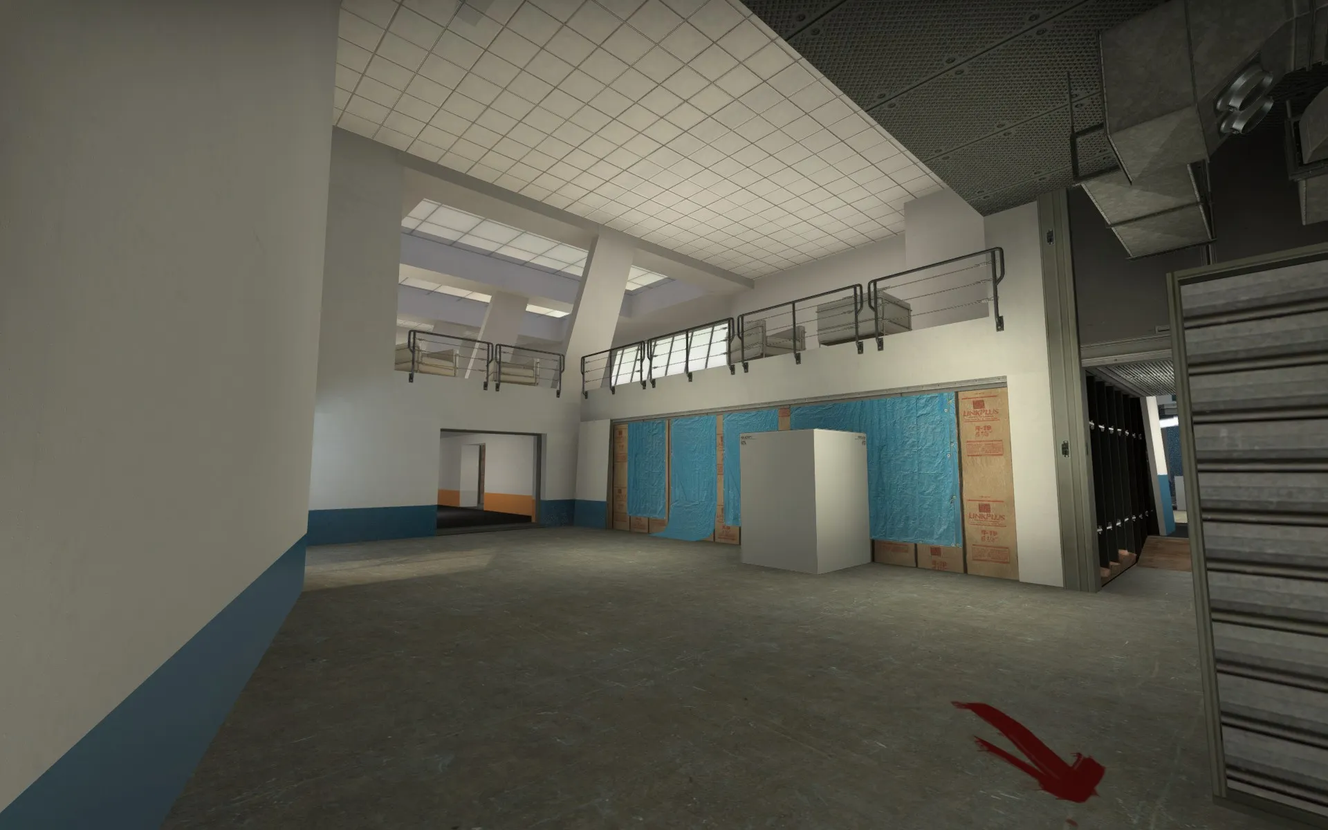
    Some more coloring and detail. Ive lowered in ceiling in the orange section to make it seem like a "finished section" in contrast to the blue T area. Ive managed to keep to higher opening over the door for grenade options. I also really need to replace that ugly placeholder box in the hallway. I tried using a vending machine prop but they are just too small.

    Don't hesitate to give more comments and feedback. Ill look into play testing whenever possible.

  • spa
    • April 16, 2016 at 5:01 PM
    • #11

    Workshop Link

    Another update since i was unhappy with a few areas in the level and needed to try out a few things:

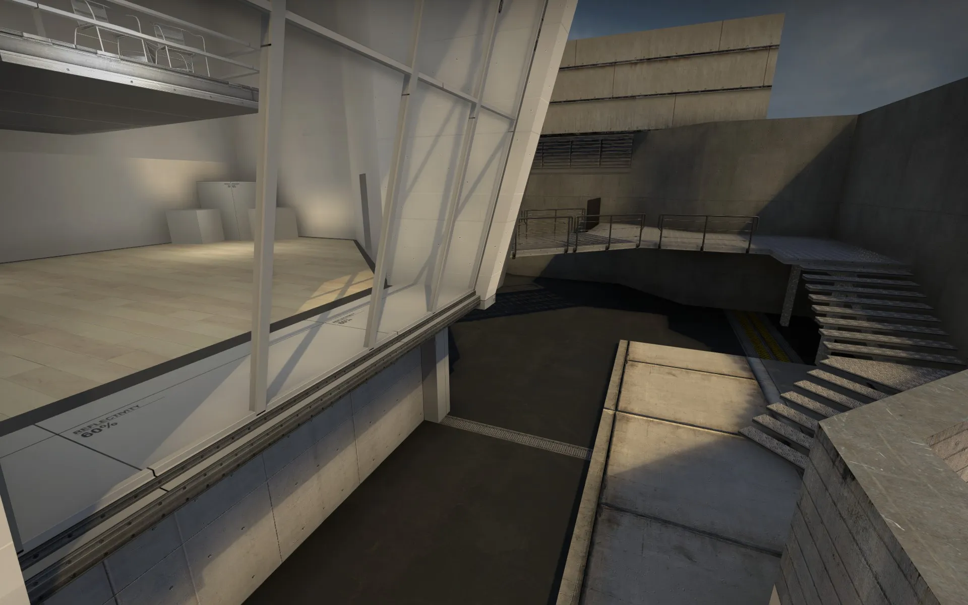
    Ive worked on the facades in mid and Ive added an upper floor (cantina) that cant be reached by the players but ties different parts of the level together. Here it can be seen through the large open windows in mid.


    And here it can be seen above the connector area between mid and B.


    It also ties into the B con entrance area from T side (upper left corner with the chairs). This area changed alot since i didnt like the grungy basement i was going with initially. It didnt look like youd expect from the posh exterior. So i added a big vista room instead tying together with the Bcon path. This also fixed another problem i had: the street entrance was on the inner corner of the T path so you could easily miss it when running B. By adding this more elaborate fire escape staircase it creates a more interesting path for the player to traverse and presents itself in advance. It also dealys T a bit to the connecter area and makes the main entrance to B relatively stronger.


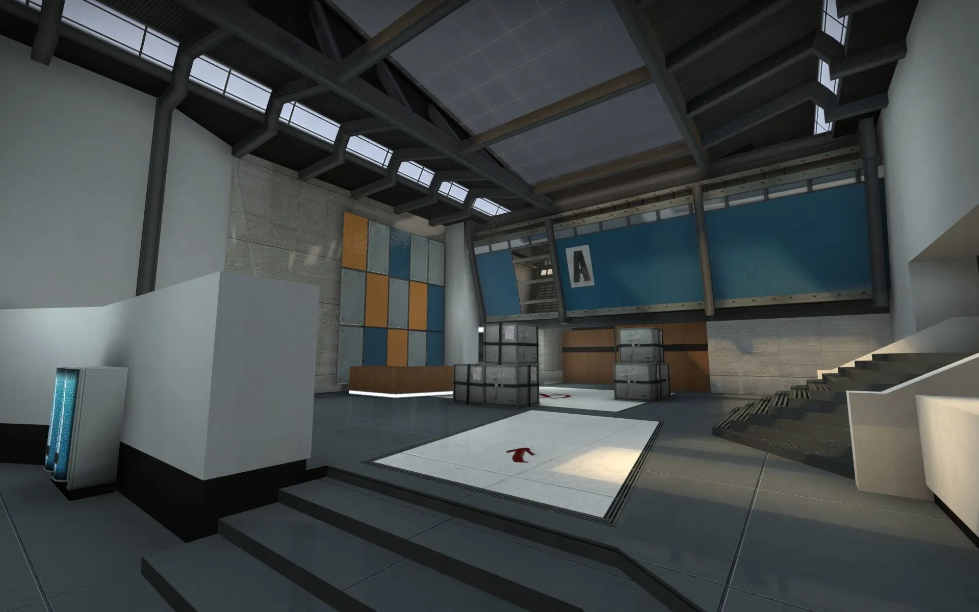
    I did a bunch of iterations on A. especially the roof section. I kept having pillars going down through the center of the room and it just felt too oppressive so ive settled on this more open design. I plan to make the colored plates behind the lobby counter shootable in later updates :)


    Please let me know if you have any comments on game play or cool ideas.

    I am not looking for gfx-nitpicks at this stage though (Some areas are still quite rough).

    I should probably get this tested at some point..

    Oh and if someone is kind enough to try it out let me know if there's any props missing (or reflections?) since this version is half the size of my last build, so maybe VIDE is playing tricks on me

  • baem123
    • April 16, 2016 at 7:24 PM
    • #12

    im glad that you gave us another update, unfortunately vide may have done sth wrong.

    there are black boxes and wireframes everywhere, while i didnt turn the wireframe mode on. interesting... i restarted cs, but the problem remained.

    [Blocked Image: http://images.akamai.steamusercontent.com/ugc/273966993692667711/A3717E9A9870DC6135B38A8E8FB5CBB3CDDB2D3D/]

  • spa
    • April 16, 2016 at 7:50 PM
    • #13

    Thx for letting me know! ill take a look :)

    Edit: fixed!

    Workshop Link

  • spa
    • April 23, 2016 at 1:50 PM
    • #14

    Update v0.44

    Workshop Link

    Reworked the B site a bit, added general polish. and finally updated the radar!

  • spa
    • August 13, 2016 at 3:41 PM
    • #15

    Update with reworked B, facades and polish. I feel pretty good about the map as an alpha map but it still requires a lot of art polish and play testing. Many textures and props can change, and the background vistas needs a lot of work at some point (the water is a bit wonky, if anyone know how to make it proper id like to know :) ). I probably have went a bit too far with the map considering the lack of play testing, but i wanted to nail down some things before committing to the next step. And its great fun to work on!

    Workshop Link

    The content cannot be displayed because it is no longer available.

    The content cannot be displayed because it is no longer available.

  • RA7
    • August 16, 2016 at 7:43 PM
    • #16
    Quote from spa

    On 8/13/2016 at 4:41 PM, spa said: May be some fallen leafs here?

    It looks a bit "too clean" for my taste.

    The content cannot be displayed because it is no longer available.

    The content cannot be displayed because it is no longer available.

    The rest looks pretty sweet..

  • spa
    • August 18, 2016 at 10:28 AM
    • #17

    Thanks man, ill look into making it a bit more worn and detailed after alpha testing. Leafs are a good idea!

  • slavikov4
    • August 27, 2016 at 6:53 PM
    • #18

    seriously? :)

  • spa
    • August 27, 2016 at 8:21 PM
    • #19

    Yeah I didnt patch the level with player clips for this stage, I assumed ppl would stay on the player area. Lesson learned

    Oh and if anyone knows how to make a proper water plane that goes into the horizon i definitely could use some help.

  • slavikov4
    • August 28, 2016 at 11:13 AM
    • #20
    Quote from spa

    14 hours ago, spa said: Yeah I didnt patch the level with player clips for this stage, I assumed ppl would stay on the player area. Lesson learned

    Oh and if anyone knows how to make a proper water plane that goes into the horizon i definitely could use some help.

    about scale of the buildings, those buildings must be in 3d skybox

Participate now!

Don’t have an account yet? Register yourself now and be a part of our community!

Register Yourself Login
Discord

The Mapcore Discord is our lively IRC channel of the 2000s reborn. Chat about level design, gaming, and more.

Latest Posts

  1. Custom Gamemodes Contest

    Angel
    July 20, 2026 at 11:46 AM
  2. FAQ

    Angel
    July 20, 2026 at 10:14 AM
  3. Tangerine

    Harry Poster
    July 18, 2026 at 11:10 AM
  4. Any of the old guard still around? D:

    Warby
    July 12, 2026 at 8:23 PM
  5. About our archived forums

    Thrik
    June 30, 2026 at 2:12 PM
  6. Mapcore Discord

    mason_fan123
    June 24, 2026 at 8:52 PM
  7. [CS2] Valley

    Serialmapper
    June 22, 2026 at 11:56 AM
  8. Free Music / SFX Resource - Over 2500 Tracks

    Eric Matyas
    June 18, 2026 at 12:32 PM
  9. Pango [WIP]

    Elowen
    June 11, 2026 at 10:13 AM
  10. [CS2] Dvina

    Jeremy Rivera
    June 11, 2026 at 10:03 AM
  1. Privacy Policy
  2. Contact
Powered by WoltLab Suite™