

ye
Workshop download:
http://steamcommunity.com/sharedfiles/fi…s/?id=617632332
updating threads regularly is for nerds

ye
Workshop download:
http://steamcommunity.com/sharedfiles/fi…s/?id=617632332
updating threads regularly is for nerds
From what I have seen running around it, de_ridge looks like it has a lot of potential. Just needs to get finished 

Some stuff needs clipping

Tiny displacement cut here

Nodraw visible on this side
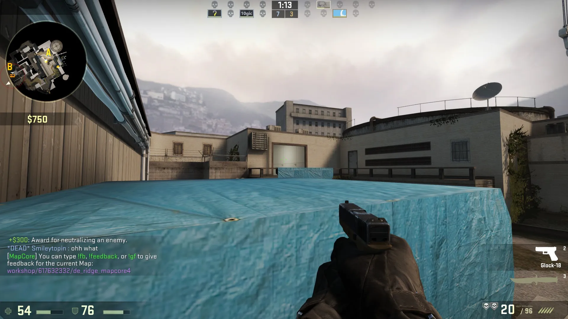
That ivy on the right is the exact size of a CT, and about the same dark colour too. It might be nice to place that somewhere else, as in a split second scenario it might be confusing?

I think moving the stairs to the other end of the hallway would make it more fun to play B site. Right now the entrances all feel very flat, especially where angles are held.Also, the map is flanking central. It was easy for me to knife the mid sniper, twice! Maybe you could remove some routes, such as the T -> A vent?
- timings and CT control are pretty much non existant at the moment. Terrorists need at least to be moved back at least 3-4 seconds
- Vent to A is stupid powerful. changing the timing will help here but the difference in height should be lowered a bit imo so CTs have a better angle on it. Less awkward headpook fights
 Quote from Vaya
headpeak fights
 Quote from Tyker
Also, the map is flanking central. It was easy for me to knife the mid sniper, twice! Maybe you could remove some routes, such as the T -> A vent?
Agreed...
This map has too many flanks, some areas are almost impossible to hold because either side would just flank. Try making it harder to flank (to start, remove the vent area). A site is fine with not having two routes for Ts, the one main route is large enough. The vent that goes closer to A makes the cover on the outside wall of A useless, as it can be shot at from near T spawn and the exit of the vents.
Try moving T spawn back a little, CTs have no time to setup on either site.
Update!
General:
Added a whole new area leading up to A-Site which makes the route from T to A Site take a longer amount of time. This means that CT's now actually have time to set up on the site before instantly being rushed down by T's. Additionally, some other minor changes were made to reduce how quickly T's can get to places. Here's some pics of the new area:
[Blocked Image: http://i.imgur.com/0YdqOtL.jpg][Blocked Image: http://i.imgur.com/1QPtMXn.jpg][Blocked Image: http://i.imgur.com/1aYBc04.jpg]
The new timings are as follows:
LAYOUT PIC:
[Blocked Image: http://i.imgur.com/CWZHNSl.png]
All the timings are based on the quickest possible route.
I also made the map brighter.
_______________________________
A Site:
Removed the T vents leading into the site.
[Blocked Image: http://i.imgur.com/ReWxvZw.jpg]
Replaced crates in the corner with a rocket silo. This removes an awkward head peeking angle into the stairs leading up to the railings. I also changed the railing on A site so that you can now no longer see or shoot through it.
[Blocked Image: http://i.imgur.com/TrpmlPE.jpg] [Blocked Image: http://i.imgur.com/OAlRxih.jpg]
Replaced the main tarp-covered crate with a metal one.
[Blocked Image: http://i.imgur.com/cs9ysHR.jpg]
Widened the CT entry into the site to make it less claustrophobic.
[Blocked Image: http://i.imgur.com/DJBBrWr.jpg]
Removed the rock leading up to the elevated area in front of A Site so that T's can no longer abuse jump scouting. Added crates instead.
[Blocked Image: http://i.imgur.com/1LMzeXL.jpg]
_______________________________
B Site:
Added more cover around the CT Platform to make CT positions more safe.
[Blocked Image: http://i.imgur.com/I5hMHSa.jpg]
Moved the CT entrance into the site to the wall next to it. This makes retaking the site less awkward. Also added crates to prevent an awkward angle from one entrance to another.
[Blocked Image: http://i.imgur.com/2D7h660.jpg]
_______________________________
CT Spawn:
Reduced size of CT spawn and moved it closer inwards towards the map. This allows for CT's to get into sites and mid faster.
[Blocked Image: http://i.imgur.com/jbv9PaK.jpg]
Changed around the stairs leading into Mid and B. This removes any head peeks that were previously there. It also makes CT spawn less flat.
[Blocked Image: http://i.imgur.com/4PBf82N.jpg]
_______________________________
T Spawn:
Moved T Spawn slightly further back. Made the area more focused and less cluttery.
[Blocked Image: http://i.imgur.com/SVhR2QK.jpg]
_______________________________
Mid:
Removed the construction in the middle of mid which allowed for T's to push mid with ease and gain a lot of free control. Added some other things to compensate for the empty space. I also moved the T side entrance into mid further back towards T Spawn to make CT AWPers feel safer.
[Blocked Image: http://i.imgur.com/fwmEvcn.jpg][Blocked Image: http://i.imgur.com/xemYDmH.jpg]
_______________________________
And some other minor changes too, but if I included them all the post would be really long. Also, a major thank you to the people who playtested the map.
I was about to post some feedback, but you just updated the map, so it's kinda irrelevant 
I guess I was the only one that liked the Vent-To-A?  My thoughts we're that if CT's were given a couple more seconds to set up they could boost up there, creating a strong defensive position.
I still think that one major flaw remains, the defensive line for T's towards B. I managed to handle it pretty well in the playtest, but any organised push from the CT side would destroy the T's.
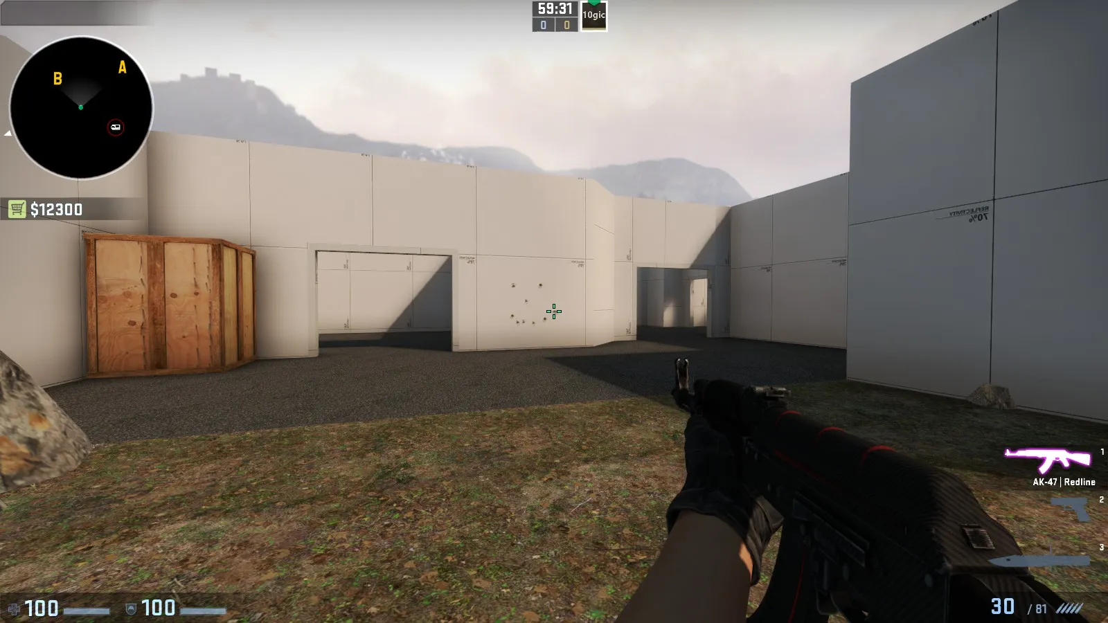
It's very hard to find a position that isn't exposed from another entrance and CT's has a couple of ridiculous lines of sight.
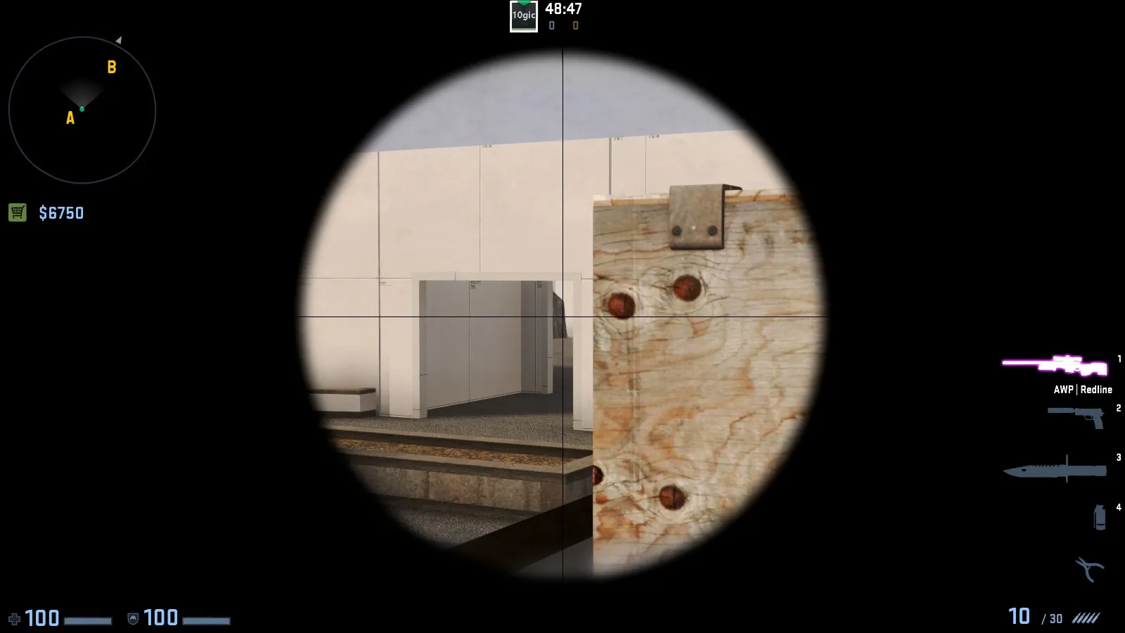
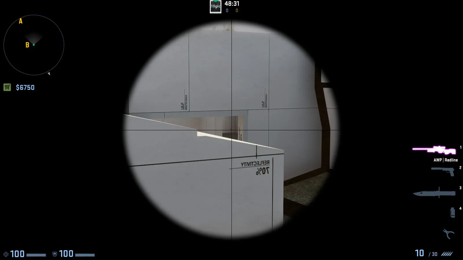
I think you should rework this area to something that 1-2 T's can defend. Some cover in the middle of the area would be nice 
Update:
A Site:
Replaced an old crate with a new one to fit the rest of the site better. Also changed around some textures and added more detail on the site in general.
[Blocked Image: http://i.imgur.com/iZUzHce.jpg]
I also changed the T route into A. The elevated part of the pathway was replaced with a small indoors area which completely removes the awkward angle which caused some ridiculous firefights a few seconds into the round.
[Blocked Image: http://i.imgur.com/3jYF7l6.jpg][Blocked Image: http://i.imgur.com/ww09n60.jpg]
_______________________________
Mid:
I made mid a bit narrower in general. Previously it was too big and open. Started detailing one side of mid. (I know the wire looks horrible right now. It's WIP.)
[Blocked Image: http://i.imgur.com/86OiSoh.jpg][Blocked Image: http://i.imgur.com/ZllTIYg.jpg]
Changed the Mid to B connector. Now it's closer to the T side of mid and the connector itself is a more complex area, which prevents CT's from being able to rush and flank T's going into B.
[Blocked Image: http://i.imgur.com/uG4prvp.jpg][Blocked Image: http://i.imgur.com/J5cIJR0.jpg]
Moved the vent exit to a different wall, removing some awkward angles. I also made some walls thicker to make wallbangs less effective. Added some crates for more defensive opportunities for T's.
[Blocked Image: http://i.imgur.com/WUMj2uN.jpg]
_______________________________
B Site:
Changed around some crates and made some pathways thinner. Made the window in B smaller as it was just a bunch of awkward angles before.
[Blocked Image: http://i.imgur.com/pEIMXxN.jpg][Blocked Image: http://i.imgur.com/RBuaDxW.jpg][Blocked Image: http://i.imgur.com/1mtUROA.jpg]
Added some defensive cover for T's before they enter choke points to make CT's rushing B less effective.
[Blocked Image: http://i.imgur.com/z48CUZy.jpg]
_______________________________
T-Spawn:
Minor changes to make timings to bombsites more even.
[Blocked Image: http://i.imgur.com/5wgCiMs.jpg]
Thanks again to everyone who play tested and provided feedback. Also, Jackophant is great.
It still needs a lot of work, but the general atmosphere & theme is there. I plan on replacing some generic things like the 'PARKER' logo with my own custom assets once I think of a name for the fictional company...
[Blocked Image: http://i.imgur.com/vJQuQid.jpg][Blocked Image: http://i.imgur.com/hO5lP5q.jpg][Blocked Image: http://i.imgur.com/p3YnJ5l.jpg]
I plan on replacing some generic things like the 'PARKER' logo with my own custom assets once I think of a name for the fictional company...
Hambhurghers
 Quote from blackdog
Hambhurghers
Can you explain the Hurg. I get it is a running mapcore thing and there is an emoticon, but I don't get what it means XD
First rule of the Hurgh club: you do not talk about the Hurgh club.
Quote from blackdogHambhurghers
Thought this was a Pink Panther quote at first glance:
https://www.youtube.com/watch?v=Z6oeAdemFZw (why isn't this embedding? :()
@Wrakk Mid's looking great, but I still think you need to shorten it and then you might not feel like the trees would be necessary (at least centrally). Obscuring a player's vision like that, even with these narrow trees can throw people off, especially as they don't serve a functional purpose.
Similarly to the lampost at the bottom of mid on inferno, you'd want people cursing their own lack of aim rather than a model/prop that is stopping them from making a kill.
 Quote from jackophant
@Wrakk Mid's looking great, but I still think you need to shorten it and then you might not feel like the trees would be necessary (at least centrally). Obscuring a player's vision like that, even with these narrow trees can throw people off, especially as they don't serve a functional purpose.
Similarly to the lampost at the bottom of mid on inferno, you'd want people cursing their own lack of aim rather than a model/prop that is stopping them from making a kill.
Thanks for the feedback. While I agree that obscuring vision is never good, I don't think the trees cause that much of an issue. They are placed in locations where no common line of sight would go through. By that I mean they don't block vision from any entrance into any other entrance or strategic point. The lamp post in Inferno is a bigger issue because it obscures one of the most common sight lines and since it's metal, it's nearly impenetrable.
Either way, if they do prove to be an issue while playing, I'll remove them. Thanks again!
Either way, if they do prove to be an issue while playing, I'll remove them. Thanks again!
No worries!
Also, just out of interest, did you make mid any shorter or is it the same length as before?
Quote from jackophantNo worries!
Also, just out of interest, did you make mid any shorter or is it the same length as before?
I made it thinner and a bit shorter.
Update:
Completely new B Site. Last one was full of awkward angles and head peeks so I scrapped it and just re-designed it completely.
Pics:
[Blocked Image: http://i.imgur.com/cHvo9vj.jpg][Blocked Image: http://i.imgur.com/vfH8W27.jpg][Blocked Image: http://i.imgur.com/gn7es3b.jpg][Blocked Image: http://i.imgur.com/w10PheV.jpg]
Hopefully this one will be better. I'm a bit worried about it becoming crate central though. Radar is shitty right now but I swear I'll bother to make a good one some day.
Workshop is also updated. http://steamcommunity.com/sharedfiles/fi…s/?id=617632332
Some stuff I guess:
Spoiler [Blocked Image: http://i.imgur.com/2cW33Bp.jpg]
Some things still need a lot of work, especially the interior. Feels kinda cluttery right now.
Don’t have an account yet? Register yourself now and be a part of our community!