1. Forums
  2. Discord
  3. About Mapcore
  4. Patreon Supporters
  • Login
  • Register
  • Search
This Thread
  • Everywhere
  • This Thread
  • This Forum
  • Articles
  • Pages
  • Forum
  • More Options
  1. Mapcore
  2. Discussions
  3. Level Design

[CS:GO] Incursion (formerly 'de_docks')

  • MinorThreat
  • September 15, 2015 at 4:17 PM
  • MinorThreat
    • September 15, 2015 at 4:17 PM
    • #1

    I've been working on a bomb scenario map that is set at a dock. I think it's reached a point where it would be a good idea to playtest it before I go any further. Before I do that, I was wondering if anybody could provide any feedback on what I have made so far.

    Here's the link to the Workshop file:

    http://steamcommunity.com/sharedfiles/fi…s/?id=518771182

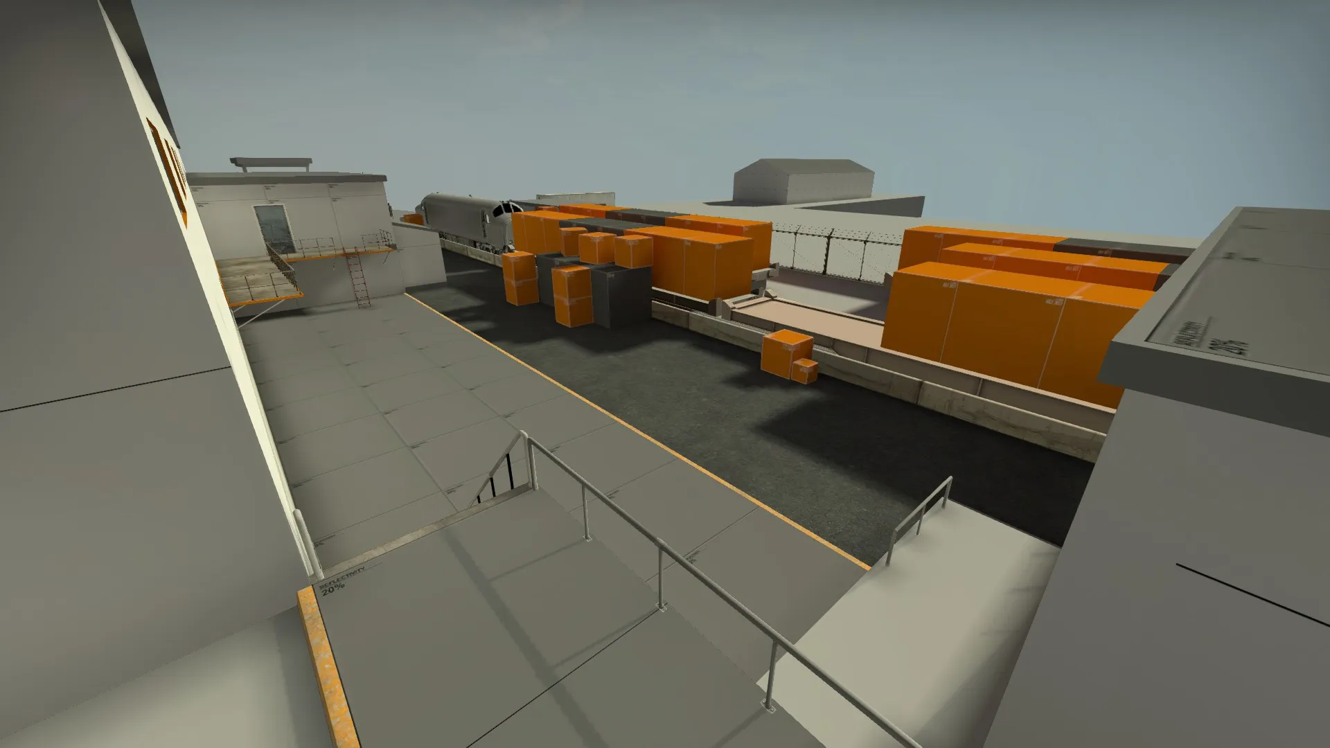
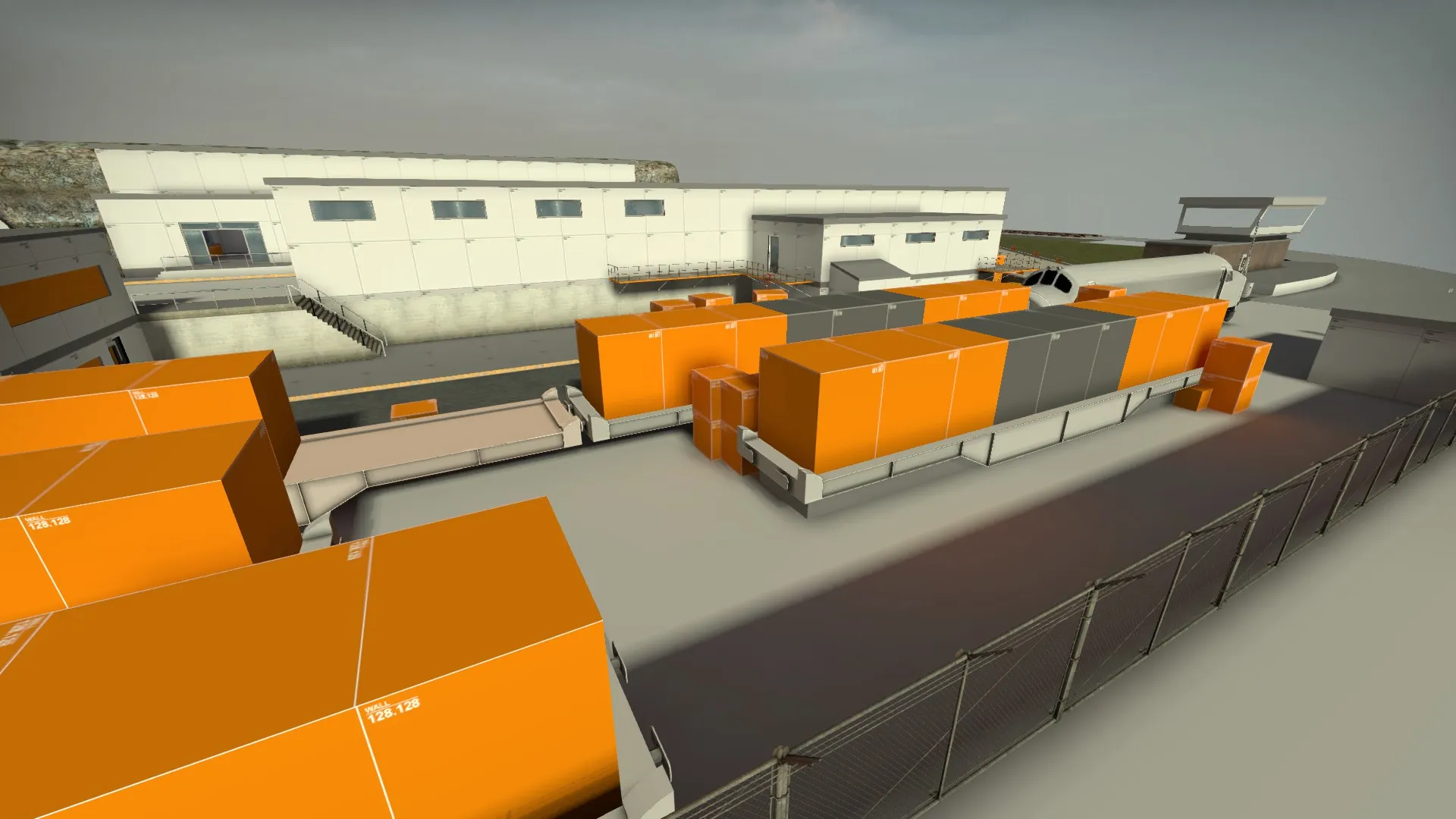
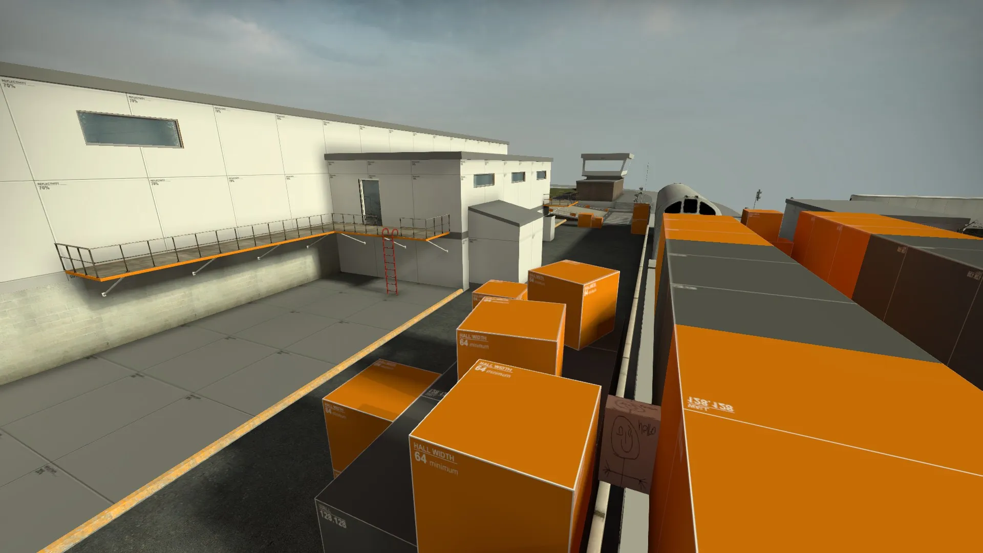
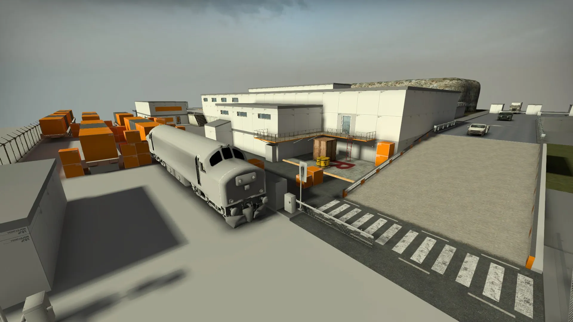
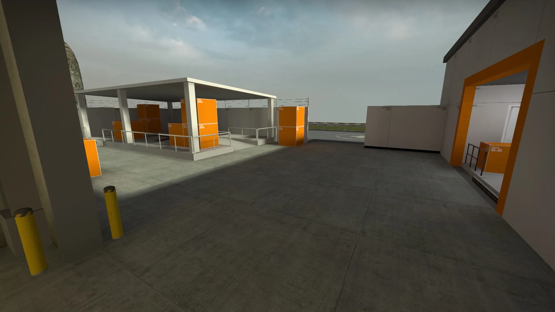
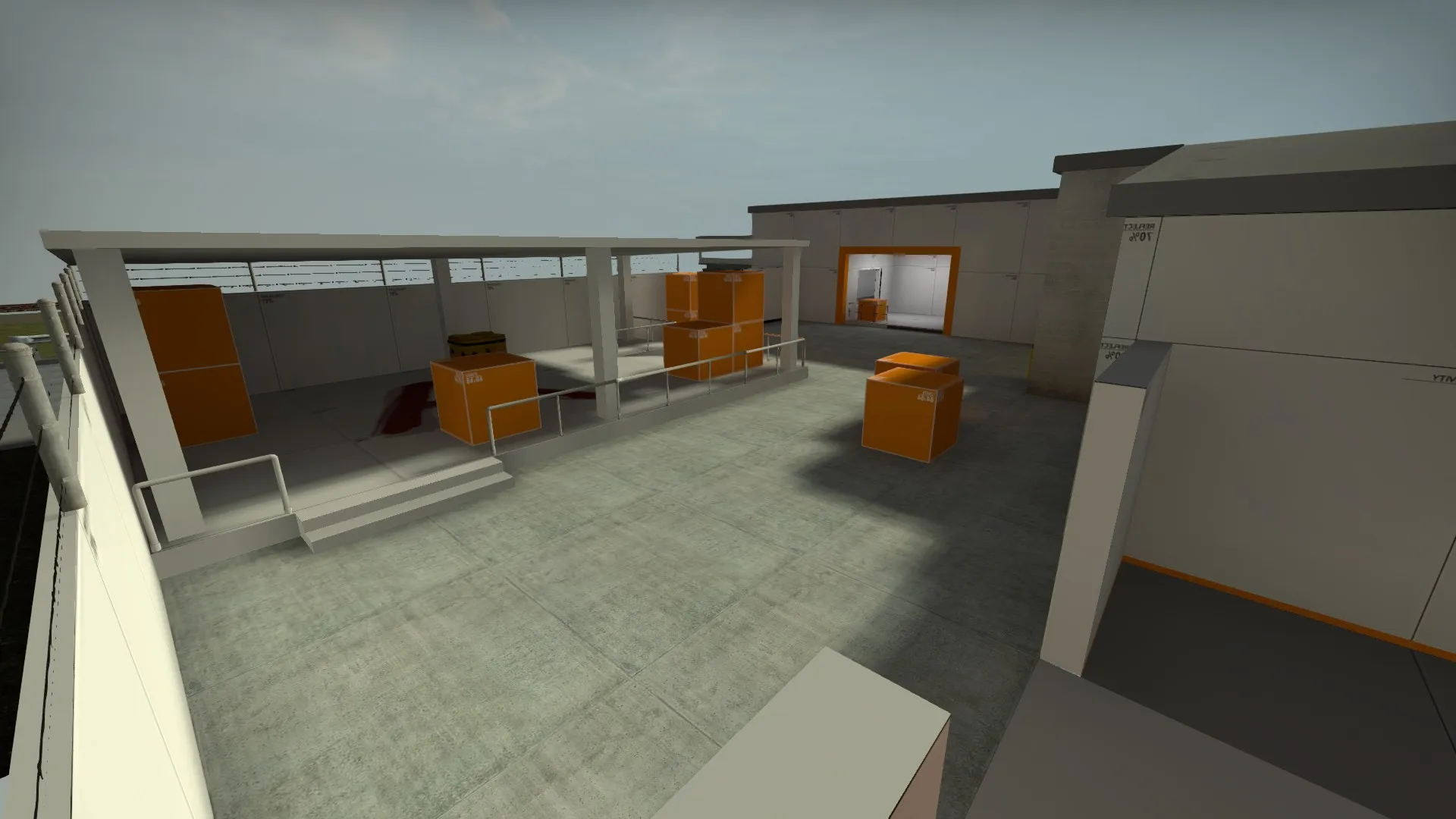
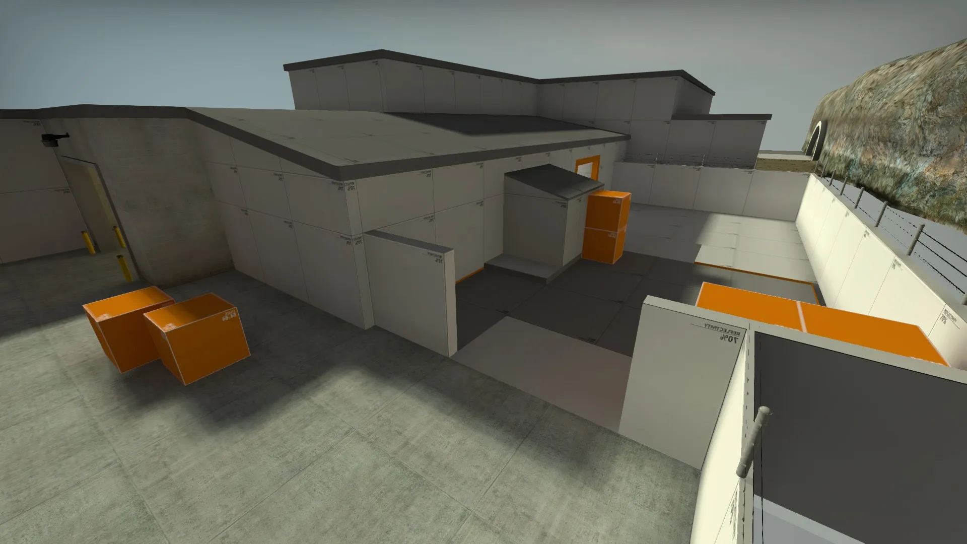
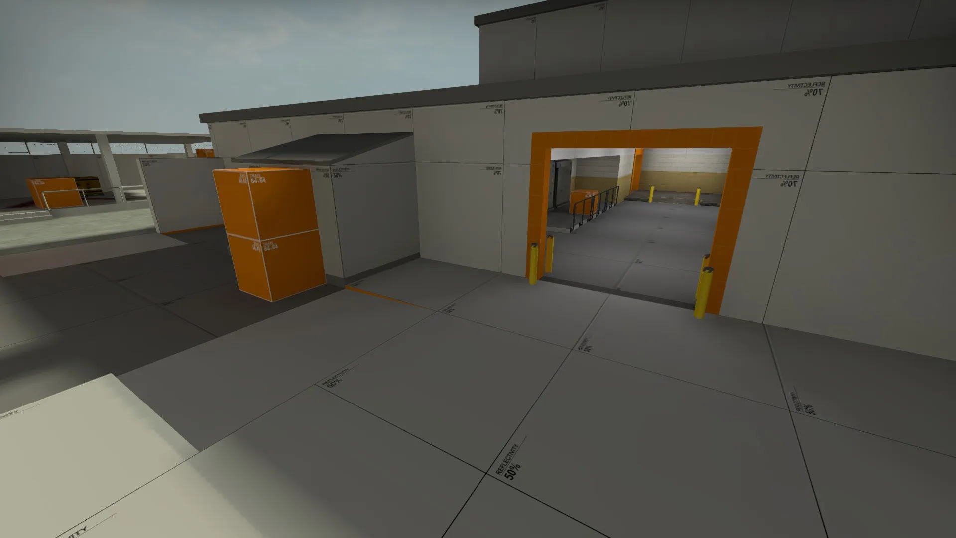
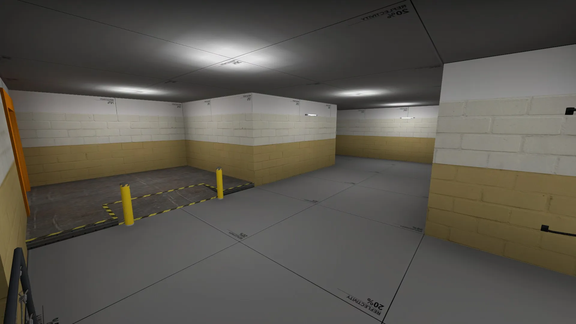
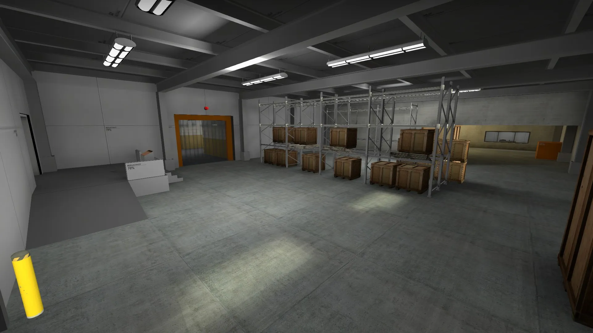
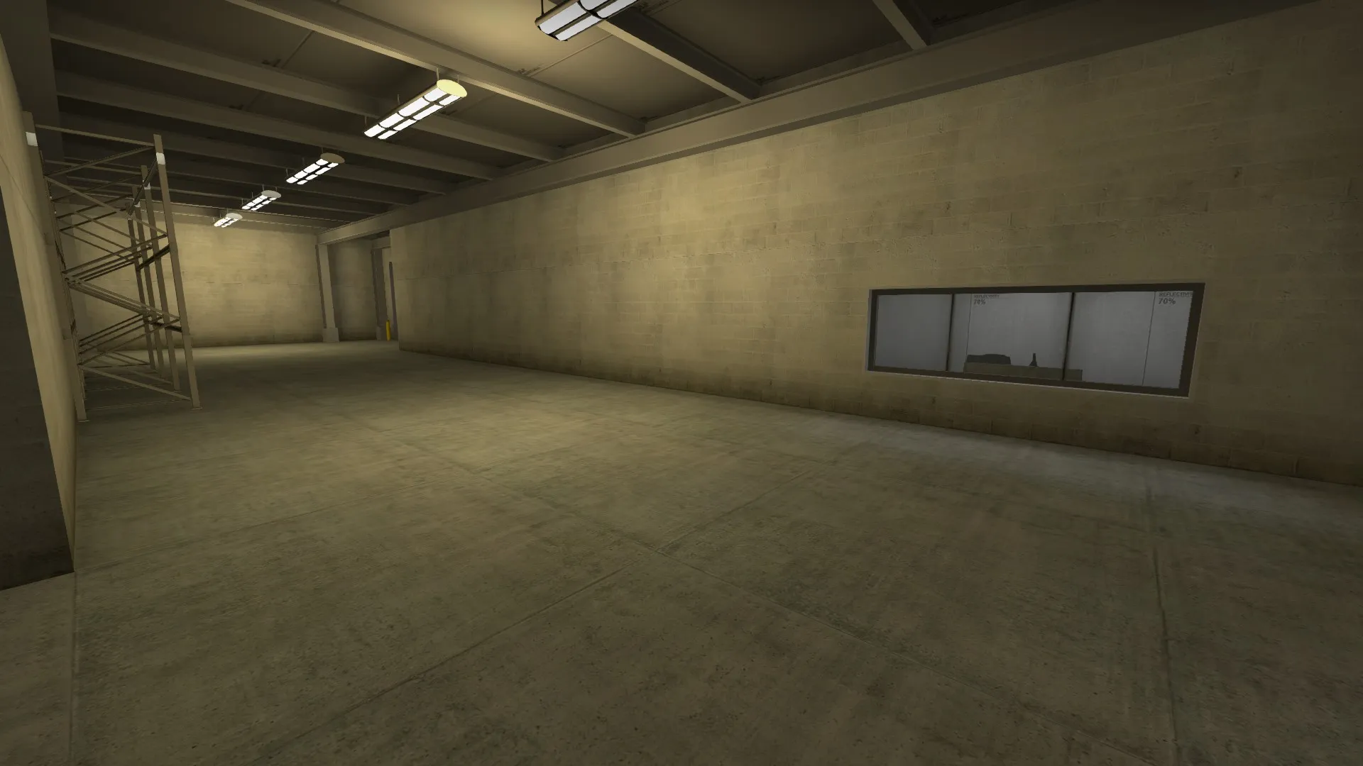
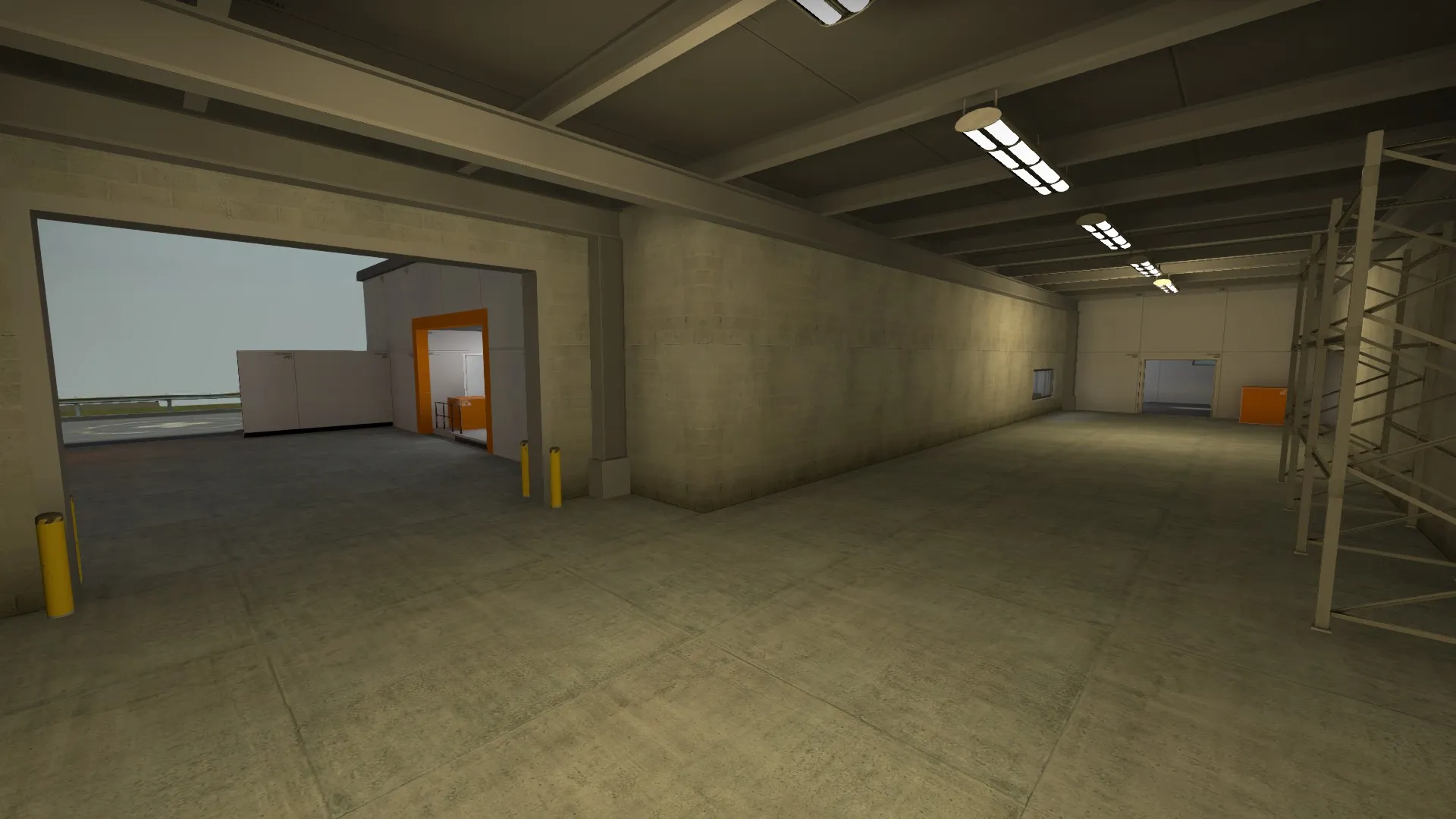
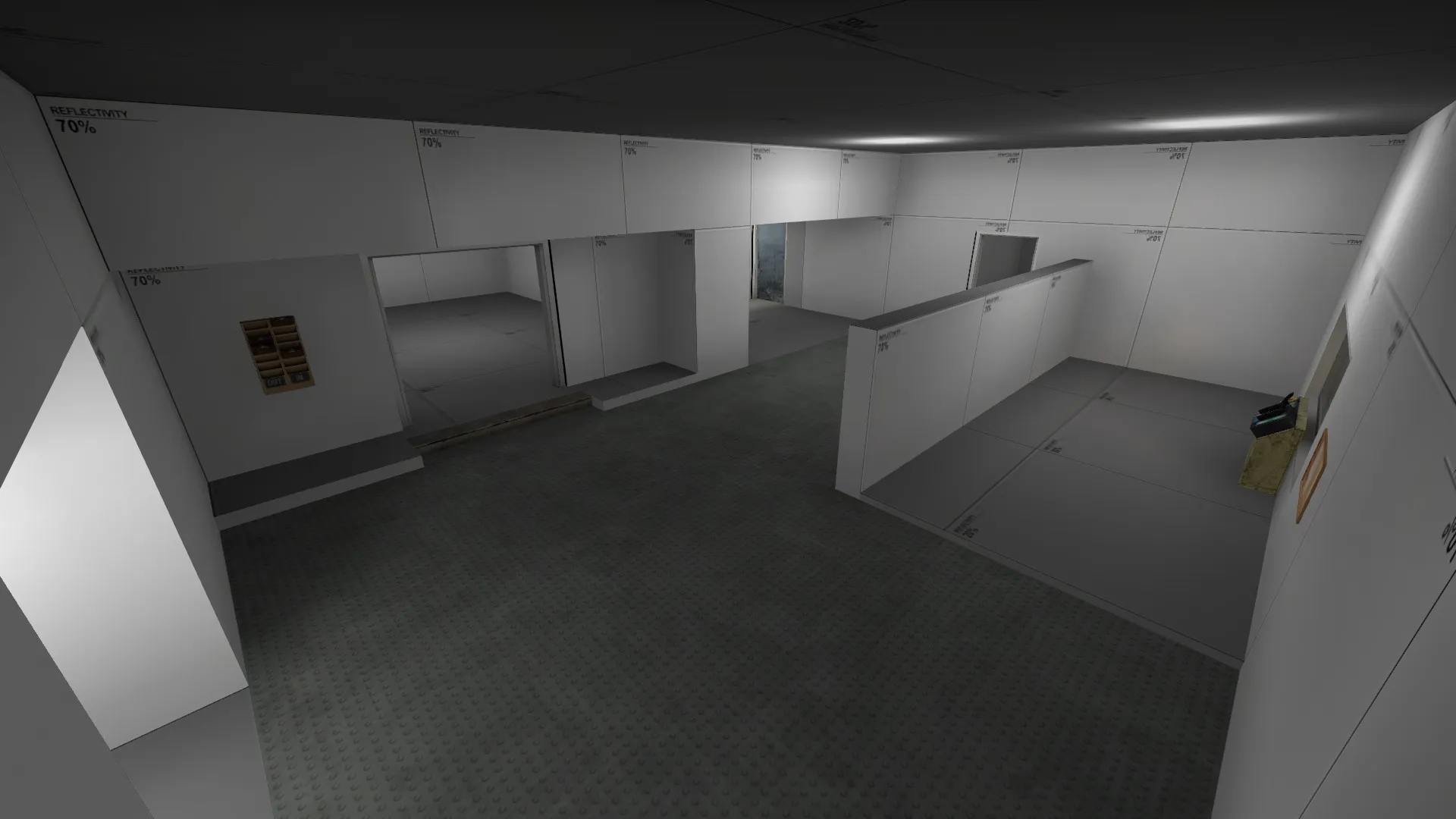
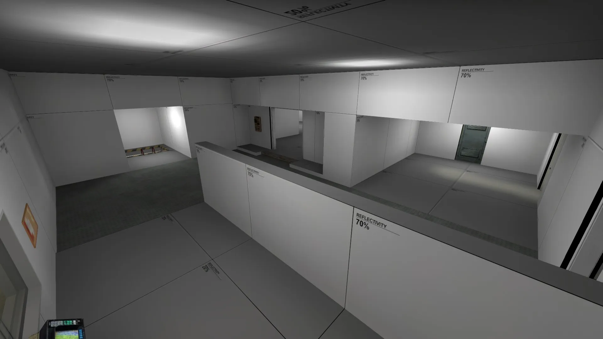
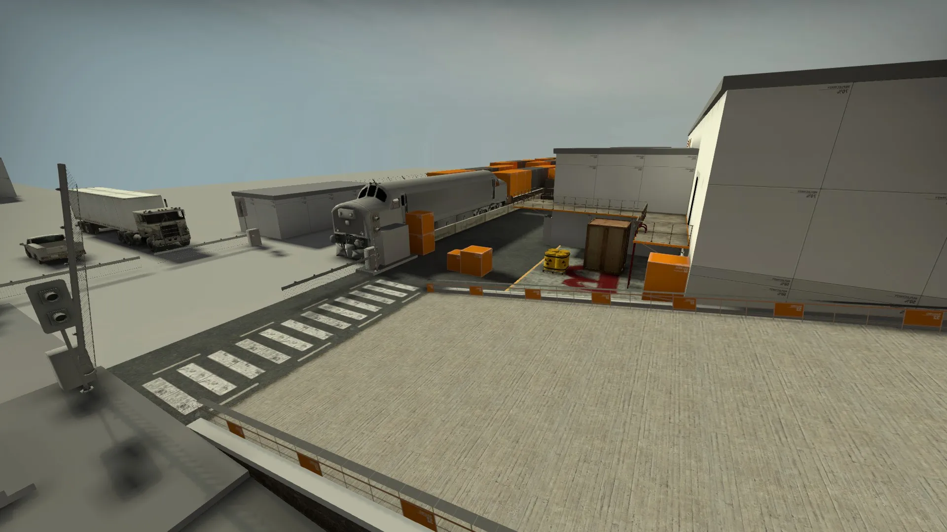
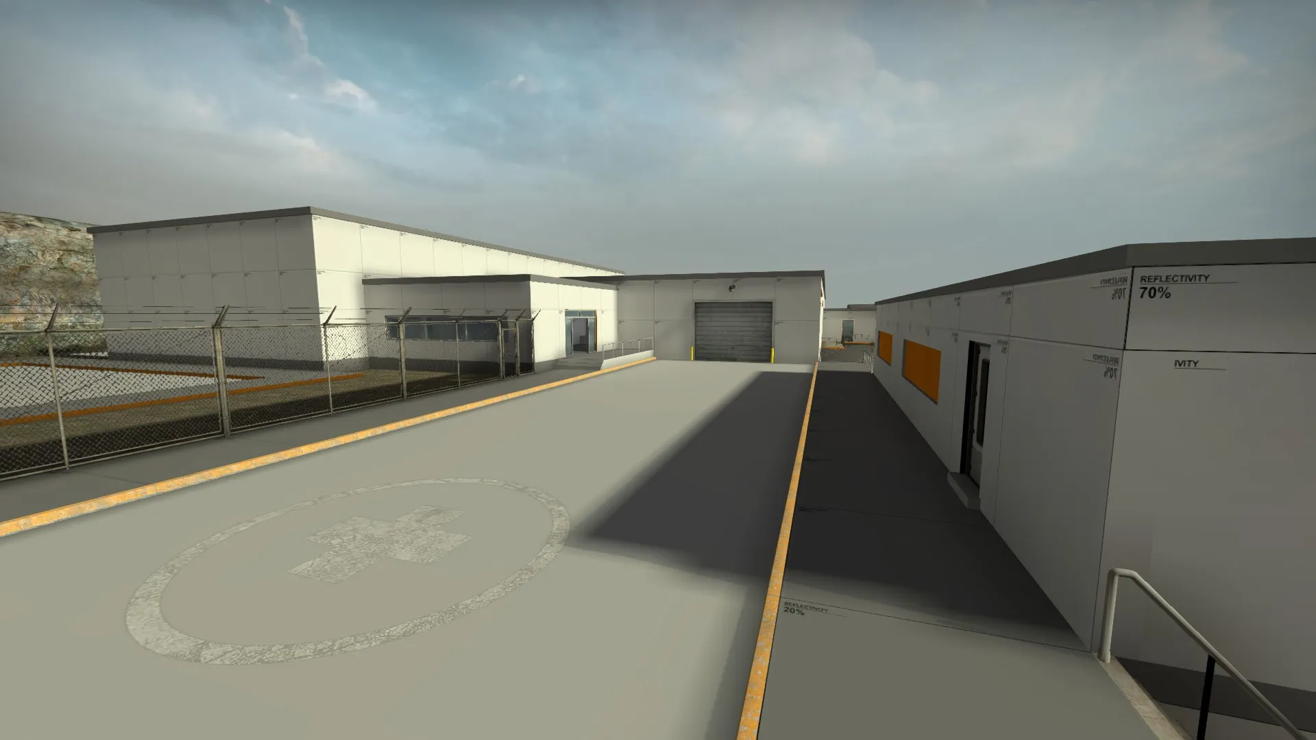
    ...And here's some screenshots:

  • Vaya
    • September 15, 2015 at 4:43 PM
    • #2

    [Blocked Image: https://migrationtest.mapcore.org/uploads/monthly_2015_09/2015-09-15_00015.thumb.jpg.4142b8e8b593aded344cf2210ae2cf8d.jpg]

    This shelving will lead to bitty/frustrating gun battles if it's in an area of conflict. Suggest filling the middle of it with plywood so players can't see through?

  • text_fish
    • September 15, 2015 at 4:51 PM
    • #3

    Just had a run around with some bots. I like the exterior areas (with the exception of behind the trains, which you could stand to lose completely IMHO) but the interior feels overly complex, with far too many winding routes through which you can catch a glimpse of the enemy but may never see them again. I think think you need to get some directional decals up and clean up sightlines in the area Vaya just posted, then it will definitely benefit from a playtest.

  • MinorThreat
    • September 15, 2015 at 4:54 PM
    • #4
    Quote from Vaya

    [Blocked Image: https://migrationtest.mapcore.org/uploads/monthly_2015_09/2015-09-15_00015.thumb.jpg.4142b8e8b593aded344cf2210ae2cf8d.jpg]

    This shelving will lead to bitty/frustrating gun battles if it's in an area of conflict. Suggest filling the middle of it with plywood so players can't see through?

    At the moment I've just placed crates to block the sight line through to the other section of the warehouse. I was intending to fill the shelves to make it more of a solid wall. Maybe I should do that before submitting it for playtesting. Thanks for your feedback!

  • MinorThreat
    • September 15, 2015 at 10:51 PM
    • #5
    Quote from text_fish

    Just had a run around with some bots. I like the exterior areas (with the exception of behind the trains, which you could stand to lose completely IMHO) but the interior feels overly complex, with far too many winding routes through which you can catch a glimpse of the enemy but may never see them again. I think think you need to get some directional decals up and clean up sightlines in the area Vaya just posted, then it will definitely benefit from a playtest.

    Thanks for the feedback! I had a feeling that the area behind the trains might be a contentious one. Having said that, I would like to at least try and make it work if possible. I had envisioned the whole side area as being the scene of a tactical stand-off of sorts, but perhaps the extra passage will ultimately prove to be a bit too much. Could you elaborate on what you mean about the complex interior? Which area are you referring to? Am I right in thinking that directional decals are ones which signpost the bombsites?

  • text_fish
    • September 16, 2015 at 3:53 PM
    • #6
    Quote from MinorThreat

    Could you elaborate on what you mean about the complex interior? Which area are you referring to? Am I right in thinking that directional decals are ones which signpost the bombsites?

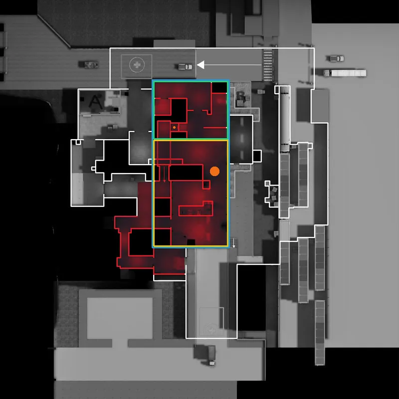
    I mean pretty much the whole interior, to be honest. See red highlight below:

    [Blocked Image: http://www.text-fish.co.uk/mappingstuff/minorthread_de_docks_anotated.png]

    As a T you can't push any of the bottlenecks without constantly worrying that you're about to be flanked, because there are so many passages and corners to check all the time. It's fine to have some element of fear if there's sufficient reward at the end, but the player at least has to feel like they can anticipate likely maneuvers, strats, rotates etc. so that they can form a coherent plan of attack. If I were you I would turn most of these corridors in to one large atrium with plenty of cover, so at least players can push in one direction and use nades to close off certain threats from a distance.

    Oh and I forgot to say, I hope the name de_docks is temporary because it's second only to de_warehouse in boringosity. :P

  • MinorThreat
    • September 17, 2015 at 11:25 AM
    • #7
    Quote from text_fish

    I mean pretty much the whole interior, to be honest. See red highlight below:

    [Blocked Image: http://www.text-fish.co.uk/mappingstuff/m…ks_anotated.png]

    As a T you can't push any of the bottlenecks without constantly worrying that you're about to be flanked, because there are so many passages and corners to check all the time. It's fine to have some element of fear if there's sufficient reward at the end, but the player at least has to feel like they can anticipate likely maneuvers, strats, rotates etc. so that they can form a coherent plan of attack. If I were you I would turn most of these corridors in to one large atrium with plenty of cover, so at least players can push in one direction and use nades to close off certain threats from a distance.

    Oh and I forgot to say, I hope the name de_docks is temporary because it's second only to de_warehouse in boringosity. :P

    I count only two bottlenecks within the area you've highlighted (I've marked them in orange). I can't really see what you mean about the problems with being flanked and corner-checking. I'm not sure how clear it is on the picture, but the choke point marked with the small orange circle is a ladder up to the room with the window (in case you didn't know). Were you suggesting that the blue, green, or yellow area becomes one large atrium? As for the name, it is temporary, just struggling to think of anything at the moment that isn't generic and hasn't already been taken.

  • text_fish
    • September 17, 2015 at 3:36 PM
    • #8

    By bottleneck, I just mean any area where a player can expect to come across an enemy if both players are rushing, so this includes any corner or doorway within pretty much the top two thirds of the overview image.

    I think it would be worth playing around with turning the blue or yellow area in to a large atrium.

    Maybe once you've settled on a storyline (i.e. what's getting blown up?) a better name will follow. :)

  • MinorThreat
    • September 18, 2015 at 4:29 PM
    • #9
    Quote from text_fish

    By bottleneck, I just mean any area where a player can expect to come across an enemy if both players are rushing, so this includes any corner or doorway within pretty much the top two thirds of the overview image.

    I think it would be worth playing around with turning the blue or yellow area in to a large atrium.

    Maybe once you've settled on a storyline (i.e. what's getting blown up?) a better name will follow. :)

    Okay. To be honest, I might see if I can get it playtested first before I make any major changes to the layout.

    As for the name, I think the bomb target's gonna be either munitions or nuclear waste, so maybe I'll come up with something along those lines.

    When you downloaded the map form the workshop did it run properly with all the custom models and textures? I made sure to pack the bsp with all the things I had made and it came in at about 40mb. I've just checked on the workshop now and it is less than 9mb... :???:

  • text_fish
    • September 18, 2015 at 4:54 PM
    • #10

    Oh yeah, a playtest is always wise!

    Yep, the models downloaded fine. They're all grey, but I'm assuming they're supposed to be at the moment. I didn't notice any custom textures TBH, but also no checkerboard or black surfaces so they must be in there somewhere.

  • MinorThreat
    • September 18, 2015 at 6:22 PM
    • #11
    Quote from text_fish

    Oh yeah, a playtest is always wise!

    Yep, the models downloaded fine. They're all grey, but I'm assuming they're supposed to be at the moment. I didn't notice any custom textures TBH, but also no checkerboard or black surfaces so they must be in there somewhere.

    Yeah, just some temporary textures at the moment. There are a couple of custom textures in there- one of them is the main ramp at the CT spawn. Thanks for letting me know.

  • Tyker
    • September 18, 2015 at 11:51 PM
    • #12

    I noticed you're trying to make those plastic flaps for some doorways!
    I'm also trying to make those. First I used brushes, which work very well but look very ugly, then a model with jiggly bones but getting collision to work so they actually move out of the way of the player seems impossible.

    Do you have any idea how you will pursue those flaps? Or will you just have them in a static way so that don't move when walking through them?

  • Vaya
    • September 19, 2015 at 9:18 AM
    • #13

    I don't think it would look right without Tessellation which (as far as I know) isn't supported by source. Static with no collision (or bulletsoaking-ness) is the best shout imo - func_illusion is probably best for this

  • text_fish
    • September 19, 2015 at 10:04 AM
    • #14

    Personally I think I would model the flaps with an opening, as if they'd been temporarily pinned back in some fashion.

  • MinorThreat
    • September 20, 2015 at 6:56 PM
    • #15
    Quote from Tyker

    I noticed you're trying to make those plastic flaps for some doorways!
    I'm also trying to make those. First I used brushes, which work very well but look very ugly, then a model with jiggly bones but getting collision to work so they actually move out of the way of the player seems impossible.

    Do you have any idea how you will pursue those flaps? Or will you just have them in a static way so that don't move when walking through them?

    I'm not sure how I'm going to do the flaps to be honest. I'm not the most skilled modeller/texture artist, and to make ones with those kinds physics properties is a bit ambitious for me I think.

    Quote from text_fish

    Personally I think I would model the flaps with an opening, as if they'd been temporarily pinned back in some fashion.

    That sounds like a good solution. It would a save doing a lot of complex stuff that I know nothing about!

  • MinorThreat
    • January 31, 2016 at 9:19 PM
    • #16

    I was wondering if anyone had any feedback on the map following the playtest we've just had? I know that there was lots of comments about lines of sight and hiding spots, and obviously there were areas that need to be clipped, but I was wondering whether people enjoyed playing it overall, and whether the general layout was good. It appeared to be a heavily CT-sided affair for the first half, but it seemed to be a lot more even in the second. I don't know whether that's due to people getting to learn the map or the terrorist side in the second half managing to overcome the bias of the map.

  • Vorontsov
    • January 31, 2016 at 11:13 PM
    • #17

    1) Clip shit, I found several places after the playtest ended that you could jump out of without even trying hard.

    2) Why is there a green tint to the map? Which was only enhanched by my digital vibrance settings.

    3) I forgot which site is which but I think B-Site is the one where you do long range engages. I think it's not as good of a site as A, if you get an awp and maybe a scar then it's not that hard to lock the site down. Weird corners that are mandatory to check while being too exposed to other locations.

    4) I remember some time I had no idea where the hell I got shot from, and apparently there is a stair where you can only see the head, and it didn't help that the place was pretty dark, don't know what the location is called, I wasn't a big fan of it.

    5) I got the impression that CT's can outmanuever T's pretty easy, it wasn't hard to flank and likewise it wasn't hard to easily get flanked and having no idea what the hell just happend.

    6) I found that the chokepoints were weird, but maybe that's just me.

    7) This is for your 3D Model(s). That train of yours looks great, very high in polygons which I think is not the end of the world but in that case you should be able to see it, you only see a part of it through the fence and don't get up close and personal with it ( ͡° ͜ʖ ͡°). I also think the small rectangular segments in the toll model could be done with a texture, the polys are unecessary and bad optimization

    These are just my personal opinions off the top of my head, I might update this comment if I can think of something else.

  • jackophant
    • February 1, 2016 at 8:29 AM
    • #18

    @MinorThreat if you can post your overview I'll happily annotate it and write up some feedback

  • MinorThreat
    • February 2, 2016 at 11:55 AM
    • #19
    Quote from jackophant

    @MinorThreat if you can post your overview I'll happily annotate it and write up some feedback

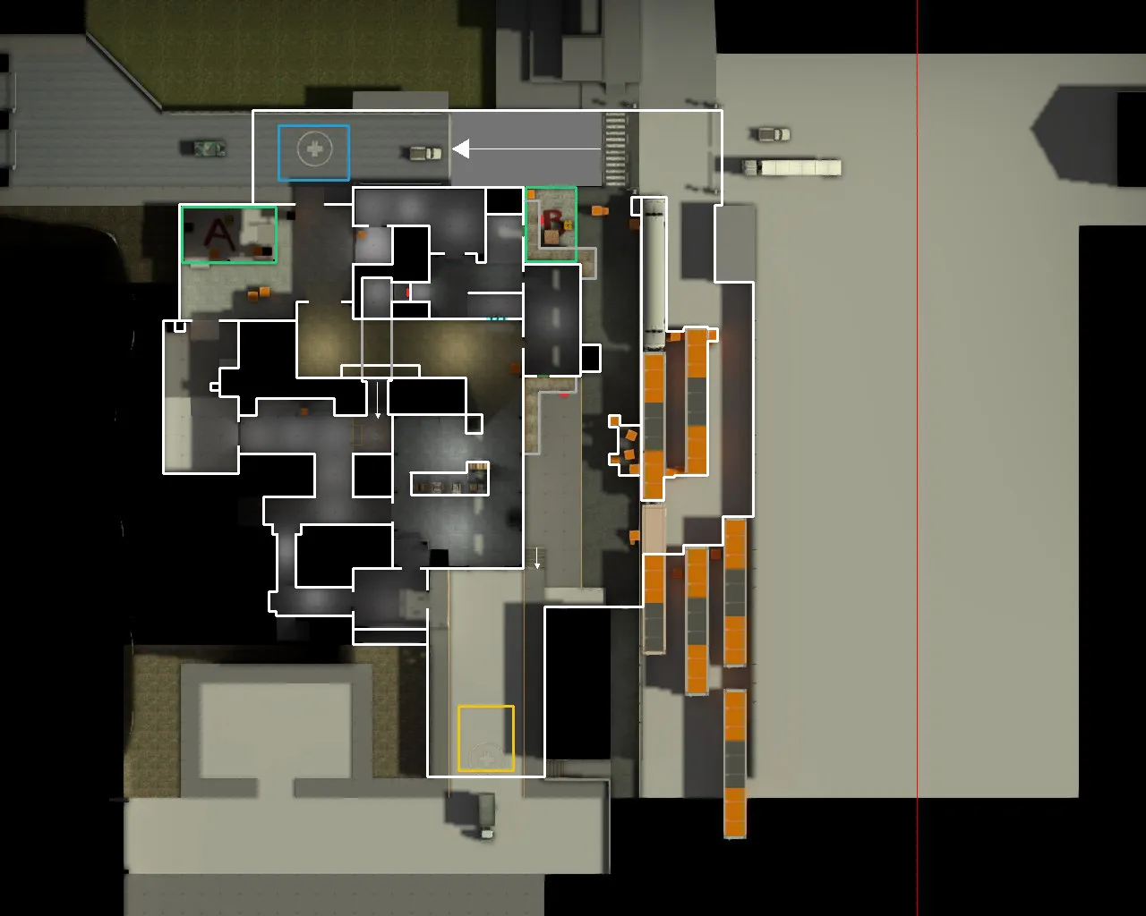
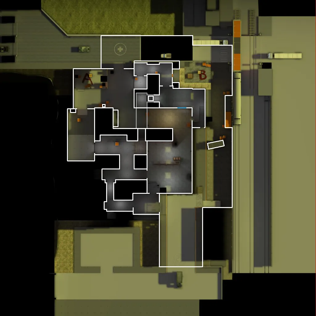
    Here is the overview:

    Quote from Vorontsov

    1) Clip shit, I found several places after the playtest ended that you could jump out of without even trying hard.

    2) Why is there a green tint to the map? Which was only enhanched by my digital vibrance settings.

    3) I forgot which site is which but I think B-Site is the one where you do long range engages. I think it's not as good of a site as A, if you get an awp and maybe a scar then it's not that hard to lock the site down. Weird corners that are mandatory to check while being too exposed to other locations.

    4) I remember some time I had no idea where the hell I got shot from, and apparently there is a stair where you can only see the head, and it didn't help that the place was pretty dark, don't know what the location is called, I wasn't a big fan of it.

    5) I got the impression that CT's can outmanuever T's pretty easy, it wasn't hard to flank and likewise it wasn't hard to easily get flanked and having no idea what the hell just happend.

    6) I found that the chokepoints were weird, but maybe that's just me.

    7) This is for your 3D Model(s). That train of yours looks great, very high in polygons which I think is not the end of the world but in that case you should be able to see it, you only see a part of it through the fence and don't get up close and personal with it ( ͡° ͜ʖ ͡°). I also think the small rectangular segments in the toll model could be done with a texture, the polys are unecessary and bad optimization

    These are just my personal opinions off the top of my head, I might update this comment if I can think of something else.

    Display More

    There's a green tint to the map because I changed the environment light settings but didn't change it back. I didn't think it would be important because I'm just looking to get the layout right at the moment. What are the weird corners that you are talking about at B? Could you point out the areas where you think that the CTs could outmanoeuvre the Ts? I was planning on moving the train model to a place where it would be more visible, but it's not top on my list of priorities at the moment. I was also planning on replacing that part of the barrier with a texture like you suggested, but I'm just looking to get the layout right for now!

  • jackophant
    • February 2, 2016 at 3:28 PM
    • #20

    [Blocked Image: https://i.imgur.com/plg1zw8.png]

    Here you go @MinorThreat, I reckon the changes I've drawn out here are fairly concise, but one thing I can't effectively show is the number of 64 unit boxes. Please do not use these, ever. They are awful and massively unfair. You can use them for self boost jumps, just out of the way of anywhere someone can easily abuse them for super effective cover.

    Green areas are somewhere you should add:

    • The green boxes in mid are your shelving. It absorbs SO MUCH damage, and make firefights very irregular, box them out in dev, or stack them full of crates, either way, make it more solid so people can play around it more.
    • I've blocked the door to the right of the window from the B path as it made going mid pointless. CS isn't fun when you keep getting shot in the side of the head because you have too many places to watch. It also concentrates the flow of players better and give more of a reason to hold window to keep people off mid.

    Red areas are something you should remove:

    • That underground path offers nothing tactically. You go towards A, get smoked off at the tightest choke point in the world and then just run past mid, past the defensive window, past every CT in the map, and just pop behind them in window. It honestly breaks the map the most for me because right now mid window CT has to watch front right and left by himself.

    The blue lines are all pretty ridiculous sight lines:

    • The one outside B, CTs can get to those boxes and start auto-sniping Ts before they're even down the stairs. It is a horrible engagement, not only is the CT very hard to spot against the shady corner, but anything other than a scoped weapon is pretty useless, especially because they'll be hiding behind a 64 unit box.
    • The long sight line from A across mid is again, aided by 64 unit boxes. The person sitting near A can very easily spot Ts running up mid and pick their heads off from complete safety.
    • The short light running north to south in the tunnels outside A is another 64 unit pillbox. CTs just sit there gunning Ts down in a tight corridor with 99% of their body hidden, even more effective when smokes are present.
    • The shorter blue light across the A tunnels / mid connector isn't a massive issue in itself, but the back drop is very dark on the left end of it making it hard to see. I like what you've tried with the plastic drapes, but they also impinge visibility, so maybe if you can slide them sideways to minimise their impact, that could be enough.

    The yellow line just highlights a very fast rotate:

    • CTs can play pretty aggressively on this map, even on mid, so to then have a fast rotate is pretty brutal.

    Sidenotes:

    • 64 unit boxes are bad mmkay?
    • Squeaky doors should ideally only be used once in a map to stop repetition and maintain area identity
    • 64 unit boxes are really like... really bad
      • try something like 52 units
      • mix up between hard and soft cover (how much damage gets through cover)
        • hard = low penetration damage
        • soft = higher penetration damage
    • Long B corridor of death needs to be staggered a bit
      • maybe push it closer to Ts and further away from CT spawn
    • Lighting is generally too dark, I know you said you were more concerned about game play, but you need to be concerned because bad lighting creates bad game play.
    • pls no 64 unit boxes.

Participate now!

Don’t have an account yet? Register yourself now and be a part of our community!

Register Yourself Login
Discord

The Mapcore Discord is our lively IRC channel of the 2000s reborn. Chat about level design, gaming, and more.

Latest Posts

  1. Tangerine

    Harry Poster
    July 18, 2026 at 11:10 AM
  2. Any of the old guard still around? D:

    Warby
    July 12, 2026 at 8:23 PM
  3. About our archived forums

    Thrik
    June 30, 2026 at 2:12 PM
  4. Mapcore Discord

    mason_fan123
    June 24, 2026 at 8:52 PM
  5. [CS2] Valley

    Serialmapper
    June 22, 2026 at 11:56 AM
  6. Free Music / SFX Resource - Over 2500 Tracks

    Eric Matyas
    June 18, 2026 at 12:32 PM
  7. Pango [WIP]

    Elowen
    June 11, 2026 at 10:13 AM
  8. [CS2] Dvina

    Jeremy Rivera
    June 11, 2026 at 10:03 AM
  9. Bridges 2.0 by NEXSIDE, MAP SHOWCASE. ( Steam Workshop )

    MrTrane18
    June 1, 2026 at 7:46 PM
  10. Classic Maps Reborn For CS2

    SillySpaceCat
    May 31, 2026 at 10:33 PM
  1. Privacy Policy
  2. Contact
Powered by WoltLab Suite™