1. Forums
  2. Discord
  3. About Mapcore
  4. Patreon Supporters
  • Login
  • Register
  • Search
This Thread
  • Everywhere
  • This Thread
  • This Forum
  • Articles
  • Pages
  • Forum
  • More Options
  1. Mapcore
  2. Discussions
  3. Level Design

[WIP] de_slate (withdrawn)

  • laerth
  • July 8, 2015 at 7:11 AM
  • laerth
    • July 8, 2015 at 7:11 AM
    • #1

    Edit: Released!


    Original post:

    Withdrawn -- won't have time to finish.


    Steam workshop link: http://steamcommunity.com/sharedfiles/fi…s/?id=476209350

    Quote

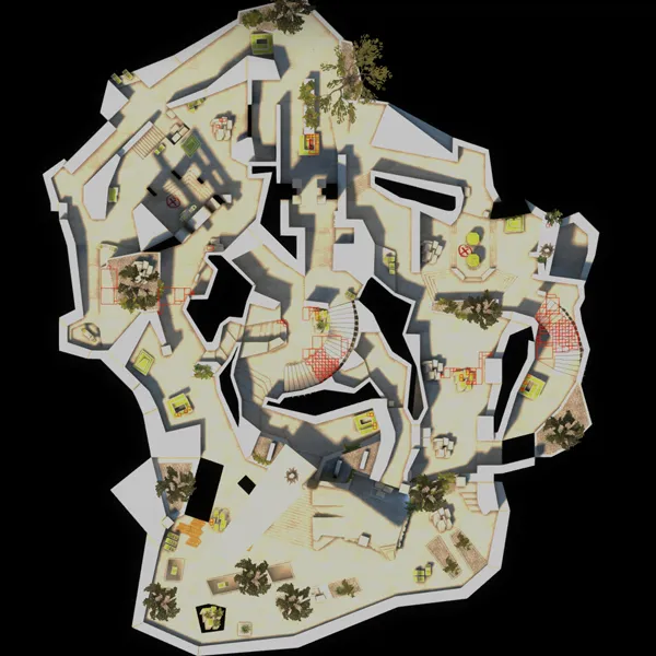
    Spoiler Overview image (updated on 7/12):
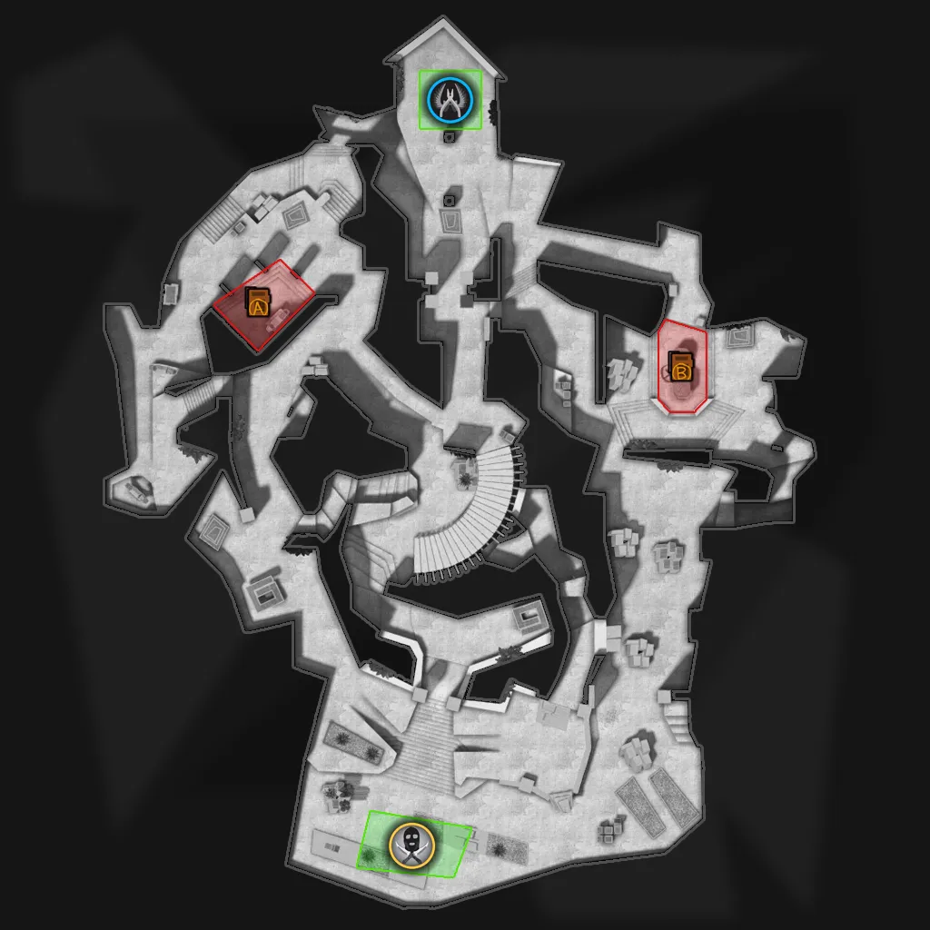
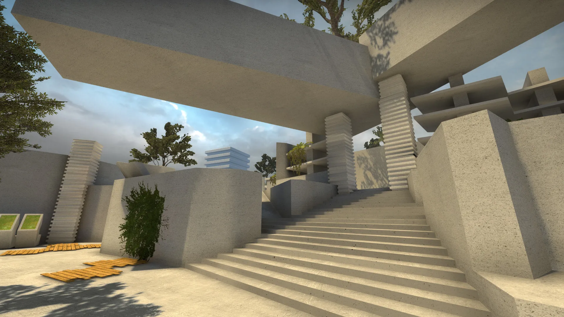
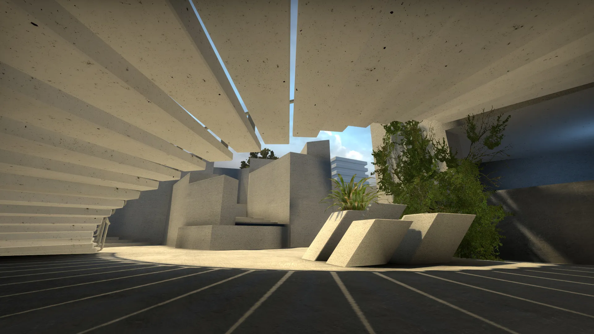
    Started this as an experiment to see what I could accomplish with minimal base-assets, while also building with as much non-cardinal, off-the-grid geometry as possible. My goal is to facet most of the brush surfaces with models, but we'll see if I have time for that.

    The basic theme is a minimalist roof garden atop a tall building, somewhat like Namba Parks.

    The A bombsite is fairly traditional, but the B bombsite is pretty open to grenades/snipers from both CTs and Ts. The elements I enjoy the most are the drop-downs from mid-to-A-choke and mid-to-B-choke, but I'm not sure how well they'll work out in practice. Curious what you guys think of the layout.

    Anyway, this is essentially just a whitebox, not sure I'll finish it in time for the deadline, but here it is /emoticons/[email protected] 2x" width="15" height="15">
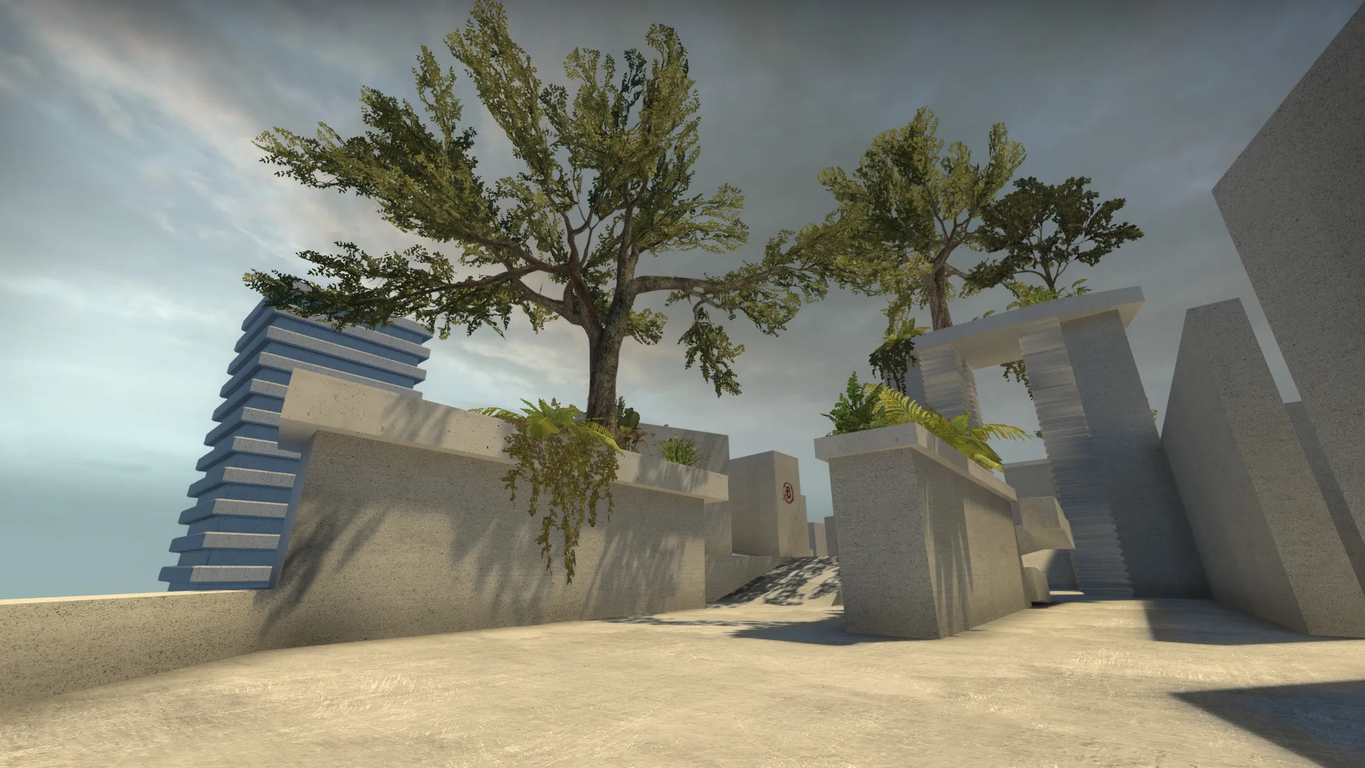
    Display More
  • Vaya
    • July 8, 2015 at 8:43 AM
    • #2

    far too complex in terms of layout- theme is pretty cool but you have so many redundant paths and changes in height.... reminds me of this map from goldeneye:

    External Content www.youtube.com
    Content embedded from external sources will not be displayed without your consent.
    Through the activation of external content, you agree that personal data may be transferred to third party platforms. We have provided more information on this in our privacy policy.

  • MaanMan
    • July 8, 2015 at 9:21 AM
    • #3

    Your map is very complicated and confusing. I recommend trying to simplify the layout or changing the name to de_Picasso.

  • jackophant
    • July 8, 2015 at 10:09 AM
    • #4
    Quote from MaanMan

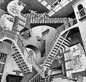
    Your map is very complicated and confusing. I recommend trying to simplify the layout or changing the name to de_Picasso. de_escher

    FTFY

    It looks nice in the screenshots, but perhaps in the overlay you can black out any untraversable routes to make it simpler to read. Regardless, I think the layout needs to be simplified:

    Too many routes = too many flanking = too many salt

  • laminutederire
    • July 8, 2015 at 10:56 AM
    • #5

    I like the concept but you need hints of color to guide the player, clean up the overview and make paths work to shorten rotation time.

    Maybe removing a path or too could be better also. But I'm not sure of that however.

    But I want to stress the fact that it interesting visually ! It has an halo feel I guess

  • laerth
    • July 8, 2015 at 5:30 PM
    • #6

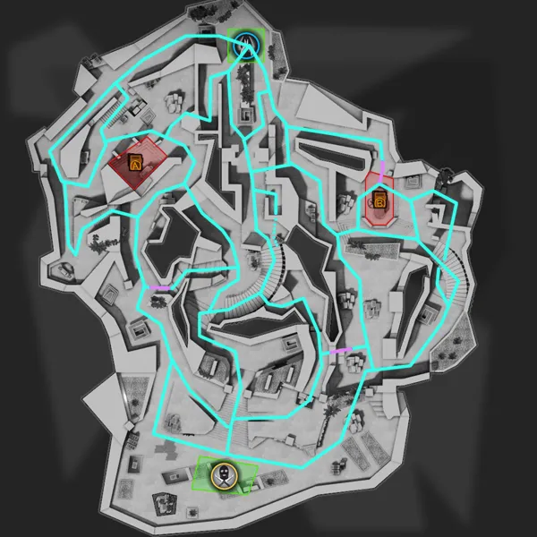
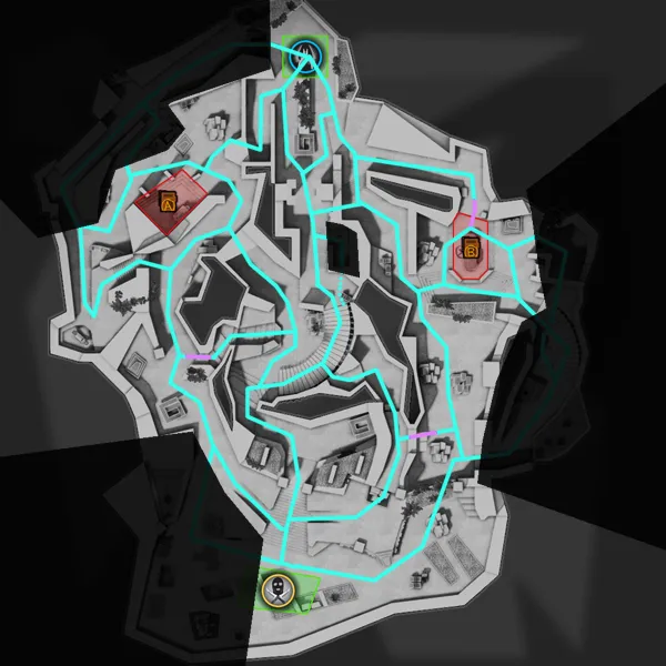
    I'll spend some time simplifying/reducing redundant routes and clarifying the overview. Here's a connectivity map in case it helps (purple lines = one-way or boost):

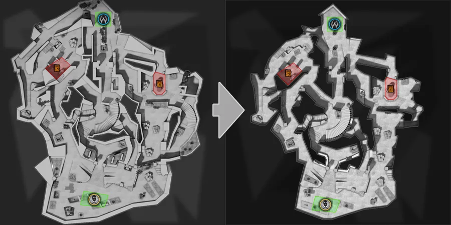
    Maybe making the following cuts might help? Or not enough?

  • Vilham
    • July 8, 2015 at 5:32 PM
    • #7

    Better but could proabably use some more near CT spawn and between mid and A

  • jackophant
    • July 9, 2015 at 10:39 AM
    • #8

    I can't help myself, sorry :D...

    [Blocked Image: http://ai-s1.infcdn.net/screenshots_siandroid/3/3362/3362989_1_2.jpg]

    You've got a lot of parallel running paths, so you could easily combine most of them.

    You've also got a few paths which allow for players to double back on themselves, so you might want to redirect or close those to keep the flow right. If people know the bombsite is a certain direction, to follow a path away from it to come back to it is counter-intuitive to people playing the map for the first time. You have the advantage of knowing where everything is already so it can cloud your judgement.

    Before you do cut it down, please share an overview screenshot with bot_show_battlefront 1 active. I'm quite intrigued.

  • laerth
    • July 9, 2015 at 5:52 PM
    • #9

  • EonDynamo
    • July 10, 2015 at 7:14 AM
    • #10

    The base layout of this map is awesome but IT could definitely use some tweaking. In its current state, there are a few paths that are either a. redundant or b. reduce the significance of other paths. I would suggest slimming the map around the edges especially by T spawn.

    I very much believe in a design philosophy of having the entire map be viable in regular play, as apposed to having dead starts (maps like Nuke or even Inferno). That being said your map seems to embody this and I would play to that. Perhaps you could remove the outward paths by t spawn and re-angle the above ones to allow for players to rotate through T spawn, but not encourage they stay there too long.

    I would argue that the layout isn't particularly complicated as it is, but rather clustered with a great deal of redundant player splitting areas. Running around in game is rather overwhelming as a result of this. Some areas have far to many corners to check and should be simplified. I'd love to see where this map ends up though, you're off to an amazing start.

  • blackdog
    • July 10, 2015 at 1:49 PM
    • #11

    Looks great for an SP mini-sandbox, but every route divides in two more, if you compare to the main CS maps you get an answer for yourself.

    I think the problem here is that maybe you have many great ideas for visuals, and you're trying to have players see it all? :)

  • laerth
    • July 10, 2015 at 8:22 PM
    • #12

    Thanks for the critiques, everyone. I think I may have been overthinking some of the bombsite taking/retaking scenarios and in effect tried to solve problems that didn't really exist. I'll make some changes this weekend.

  • laerth
    • July 12, 2015 at 7:29 PM
    • #13

    I pushed a new update to workshop: http://steamcommunity.com/sharedfiles/fi…s/?id=476209350

    I simplified the layout a bit, removed redundant paths to bombsites (each site has 3 entries now instead of 4), added bombsite decals, reworked the CT->A connector, added a shortcut ramp to the top of the curved staircase, and clarified the overview image.

    I still have more improvements to make, such as reducing the number of corners you have to check, but I wanted to get something out before the end of the weekend.

  • NihiL
    • July 12, 2015 at 10:26 PM
    • #14

    Hey, quick question that always comes up for me when I see layouts as organic as this one: how do you keep things on-grid in Hammer? Is it through usage of func_details or how do you manage to do that?

    New layout looks like a step in the right direction. Still seems extremely mazey though, like a connector hell. If I imagine myself in literally any place on your map overview, I feel I could be killed from 3-4+ angles at all times pretty much. I'd try and reduce that further. Looks very unique and interesting though!

  • laminutederire
    • July 12, 2015 at 10:43 PM
    • #15
    Quote from NihiL

    Hey, quick question that always comes up for me when I see layouts as organic as this one: how do you keep things on-grid in Hammer? Is it through usage of func_details or how do you manage to do that?

    New layout looks like a step in the right direction. Still seems extremely mazey though, like a connector hell. If I imagine myself in literally any place on your map overview, I feel I could be killed from 3-4+ angles at all times pretty much. I'd try and reduce that further. Looks very unique and interesting though!

    I think he does not keep geometry on the grid, which is probably an obligation as soon as you create something not square-ish. At least that's what I understood when he said he was keeping it off the grid geometry (in his first post).

  • NihiL
    • July 13, 2015 at 4:53 AM
    • #16
    Quote from laminutederire

    I think he does not keep geometry on the grid, which is probably an obligation as soon as you create something not square-ish. At least that's what I understood when he said he was keeping it off the grid geometry (in his first post).

    I'm pretty sure he meant that his layout is non-square and more organic when he said that, but you need your stuff to sort of be on grid still in Hammer - otherwise how are you going to put in func_details and props? Hence my question how he does it!

  • laminutederire
    • July 13, 2015 at 8:38 AM
    • #17
    Quote from NihiL

    I'm pretty sure he meant that his layout is non-square and more organic when he said that, but you need your stuff to sort of be on grid still in Hammer - otherwise how are you going to put in func_details and props? Hence my question how he does it!

    why couldn't he tie off the grid geometry to func_detail ? He just have to select brushes and here you go. I do this all the time, and there is absolutely no issues with that excepting for the compiling time which is a little bit higher, a matter of a few seconds.

    For props he can explain you his technique for placing them correctly but it will probably involve placing them on the 1 unit grid then adjusting off the grid. I'll let him answer that one though.

  • NihiL
    • July 13, 2015 at 11:26 AM
    • #18
    Quote from laminutederire

    why couldn't he tie off the grid geometry to func_detail ? He just have to select brushes and here you go. I do this all the time, and there is absolutely no issues with that excepting for the compiling time which is a little bit higher, a matter of a few seconds.

    For props he can explain you his technique for placing them correctly but it will probably involve placing them on the 1 unit grid then adjusting off the grid. I'll let him answer that one though.

    I wasn't talking about issues with tying off-grid brushes to func_details, I meant placing the brushes properly in the first place. Here's what I mean:

    [Blocked Image: http://i.imgur.com/OBlvLB3.jpg]


    Imagine the top brush in both cases is a world brush. The first is on-grid and so it's easy to add a little extrusion detail brush to it. But the second version is not on-grid and it becomes impossible to properly/cleanly place the same detail brush.

    I was asking how the maker of de_slate achieves this. I mentioned func_instances because you can use them to create off-grid 'prefabs' on-grid and then rotate them off-grid in the final map.

  • laerth
    • July 14, 2015 at 5:08 PM
    • #19

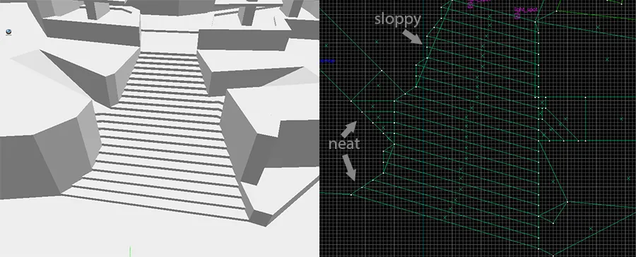
    The whitebox is a little sloppy at the moment for iteration's sake, but I do try to make most angled brushes conform to grid ratios as much as possible, such as 1:1; 1:2, 1:3, 2:3 etc. One example is the stairway at T spawn:


  • NihiL
    • July 15, 2015 at 2:53 PM
    • #20

    Ah okay, you're going for the whole ratio thing. I'll be very interested to see if/how that works for you when it comes to detailing as I've had bad experiences even if you stick to 1:2, 1:3 ratios etc with detailing and prop placements. Good luck!

Participate now!

Don’t have an account yet? Register yourself now and be a part of our community!

Register Yourself Login
Discord

The Mapcore Discord is our lively IRC channel of the 2000s reborn. Chat about level design, gaming, and more.

Latest Posts

  1. Any of the old guard still around? D:

    Warby
    July 12, 2026 at 8:23 PM
  2. About our archived forums

    Thrik
    June 30, 2026 at 2:12 PM
  3. Mapcore Discord

    mason_fan123
    June 24, 2026 at 8:52 PM
  4. [CS2] Valley

    Serialmapper
    June 22, 2026 at 11:56 AM
  5. Free Music / SFX Resource - Over 2500 Tracks

    Eric Matyas
    June 18, 2026 at 12:32 PM
  6. Pango [WIP]

    Elowen
    June 11, 2026 at 10:13 AM
  7. [CS2] Dvina

    Jeremy Rivera
    June 11, 2026 at 10:03 AM
  8. Bridges 2.0 by NEXSIDE, MAP SHOWCASE. ( Steam Workshop )

    MrTrane18
    June 1, 2026 at 7:46 PM
  9. Classic Maps Reborn For CS2

    SillySpaceCat
    May 31, 2026 at 10:33 PM
  10. [CS2] Dvina

    Pulbusha
    May 29, 2026 at 5:54 PM
  1. Privacy Policy
  2. Contact
Powered by WoltLab Suite™