1. Forums
  2. Discord
  3. About Mapcore
  4. Patreon Supporters
  • Login
  • Register
  • Search
This Thread
  • Everywhere
  • This Thread
  • This Forum
  • Articles
  • Pages
  • Forum
  • More Options
  1. Mapcore
  2. Discussions
  3. Level Design

[WIP] de_perish

  • Promulle
  • June 15, 2015 at 12:44 AM
  • Promulle
    • June 15, 2015 at 12:44 AM
    • #1

    workshop link : http://steamcommunity.com/sharedfiles/fi…s/?id=417112476

    Hi i'm Promulle,

    I started mapping not long time ago and want to enter my first map de_perish.


    The map was already playtested and optimized by feedback from playtesters.

    I hope you like the map, and of course feel free to leave feedback.

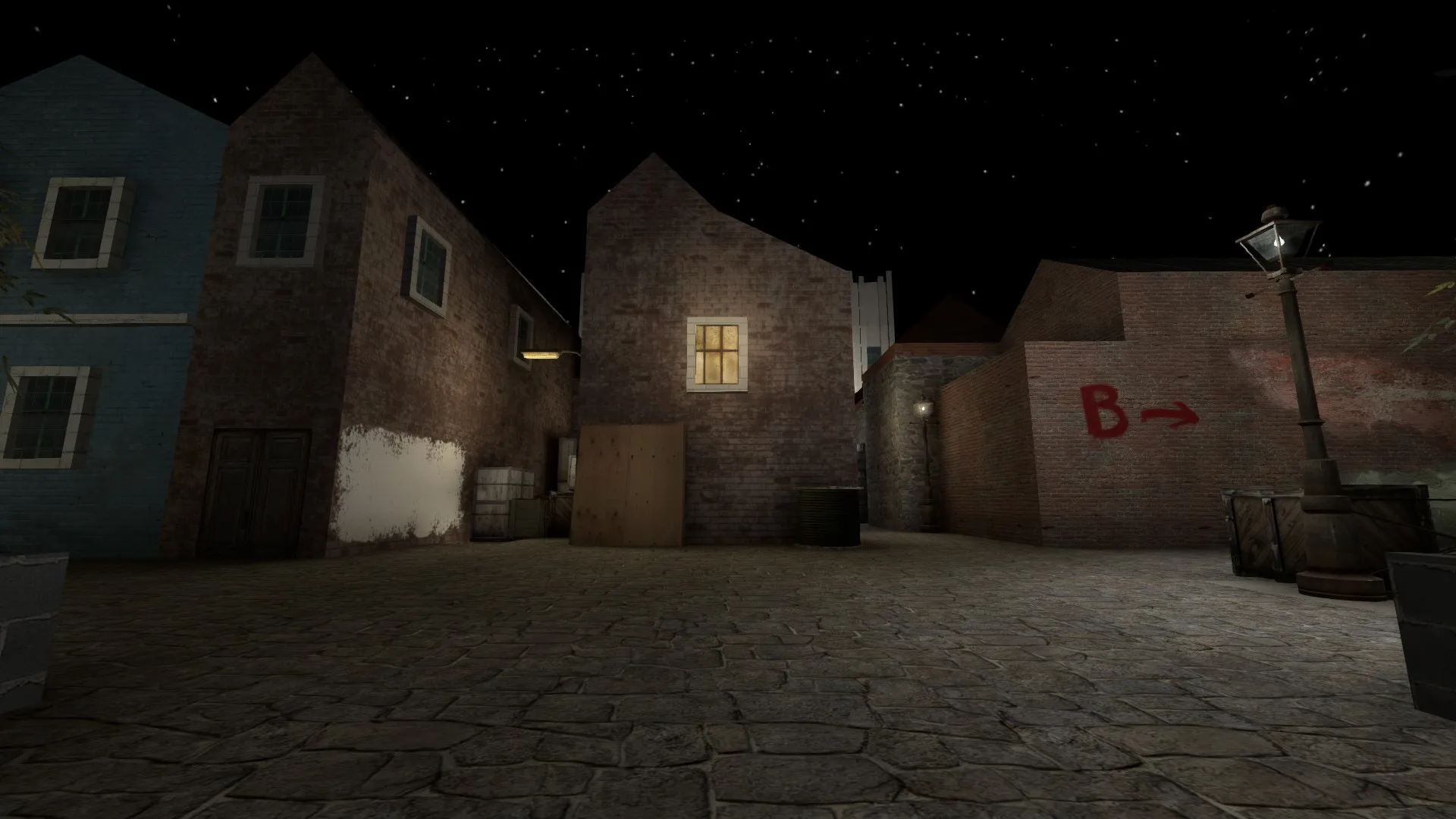
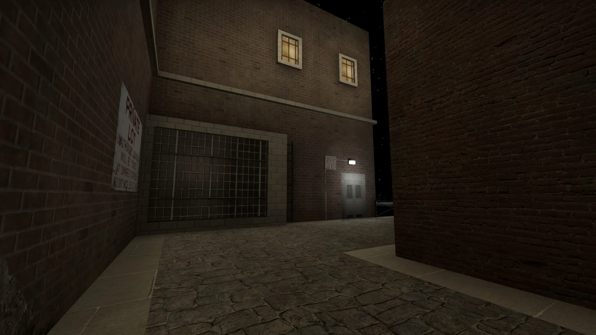
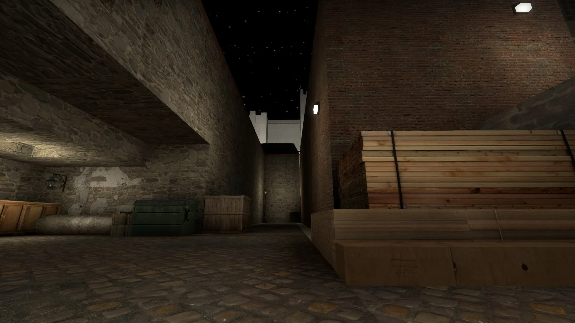
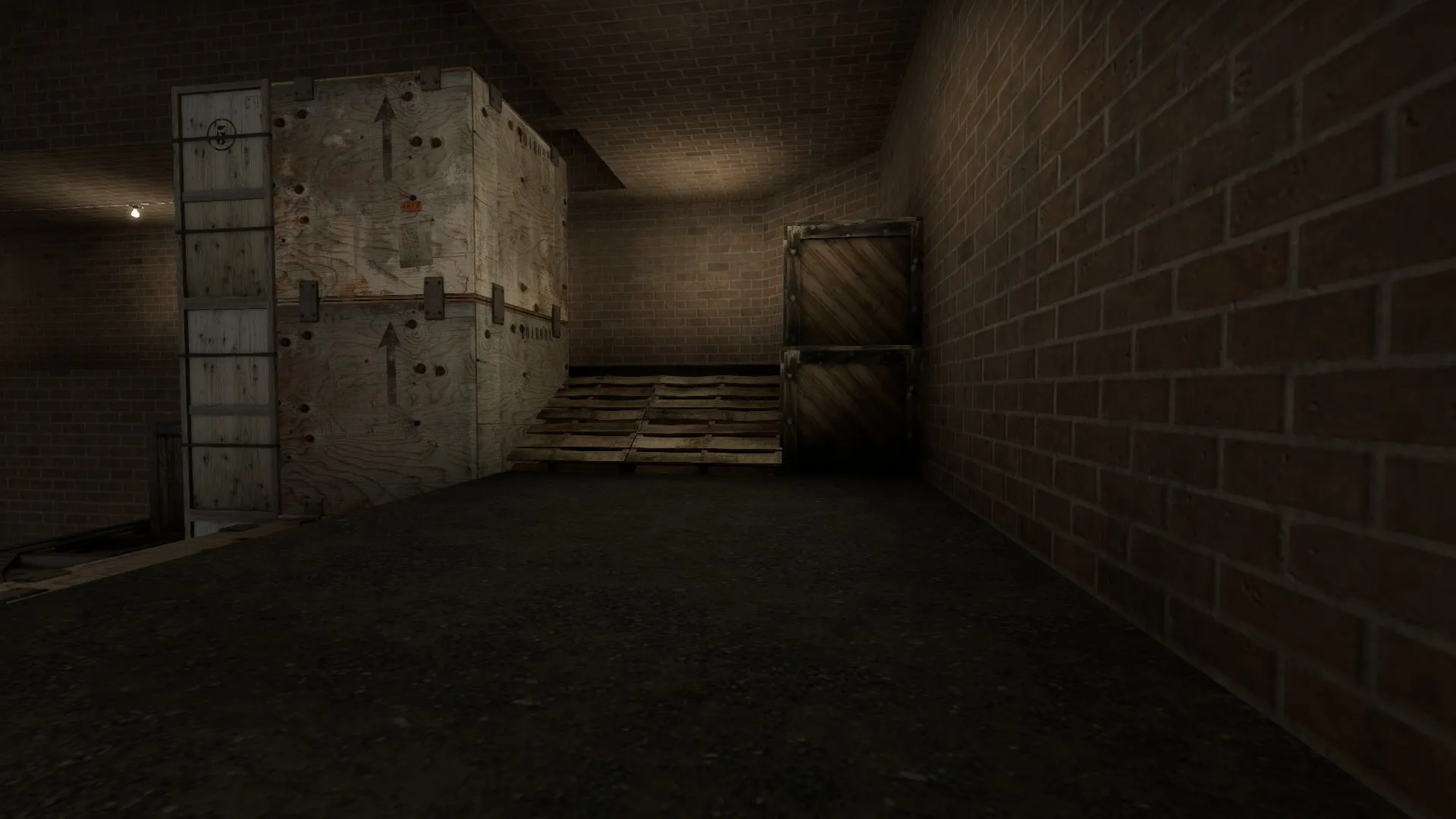
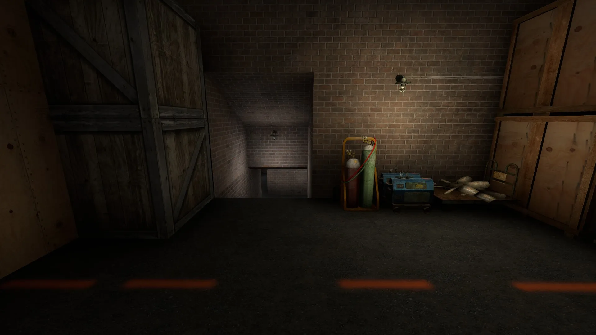
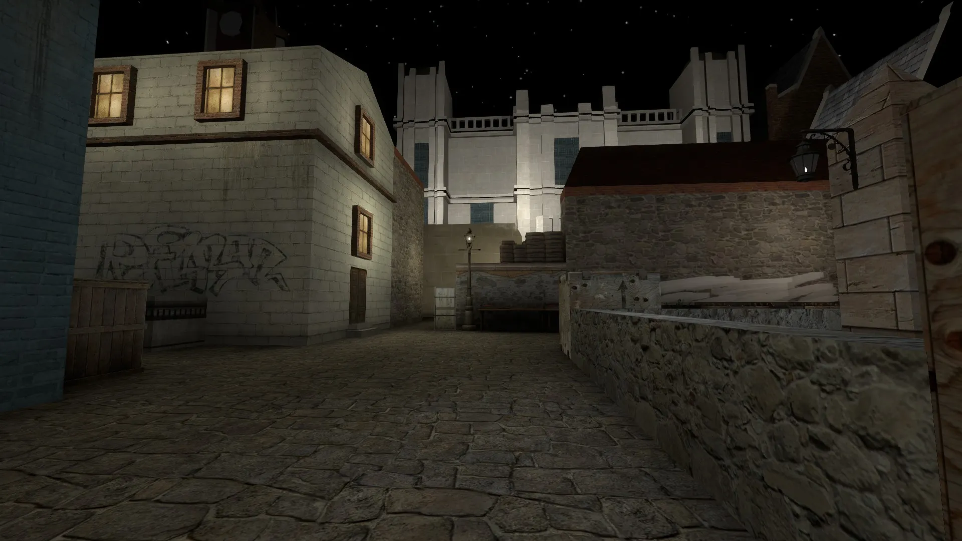
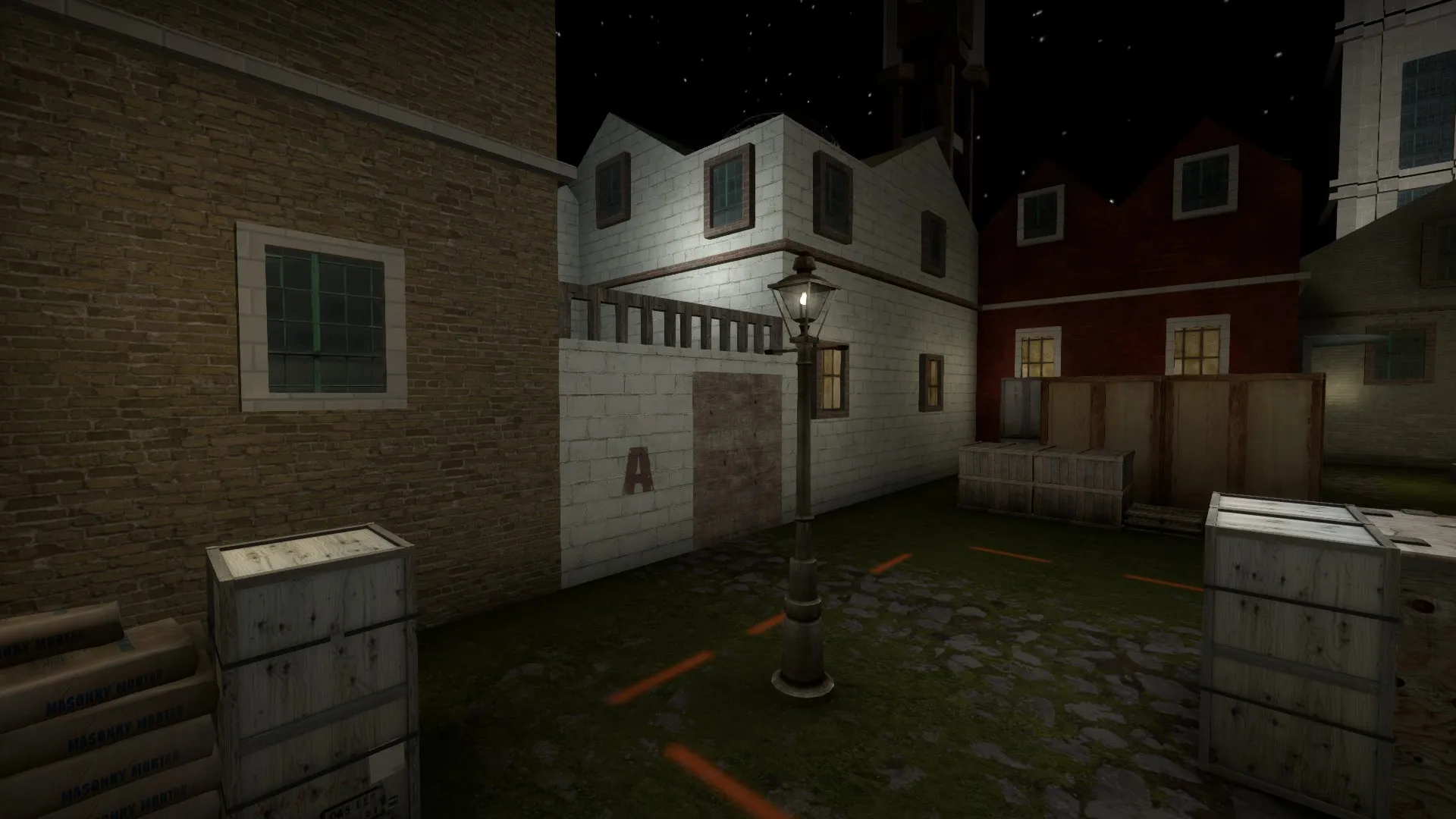
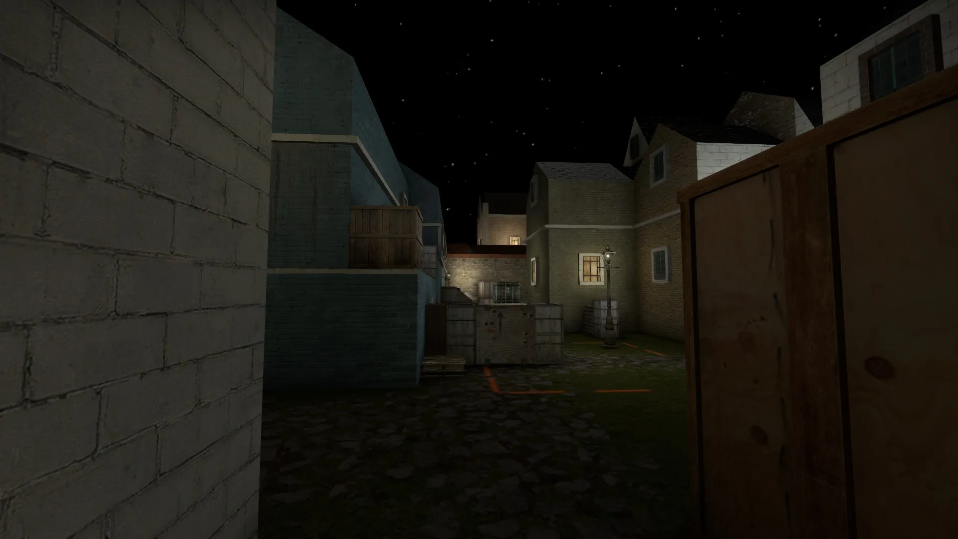
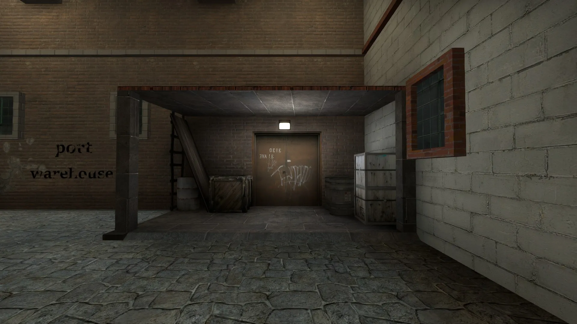
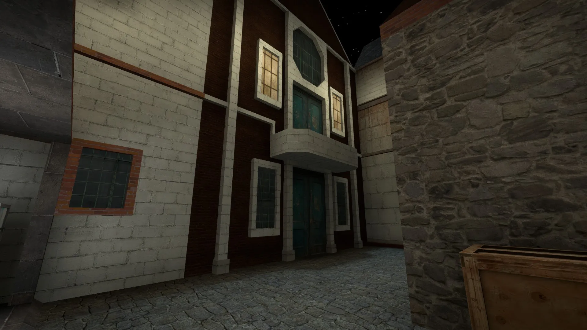
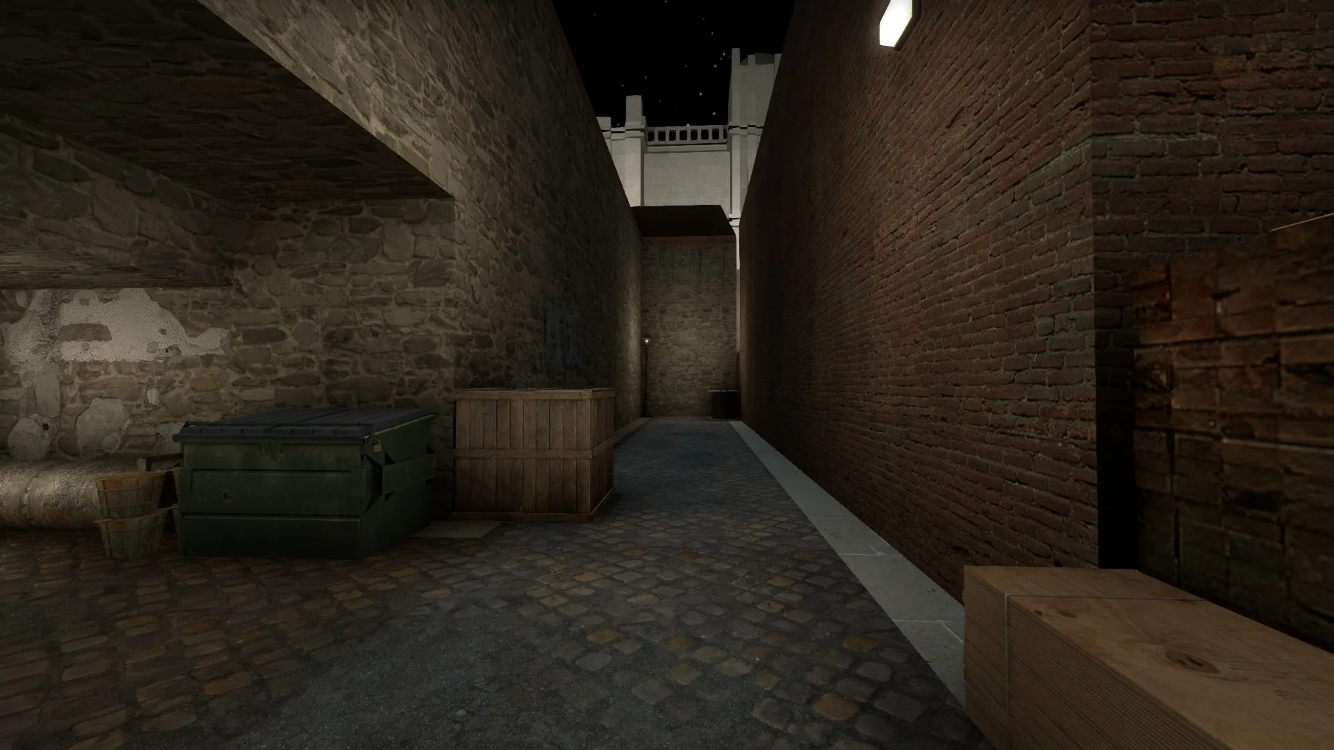
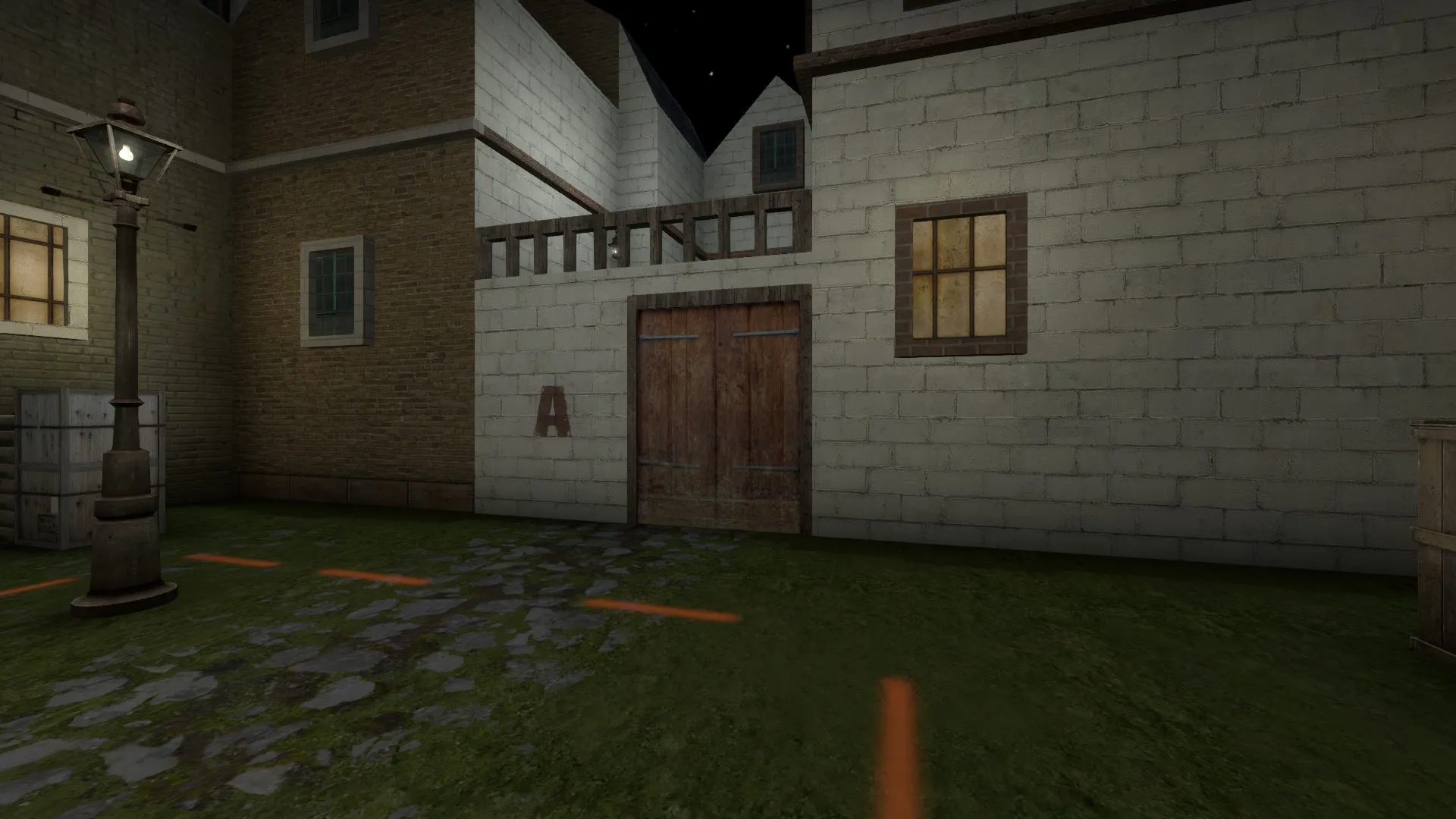
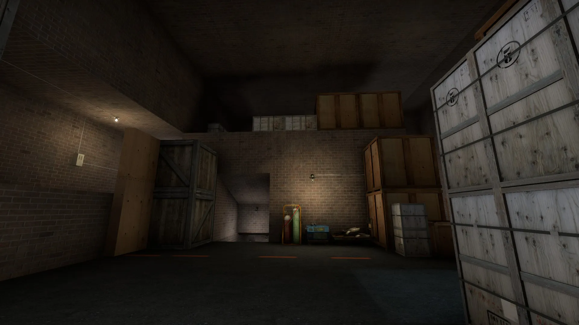
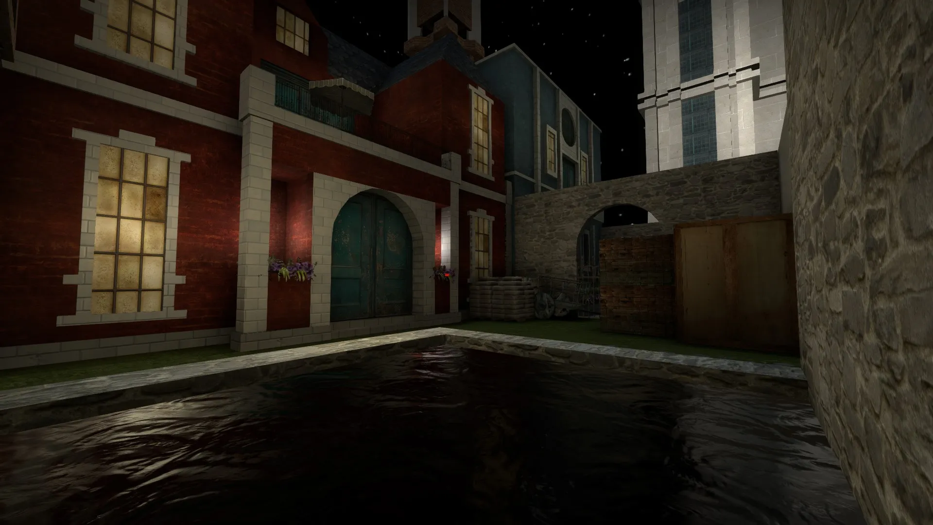
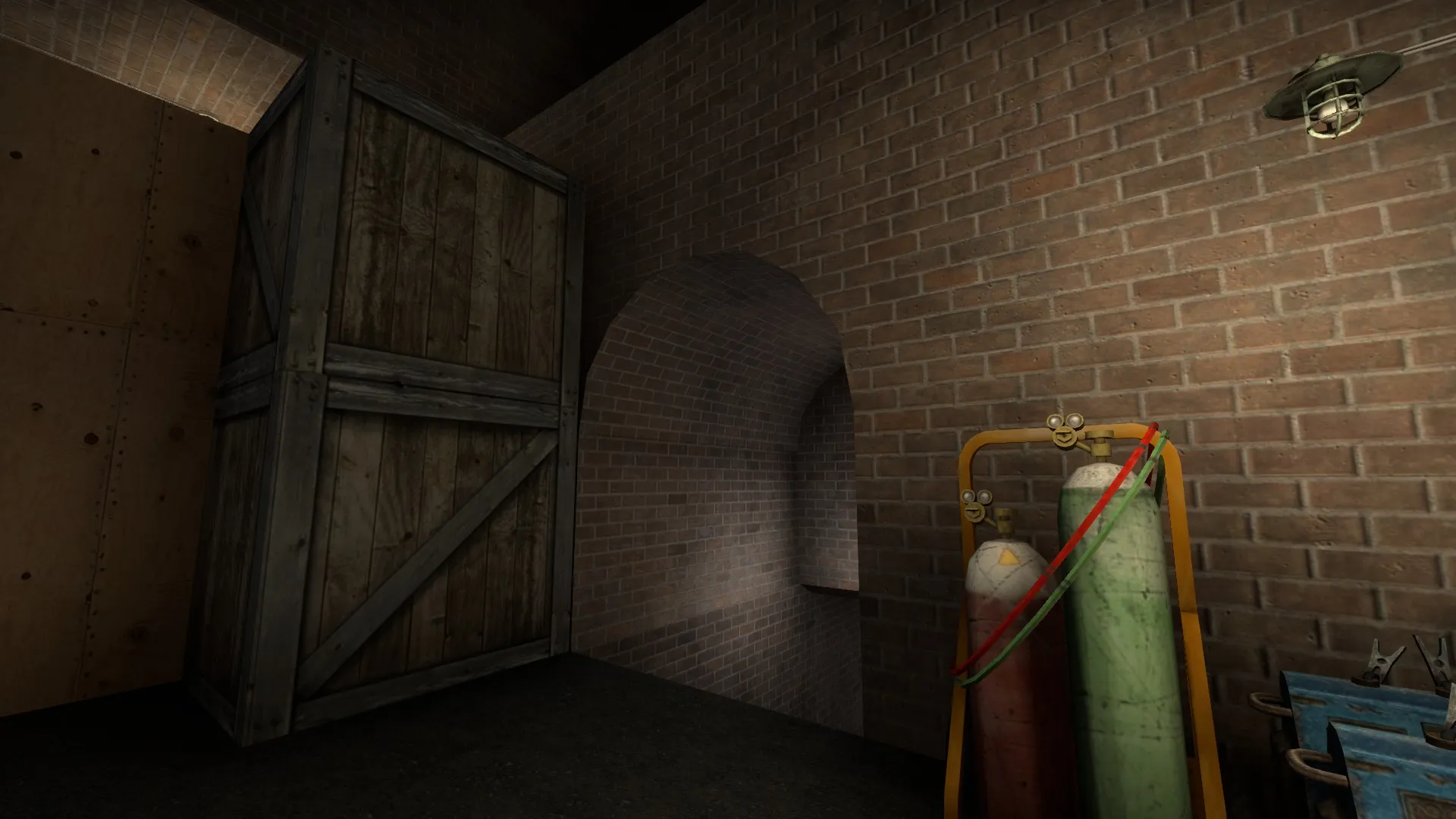
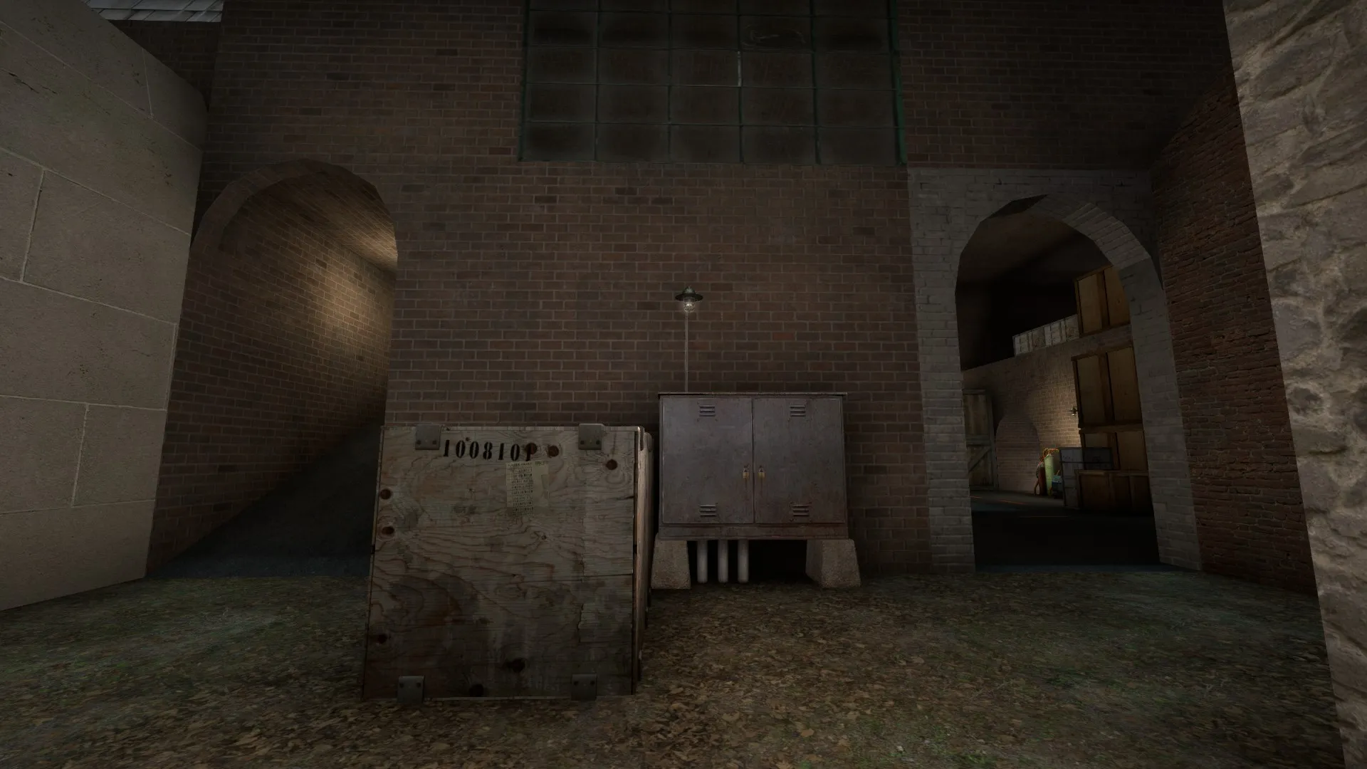
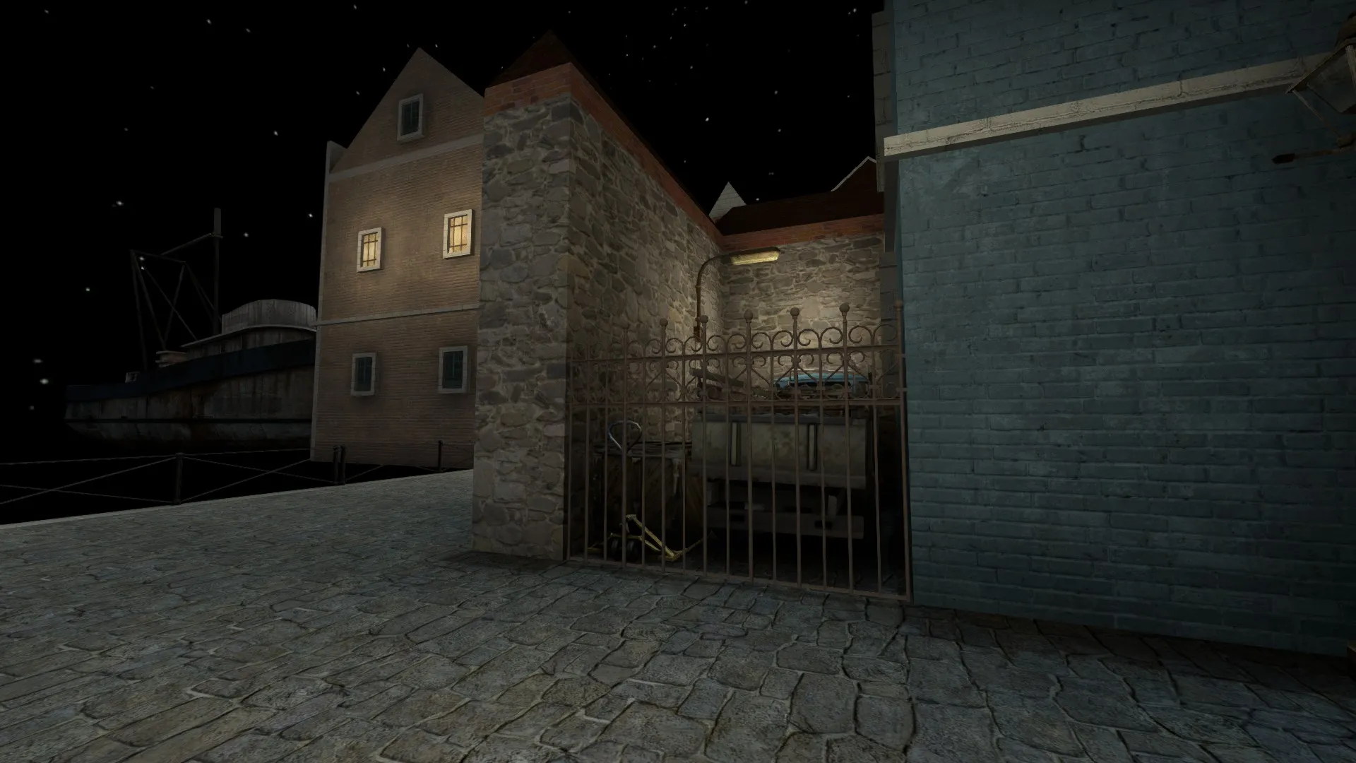
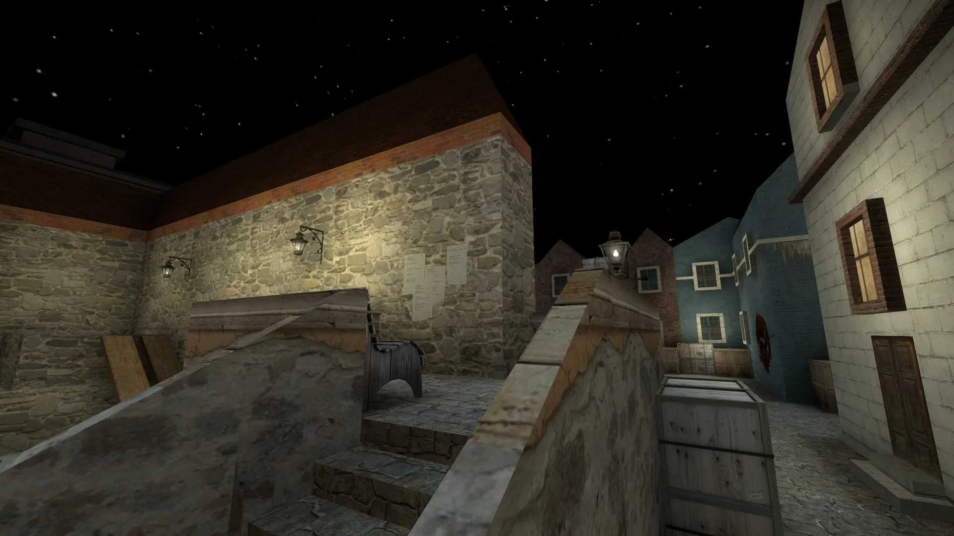
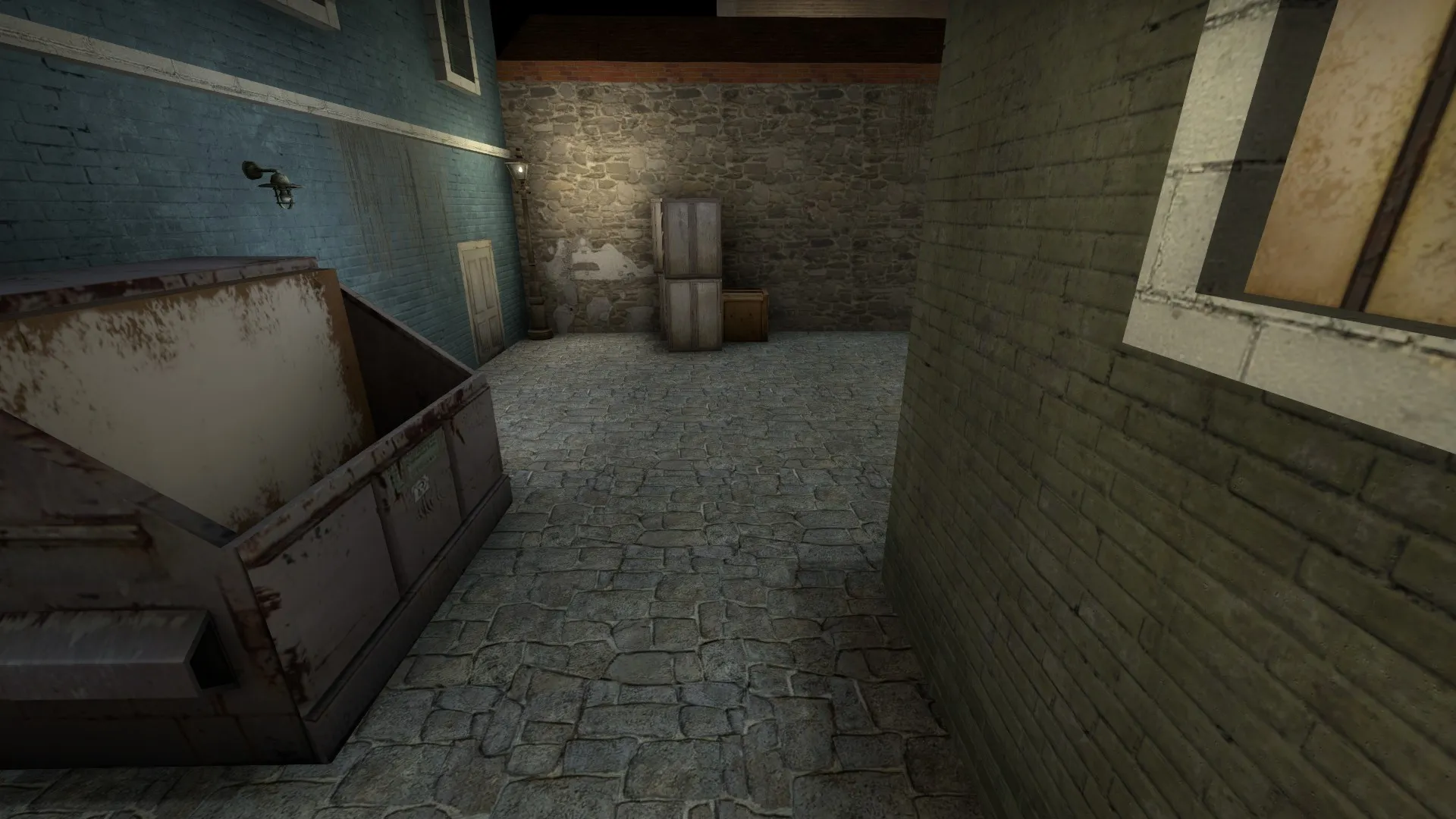
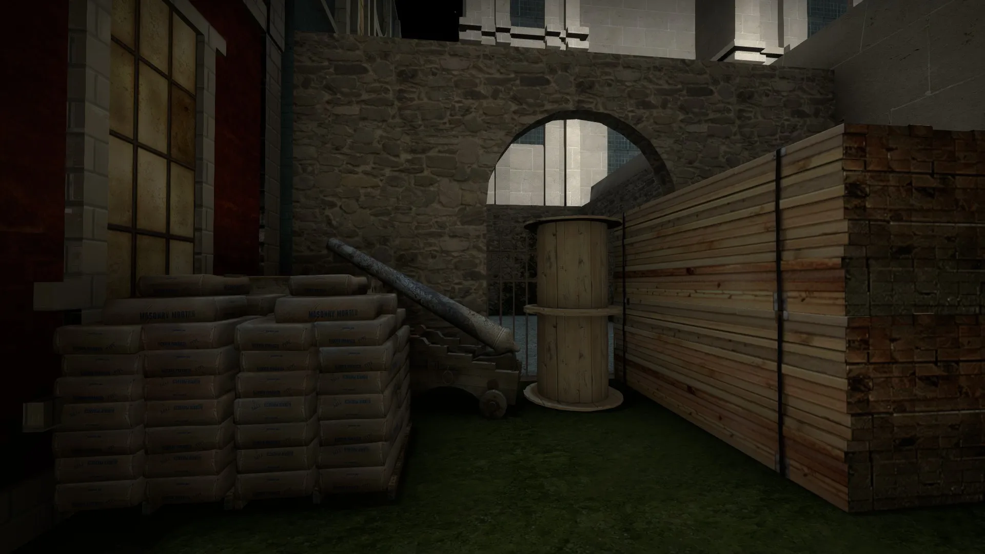
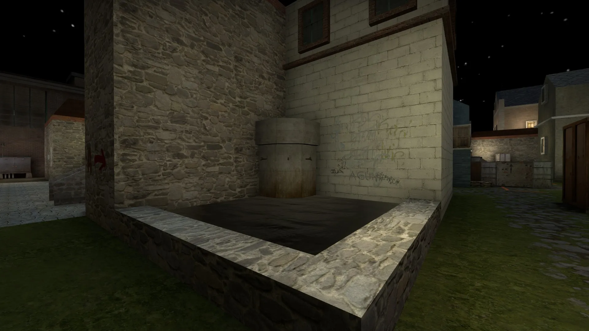
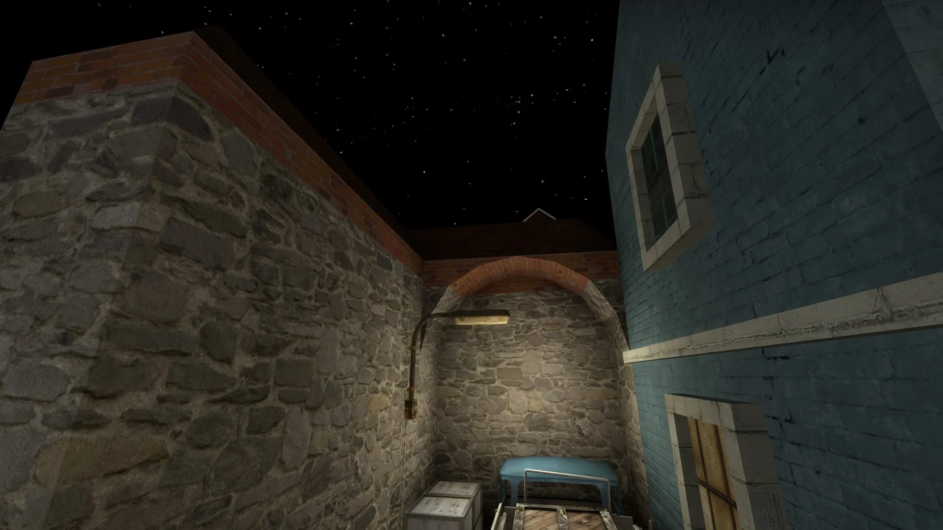
    Screenshots:

    Thanks for your time :)

  • Promulle
    • July 7, 2015 at 3:51 PM
    • #2

    Took some time, but here is the first update of de_perish since I entered it to the contest :)

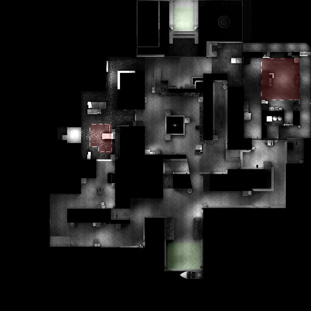
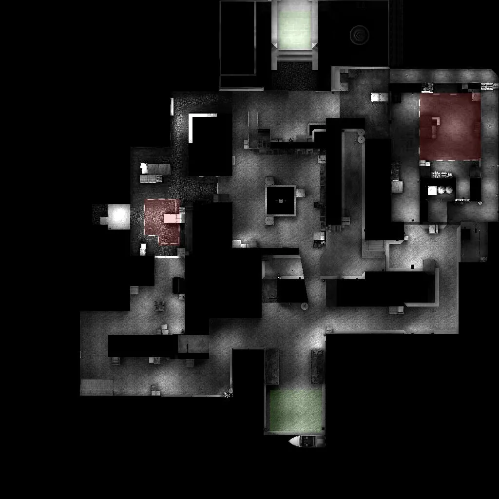
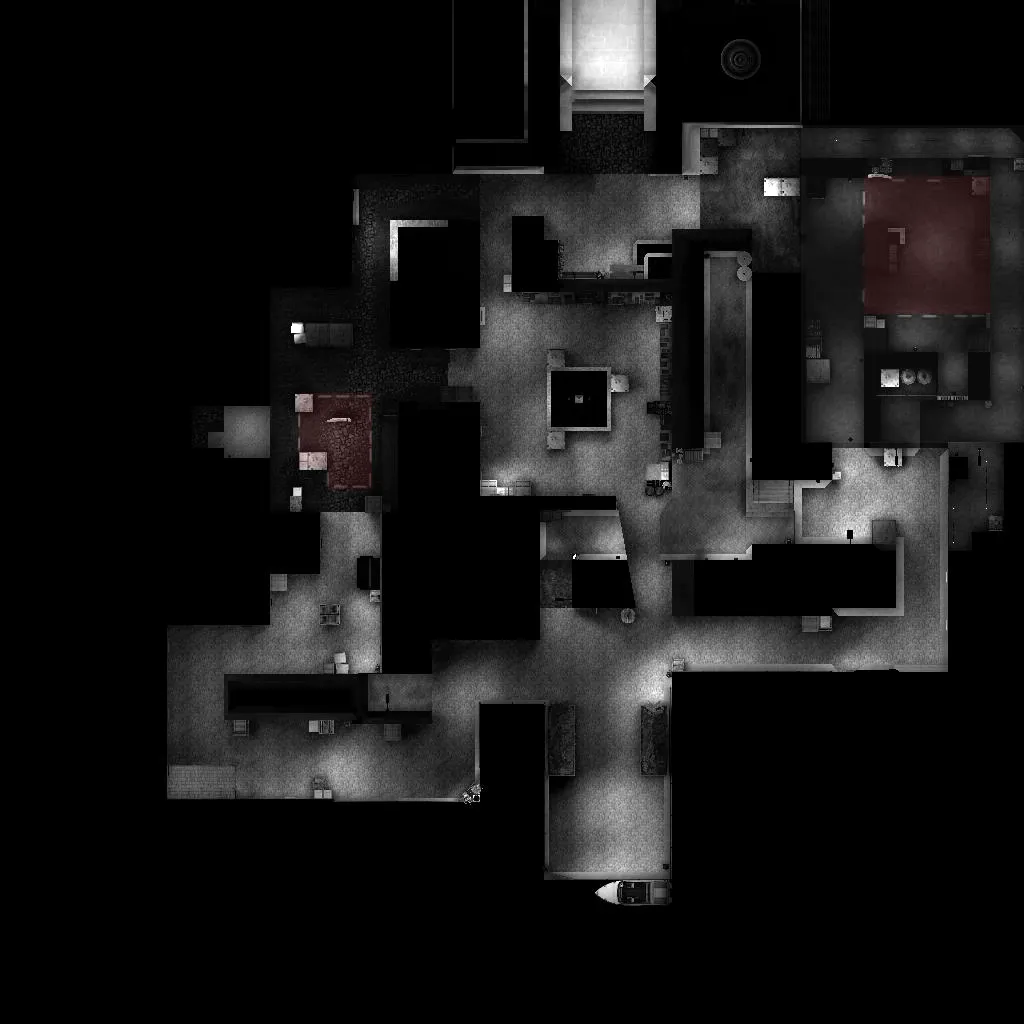
    I did change some things so now at first the new minimap :

    Now to the changes in detail :

    B-Spot :

    - made entering ct-upper way easier

    - added some props

    - made movement to tunnels easier (raised ceiling etc.)


    Mid :

    - replaced the white house with this platform, which offers ct more strategic elements when it comes to holding mid

    - added a wallbang spot at t-spawn, over the entrance to second mid where the crates are


    A-spot :

    - rebalanced the spot to be more t-friendly and open

    - added the street light as an easy way to molotov/nade the corner on the left

    - booster now has a destroyable wooden railing

    - added a ledge (left side, below the crate) for an easier way to take a

    - boxes on the right are no longer spammable (only through their corners, fully spammable boxes lead to a flash-bug)


    Misc :

    - added decals for a more aesthetic experience

    - added buildings in the 3d skybox

    - modified a 3d skybox building


    Those were all changes made in this update.

    Thank you for reading and feedback is always appreciated. :)

  • jackophant
    • July 7, 2015 at 5:44 PM
    • #3

    I realise it's a night time map, but it's still a little dark.

    Your pathing looks quite complicated as well (and redundant if Ts can go through that connector on the bottom left corner).

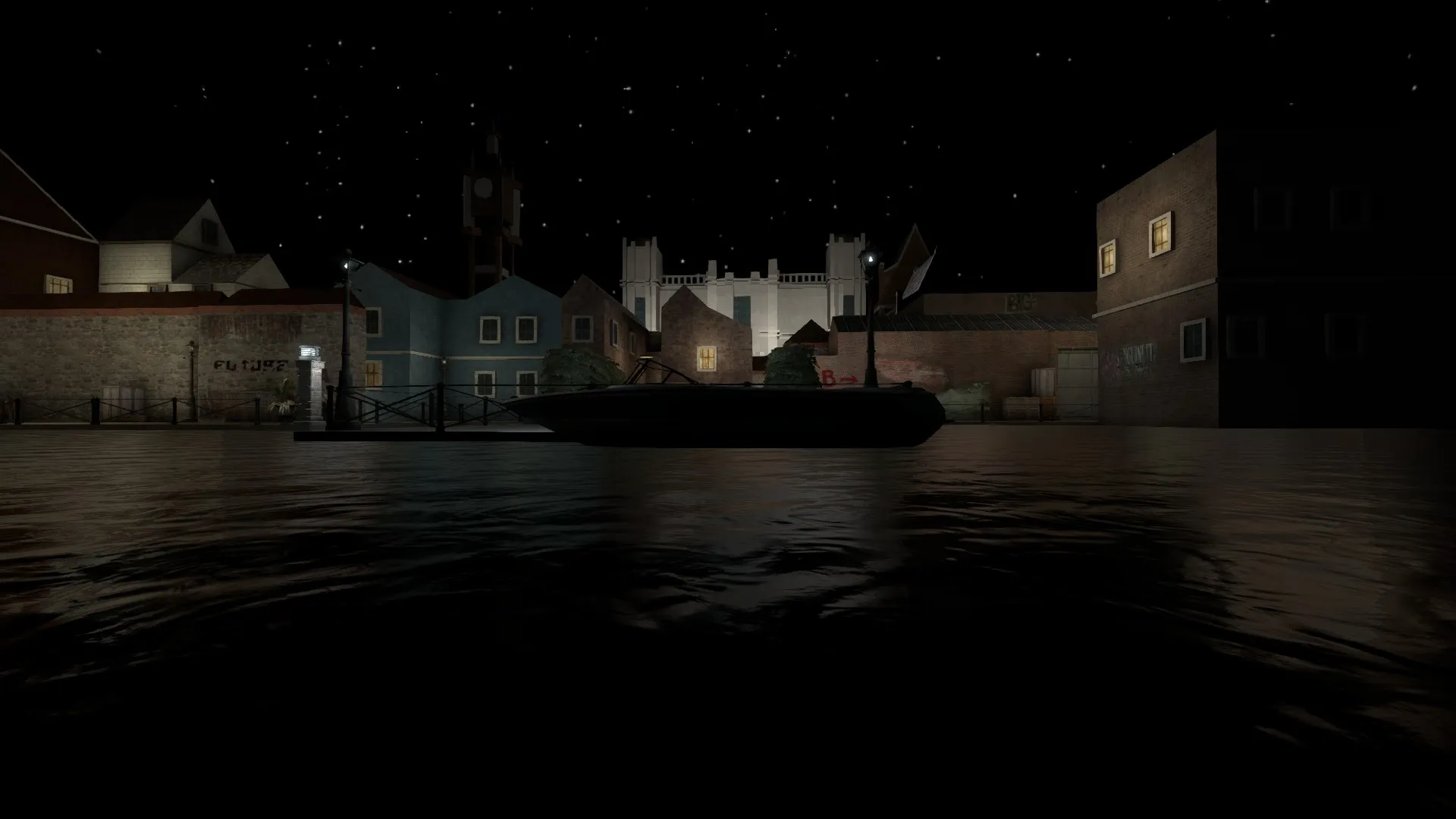
    What's the theme meant to be? I'm seeing a lot of different coloured houses, a boat, and a rather large church?

  • Promulle
    • July 7, 2015 at 8:19 PM
    • #4

    Hey, thanks for the feedback.

    The people I played the map with had no problems regarding light.

    But I still consider making the light a bit brighter.

    Maybe in a later update.

    (I usually play on a brightness setting 1.6, on which the map does look fine for me)


    The Layout might look wrong on the minimap, cause there is only one way in the bottom left corner.

    But i realise the one thing could look like a second way, but this is a dead end, mostly used to save weapons.

    I maybe should put some afford in distinguishing the path and the dead end a bit more on the minimap.


    And the theme and artwork is mostly the greatest weakness of the map so far. I wanted it to appear old, but still not boring, so i used different colored brick textures.

    The floor should be some kind of stone, just like the walls.

    With the 3d skybox building, which you identified as church, it is meant to be a castle, but working with 1/16 scale makes it a bit hard to be precise in design. (in my oppinion, with my mapping skills)

    But using bigger scales would cost performance as far as I know, so i stick to 1/16.

    And ofcourse aesthetic, design, are not finished by now. I will keep working on them.


    Sorry for the large answer and my bad english.


    EDIT : The boat makes sense in my oppinion, because it is at t-spawn, which so provides a way terrorists found thier way there.

  • Vorontsov
    • July 7, 2015 at 8:47 PM
    • #5

    The buildings look very basic and blocky, you might wanna open up a few official maps to see some techniques and such, or just in general open up a new .vmf to practice making buildings, I hope it helps

  • Guni
    • July 8, 2015 at 5:38 PM
    • #6

    Hello Promulle,

    I went through your map and besides some of the other issues people have stated, i found these to take from the map in a negative way

    > The underground area is just confusing and redundant, it creates too many hideyholes and pathways that are un-necessary, and makes the whole idea of pushing a site confusing. I think either refine it to a one way path, or remove it completely.

    > B site has a huge bomb plant zone and you have about 4-5 entrances into the site, holding it is a nightmare.

    >There is a secret tunnel that is half done, or something... I'm really not sure but its behind the silver door.

    > The two ladder access's, one on top of a glass window and the other on top of the veranda, serve no purpose what so ever and are pretty much pointless. It's nice if you want it there as a scenic value, but don't make it possible to climb them.

    > To many boxes and cover scattered around.

    > Buildings are simple and not much to them, also the windows and edges are all non-solid. Door ways were also very large and B site you could just throw grenades over the walls.

    > A site has a strange wood wall to break to go up into the top area. Don't mind this idea but the wood itself is just way to big.

    > Timings were very strange and didn't really have much balance due to all the pathways.

    > The sky-box is just too dark and half the map is still very dark, especially the water and little detail areas at T and CT Spawn, think about changing the map to a daytime or dusk version, or adding more lighting to the map.

    > The area just in-front of T spawn with the boxes that is blocked and leads no where is also pointless. I think you set up a wood window for wall-bangs but it really isnt going to be a viable option. Either turn it into a scenic thing you can run pass, or just remove it all together.

    > The little saving area to the left of T spawn is also pointless. It will just turn into a camping den of love and sex.

    I know this may sound over critical but I'm just trying to help before you go any further, I think your best bet at this stage would be to take what works, and what you are happy with and look at downsizing it a bit, maybe run over some of the helpful tips in Jacks Bible, and then try creating a grey-box version of the map that is a bit cleaner and smoother.


    Hope it helps, Goodluck!

  • Promulle
    • July 8, 2015 at 9:36 PM
    • #7

    Hello, thanks for the huge amount of feedback. :)

    I will look into a ot of the things suggested, which I was planning to do anyway like the windows, the details on the houses and so on.

    The tunnel behind the silver door is more a leftover from an older version. I did not remove it, because I was thinking of making it an out of play area,

    which would add a bit of detail to the tunnel area.

    But I couldn't decide on keeping it or removing it.


    Thank you for your time.

  • jackophant
    • July 9, 2015 at 12:43 PM
    • #8
    Quote from Promulle
    • (I usually play on a brightness setting 1.6, on which the map does look fine for me)
    • And the theme and artwork is mostly the greatest weakness of the map so far. I wanted it to appear old, but still not boring, so i used different colored brick textures. The floor should be some kind of stone, just like the walls.
    • With the 3d skybox building, which you identified as church, it is meant to be a castle, but working with 1/16 scale makes it a bit hard to be precise in design. (in my oppinion, with my mapping skills). But using bigger scales would cost performance as far as I know, so i stick to 1/16.
    • EDIT : The boat makes sense in my oppinion, because it is at t-spawn, which so provides a way terrorists found thier way there.

    I've broken your quote down into edited chunks so it's easier to focus on my comments:

    • I can't remember what the default brightness is, but leave it on that when mapping otherwise you will have replication issues for other people (look ok to you and pitch black to everyone else).
    • "Appear old" is not a theme, it's barely even a concept for a theme. Find a setting you want your map to be in, and then you have all the reference photos and images you can dream of. I even used google maps street view for some screenshots for my own reference. It will help there be a more consistent theme. DO NOT (EVER), make your theme up, seriously ever. Even if it's based on some fantastical, alien planet, you still want references for things you want to try and do.
    • Build it full scale in a separate vmf file and copy it into your main map skybox and use the scale/rotate tool, shortcut "ctrl+m". select the scale option and make the value for x, y and z all "0.16" [ 0.0625 = 1/16 ], voila! However, I think the problem you're having with the church/castle, is due to lack of reference, not your brushwork ability.
    • The boat makes sense to you but it could just as easily be a van or car. Refer to my previous point about a theme and then choose the vehicle that makes most sense. RIght now, a boat does not.

    As a side note, you shouldn't "need to decide to keep something or not". You need to be strict with the layout, if it's a gangrenous limb you chop it off rather than letting it negatively impact the rest of the map. If you have too many routes already then remove it, if you don't have enough and it's a problem redesign it or look for an alternative solution.

  • Thund3rb1rd
    • July 9, 2015 at 3:35 PM
    • #9
    Quote

    [*]The boat makes sense to you but it could just as easily be a van or car. Refer to my previous point about a theme and then choose the vehicle that makes most sense. RIght now, a boat does not.[/list]


    I really don't mean to upset you, but are you totally serious? A replacement of a boat to van, while there is all water around it? ...How did the terrorists get to the map? By a van driving underwater? "The Mystery machine" from scooby doo :D?

    And I think this change is just more of a decoration than a useful addition to the gameplay.

  • Promulle
    • July 9, 2015 at 4:25 PM
    • #10

    Just to clear up the boat thing. ;)

  • jackophant
    • July 9, 2015 at 5:59 PM
    • #11
    Quote from Thund3rb1rd

    I really don't mean to upset you, but are you totally serious? A replacement of a boat to van, while there is all water around it? ...How did the terrorists get to the map? By a van driving underwater? "The Mystery machine" from scooby doo :D?

    And I think this change is just more of a decoration than a useful addition to the gameplay.

    Before the message following yours, show me where the water is in any of those screenshots?

    Regardless, even if I had seen the water, what's stopping the replacement of the water with another form of boundary involving a road?

    It's feedback, whether it's aimed at the aesthetics or the gameplay why does it matter?

  • Guni
    • July 9, 2015 at 7:49 PM
    • #12
    Quote from Thund3rb1rd

    I really don't mean to upset you, but are you totally serious? A replacement of a boat to van, while there is all water around it? ...How did the terrorists get to the map? By a van driving underwater? "The Mystery machine" from scooby doo :D?

    And I think this change is just more of a decoration than a useful addition to the gameplay.


    Quote from jackophant

    Before the message following yours, show me where the water is in any of those screenshots?

    Regardless, even if I had seen the water, what's stopping the replacement of the water with another form of boundary involving a road?

    It's feedback, whether it's aimed at the aesthetics or the gameplay why does it matter?


    I was under the impression that jackophant was refering to the fact that there was no real indication for the boat to dock there. Besides the water being incredibly dark, i think he meant that the fencing and concrete didn't really give the direction that ct's arrived to a dock. You have to create a little story for the player, make it seem like they just arrived to the location, make it real, make me emotional.

    Also on the topic of spawn points and there relevance in the area. Why are CT's emerging from a church?

  • Promulle
    • July 15, 2015 at 5:04 PM
    • #13

    Next update is here.

    - improved detailing in a lot of areas

    Lighting :

    - added ambient light which should make the map more playable on low brightness settings

    - brightened up b-spot upper areas

    A-Spot :

    - made the way to booster/upper more reasonable

    Bugfixes :

    - fixed a boost on b-spot which would give you one way vision

    Thanks for reading, and as always, feel free to leave feedback. :)

  • biXen
    • July 16, 2015 at 3:18 PM
    • #14

    Getting better, I know how hard it is, my level is still a blocky mess :)

    As a new mapper myself but somewhat experienced 3d hobbyist I would just like to give you an advice for detailing. Almost no edges in real life are sharp / completely square, so a lot of your details look very blocky, e.g. your A spot screenshot a couple of pictures above. If you are not grayboxing you are probably better off rounding some things off right away :) Also references are alpha omega like jackophant touched on. The scale of windows to doors to building in that A site picture is off.

  • Geno
    • July 17, 2015 at 6:53 AM
    • #15
    Quote from jackophant
    • Build it full scale in a separate vmf file and copy it into your main map skybox and use the scale/rotate tool, shortcut "ctrl+m". select the scale option and make the value for x, y and z all "0.16", voila! However, I think the problem you're having with the church/castle, is due to lack of reference, not your brushwork ability

    Hello sir,
    Just to correct it a bit, 1/16 != 0.16
    1/16 = 0.0625 (that's what you rescale the brushes to in hammer for skybox)
    and in percentage, 1/16 = 6.25% (If you create custom models for skybox. Make them the normal size in 3ds max or whatever you use and then rescale them to 6.25%. Alternatively, you can create a normal sized model and compile it with "$scale 0.0625" line in qc file.)

  • jackophant
    • July 17, 2015 at 9:54 AM
    • #16

    @GenoCide you are indeed correct, rushed and rusty maths from myself spreading false information. I've corrected my OP in case anyone happens to come across it again. Thanks

  • Promulle
    • July 19, 2015 at 9:30 PM
    • #17

    Thanks for the feedback everyone provided so far. :)

    To some things mentioned:

    Non-solid windows,edges etc. : - this is a decision i made to favor uncomplicated gameplay (or i just hate to stuck at such things)

    sharp edges : - I do like sharp edges more than round edges when it comes to playing and holding those angles. So i decided that no gameplay-relevant edge should be round.

    But i am working on making the map look less blocky.

    Also i wil focus on fixing the mentioned wrong scale on a-spot.

  • Promulle
    • July 22, 2015 at 12:08 PM
    • #18

    New update is here. :)

    A-Spot :

    - fixed windowscale

    - reworked ct-water area

    B-Spot:

    - reworked some architecture

    Layout :

    - removed the save spot at t-spawn

    This is all for this update.

    As always feel free to leave feedback. :)

  • Promulle
    • July 30, 2015 at 3:42 PM
    • #19

    New update released. :)

    - Improved clipping in mid

    - improved skybox (added buildings)

    - enhanced detailing on one house

    - added first piece of "background story"


    As always feel free to leave feedback.

  • Promulle
    • August 14, 2015 at 12:57 AM
    • #20

    Next update incoming. (as soon as workshop let's me ;) )

    All of this changes should be looked on as upcoming.

    Changes :

    Mid:

    - changed the sandbags to this wall, for balancing purposes

    A-Spot:

    - removed a static prop in front of a

    - reworked ct area to better suit to the clipping i made there

    - added a boosting spot, to increase tactical depth at the ct-water area

    Misc:

    - reworked the roof of this wall between t-spawn an A-Spot


    Some final notes:

    Those are the changes I am certain about. There may be more in that update.

    Once I uploaded, you will know.

    As always have fun and feel free to leave feedback :)

Participate now!

Don’t have an account yet? Register yourself now and be a part of our community!

Register Yourself Login
Discord

The Mapcore Discord is our lively IRC channel of the 2000s reborn. Chat about level design, gaming, and more.

Latest Posts

  1. Custom Gamemodes Contest

    Angel
    July 20, 2026 at 11:46 AM
  2. FAQ

    Angel
    July 20, 2026 at 10:14 AM
  3. Tangerine

    Harry Poster
    July 18, 2026 at 11:10 AM
  4. Any of the old guard still around? D:

    Warby
    July 12, 2026 at 8:23 PM
  5. About our archived forums

    Thrik
    June 30, 2026 at 2:12 PM
  6. Mapcore Discord

    mason_fan123
    June 24, 2026 at 8:52 PM
  7. [CS2] Valley

    Serialmapper
    June 22, 2026 at 11:56 AM
  8. Free Music / SFX Resource - Over 2500 Tracks

    Eric Matyas
    June 18, 2026 at 12:32 PM
  9. Pango [WIP]

    Elowen
    June 11, 2026 at 10:13 AM
  10. [CS2] Dvina

    Jeremy Rivera
    June 11, 2026 at 10:03 AM

Users Viewing This Thread

  • 3 Guests
  1. Privacy Policy
  2. Contact
Powered by WoltLab Suite™