

Thanks Mark, good stuff! Working on those now.

de_royal (previously de_street)
-
-
I kinda agree with the guy saying it looks like Dunwall, I liked all the little details, nooks and crannies through the map.
The sound design especially is nice, it add a lots to the map. However it might be a little overdone, usually CS players don't like loud noises. The seagulls, and especially the clock, are waaay too loud. -
Congratulations! As a finalist, this map thread has been stickied.
I'll be providing my feedback in the coming days.
-
As mentioned on tonights playtest, hit me up this weekend if you want a 1 on 1 feedback session.
-
Some things I saw, which I noticed while running around, they may not be big issues :
QuoteDisplay MoreYou can stand on an nearly invisible prop part (I do not know if this is wanted):
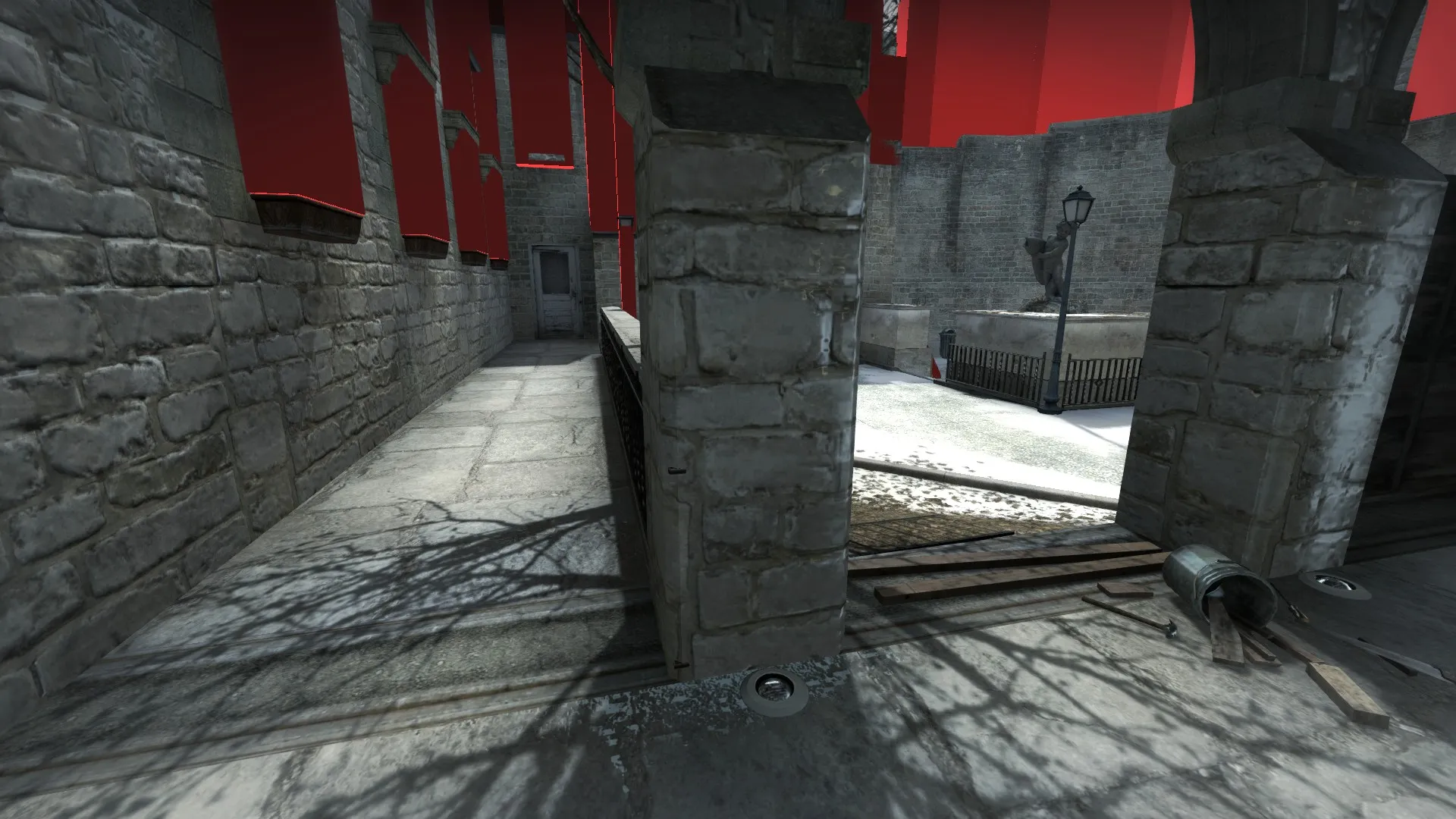
The following picture is not noclipped:
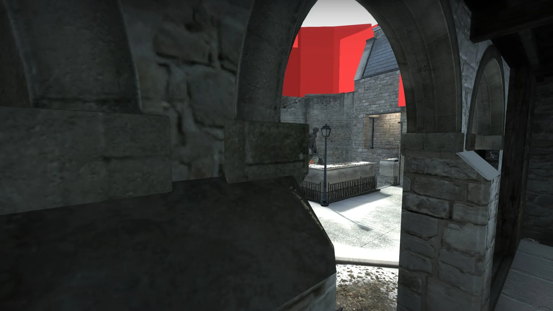
The ledge (red dots) in mid (?) being solid (again I do not know if this is intentional):
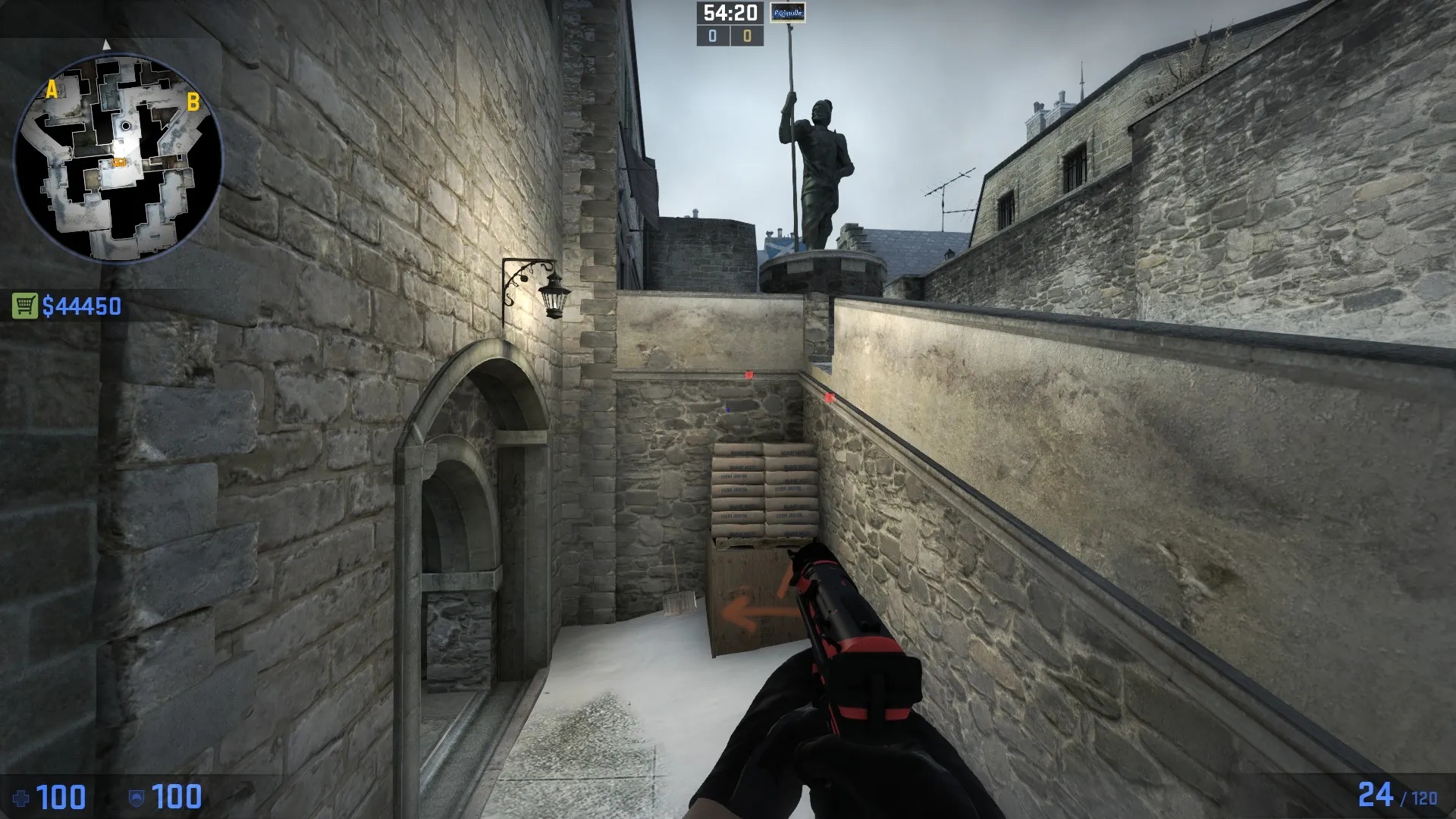
enabling this way:
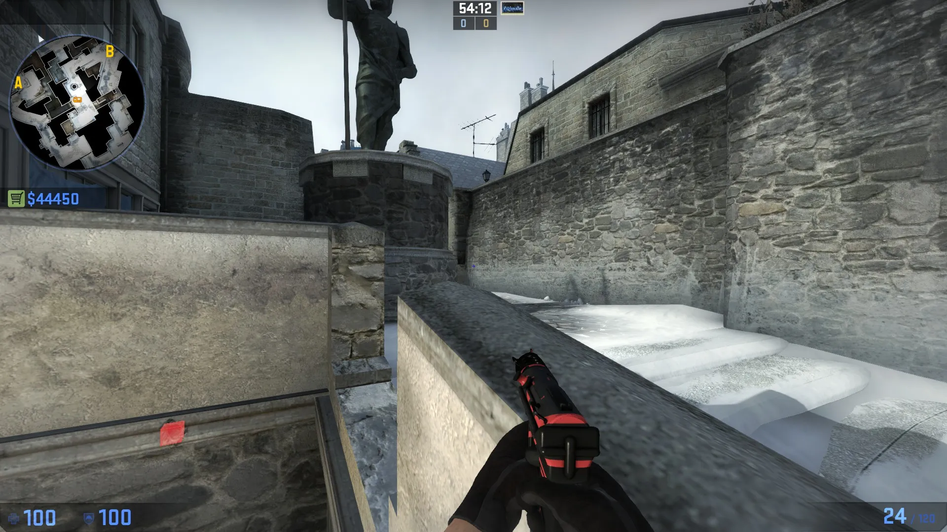
Not clipped door/gate which leads to some quite strange movement:
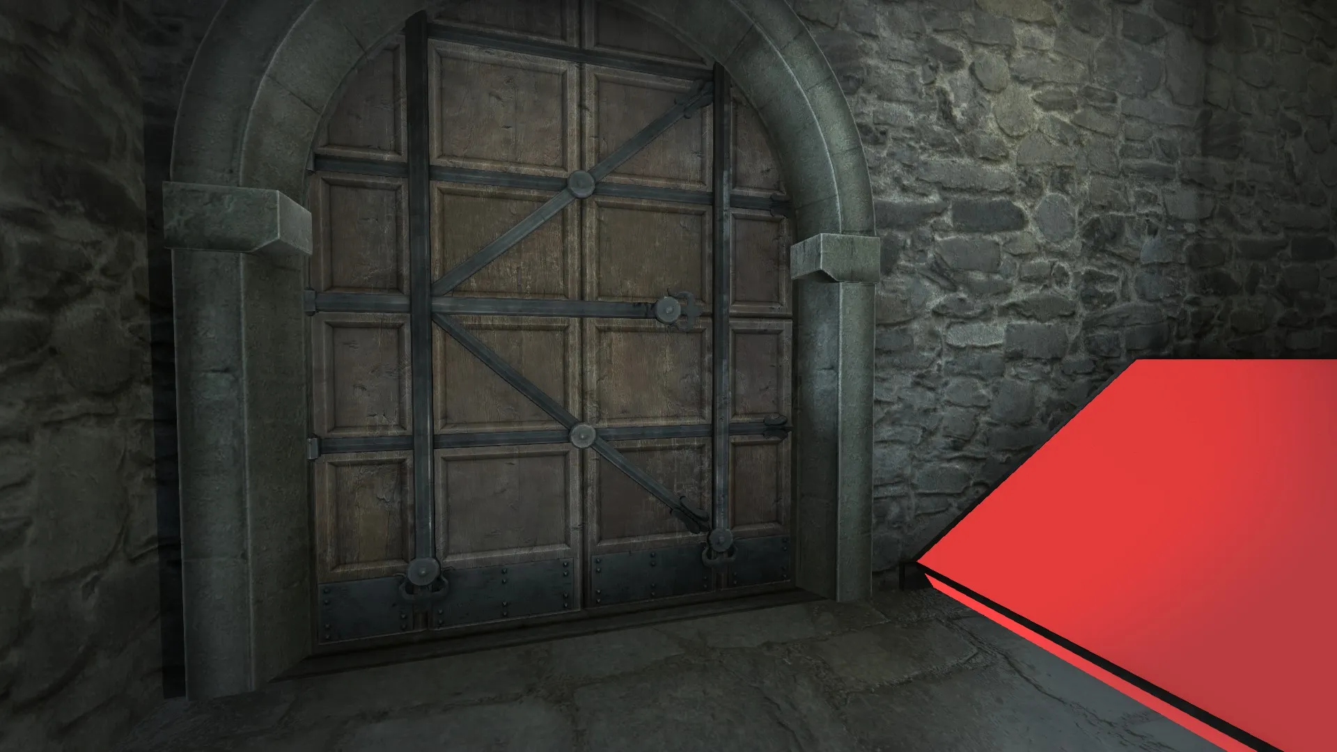
again not noclipped:
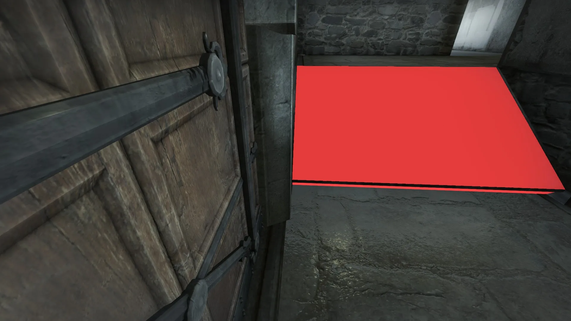
Those are the major problems I saw.
Apart from those, and the already posted flower pot, I quite like the map.
Hope my feedback helped

EDIT : corrected some spelling errors
-
There's quite a lot of clipping issues but those will get polished up I'm assuming.
hard to make any criticisms, especially with that small 4v5 playtest, so the only thing I could find was that fence texture at B. You can see through the transparent parts of it and also see player place markers (you can also boost over onto the fence):
[Blocked Image: http://i.imgur.com/xBUMuea.jpg]
Map played out pretty nicely but I forgot to test out T's mid to A route. Seems like mid CT's couldn't really contest that route. Other than that, couldn't find much faults other than that bar room at B being a bit clunky near the windows.
Good luck!
-
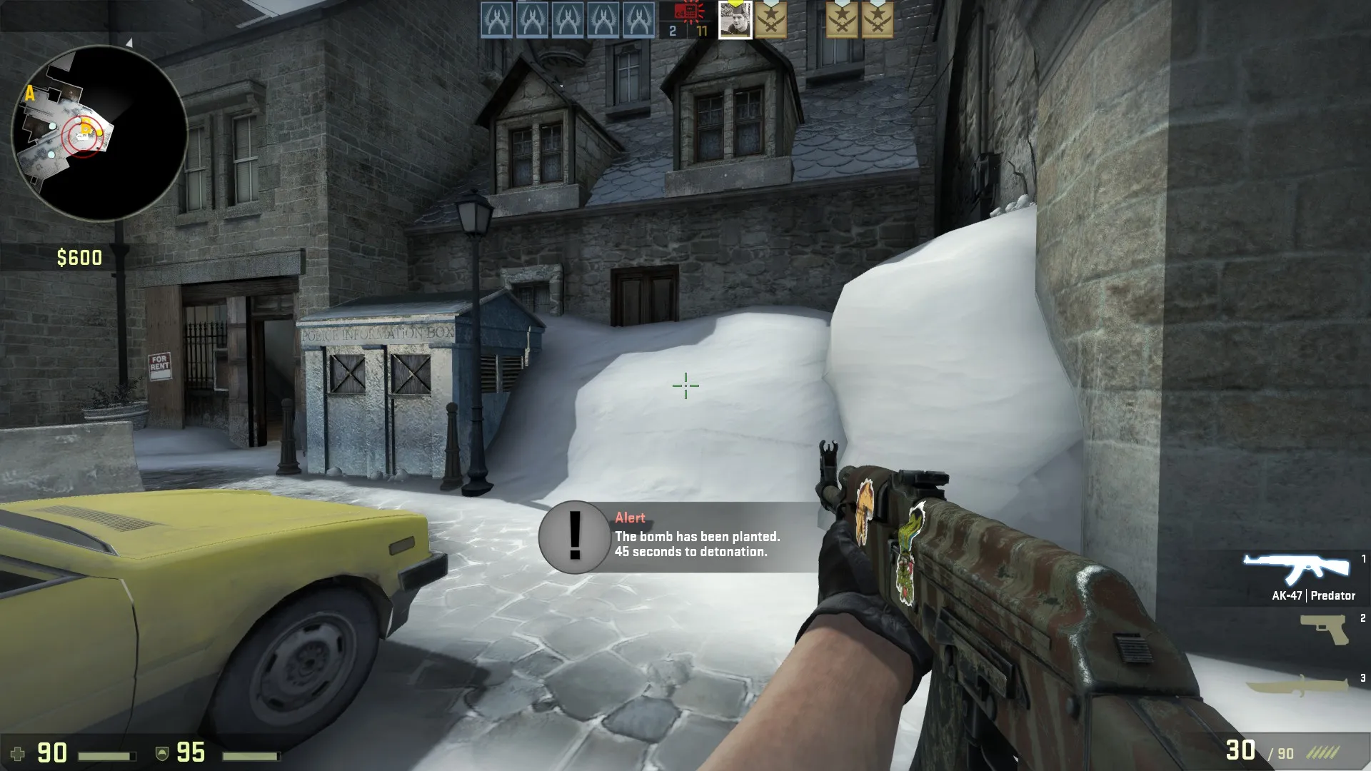
I don't know about anybody else, but whenever I see this mound of snow I'm filled with an insatiable desire to climb up it and sit on the blue hut, and my hopes are cruelly dashed by the clipping every time. Maybe you could add some spiky railings poking up through the snow?
-
I think that mound should be removed. Looks very out of place. There's no sign of snow on the roof..
-
 Quote from Vaya
I think that mound should be removed. Looks very out of place. There's no sign of snow on the roof..
I guess they piled all the snow there? If snow are contained like that it can take weeks to melt, so you can see big piles of snow even tho it stopped snowing weeks ago, and green grass is covering all the rest of the landscape. Seems kinda douche'y to block someones door like that tho. ):
-
Thanks guys for feedback. I just updated with a clipping pass and a few changes at B.
I don't know what to do about the fence atm, I haven't seen anyone use it in-game yet. I should make it unboostable though. I probably should also do something with the snow at B, since I see a lot of people trying to jump up there, but the idea was that the snowfall on the street had been piled there. I made some blend textures to put snow on the roofs, but I haven't figured out a way to make it look good yet.
Oh yeah and the bar needs clipping work as well, true true.
-
I don't know if this tutorial is made by you but: https://www.youtube.com/watch?v=f2SHEJcStEc Your map has no callouts. I Know it's not a big thing but it's hard to know where people are when your calls are left, right, there, up. Also the birds are annoying. I always think they are flashbangs or something. Maybe it's just me
-
Hey!
So gameplay wise I have very little in the way of criticism. Map played extremely well. I'm going to write up some aesthetic critiques here because I think the map needs more help in that department.
feedback album
http://imgur.com/NAZRmCy,wrOcdp…VUeay,5gTRGAT#0
***on 18 I meant bottom RIGHT, not bottom left
-
https://www.dropbox.com/s/l3eo89e8kyznxqg/royal refs.zip?dl=0
Dropbox link of 100+ references- I took these this morning and the sun/shadow wrecked a couple of them. Hopefully you find some use in these...
-
Lets start with that I really like this map, i playtested it yesterday, the layout seems interesting, but in terms of gameplay i find the layout a bit untweaked...
I know taht now is too late to make any layout changes, but i will post my criticism anyway

There are too many pathways to A site and there also too many cornes to hide, if CTs/Ts are well setup, it is really hard to re/take the bombsite. So I would simplify the corridors behind A to be more easily checked by the other team.
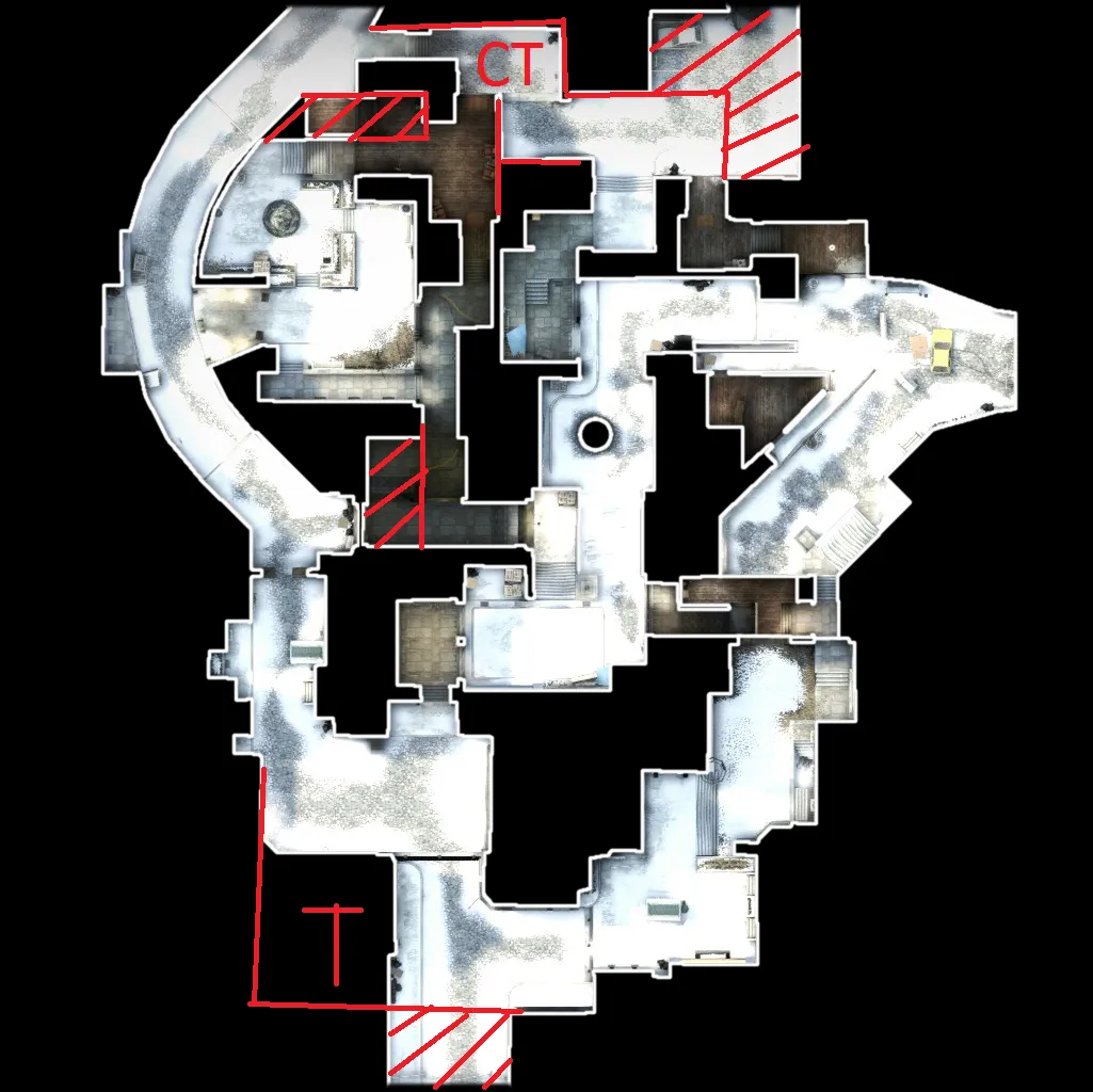
The second thing i would do to simplify the map is moving the CT spawn behind A. It has many benefits. Firstly, you can remove the area of current CTs spawn, but more importantly, you can straighten the connector from lower mid to A because both teams will get there at the same time like now. This connector will then aslo become more attractive during rotations B > A and vice versa. The third benefit I see is taht long A (especially the upper part) will become more used by both teams, because it won't by so far away from other parts of the map. Of course, if you move the CT spawn, you have to move the T spawn, too. I would move it as I painted in the overview (maybe a bit further to A long) - CTs and Ts would still get to B as now and because the CT spawn is closer to the long, T spawn should by pushed further, too. I don't know how much would these changes affect timings on mid, I hope that not much, but it's possible, that some changes in pathways from spawns to mid would be needed to current timing be preserved.
-
 Quote from P1g3oN
I don't know if this tutorial is made by you but: https://www.youtube.com/watch?v=f2SHEJcStEc Your map has no callouts. I Know it's not a big thing but it's hard to know where people are when your calls are left, right, there, up. Also the birds are annoying. I always think they are flashbangs or something. Maybe it's just me
Callouts are in now, thanks.
 Quote from FMPONE
Hey!
So gameplay wise I have very little in the way of criticism. Map played extremely well. I'm going to write up some aesthetic critiques here because I think the map needs more help in that department.
feedback album
http://imgur.com/NAZRmCy,wrOcdp…VUeay,5gTRGAT#0
***on 18 I meant bottom RIGHT, not bottom left
Thanks! I see I've got my work cut out for me.
Quote from Vayahttps://www.dropbox.com/s/l3eo89e8kyznxqg/royal refs.zip?dl=0
Dropbox link of 100+ references- I took these this morning and the sun/shadow wrecked a couple of them. Hopefully you find some use in these...
Thanks man. These are great, but I think I kinda shot myself in the foot setting this map in the winter...
 Quote from Adam108CZ
Lets start with that I really like this map, i playtested it yesterday, the layout seems interesting, but in terms of gameplay i find the layout a bit untweaked...
I know taht now is too late to make any layout changes, but i will post my criticism anyway
There are too many pathways to A site and there also too many cornes to hide, if CTs/Ts are well setup, it is really hard to re/take the bombsite. So I would simplify the corridors behind A to be more easily checked by the other team.
The second thing i would do to simplify the map is moving the CT spawn behind A. It has many benefits. Firstly, you can remove the area of current CTs spawn, but more importantly, you can straighten the connector from lower mid to A because both teams will get there at the same time like now. This connector will then aslo become more attractive during rotations B > A and vice versa. The third benefit I see is taht long A (especially the upper part) will become more used by both teams, because it won't by so far away from other parts of the map. Of course, if you move the CT spawn, you have to move the T spawn, too. I would move it as I painted in the overview (maybe a bit further to A long) - CTs and Ts would still get to B as now and because the CT spawn is closer to the long, T spawn should by pushed further, too. I don't know how much would these changes affect timings on mid, I hope that not much, but it's possible, that some changes in pathways from spawns to mid would be needed to current timing be preserved.
These changes make a lot of sense. You're right, I'm too scared to change the map this much for the contest, but I will want to try these out afterwards.
-
Quote from jakuza
Thanks! I see I've got my work cut out for me.
Thanks man. These are great, but I think I kinda shot myself in the foot setting this map in the winter...
A little, yes. Winter here isn't that harsh so that giant snow displacement at B looks a little out of place

I think you can use some of these to make some areas feel more unique though..Take @FMPONE's highlighed areas of needing work..apply some more uniqueness to these using these references (I'm really surprised you don't have 1 church, there's like 100000 of them here) and the overall feeling of the map should improve
-
*shakes hand*
Glad to see someone adapt so quickly to a game and replicate it in a personal work (not to mention a very original idea at that).
The layout feels really smooth, though I crossed out objects that you may consider moving to where the player is standing in the screenshot or replace the models with clean ground detail that makes the A site easy to travel in.
Overall the geometry in the map is very original, each building seems unique and although the textures repeat the architecture is enough to where we can make distinctions between each area.
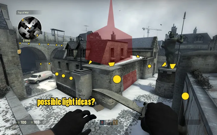
Since the textures seem to be a very similar tone of color, with reflections only blending wall geometry into the sky it feels very saturated. Since any official deadlines aren't in place it would be worth experimenting with lighting, possibly changing the color of the sun to a more saturated orange, possibly recoloring the skybox a deeper color (maybe throwing in some purple into the blue as if it was later in the day), throwing up a few more bulbs around the city so it seems a bit more lively, turn lights on in some of the windows, take advantage of being the person responsible for making such a historic landmark in such a quiet spot a possible tourist attraction?
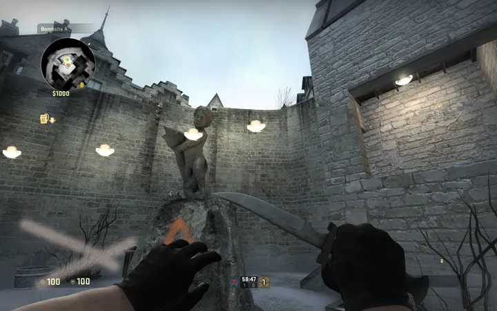
The building at A seems like a central point in the map, I think possibly putting more emphasis on the architecture of this particular building will benefit a lot of surrounding areas at once. Adding more lights around the map for visual warmth will balance the monotone color palette this map currently displays.
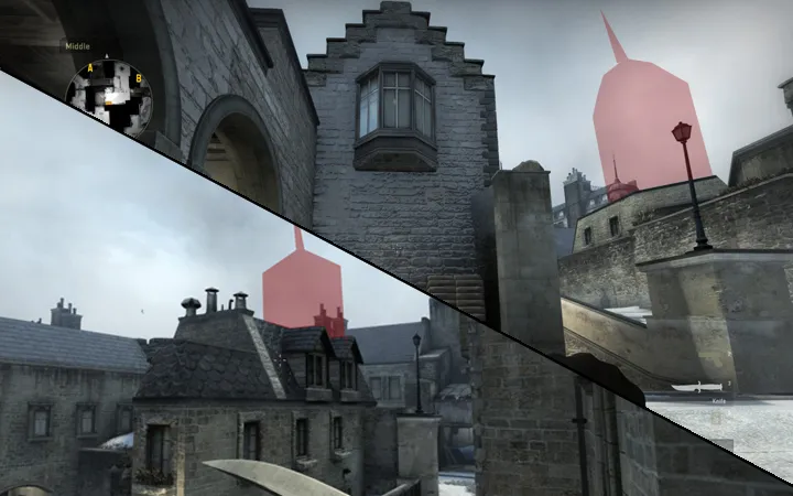
Random visual bugs
Congrats, this map is definitely on the right track and it's good to see a map that looks and feels original, especially for a new generation of GO players who may never get a chance to experience a map like Vostok, this is absolutely an Operation worthy map.
-
-
External Content www.youtube.comContent embedded from external sources will not be displayed without your consent.Through the activation of external content, you agree that personal data may be transferred to third party platforms. We have provided more information on this in our privacy policy.
-
Does anyone have any knowledge of whether Valve will incorporate changes from the workshop if it's something important like these exploits?
-
Participate now!
Don’t have an account yet? Register yourself now and be a part of our community!