1. Forums
  2. Discord
  3. About Mapcore
  4. Patreon Supporters
  • Login
  • Register
  • Search
This Thread
  • Everywhere
  • This Thread
  • This Forum
  • Articles
  • Pages
  • Forum
  • More Options
  1. Mapcore
  2. Discussions
  3. Level Design

[CS:GO] DE_LITE

  • cashed
  • May 31, 2015 at 7:34 PM
  • Shibou
    • June 18, 2016 at 11:28 PM
    • #81
    Quote from cashed

    5 hours ago, cashed said: @'RZL havent decided on a CC and lighting it feels a bit too brown now with textures being more in that hue. So im going to tweak the colours


    Started branding ideas

    [Blocked Image: http://i.imgur.com/mt5SFXg.jpg][Blocked Image: http://i.imgur.com/pxeKNyw.jpg]

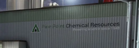
    Sans serifes looks nice, yet the theme of the map itself doesnt seem to fit a modern company logo...
  • cashed
    • June 19, 2016 at 4:06 AM
    • #82

    shhhhh

    [Blocked Image: http://i.imgur.com/osxoWzM.jpg]

  • soultron
    • June 21, 2016 at 7:24 PM
    • #83
    Quote from cashed

    On 6/18/2016 at 0:54 PM, cashed said: Started branding ideas

    [Blocked Image: http://i.imgur.com/mt5SFXg.jpg]

    I think this one looks best so far and will probably be most readable at a distance. Have you considered all caps in this font?

  • cashed
    • June 22, 2016 at 3:07 AM
    • #84

    Updated the workshop, couple bugs and fps drops, now the tedious work

    http://imgur.com/a/fovaF

  • poLemin
    • June 23, 2016 at 12:47 PM
    • #85
    Quote from cashed

    On 6/22/2016 at 4:07 AM, cashed said: now the tedious work

    hehe.

    looks amazing! very inspiring

  • soultron
    • June 25, 2016 at 3:26 AM
    • #86
    Quote from cashed

    On 21/06/2016 at 10:07 PM, cashed said: Updated the workshop, couple bugs and fps drops, now the tedious work

    http://imgur.com/a/fovaF

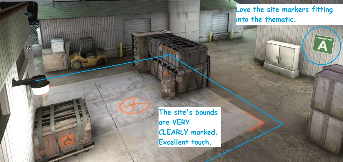
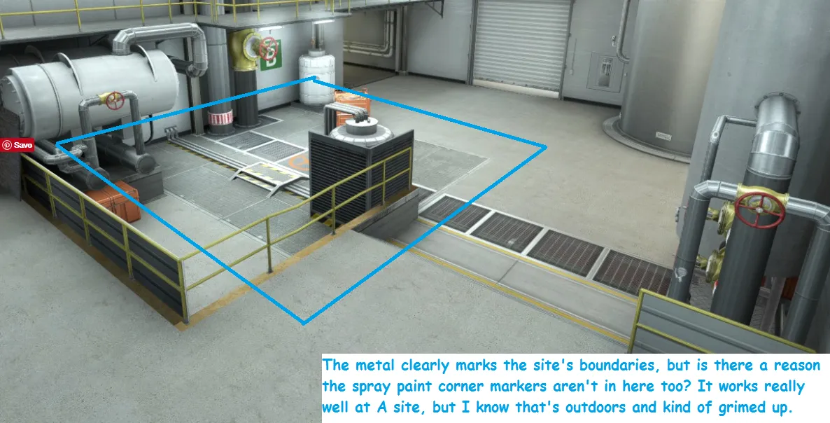
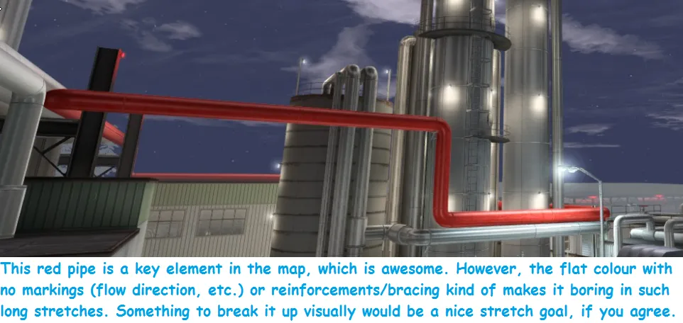
    The logo and accompanying text get a bit lost, especially from that distance, on the corrugated metal they're sitting on. Maybe a solid backing panel (or something of the sort) would help it standout a bit more. It's really the vertical lines of the metal texture that kind of slice it up and make it difficult to read. The green text also blends into the white/gray of the metal texture -- the black text is much more readable. Minor stuff to come back to after the tedious work, honestly. Attached some other feedback notes. I'm not sure if you're going in to do other visual touches and polish later on, but I made some suggestions to that effort. Some of the stuff you've already thought of I'm sure, so forgive me if some of the feedback is obvious or stuff you're planning on doing but just haven't gotten around to doing yet. All around, good progress in such a short amount of time! You've been crushing it this week!

  • blackdog
    • June 25, 2016 at 1:56 PM
    • #87

    Like first logo better. Would be interesting see a full caps version, as well as text as tall as the logo.

  • cashed
    • July 12, 2016 at 2:20 PM
    • #88

    new batch of screeens!

    http://imgur.com/a/FwGWG

    and updated the workshop! http://steamcommunity.com/sharedfiles/fi…s/?id=632040311

  • Radix
    • July 12, 2016 at 3:50 PM
    • #89

    Wow! This really gets better and better. Night theme is doing a great job there.

    But sky color feels not 100% perfect yet to me. Maybe a little warmer color. Something between what it is now and this.

  • cashed
    • July 12, 2016 at 4:01 PM
    • #90

    you find that too? Been using that ref for a while ;)

  • Vaya
    • July 12, 2016 at 4:49 PM
    • #91

    that ref is awesome. Ted just copy and paste that into hammer. ez.

  • Radix
    • July 12, 2016 at 5:05 PM
    • #92
    Quote from cashed

    1 hour ago, cashed said: you find that too? Been using that ref for a while ;)

    Got it from your reference album. :D

    That's how it happened:

    Watched at your screenshots. Thought: "Wow, that's nice. But hmm... the sky needs a little bit of... I don't know... - wait - didn't he post this amazing reference pic some time ago?" Went back to page 1. "Ahh there it is!" Posted link. :D;)

    And I have to say you're pretty damn close to it!

  • cashed
    • July 12, 2016 at 6:04 PM
    • #93

    I think I need more pipes tho :)

    Going to make a low res multi-pipe asset asap

  • jackapples
    • July 12, 2016 at 6:10 PM
    • #94

    I really hope you re-consider using this night theme, good competitive maps have never been set at night because of visibility issues. Castle, Rails, and Mist have all been forgotten about and we're never intended for serious competitive play, so why put de_lite in that weird mix of maps? de_lite was a phenomenal map in 1.6 so why change that by giving it a completely new look, for gods sakes don't kill this map by giving it a night theme, just keep it set in daylight just like your version of de_season.

    Also their is a serious amount of ambient noise in the updated workshop version, especially around middle.

  • Vaya
    • July 12, 2016 at 6:45 PM
    • #95
    Quote from jackapples

    31 minutes ago, jackapples said: I really hope you re-consider using this night theme, good competitive maps have never been set at night because of visibility issues. Castle, Rails, and Mist have all been forgotten about and we're never intended for serious competitive play, so why put de_lite in that weird mix of maps? de_lite was a phenomenal map in 1.6 so why change that by giving it a completely new look, for gods sakes don't kill this map by giving it a night theme, just keep it set in daylight just like your version of de_season.

    Also their is a serious amount of ambient noise in the updated workshop version, especially around middle.

    honestly dude- those maps could of been the most super competitive maps ever set at day and still they would of been forgotten about. The CS community really hates new maps just now- the only reason valve's official ones (train/nuke etc) have gotten anywhere is because they've been forced on the comp scene. The visibility is NOT an issue in this map currently.

  • cashed
    • July 12, 2016 at 7:19 PM
    • #96
    Quote from jackapples

    1 hour ago, jackapples said: I really hope you re-consider using this night theme, good competitive maps have never been set at night because of visibility issues. Castle, Rails, and Mist have all been forgotten about and we're never intended for serious competitive play, so why put de_lite in that weird mix of maps? de_lite was a phenomenal map in 1.6 so why change that by giving it a completely new look, for gods sakes don't kill this map by giving it a night theme, just keep it set in daylight just like your version of de_season.

    Also their is a serious amount of ambient noise in the updated workshop version, especially around middle.

    To say all comp maps have to be daytime is opinion. If valve thinks its should be day to be used in Active Duty I would oblige. Right now I'm looking for a theme target to hit.

    Sounds will be fixed asap.

  • cashed
    • July 18, 2016 at 6:20 AM
    • #97

    A new screen and album

    http://imgur.com/a/Lrnmq

    [Blocked Image: http://i.imgur.com/2k6s98I.jpg]

  • The Horse Strangler
    • July 18, 2016 at 7:01 AM
    • #98

    Looking good dawg, gonna give it a run thru tonight.

  • cashed
    • July 18, 2016 at 9:14 PM
    • #99

    please do, latest is up on the workshop.

  • MadMax
    • July 20, 2016 at 6:06 AM
    • #100

    Night theme looks amazing. Just have a couple little things that would be nice if tweaked.

    Right now it requires two jumps to get up on this metal platform (one onto the box, one more on the platform itself). For increased movement flow, I'd suggest raising the box enough so that it only requires a jump onto the box then straight walking onto the platform. The ground below the box could be raised in this corner to accomplish this (similar to the way the updated Cache Mid Vents to B works).

    [Blocked Image: http://images.akamai.steamusercontent.com/ugc/2751014586…72C2F6F267C8C9/]

    Other change is eliminate this pixel peek in B:

    [Blocked Image: http://images.akamai.steamusercontent.com/ugc/2751014586…6A8653D46A7358/]

    View from site:

    http://images.akamai.steamusercontent.com/ugc/2751014586…1FEEE92BD727BB/

    These kinds of sight lines are just frustrating.

Participate now!

Don’t have an account yet? Register yourself now and be a part of our community!

Register Yourself Login
Discord

The Mapcore Discord is our lively IRC channel of the 2000s reborn. Chat about level design, gaming, and more.

Latest Posts

  1. Tangerine

    Harry Poster
    July 18, 2026 at 11:10 AM
  2. Any of the old guard still around? D:

    Warby
    July 12, 2026 at 8:23 PM
  3. About our archived forums

    Thrik
    June 30, 2026 at 2:12 PM
  4. Mapcore Discord

    mason_fan123
    June 24, 2026 at 8:52 PM
  5. [CS2] Valley

    Serialmapper
    June 22, 2026 at 11:56 AM
  6. Free Music / SFX Resource - Over 2500 Tracks

    Eric Matyas
    June 18, 2026 at 12:32 PM
  7. Pango [WIP]

    Elowen
    June 11, 2026 at 10:13 AM
  8. [CS2] Dvina

    Jeremy Rivera
    June 11, 2026 at 10:03 AM
  9. Bridges 2.0 by NEXSIDE, MAP SHOWCASE. ( Steam Workshop )

    MrTrane18
    June 1, 2026 at 7:46 PM
  10. Classic Maps Reborn For CS2

    SillySpaceCat
    May 31, 2026 at 10:33 PM
  1. Privacy Policy
  2. Contact
Powered by WoltLab Suite™