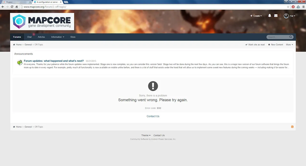
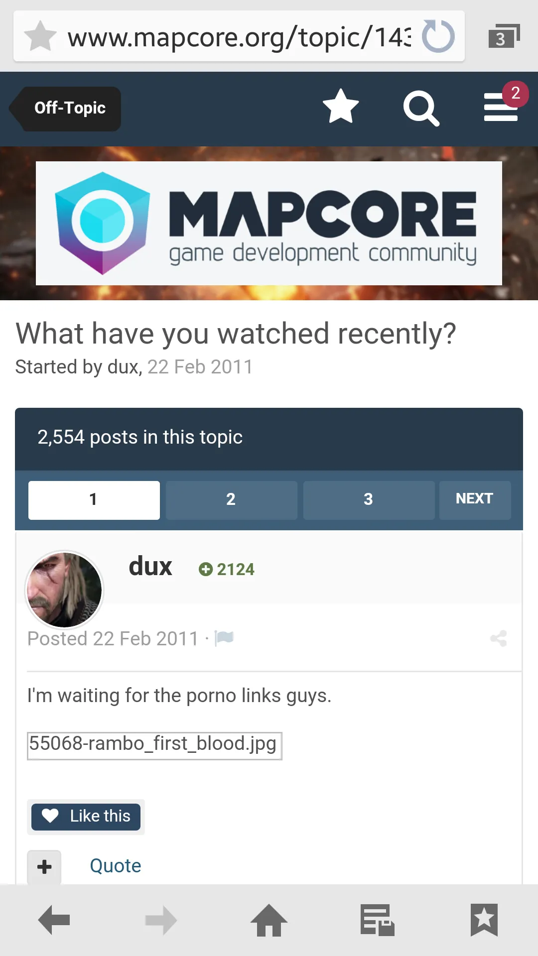
I think the design looks better and more modern on an astetic perspective, but due to the missing tableborders between topics and post the readability is suffering. I would suggest adding some kind of border, or change the background of every second topic/post to a light grey, so the posts become more easily distiguishable.
Also fix this EX2, it is getting annoying...