

Title. Looks very slick and minimalist, I like it.
EDIT: Found something that makes this gaem unplayable and broken, chat can't be windowed anymore </3

Title. Looks very slick and minimalist, I like it.
EDIT: Found something that makes this gaem unplayable and broken, chat can't be windowed anymore </3
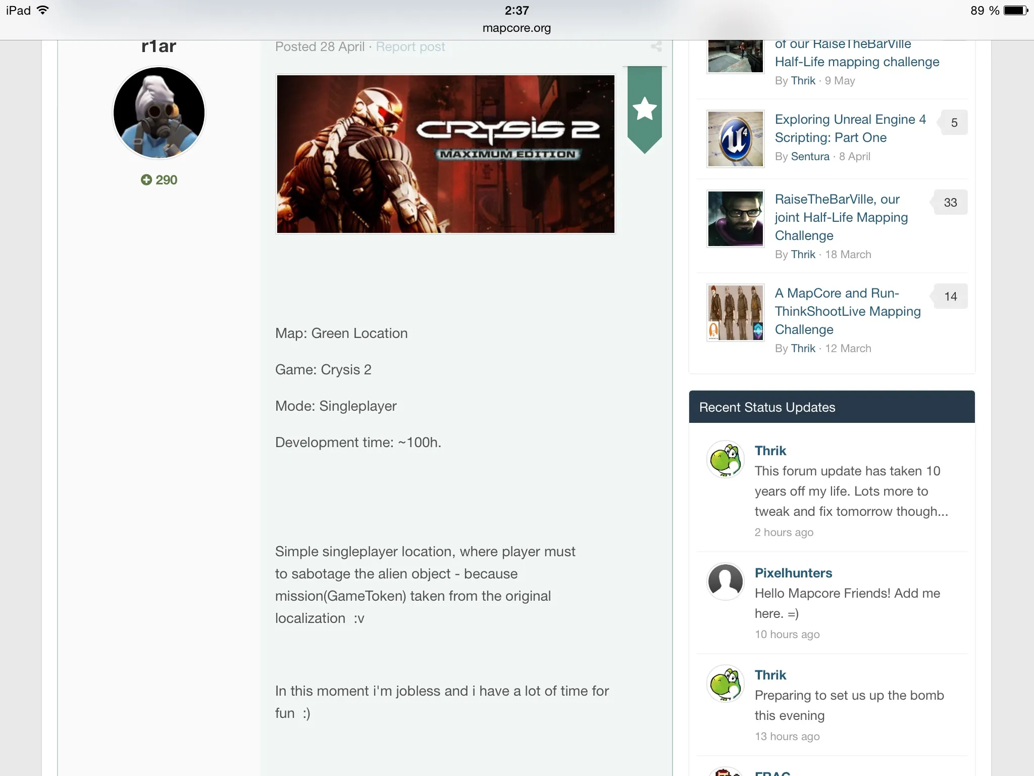
Content block is too narrow on iPad Mini 2

Layout is pretty much the same tbh. Not much has changed with that and I don't mind the look either. All good to me.
[url='']https://www.mapcore.org/announcement/1…and-whats-next/[/url]
I appreciate that this unavoidable update will be jarring to most people, and I'm no exception. It's human nature to grow fond of familiar things, but I ask that for at least the next week or so you try to avoid pointing out subjective/style problems beyond honest-to-god formatting problems and such, because I'm just not going to have the time to address things that are more about preference than functionality. However, there will be lots of iterative improvements coming throughout the following months, so feedback won't be ignored.
Round avatars are scary!
For real though, most of the stuff is way too big/padded out.
Earmahgurd change
Round avatars are something I've never seen before 
I like that we can see eachothers reputation. Mines high. I look like a bigshot 
Sweeeeet!
Thank you so much for your hard work thrik.
It's good
Hoping for support for gifv, gfycat, webm or something similar!
http://community.invisionpower.com/files/file/7137-gfycat-media-tag/
Of course change always take a bit of getting used to, I do like the new style though the more I've been sat on here, it compliments the logo branding better and everything seems flush.
I've noticed one or two issues but this is the first night of changes, so I'm not yelling out yet as they will most likely get fixed (and if they don't, I'll be coming for ya!)
Great job so far 
I'm good with it. I've seen the style used elsewhere and its nice. I agree with the comment about the padding being too much though. Thanks for all the hard work! You rock.
Looks good, but round avatars sucks.
Looks good, however I must be dumb but I cannot find the way to skip to the latest page when you already are in the post, like there used to be, if someone knows, I'd be grateful ! (I've already seen that you can go there directly from the topic page )
Web 6.0 style
Looks good, thanks man 
I keep having an error window every new tab i try to open : "Sorry, there is a problem - Something went wrong. Please try again. Error code: EX2"
I have to refresh the page twice to access the thread i try to reach...
I keep getting the below error:
--
Sorry, there is a problem
Something went wrong. Please try again.
Error code: EX2
--
What version are we now running? internet searches suggest invision have fixed this in 4.0.6
I'm using the latest google chrome at home and I've got the same issue at work which is on firefox v22
Snap! Em
Also, it might be just me but i find that there is too much spacing everywhere. Let's compare to a forum like Polycount, for the same amount of text i can fill 4/5 posts versus 2 posts with mapcore.
Besides that the design is cool
 Quote from laminutederire
Looks good, however I must be dumb but I cannot find the way to skip to the latest page when you already are in the post, like there used to be, if someone knows, I'd be grateful ! (I've already seen that you can go there directly from the topic page )
What do you mean? It's still there both on top and on the bottom of the page.
[Blocked Image: http://i.imgur.com/tOMufEJ.jpg]
I find that everything is a bit on the large side. The scrolling! THE SCROLLING!!!
Don’t have an account yet? Register yourself now and be a part of our community!