1. Forums
  2. Discord
  3. About Mapcore
  4. Patreon Supporters
  • Login
  • Register
  • Search
This Thread
  • Everywhere
  • This Thread
  • This Forum
  • Articles
  • Pages
  • Forum
  • More Options
  1. Mapcore
  2. Discussions
  3. Level Design

[CS:GO][WiP]de_hospital

  • Rogerztheurbanlegend
  • March 16, 2015 at 8:23 PM
  • Rogerztheurbanlegend
    • March 16, 2015 at 8:23 PM
    • #1

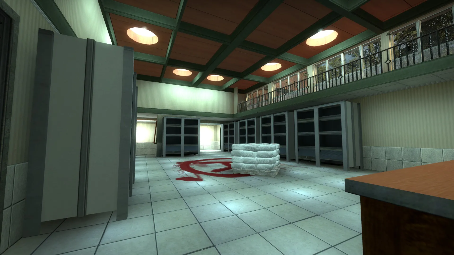
    Hey guys, new mapper here! I finally got around to trying my hand on some map building after a long hiatus and over a decade of active duty. I thought I would post the workshop here, since it is playable and testable. I have been watching/reading tutorials throughout the process and I feel I have come a long way, but there are tons of things to work out, such as optimization and lighting. The layout/flow seems to be very well received (by clan members/friends) but that could be them being nice. I could use some testing from the community, and would love to hear what you guys think. Below are a couple screen shots and the workshop link. The minimap is working, albeit a bit off grid which won't matter, due to the map changing once I detail the T and CT starting zones. Currently they are low priority and bombsite A needs to be worked on next for a better layout. The map has no custom models (haven't found someone to work those just yet) and only a couple custom textures. Thanks for paying a visit and hope to hear from you guys soon!


    Workshop: http://steamcommunity.com/sharedfiles/fi…s/?id=323136468


    [Blocked Image: http://i.imgur.com/0A27NYF.jpg]


    [Blocked Image: http://i.imgur.com/z3tg0vb.jpg]


    [Blocked Image: http://i.imgur.com/IwZRmPn.jpg]


    [Blocked Image: http://i.imgur.com/0QDRi9f.jpg]


    [Blocked Image: http://i.imgur.com/yo8xvkS.jpg]


    [Blocked Image: http://i.imgur.com/1Ud8NNI.jpg]


    [Blocked Image: http://i.imgur.com/fc0ShII.jpg]


    [Blocked Image: http://i.imgur.com/p6bXOv5.jpg]


    [Blocked Image: http://i.imgur.com/1YZEnDz.jpg]


    [Blocked Image: http://i.imgur.com/NsInmRA.jpg]

  • Rogerztheurbanlegend
    • March 16, 2015 at 11:09 PM
    • #2

    Here is the minimap, kinda dirty but it should give an idea of the layout.


    [Blocked Image: http://i.imgur.com/oYefr1U.jpg]

  • Vaya
    • March 17, 2015 at 11:47 AM
    • #3

    I would use lighter textures inside - I've never seen a dark hospital. Seems to be some long lines of sight too.

  • Rogerztheurbanlegend
    • March 17, 2015 at 2:37 PM
    • #4

    I am more than likely going to go with this being the clinic portion on the side. Clinics have a softer color palette and if I go with bright white and fluorescent colors, it would make the map too bright and not work well. The long lines of sight have some broken parts, but the map isn't nearly as big as it seems, however I understand this criticism and have been trying to come up with a solution of breaking up the rest of the long halls, but the ideas I have will change around the layout a bit. Unfortunately, the best way to see if jumping on the map (if players haven't yet). My main concern is no boxes/dirt so it doesn't look like 80% of the other maps on workshop.

  • Vaya
    • March 17, 2015 at 3:03 PM
    • #5

    I'll try it out tonight

  • sevin
    • March 17, 2015 at 11:22 PM
    • #6

    The green lighting would never appear in a real hospital. It is a sickly color, the exact opposite of how doctors want their patients to feel. I would stick to a whiter palette.

  • Rogerztheurbanlegend
    • March 18, 2015 at 1:03 PM
    • #7

    I am changing the main lobby to be more 'hospital' and I will post screenshots later tonight. I might do some more custom textures for this to make it stand out much more.

  • Rogerztheurbanlegend
    • March 18, 2015 at 10:07 PM
    • #8

    I brightened up the lobby area, and started working on the T spawn. I think it looks better than the improper coloring for a hospital I had before.


    [Blocked Image: http://i.imgur.com/QlQhrCP.jpg]


    [Blocked Image: http://i.imgur.com/99s6QKg.jpg]


    [Blocked Image: http://i.imgur.com/weEXLAR.jpg]

  • Rogerztheurbanlegend
    • March 19, 2015 at 5:52 PM
    • #9

    Textures are placeholders, but I felt the need to fix the long, boring hallway from CT side to lower B site.


    [Blocked Image: http://i.imgur.com/tNzqJUr.jpg]


    [Blocked Image: http://i.imgur.com/gRjrZaH.jpg]

  • sevin
    • March 19, 2015 at 7:28 PM
    • #10

    The toning is better, but it's still way too dark. Is this hospital supposed to be closed or something? There are lights everywhere in hospitals.

  • unremarkable player
    • March 19, 2015 at 7:31 PM
    • #11
    Quote from sevin

    The green lighting would never appear in a real hospital. It is a sickly color, the exact opposite of how doctors want their patients to feel. I would stick to a whiter palette.

    It's bright and white during waking hours and it's dull and dark during sleep hours.

  • Rogerztheurbanlegend
    • March 19, 2015 at 8:25 PM
    • #12

    My next run through will brighten the lights up more, because there are definitely areas that are too dark. Just curious, has anyone tried testing out the map for fun to check for balance? I've done a lot, and came to the conclusion that it is pretty well balanced right now.

  • El_Exodus
    • March 20, 2015 at 12:24 PM
    • #13

    In terms of lighting, you can also raise your value for the ambient light. This will help you with the overall brightness inside.

  • Bodd Jonar
    • March 20, 2015 at 4:48 PM
    • #14

    I think you need to take inspiration from a real hospital, because this doesn't look very modern or like a any hospital I ever visited. Maybe go to your local hospital, grab some photos (and if that isn't allowed, make it sneaky beaky like, or take pictures from google.) There is nothing wrong in completely rip off a real hospital.

  • Rogerztheurbanlegend
    • March 20, 2015 at 5:12 PM
    • #15

    Maybe I should just rename it de_randombuilding and go from there? Lol..jk. This, to me, looks like a clinic more than a hospital. I think I got carried away with wood trim early on and just didn't stop. I might be wrong, but it seems a good map wouldn't be exactly like a hospital. The latest pics I posted aren't the textures I ended up using, so that small check in window area is actually much brighter. I will take into consideration the ambient light, which might be what would help the overall lighting issue. My next main concern is the outer areas, since they are only for the starting points...I am having troubles getting the motivation to put a lot of time into detailing those areas knowing they are only seen for a couple seconds each round.

  • Rogerztheurbanlegend
    • August 13, 2015 at 1:43 PM
    • #16

    I took a break due to some real life stuff, but I am back and have some more screenshots of the map. It is easily testable, but the minimap needs an update. I will have that done later today. Here are the images for a few changes and some odd stuff around the way. I am considering calling this clinic, because honestly it gives me a small clinic and pharmacy feel.

    [Blocked Image: http://i.imgur.com/GEzEu3c.jpg]

    [Blocked Image: http://i.imgur.com/HT2YLjE.jpg]

    [Blocked Image: http://i.imgur.com/3MZNWDY.jpg]

    [Blocked Image: http://i.imgur.com/Tx2QJ2v.jpg]

    [Blocked Image: http://i.imgur.com/bEWFGxJ.jpg]

    [Blocked Image: http://i.imgur.com/fJJ8fwV.jpg]

    [Blocked Image: http://i.imgur.com/ELGhurJ.jpg]

    [Blocked Image: http://i.imgur.com/1F0QV02.jpg]

  • Rogerztheurbanlegend
    • August 13, 2015 at 3:19 PM
    • #17

    Made a mistake, and now the map is here: http://steamcommunity.com/sharedfiles/fi…s/?id=499122482

  • Rogerztheurbanlegend
    • August 16, 2015 at 9:25 AM
    • #18

    Reuploaded because apparently, the textures were screwed up.

  • clankill3r
    • August 18, 2015 at 1:17 PM
    • #19

    Looks like a great map for the specialists with the nice variations in hight.

  • Rogerztheurbanlegend
    • August 20, 2015 at 9:59 AM
    • #20

    Thought I would share the final cut of the bombsite A layout:

    Changes in the offline version (my version):

    - Bombsite A has had a full overhaul. The maintenance room next door is now being conditioned into a Pharmacy entrance from outside (not traversable by players). The overly open area above, balcony from second floor, is gone. There is now a small vent that players can break and drop down through top floor to the help desk area of the pharmacy. Lots of open, unnecessary areas have been cut down.

    - All lighting in areas with the tiled style of ceiling is now fleshed out with flourescent bulbs and inlaid to the ceiling.

    - Various decals and props slowly trickling into the map to give more life.

Participate now!

Don’t have an account yet? Register yourself now and be a part of our community!

Register Yourself Login
Discord

The Mapcore Discord is our lively IRC channel of the 2000s reborn. Chat about level design, gaming, and more.

Latest Posts

  1. Custom Gamemodes Contest

    Angel
    July 20, 2026 at 11:46 AM
  2. FAQ

    Angel
    July 20, 2026 at 10:14 AM
  3. Tangerine

    Harry Poster
    July 18, 2026 at 11:10 AM
  4. Any of the old guard still around? D:

    Warby
    July 12, 2026 at 8:23 PM
  5. About our archived forums

    Thrik
    June 30, 2026 at 2:12 PM
  6. Mapcore Discord

    mason_fan123
    June 24, 2026 at 8:52 PM
  7. [CS2] Valley

    Serialmapper
    June 22, 2026 at 11:56 AM
  8. Free Music / SFX Resource - Over 2500 Tracks

    Eric Matyas
    June 18, 2026 at 12:32 PM
  9. Pango [WIP]

    Elowen
    June 11, 2026 at 10:13 AM
  10. [CS2] Dvina

    Jeremy Rivera
    June 11, 2026 at 10:03 AM

Users Viewing This Thread

  • 1 Guest
  1. Privacy Policy
  2. Contact
Powered by WoltLab Suite™