


Other than the low res textures on the rocks (scaled up model maybe?) it looks awesome!
Posts by SirSnail
-
-
de_wake
by SirSnail
Wake is finally up!
Set on an island castle with a secret lab entrance in the back, this project was fun and a good learning experience.
Feedback is welcome!
Some assets borrowed from Yanzl (de_castle)
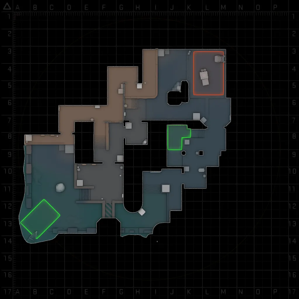
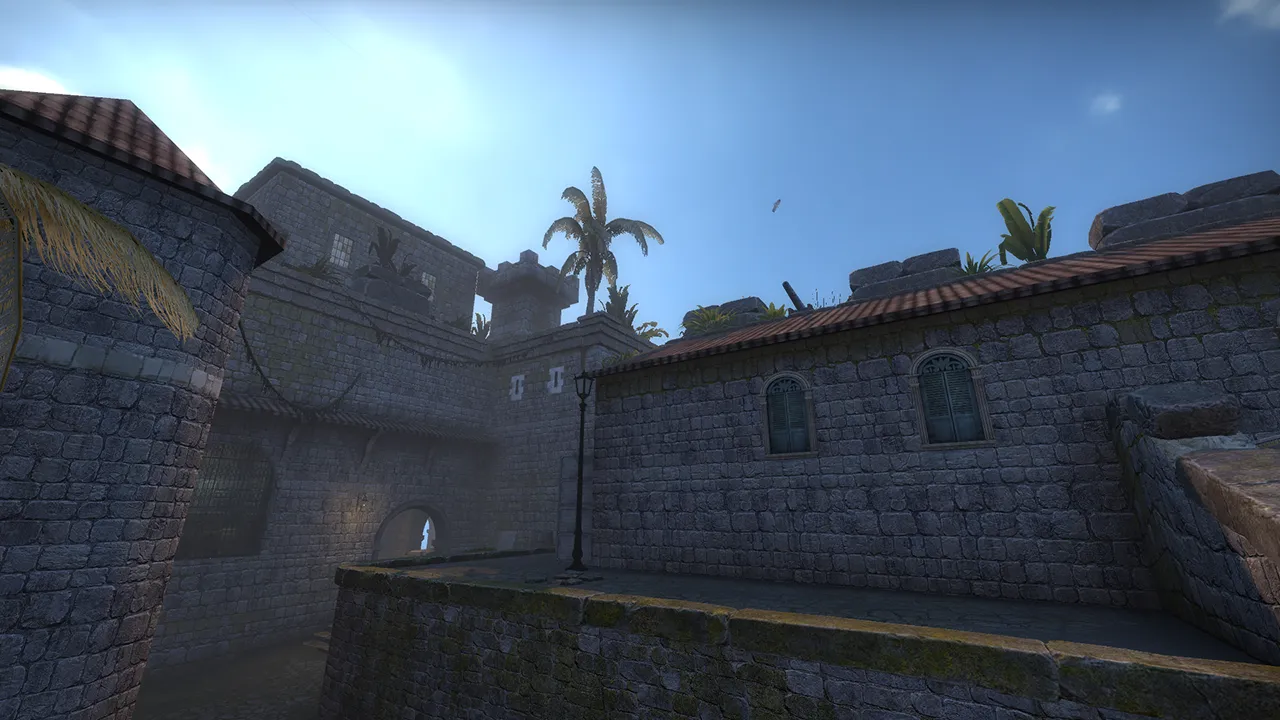
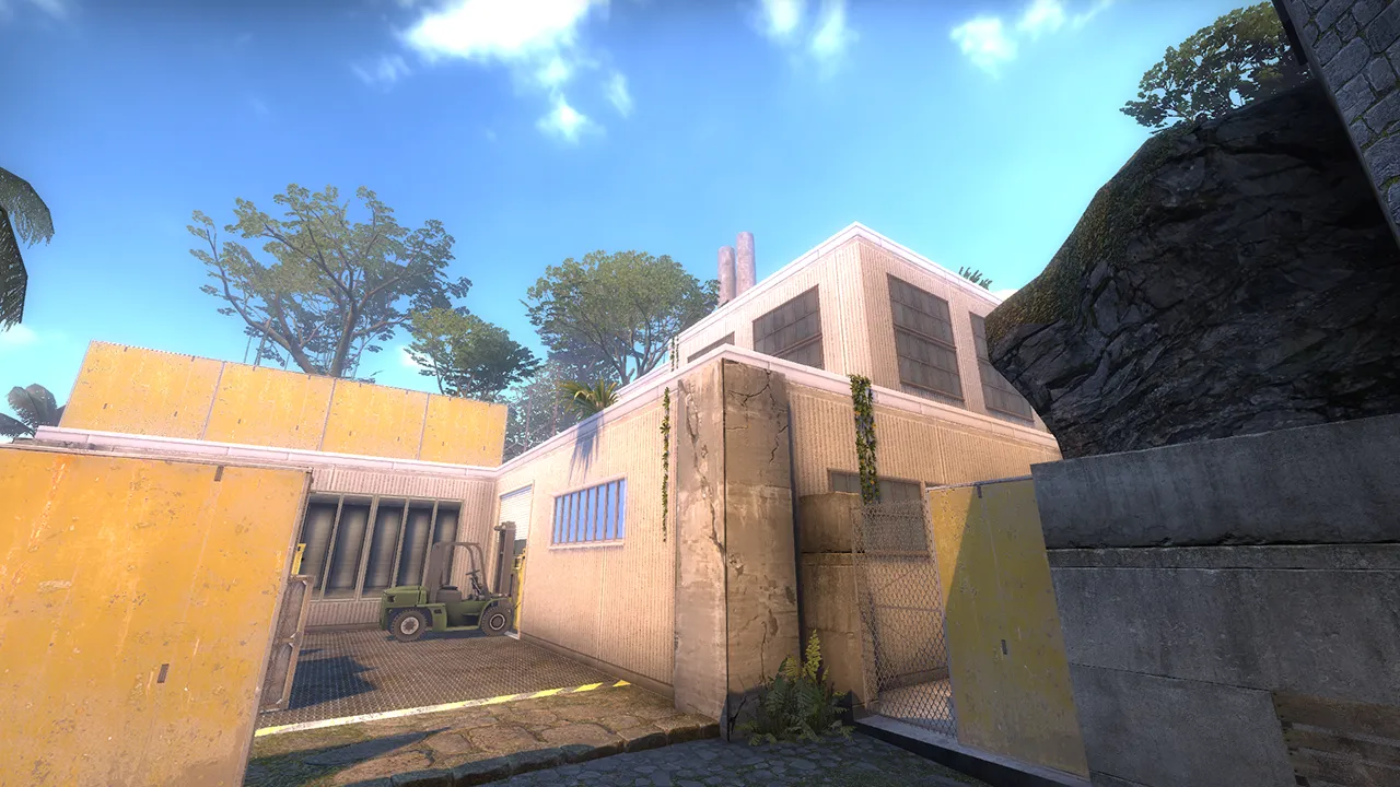
-
Quote from ThunderKeil
4 hours ago, ThunderKeil said: @SirSnail
Looks great, though I'd suggest moving the buoys a bit farther from shore - they kind of mess with the perceived scale, sort of makes it looks like a snowglobe if you know what I mean
Well - unless that's what you were going for of course, in which case chef's kiss
Yeah still need to change a few more things, working on the 3D skybox as well which is probably where I'll put them but for now it's a funny death tripwire
-
Haven't posted anything on the site yet until I got to a certain level, small Wingman map for CS:GO.
It's an overgrown castle on an island because that's just the direction it took but I think it looks neat.
Still working out the textures so it'll look (hopefully) better.

-
Beautiful map! So much so I had to run around in it for research and I came across a few things:
The archway where my crosshair is has the fade distance set too low
Spoiler
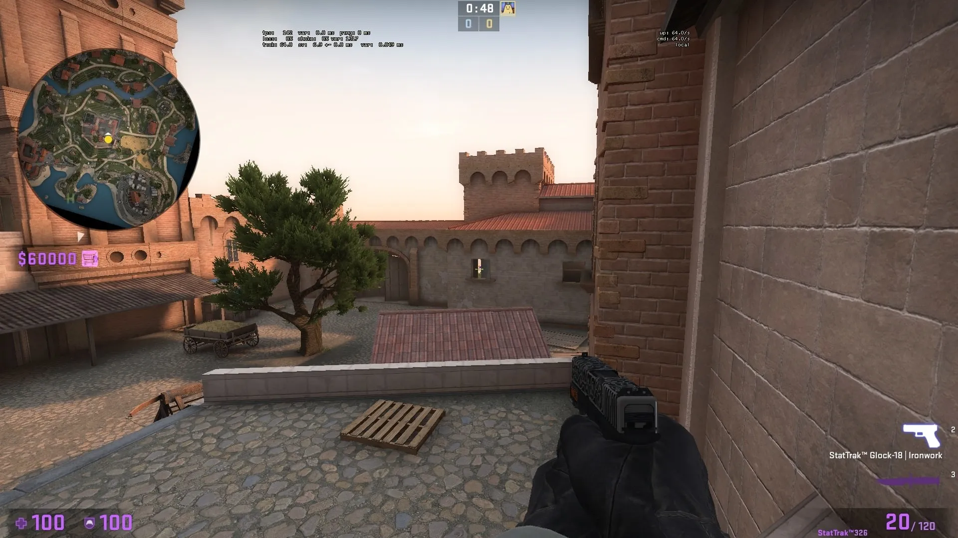
As well as here (in the window by crosshair, about 4 props i wanna say?)
Spoiler
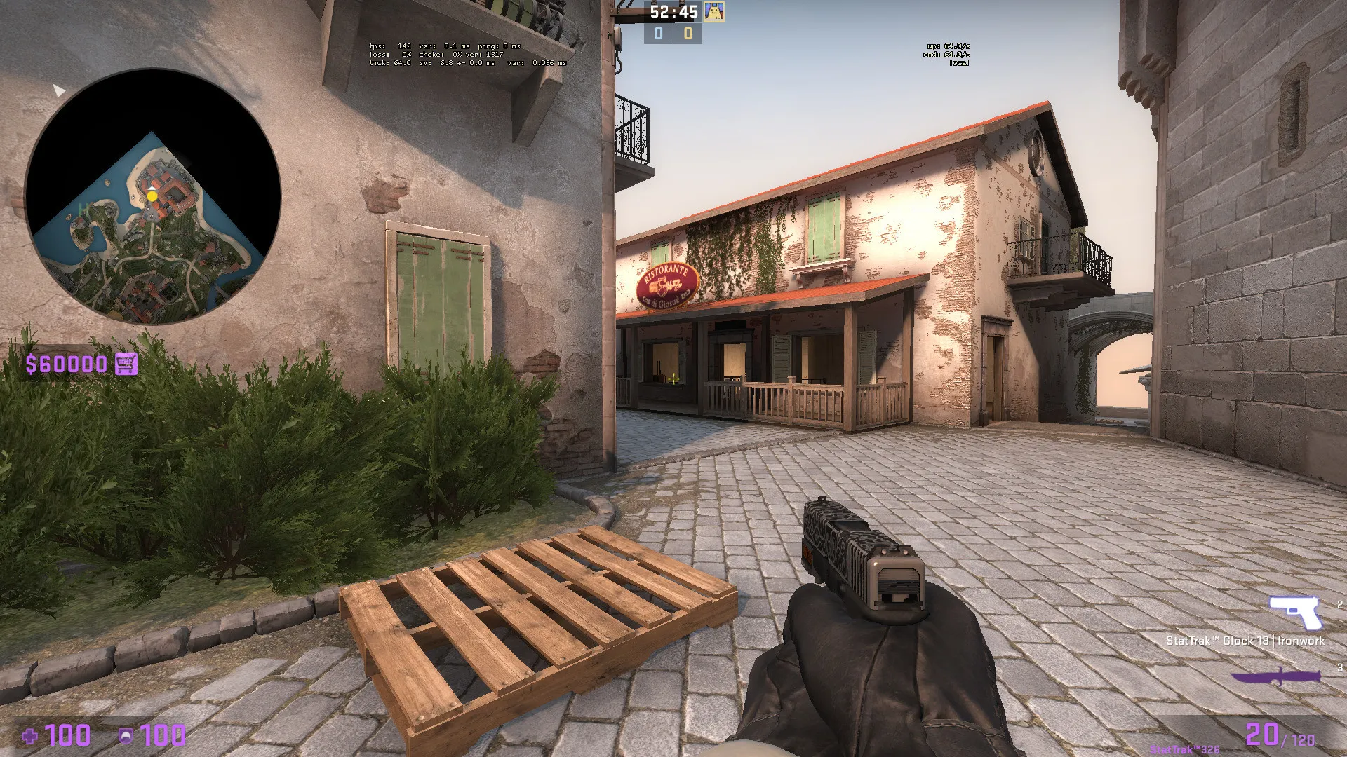
There's a weird bump here, could be clipping or model collision
Spoiler
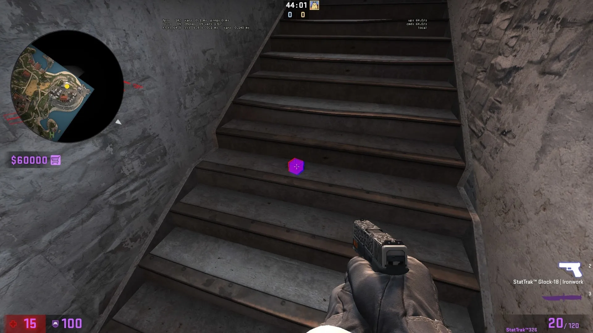
Speaking of stairs, a little short here
Spoiler
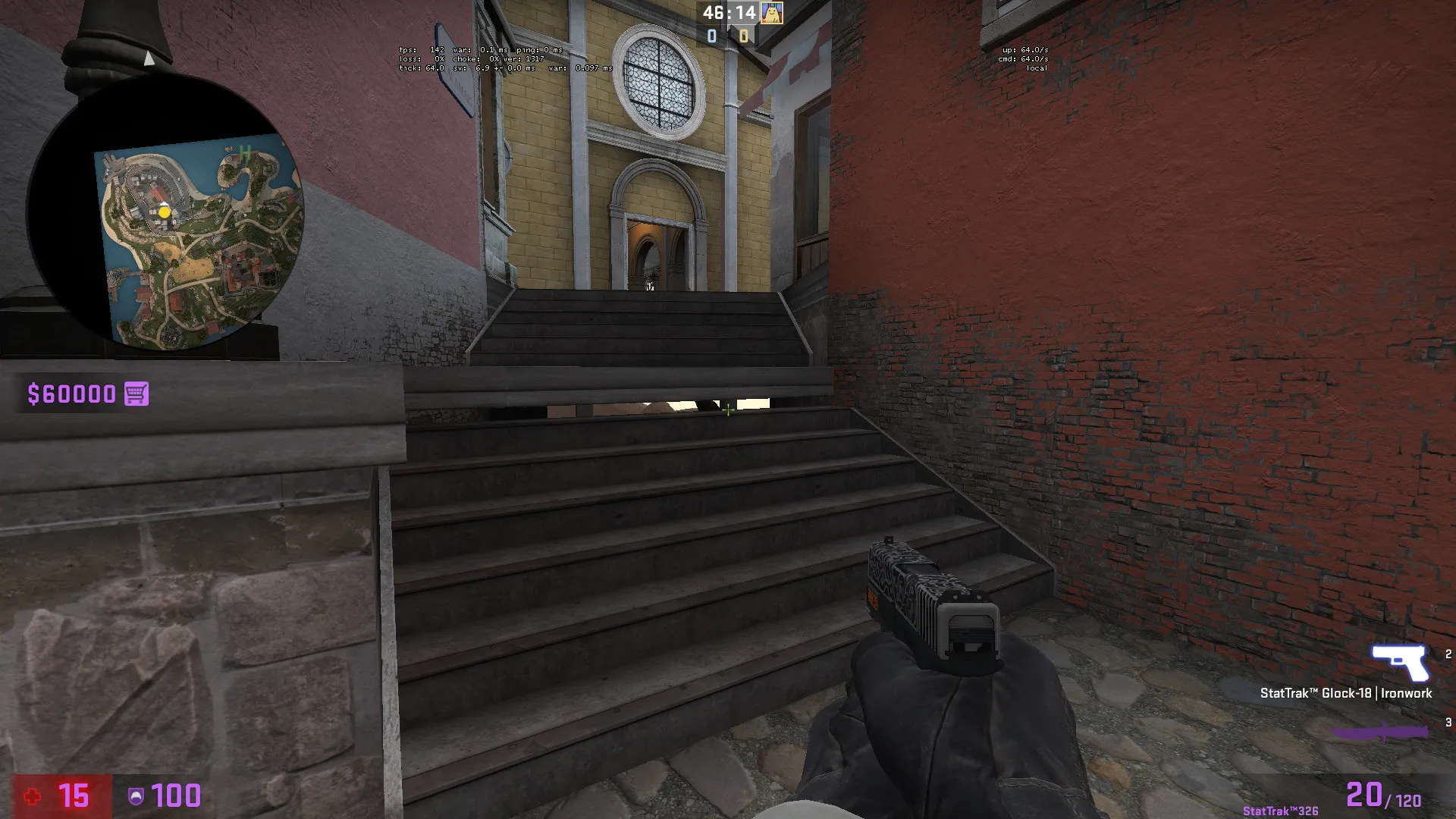
The water in the sewers is showing the 3d skybox
Spoiler
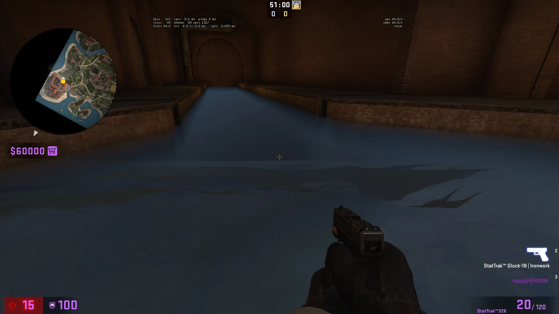
And missing a water texture here
Spoiler
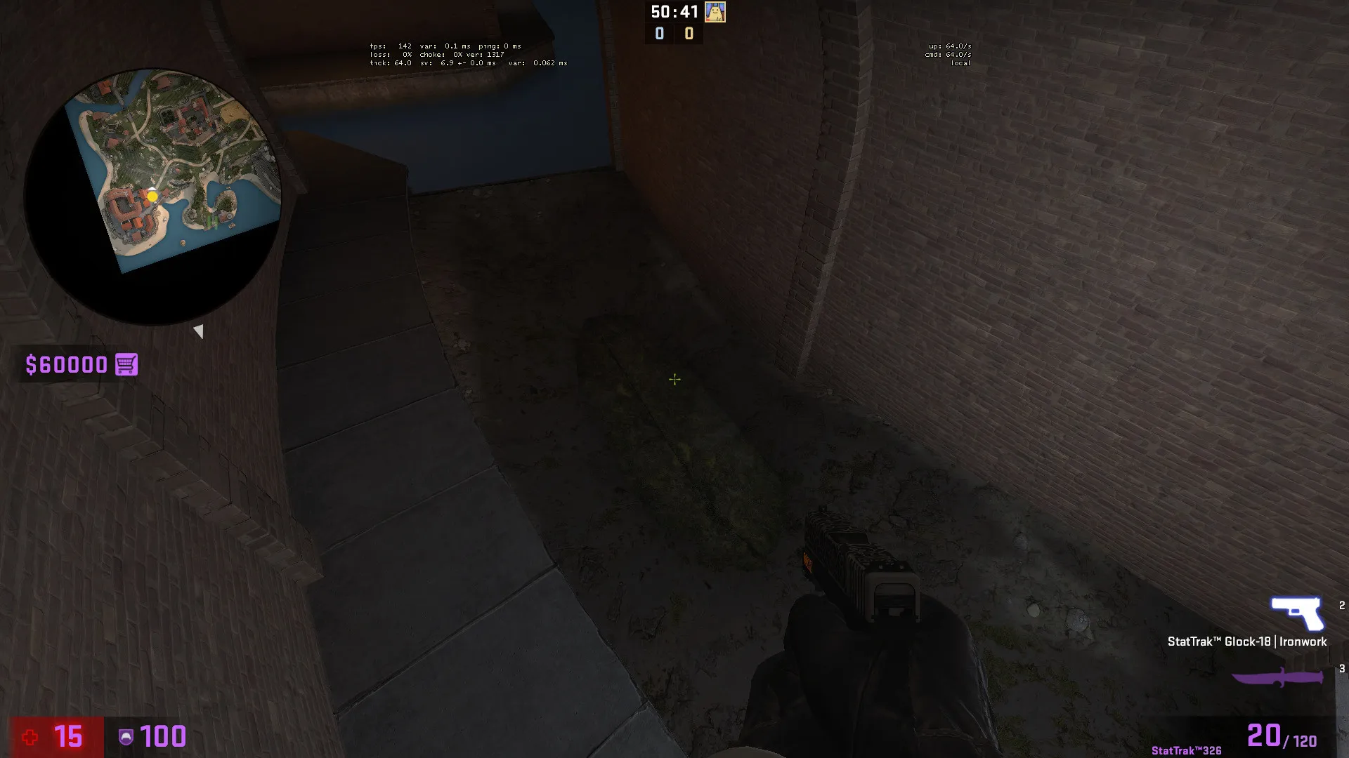
These areas I found are a bit too dark and IMO it just doesn't look all that good (first image needs the displacement sewn or adjusted)
Spoiler
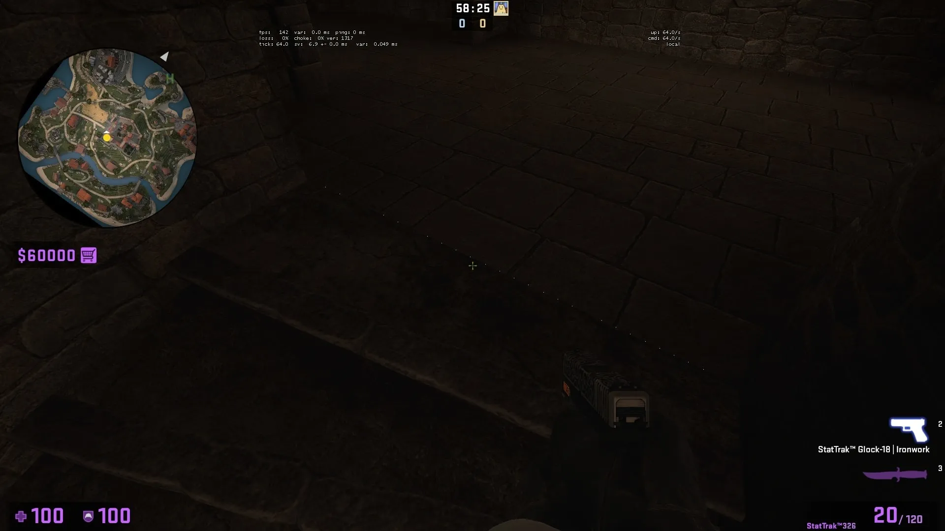
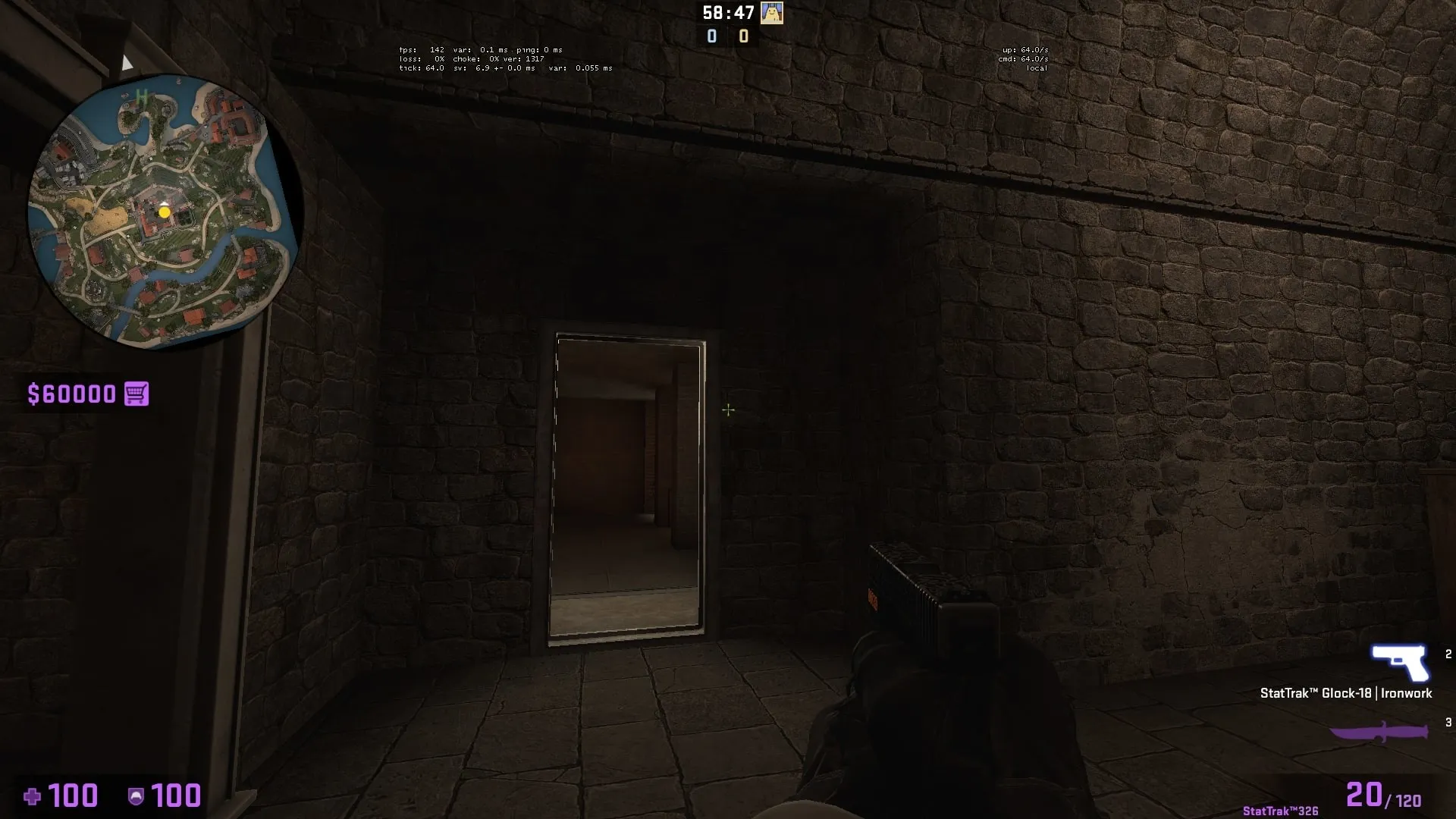
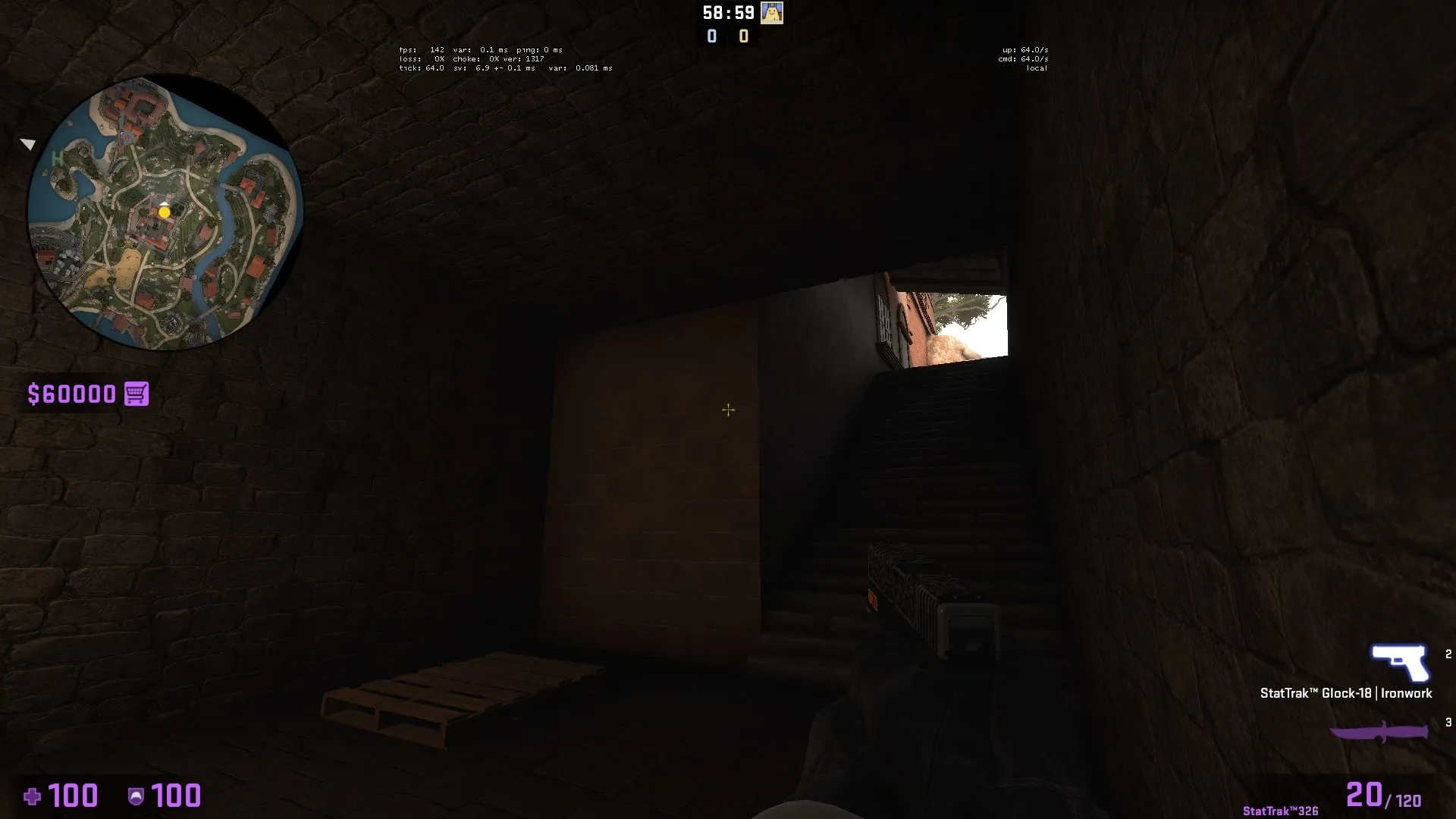
This wall all needs to be sewn (thin line visible through where the displacements are supposed to meet)
Spoiler
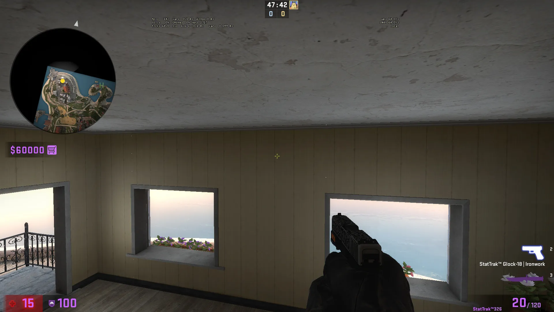
And finally, just something I would do probably doesn't matter all that much, but I would add a block light to this roof
Spoiler
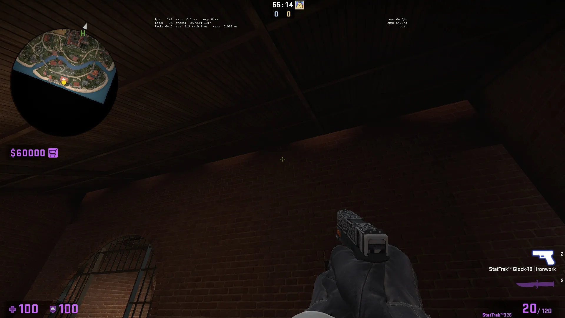
Overall amazing and really good looking map! I can't imagine making something so large and having it work with this ancient engine, framerate overall was great, had a few hiccups going through some buildings but I was also noclipping everywhere so it could've been that.
Personally don't play DZ at all, but I would love to see this included for diversity and, y'know, less desert maps overall?
Hope I helped in finding some bugs!
-
Wow this really looks nice! I love the custom textures, could you share how you got/made them?
-
I agree, the map is an absolute unit, stairs are chunky bois too. I really like the theme of a dark gray bunker with vines everywhere, I'd suggest adding color with decals and lights, like the painted lines and alarm lights and the like. Looking at the overview the pathways look really interesting however making things simpler and easier to move around in for maybe 2-3 players makes things feel nicer. Good luck!
-
Looks better than my first map! My only suggestion is to remove or change the really long angles, 1300-2000 units may be acceptable but having to many of these will make it an awp only map and the gameplay will get stale, try curving or zig-zagging these to improve gameplay or add rooms inbetween to spice it up a little. Also decompile and look at other maps to see how the built certain things and sized them as well, always a great help and easy to steal lights to test out and learn with as well to get a better understanding of lighting and coloring of your indoor areas. Good luck!
-
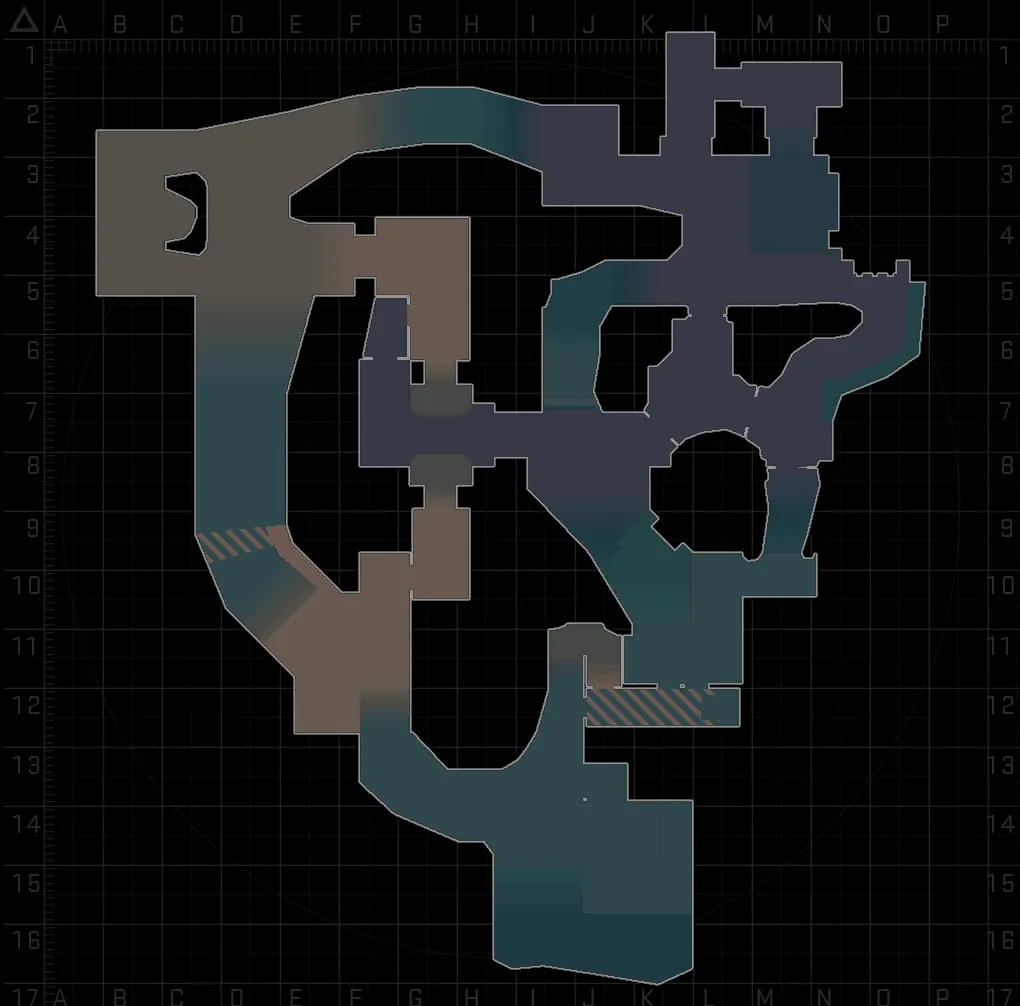
MASSIVE CHANGE
So I decided to rework the layout itself, merging paths while remove others, and shifting the theme around to other parts of the map while still keeping everything simplistic.
Currently I understand that it's just a lot of corridors and I plan to break those up somehow, some suggestions for that would be greatly appreciated, as well the bombsites are pretty simplistic but I also don't want to increase the size of the map for some slightly better bombsites.
-
 Quote from mtchromatic
2 hours ago, mtchromatic said: Retaking the left bombsite from the CT spawn area seems difficult, maybe connect this bit or put a box here if it doesn't mess up the timings. There are some sightlines around that look long based on the radar, have to check it out in-game to really see.
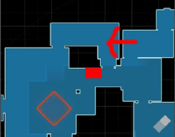
Totally understand, it never really got used in playtesting and the routes are actually smaller than they look in the radar I think that room is about 200 units wide? I'm currently reworking the map and making the boring areas less boring and shifting the theme to different areas.
-
The map is now on the workshop!
Here: https://steamcommunity.com/sharedfiles/fi…/?id=1987252369
It's only version 0.2 and doesn't contain the new layout changes I'm currently working on, but more feedback is welcome.
-
 Quote from Freaky_Banana
14 hours ago, Freaky_Banana said: Maybe I am judging this wrong, but the left site seems quite easy to take and then hold down. All CT side entrances are quite narrow, Ts are given the high ground and maybe an entrance too much I feel? But maybe the flank threat from CTs on the right side is higher than I think right now, since I don't know the exact timings and LoS.
Anyway, liking the idea.
I understand that, the height's not quite there. The farthest left the CT's have height advantage that T's can rush from afar or sneak up close, CT Mid however is shaky and I need to figure out what I need to make to balance that. The right bombsite is a bit plain and I've been adding to it. The narrow CT entrances are actually decently sized, the map is a bit "thick" i guess because the largest areas you see are very open, especially T Spawn which I'm closing up.
I posted v0.2 on my workshop that I'll link when it's been approved by Steam.
Thanks for the feedback, there's a lot still being changed and tested!
-
Looks like the bombsites are too close to T Spawn, while it might be an interesting thing to test in gameplay it doesn't do well competitively. I'd also suggest changing the lines of sight down middle and the main bombsite entrances, they're too simple and while they serve their purpose they don't add anything else. Keep twisting and changing everything until you have many different areas that compliment each other.
Also take a look at the other maps here in the forums to get a good idea on how everyone makes their layouts work, mapping is a lot of fun but a ton of brain work. Looking forward to updates!
-
WOAH
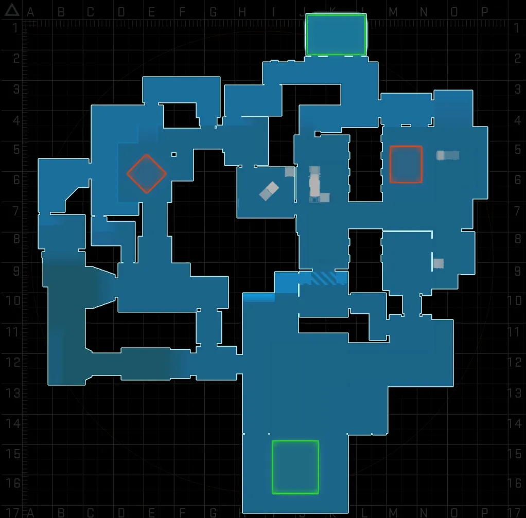
Big Update!
I've put another good hour into just adjusting the layout with some of the changes, so here's the layout, will post screenshots later after I run around in the map and make more adjustments.
- Changed A entrance
- Added A Long sniper alley with connector to A Main and a squeaky door to upper A
- Shrunk mid by changing connector to break more LOS
- Shortened T Spawn to improve timing
- Added ladder for T Mid Upper
Other than that, the map might be a little on the larger side, any tips on shrinking areas and stitching from experience?
-
Looks neat so far, maybe the lights could be toned down a bit and maybe a color change? It sort of blends into the walls a bit since they're all a shade of green/yellow.
-
This map is damn gorgeous, looks like if Tibet was turned into a defuse map but like had grass, really think that adds more to the map and breaks up the colors a lot more.
-
I threw this level together in a couple hours based of an idea, a secret super villain / military style base inside of an ice glacier, let me know what you guys think! I already have ideas to implement and haven't really posted anything for feedback like ever so anything is appreciated.
Workshop Link (OLD LAYOUT)
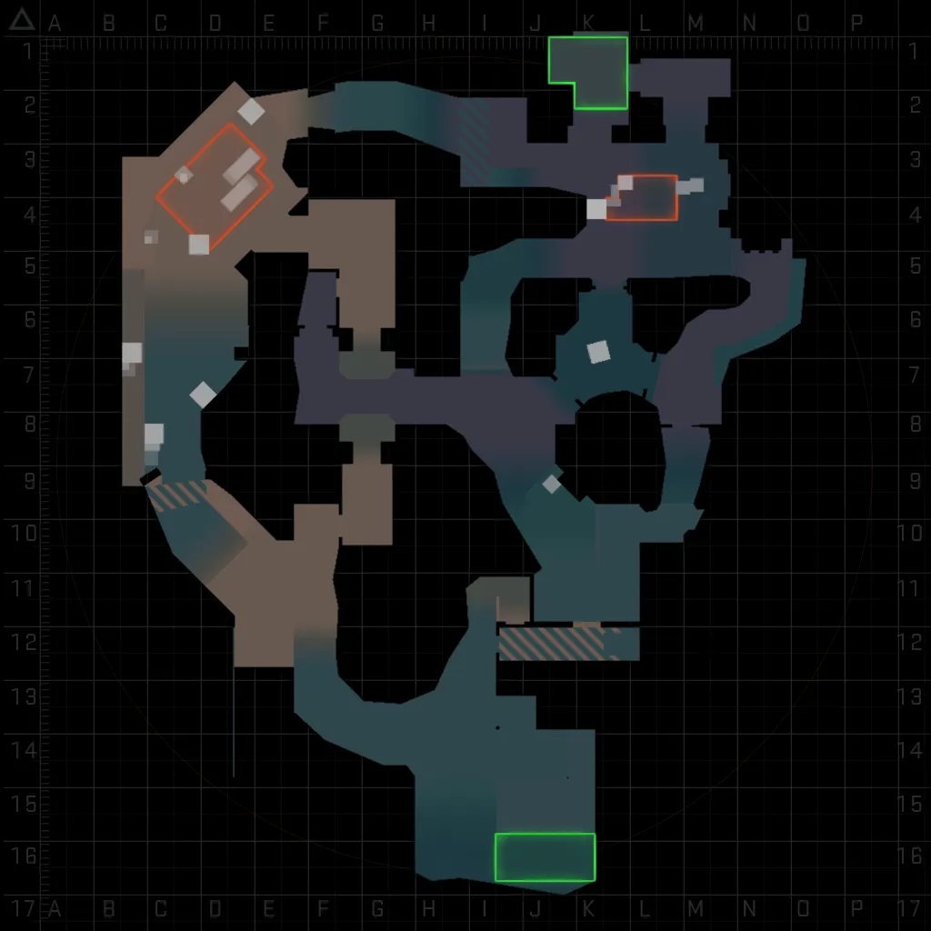
VERSION 0.4a
I've changed the layout quite considerably, a lot of the change was the theme of the layout being shifted/spread out:
- Mushed Middle, B Connector, and CT Mid together into a 3 interconnecting lanes that go to CT Spawn and Bombsite B
- Warped A Long and A Main into 2 separate lanes that bring that straighforward feel to the bombsite (like Banana on Inferno)
- A Main serves as a connector to Middle with a skill jump and a ladder, which should serve a quick rotate and an alternative if you fail the jump, increasing the rotate times (failure is not an option! mindset)
- Tons of over arching 'rock' and 'ice' to block lines of sight to make up for the amount of vertical difference in the map
- Added basic cover and indoor lighting
-
It looks really nice! Love to see more Asian themed maps, I'll check it out and update with my thoughts here!
-
Really great looking map! I just recorded a video on it with all my thoughts in an amateurish review-type deal I'll update on that too, would love to play a game on this! If i were to rate it I'd give like an 8.8 to 9.2 do to areas looking too similar when transitioning between them and not having played a game on it. Def a 9.5 though! I'm not a great reviewer lol.