


Also, the lights on the walls, will look cooler, if they weren't so bright. Or just make them a bit more further away from the wall.
Posts by ynel
-
-
some suggestions (But otherwise, it's really good) :
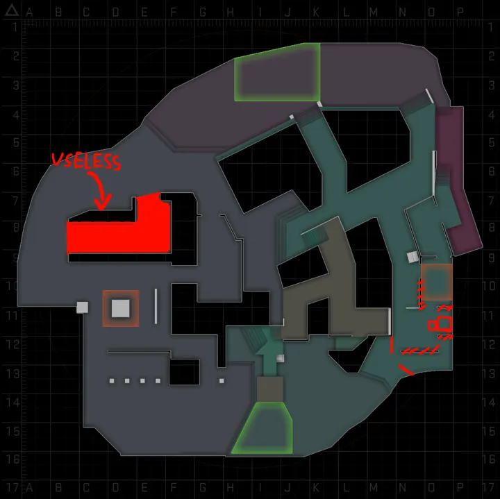
(And these I'm not so sure if these would make it better, but that useless area, really should be removed)
-
This is not how you should make a map. a Map, with corridors is not fun. You need to make the walls, not the paths. And it looks VERY claustrophobic. It's not going to be fun. You should start over.
(And replacing all lights with red, is not a good idea. It just hurts, for your eyes.)
-
The lightning is so cool. But, at this stage, it looks a bit open. I Hope it will change!
-
People say its great. But it has BIG problems. First of all, mid is CT sided, while rotation times between the sites are short, if you go mid. It's not good, Mid, in a case like this, NEEDS to be T sided. And there are other serius problems with the site on the left. For first look the path at the left side, is unbalanced. Ts can get there, and catch CTs going to the site off-guard. The other site doesn't seems too bad, but it feels claustrophobic.
-
The layout is not really that awesome, but that's not why I'm writing. I don't really know if this counts as "exotic". It's a canadian map....
-
The Layout looks so good. I Can't wait to play it!

-
I don't know how I feel about this map. This is way to complex, and should be simplified. But I would just reccomend simply starting again. You still have time. Make your decesion now.
-
woah. That is a complex layout...
-
Quote
Quote
The layout looks much nicer than those drawings. I hope you make something fun!
-
Spoiler
Okay, I trust in you! Good luck on the level. I would really love to see this in game btw.
-
I like it, but... I see it has multiple layers. Please don't let this become Nuke 2!
-
That's fucking genius... And I don't even know, what do I want to make...