1. Forums
  2. Discord
  3. About Mapcore
  4. Patreon Supporters
  • Login
  • Register
  • Search
Everywhere
  • Everywhere
  • Articles
  • Pages
  • Forum
  • More Options
  1. Mapcore
  2. Members
  3. Noodle King

Posts by Noodle King

  • Aerospace (Alpha)

    • Noodle King
    • November 7, 2017 at 5:07 AM
    Quote from Rafael Oliveira

    16 hours ago, Rafael Oliveira said: Thanks...

    But i need to say...

    Its an Awesome Map! Me and my Friends plays a Lot this map in Weekend, and all of us Like The idea of The map, and this design...

    I give only gameplay feedbacks, and some little things to improve. In general, is an Awesome Map!

    Thank you very much :) I'm glad to receive all the feedback I can get!

  • Aerospace (Alpha)

    • Noodle King
    • November 6, 2017 at 5:05 AM
    Quote from Rafael Oliveira

    3 hours ago, Rafael Oliveira said: Noodle... Some Things that i have to say... Playing CT on this map sounds a LOT More Easier Than TRs... The A Bombsite have a LOT of Hidings Positions that you can stay and not be seen Ex: Outside the Boxes with a Boost, in the Flowers, on the Bar... And in B Bombsite, if you are an AWPer, you can jump in the Box and Zoom in the corridor. You can see all the Other teams Movements, not mattering the TR Respawn... The Path connecting the base to the corridor is Very Long... I Think if a bit shorter, the B is More Competitive... In A, the Boxes in the Bombsite should be smaller... If i Bang a Flash in A, I do not blind the person who is on top of the box, and this is a major disadvantage... I'm Continue to Playing and give some more Feedbacks... Peace!

    Thanks for the advice :) For all the problems with A-site, I actually redid that whole section of the map for the next update. The new layout looks more believable for a plane map, and gives CT's less places to hide. You are right that in the current public build the map is CT sided, but ever since our last playtest I've been working to balance it out a bit. The changes I made should be subtle enough to not throw everything out of balance, and give the T's a better chance. Overall don't worry, all the problems you mentioned are fixed or being fixed :)

  • Aerospace (Alpha)

    • Noodle King
    • November 5, 2017 at 4:50 AM

    Love you guys <3

  • Aerospace (Alpha)

    • Noodle King
    • October 6, 2017 at 10:25 PM

    Well it's been a little while, sorry for the wait! GZ and I have been busy with school and procrastinating, so it's taken us a while to get another update out. Over the last month or so we've been hard at work detailing and sorting out game play issues. I think we can both agree that we are narrowing down on our final layout.

    No new update is live on the steam workshop just yet, but expect one in the coming days!

    New screenshots and descriptions of our changes:

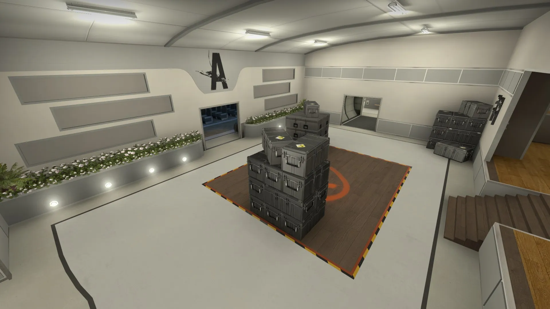
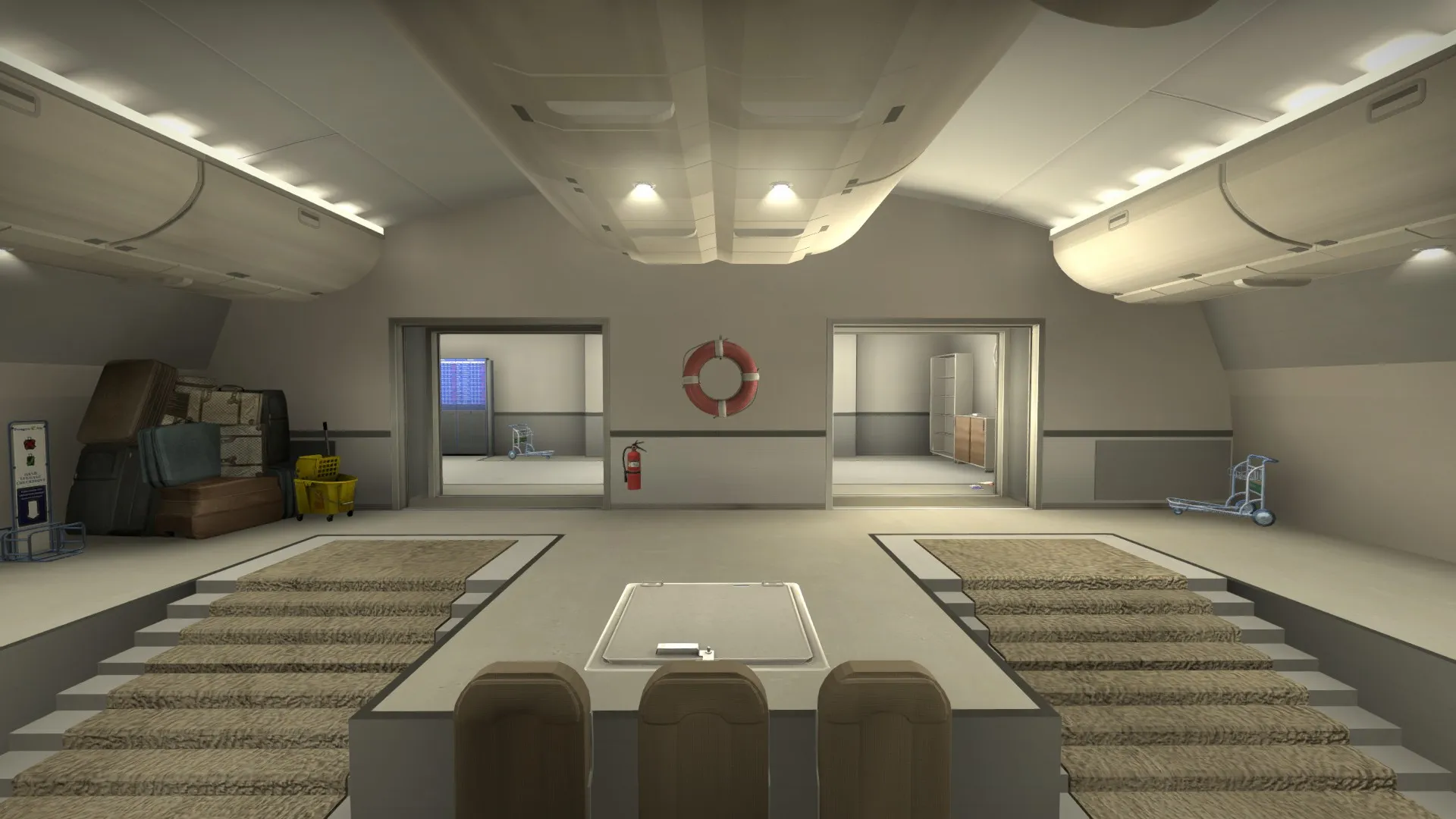
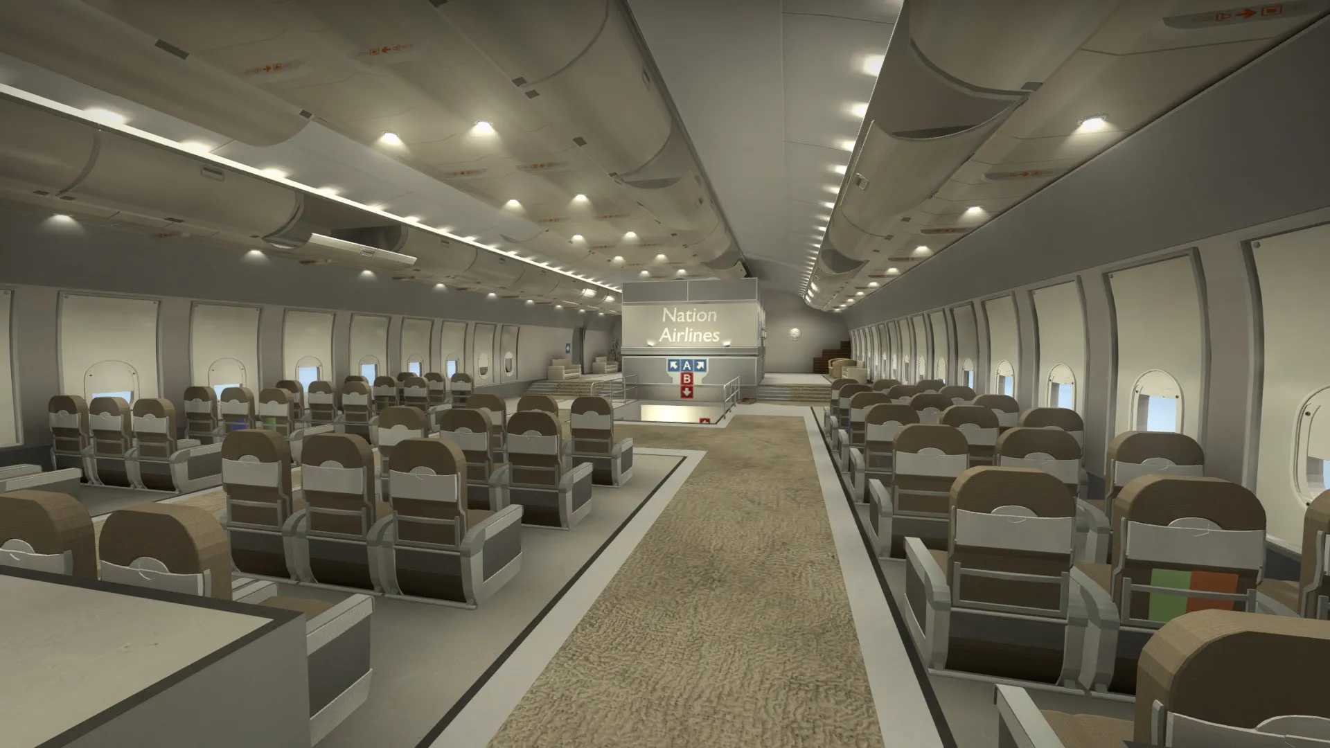
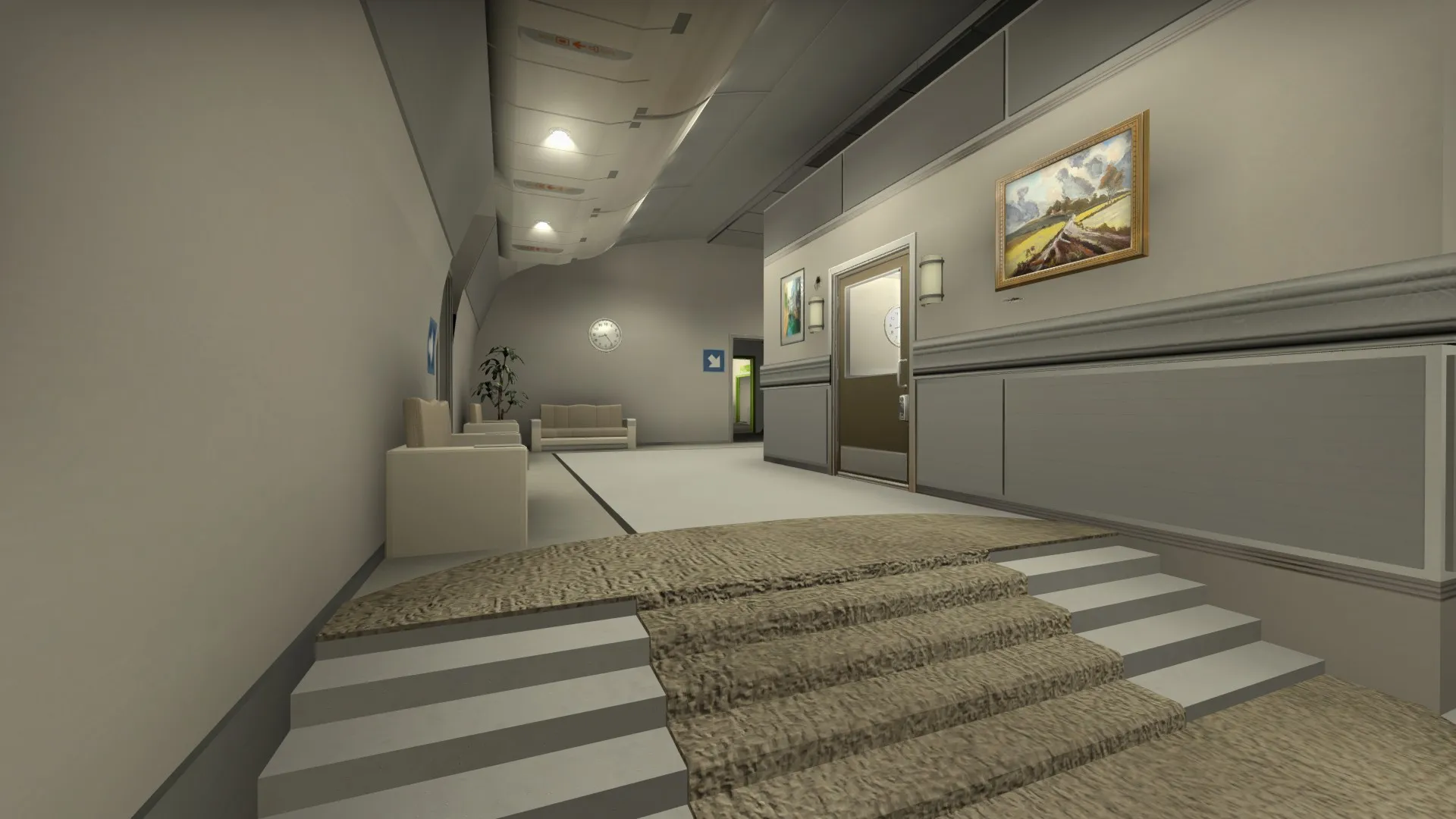
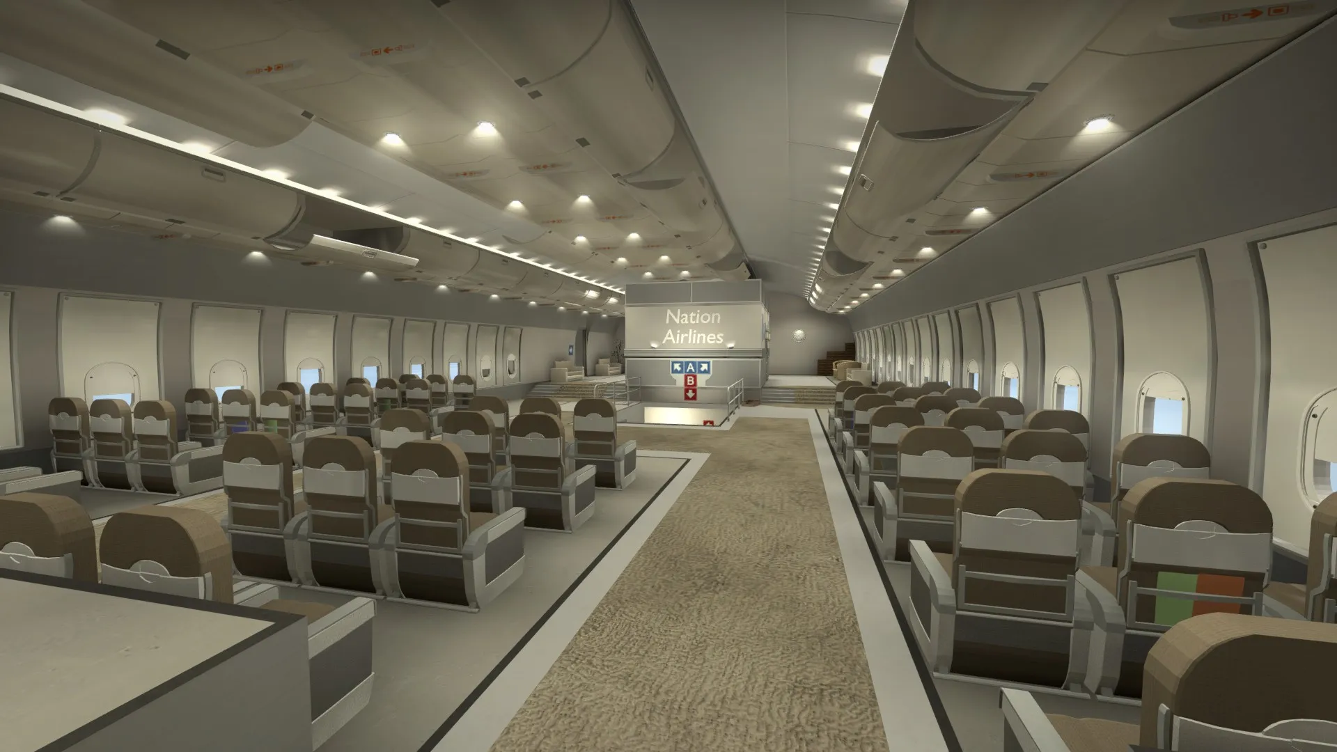
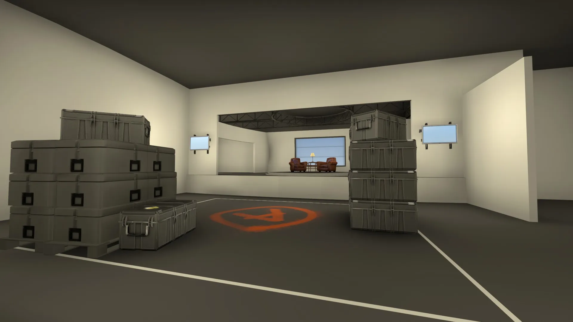
    A-site after the first art pass. While it may not be super super realistic to a plane, we wanted it to feel open and not feel crowded. In the context of a massive luxury airliner, I think a room this big would be very possible.

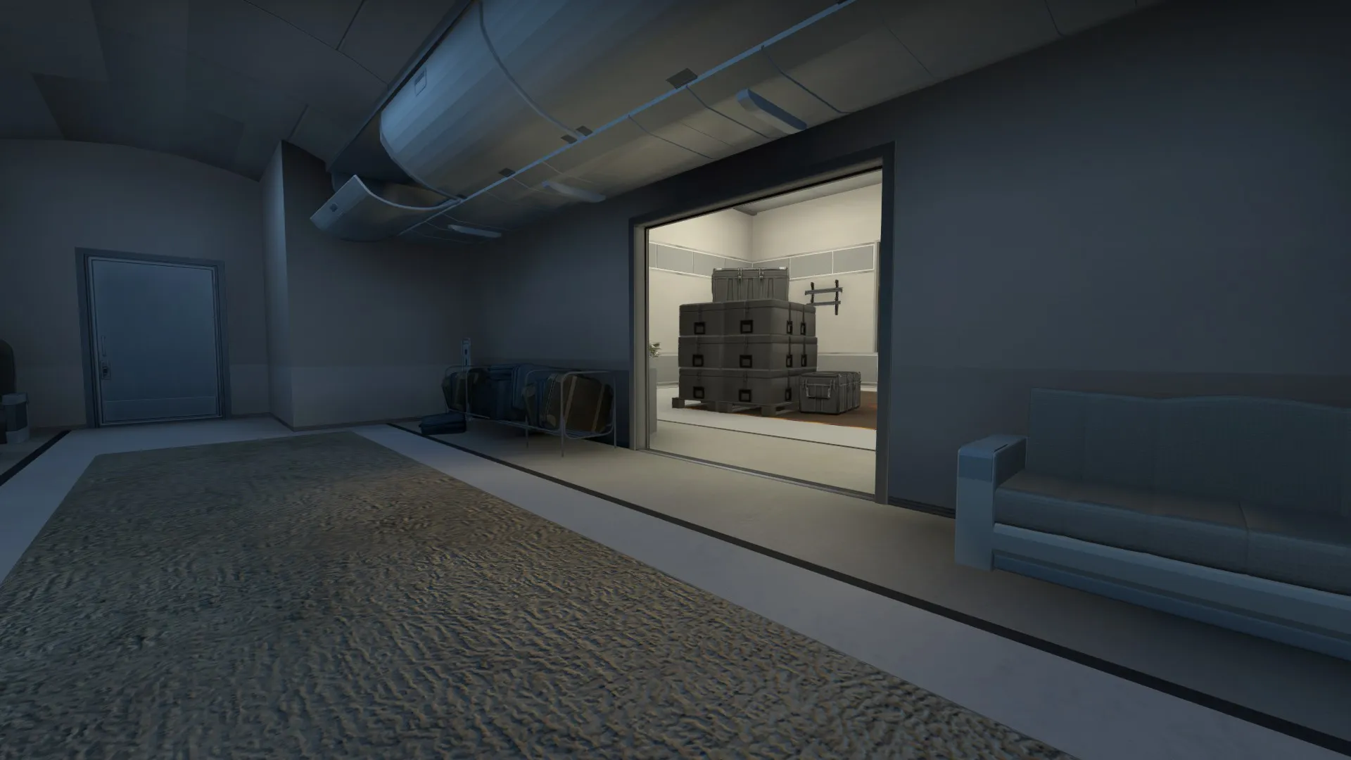
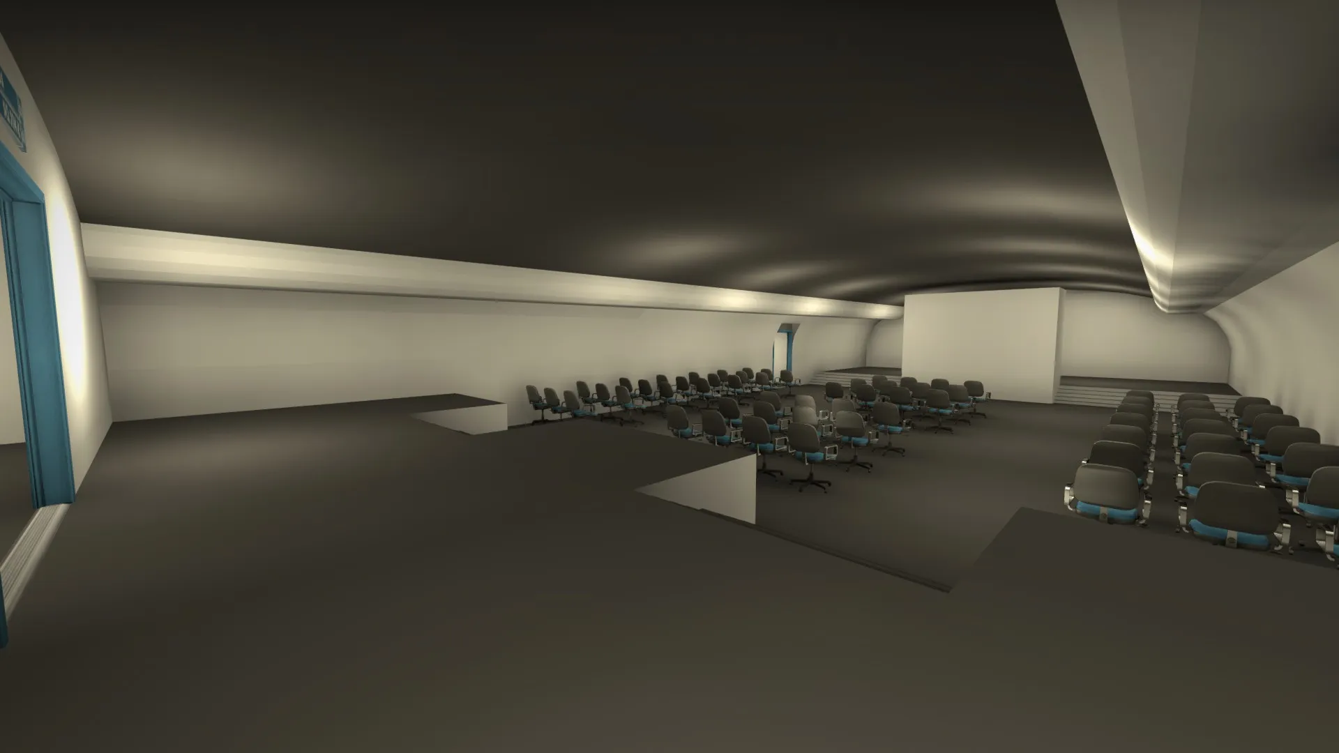
    I guess you can call this "dark." It's a room off to the side of A site that acts as a good spot for CT's to defend from, and a valuable post plant position for the T's. Also, the normal mapping on the carpet texture makes the light gradient look pretty cool :P

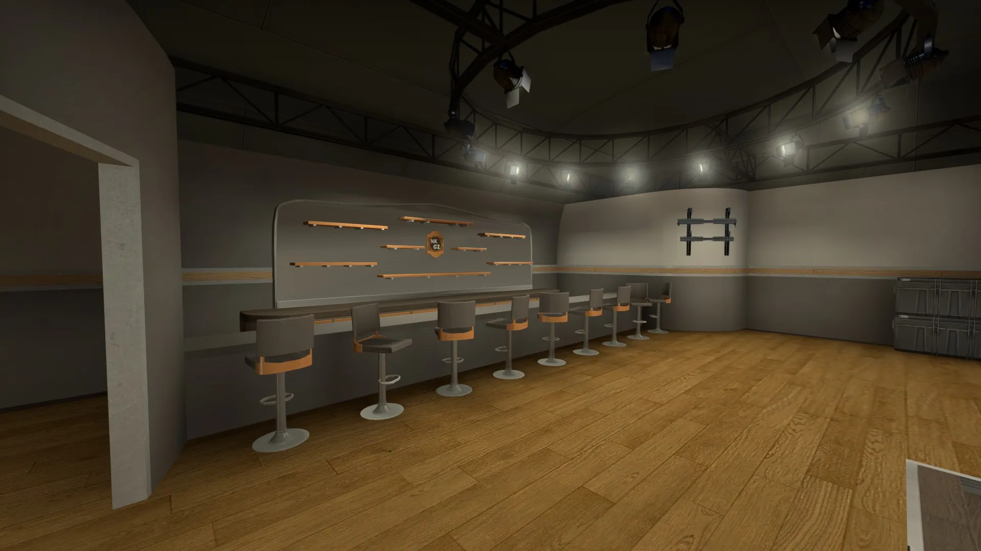
    Opposite to "dark" on A site is the bar area. To the left is where the T's enter from this area. To the right is the small drop down into the main site. Pretty much everything you see in this screenshot is custom content, with the exception of a couple models. Smaller details are still in the works, such as bottles on the bar shelves and clutter around the empty spaces.

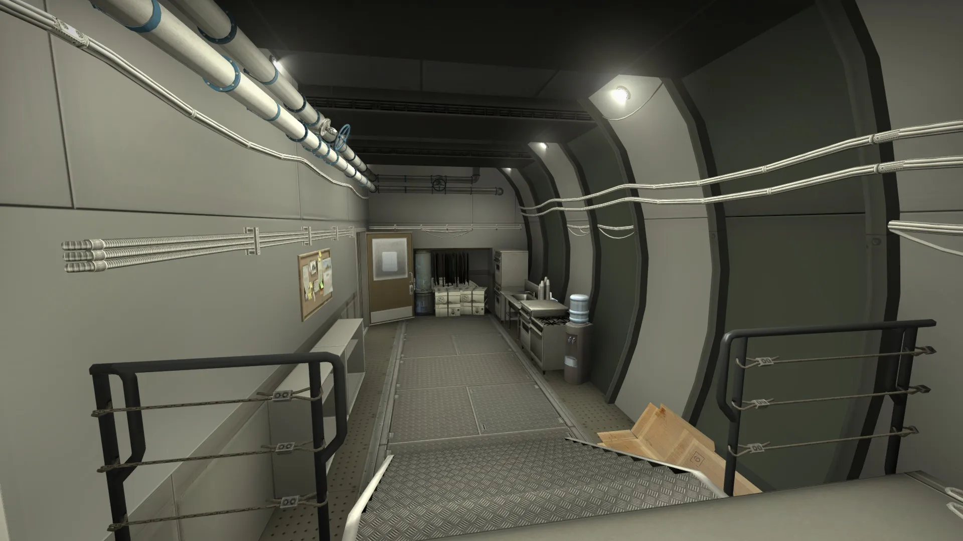
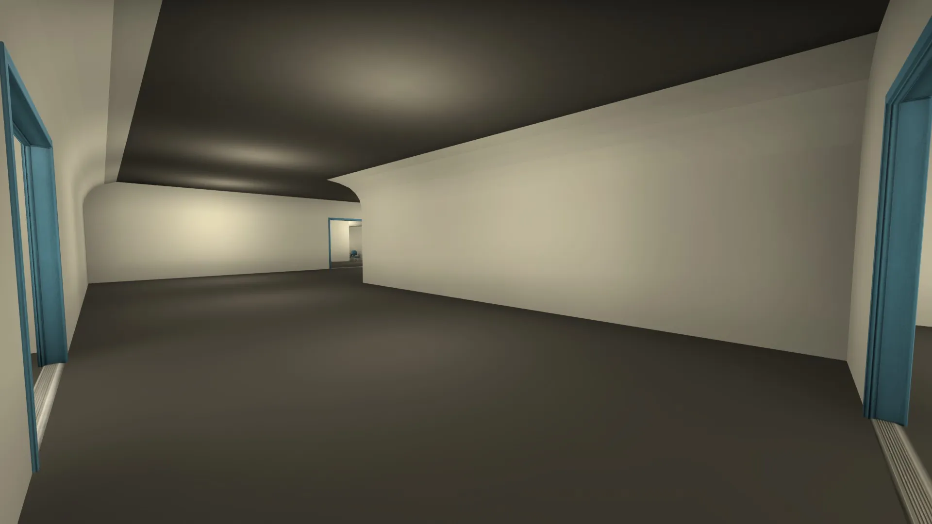
    Behind this screenshot is the doorway to the bar area in the picture above. This area is themed to be an "employees only" sort of room. The cooking for the bar is done back here and that sort of stuff. The doorway on the left leads to mid. Id say that this area is pretty much done visually.

    The biggest and probably most important change is that there are now two entries to mid for T's. My hope is that this change balances out the fight for mid a bit, without making it too messy. If this configuration does turn out to be too chaotic, we may need to ditch one of the extra angles that CT's get from mid.

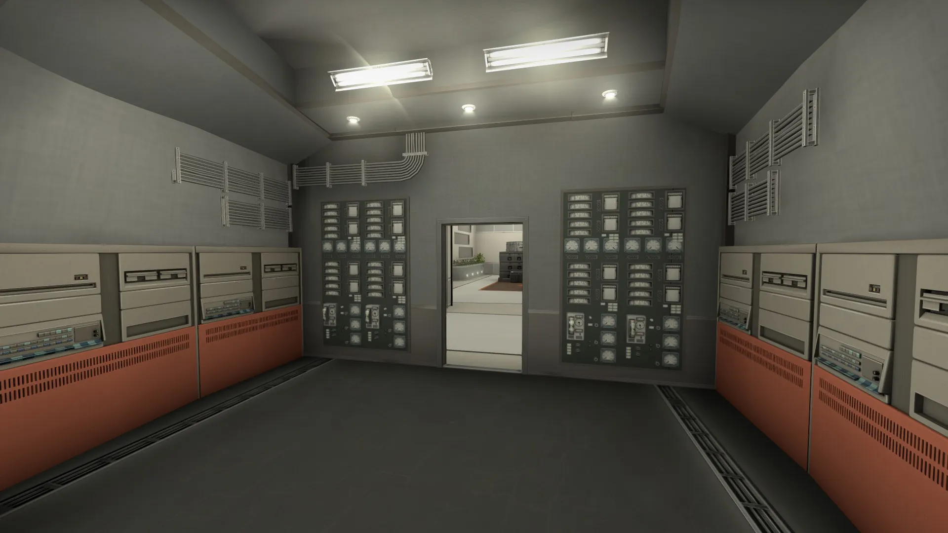
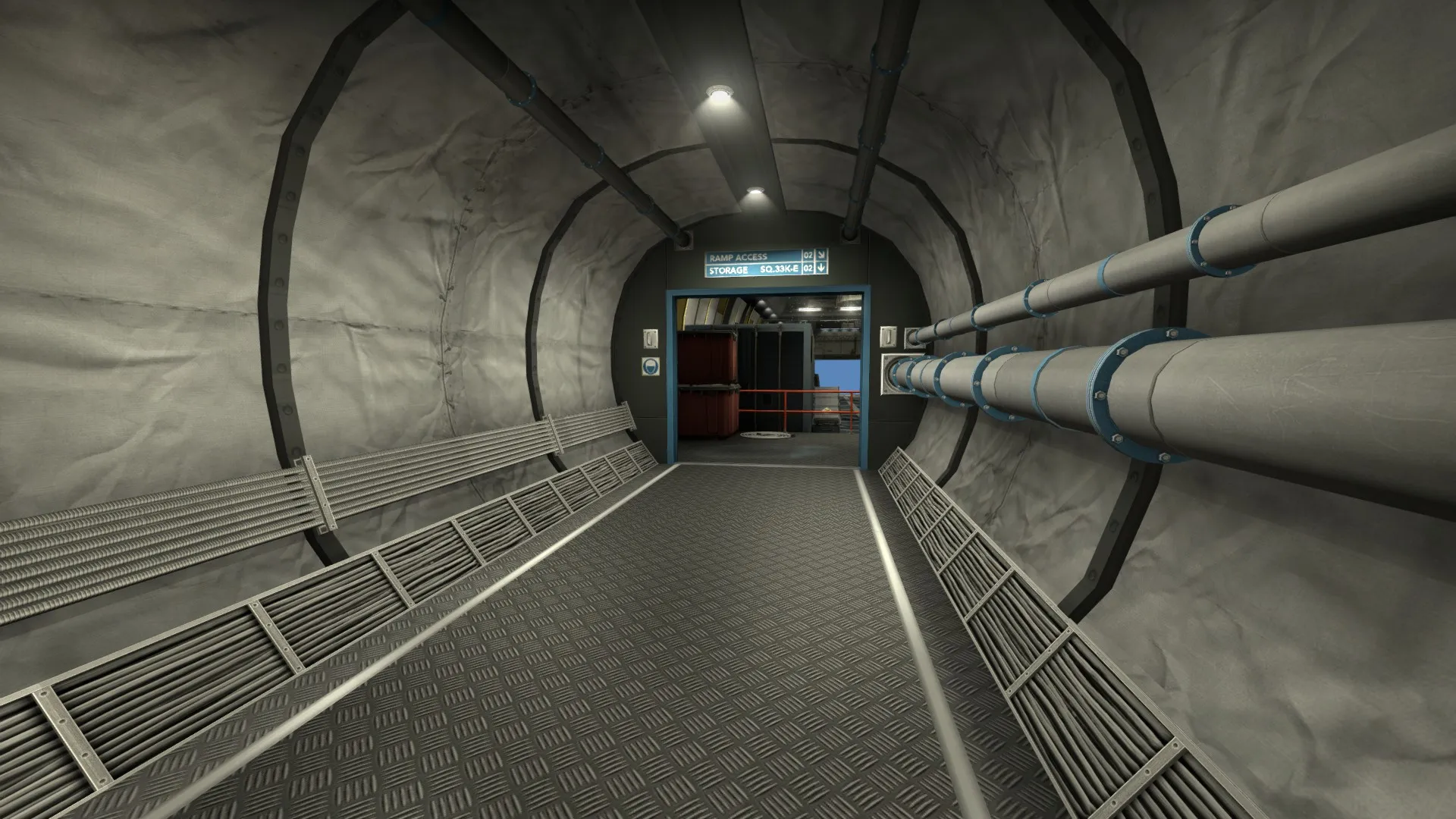
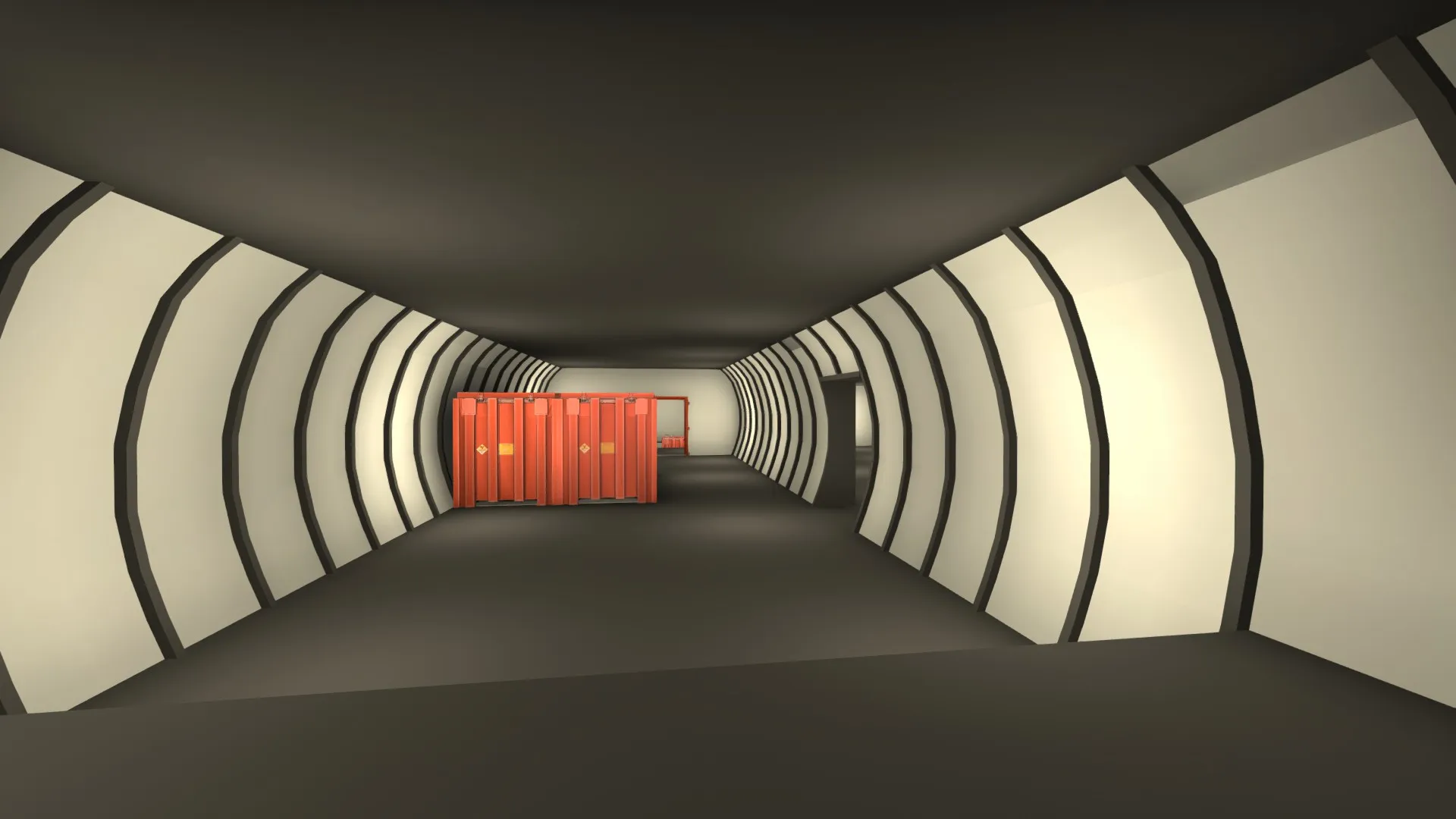
    It's also very worth mentioning that this layout change required me to shift the whole t spawn area to the left (if you look at it on the radar.) This actually makes the plane more realistic, since the cargo hold and cockpit were previously not lined up. Not really sure how that happened in the first place, but its all good now. Also, the hallway leading down to B from T-spawn has been altered from this change. In my opinion, it looks much better.

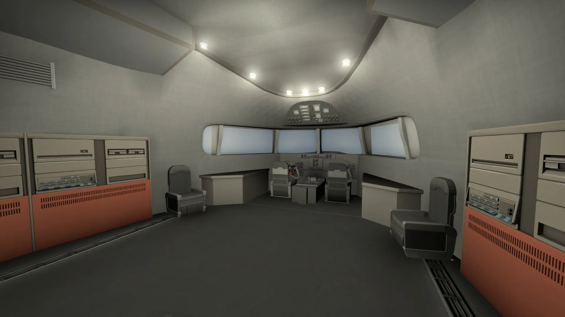
    I'm no expert modeler, but here is the cockpit. I probably scrapped and restarted this 20 times in blender, but the end result looks pretty good in my opinion. It could be way better, but it gets the job done. Note that most of everything featured in this update isn't done visually. This cockpit area will need some work, but the basic idea is there.

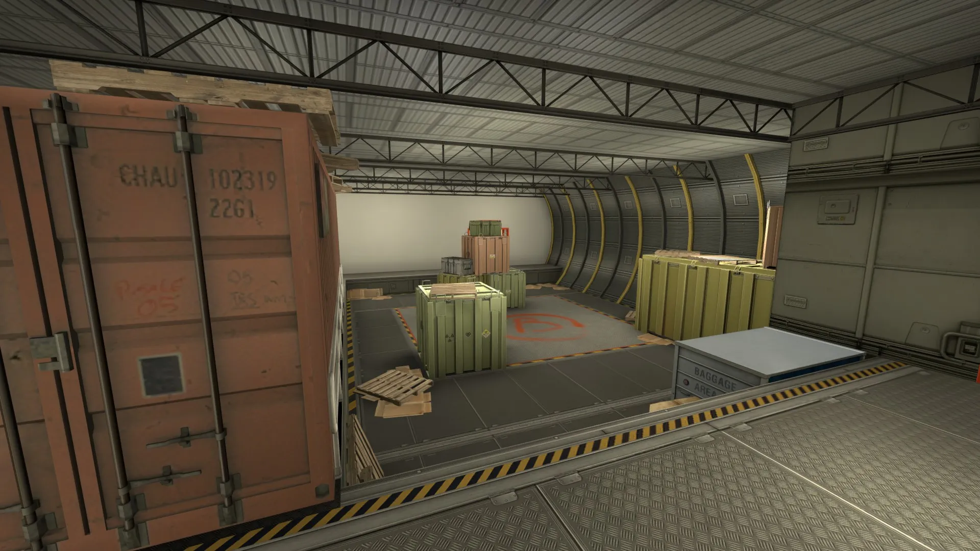
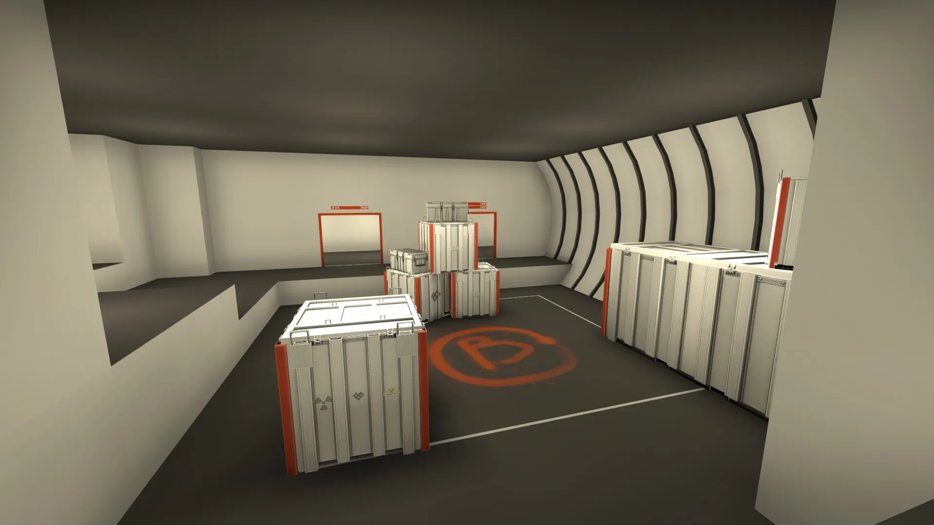
    Finally, I'll show you our progress on B-site. We're still experimenting with textures and such, but the main idea is starting to take shape. Ya know, dingy cargo hold and all.


    Sorry that none of this is in a spoiler, I couldn't find them in the edit menus. (Were they removed?) Anyways, hope you like the progress we're making and take comfort in the fact that were actually aren't dead, just lazy :P Once again, expect to see these changes get pushed to the workshop version in the next couple of days. Tell us what you think, and thanks for reading!

  • De_Cypress (Beta)

    • Noodle King
    • September 3, 2017 at 2:26 AM
    Quote from S1lv3r 4 lyf

    3 hours ago, S1lv3r 4 lyf said: I have two complaints:

    - Lots of things clipped off that look like you should be able to jump them (ie. behind the bar, crates, etc.).

    - At higher resolutions like 600x480, the weird panely walls have weird black outlines that move about in an annoying fashion.

    Good luck.

    This map has gotten a full release,

    Check it out, fixed lots of the stuff the Beta suffered from.

  • Aerospace (Alpha)

    • Noodle King
    • September 2, 2017 at 8:23 PM
    Quote from S1lv3r 4 lyf

    On 9/2/2017 at 4:45 AM, S1lv3r 4 lyf said: I took a gander at your map, and I don't see any major problems, but there are some little ones. You're probably already working on most of these.


    You missed stair and wall clipping at the:

    -Spiral stairs at CT

    -Steps at Nation Airlines sign

    -Walls of CT spawn

    -Walls at 3973 5571 4008

    -Stairs at 3821 3710 4001

    -Walls at 3423 3969 3646


    -I had bad fps in both spawns, particulary at T spawn. This could just be my computer (it was a little glitchy this morning).

    -You may also want to use player clip around the chairs. I found that as I was defending B I would get hung up on the ones behind me in that side room.

    -The red crates in the bombsites should be clipped as well (I know you clipped one of them).


    If you don't already know how, there is a tutorial for a method of clipping spiral staircases here.

    Hope this helps and good luck.

    Display More

    Yeah as far as clipping goes, that's a combination of me being lazy and not wanting to do too much before an area is detailed. But don't worry, everything will be like silk to walk on once everything is polished :) For the bad fps, on my system at least, whenever I spawn in for the first time on a map in csgo, I get really bad frame stuttering until I die and respawn again. The frame numbers for me In T-spawn are pretty good, considering the whole map is indoors, which is a blessing when it comes to optimization.

  • de_modern_beta

    • Noodle King
    • September 2, 2017 at 12:06 AM

    S1lv3r 4 lyf feedback rampage 2017 :P But in all seriousness, I love the theme you're going for. To my knowledge, no one's done a railway museum before. The brushwork is beautiful, and you've got some great centerpieces that really make it feel unique. Keep it up!

  • Aerospace (Alpha)

    • Noodle King
    • September 1, 2017 at 11:24 PM

    Holy hell I can't believe I actually did it. It was a huge change, getting rid of an entire floor, but it was for the better. After a couple of play tests, it became more apparent that the 3-floor design just isn't compatible with CSGO. Maybe it would have worked better if the levels weren't right on top of each other, but staggered levels makes no sense for an airplane. Anyways, The new 2-floor design is going to be easier to learn, more fun to play, more accessible, and will restore the radar's usefulness.

    #8: Massive Update: -Merged together the mid floor and top floor. Ct's now spawn at A site. There are now only two floors to worry about. -Detailed a good portion of the aproach to A. -Reworked the connectors between levels. -Added tons of new custom content. -Improved lighting. -Reworked theming in passenger areas. -Added signage to lead players to where they want to go. -Created a new radar. -Created a new bot navmesh.


    Screenshots of the new update:

    Spoiler

    The new radar, once again, didn't put too much love into it. I probably won't until the full release. The top image is the top floor, and the bottom image is the bottom floor. I think this 2 layer layout is going to work a lot better, so we'll have to see how it plays out.

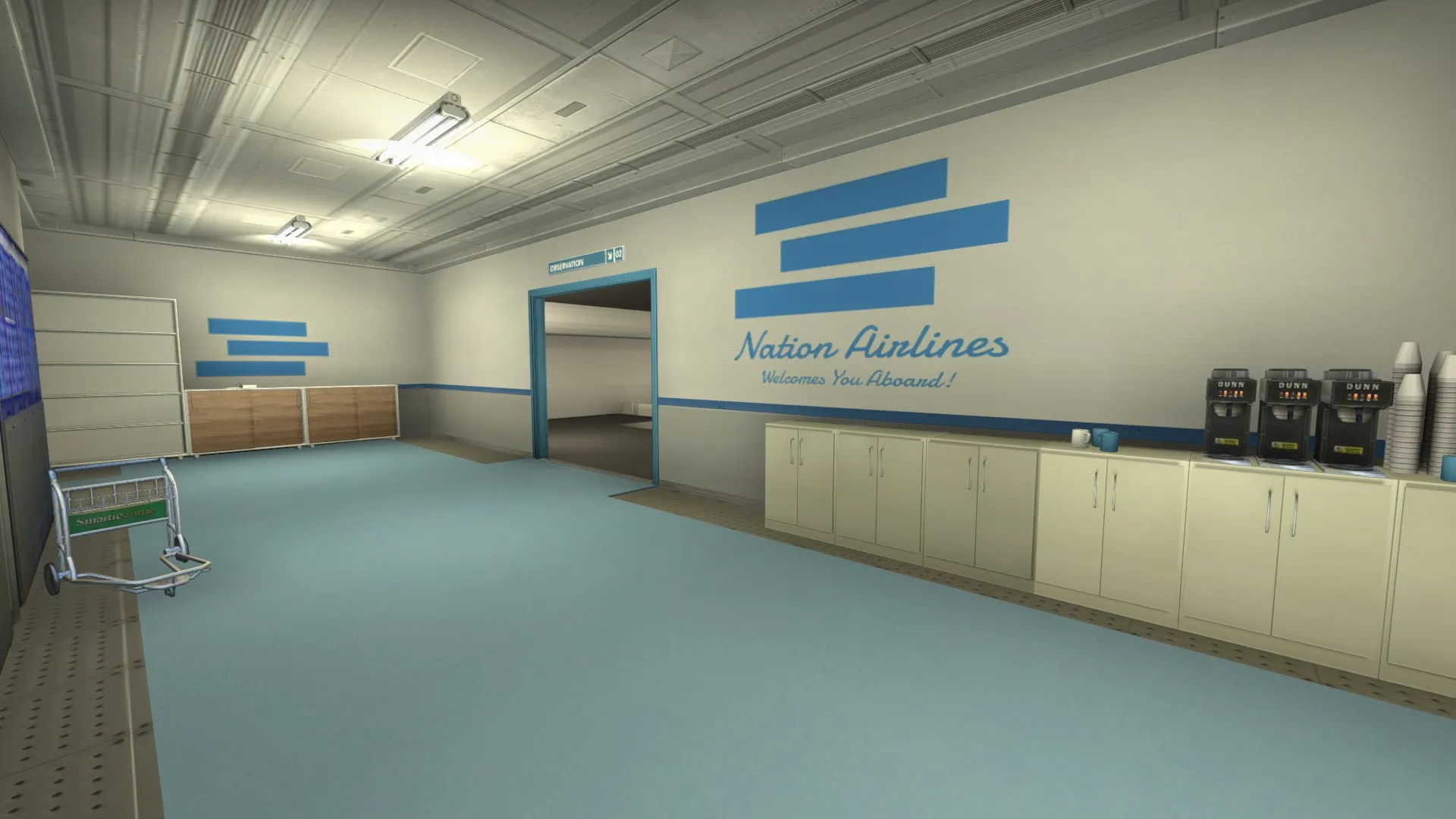
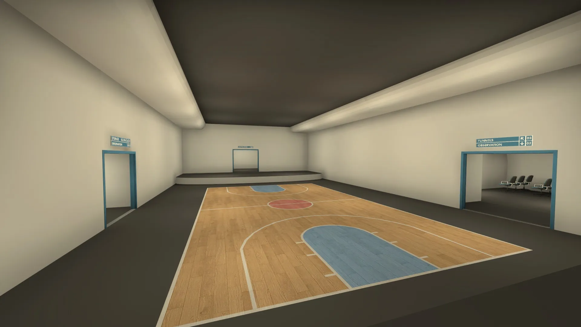
    I'm having a blast detailing this area. Most of what you see is custom content, textures and models. Underneath the "Nation" sign you can see the new directional signs I made based off of the nuke ones. Now getting around should be easier since there are signs telling you where to go, and the layout as a whole is much simpler.

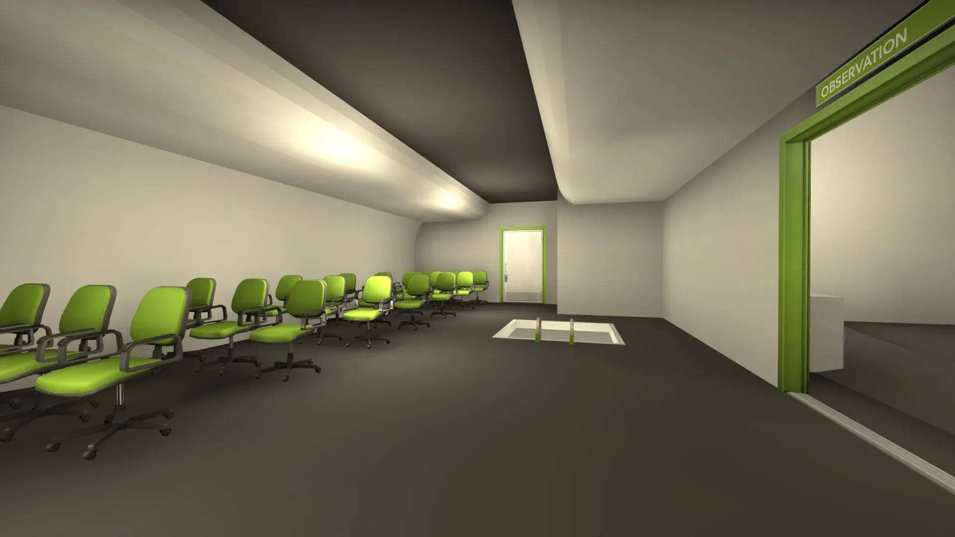
    Here's a good example of how I'm shifting the theme away from a Fisher-Price solid color palette to a more luxury oriented, warm palette. I feel that since the themes between the cargo area (bottom floor) and the passenger area (top floor) are so different, we don't need to color code them so harshly. You can tell what floor you're on by looking around. I've still subtly kept in some color coding, such as blue signs for A site, and Red ones for B.

    Here you can see some new textures and models.

    Tell me what you think, are we on the right track still? Notice anything that needs improving? Any help is appreciated, Thanks for reading!

  • Aerospace (Alpha)

    • Noodle King
    • August 28, 2017 at 10:58 PM
    Quote from fewseb

    1 hour ago, fewseb said: I dont know if you've done this yet, but you can have multi-layered radars that show different layouts, the new nuke has this.

    The radar does currently have multiple layers. It's easy enough to read, but once you add bombsite icons, player icons, etc, it becomes really difficult to see where everything is.

  • Aerospace (Alpha)

    • Noodle King
    • August 28, 2017 at 4:35 AM

    After our last play test, it's becoming more clear that the overlapping 3-layer design isn't working out as well as we expected it to. There are a few fundamental errors with the whole idea inside of CS, some of which are our fault, some of which are not. First, the radar is basically useless, it's extremely hard to tell where someone is by looking at the radar, above you, below you, or right in front of you. Similarly, sounds from all 3 floors can be heard from all around, once again making it difficult to determine where a sound/enemy is. Lastly, it is kind of hard to navigate a 3 layer level. It makes sense to me, I created the layout after all, but for everyone else its a maze.

    So, after some thought and experimentation, we're gonna completely ditch the 3rd floor and follow some of the feedback we've been getting. We're essentially in the process of merging the mid and A-site floors into one, with the bottom/cargo floor remaining similar. This way, the map will be more similar to the classic stacked-bombsite styled maps, most prominently nuke, but also reminiscent of Overpass. With just two layers to worry about, there won't be as much disorientation. Plus, my hope is that the somewhat linear design of a plane will make it easier to navigate, even though the floors are still stacked on top of each other. This is a massive change, I'm basically rebuilding half the map, so it will take time. Thankfully, the parts of the art pass I've done so far won't be to greatly affected. Considering how big the changes are, not a lot of work is being lost. The next couple of days will consist of fiddling around with different ideas, then finally polishing and integrating them into the map.

    Thanks for reading, all the help we can get is welcome, so please leave a comment telling us what you think!

  • Aerospace (Alpha)

    • Noodle King
    • August 22, 2017 at 6:28 AM

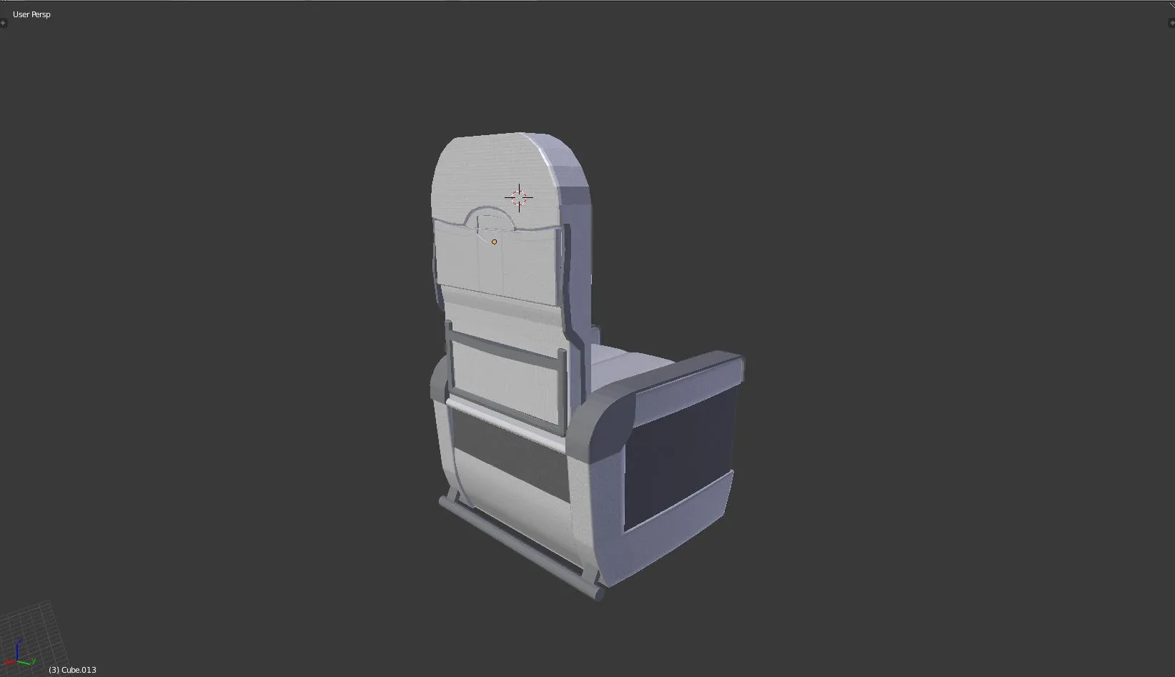
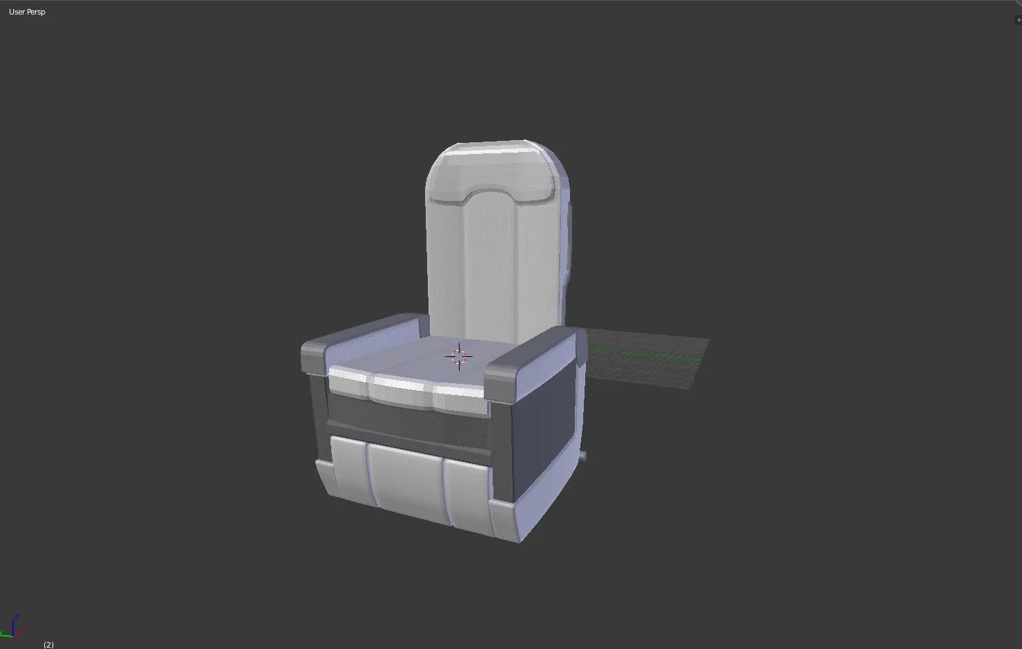
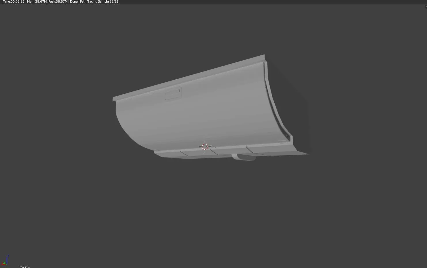
    Been working on some more models for the passenger areas:

    New and improved chair model, now with more detail and rounder edges

    An overhead compartment for luggage storage.

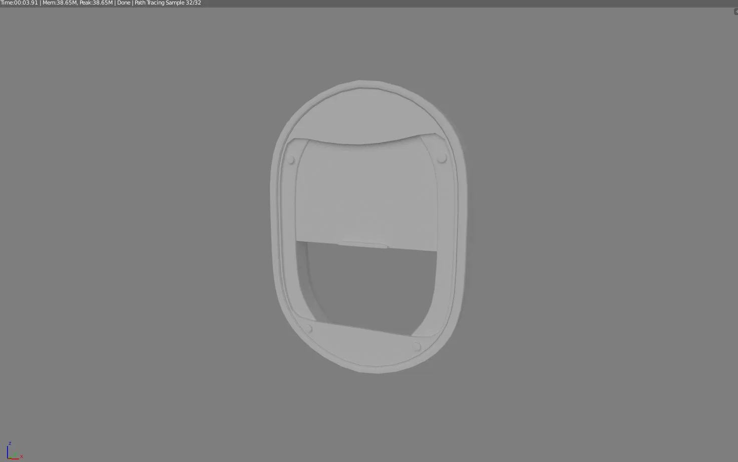
    A classic-styled airplane window.

  • [WIP] de_biome

    • Noodle King
    • August 20, 2017 at 7:52 PM

    Starting to take shape! Looks nice :)

  • Aerospace (Alpha)

    • Noodle King
    • August 20, 2017 at 1:38 AM

    Finally got some custom models imported in game! Take a look:

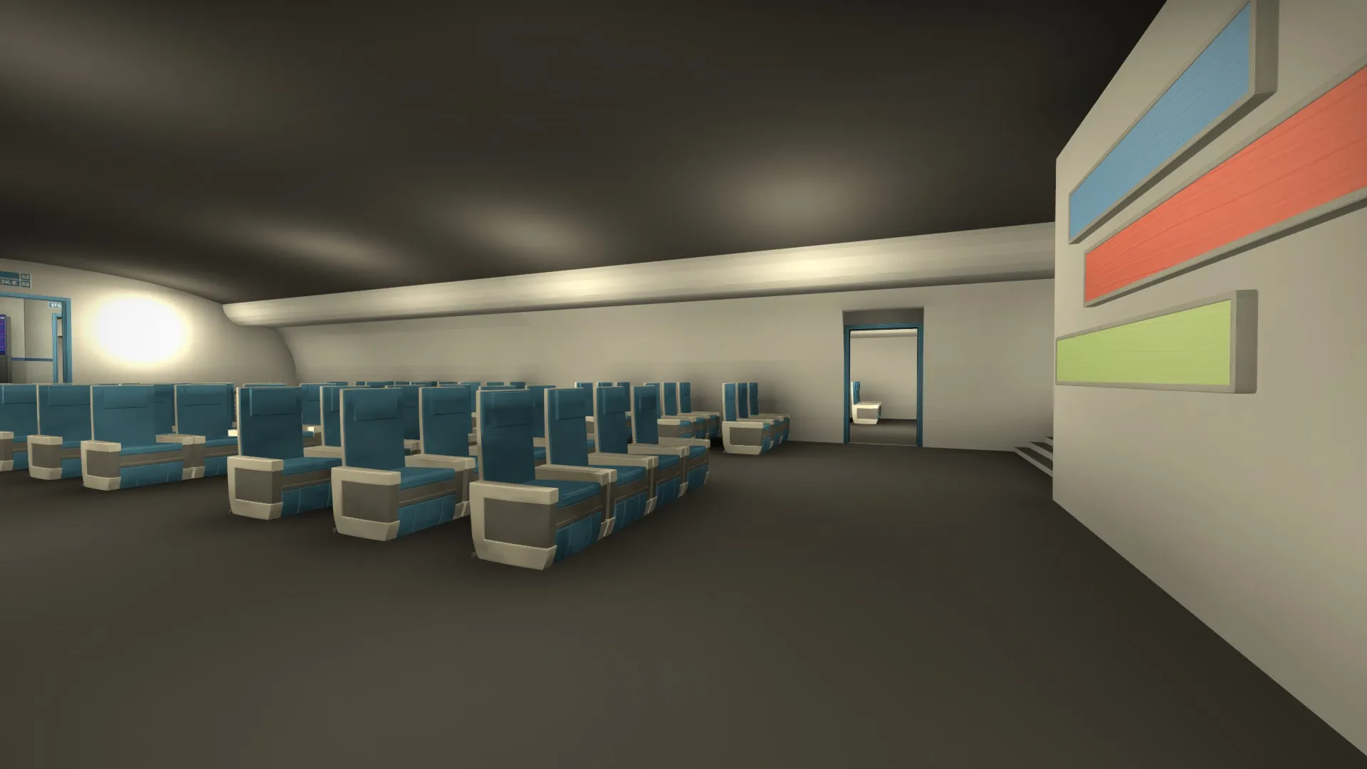
    Mid, now with a unique logo sign (seen on the far right) and a new chair model that better fits the theme of an airplane.

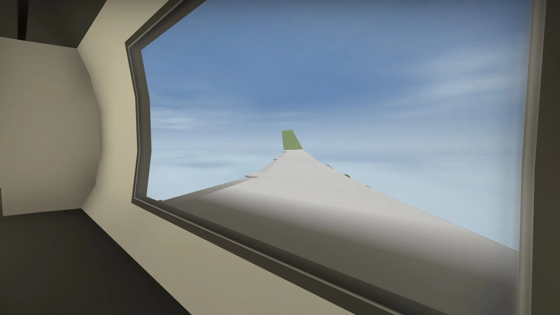
    The new wing model, as see from the window on A-site.

    No custom models here, but it shows some of the theming we're going for.

  • Aerospace (Alpha)

    • Noodle King
    • August 18, 2017 at 12:23 AM

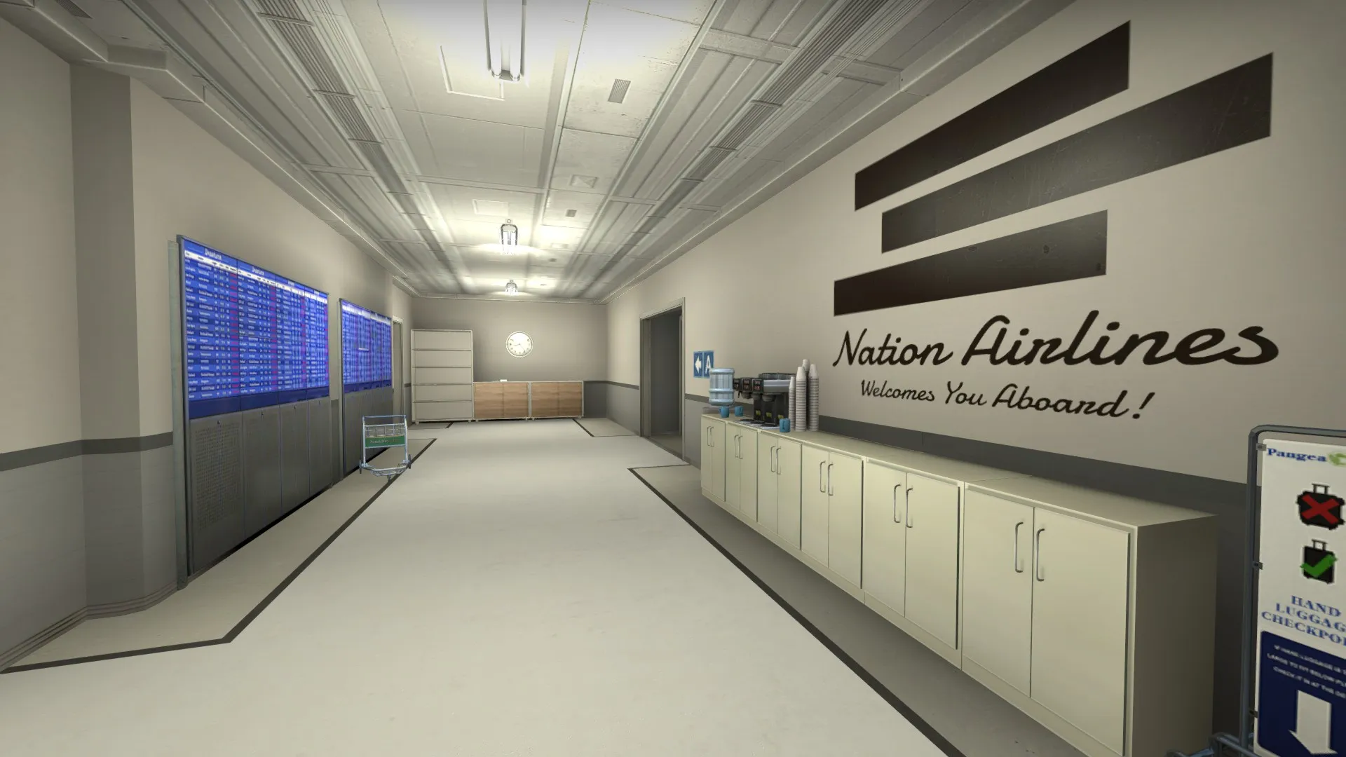
    Work has begun on detailing some areas! For now we're just working on areas that we know aren't going to need as many changes. Right now, T-spawn and a bit of the surrounding area are almost done. Take a look:

    T Spawn

    T-Spawn to mid connector

  • Aerospace (Alpha)

    • Noodle King
    • August 17, 2017 at 3:33 AM

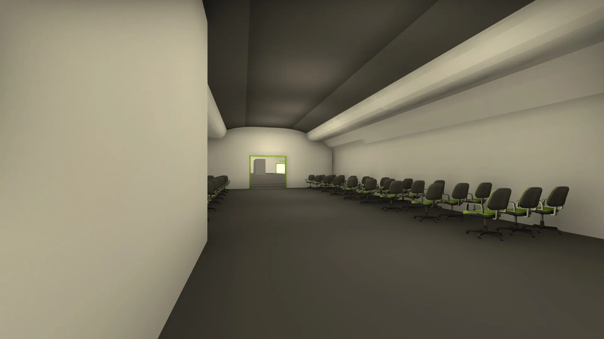
    Like I said in the original post, placeholder assets are being used, though it would be hilarious to have a bunch of roller chairs on a plane during turbulence :P But we're working on some custom assets, the main issue is getting them imported into the game, but we're making progress.

  • Aerospace (Alpha)

    • Noodle King
    • August 15, 2017 at 9:15 PM

    Alpha 2.0 Is Out!

    Lots has changed in this update. After getting lots of feedback from play testing, we've modified the layout lots to better suit competitive play.

    #6: Big Update: -Reworked the maps layout to better fit competitive play: -Lengthened the entire map by a considerable amount, making the timings for each side more reasonable. -Added a new area on the lower level for the T's aproaching to B. -Shifted B-Site back. -Added a new area to the upper level for T's. -Completely re-did mid to better suit the theme and provide more cover. -Removed the mid connector to A. It gave the T's way too much map control if they were able to reach it from mid. -Added a new passageway connecting the T's entry to mid with the tunnel leading to B-site. -Reshaped the path T's take to get to the top floor from spawn. Now it is a switch-back staircase opposed to a boring ladder. -Added some minor detail improvements. -Overall, this update improves Aerospace in almost every way. For the top and bottom levels, more area has been added in between bomb sites so that engagements take place in other places as well. More area gives the CT's more options on where to defend, giving the map more variety. In fact, more area across the entire map has toned down the gameplay from casual and fast rounds to something more slow and tactical. The removal of the Mid connector to A may need to be substituted with another alternate way to get to the top level, but we'll see how it plays out. As for mid it'self, I think it will play much better than old mid. It now has some meat to it, not just an empty cube-shaped room.

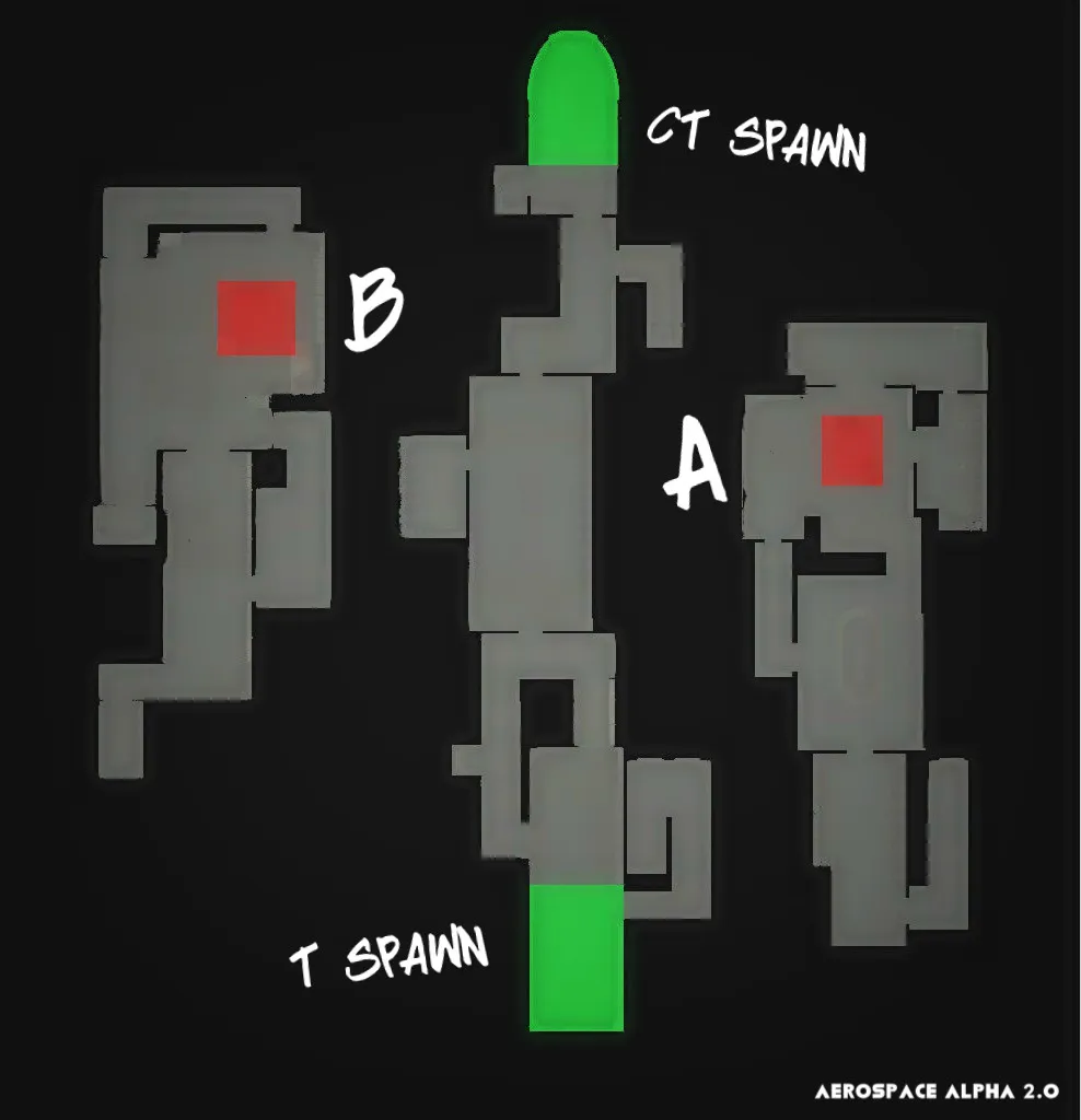
    The updated radar. I gave it a bit of love in this version, but its still not final.

    New and improved mid as seen from the T's side. Its got more cover, takes longer to get to,and doesn't give one team an overpowered advantage to hold.

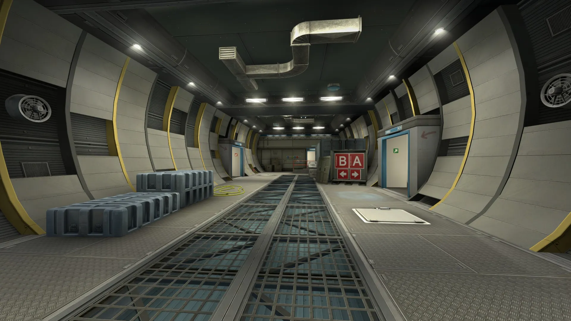
    New "long" area on the t's aproach to B. This area will make for some interesting long distance plays. Also, the doorway on the right gives the T's a safer passage to the site, but they have to risk crossing the bombsite sightline to get there.

    New corridor for CT's. On the far right is the entrance to CT spawn. In the middle is the entry to mid, and on the left is the passage to A. This corridor makes it so that CT's don't get to mid in seconds. A similar setup has been added on the T side as well, I think mid will play a lot better with this update. Although the negev and auto spamming was fun while it lasted.

    The final major change I'll mention is this new area on the top floor. On the right (Off screen) is the T's entrance into this area. It basically acts as a "long" for the A approach. Also, with this area making it a longer way to A for the T's, it allows CT's to push up and be able to hold more ground before site. Before this update, almost all the engagements took place right in the sites. Now there some other engagement points that the CT's can either chose to push and hold or stay back and wait.


    Thanks for reading, tell us if we're on the right track, and have a good day :)

  • Aerospace (Alpha)

    • Noodle King
    • July 30, 2017 at 10:08 PM

    Me and Gz are working on a new project, Aerospace. This is my second entry into the Mapcore Csgo Mapping contest, and Gz's first.

    Aerospace takes place entirely on a resort luxury airliner as it flies through the sky. It is still very early in development, and our ideas are ambitious. However, we have managed to put together a solid design for the alpha. It's going to need tons of work, but it functions. Since Aerospace is still in very early development, we'll be taking all the feedback and suggestions we can get.

    Note that Aerospace is very far from a finished product. Placeholder assets are being used and everything is subject to change.

    Workshop: http://steamcommunity.com/sharedfiles/fi…/?id=1095542813

    Some more screenshots:

    Spoiler

  • [WIP] de_biome

    • Noodle King
    • July 30, 2017 at 7:31 PM

    I think it's OK to mix themes as long as it makes sense. In this case, a scientific facility designed to grow plants would totally be able to look different than the environment around it. This counts for the clean parts as well, you can have labs, rec rooms, utility rooms, etc. Just be careful that it doesn't become a mess, and that there are sensible transitions between the different themes.

  • Cypress

    • Noodle King
    • July 29, 2017 at 5:36 PM
    Quote from blackdog

    8 hours ago, blackdog said: @Noodle King of course you will do what you feel with the map. I think is great that you are seeing an immediate improvement implementing suggestions you received!

    Because of the terminology you are using ("triggering, upsetting") I think you are reading too much into the feedback, is not like anyone said "I want to poke my eyes off" :D also apologies if I didn't add any particular suggestion, but all was said already, I just wanted to reinforce that it wasn't only those people thinking this early things.

    Here I just wanted to clarify what I mean with contradiction. You are saying "I don't want to make big changes now", but you admitted you had comments about the theme already a long while back. People wouldn't comment on it now if you had worked on the theme when you were first prompted about it, or would be suggestions on little changes.

    Apologies for dragging the reply, but I can't read the "art" argument. Personally I object to the "small sample of people who complain", I'm not sure where else you posted, but this is a forum with lots of professionals of the industry, I think their input is more valuable than gamers; people "like" aim_ maps with dev textures, so… draw your own conclusion.

    What you do is Map Design, all the lighting and modelling might fall under "environmental art" umbrella, but we are still talking about architecture, placement of items of daily life etc: all stuff that ultimately has to be functional to be believable, this is not a painting, this is still "design" – maybe an artist like @[HP] can correct me if I'm wrong.

    Best of luck with the release ✌?

    Display More

    Maybe I could have clarified more, I didn't actually release Cypress until it was in beta. By then, the art pass was pretty much done. Since then I made lots of changes, but changing the theme just never was one of them. Also, sorry if it would appear that i'm taking this personally, I know that the people here are a tough crowd that will point out whats wrong with a map and won't hesitate to make their opinion known. Which is good ya know, someones gotta tell you whats wrong, otherwise you would just think its all OK and the map would never get any better. Since i first did post Cypress on here, it has improved massively thanks to feedback that I've gotten from Mapcore. No hard feelings, I hope we can still love each other in a weird detached sort of way, thanks for the feedback :)

  • Cypress

    • Noodle King
    • July 28, 2017 at 7:12 PM
    Quote from blackdog

    12 hours ago, blackdog said: This is some weird contradiction :-| if you've been told for months to address the clutter you can't really say "at this point"... also not sure people that have spent time to accurately give feedback so you can improve, will want to do same in the future, knowing you are not inclined to make changes.

    I dunno, is a real shame you won't polish this, as pointed out there are some good things in the map, looking at the screens I was gping to say that the theme is not consistent and there are main structures that don't make sense ("nuke meets mirage?") but taken singularly, I was liking certain angles/rooms.

    I said right from the get go, on this page that I will make small changes. I've been developing Cypress for a very long time, and I'm starting to move on to other things. I'm still updating it by fixing bugs and game play issues, but I'm not in a place where I want to change half the map. I'm not denying or contradicting any of the feedback given to me. It's right and I know that, but I'm just plainly not going to overhaul half the map cause some people, (A very small minority) do not like the theme mixing. Like all art, it is still subjective, and while I see the valid points behind the themes not mixing well, it's just not worth the time and effort to change in my opinion. I will, however, use all the great feedback from Cypress and utilize it with future projects. In fact, I'm already doing this :p. Hopefully you can understand where I'm coming from here :)

    Quote from RAD

    10 hours ago, RAD said: Map is looking great,detailed,polished and everything ,but it doesnt feel like a real place ,many buildings are architecturally wrong.

    I have seen wrong use of some textures and props,you need a story for your map,and strong theme,you can mix old and new but not this way.

    Too many props,remove most of them,reasons optimization and gameplay.

    If someone asked me where is your map taking place,is it nuclear facility,factory i wouldnt be able to tell from screenshots.

    Overall you have a talent,did a great job in some parts but you need to rethink some things.

    I actually fixed some of the things you brought up in the most current update. I changed some of the textures that were really triggering people, and It really does look better. There is a story for the map, go to the workshop description, it's all there. In the most recent update I removed a lot of clutter that really didn't have to be there. I think it makes that map look a lot cleaner and readable. For anyone who's wondering, I do still care about Cypress and it's development, and I am still working on it.

    Quote from FizzyPhysics

    2 hours ago, FizzyPhysics said: Hey Noodle King, I've seen a lot of people comment about how you're map takes place in a weird setting and that you mix and match props from maps into yours and the result is a great looking map but a poor theme. I'm here to recommend a different solution to your problem. You could try to make a place up, invent a location that doesn't exist but utilize props in a way that it makes it feel like a real place. There's nothing wrong with borrowing props, everyone does it to some degree. The problem is not thinking about the world and what purpose your prop has in it. Just another solution to the problem you're facing, also it doesn't bother me personally that the theme of the map is all over. To me, it's more important how the map plays than how it looks. Good luck on your map, ty for your feedback on mine, and I hope you are able to improve the map from my feedback.

    Thanks for the advice, you're right for sure. There are things that don't belong in a ultra realistic setting within Cypress, and this upsets some people more than others. It's impossible to make everyone happy, basically. I have come up with a plausible story that merges the two themes together. If anyone cares to look closely at the map and read the story on the workshop page they will find the themes aren't as outlandish as they may first think. It may not make a lot of sense as a real place, but It still makes sense. Thanks for your feedback :)

Discord

The Mapcore Discord is our lively IRC channel of the 2000s reborn. Chat about level design, gaming, and more.

Latest Posts

  1. Custom Gamemodes Contest

    Angel
    July 20, 2026 at 11:46 AM
  2. FAQ

    Angel
    July 20, 2026 at 10:14 AM
  3. Tangerine

    Harry Poster
    July 18, 2026 at 11:10 AM
  4. Any of the old guard still around? D:

    Warby
    July 12, 2026 at 8:23 PM
  5. About our archived forums

    Thrik
    June 30, 2026 at 2:12 PM
  6. Mapcore Discord

    mason_fan123
    June 24, 2026 at 8:52 PM
  7. [CS2] Valley

    Serialmapper
    June 22, 2026 at 11:56 AM
  8. Free Music / SFX Resource - Over 2500 Tracks

    Eric Matyas
    June 18, 2026 at 12:32 PM
  9. Pango [WIP]

    Elowen
    June 11, 2026 at 10:13 AM
  10. [CS2] Dvina

    Jeremy Rivera
    June 11, 2026 at 10:03 AM
  1. Privacy Policy
  2. Contact
Powered by WoltLab Suite™