 Quote from Andre Valera
On 13/09/2017 at 7:00 AM, Andre Valera said: Less is More; limiting the amount of different default csgo art asset libraries referenced within this map might help centralize a theme that's unique.
Since most of the assets in csgo have been overused your next best step is to implement your own custom art work. If you're on a tight budget (this includes time) then narrowing the assets used during development will help drive the central theme.
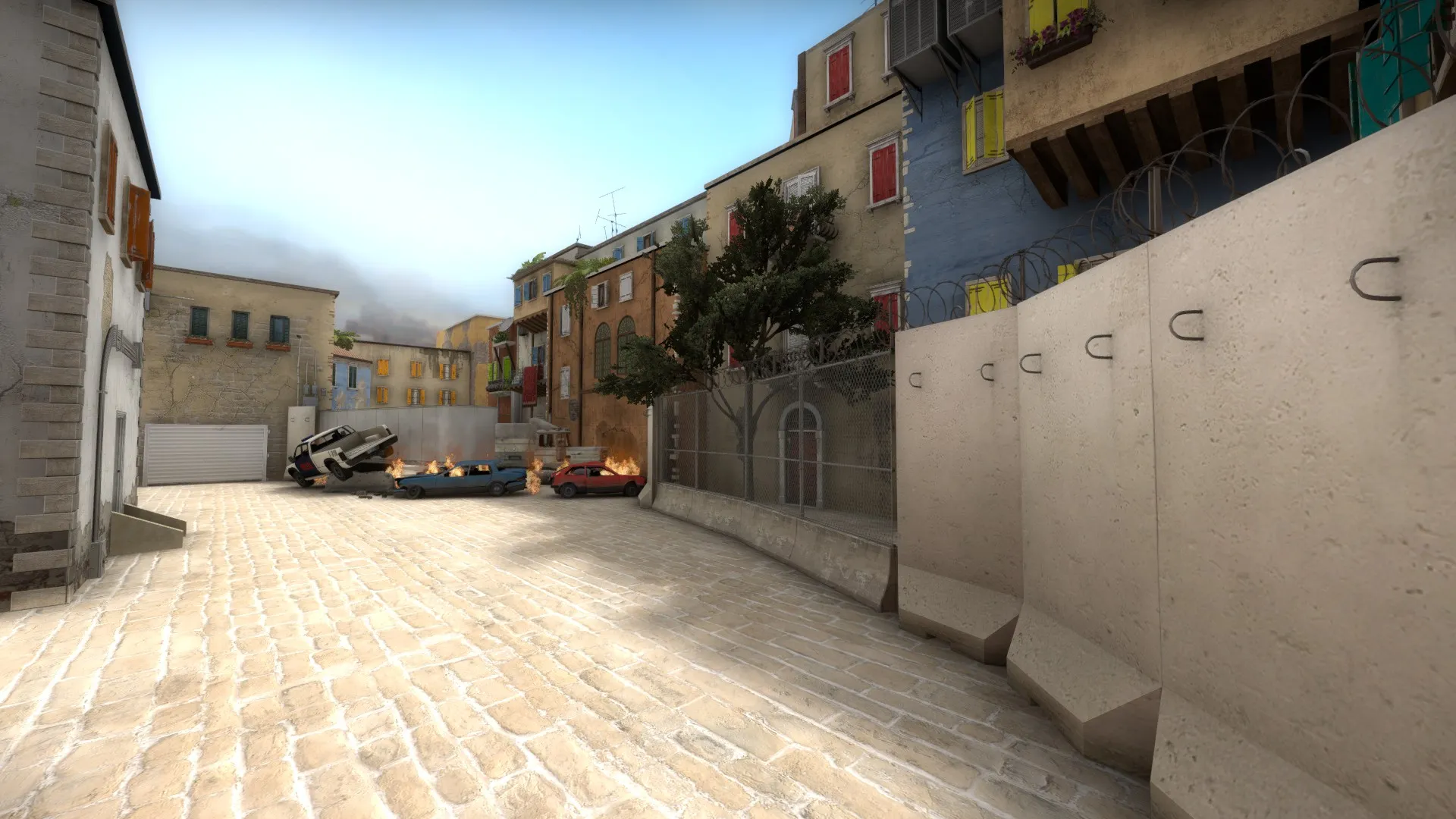
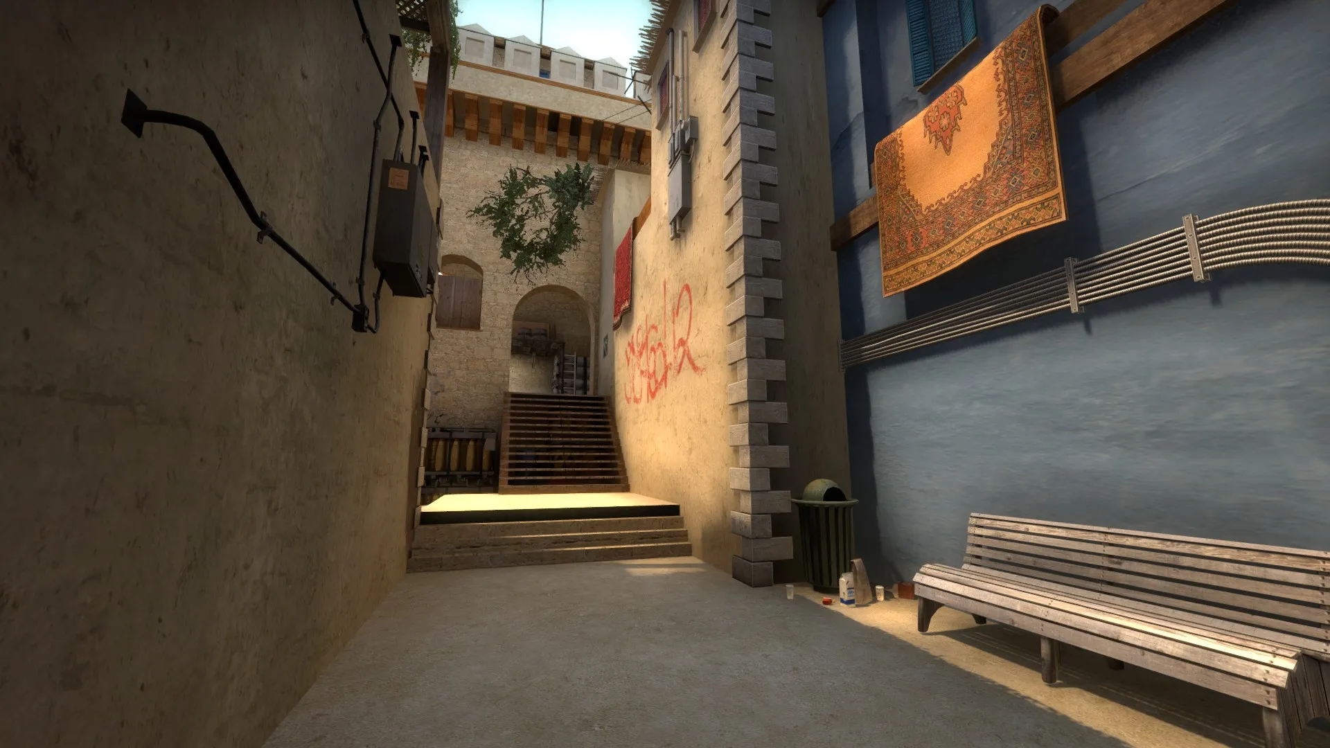
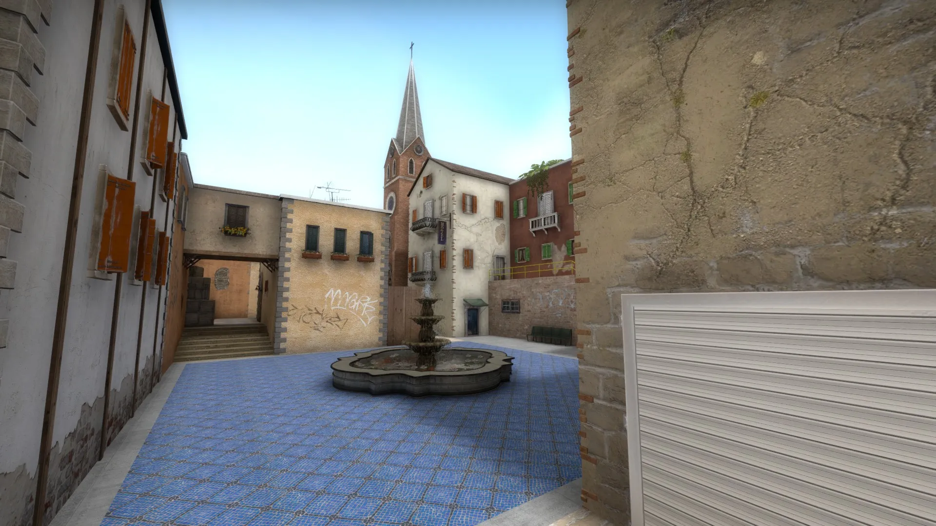
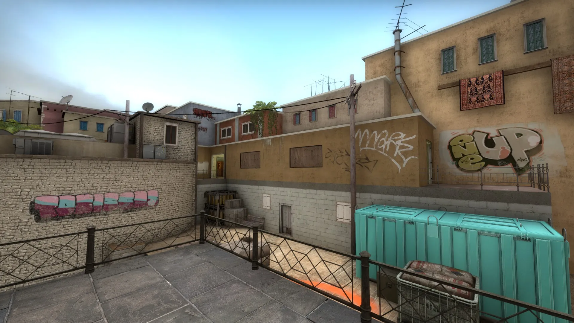
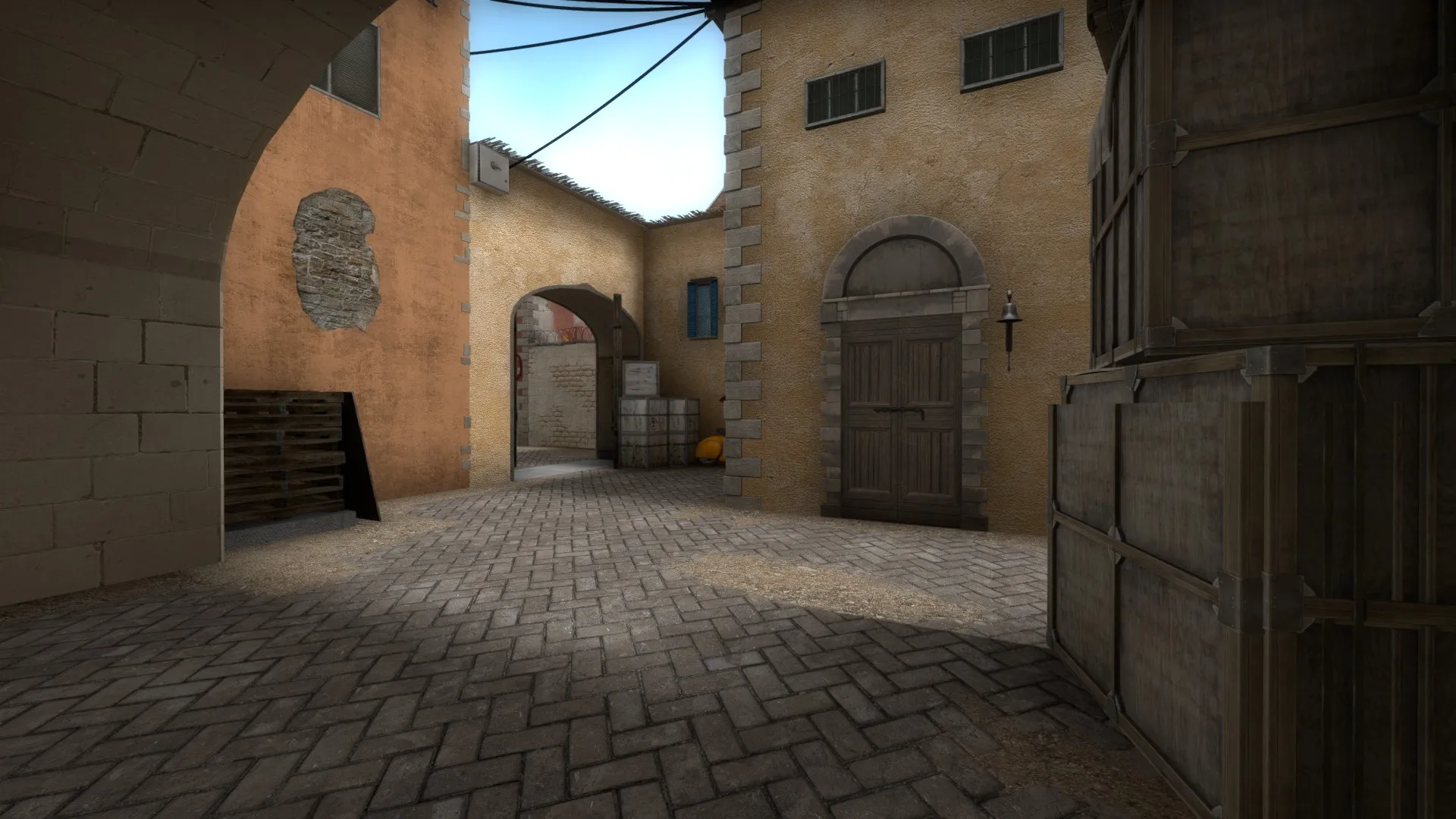
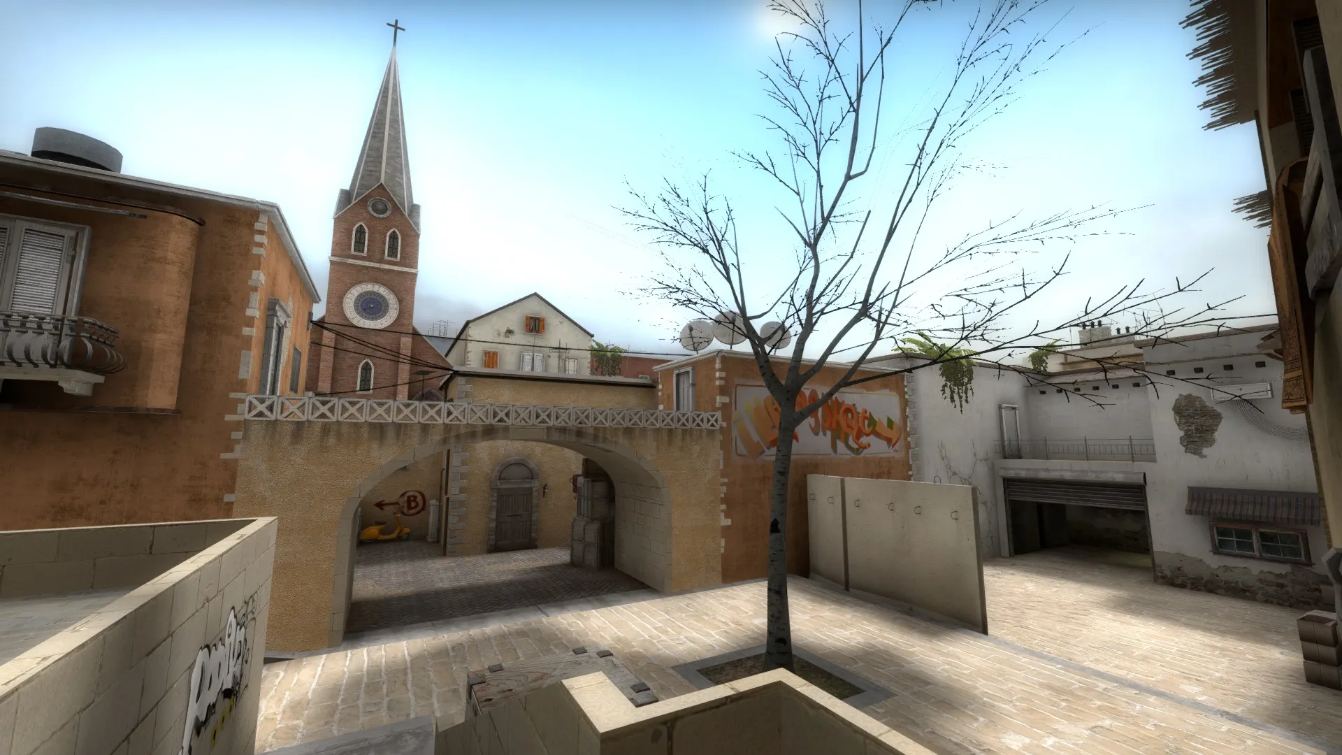
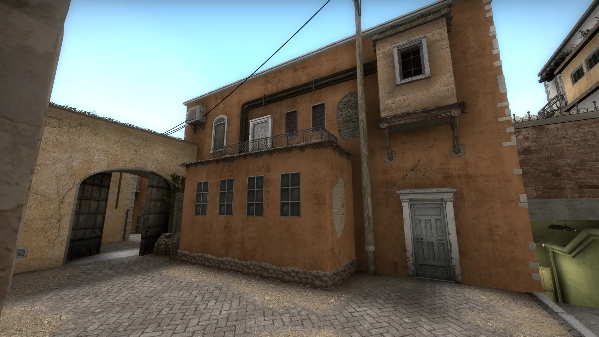
P.S. Right now I'm seeing D2/Mirage rugs, Italy windows, default bombsite decals, D2 assets right next to colorized Nuke assets, Plaster Stone Brick combinations I've never seen before, Cobble trims, default l4d2 utility pipes, decals seen in hl2, assets that are alpha colored lime green next to buildings that represent the complete opposite. Create your silhouettes first, then fill in the detail. Less is more and folks are more willing to play the d2_d3remake than they are d2_nuke_inferno_someofthoseHL2assets_aztec_decalsfrom_2004. Get your layout test played and go out of your way to create something original, your greybox is really important and working with a content artist/concept artist/ environment artists will jog your creativity to makes something original : )
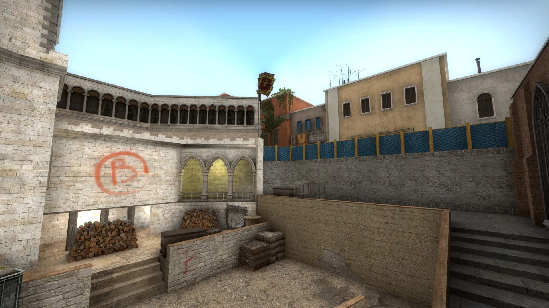
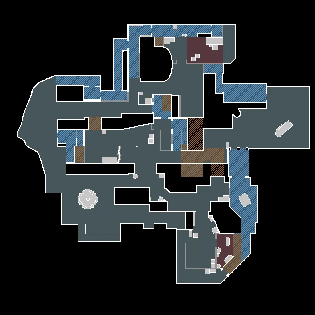
Thanks for the feedback! I completely agree with your idea of 'Less is more' but as this is my first map for CSGO I wanted to play around with the variety of props available to me. I don't necessarily find however that it's a bad thing. Each individual area of the map feels unique and a new player would be able to learn the map quickly because of this. With regards to your comment on the lime green box on bombsite B - I found that this was more of a gameplay thing than an aesthetic thing. It draws the players eye straight to the most powerful piece of cover as soon as the squeaky door is opened which helps the terrorist player a great deal. I also like the colour as it helps prevent the map from feeling gloomy, something which I think is quite important, the same design philosophy went into the fence present behind the box, the bright blue tarp is a good contrast to the brown of the church brick. For me personally, the aesthetic of a map doesn't have to be 100% realistic but it does need to be memorable and unique, something which I hope my map does well!
 Quote from NikiOo
On 10/09/2017 at 9:05 AM, NikiOo said: Please delete those nuke crates. They look so out of place. Other than that I feel like there are too many conflicting themes. There's nothing wrong with not using custom content, just try not to make a visual mess.
I appreciate your feedback and I know there is a lot going on in the map but if you read my response to Andre Velera you can see the reasoning behind my decision to include the nuke crates in the map. You may not agree with me but I hope you will at least understand the process behind my aesthetic decisions.