


Oh and there's a workshop link as well:
Posts by NikiOo
-
-
Three days after the news of the meteor, a research team had already been sent on location to sample the alien rock. The samples were loaded into the truck. All they had to do was wait out the storm. But then came the Cthulhu lunatics proclaiming that the rock belonged to them. They had heard about the great rock that fell out of the sky and bedded itself in the cave within the snowy mountain, leaving a gaping hole in the vertical cliff side. A spec ops team was sent to the location of the crash-site to protect the rock and the van with the scientists. They were trapped in there, surrounded by the storm, while the cultists were closing in on them from the south. It was a dire situation. Some would say unreasonable. But the only way out was the way of the gun. For their assailants were about to break through the thin veil of ice, concealing the fragile scientific equipment, and bring the storm with them.
Spoiler [Blocked Image: https://i.imgur.com/fwB0Apx.png]
It was beyond nature, this gleaming red abomination.
[Blocked Image: https://i.imgur.com/pau06mk.png]
It's appearance so mystical and absurd as to bring it's observer to sheer lunacy.
[Blocked Image: https://i.imgur.com/hvyiaYB.png]
Dr. Muego, Bastir and Fallace lay trapped beneath the ice cape. They sat inside the cold van, admiring the unfathomable substance they'd sampled from the rock.
[Blocked Image: https://i.imgur.com/7kRptye.png]
Bastir had laid a ladder on the East side of the cave in case they had to climb out running for their lives. Outside was unforgiving wind. You couldn't hear a helicopter outside, let alone the footsteps of a horde of fanatics... But their arrival was imminent nonetheless.
What will happen to our Bastir, Fallace and Dr. Muege? Will the spec ops team manage to fight their way out in this terrible storm? Find out in the next issue of Gust - The Graphic Novel.
This issue contains a special poster - an overview of the surroundings of the crash-site, which can be found below:
Spoiler [Blocked Image: https://i.imgur.com/2cEg79N.png]
-
I don't think the swamp water slows you down that much.
It's an interesting mechanic (quite exotic ?). I wonder how it's going to affect gameplay, especially in the T rotation route between the two sties.
There's also this cool section where you can pull out your knife and do some platforming. Pretend you're playing a fun game, that's not CS:GO (it doesn't get any more exotic than this). But at the same time it's risky, cause you're more exposed and you can't throw knives in CS:GO.
I don't think anyone b-hops in CS:GO. At least I wouldn't do it when someone is watching. It's morally reprehensible.
You know what would be really cool? If you added a feature where if you stood long enough in the swamp water (say 10 seconds) an alligator pops out and devours you, taking half your HP. You can also play some horror music with building tension to let the players know when it's coming.
-
Really awesome art! My only pet peeve is that some of the interiors look a bit empty, especially the indoors area in the back of A.
The layout looked a bit redundant from the radar image, but now that I ran around it, it's actually quite nice. I'm intrigued to see how mid is gonna play, especially with that see-through, not-go-through room. Besides that, I really like the bombsites, a lot of interesting angles everyone, especially with all the elevated areas around B.
I also have to give props for not clipping the cliffs. Great choice there, I'm sure you've spared a lot of players the annoyance of bumping into invisible walls, by providing them the liberty of plunging to their death, should they decide that life isn't worth living anymore.
And those trees are ?
-
This definitely has to be my favorite entry in terms of visuals. I can't tell precisely which assets are custom but the overall choice of high quality textures and models makes for an almost photo-realistic aesthetic. The shadows also contribute to that by adding quite a lot of contrast, but I agree with RadimaX that they might be a bit too dark, relative to the sky.
Perhaps it's just me, but I feel like in general picking photo-realistic textures and high quality models really opens up more opportunities for all sorts of color combinations, because such textures have a natural harmony.
In terms of the layout, I think it's pretty solid from the experience I had playing with bots. The only thing that felt a bit off was that some of the connectors were a bit too zigzaggy, but I guess it might make for more interesting angles.
-
A well made theme park is supposed to be immersive, right? Perhaps it could have some more signs and sunbeds and an ice-cream shop or whatever else you'd associate with a waterpark, but overall the art looks great, I'm digging the red + green color scheme. Great work!
-
I like the colors. Very pleasing to look at!
-
I love those arches at the balconies! ?v?
-
This is giving me some Uncharted 4 vibes. Looks absolutely incredible! I never thought source could be pushed so far with regards to realistic vegetation but this proves me wrong. All it needs is some more personality.
Quote from untorOn 11/13/2019 at 4:32 AM, untor said: - Final refinement of timings
?
-
 Quote from ItzOmega
You might wanna lighten up those shadows. See hoe bright the sky is? It doesn't make sense to have such high contrast lighting. It looks really dark and depressing.
-
 Quote from Interfearance
20 hours ago, Interfearance said: @blackdog I for one am not really too opposed to the platform because the old one was pretty hard and more of a novelty than a reliable route. It is a good part to experiment on. This iterative mapping based on feedback reminds me: Why is stopping Valve from trying to find ways to balance unpopular maps like Train and Nuke?
I don't think balance is the issue with Nuke and Train, they're just not the most fun maps to play on.
A map can be very competitive, and I think train is a really good competitive map, but not very attractive for the average player.
-
This project has clearly been a massive mistake.
-
Yep, those three vehicles need to be replaced with soviet asap. You can't just pull a fast one on the whole community like that. The solviets are gonna be insulted. That's practically butchering their cultural heritage. Imagine if everyone started making arbitrary changes to historically-themed maps, what will happen in 10 years, 50 years? We'll forget what soviet cars looked like.
Remember when Coca Cola took santa claus and made him red? They didn't care about Jesus Christ and what colors he liked! And now no one remembers that Santa was actually black.
-
As someone who started 3d modelling in blender and only 2 years later went on to learn maya, I'm baffled at the amount of people calling Blender unintuitive. I find it the exact opposite. The navigation in the viewport is incredibly smooth and easy to get used to, especially the shift F feature which I use all the time to fly around and save a lot of time of panning and rotating. The vertex editing tools are 5 times faster than maya and it loads 50 times quicker. The rest of the interface is considerably well organized imo. In fact I think you can learn most of the stuff through trial and error relatively quickly. Of course the experience is gonna be very different for people who have been using maya or 3ds max or 4d or any other software before trying blender and have to adapt to the different UI and controls.
This is just my personal experience. And I love blender. Only thing I've ever had to use another program for was 3d modelling, where of course nothing can beat zbrush.
-
I'm just very proud of the way this turned out:
[Blocked Image: https://i.imgur.com/d5ojShi.jpg]
This doesn't look very abandoned, does it?
[Blocked Image: https://i.imgur.com/wU8PkRi.jpg]
And for some reason I wanted to have green lighting in the lake, so here's a bunch of weird ghastly lanterns.
[Blocked Image: https://i.imgur.com/mGKsyPP.jpg]
I'm also changing to the other rocks, from the other deathzone map, these look a lot better with my bamboo trees.
[Blocked Image: https://i.imgur.com/JvMzlsN.jpg]
This is bombsite B. Beware! Big W.I.P. layout wise, it's gonna be very similar to the first version, I'm just trying out some weird quirky stuff.
[Blocked Image: https://i.imgur.com/FI34azb.jpg]
[Blocked Image: https://i.imgur.com/43RD1eb.jpg]
And here's middle. I think I've managed to make the areas look quite distinct visually, and I still have a lot of unused balcony and windows props.
So far I think I'm doing a really good job at making this look like a fishing village as little as possible.
I could just keep people in the dark and reveal the art when it's all ready and that would probably have a much better effect on people who have been following the development, but I don't like keeping things in my closet, if something looks good, I wanna share it. Besides, now I'll have to look at these screenshots every time I open up my thread and I'll start to see why it looks bad.
All feedback is welcome!
bye
-
I think I've decided on the lighting.
So apparently bamboo trees do grow on red soil.
Here's my little bamboo tree:
[Blocked Image: https://i.imgur.com/A9bdgLm.jpg]
[Blocked Image: https://i.imgur.com/sK1m9Fh.jpg]
And here's my super dope, duper exotic 4-way blend texture:
[Blocked Image: https://i.imgur.com/5HbVQKh.jpg]
I still haven't made up my mind on whether the village is gonna be abandoned or not, but I am starting to lean more and more towards the latter, for nothing else but my laziness to make things look old. Either way, there's gonna be a bit of moss over the buildings, otherwise they just won't fit in the color scheme and that's bad.
And because of how much I like to document my development process, here's a screenshot from the lake:
[Blocked Image: https://i.imgur.com/tuXuIQ0.jpg]
It's gonna have lanterns like these:
[Blocked Image: https://i.imgur.com/e84YMYz.jpg]
floating in the water, unless of course someone can confront me with a flash of cultural wisdom about how inadequate it would be to place them there.
P.S. I realized the wood textures on the houses was too dark and I've tried several different ones, but none seem to just Whoa me, maybe because of the messy blend of greybox visuals and prototype art that surrounds the buildings. Or maybe I just need to find an actually realistic looking wood texture that's not super dark.
bye
-
 Quote from Ynel
On 7/16/2019 at 8:31 PM, Ynel said: Those tiles are looking extra cool! But thr layout is very boring. Every round will play kinda the same. CTs rush out, and catch Ts off-gourd, while going to one of the sites.
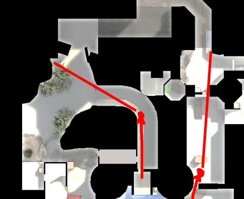
That's the old layout. Mid has changed quite a lot since then.
Now you're gonna need to increase your brightness for this one, cause I'm too lazy to recompile.
Here's some screenshots of mid house:
[Blocked Image: https://i.imgur.com/6hXPyz6.jpg]
[Blocked Image: https://i.imgur.com/L557Ayv.jpg]
Lighting is bad and I still haven't imported my custom brick textures, but so far I'd say it looks fine. I think I might scrap the night idea, though and just make it daytime with clouds, my textures are too dark and it's hard to see anything.
I imagine when I add some mossy brick textures, place some vines coming up the walls and roofs and a lot of grass, it would be much better looking.
Here's one with better lighting:
[Blocked Image: https://i.imgur.com/ppx3xRv.jpg]
I was also looking for a giant fish skeleton prop to hang somewhere, and I think I've found a suitable one. I just need to make it look like a zombie.
-
Alright, so my theme clearly wasn't exotic enough, so I'm changing it to an Old Fictional Chinese Fishing Village (maybe Abandoned, maybe there is still a terrible old man lurking in the shadows).
I started making a rooftops tileset:
[Blocked Image: https://i.imgur.com/qh0IidE.png]
[Blocked Image: https://i.imgur.com/ctO4tab.png]
The pierced fish is gonna be the emblem of the map and there's gonna be a lot of fish hanging around, I can also imagine making flies around the spoiled fish, but then again it's just my imagination and I might find it too hard and give up.
I decided to put more effort into the textures than the models (quite frankly I was just being lazy), but still, it's gonna be hanging high in the skies so no one should have anything to complain about. Other than that, I think I got the colors pretty much right, the fish might have to change to a more metallic color, though.
I'm thinking of a relatively dark weather to fit with the gloomy mood, maybe early morning or late evening, or I could just make it a stormy day with rain and dark clouds.
-
There is so much pink, man. I'd change at least half of all those lights you have laying around to sky color blue, and leave most of the spotlights pink.
I think the interiors, especially should rather be 100% blue, instead of 100% pink.
Also I think it would benefit from a bit of simplifying. Especially the T routes to A are super convoluted and confusing.
-
Notice in your reference how the pink colors are coming from lights illuminating select walls, the sky is still blue, and some back walls are lit by blue street lights and it doesn't hurt your eyes. Your pink lights are spreading too much imo, tinting almost everything. If I was you, I would try adding some blue spotlights to replicate that look of the first photo, and keep the sky relatively close to white, or slight blue.