


I remember enjoying my time with Dark Souls 2 more than with DS 3. In retrospective, it looks much uglier but the atmosphere was more welcoming. Perhaps it's because of how much variety there is in the places you visit. And with the slow combat it is certainly a lot more chill.
Posts by NikiOo
-
-
It's amazing that computer graphics have come so far that we can finally have glossy rocks.
-
Yes, gimme more of those meaningful games!
Frostpunk is awesome. It's like a management game that's not made for psychopaths.
-
Why do you think a 3 lane layout is not interesting? Most defuse maps follow a very similar four square pattern. That doesn't prevent them from doing a lot of original things within individual areas.
Also, I think you'll have better luck coming up with interesting ideas if you play around with it in the editor rather than on paper.
Here's something you can do - take a cool real life location that you would like to make in the game (this will motivate you) and think about how you can design a wingman layout around this location. You will find yourself solving interesting architectural problems and even if you end up with a three-lane layout still, it will be an interesting three-lane layout because of the constraints of the theme. You may not even notice that you have a three lane layout just like cache is pretending to not be a four-square layout while it is exactly that.
-
Well, it's actually quite simple.
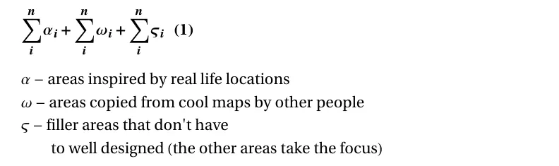
Ideally, you want to minimize the filler areas and maximize areas of type alpha and omega. You do this by learning how to think in 3 dimensions and how to generate interesting areas, while working within the constraints of nature and human architecture. Here is the formula for what makes a good area:
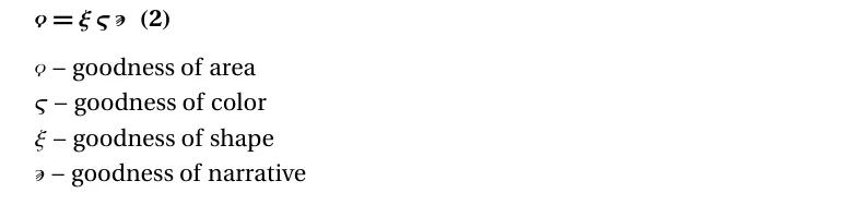
Goodness of narrative comes down to story-telling, which is a very expansive topic in and of itself so I will focus on goodness of color and goodness of shape. So we'll use a simplified formula for goodness of area, shown below:

Formula (1) is the lego approach to area engineering, where you deal with large presets, since you're not yet experienced enough to work on area microarchitecture. Now I will show you the wizard approach. You won't read about this in LD text-books.
Let H be the set of architectural components used by humans and let N denote the set of architectural components used by nature (God / evolution). Then we'll use Z to denote the available language of architectural expression. Z is the proper set of the union of H and N. Naturally, you cannot use the entire language of expression at your disposal so let's say the language you're going to use is some subset of Z, which we shall call L.

Now in order to learn how to make a good area, you need a way to calculate the goodness quantifier of formula (5). Without that you won't have the much needed feedback-response cycle and you will not improve. So we need to measure koppaI from an already built level. To do this, you take all elements of L and distribute them in a 3-d vector space, based on their position of use in the level. If you want, you can use two separate vector spaces - one for the color subcomponent of every component, and one for its shape. But beware, the natural distribution of the reasonable color spectrum for most components is pretty tight.
Next thing you do, you color code the scattered points based on the spatial locality of the components in the real world. In other words, components that appear together are assigned similar colors. Then you want to reduce the amount of overall entropy in the color distribution. One way to do this, without sacrificing variety is to have clusters of low entropy (which appear as splatters of uniform color) in distinct areas of your map, while the connecting areas should be kept low entropy (without many micro-clusters) so they can compensate for the contrasting transition between the larger areas.
[Blocked Image: https://www.mdpi.com/entropy/entropy-21-00683/article_deploy/html/images/entropy-21-00683-g003.png]
For reference, in the image above, a high entropy area would look something like (c), while the rest are relatively low entropy.
Some easy ways to reduce color entropy in your level are:
- using a very limited color palette
- using painterly textures
- using photo textures taken from the same real world location
Some easy ways to reduce shape entropy in your level are:
- using references
- not mixing architectural styles from different historical periods
- use large pieces for cover, remove small pieces that only add clutter
- reducing signs of human life (it is very difficult to prevent signs of human life from skyrocketing your entropy meter)
- hierarchical procedure (starting from a silhouette blockout and gradually filling in details)
Keep in mind, entropy can also be too low. This can happen if you put too much effort into silhouette and visual harmony and don't use any references. You can end up compensating with bad entropy. Bad entropy is when details you add increase visual disharmony very rapidly. Ideally, you want your learning process to lead you to a place where your entropy is similar to the entropy in areas you find visually appealing in real life or virtual environments, and you also want the level of detail to approach the level of detail in those environments.
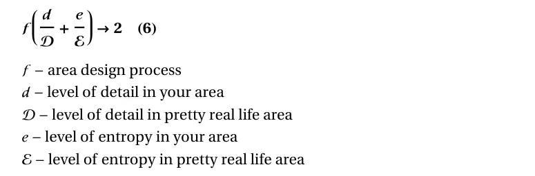
In formula (6) I show an example optimization model for a realistic style area. You can use this to derive a model for fantastic or stylized areas. You want entropy and detail to move in parallel with one another. The ideal scenario would look something like this:
[Blocked Image: https://i.imgur.com/NF9hRma.png]
Keep in mind that adding narrative elements such as signs of human life and natural decay can increase entropy quite alot. For further reading on sings of human life look into How buildings learn by Stewart Brand.
If you get good at adding detail without massively increasing entropy, you will have more confidence to experiment with unique layouts.
Then there is another formula, called the challenge complexity formula. Player enjoyment from playing a map tends to correlate inversely with frustration. Frustration comes from low correlation between expected challenge and actual challenge.
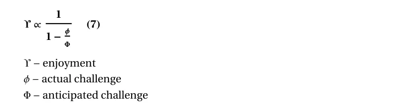
One way to model challenge is as a scalar, representing net difficulty (7).
[Blocked Image: https://i.imgur.com/UFpZMa8.png]
Another way you can model challenge, shown above, is as a set of micro-games that the player will have to play during the match, determined by the context of each encounter. The phrase "micro-games played in wingman maps on official servers" can be replaced with micro-games anticipated by the user or micro-games user enjoys to play in counter-strike. For this analysis, I assume that enjoyment is maximal on wingman maps on official servers, presuming those maps are examples of prime level design. This is more true for defuse maps than it is for wingman.
Micro-games constitute things like how you peek certain corners, how you play around with cover and position in certain contexts, how you use your utility, and all sorts of other actions you take to become more unpredictable and to put yourself in a favourable situation. The possible situations you may find yourself in are determined by the architecture of the level.
You don't want to introduce too many unique ideas into your level, because it will reflect badly on the micro-games ratio coefficient.
You can just plug those formulas into hammer and watch the magic happen!
-
We finally have a challenger.External Content www.youtube.comContent embedded from external sources will not be displayed without your consent.Through the activation of external content, you agree that personal data may be transferred to third party platforms. We have provided more information on this in our privacy policy.
-
Seeing this guy's channel, I'd say the funny is fully intentional.
-
I suggest that you align your geometry to the grid as much as you can, without compromising shape. In the example I show, I have roughly the same slope, but since it aligns with an exact point on the grid every six units. If you then reduce to a smaller grid, it would align every 3 units:
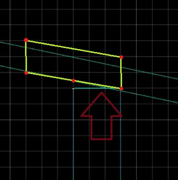
You can then use the vertex tool to raise the left edge of the wall. Or alternatively, you can make the wall overlap with the roof and use the knife tool to cut it at the same angle, but I wouldn't advice it since making changes afterwards is gonna suck for you.
-
Quote from ThunderKeil
11 hours ago, ThunderKeil said: well, first time I tried it I just gave up after like 15 minutes because holy shit the viewport control is awful for newcomers & wow it's impossible to do anything without remembering 13 hotkeys
Reading this feels odd to me since it's the exact same reaction I had going from blender to 3ds max :D. Imo blender is the most intuitive software to use as far as navigating the viewport goes, especially if you use the (Shift + F) mode to fly around the 3d space. It may just be because I've used it for much longer than any other 3d software. Anyways, it's a matter of personal preference. I find myself switching from one software to another if I don't like how they do a certain thing.
Here's the first fully textured car I've made (at least one that's good enough for me to remember)
[Blocked Image: https://i.imgur.com/A7Se6fT.png]
-
Maybe you're not supposed to interact with the world, but rather just observe and admire the beautiful static pieces... Like those cactuses.
-
The only game I've played that came out this year was Carrion. It was an interesting concept and felt good to play, but the levels felt short and linear, and very easy. It was more like a demo than a complete game.
That being said, my game of the year for 2020 is Pathologic 1 Classic Edition HD.
-
I really like the theme. It's not something you see very often. I believe you guys will know how to romanticize this cold industrial city.
The layout looks a bit on the large side with a lot of narrow pathways, but you'll get a better sense for it when you build it in hammer.
If you're still looking for references, there's this Facebook group, https://www.facebook.com/SocModernism/
It was one of the sources of inspiration for a current project of mine with a similar theme.
Good luck with the project and I'd love to see where you take it.
-
The furniture has arrived!
I wish I had more time to work on this, but it is what it is. I managed to get it to a state of half-finished.
[Blocked Image: https://i.imgur.com/dXR2aD6.jpg]
[Blocked Image: https://i.imgur.com/DuHfcLz.jpg]
[Blocked Image: https://i.imgur.com/HURnT71.jpg]
[Blocked Image: https://i.imgur.com/MxWF27J.jpg]
[Blocked Image: https://i.imgur.com/CZyU6FD.jpg]
The rocks look horrendous. I was too cautious not to go overboard with the polygons cause I knew I wouldn't have much time for optimization so I quickly put together a set of basic rocks. They looks at least 20% better than the previous set, and I'm satisfied with that.
Here's some more screenshost:
Spoiler [Blocked Image: https://i.imgur.com/7lhtctI.jpg]
[Blocked Image: https://i.imgur.com/PtzWnzj.jpg]
[Blocked Image: https://i.imgur.com/iFizx3o.jpg]
[Blocked Image: https://i.imgur.com/IxWNsNz.jpg]
[Blocked Image: https://i.imgur.com/XRUg7KS.jpg]
[Blocked Image: https://i.imgur.com/iV4yRYe.jpg]
[Blocked Image: https://i.imgur.com/G73ezQ3.jpg]
[Blocked Image: https://i.imgur.com/kZvtLT0.jpg]
[Blocked Image: https://i.imgur.com/dUJKHm2.jpg]
[Blocked Image: https://i.imgur.com/iCDLarg.jpg]
Fun fact: Importing the custom assets took more time than actually making them.
I had a lot of fun making custom textures for this map.
Thanks to everyone who helped with playtesting!
Workshop link:
https://steamcommunity.com/sharedfiles/fi…/?id=2095685385
Now let's hope the moderator staff can approve this in the next 16 hours...
-
[Blocked Image: https://i.imgur.com/AxouwEB.png]
Ash Tray inspired by Matchstick Men.
-
I think this is a major improvement on Victoria in many ways. Awesome work! The way you've put the in-game screenshots right next to the real images shows that you've made a really good use of those references. For things that could be improved, I'd say the water texture could look a bit more watery and the rock cliffs are a bit too flat. But perhaps it's fine in game, I'm too lazy to launch CSGO.
-
Something feels off about the shape and size of that bottom jaw. I feel like it would look better if it connected to the neck and if the neck was thicker, or if the jaw was just smaller.
-
[Blocked Image: https://i.imgur.com/LvUFoNt.png]
I recently started learning how to model faces in Zbrush. I've always been afraid of organic modeling but it turns out it's not that hard. P.S. looks better when you squint.
-
[Blocked Image: https://i.imgur.com/lw7rP3f.jpg]
People told me to get rid of the benches, so I thought, why not add yoga mats instead? Don't worry, I'll add some more color variety. I'm still experimenting with the textures.
The story of this building goes back hundreds of years (or at least dozens!). It was built a long time ago. Before it was closed, it was a working church, visited by people of all creeds and ages. The surrounding area was populated by tigers, which was quite stressful for the old ladies with their fickle minds. One day one of them got the brilliant idea to start feeding the tigers so they wouldn't bother her. So she bought a pack of beef from the grocery store and took it with her the following Sunday. The day after she was found dead. No, a month later! They only found her hand. So yeah... she was eaten alive. Poor thing. Anyways, the old ladies got together and protested to the mayor, requesting the tigers to be slaughtered. The mayor, whose name is Harold Pleski, decided to close the church instead, to discourage people from visiting the desert. Some say he hates old ladies. After that people stopped visiting and churching took place in the pastors house temporarily. Fast forward a couple decades, a group of hipsters found the church and decided to settle in. They painted the walls and started practicing eastern spirituality. Today this place still stands as a home to a moderately large yoga cult. Joshua, one of the founding fathers wears the mask of a tiger all the time. He even sleeps with it...
Speaking of textures, you might have noticed I've changed the wooden walls with my own custom white painted wood. I just got Substance Alchemist and I've been experimenting with it during the limited time I have before my laptop shuts down to let its internal organs return to solid state. Here goes:
[Blocked Image: https://i.imgur.com/C0NZySj.png]
I'm still working on it, but the basic premise is that the walls have been repainted many a time. I want the age of the building to show through the layers of paint. My plan is to make a two texture blend, one with the white paint only, and one with the same white paint but a lot more worn, and then blend between the two. And then I'll use overlays to add the second layer of paint (blue or some other color) like Valve did on mirage with the broken walls.
So that's it for now. I'll run some more tests on the source engine discord once my exams are over.
-
CS_Joshua is the remake of CS_Erect, sporting a new theme with greater elevation changes. It's a wingman hostage map set in a semi-desert biome.
[Blocked Image: https://i.imgur.com/NeEkMVw.jpg]
Here's the backstory from the Steam workshop:
Joshua is a wingman map set around the church of a good samaritan community, led by the loving and generous mister Joshua. An anonymous source has informed the local police that a religious sacrifice is about to go down. Has Joshua lost his wit, turning to the dark side? Or is this yet another disgruntled atheist trying to throw shade at our wholesome community? The sheriff sent two cops to check out what's really going down there. His gut tells him that this might be linked to the missing high-school teacher. Not many crimes happen in this small town. Starring Sam Sante and Corelle Lalil as the hard-boiled cops, Mutah Schickre and Raffael Mike as the occultists, and John Pain as the abducted high school teacher.
More screenshots:
Spoiler [Blocked Image: https://i.imgur.com/WD3Fs1g.jpg]
[Blocked Image: https://i.imgur.com/zVTOBmw.jpg]
[Blocked Image: https://i.imgur.com/eUqXXed.jpg]
[Blocked Image: https://i.imgur.com/dD5IS3c.jpg]
[Blocked Image: https://i.imgur.com/AZuI6jY.jpg]
[Blocked Image: https://i.imgur.com/xUaekUz.jpg]
[Blocked Image: https://i.imgur.com/ZI8hVog.jpg]
[Blocked Image: https://i.imgur.com/Z7Tsw5m.jpg]
[Blocked Image: https://i.imgur.com/tFpdBFq.jpg]
[Blocked Image: https://i.imgur.com/tZ0Mn9C.jpg]
I changed the location from the Negev Desert to Joshua Tree Park because I found some cool photos on r/EarthPorn.
This is what it was gonna look like before I had a change of heart:
Spoiler [Blocked Image: https://i.imgur.com/MU61FLZ.jpg]
When I pictured it in my head it sounded like a pretty dope idea. I was gonna have these sharp rocks sticking out of the dunes, surrounding the church entirely, and then these two rock hands sticking out above the rest, as if they're holding an invisible halo above the church. But then I made it and the rocks ended up looking like utter shite. I don't know if it's the lighting. Or if my models are too low poly. Perhaps I should have used more references. Or maybe it's the basic ground that's not doing enough to complement the cliffs. Either way, I thought I'd be better off changing to less deserty desert.
So my current reference looks like this:
Spoiler [Blocked Image: https://i.imgur.com/bg45TVd.jpg]
...with some tall cliffs like this one:
Spoiler [Blocked Image: https://i.imgur.com/EyVfOwB.jpg]
...to round off the boundaries of the playable area.
You might say, but Nikio, if you keep changing the theme of your map, you'll never finish anything. You might be right. But the success of the visuals is very much dependent on how good the surrounding rocks are gonna look. And this is not the first time I've remade a major set of props. I remade the props for my first map, De_BigAssStatue two times, and in my eyes they got better and better with each iteration. And that's what this is - an iterative approach. Sometimes when you set your goals too high and you fail, you then have to try something else to get your confidence back.
Here's the radar:
[Blocked Image: https://i.imgur.com/nAFBjOW.png]
There are three lanes:
1. Roof:
[Blocked Image: https://i.imgur.com/ivKi7ii.jpg]
If CTs take control of roof, they'll have an easier time taking the hostage.
2. Outside:
[Blocked Image: https://i.imgur.com/uw1X0Wf.jpg]
If CTs kill the outside player, they'll have a clear path for the rescue, knowing the the other T is on the other side of the map.
3. Middle:
[Blocked Image: https://i.imgur.com/WD3Fs1g.jpg]
Middle provides a quick rush route to the hostage.
Since the previous release version, I've increased the height changes in order to limit movement. I think this is a good way to balance small maps, making them less chaotic without oversimplifying the routes.
I've uploaded it on the workshop. It's gonna take a couple hours for the mods to approve the update. Here's the link:
https://steamcommunity.com/sharedfiles/fi…/?id=2095685385
Let me know what you think!
-
Thank you all for participating in my Piss off the Mapcore moderators speedrun!
Totally stomped it!
[Blocked Image: https://i.imgur.com/mcHIN6z.png]
P.S. seriously, why is this in off-topic?
P.S.#2 I've put all the jokes in spoiler.