

Hello everyone.
My overview is purple & black texture ingame, what is wrong?
I have followed the tutorial about level overviews from valve dev community.
Hello everyone.
My overview is purple & black texture ingame, what is wrong?
I have followed the tutorial about level overviews from valve dev community.
How do I open the vpk?
When I try to take soundscapes from Ortona they don't sound in my level.
Yeah, Doom hands down. The ending was really great too!
 Quote from Radu
2 minutes ago, Radu said: Congratulations for making it this far! I recommend you work on the destruction a bit more as it's quite blocky atm and add warm lights to every building interior to improve readability and create contrast between indoors/outdoors.
Thank you! I will look into it!
To integrate all classes I've had certain things in mind when designing my map. I've thought a little bit about rock-paper-scissors and how this combat triangle can influence this map from a gameplay perspective. Let's delve into the classes and see how they can influence gameplay.
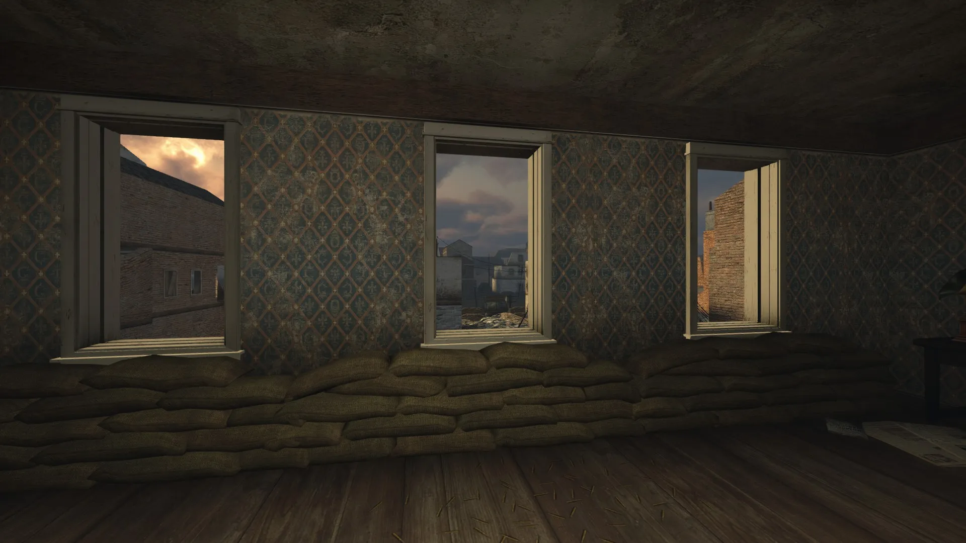
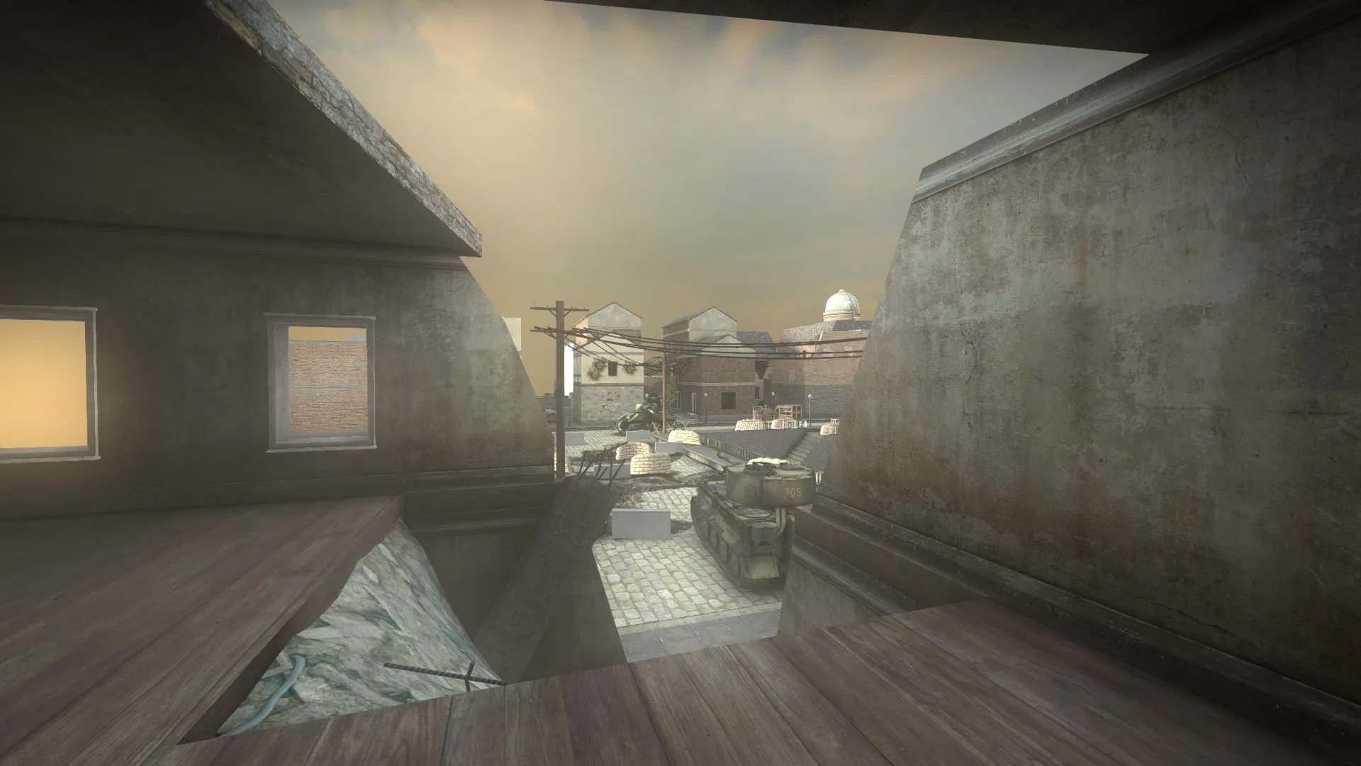
This view from the center building in the Axis natural point makes for a great sniping spot since it is safe and it is looking through the middle of the map to this view for the allied team.
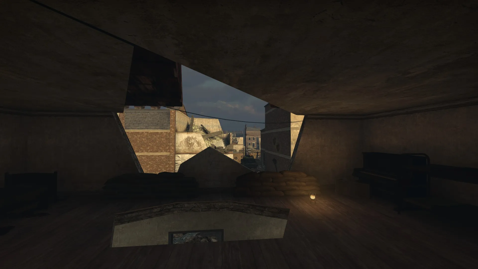
Both these spots are great for sniper battles and they are great MG-spots for defending the natural points for both teams. Depending on who is pushing back who either team can change the role of sniper/mg, this promotes a fair symmetrical and dynamic gameplay which is always shifting. If axis is getting pushed back this is now an MG spot while on the allied side it is an sniper spot and vice versa.
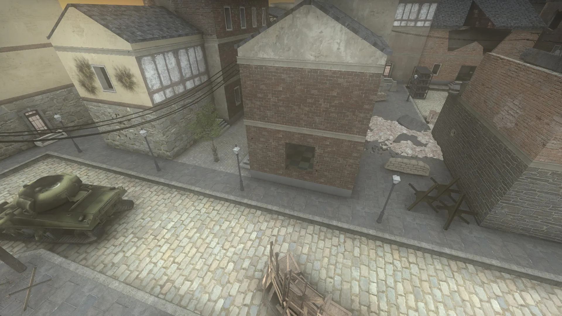
Regarding the middle point I've told you in the previous post about the MG positions. Those are great to mount up, if possible and will pin down the enemy and once the guns are up they will be hard to take down by normal fire. To counter this I've made attractive spots for snipers to take out the MGs. Of course, there must be a risk involved in having the advantage of taking out high value targets from high range and it in this case it is almost every time the exposure of your body. To deal damage you must wait for the right time and take them out quick before you have been counter sniped. This spots in the following screenshots will explain.
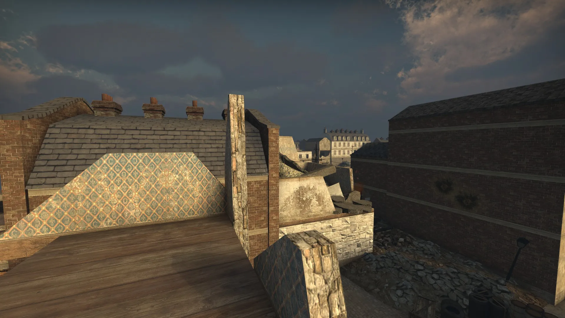
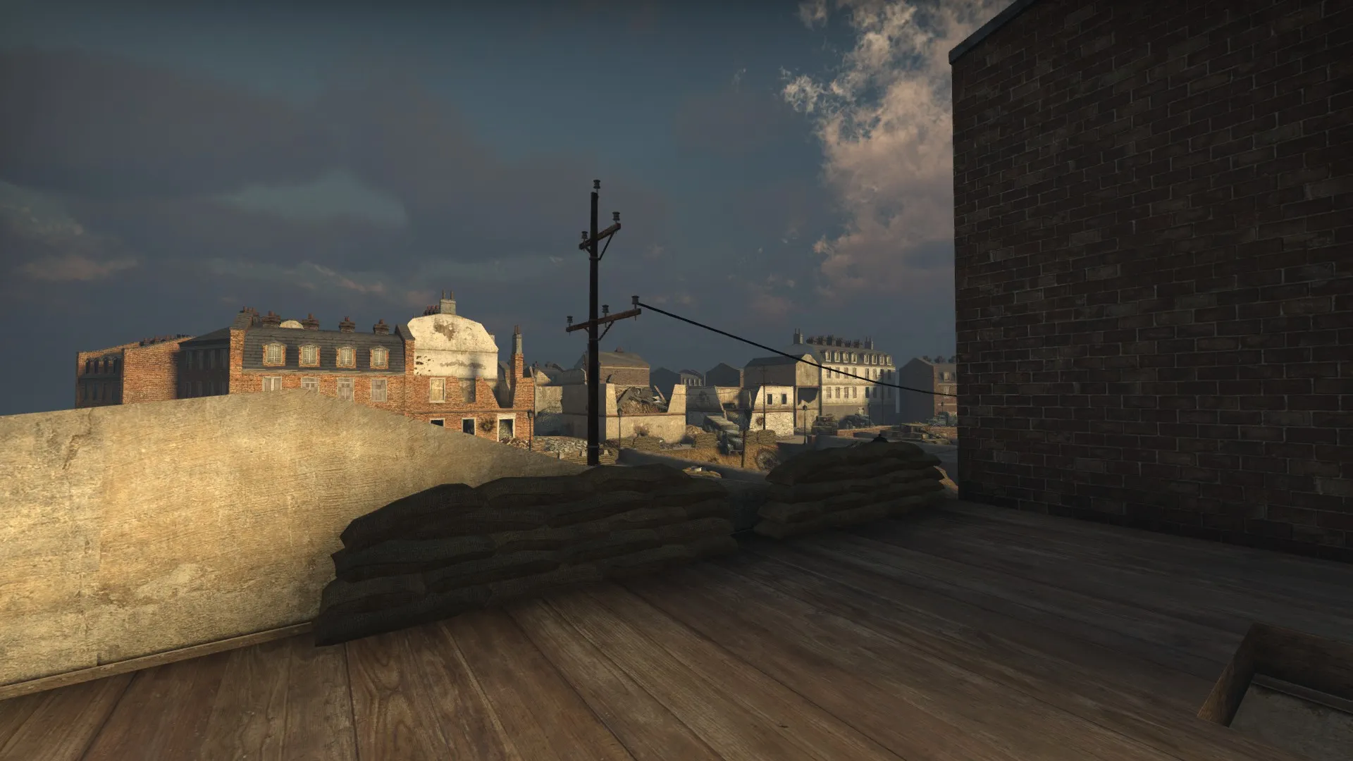
For the allied team, these two spots are very exposed but still very deadly if the sniper opts to show up in the right movement and kill the MG. Since the spots are fairly obvious to the players you can perceive that there will be a sniper or an mg since the spots are too valuable to ignore.
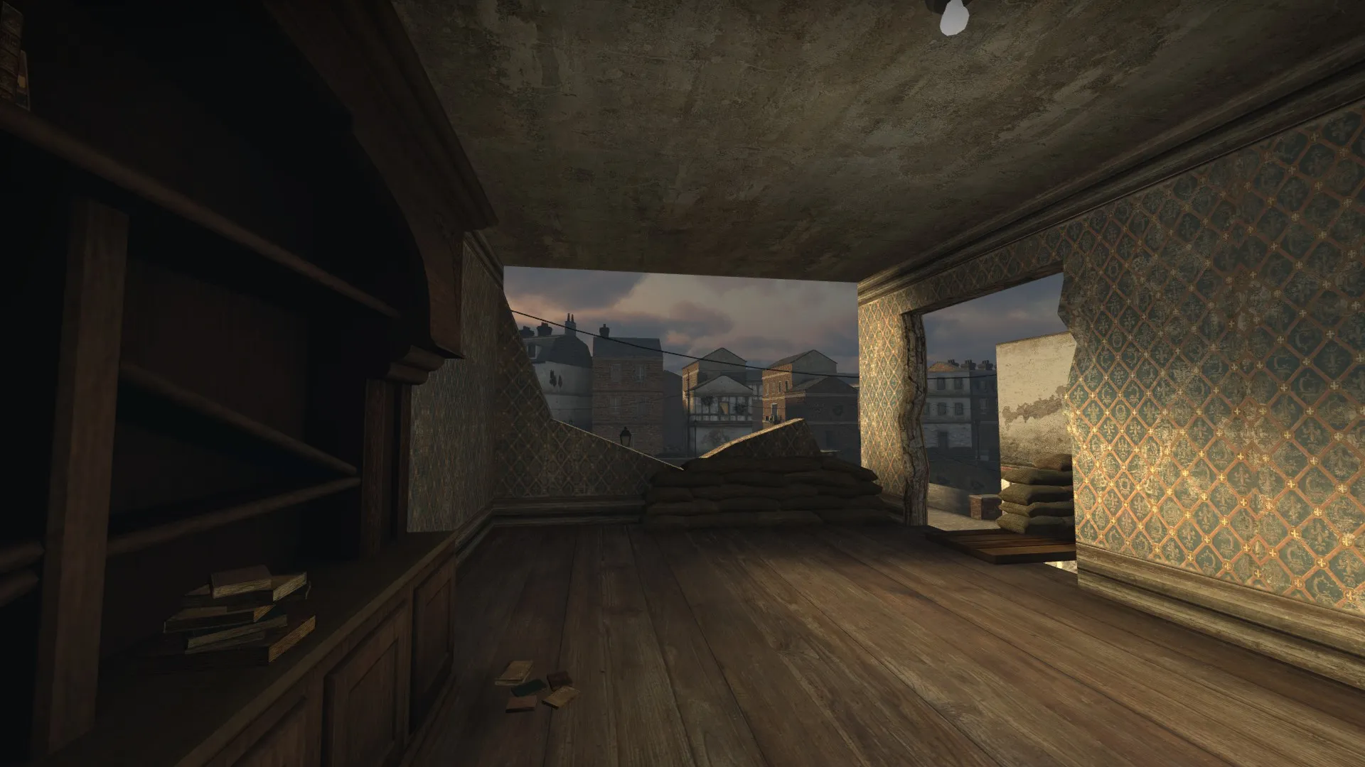
Except for the building above mentioned earlier this is the second really great sniping spot for the axis team. Wide field of view but still not a lot of cover. A simple grenade, stray bullets or another sniper will easily take you down.
Well, this is all from me. I hope you have had an interesting read and that you've enjoyed my map. I am still looking for feedback and criticizm so don't hesitate to contact me if there is anything you would like me to know.
Thanks for reading.
GRiNET
Hello everyone!
Next big update is here after a big break off the grid. I've had quite a lot to do and I am proud to say that Heidel will be going Gold this following week. The struggle is coming to and end and I am proud to see my product take shape. No matter how it goes in the competition, I can say that I now have completed constructing a map from the planning phase to final production. It has not been easy but it's been great fun and I have learned so much. That alone is worth a lot to me. Well, enough with the pats on the shoulder and on the the post!
Since the last update I have made a couple of big changes. In the previous post I told you guys about the remake of the map. I hadn't stayed very well on the grid and it hurt me pretty bad after constructing my final buildings. I had to remake the map and in the same process I decided to tweak it with the feedback and input I got from playtesting as well as my own thoughts. A designer is never completely satisfied but they should never be afraid to test new things.
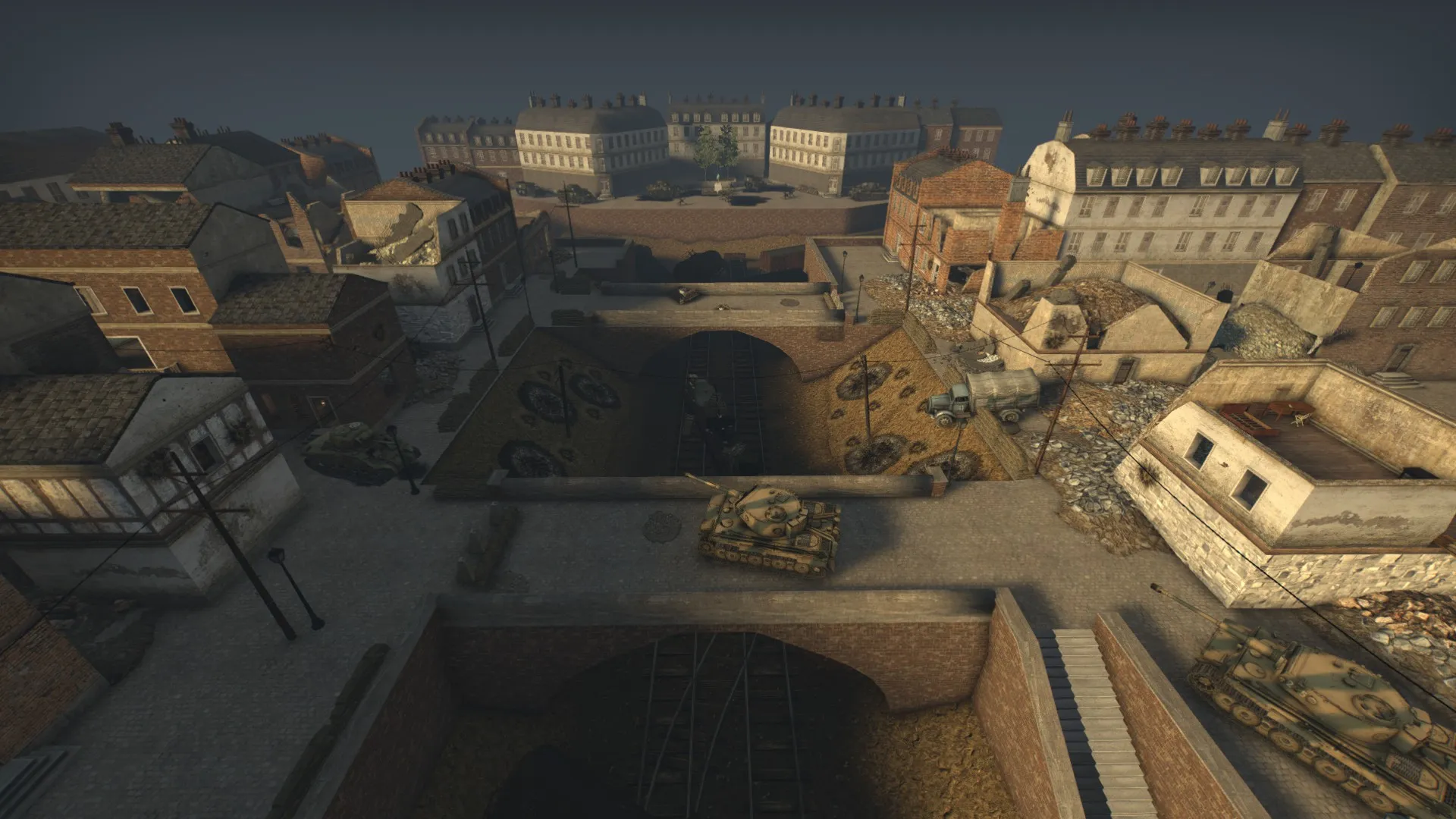
This is how the map is looking right now. The general layout have stayed true even though the massive rework. The only thing that is heavily modified is the center point that before was on the bridge in the middle. Now there is no water at all and a second bridge has been added. I am greatly satisfied with this change since it has opened up a lot more gameplay possibilites and added to a more dynamic gameplay than I had before. Now there are more flanking possibilities and the point in the middle is both harder and easier to take than before and I'll explain why later.
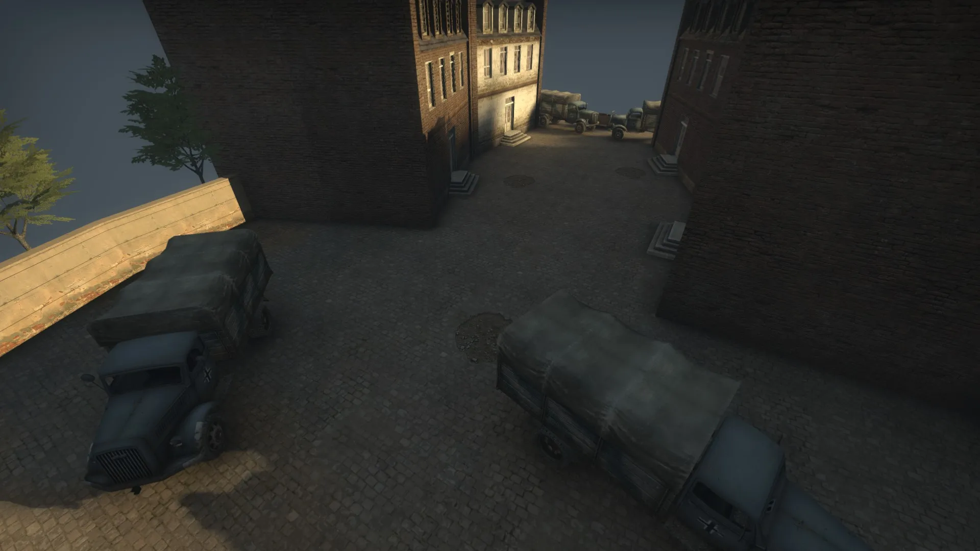
The spawns have been added and timed correctly to be equally fast for both teams to reach the point in the middle. This is the current Axis spawn, it's final all except a possible 3D skybox behind them to remove the horizon-line and add to the city-feel and mood.
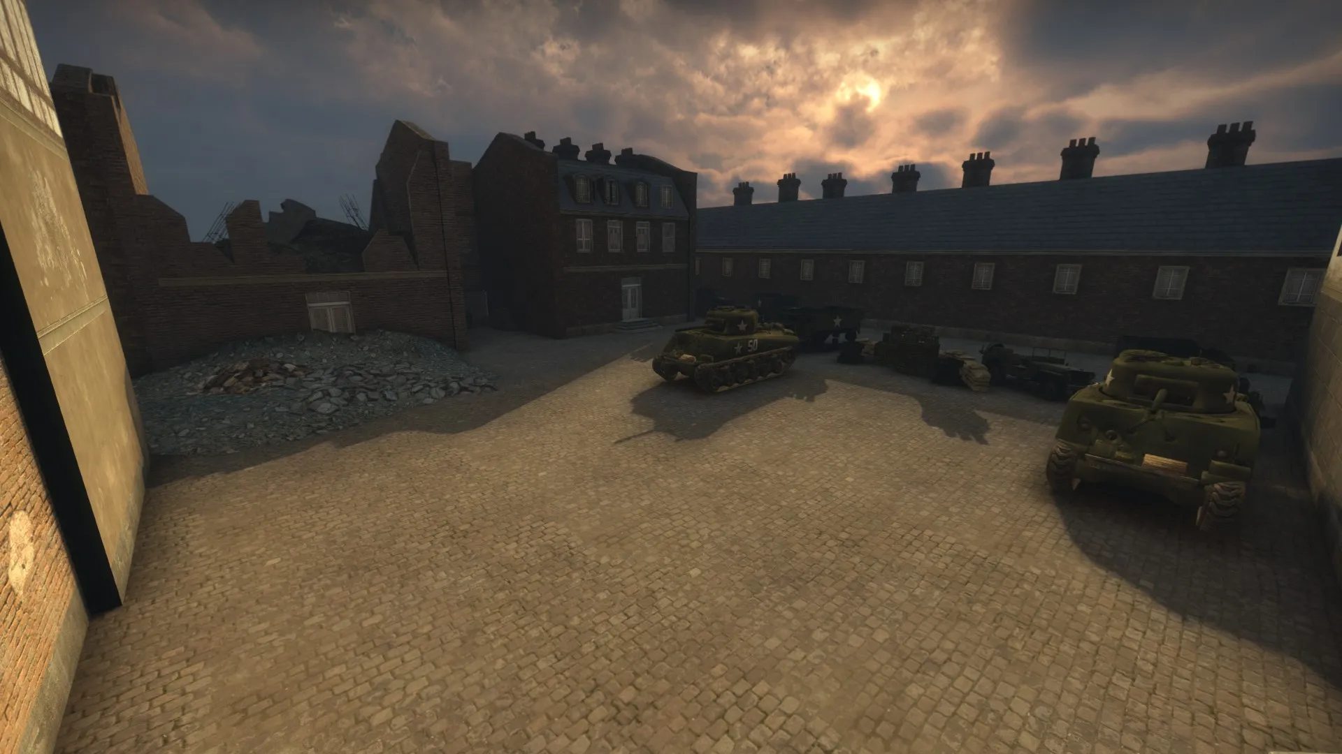
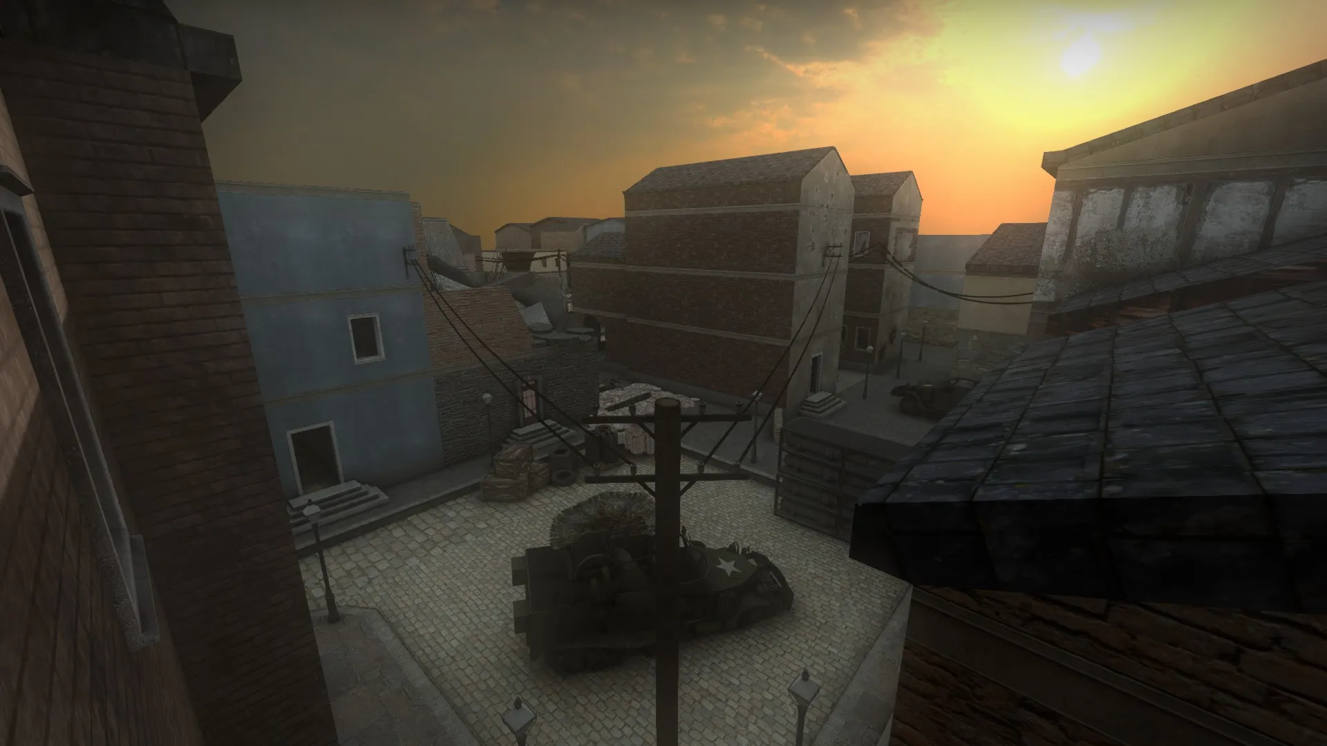
This is the final Allied spawn. Here we can see the temporary point of advancement for the allied team trying to retake the crucial anti-air gun positions located in this part of the town.
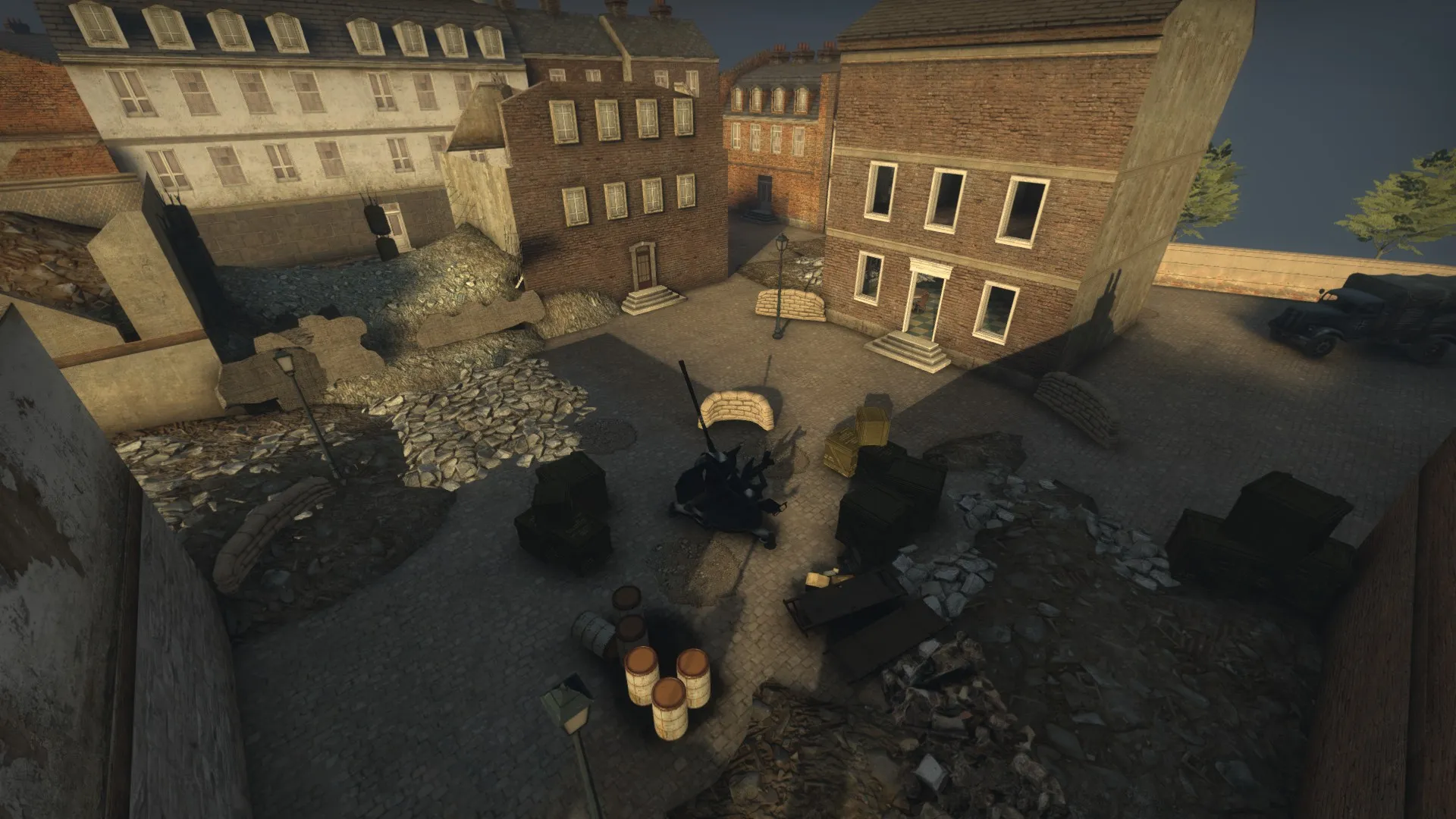
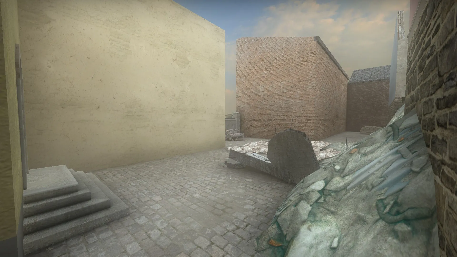
This is the Axis natural point at the final stage. I've added a bit more cover change the strategic possibilities for the defenders as well as the attackers on this site. Overall I am pretty satisfied with this one and it plays pretty well.
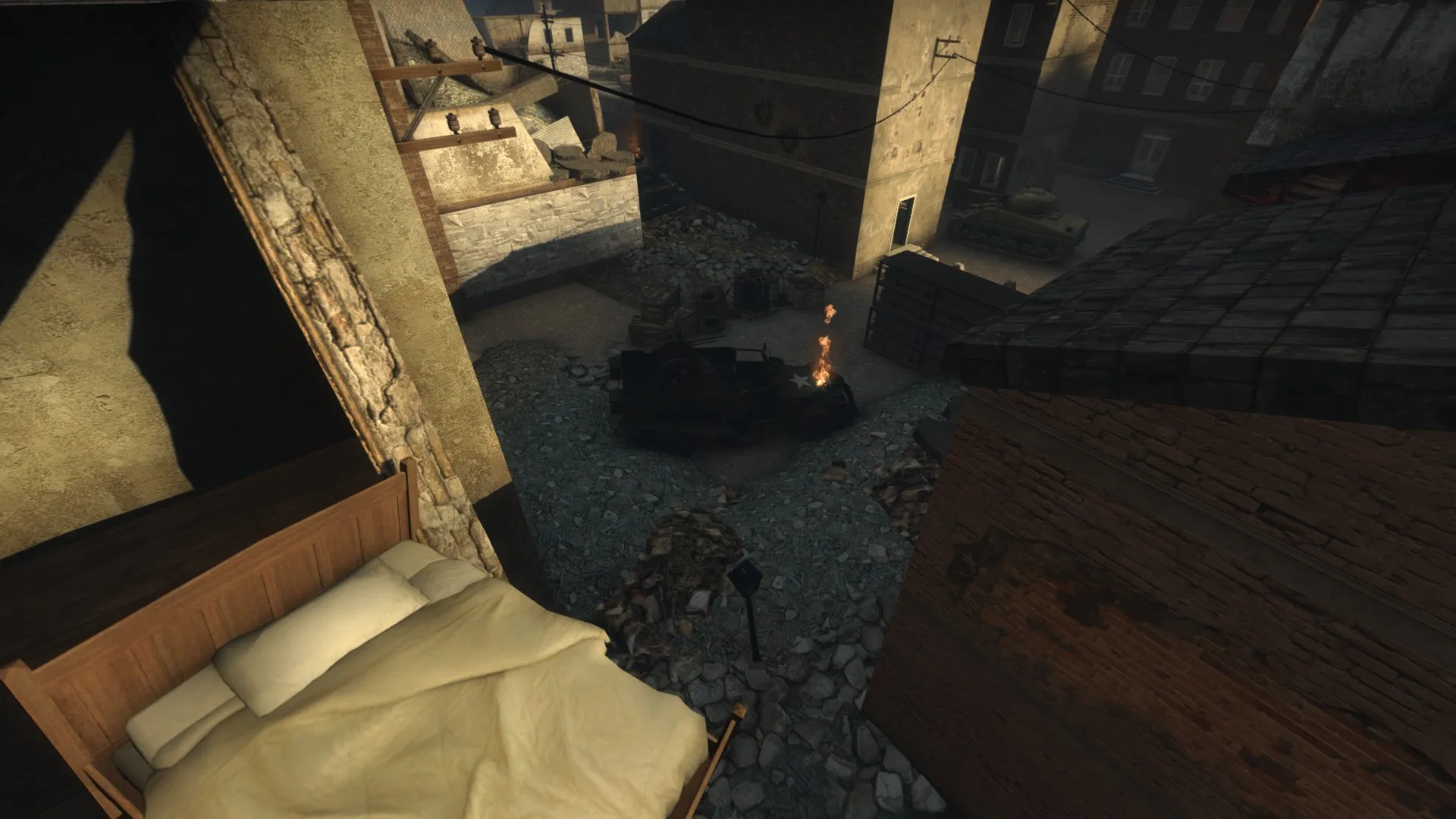
This is the Allied natural point at the final stage. Added quite a lot of debris and other graphical flavor things such as a burning flame in the destroyed vehicle, cable lines and overlays to convey the feeling of a battle. Cover wise there have been minor tweaks to the site to equalize the advantage for the defending team and the attacking team from different perspectives.
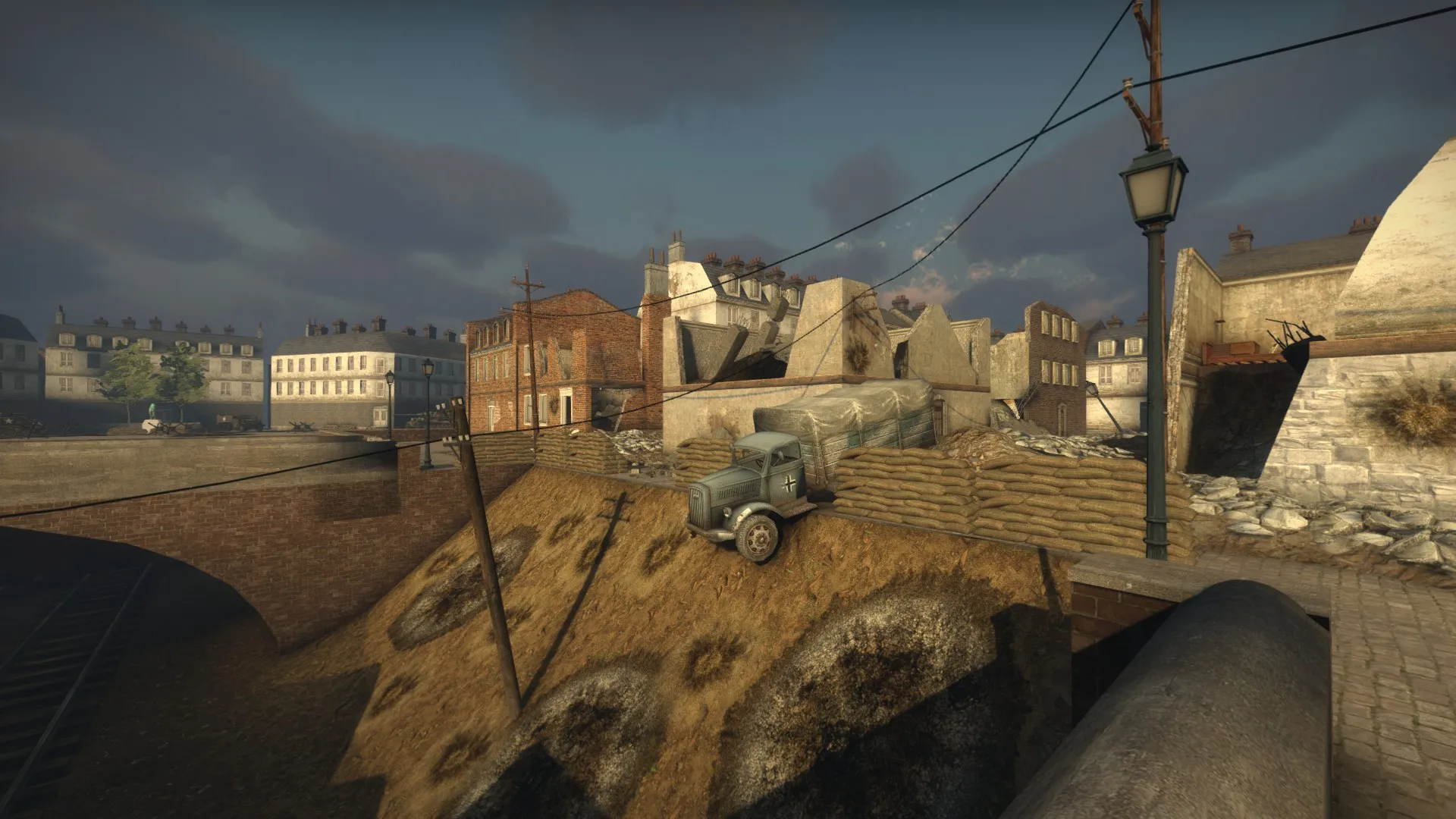
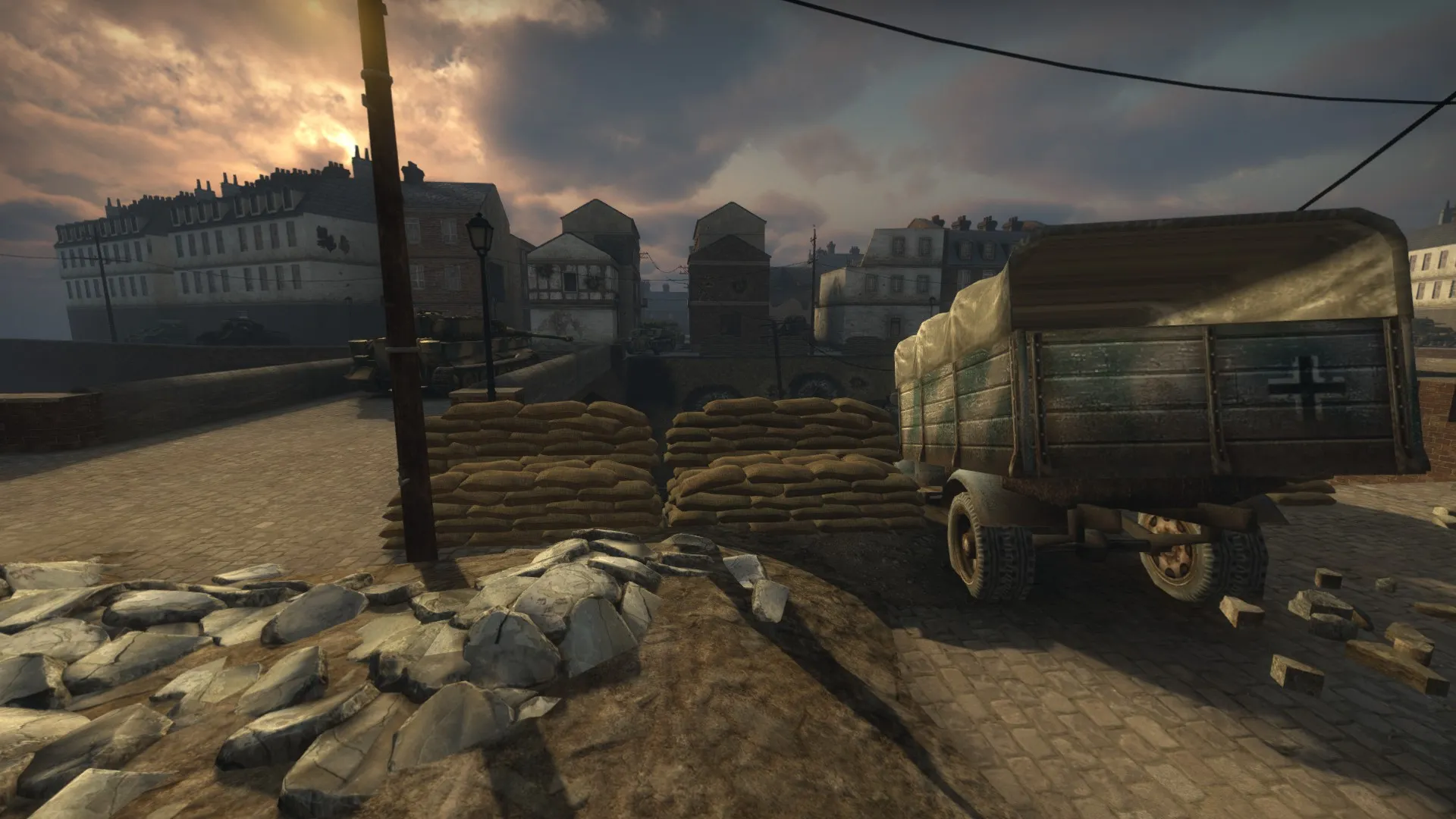
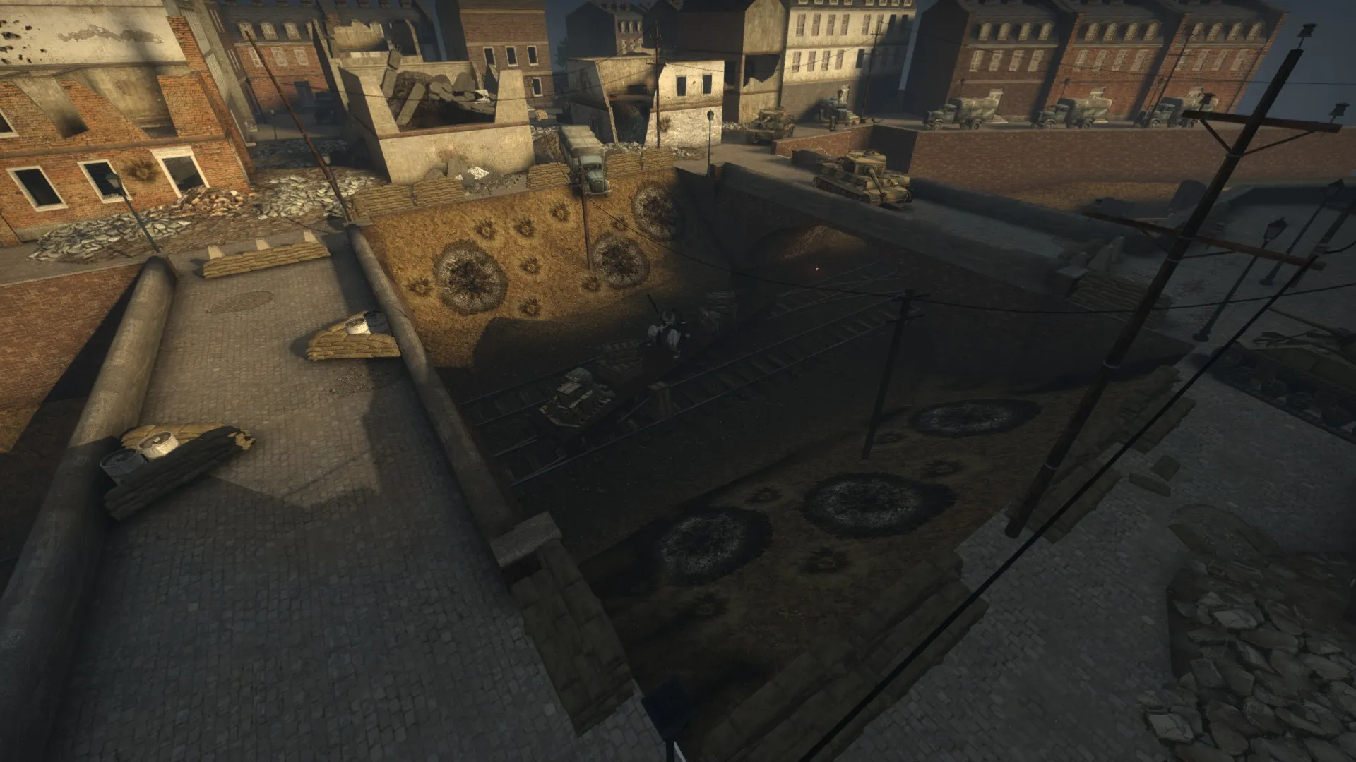
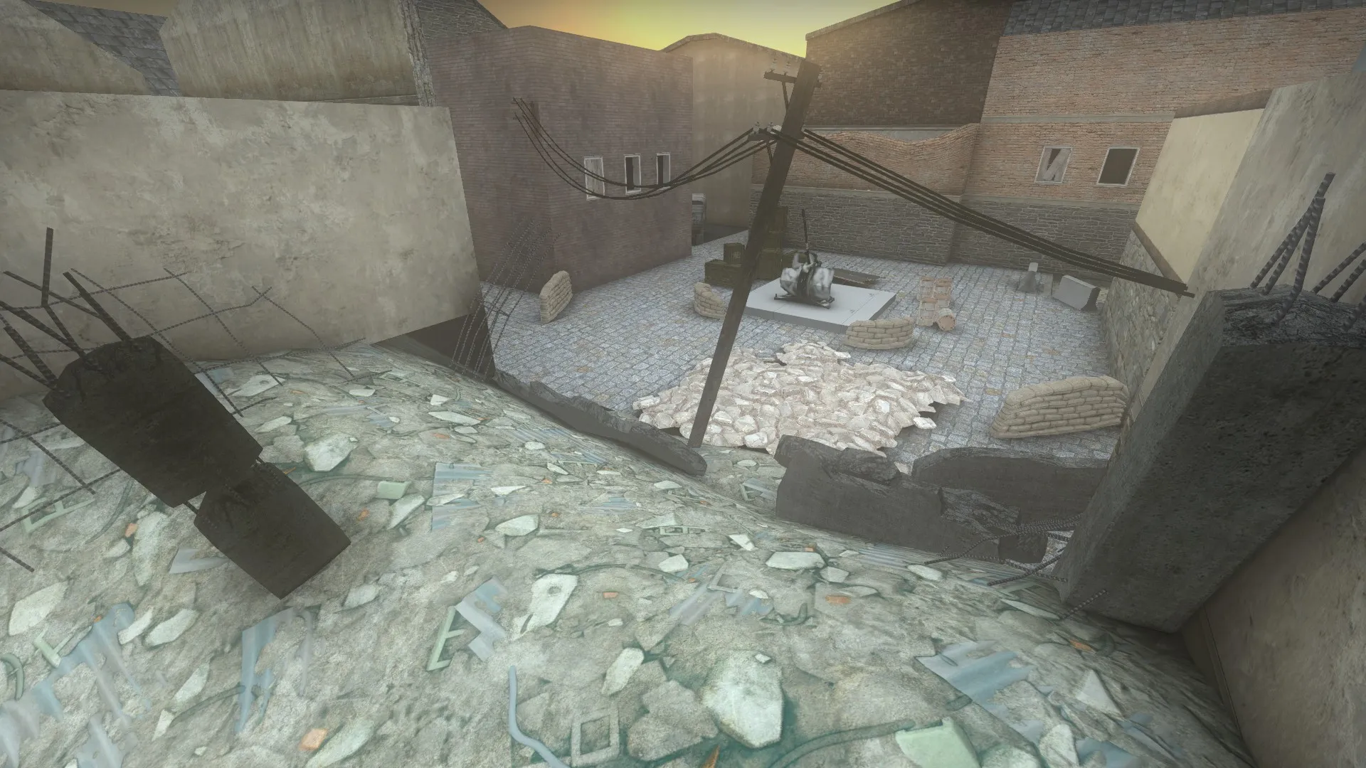
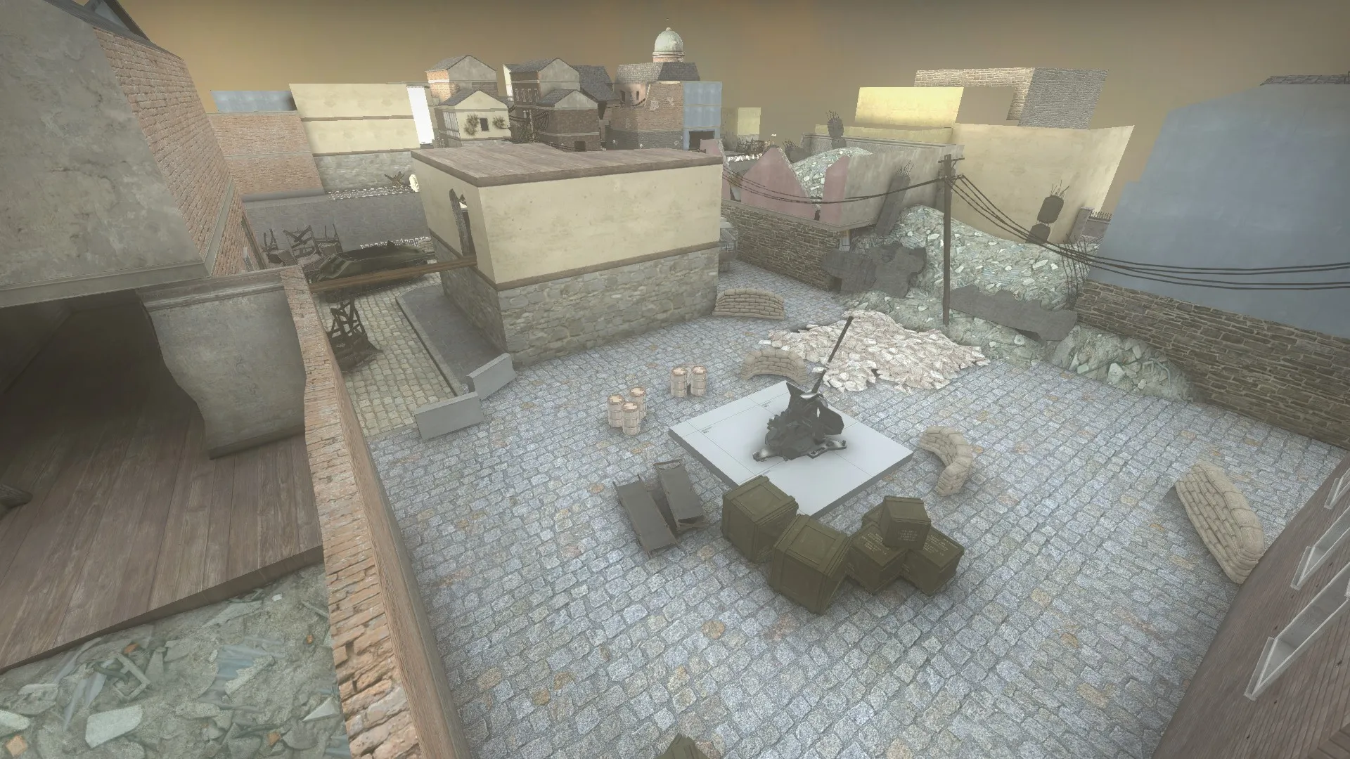
This is the current middlepoint in its final stage. It has plenty more cover and its playing quite a lot with verticality. I've put up sandbag covers for both team so they can flank and outmaneuver each other. A grenade thrown with the right speed at the right angle can reach behind the other teams' sandbag without hassle, taking out plenty of players or providing good smoke to disorient the enemies or cover for a rush down the hill to capture the objective.This point requires good team composition and cooperation to capture. Players are always out in the open also so they have to quickly pull back, get inside the houses or rush down under the bridges when the artillery is firing, but to use the binoculars to call down artillery is dangerous as the officer will be greatly exposed. When designing this map I wanted to make use of all the different loadout classes. I have noticed that during some of the maps I've played, but fan made and official machinegun and sniper is seldom used. At least not to that extent which I would like to see. So in my map I was aiming to bring all those classes together and not just the standard, officer, assault and rifleman/enginneer class.
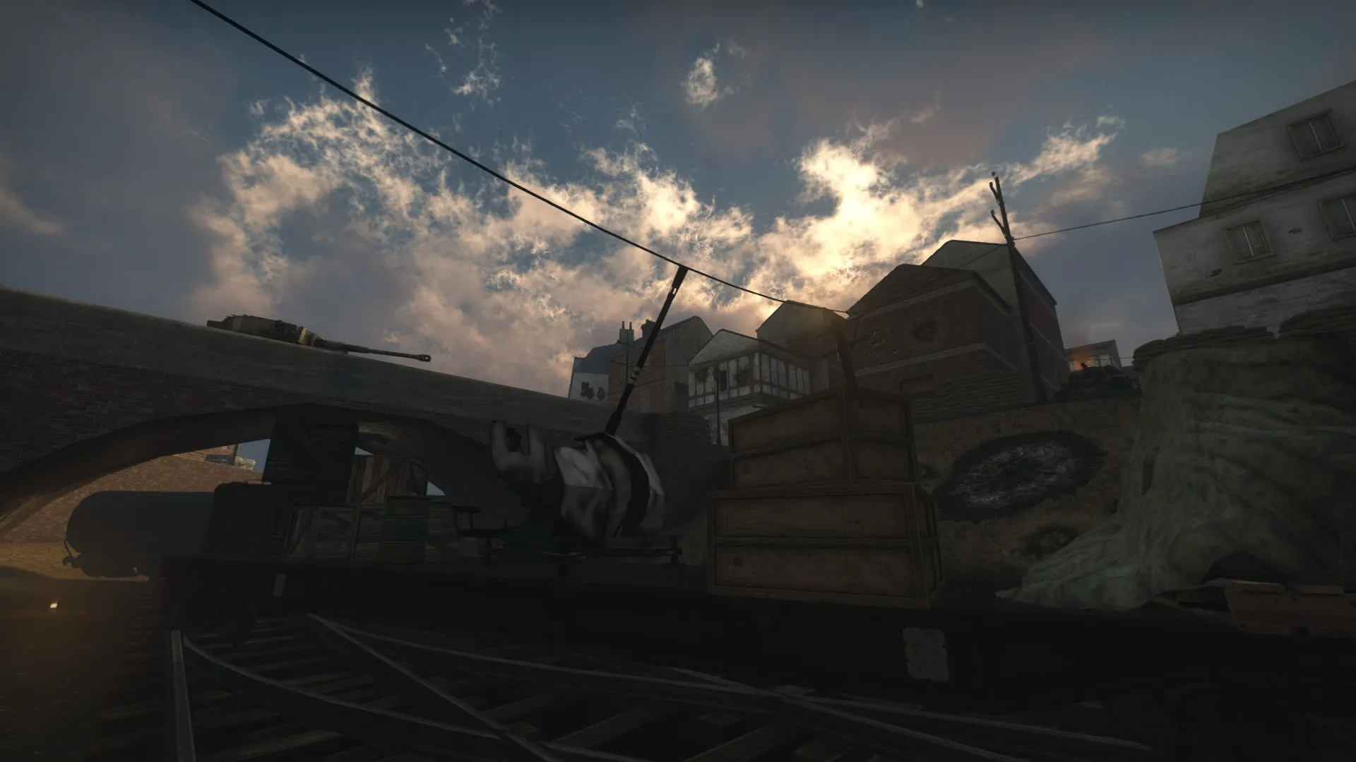
Therefore I have added these high-value points for machine gunners on both map to pin down the attacking team that are trying to push and capture the low ground point. This is the view from the axis team if they are trying to push and capture, and sure there are cover to hide between but you are never fully covered. This is purposely made to make the player feel vulnerable and exposed and when there is raining down machinegun fire at you will your teammates are dying both left and right, artillery is firing and grenades are exploding in front of you, this point really captures that moment and feel.
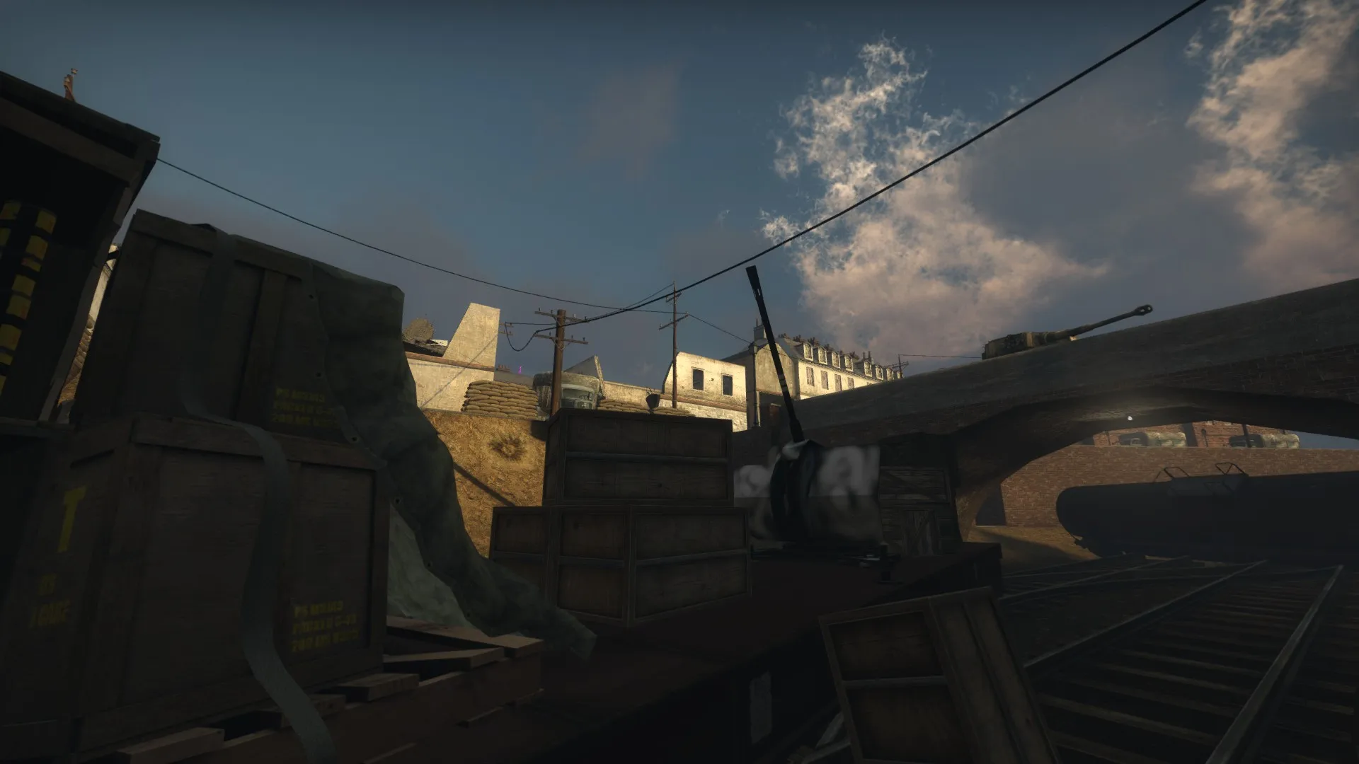
This is the same view for the allied team and they are equally exposed and vulnerable. As level design flavor to implicitly tell the player where there are good MG-nest spots I've laid down a lot of bullet decals beneath the windows as seen in the screenshots below. Of course the spots are mostly obvious to the eye but still, it's a minor detail to emphazise this.
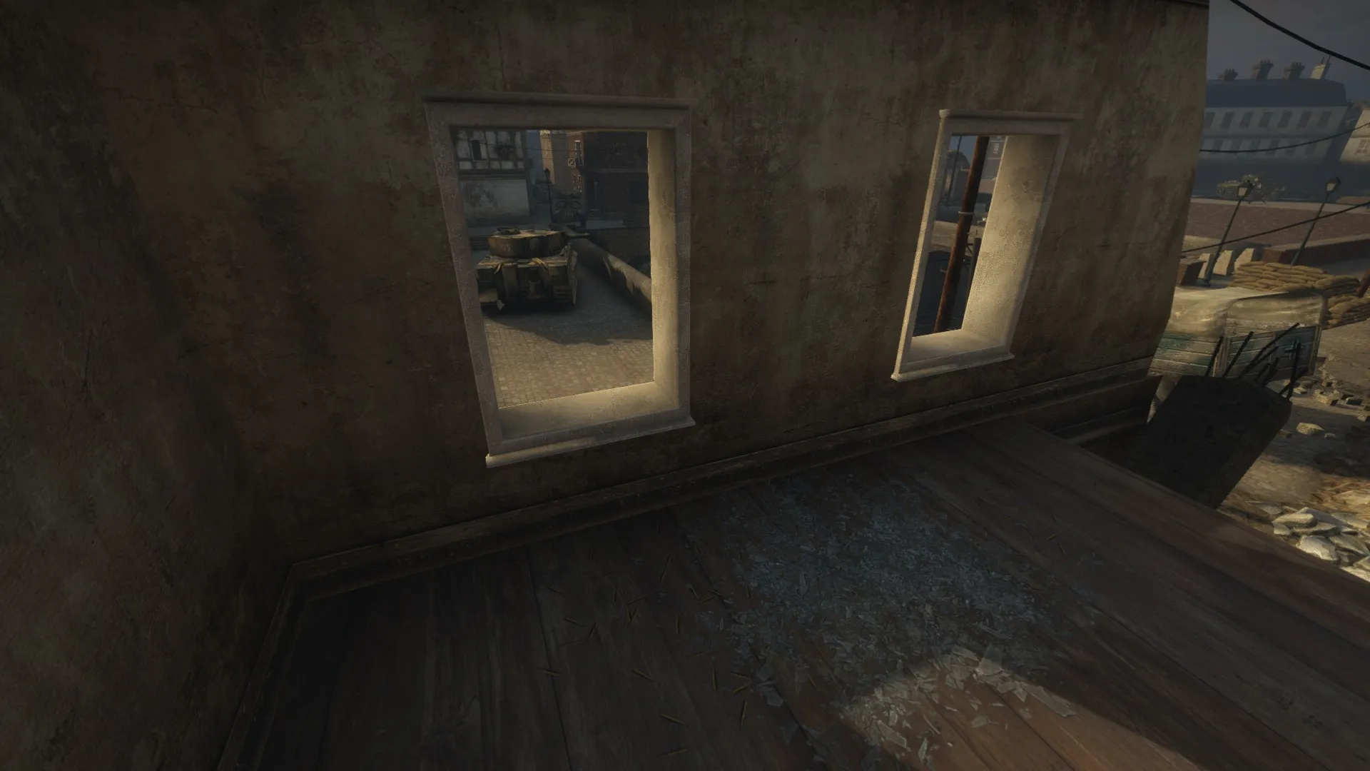
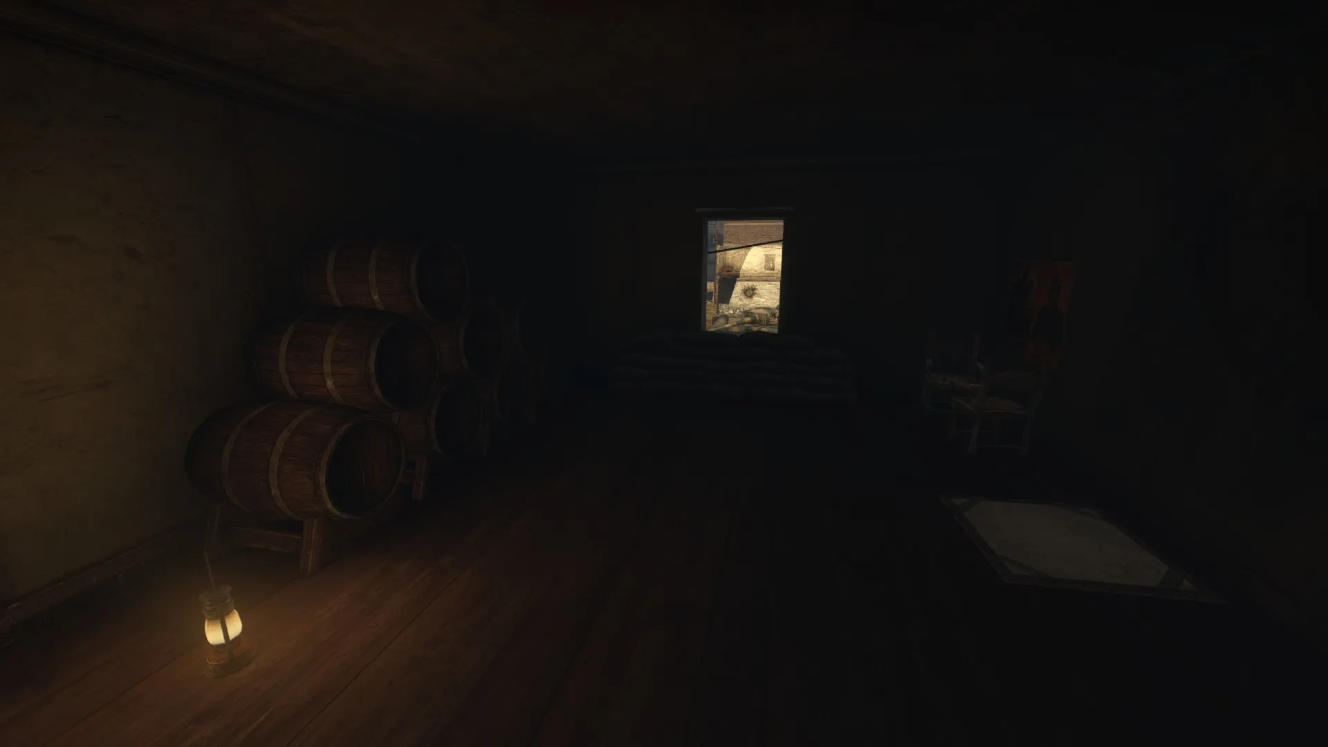
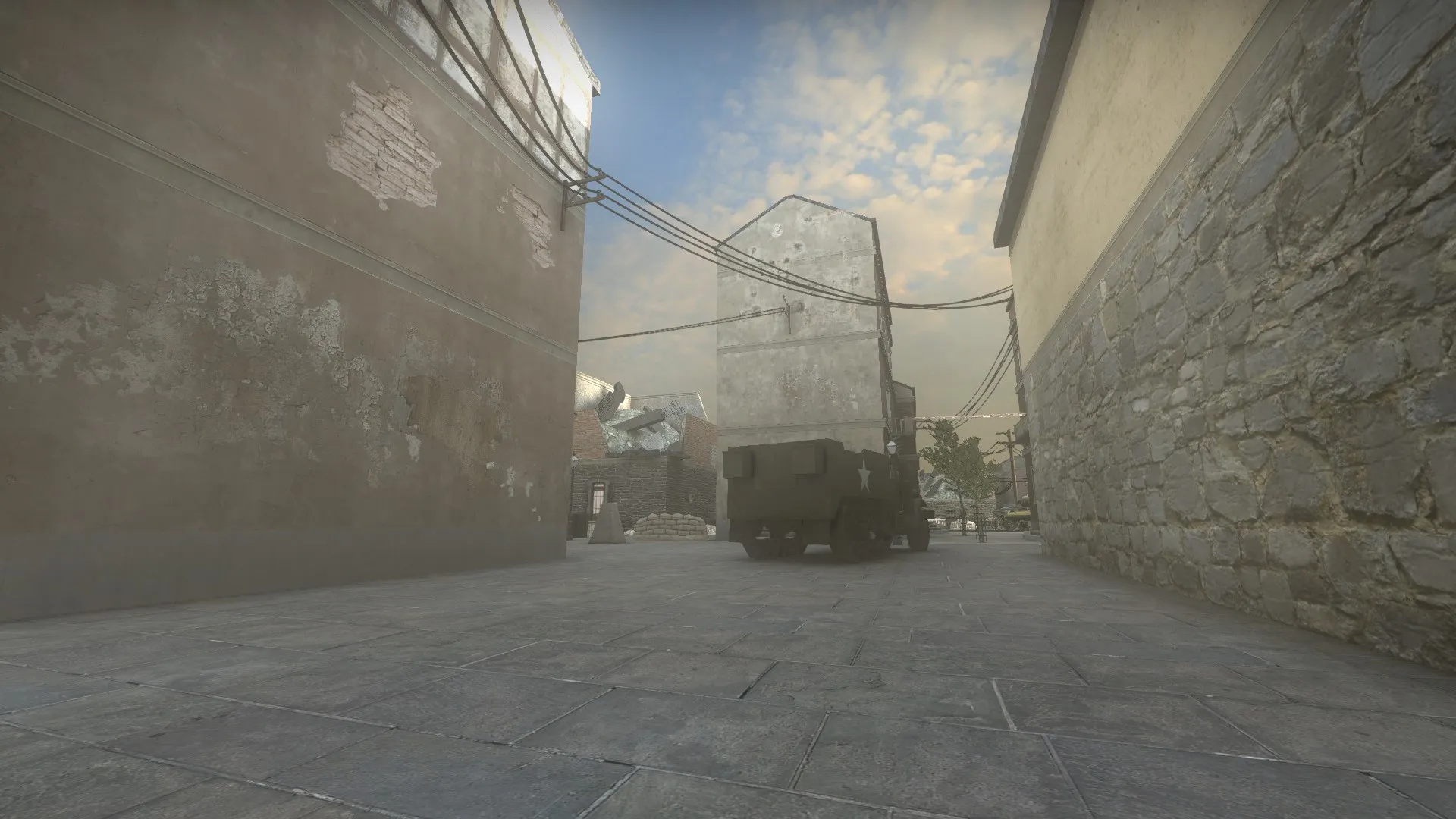
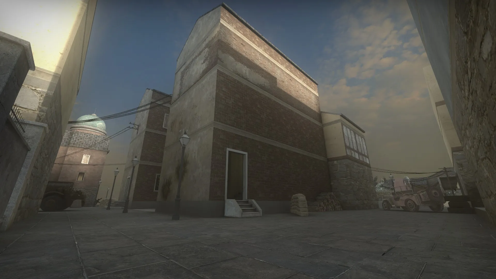
I've also propped out and dressed my level with decals, props and overlays to sell the environment more. Me personally really love telephone/power lines as I think they are great to tell the player where they should go but also where the boundaries of the map are. In my map I've "sealed" off the middle section with the power lines, building a sort of box where there playable area is. Another thing that isn't obvious at first but as a player you will probably understand it anyway. Here are some pictures with lighting, and props to flesh out the city and environment as a whole. Due to uploading restrictions of 5MB I will continue this post down below.

 Quote from Bastion
20 hours ago, Bastion said: Pull Marino out of the test list.
I've stopped working on Marino because of my personal dislike towards the design. Got something else in development now though, although that won't be making it for the contest.
Nooooo. I really had high hopes for your map! But I understand your decision and wish you goodluck on your new project!
Hello! Some WIP for the HL2-campaign school assignment. Added lighting and dressing to the level as well as several gameplay changes.

 Quote from FMPONE
1 hour ago, FMPONE said: I wonder how many times this happened in history
I went to my headmaster and asked for the blueprints of theschool which the janitor had. He was very suspicious when I asked for it.
I am running hammer through the .exe. I will check with the .bat file!
@will2k Thank you so much for playing through my map. I appreciate your feedback! I strongly agree that I will have to rework the cover area in the middle of the plaza, as of now it feels very rigid and too linear to feel real. As for the tip to add health kits and batteries at the museum door, I think you will like the upcoming version of this map!  As a side note, thank you for writing all those great tutorials on optimization in the source engine. I am reading through them quite often and altough I find it hard to understand they have helped me immensely. Perhaps you can answer some questions some time in the coming future? I have taken some notes when I tried to optimize my Day of Infamy map for the competition and I can't really get my head around certain things. Thank you,
GRiNET
Hello lads. I've encountered another problem.
Whenever I try to paint alpha on my discplacement brusches on the ground hammer crashes, no error or anything just straight to desktop. The texture I am using is called: de_mirage/ground_de_tileh_blend3_diffuse. Is it something wrong with the texture or is it me?
Occupation
Description & background This map is a part of the HL2-TGA-Project where I am one of the level designers. My level is taking place right after the Cathedral level where the player is going deeper into the city. In my level, the player is going through some alleys to later arrive at the center of the city, the old town. At the center of old town, the town hall is located and unfortunately for us, held and heavily fortififed by the combine. When the player reaches the main street they can see and hear rebels fighting the combine and quickly the player will jump into the fray.
Role in the campaign The player will be fighting the combine, retake the square and hold out for a brief time to feel in control. This to set a shift in power in the campaign. First, the player is weak and hunted, but now more people in the city have begun to resist the combine's hold on the city. Therefore they now join the player in the struggle and provid extra firesupport. Since I am in the middle, I am introducing the crossbow to snipe out high value targets such as machine gunners. I am also introducing large scale battles and the turn of the campaign. My design idea on this map is to make the player feel vulnerable at first before they have taken the square. Being under heavy machinegun fire makes you feel weak and vulnerable. But after taking the square the player will feel strong, powerful and smart to have succeeded with this feat of strength.
Alpha build Here is the first build of my map. I've been putting in some extra man hours in to polish things up so therefore everything is textured and looking less alpha than it really should.
LINK: https://drive.google.com/file/d/0Bys6E5…iew?usp=sharing
Alpha screenshots
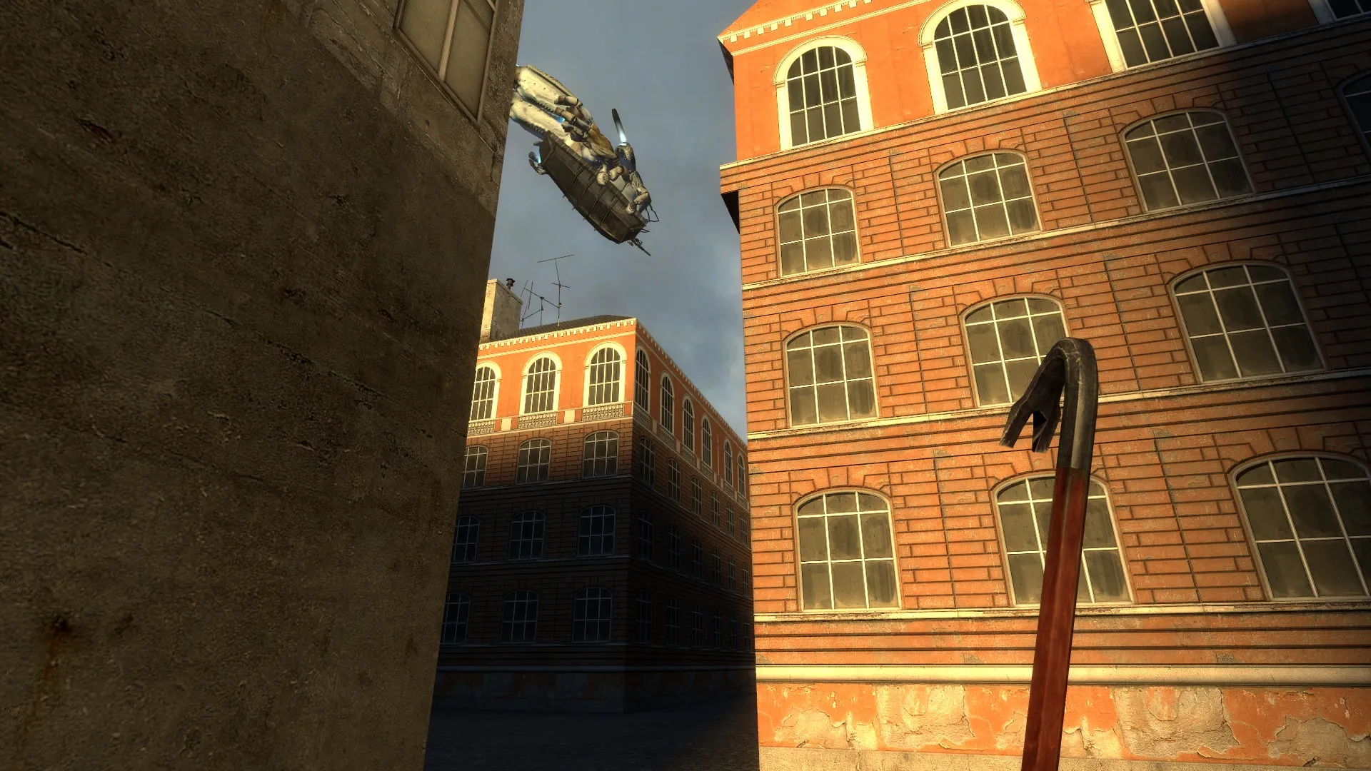
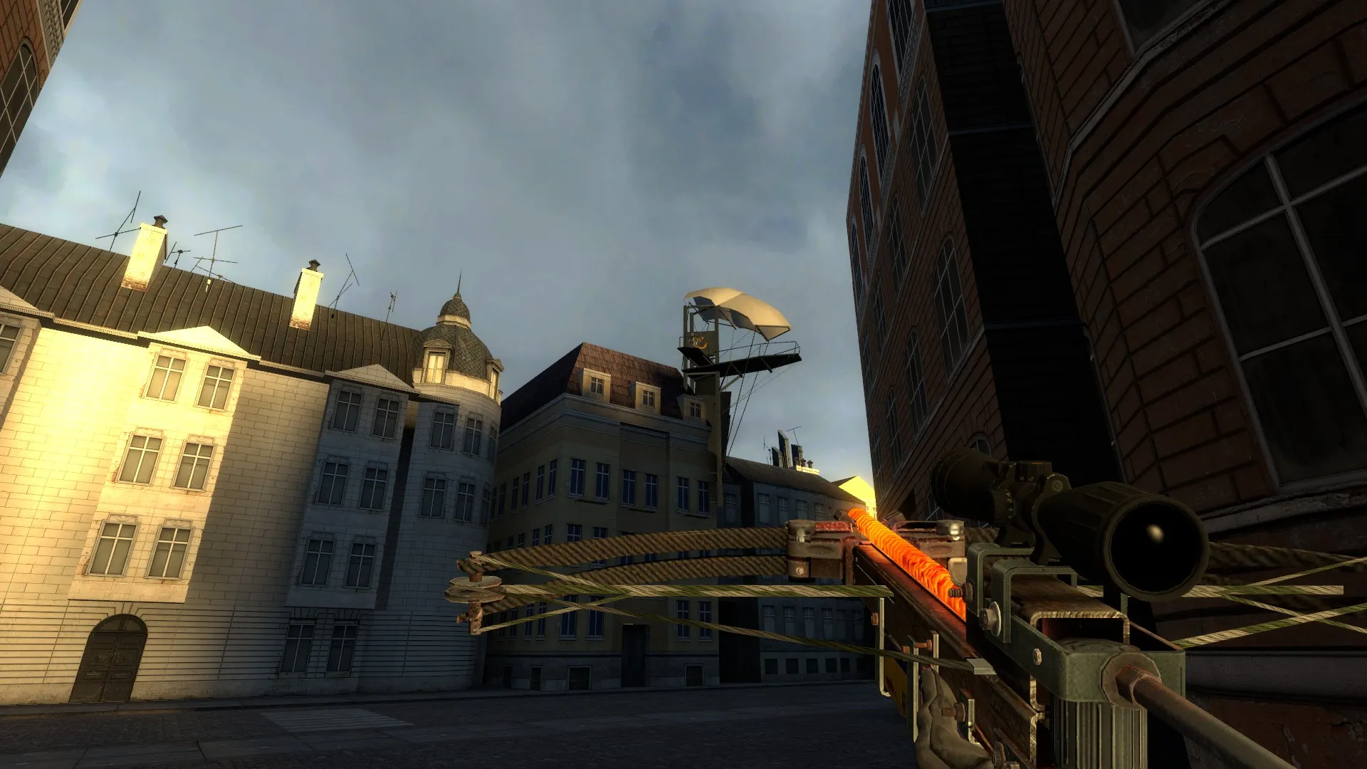
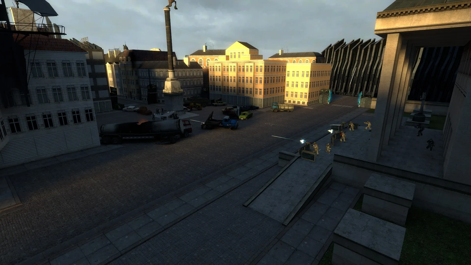
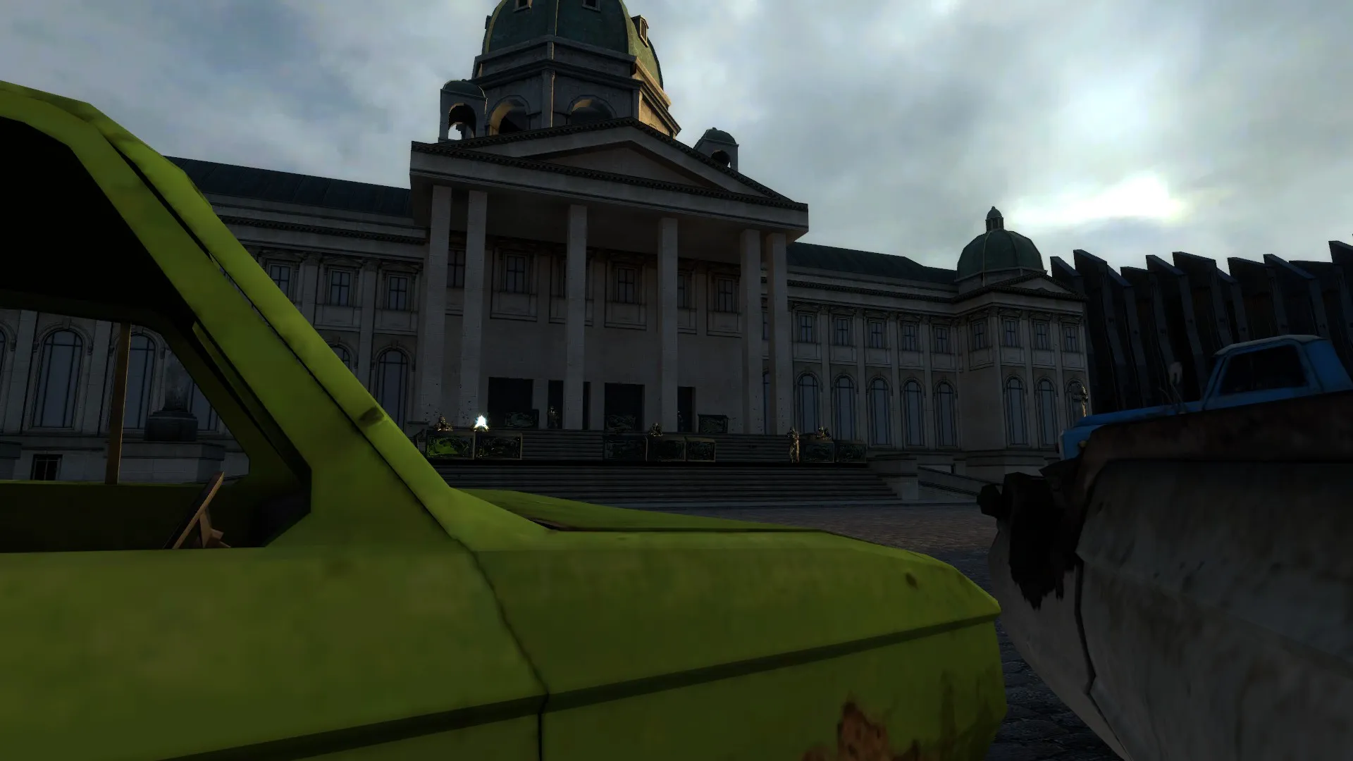
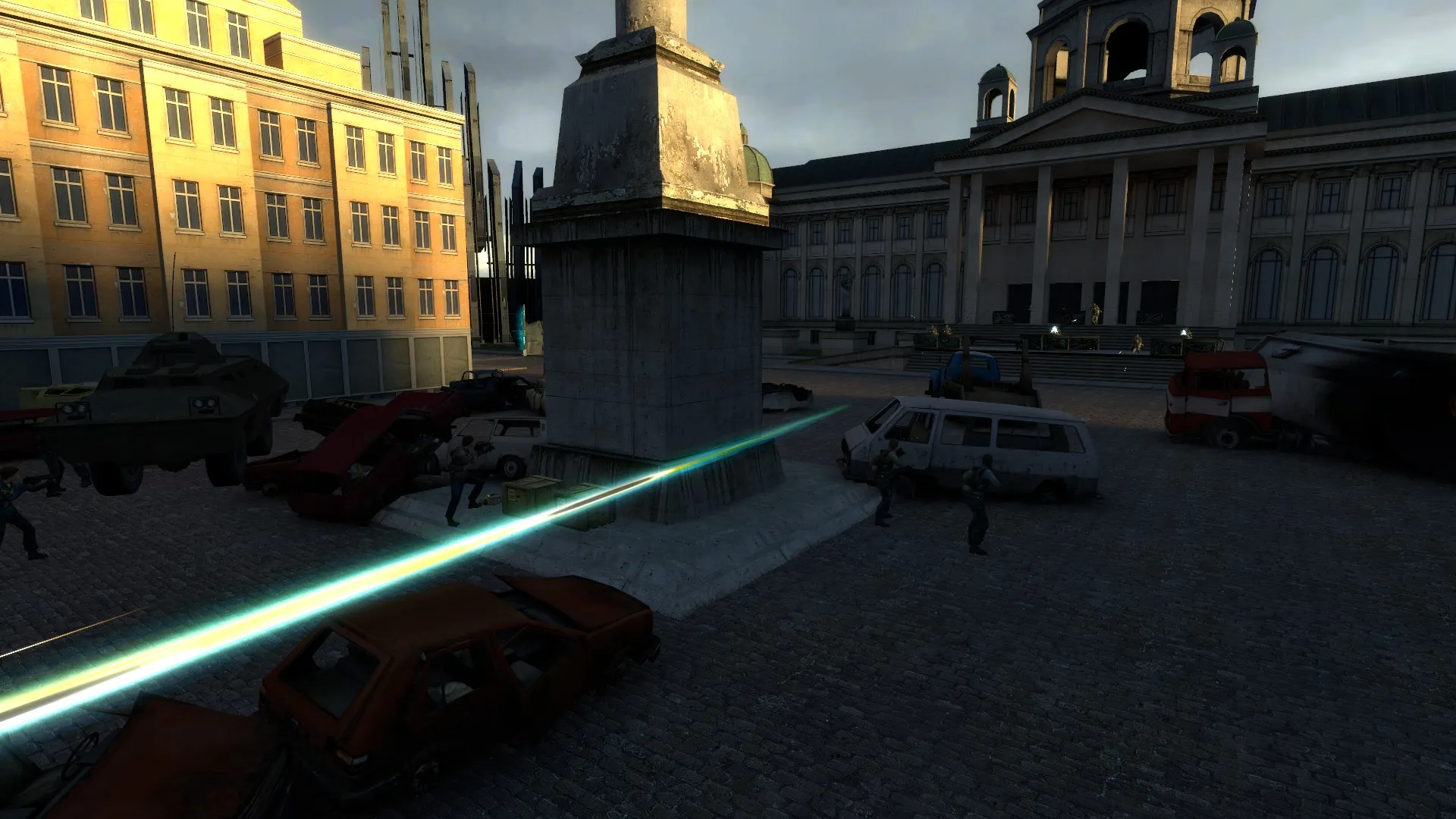
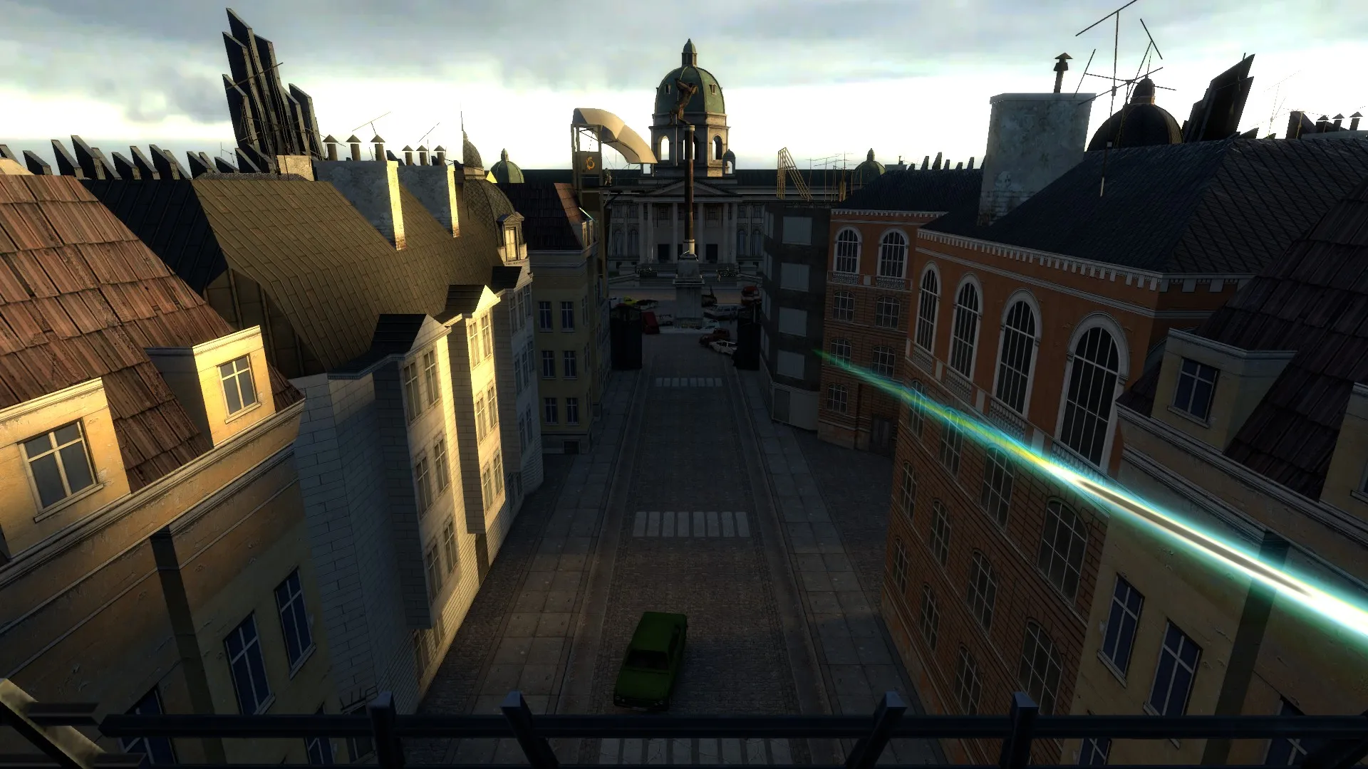
Here are two WIP screens of Heidel in its current state. A lot of cover have been added for balancing purposes and fleshing out the level.
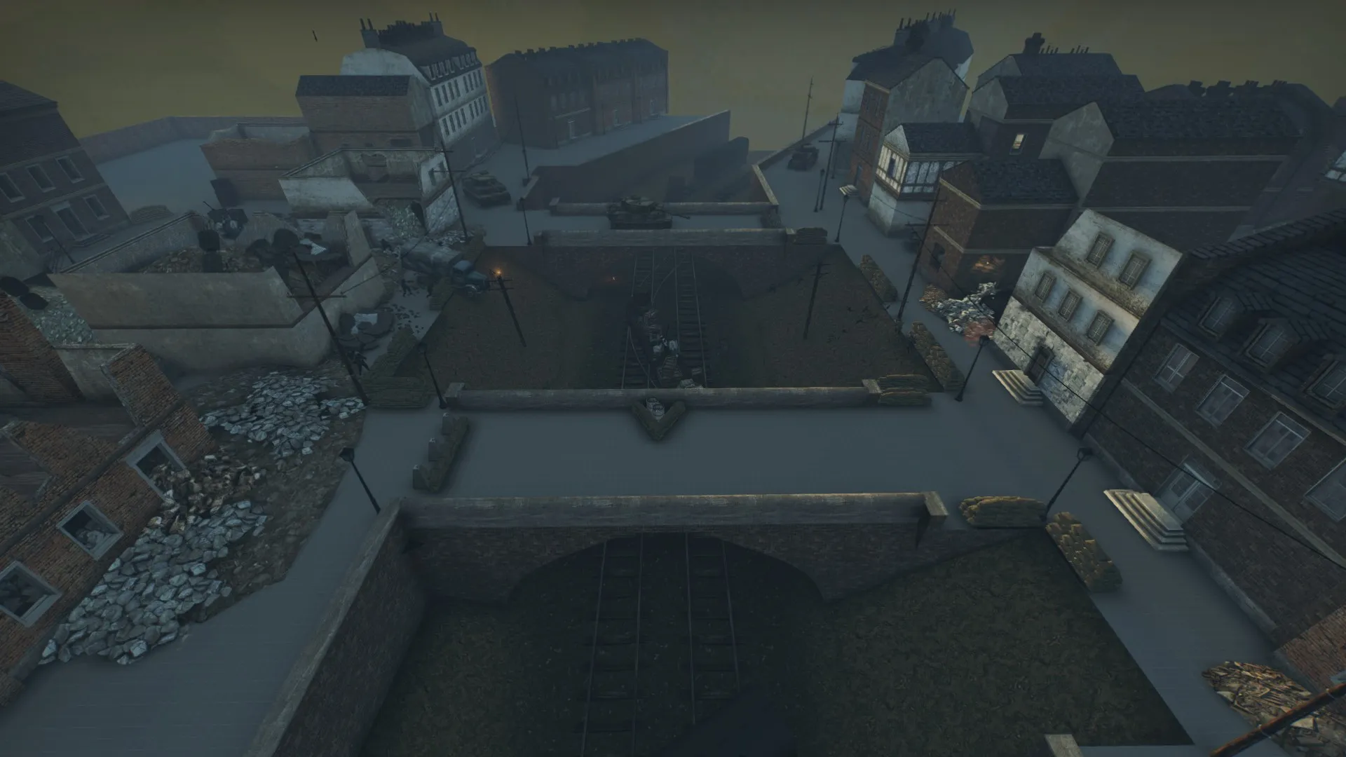
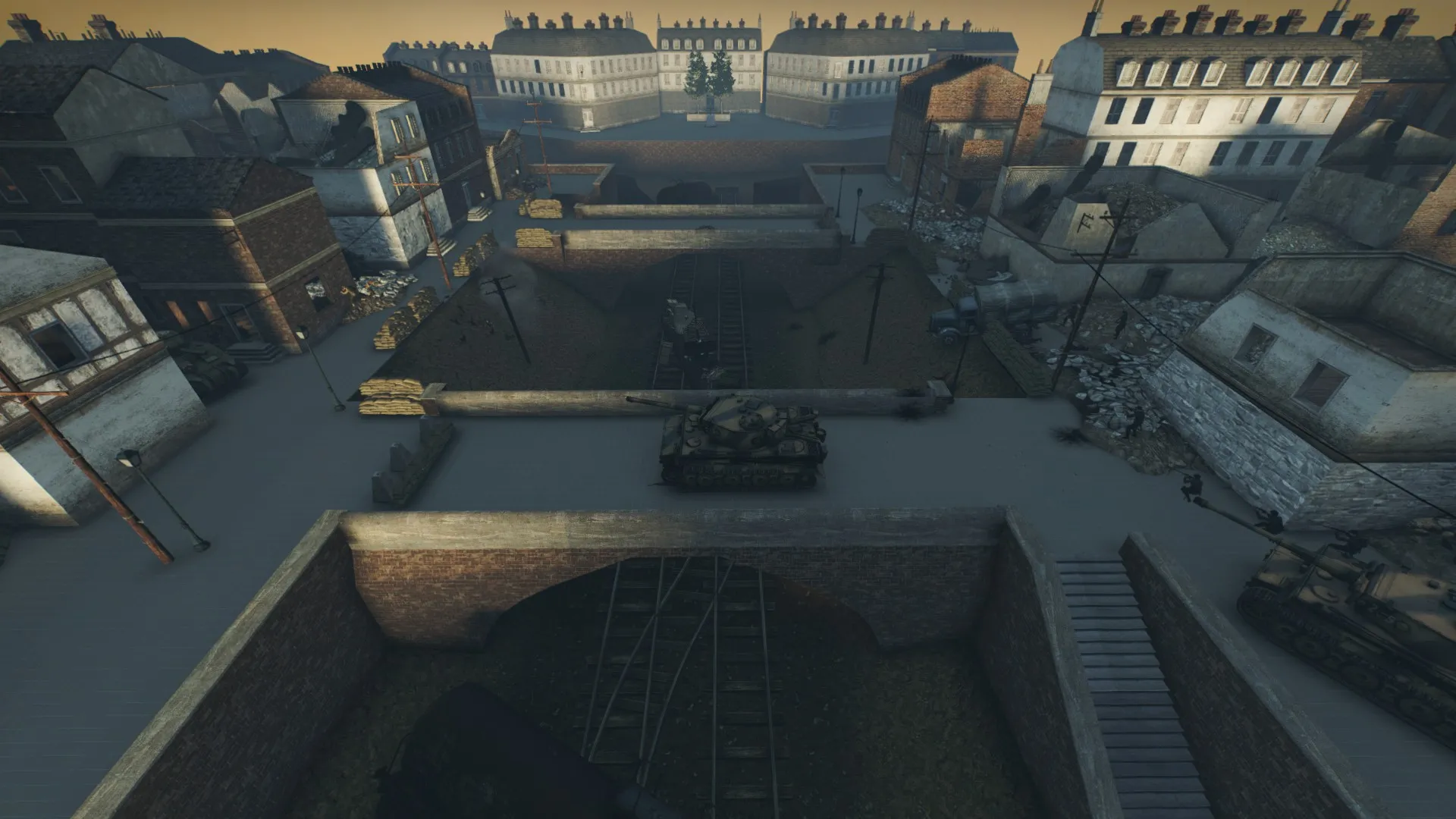
@Radu Looking really tight. I really dig the destroyed buildings with several floors. Great job!
Hello everyone!
Does anyone know if source batch compiler works with DOI and Insurgency?
And also, I still have the purple texture / specularity problem. I cant seem to solve it permanentely. Everytime I run my map I have to do mat_spec 0, build cubemaps and then mat_spec 1. Is there a fix to this?
@Xanthi Thanks for the heads-up! Going through some massive reworking so I'll put another gear in!
In the screenshots above you can clearly see that a lot of the buildings are just plain cubes, some with a window inserted into them. That is because I wanted to block out the map before I settled down with the details. So instead of building houses directly in the map, I created a new file which I call "PrefabFactory". This allowed me to make new buildings in all kinds of designs and materials and align them correctly to the grid. "ALWAYS WORK ON BIG GRID SIZES AND STAY ON THE GRID" I cannot stress this enough for everyone out there, proffesional or amateur. This house building method proved efficient since I could simply copy and paste the new buildings into my original level.
I noticed a big problem with my map when I inserted the new buildings. I had been sloppy and I hadn't built everything on the grid. Sadly enough, I took the decision to rebuild the whole map with the new time given to us mapmakers in the competition. Since I am not only creating this map for the sole purpose of winning the competition but also master the source engine and up my level designing skills, I found the remaking of my map a good choice. Do it again and do it right!
A lot of feedback from testing was that the water was a cool idea but it wasn't working as expected. Water physics and playermovement are no good combo, atleast not in the source engine. However, I didn't want to remove the bridge from my level considering I early on decided that it was going to be my centerpiece. I instead opted to go another route. I decided to remove the water and instead make it a railway going under the bridge, more like my first drawings and original concept.
This rework is however a big risk since it probably will alter all the gameplay in the map. But I guess that's whats make you a designer, to make decisions that affects someone, for better or worse is hard to say.
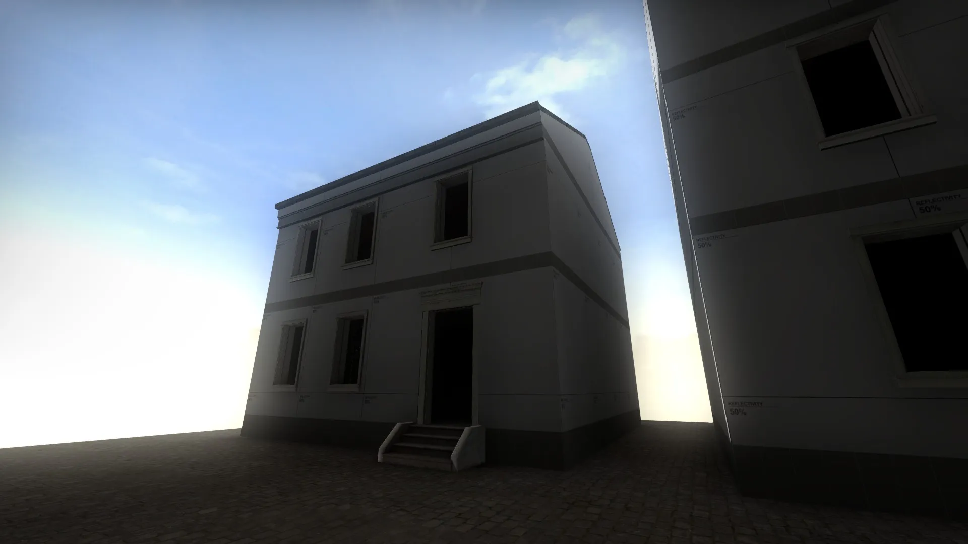
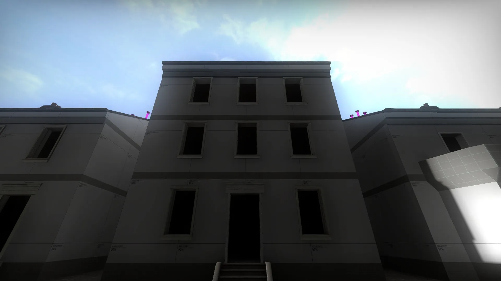
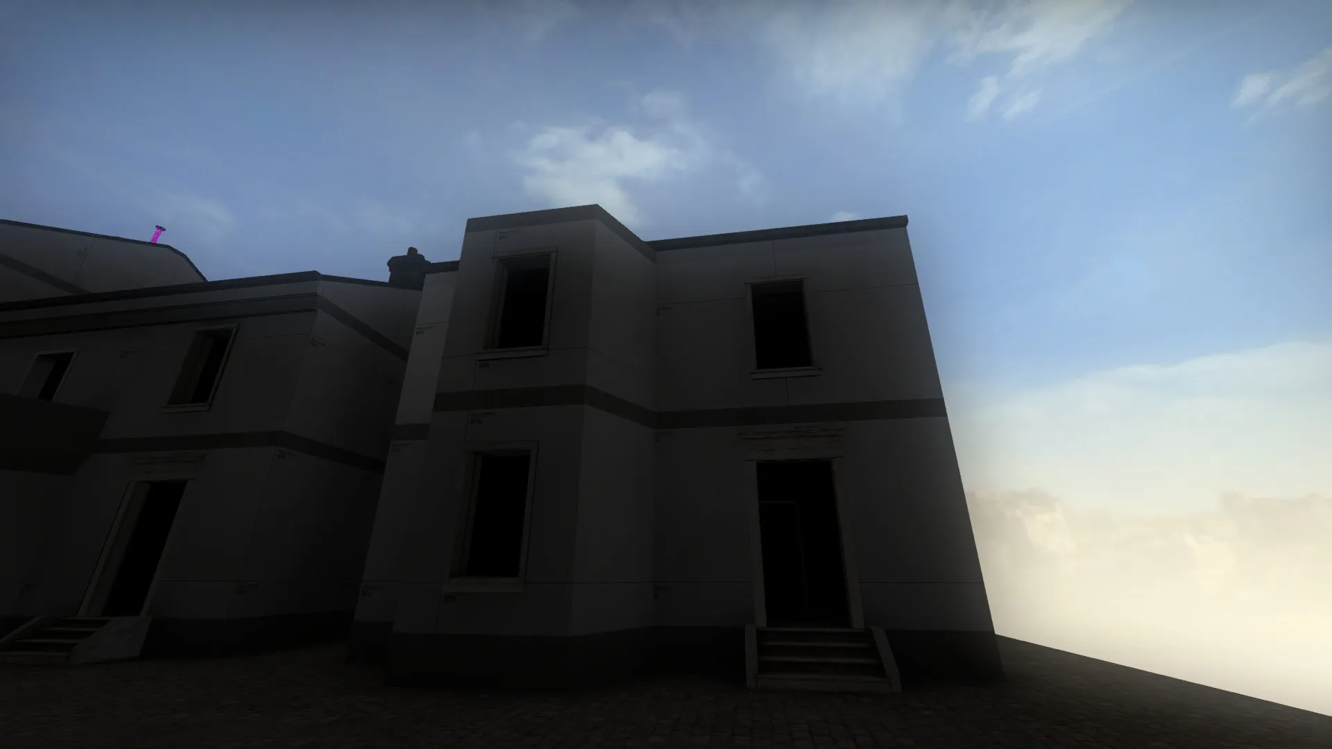
Hello again everyone!
Time for post number 2 with some talk about the skybox, lighting, fog and choic of material.
Also, as an added extra I will touch on the criticism recieved from playtesting and how I've approached that feedback.
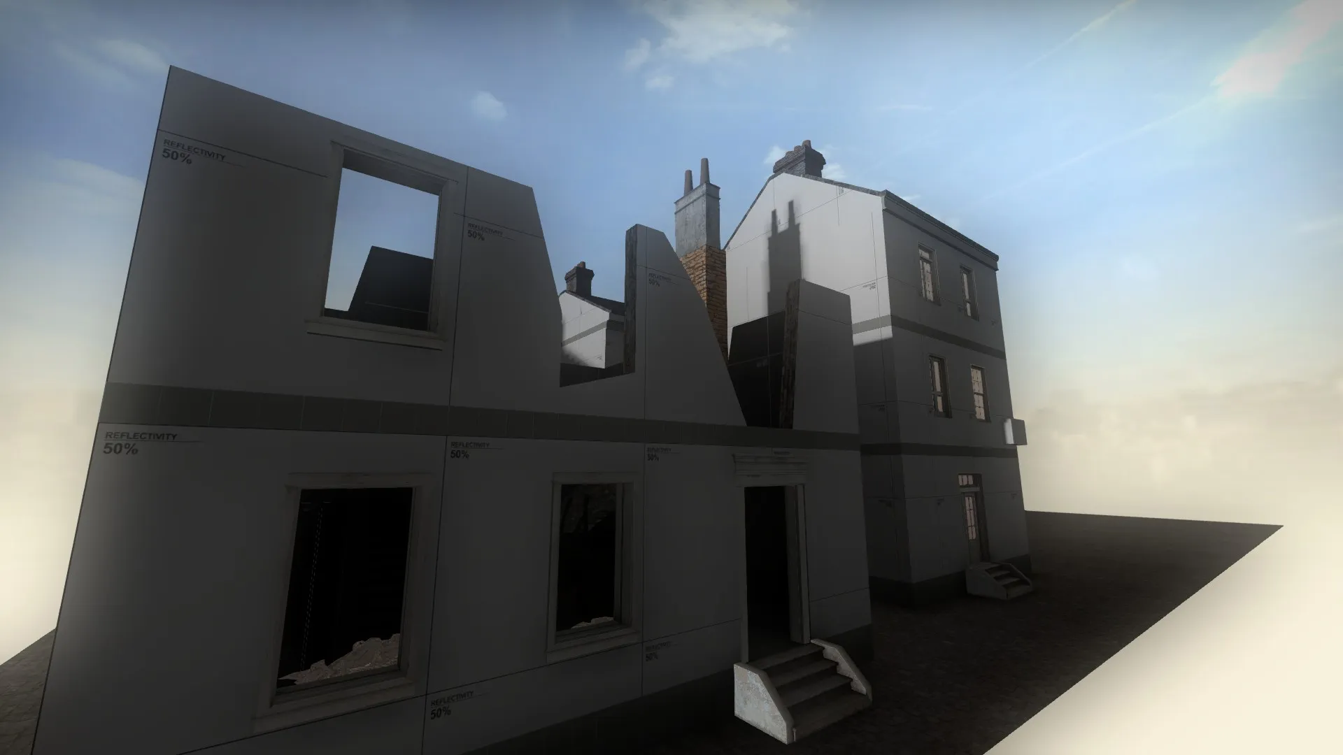
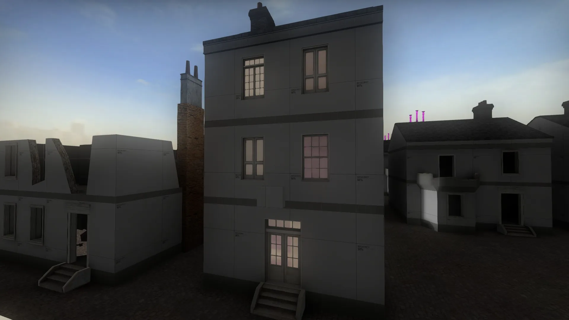
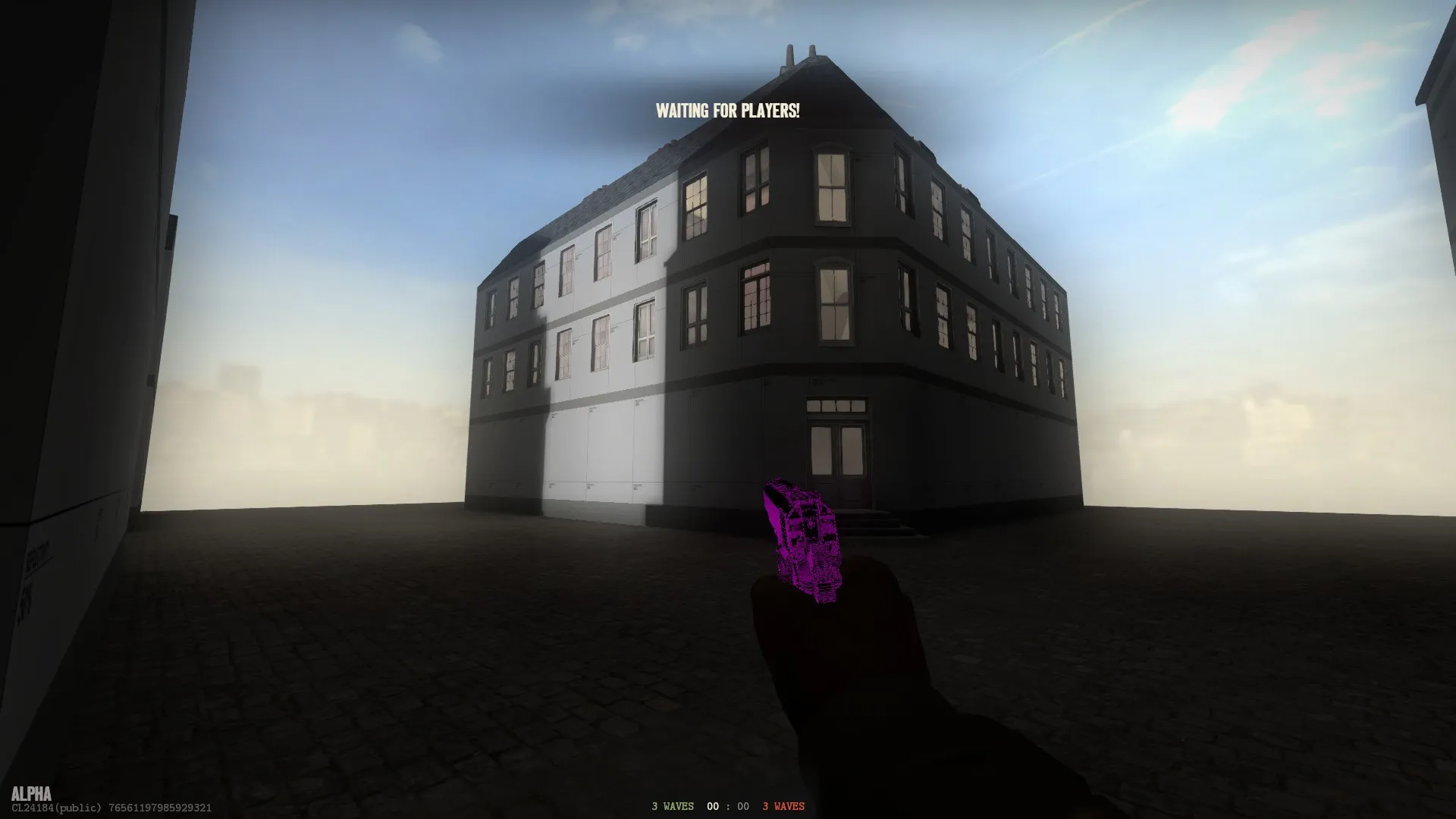
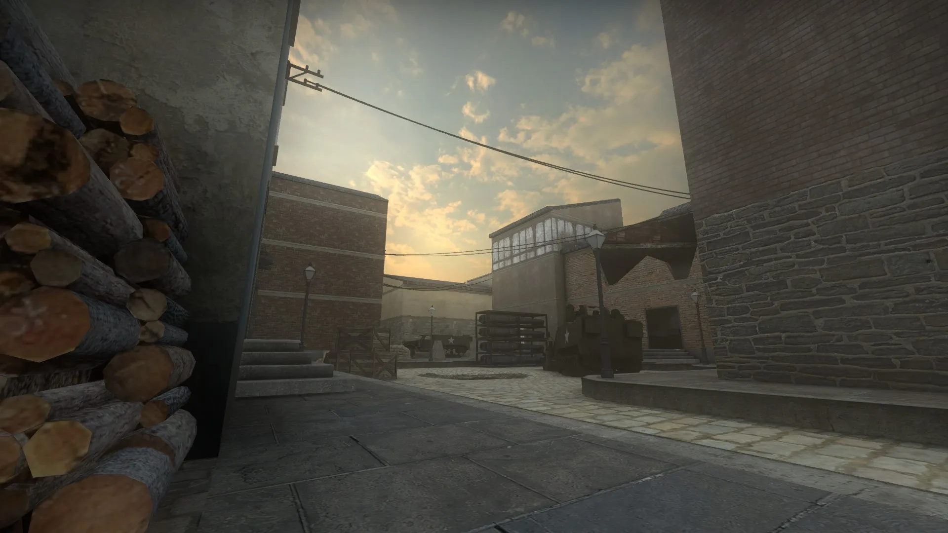
Since my map is inspired by the german town "Heidelberg" I wanted the buildings to represent some kind of german city with buildings looking like the ones from around 1920-1950. I constructed these simple buildings seen below. During testing I found out that when everything was brown bricks it was very boring to look at and it all looked the same. I tried to switch things up by adding some plaster to the sidewalls. But that didn't quite do it either so I had to chose from a pool of materials. I settled down with some orange brick, stone and yellowish plaster to make some buildings pop out more and catch the eye. With that finished for now I went on to the lighting. Before my map was very bright, almost like a clear summersday. I didn't want everything to look so clean and happy so I chose a skybox with a sun that represents the afternoon and I was instanly more comfortable with the map. I also added a thin amount of fog to reduce field of view around parts of the map and to set the mood.
Quote from Radu10 minutes ago, Radu said: Make sure you have placed at least one cubemap in your level. Load up your map, open the console in-game and type: "mat_specular 0", then "buildcubemaps" and finally "mat_specular 1"
It worked amazingly!
Thank you very much!