

DooM, The Witness and INSIDE are my highlights for this year. Played a bunch of Overwatch but kept going back to dota2 and cs:go for my competitive fix 
Posts by spa
-
-
 Quote from Oliver
14 hours ago, Oliver said: Try de_fraud! It fits with the theme, and I couldn't find a map with that name. Good luck with the map, I will check it out

Thanks man! Im probably going with de_Icarus - let me know if you have any comments or observations!
-
 Quote from El_Exodus
14 hours ago, El_Exodus said: Cause right now it's de_sepia.
Is that name taken ?

But yeah the issue is that I went overboard with the colorcorrection and ill try and be a little more conservative with it in the next update.
-
Roald: thanks alot man! ill probably still fiddle back and forth with the CC but yeah more smaller lights and, i think, details in general. Some areas are still a bit barren. Im constantly playing around with colorschemes and surfaces. Its pretty hard to nail the balance between making it seem "cool" and corporate but also having colors and look fun and vibrant for the player. This style has never been my strong suit so im trying to learn and challenge myself here.
The reason for the name change is that "corp" could really mean any map that deals with a corporate environment and i see more and more of them as the more traditional and grungy themes are a bit overdone. Since the corporate in question is called Icarus i think it makes sense to try and own that and have the map name resonate a bit more.
baem123!: thanks dude and also for all your previous feedback! yes i didnt include all of it but it was still extremely helpful. Im trying to keep mid the way it is for now.
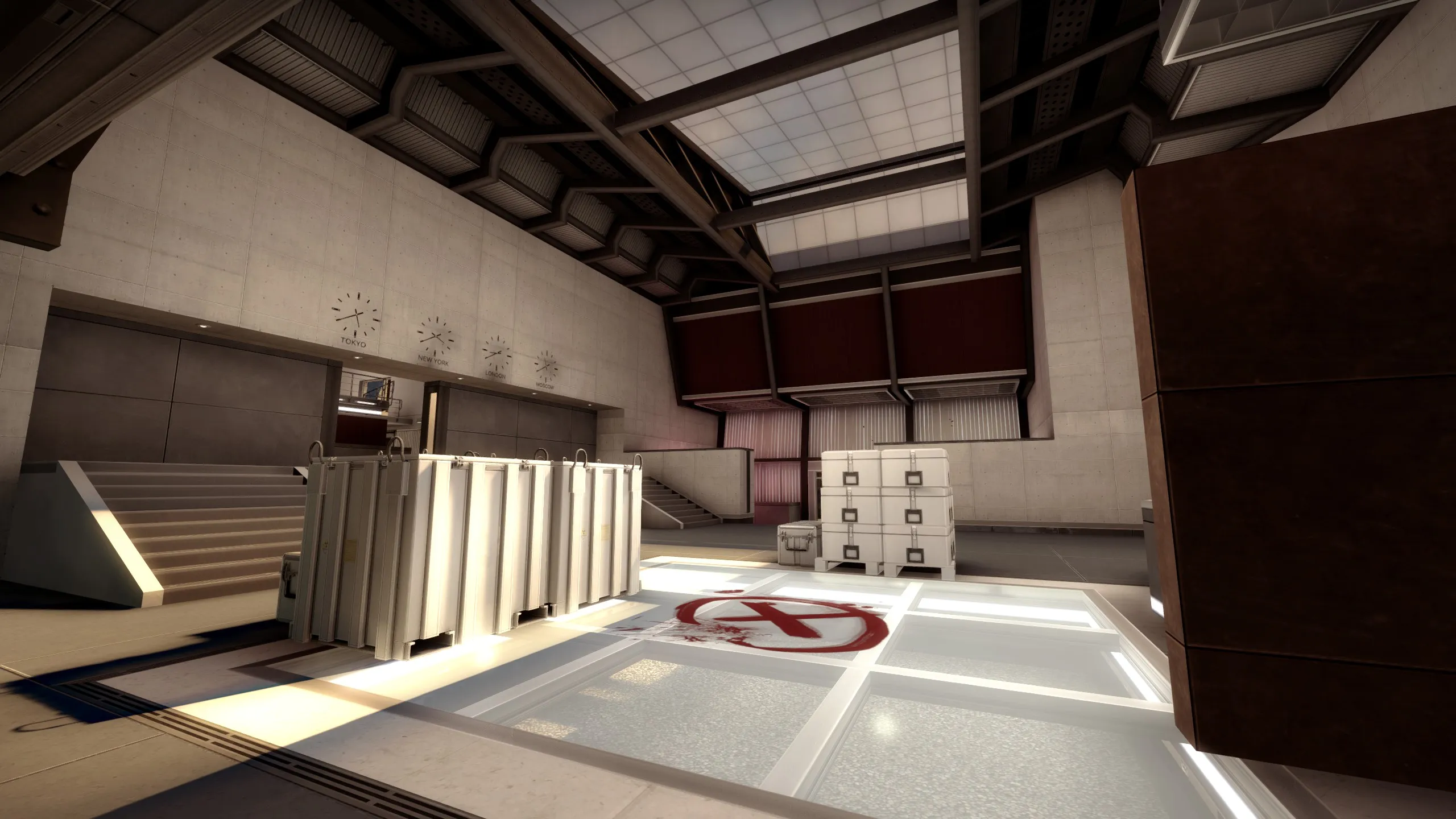
Yes the nuke crates are really generic and can easily become a crudge, but i try and restrict them to the bomb sites (with some exceptions
). Theres a piece missing there: the "story" is that they are being transported from the lobby to the b site to be taken away in the truck and that they contain money, barebonds, etc. i had the idea of having a money trail connecting A and B showing the rotation path - ill see how that works and consider something else if not!I should have mentioned that there's blue artifact/shadows going on. I believe its due to compiling on fast but with HDRI on. I havent done a full compile in ages - dont know if it can be done in a day but ill try and let it run overnight sometime and see.
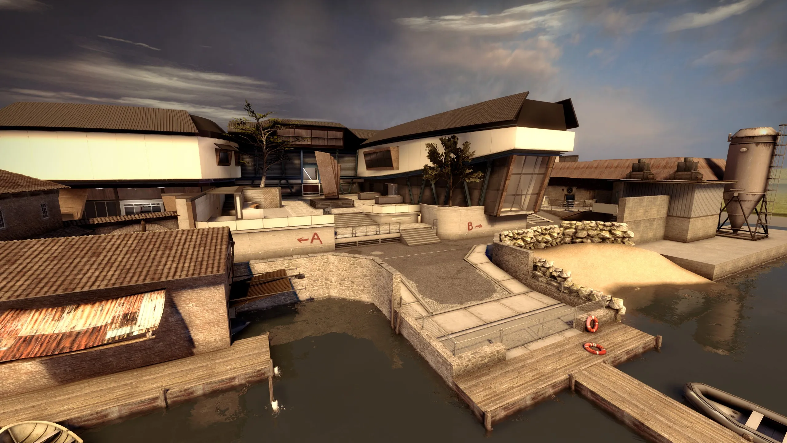
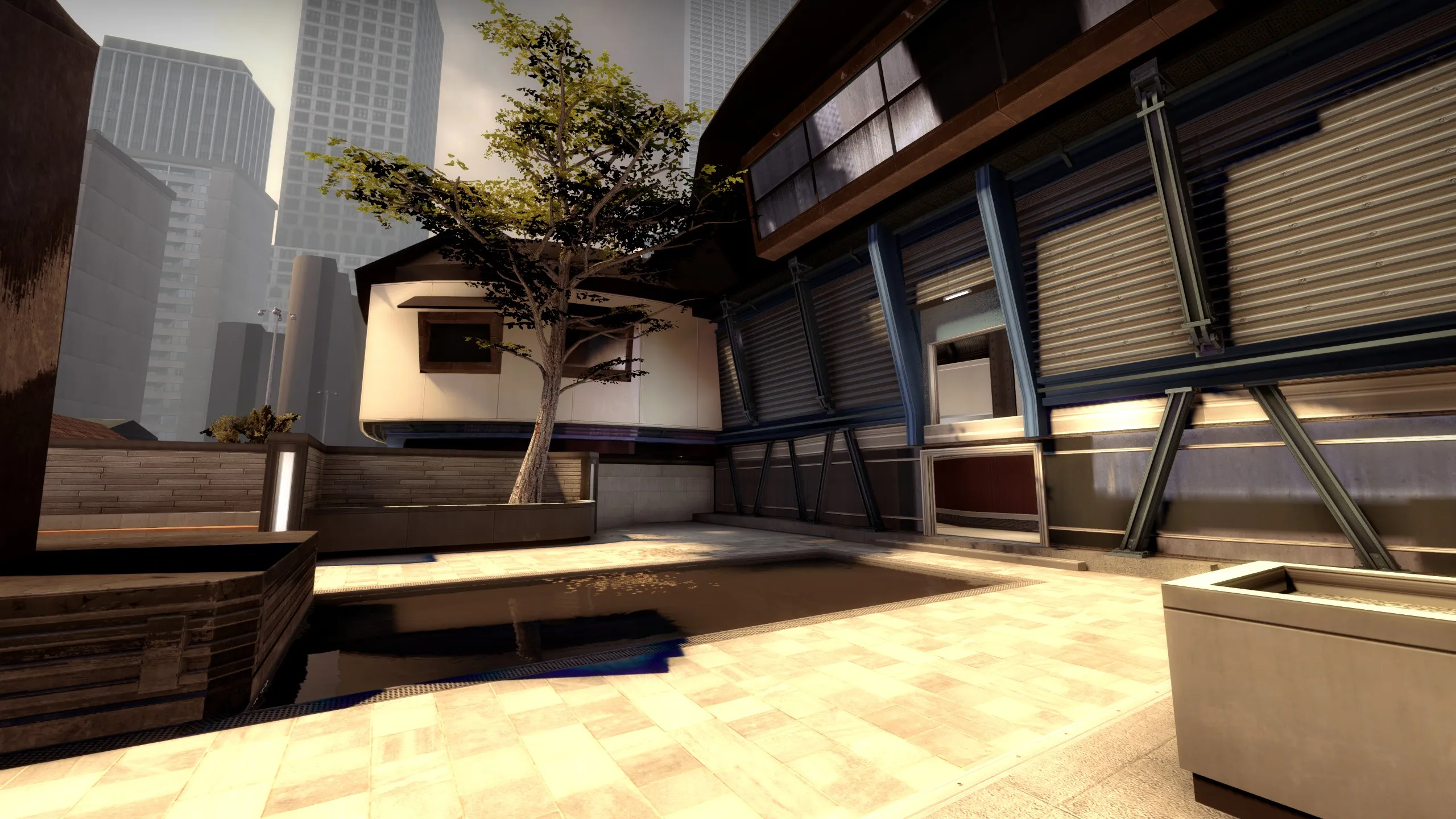
About the the small dingy house: My thinking on this map is that this newly build corp-building is offset a bit from the overcrowded city-core and placed between some old water-front buildings (A route) and some grungy industrial area (B route). This makes a nice contrast to the building itself and makes the traversal to each of the bombsites from T feel different. It also reinforces this theme of a big expensive corporation infringing on the space of the original inhabitants (like a spaceship that landed there) Maybe it doesnt come across well enough, but thats the idea!
-
 Quote from will2k
21 minutes ago, will2k said: Too much brown

Seriously though, I think a bit of color palette diversification would help the scenery. Maybe those tile roofs could be of different color instead of dark brown.
A bit of experimentation with different textures should be the answer
Solid work so far, keep it up
Hey man, thanks. - I think i may have gone a little overboard with the color correction
i expect it to change a bit with iterations, but yeah i can definitely see what you mean.Ra7: thanks alot!
I should probably also mention that i plan to rename the map to the slightly less generic name: de_Icarus
Ill make the change and re-upload the map once i deem the map finished - which is still a while to go.
-
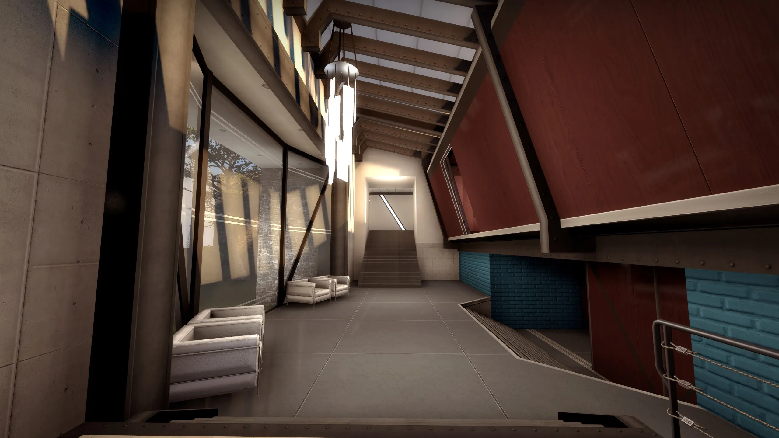
New update i wanted to share. Map is getting there although some things need more work still. And LOTS of optimization.
However i managed to get a proper 3dskybox in, better tonemapping and added colorcorrection. As always any comments and feedback are super welcome.
-
Very happy with the wins but i was really rooting for this to take best narrative! Ofc you cant beat Uncharteds amazing production value, but i appreciate how INSIDE used the medium in such a pure and excellent way. Would have been a better signal for the industry imo (assuming awards matter in any way) I see many game teams burning their fingers trying to do what Naughty Dog are masters of.
-
This makes me want to get a PS4.
-
I just had a quick run-through and i agree that its a hard sell on a first attempt due to the complexity of the layout but i also think that its an interesting one! maybe atleast one crouch-move too many though, but i like the wide gate one in the center. However you need to work more on the theme - its too much boxes and sort-of-warehouses atm. A site needs something more memorable and thematically strong - maybe its a nuclear warhead or a vintage car, maybe your actually breaking into a fancy apartment through all the grungy exterior?
I also think that the drop down for each site is way too strong for T atm. If T had to fight harder to get there maybe? or T was more exposed? Its pretty risky to allow such fast rotations* because it can invalidate mind games as to where the plant is happening or just make it unfair.
*okay its not really a "rotation" but you get my meaning.
-
 Quote from Sprony
1 hour ago, Sprony said: I can't phantom why minorities and women would vote for a guy with such a long and well documented track record of discriminating remarks? Why would a woman, Muslim or Hispanic vote for him?
One of the theories for why the latino vote was so relatively strong for Trump was that Obama actually deported more mexicans than Bush did (2.5m vs 2m). There is a high chance that some of the latinos that voted for Trump knew about familty members or friends who were recently deported by the democrats.
With women I really have no idea..
-
Hey man, really nice effort on this map, looks like a tight layout and a good theme if you can make it really dirty and grimy to fit the title.
-
I have an update for anyone interested in checking out the map. Ive added more details tweaked A-long and B entrance for better grenade options and lowered the T spawn area a bit:
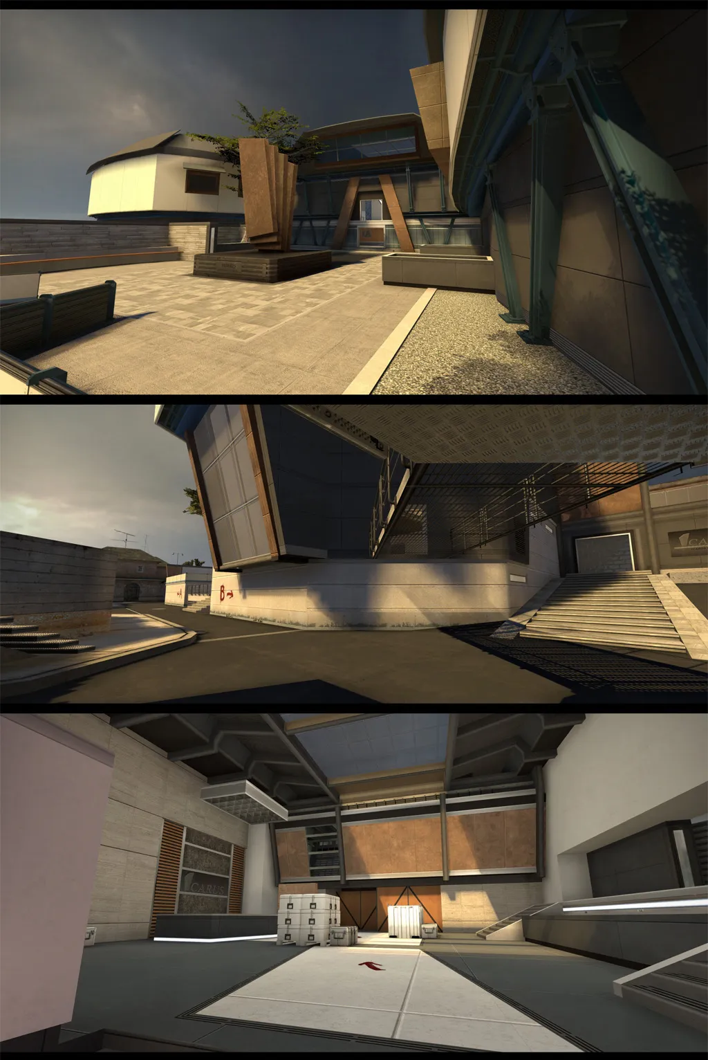
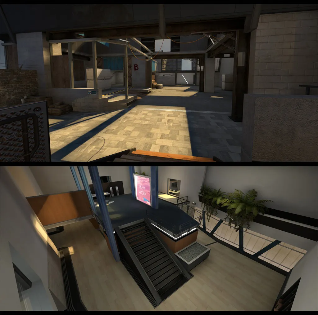
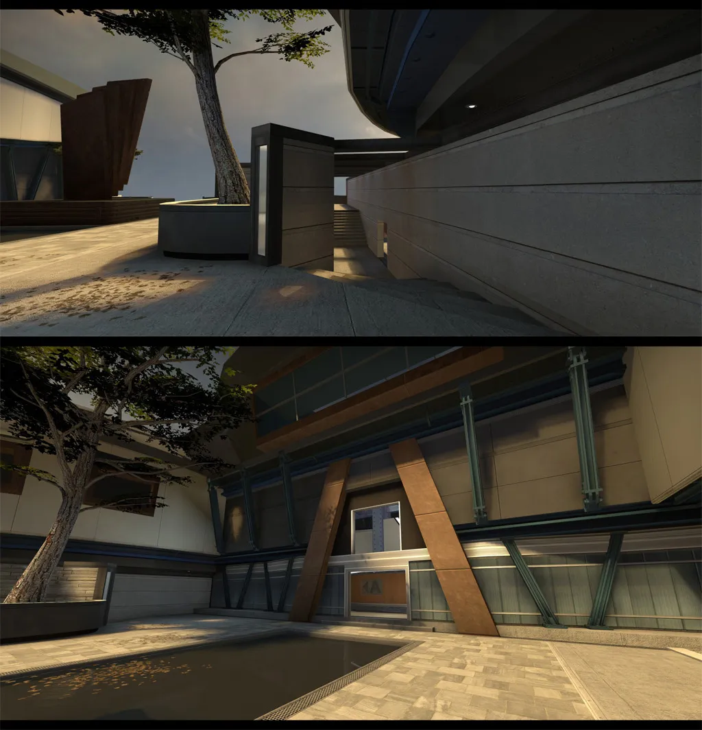
Whats left:
- Map still lacks a lot of polish and a big round of optimization at some point.
- Facades need proper coli
- Radar isn't fully updated.
- More custom models (lobby desk, final lobby wall art, etc.)
- 3D skybox!
- And finally more play testing! But I'll get to that soonish i hope.
Comments and advice are, as always, highly appreciated!
-
 Quote from blackdog
21 hours ago, blackdog said: @AndyW i think that's a bit dark...
I agree and i think the solution would be to brighten the floors since they blend too much with the walls atm. Nice work nonetheless!
-
Working on custom facades for de_corp. Still very WIP

-
 Quote from catfood
5 hours ago, catfood said: This could occur when you deleted a brush or entity and then used undo (ctrl+z). should be fixed after restarting hammer
Good to know!
-
Quote from catfood
8 hours ago, catfood said: I'm not sure I see what you mean with where CTs have to move backwards to get forward, you mean the part when CT go mid through A site?
Yeah that space feels a little zig-zaggy and could perhaps be consolidated a bit,
Spoiler

This could make some players lose orientation and make the map harder to navigate.
-
 Quote from jUST_RUSH
4 hours ago, jUST_RUSH said: I've never had this problem, to my knowledge. I have, however, had entire func_detail staircases and the like disappear unless in a certain position.
Ive seen that too and i just ended up deleting and rebuilding.
-

 Quote from text_fish
36 minutes ago, text_fish said: Carving doesn't keep verts on the grid, resulting in messy brushwork at best, leaks and poor optimization at worst. There's never any excuse for carving.
Fair point, but i think it can be worth it for the uv topology (lets say you want a ring of stones following the opening of the arcway) I guess he can add a "straight" arc on each end to achieve this
-
I just tested my carving method and it seems to work fine (any good reason not to do this?). I think either technique can depend on how you prefer your topology with regards to uv mapping.
-
I guess you could make it longer and then rotate the whole thing to fit the angle and then carve the ends?