


Looks amazing! The one thing I think that could be improved is optimization.
Posts by Mehvix
-
-
Perhaps change the skybox from d2

-
 Quote from Shibou
On 5/6/2016 at 5:39 PM, Shibou said: Not unless its an explosive vase!

Besides that i like what i see so far. Second mid apears a bit boring due to its simplicity.
-
What ever you do, please don't make it like newke (lots of little things poking out from walls that dont have clipping on them
)Also, adding skylights on the ceiling with the combination of smoke stacks in the background would allow easier smokes and flashes, much like in de_season.
-
 Quote from Radu
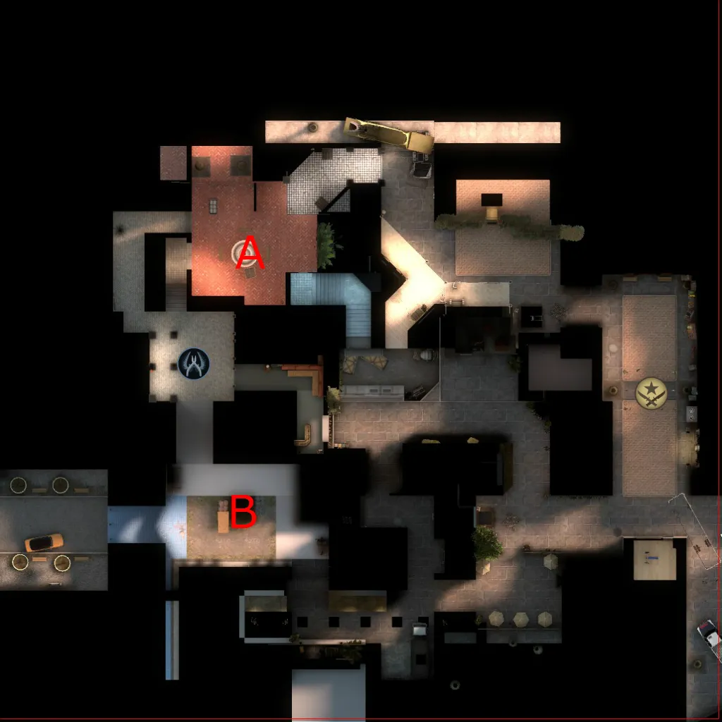
On 4/29/2016 at 2:44 AM, Radu said: Add an overview image for people to see ahead.
Added
 Quote from Logic
On 4/29/2016 at 2:52 AM, Logic said: It looks good so far, but the map feels very claustrophobic, mainly because of all the low angle screenshot's you've provided.
I'd prefer it if you presented screenshots taken from a few meters up, looking down at an area at a slight angle instead
 Quote from Shibou
On 4/30/2016 at 4:46 AM, Shibou said: I have to agree with Logic. Judging from the Overview it looks a bit small. But that doesnt have to be a problem, it can generate a fast paced gameplay.
So far the theme looks quite nice, i like the scene showed on your third screenshot the most.
 Quote from blackdog
On 5/2/2016 at 8:10 AM, blackdog said: Shots look pretty much from player perspective… so if it feels claustrophobic I think it's necessary to open up a bit. I'm interested in bird's eye view more to understand possible player placement.
Maybe it's just because of dev textures, but the red tiled floor seems too red, I can imagine the area, already small, feeling very crammed and with reduced player readability. But do your work first, I don't like commenting on these things when it's way early to worry about textures.
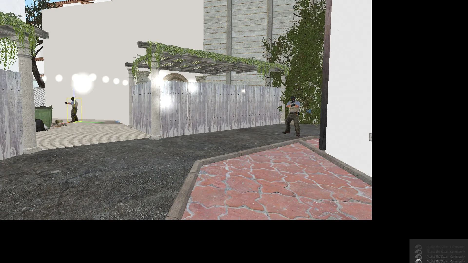
I have opened up the pathway outside A main, and also stretched A connector it is now a bit shorter then the cross on de_dust 2.
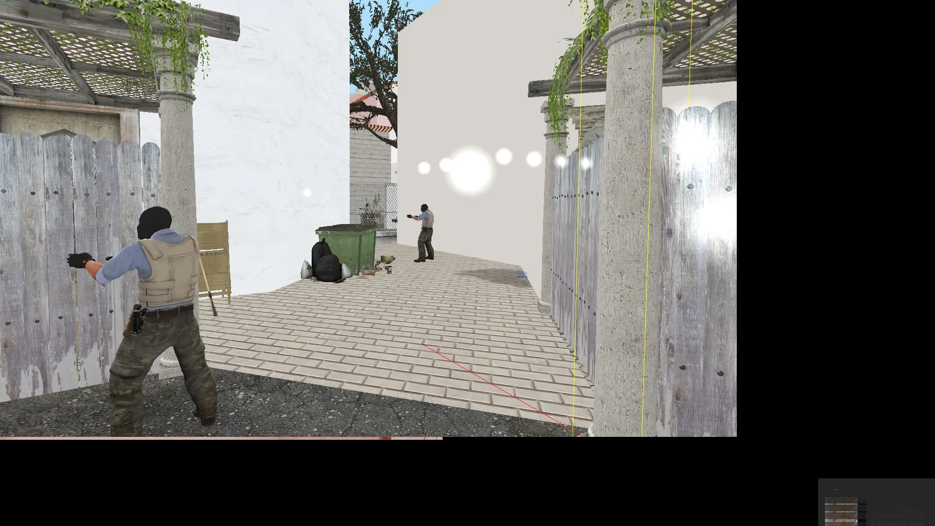
Also, I started to re-making the entrance to A.
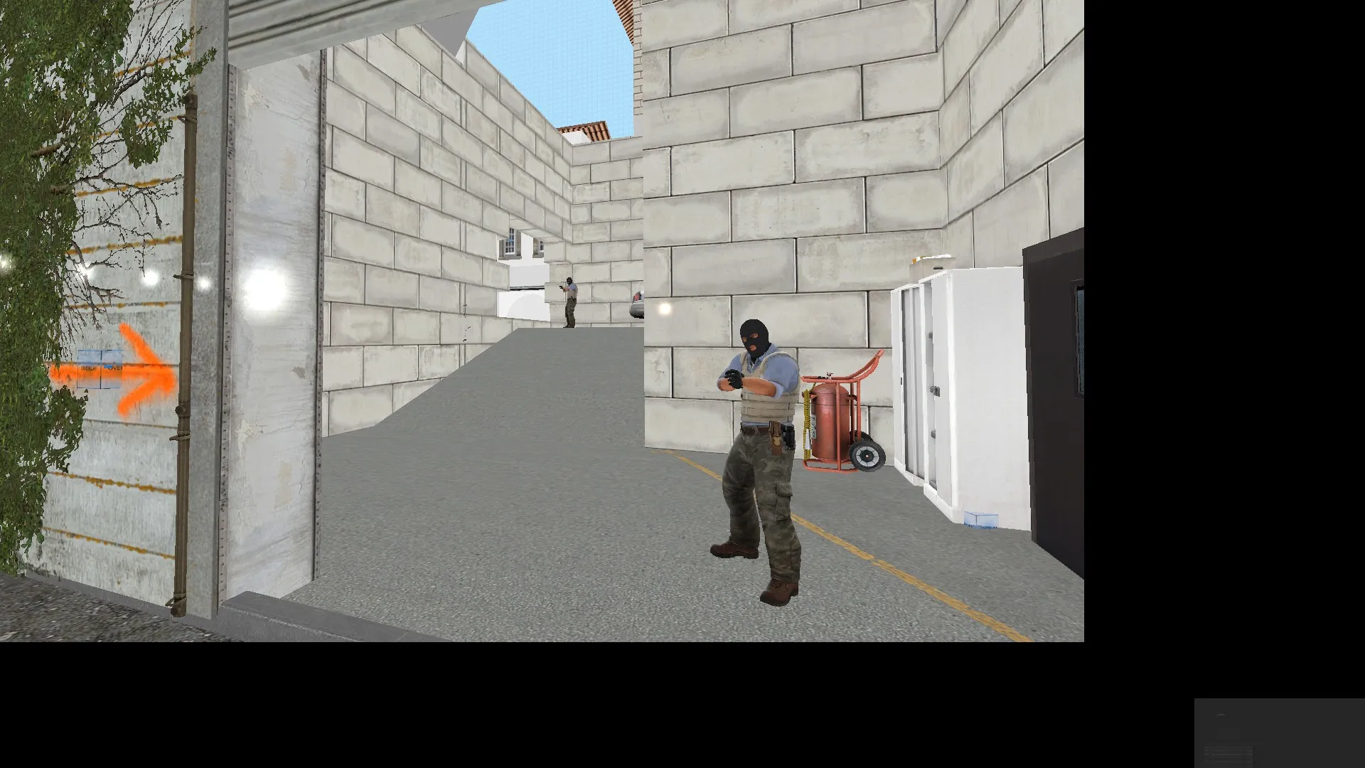
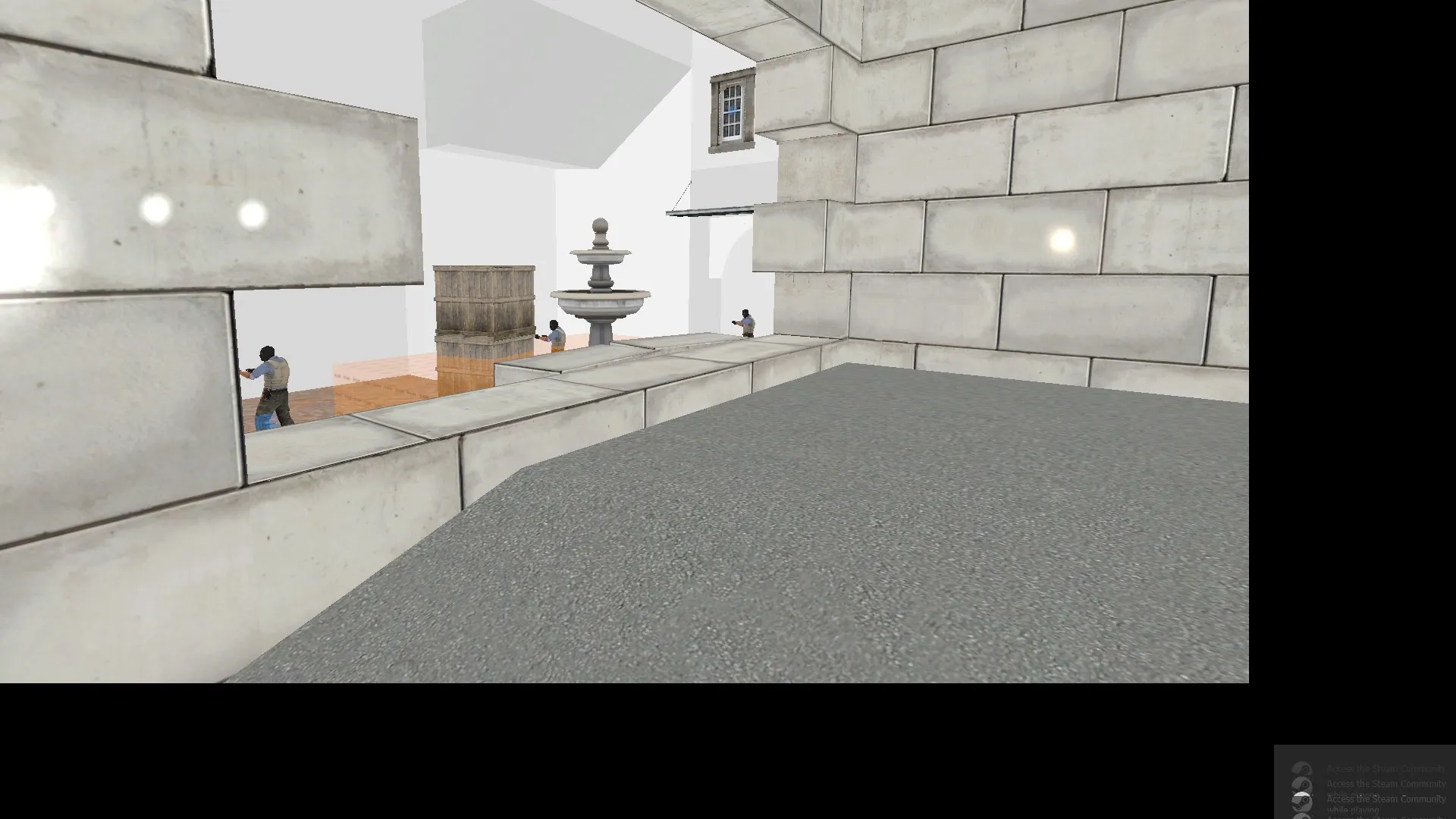
As for the texture on A, I have replaced it with a much lighter texture.
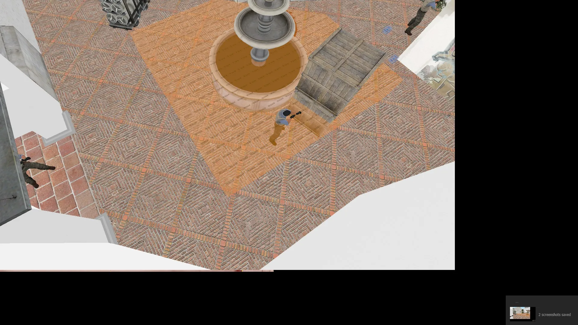
-
Hello!
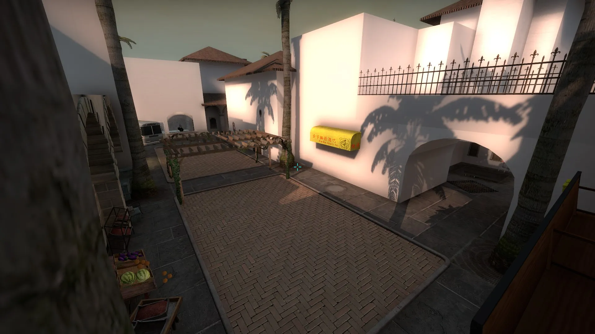
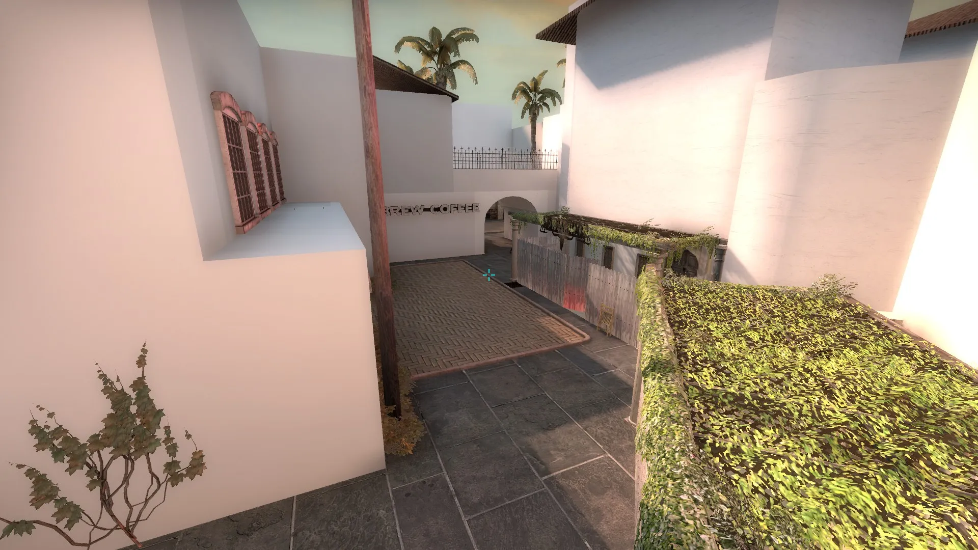
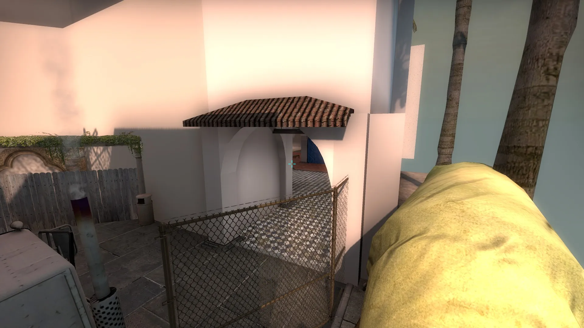
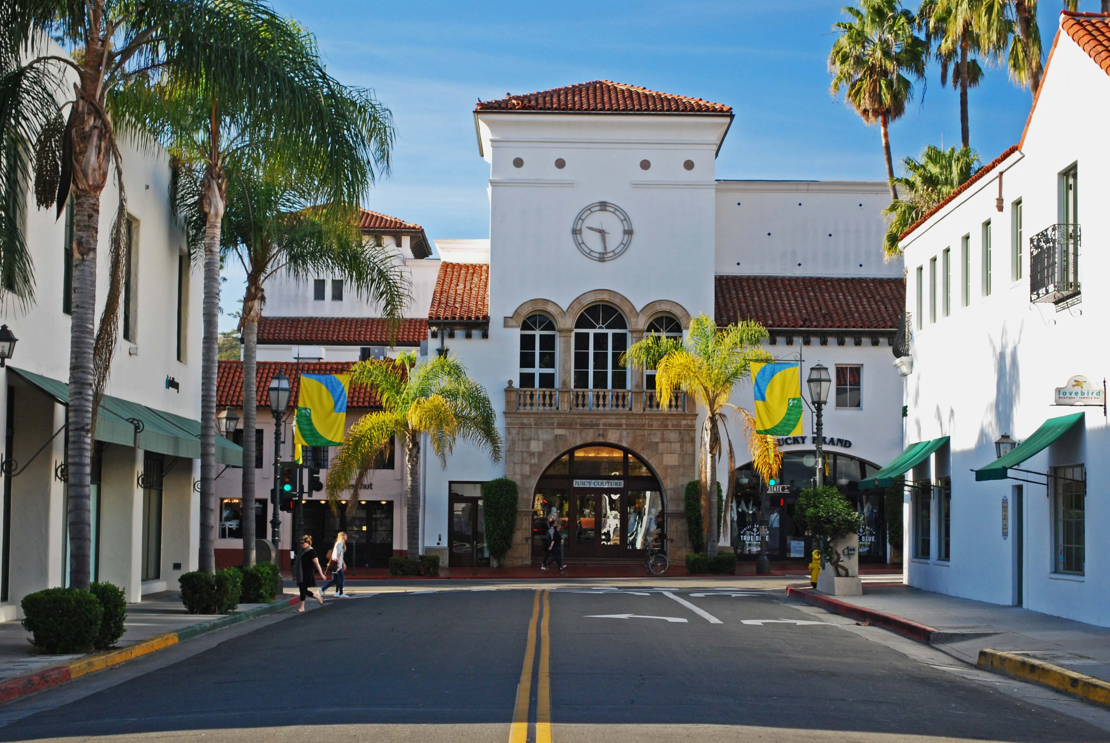
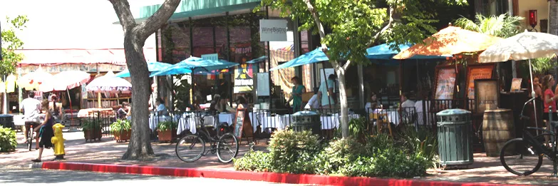
De_Barcelia is my first shot at a competitive map, I based the layout on a few maps such as Season, Mirage, and Inferno. As for theme, I set in downtown part of Santa Barbra, California.
Any feedback/criticism is welcome!
Workshop link: http://steamcommunity.com/sharedfiles/fi…s/?id=624776829
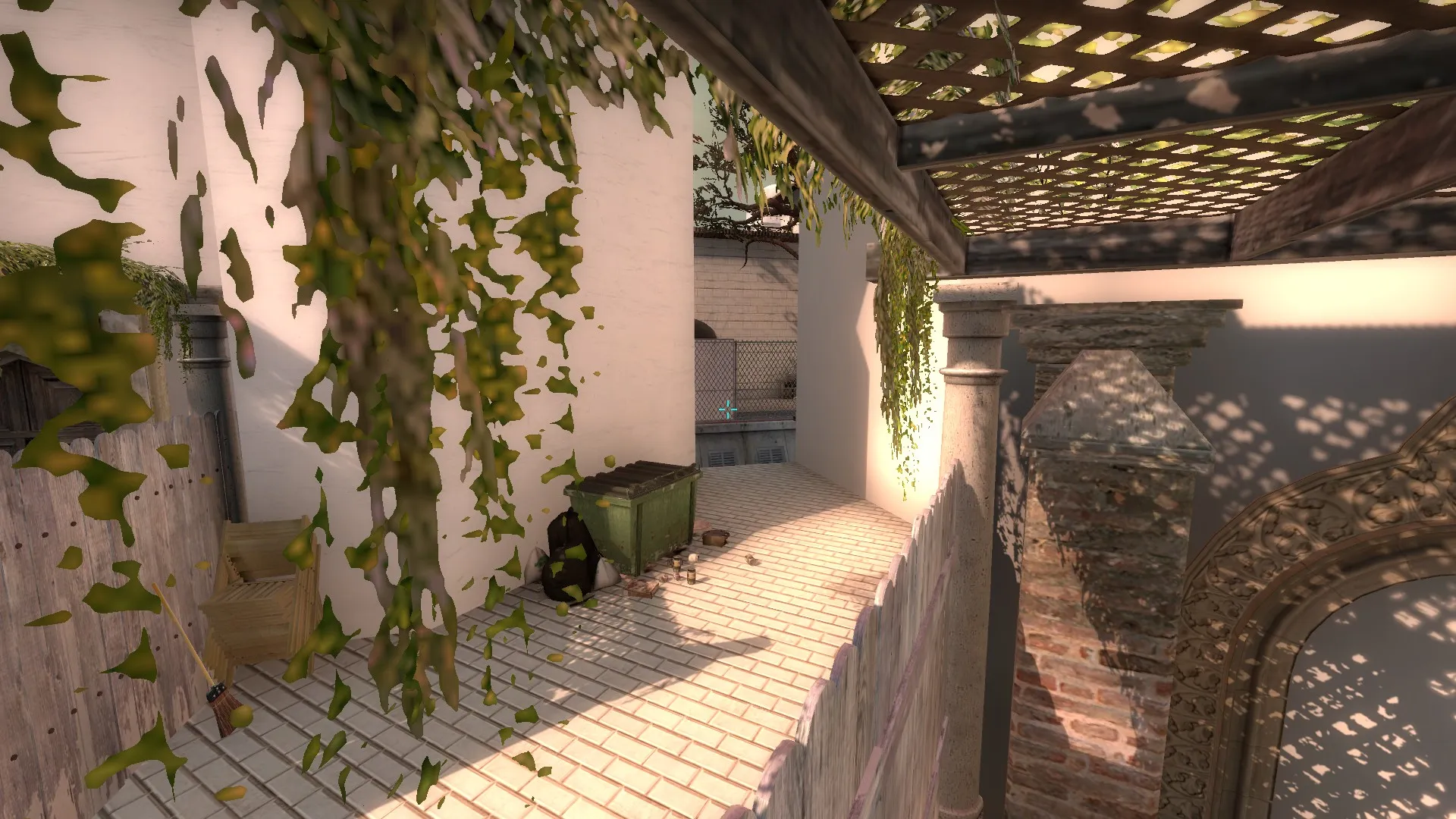
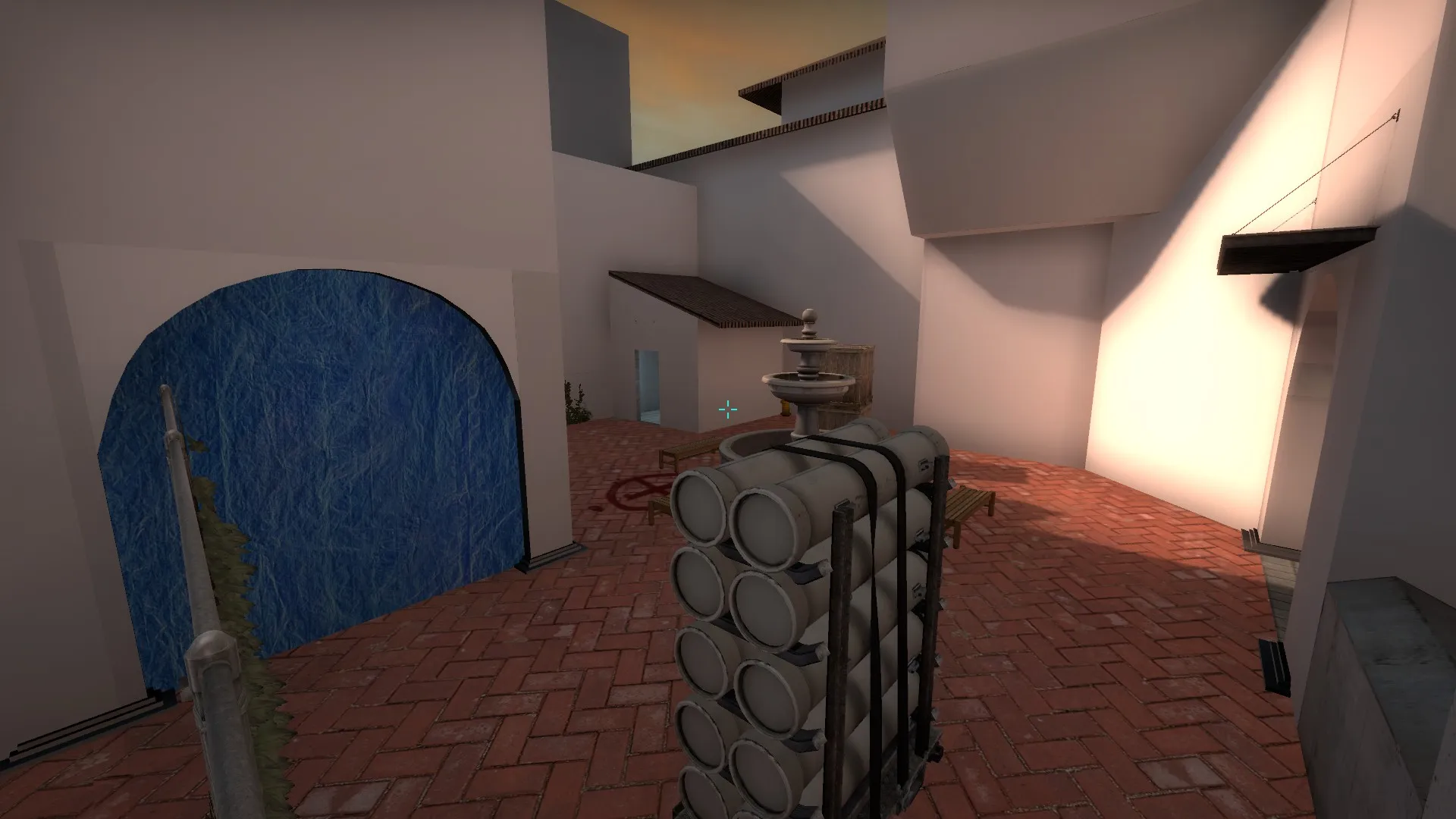
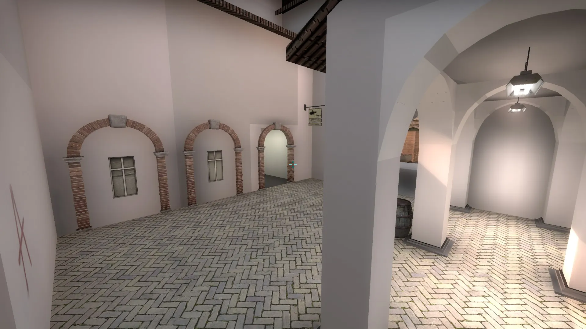
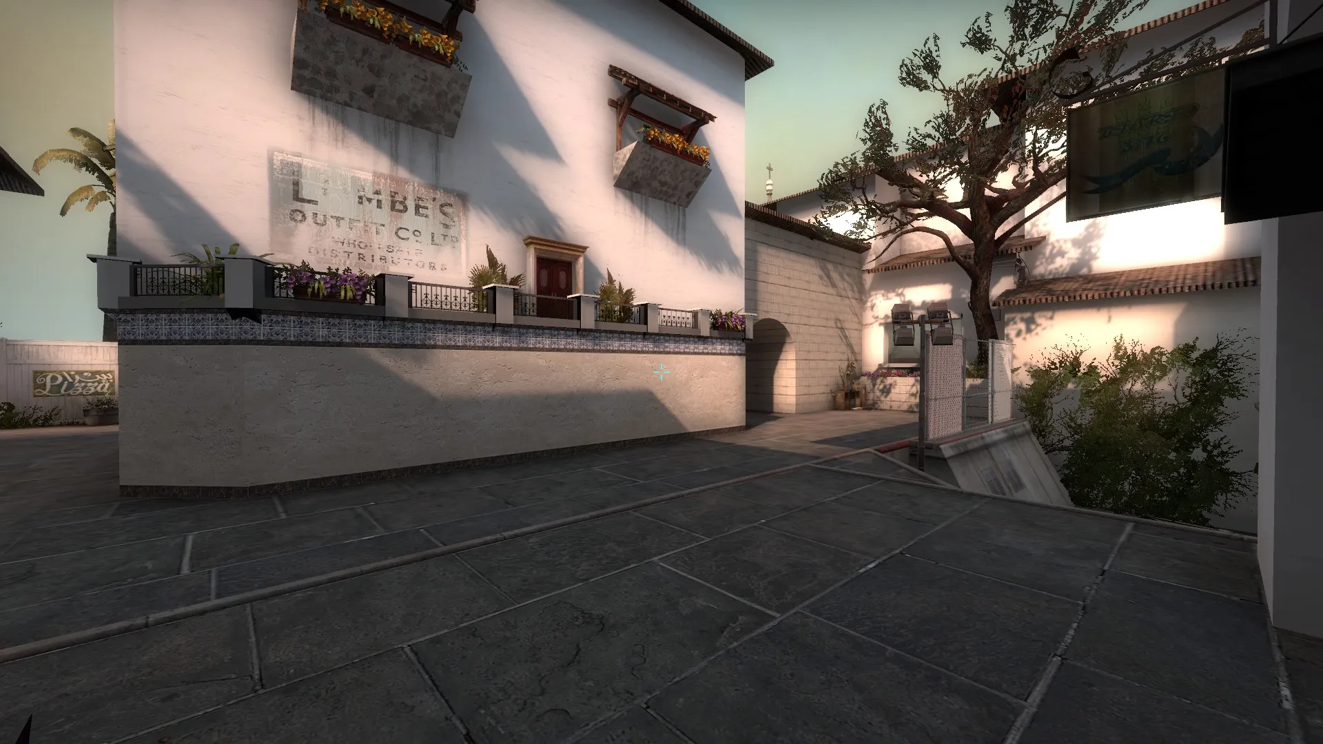
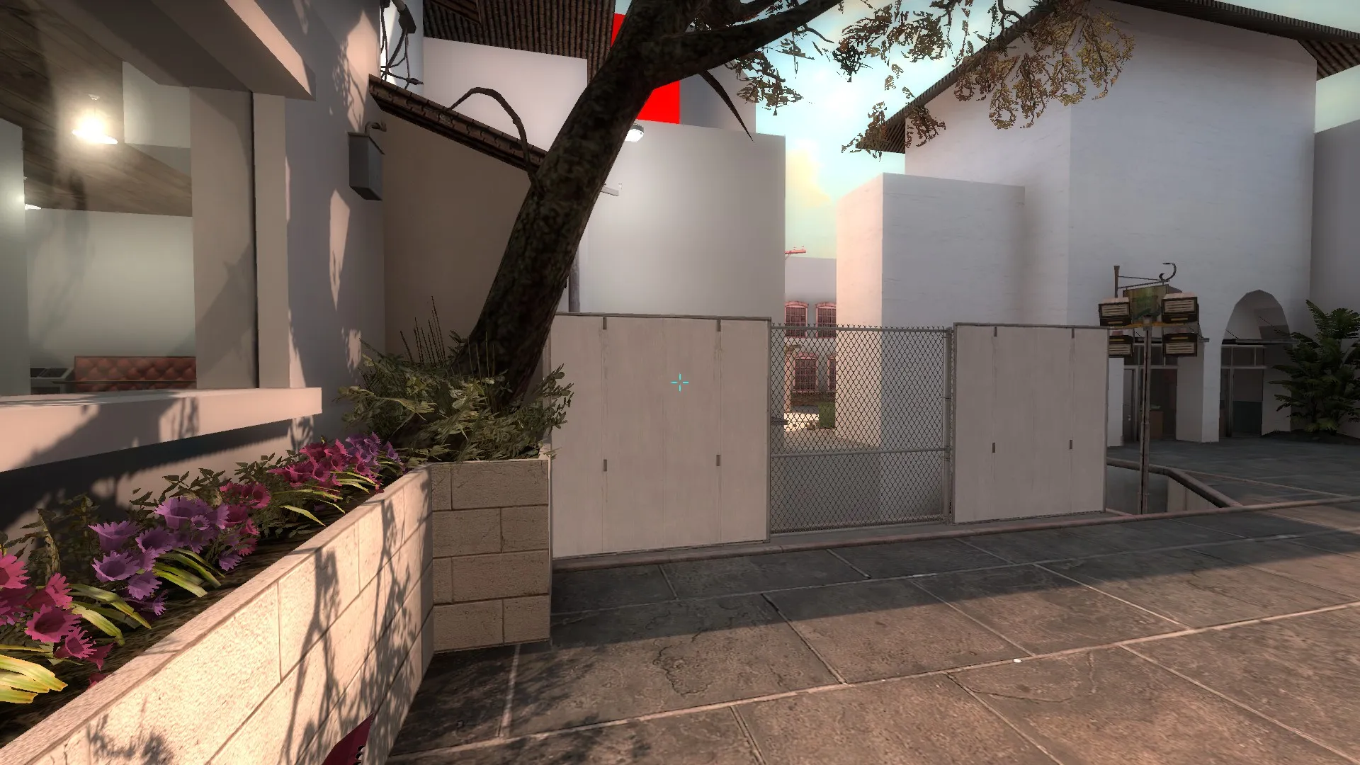
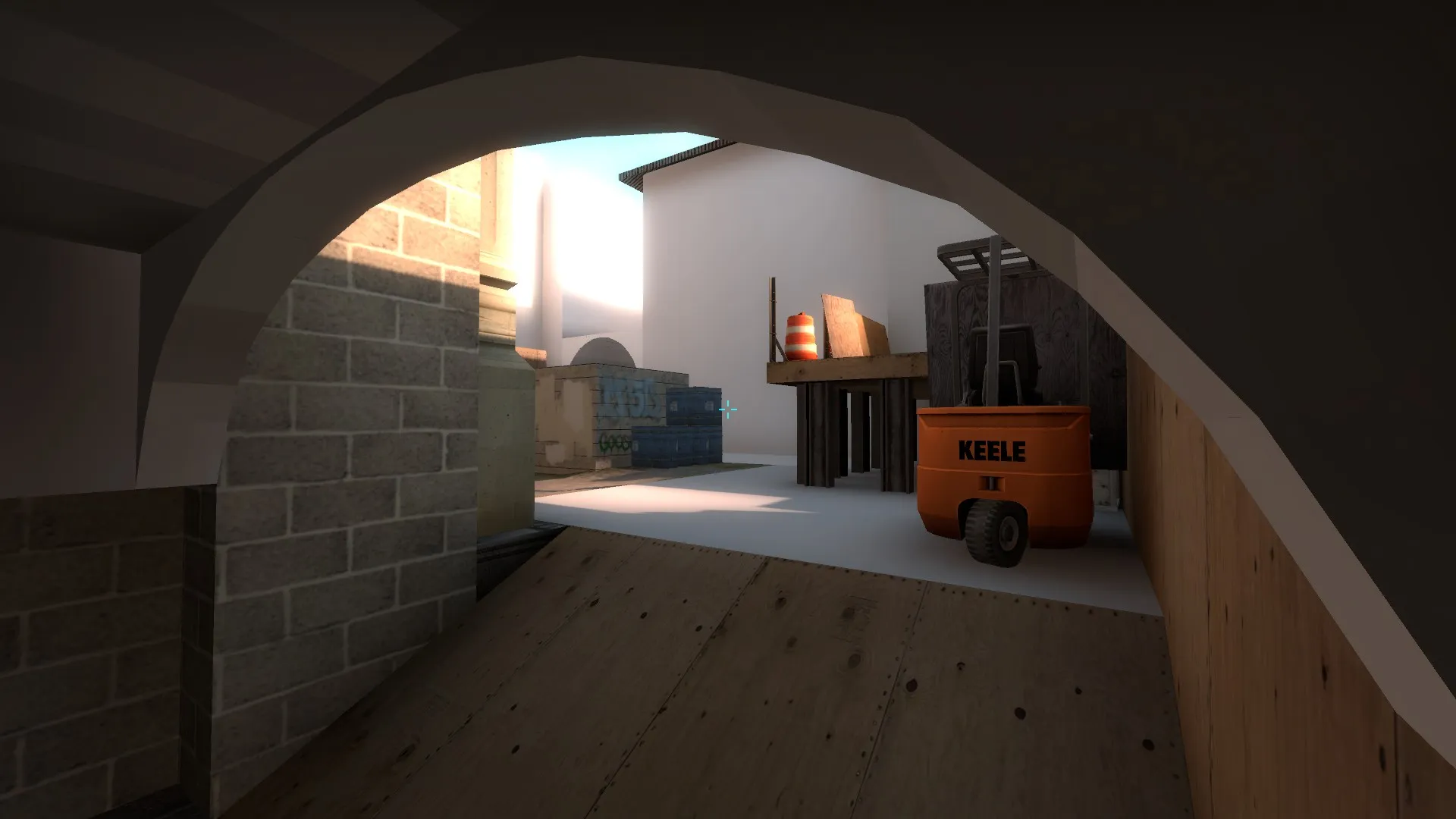
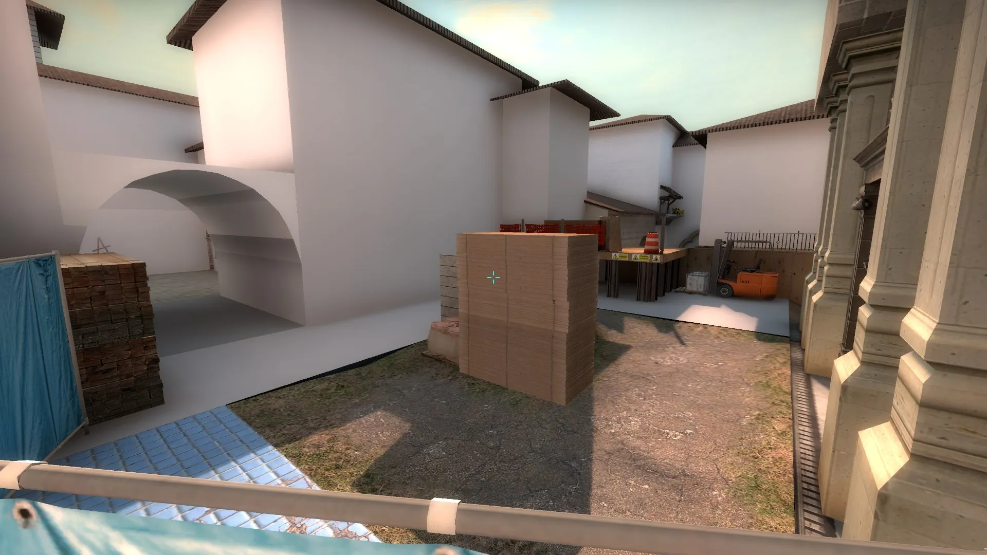
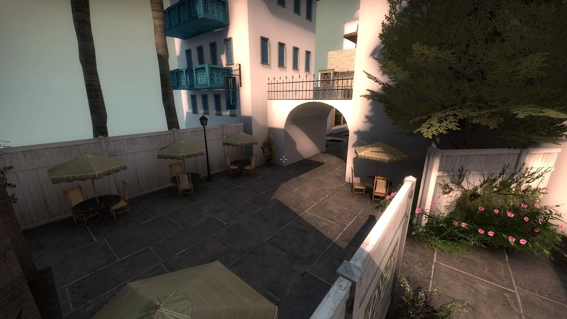
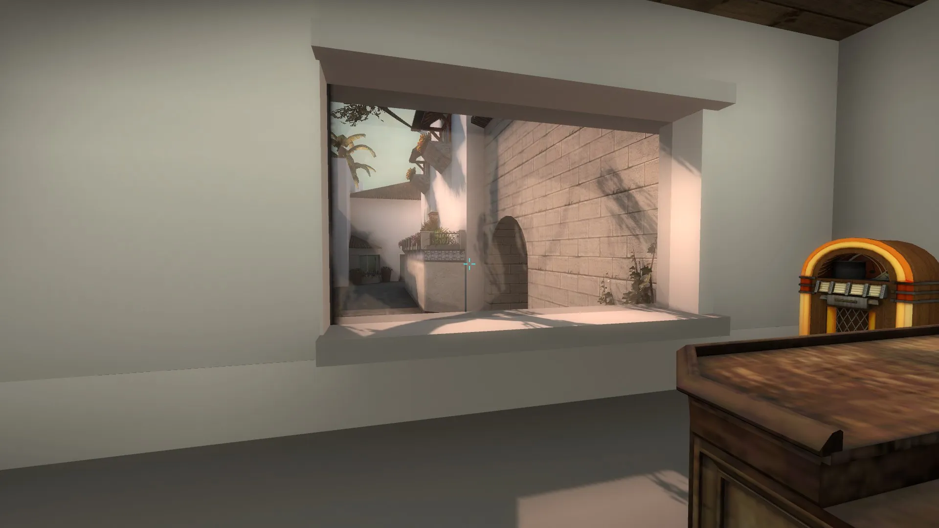
-
I feel like moving ct spawn back to the road because otherwise the Ts only have to watch 2 angles/use a smoke making it difficult to retake. Also try adding skylights to B site, excited to see how this turns out!
-
I have my greybox almost finished and am starting to detail. I have a idea of what I want to make it look like (santa barbara) Is their anything that I should keep in mine while detailing? (i.e. don't use to much foilage) Thanks!
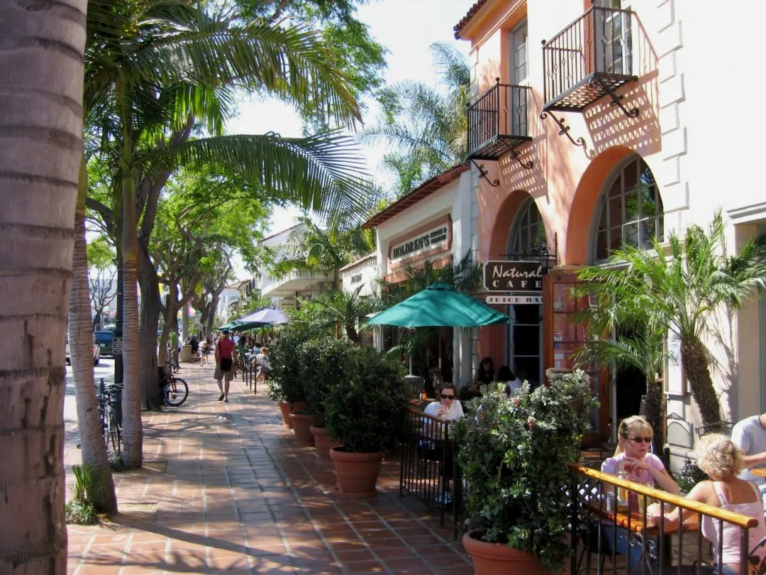
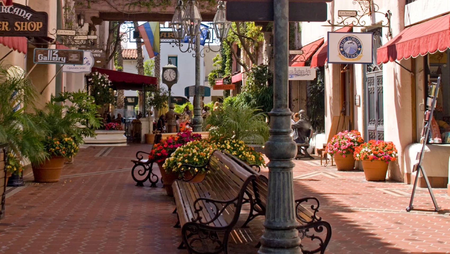
-
I played Rainbow Six Seige and I loved the amount of detail that went into the walls. Is their any way to do this with source? I tried func_breakable but that didn't really work that well (having a brush disappear after shot a few times doesn't look to well)
-
It looks very nice, but for the future try making a greybox map then detail so that if you do mess up somewere you dont have to remake everything, only a few brushes