1. Forums
  2. Discord
  3. About Mapcore
  4. Patreon Supporters
  • Login
  • Register
  • Search
Everywhere
  • Everywhere
  • Articles
  • Pages
  • Forum
  • More Options
  1. Mapcore
  2. Members
  3. wylde

Posts by wylde

  • de_stolen (nearing release, seeking feedback)

    • wylde
    • May 30, 2016 at 7:16 AM

    Small update with clipping, decals, foliage, and a few new func_details.

    Still thinking about how to fix a couple issues that have been raised. For now, I removed one of the windows from the security hut overlooking B to remove a tiny AWP angle. Once I remove all tiny angles and am positive no one can boost out of the map, I'll schedule the playtest. With this update, I prioritized the spawns to try and work on meet-up times a bit. I think CTs are getting to B Main a little too early as is, so I might have to move CT spawn back a little.

    Thanks for all the feedback so far, please keep it coming!


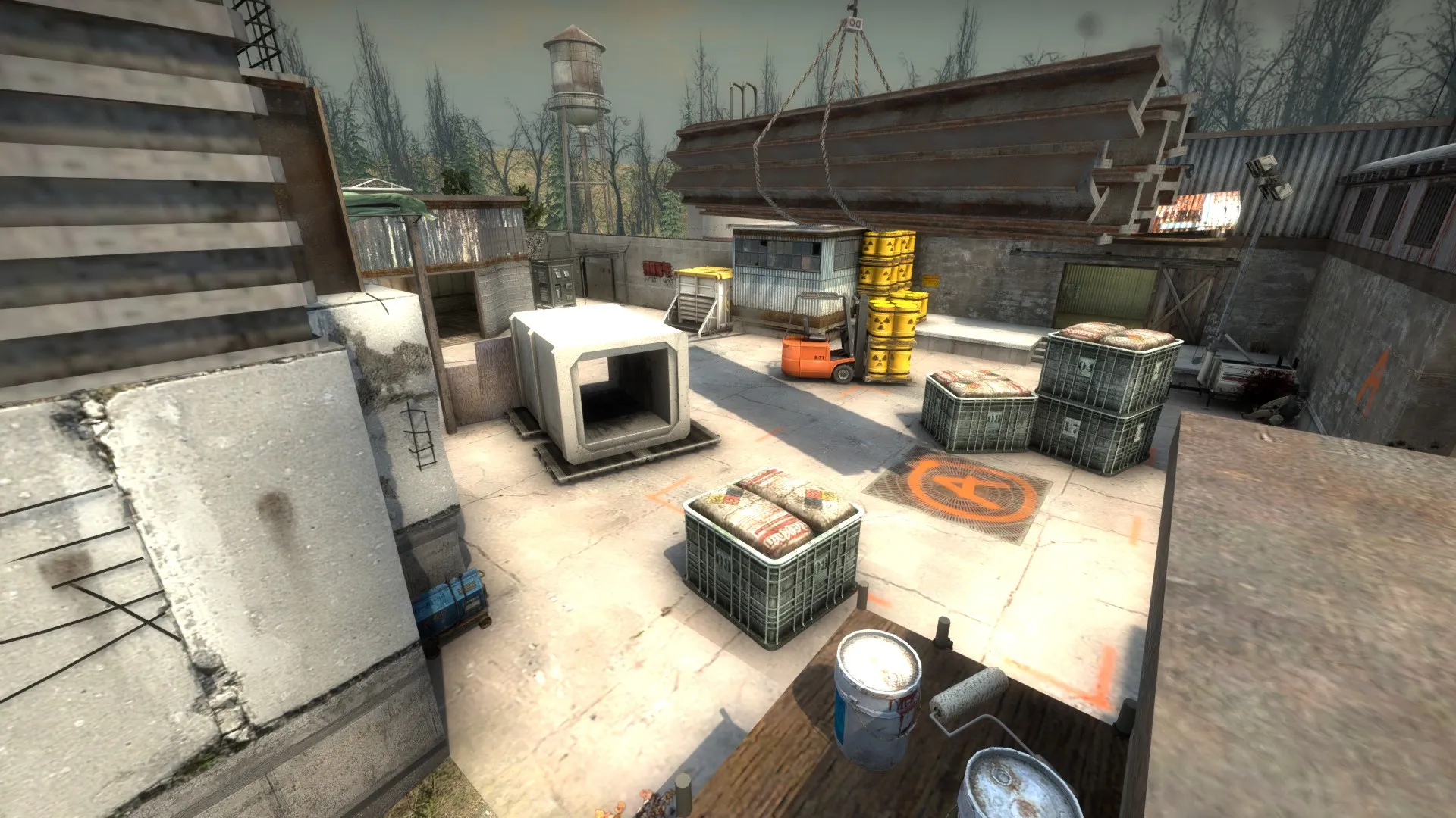
    Some new foliage detail in A Main:

    New brick texture (needs some alignment):

    New texture and foliage in skylights:

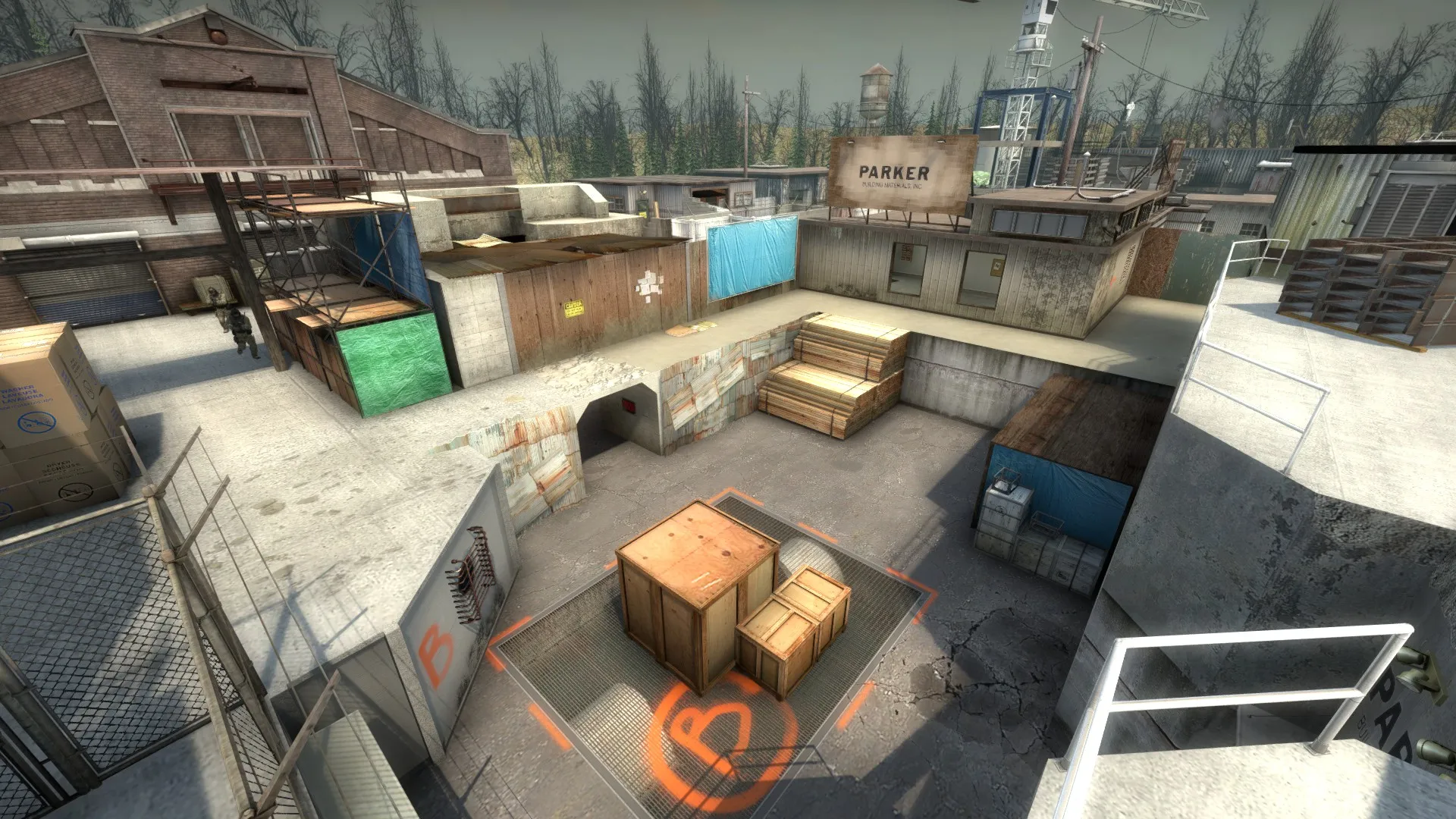
    One less window in B security hut:

  • de_stolen (nearing release, seeking feedback)

    • wylde
    • May 25, 2016 at 12:51 AM
    Quote from sevin

    2 hours ago, sevin said: Gives me a Siege vibe.

    In a bad way?

    edit: Just realized there was a siege in GO. I was thinking of like 1.3 siege which was pretty ugly. Hopefully you meant the GO version, which I'd be pretty happy with a comparison to . Maybe I can learn a thing or two from its roofs.

  • [CS:GO] Legacy

    • wylde
    • May 24, 2016 at 4:14 PM

    There are a million positive things I can say about this map, but I'll cut right to the chase.

    This map seems to have the same balance problem cbble has, that others have identified. In cbble, Ts can get to long B at the same time/earlier than CTs can get there and set up. It makes rushing long B as a T too attractive of an option. I will take a closer look at it when I get home, and I see you have updated it by pushing the CP spawn closer to B, but you run the risk of forcing CT teams to play sites by spawn position (not favorable at pro level). It might be a matter of moving T spawns a meter to the right and CT spawns a meter to the left, but this timing will be critical in terms of becoming a truly competitive map.

    Also, B site itself may ultimately suffer from the problem B site on inferno has: two ways in, two ways out, but inferno has a back route to help CTs retaking the site, same as how B site dust2 has window for a 3rd option (I am only judging this from the overview right now, been a while since I ran around the map). Maybe you could solve B site retake and CT spawn timing problems by adding a small connector somewhere from the CT side of B that functions similar to inferno's construction? If it gets CTs into site a second faster, it could balance the map.

    Anyway, fantastic work! This should be in the next operation.

  • de_shiro

    • wylde
    • May 24, 2016 at 3:53 PM

    Like Shibou said, your brush work is great for such an early layout! Scale looks good from the screenshots. The raised porches are a cool visual element, but be sure to clip them off so that guns or the bomb can't get lost under them.

    I agree that you should put it on the workshop so we can run around it!

    Are all the curved roofs done with vertex manipulation? I think I really need to experiment with that tool more.

  • de_stolen (nearing release, seeking feedback)

    • wylde
    • May 23, 2016 at 5:11 PM

    Thanks for the detailed feedback!

    - I'll work on adding a majority of clips by the end of this week.

    - I can raise the girders from crane in A site.

    - I can open up the A site skybox (and elsewhere). I think my intention here was to force players to go into the A Main building and throw smokes through skylights or windows. Perhaps this is too artificial of a restriction.

    - I think upper CT B route is supposed to be a challenge to defend from, making the CT either commit to the site or play from afar and go for entry picks. I could be wrong about that though. CT spawn will likely be moved a second or two back, which would make it the fastest way into B site/peeking B Main.

    - Very possible that I need to remove a route to A, or vent to mid, or one of the two windows overlooking B (or all of these). It will be easier for me to remove them now then add them if they weren't there. I'll keep an ear out for any one else mentioning it. I also think this is why I have stopped adding detail to look for feedback, as I don't want to spend hours making window frames and rooflines if I need to rework a passageway entirely. I know I'm pretty close to a truly competitive layout, but I'm sure it isn't perfect. Is it the mid to A route that seems unnecessary?

    - I agree with the detail comments, I need a few more displacements and decals. I've been making some of my own textures from maxtextures.com and haven't gotten around to making my own decals yet, but they should be added in pretty soon. I'll work on the widths of my walls.

    Was there an image missing in your post? I see you referred to one.

    Thanks again!

  • de_stolen (nearing release, seeking feedback)

    • wylde
    • May 23, 2016 at 8:15 AM

    Hi, guys!

    de_stolen is my first map nearing an "official" release. It is designed as a 5v5 competitive defusal map, but supports up to 16v16 players. It has a fairly generic abandoned electric/water plant setting. It borrows in its simple, compact layout from maps like cache and mirage (this is also how I came up with the name), measuring on the smaller side for a competitive map.

    There are likely some OP boost spots or weird angles I have overlooked in my eagerness to post this. The map, while under development, has been on the workshop for a month or two, but I've never publicized it before.

    Some Screenies:

    Overview: I'll work on adding icons soon, but CTs spawn very top middle, Ts spawn very bottom middle-left.

    Some highlights:

    Workshop link: https://steamcommunity.com/sharedfiles/fi…s/?id=549957925

    This map has taken about 3 months (on and off) of my mapping time so far. I have learned a lot while making it, though it is still rough around the edges. CT Spawn is still pretty boring and needs a lot of aesthetic work. There are no sounds yet, and lighting is very much a first pass.

    I am seeking as much feedback as possible as I near release, particularly regarding any major game play issues or aesthetic concerns with what is currently in the map. I have two new maps in the pipeline with more coherent themes in mind, but I am wanting to complete this one first.

    I'll be scheduling a 5v5 play test either here or on r/csmapmakers very soon!

    Thank you for your time!

  • [WIP] de_pharaoh

    • wylde
    • May 18, 2016 at 5:15 AM

    This map is looking phenomenal. I'd love to playtest it 5v5 to see how mid plays out.

    I feel like something is a little too cartoony with the color palette in the gift shop, but I can't quite put my finger on it. Maybe the light tan near the top is too light, and the pastel bottles are too bright? Really hard to find things to complain about though. Love keeping up with the blog posts as well!

  • [CS:GO] DE_LITE

    • wylde
    • May 18, 2016 at 4:53 AM

    This is looking really good, but the latest version doesn't have an overview. Without one I couldn't really get a good feel of the map, especially as this one seems so twisty. The detailing is on point though.

  • Glass and visibility

    • wylde
    • March 13, 2016 at 6:42 AM

    I think the problem here is two fold: one, the size of this glass should probably be kept small, like a bulletproof window next to a door that can't be opened, and smoking it could be a way to block the vision. The second problem is that players need to understand and believe that the glass is unbreakable. A large glass floor might be hard to work into the level for both these reasons, but this is an interesting idea.

  • [WiP][CSGO] de_narco

    • wylde
    • March 8, 2016 at 4:12 PM

    From a CS game theory stand point, you screenshots have many areas where a person can stand and be seen from 5-7 angles. Most spots in competitive CS maps are open to 2-3 at most spots, and the smarter players have a good idea of which 1 or 2 spots the opponent will be in. Think about removing a couple paths of cubby holes to streamline gameplay. That room with 10 pillars = 10 hiding spots, which is bad for CS. Also like someone said, vertical gameplay can only work in certain contexts in CS. Cbble drop room is a good use, nuke rafter maybe not so much. The bridge you have is too open of a vertical platform to enable balanced gameplay (the guy on top has a huge advantage).

    Also your steps look kinda big. Are they 16 unit? I'd recommend using 8-12 unit.

    Otherwise visually it is looking quite good. I think if this is truly a research project you will learn from playtesting that your layout is too complicated/open to too many angles, so I'm just trying to save you some time in the long run. :)

  • de_contract

    • wylde
    • March 8, 2016 at 3:56 PM

    What an update! I just hopped in here to check the progress of this since those sawmill screenies first gave me a map rager. I was looking through the early posts of this and wanted to say that it looked so aesthetically promising but that layout was way too complicated. But this updated overview looks much more like a balanced, fun competitive map! These new nuke assets are gonna make for some great maps.

    WILL THERE BE A GIANT SAWBLADE SOMEWHERE?

  • de_nuke - A revised optimization system

    • wylde
    • February 27, 2016 at 12:04 AM

    Doesn't running a compile with fast VIS take Hints out of the equation?

  • [Crysis] Cold Fusion

    • wylde
    • January 7, 2016 at 11:12 PM

    I don't even play Crysis, but you obviously put a lot of effort into this and did a great job judging from the screenshots and trailer. Your presentation is on point. Cave area looks especially cool. Congrats on release!

  • de_aqueduct new level in need of feedback BAD!

    • wylde
    • December 28, 2015 at 7:09 PM

    Wow man, that last graphics update looks much improved! The huge aqueduct being balanced atop those plaster walls seems to irk me a bit, but the color palate is much better and consistent, and it doesn't look like dust2 any more. The red bricks might be out of place as well. I like the plaster more. Keep it going!

  • de_sawmill

    • wylde
    • December 17, 2015 at 5:56 PM

    This map is shaping up quite nicely! From your B shots, I think it needs a bit more light (especially in those near-black corners) and the coffee table could be removed. I think props that just get in the way of movement are always a bad gameplay choice (and people will crucify you for "clutter" over it). Maybe one of the boarded up windows could be partially opened to let some light/a view in?

  • [WIP] de_meat [Looking for gameplay feedback]

    • wylde
    • September 24, 2015 at 6:08 PM
    Quote from Tyker

    Thanks! I'll see if I can include those models in the next version, and see how they look in-game!

    Currently on the workshop is version b7, and I'm working on b8. b7 is fully optimized, and the map now runs at a minimum of 145 FPS in all areas on my machine! http://steamcommunity.com/sharedfiles/fi…s/?id=481597483
    [Blocked Image: http://i.imgur.com/SS3JQGH.jpg]

    The red floor stripe here looks very video-gamey. I think it could be darker, and maybe some trim would make it look better. The white and grey brick texture is beautiful and great for CS GO maps. I like the metal thing in the middle acting as a guide to new players.

    [Blocked Image: http://i.imgur.com/DcxlF1z.jpg]

    Beautiful little scene here. Good job.

    [Blocked Image: http://i.imgur.com/ve3LsDn.jpg]

    Same here, looks good. Maybe that middle roof tile is a little too light?

    [Blocked Image: http://i.imgur.com/YINZFgd.jpg]

    Looks nice and clean.

    [Blocked Image: http://i.imgur.com/pHNQ3xv.jpg]

    The blue has the same issue as the red, just a little too bright I think. The floor could be grey here and people would call it blue halls already. Dust particles look nice as long as they don't impact gameplay.

    [Blocked Image: http://i.imgur.com/t7J5BQf.jpg]

    A little dark?[Blocked Image: http://i.imgur.com/QUPIxVK.jpg]

    A little bland and maybe prop heavy?

    [Blocked Image: http://i.imgur.com/b05909v.jpg]

    This looks pretty good to me.


    These screenshots are from areas that I feel a bit insecure about on whether they look nice. What do you think?

    Display More
  • [WIP] de_poula

    • wylde
    • July 29, 2015 at 5:15 PM

    Your new screenshots look much better! I haven't run around the level yet, but you've really improved on the theme, brushwork, and detailing. The one thing that really bothers me from the screenshots is the cardboard box on that small ramp in B house. Props on the floor in people's way just reminds me of CS Source. I'll try to add more feedback when I can play it though. Keep it up!

Discord

The Mapcore Discord is our lively IRC channel of the 2000s reborn. Chat about level design, gaming, and more.

Latest Posts

  1. Building a Huge Library of Free Images for Everyone

    Eric Matyas
    August 10, 2026 at 1:52 PM
  2. Any of the old guard still around? D:

    Chunks
    August 7, 2026 at 11:08 PM
  3. CS:S | cs_manoir | Map creation process by D'artagnan

    Thrik
    August 3, 2026 at 10:42 AM
  4. Custom Gamemodes Contest

    Angel
    July 20, 2026 at 11:46 AM
  5. FAQ

    Angel
    July 20, 2026 at 10:14 AM
  6. Tangerine

    Harry Poster
    July 18, 2026 at 11:10 AM
  7. About our archived forums

    Thrik
    June 30, 2026 at 2:12 PM
  8. Mapcore Discord

    mason_fan123
    June 24, 2026 at 8:52 PM
  9. [CS2] Valley

    Serialmapper
    June 22, 2026 at 11:56 AM
  10. Free Music / SFX Resource - Over 2500 Tracks

    Eric Matyas
    June 18, 2026 at 12:32 PM
  1. Privacy Policy
  2. Contact
Powered by WoltLab Suite™