1. Forums
  2. Discord
  3. About Mapcore
  4. Patreon Supporters
  • Login
  • Register
  • Search
Everywhere
  • Everywhere
  • Articles
  • Pages
  • Forum
  • More Options
  1. Mapcore
  2. Members
  3. Baggle

Posts by Baggle

  • help with shadows

    • Baggle
    • May 14, 2016 at 9:49 PM
    Quote from JSadones

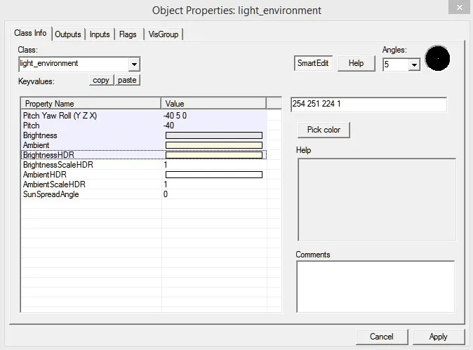
    3 minutes ago, JSadones said: Don't know if it's a bug or anything, but stick to the default values of the HDR ones. NEVER CHANGE them or you'll get up with those funky shadows.

    So just change your BrightnessHDR back to -1 -1 -1 1

    yes, this has fixed it, thank you very much :)

  • help with shadows

    • Baggle
    • May 14, 2016 at 9:39 PM
    Quote from JSadones

    18 minutes ago, JSadones said: Did you edit the values of HDR in your light_environment?

    yeah, i changed the a few of the values, is this a bug?


  • help with shadows

    • Baggle
    • May 14, 2016 at 7:35 PM

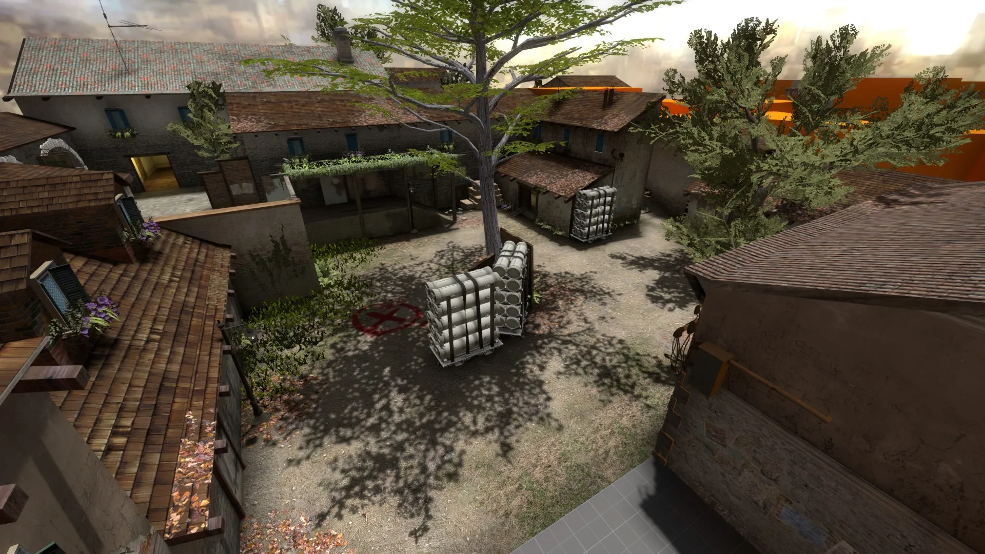
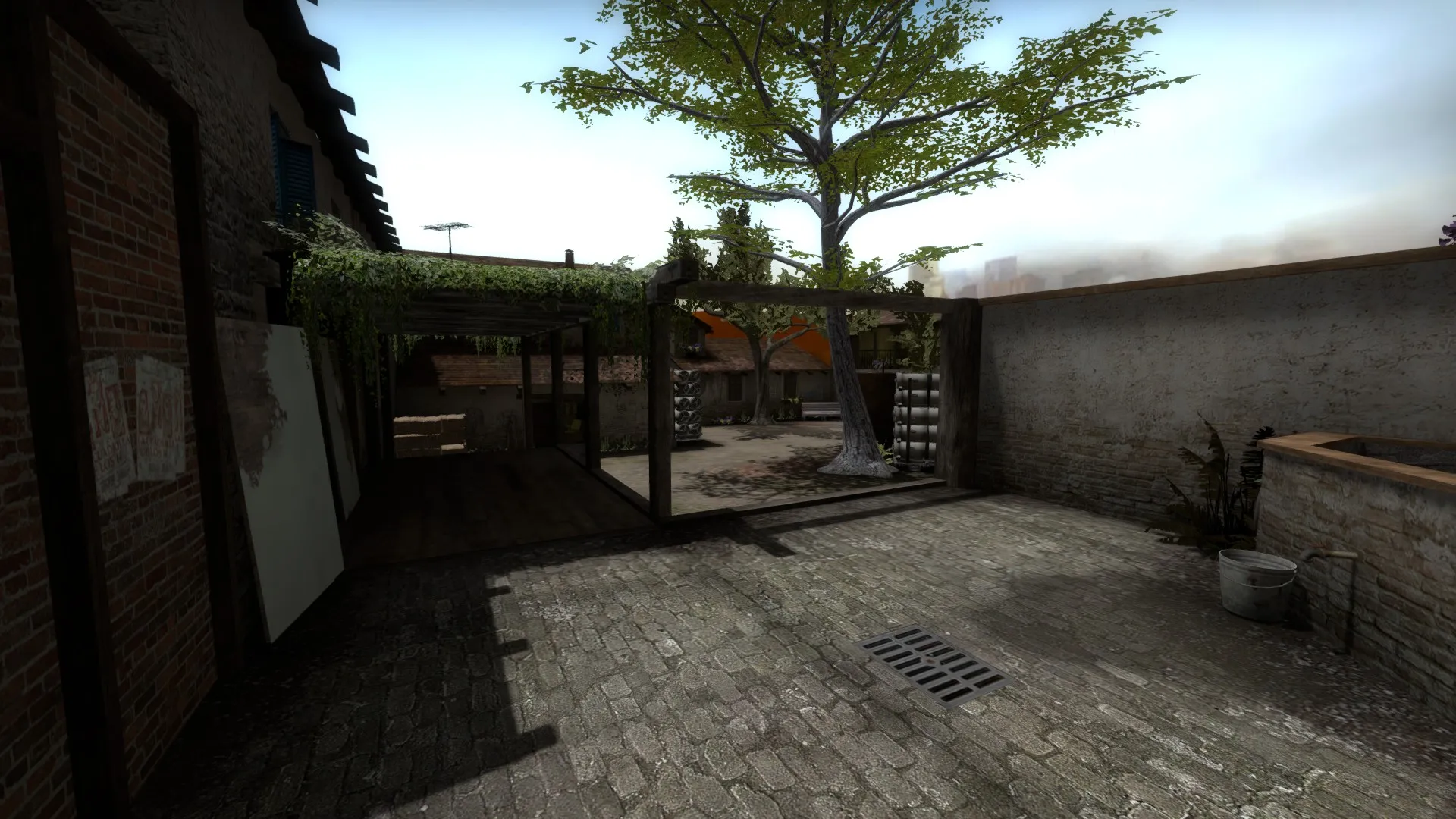
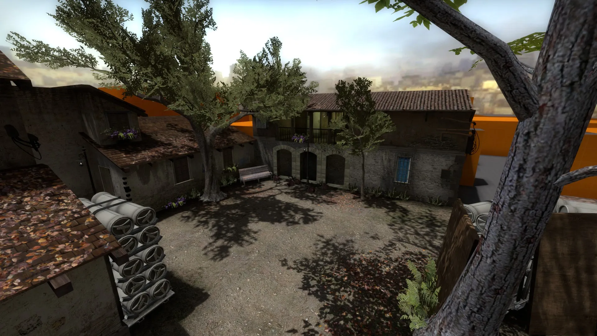
    when i compile my map the shadows don't look right and i don't know how to fix it :/ i have tried a full compile with and without HDR and LDR and it still persists. i have also tried with and without adding cube maps, thats why the screenshots look a bit strange.
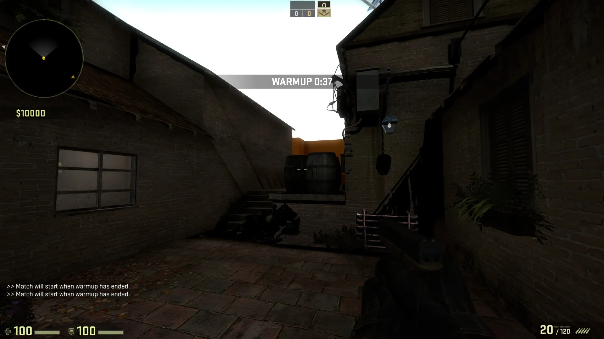
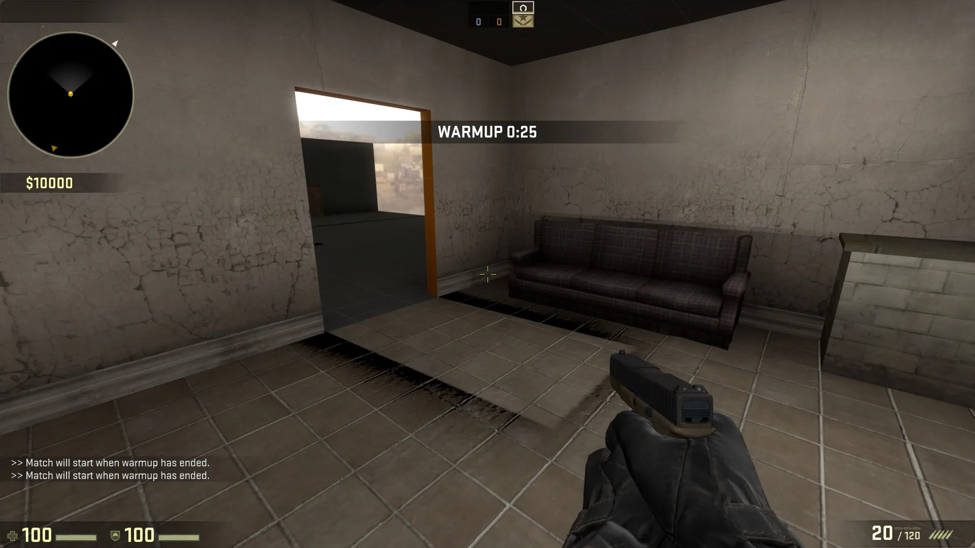
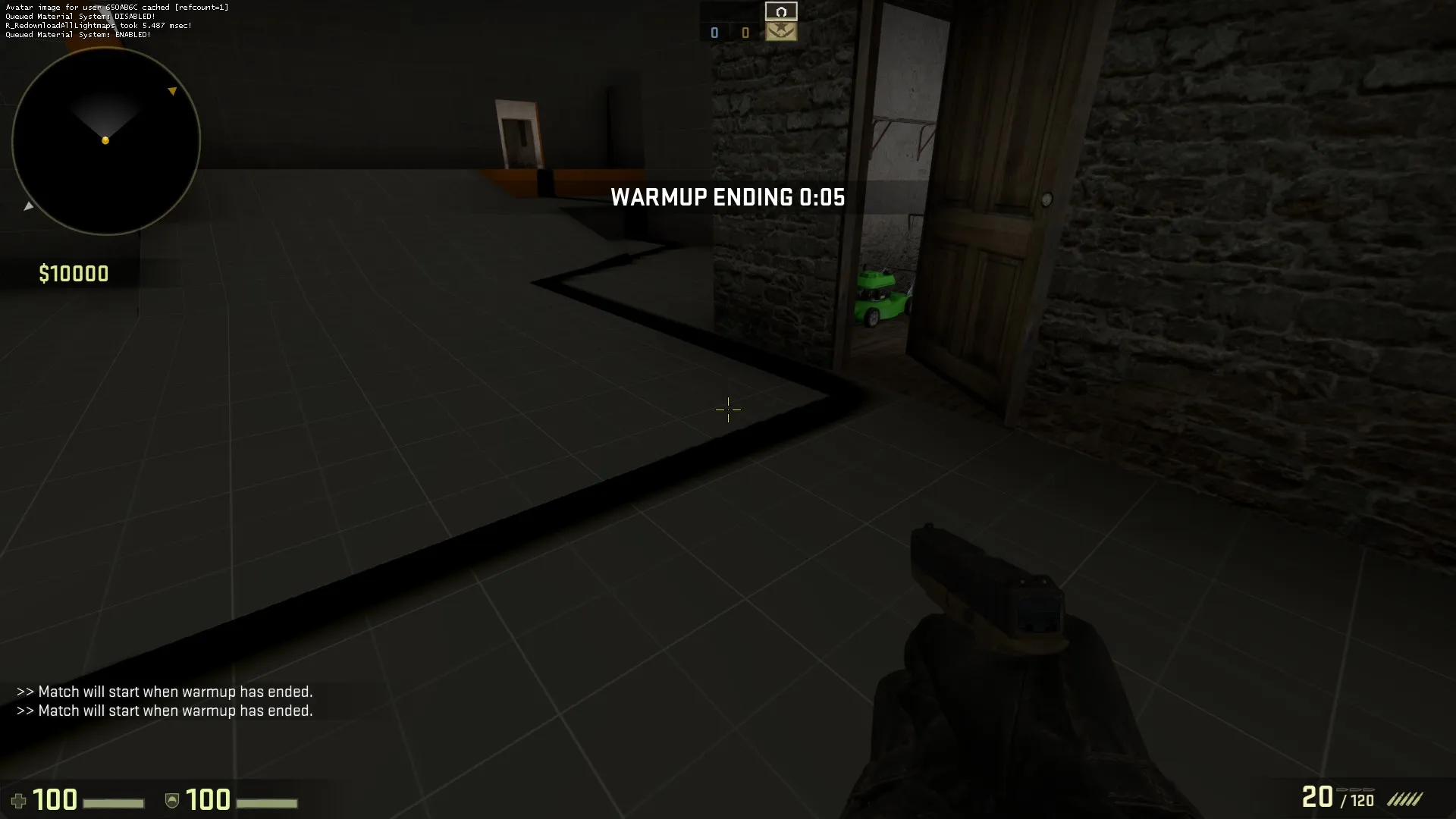
    has this happened to anyone before and have they managed to find a solution?

    -sorry if i'm posting this in the wrong place, i haven't used this website in a long time

  • [CS:GO] de_flashbeng

    • Baggle
    • June 4, 2015 at 1:33 PM

    Quite the setting i like a more comical setting to a boring serious one , with name like that you should make sure there are lots of windows and angled surface to bounce interesting pop-flashes off.


  • Feedback please

    • Baggle
    • May 30, 2015 at 2:45 PM

    I made a few changes to the map, mostly changing the lighting and making a few areas more readable. i changed the angle of the light and brightened up a few dark areas. as far as verticality goes, i plan to make changes to the terrorist spawn.

    its been uploaded to the workshop now if anyone wants to have a run around. i am aware that it is too dark, but like dux said i am more focused on filling in the rest of the map before really having a sit down and getting the lighting sorted.

    http://steamcommunity.com/sharedfiles/fi…earchtext=keith

    ... and also i need to think of a name

  • [CS:GO] de_orion

    • Baggle
    • May 30, 2015 at 2:38 PM

    I really like the aesthetics of this map, like, a lot. i look forward to see how this turns out

  • [CSGO] De_Marketplace help with design

    • Baggle
    • May 30, 2015 at 2:34 PM

    I find it helpful when trying to get the looks of the map right, watch movies or play games set in a similar theme to give you ideas. as far as the layout you should show us a radar view so we can see how it is currently set out.

  • Feedback please

    • Baggle
    • May 29, 2015 at 4:45 PM
    Quote from dux

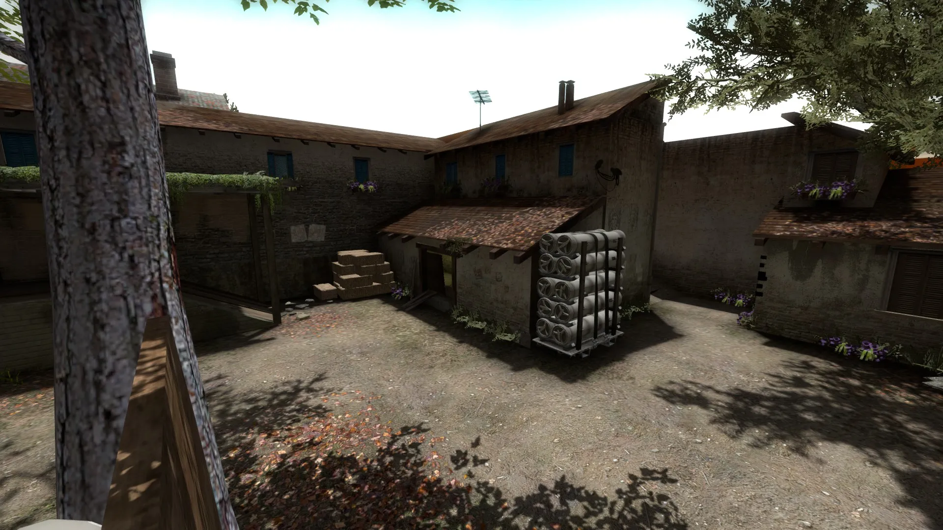
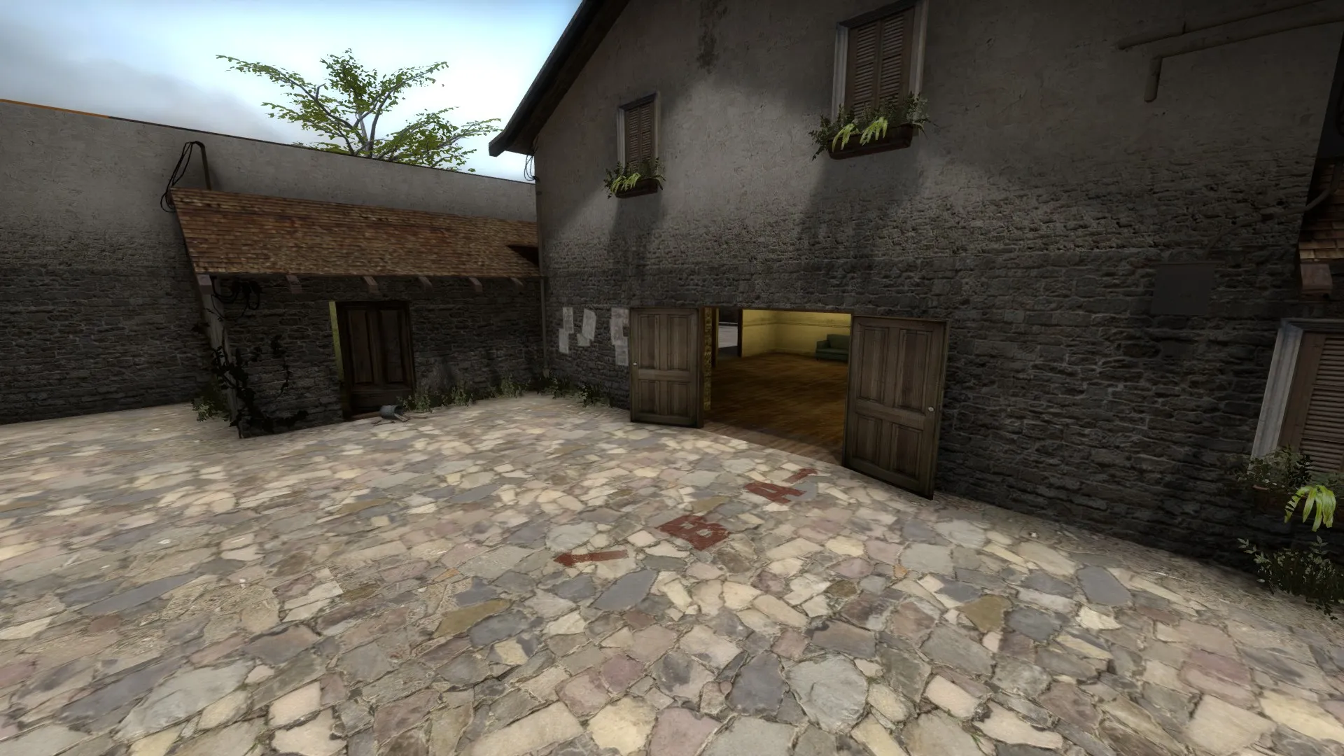
    First thing I thought is that the shadows are too strong as I missed the B bomsite tag at first glance because of the tree casting it's shadow on it. The lighting is rather intense and sterile as well. I'd personally remove the tree over the B tag or do something to make it more clear because of the strong shadow casting over it. remember readability is very very important for a CS map and most CS:GO maps fail at this miserably in my opinion. You've got a good foundation to work off of though, good stuff!

    thanks for the quick reply! but yea, at times it can be hard to spot a player model straight away in certain areas, especially on the raised walkway at the back, i put a few white boards against the wall to help, but more still needs to be done throughout the site. as for the shadows, do you think that changing the angle of the light will help, e.g have the central tree's shadow cast onto a roof or some where else?

  • Feedback please

    • Baggle
    • May 29, 2015 at 4:30 PM

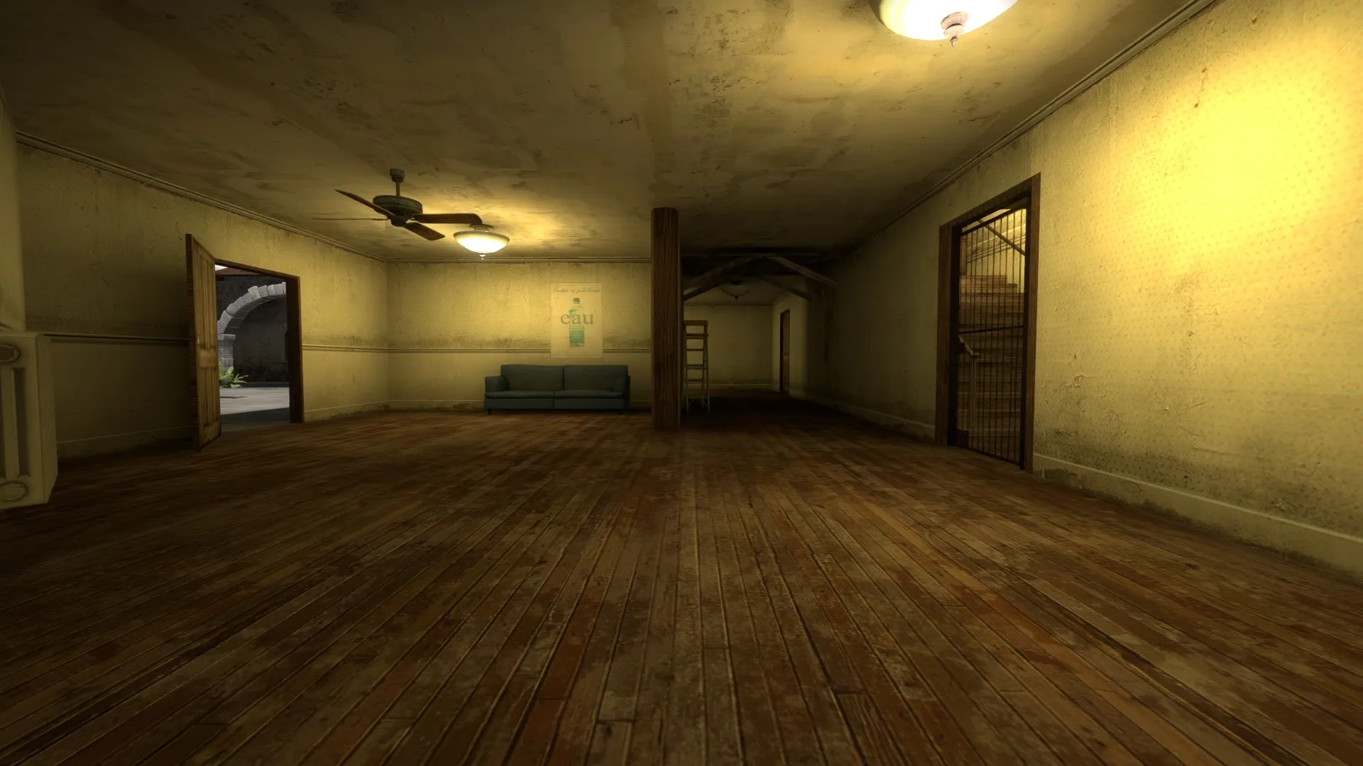
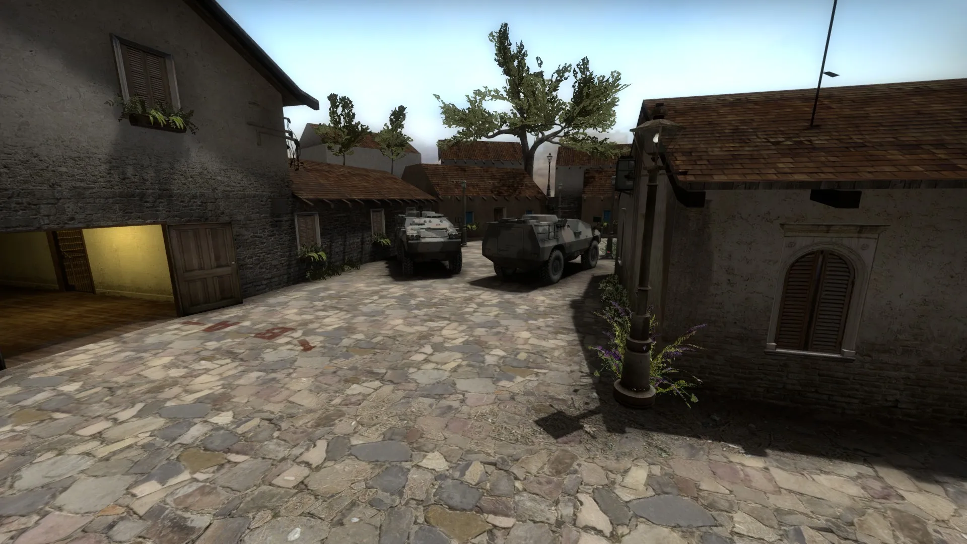
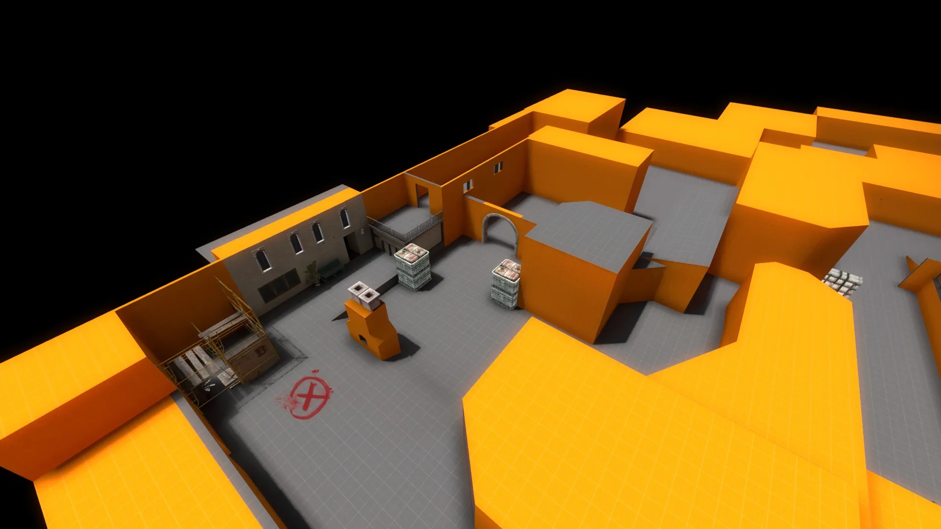
    so this is my first attempt at a "real" map, others than ones to mess around in with my friends. i have been tweaking the layout of the A bombsite for a few weeks now and have it how I like it now, so i started adding some detail.

    I know that I have gone with the generic Inferno theme, but personally i like a warm cosy map rather than cold clean one (i know its an unpopular opinion :P). i am looking for feed back on the aesthetics of the map, please be picky and tell me anything that you think that's wrong, no matter how small or large it is.

    BONUS , I have also included a screen of the current B bombsite layout, it atill needs a few tweaks to play better, bu if you see anything that stands out a s bad for game-play please let me know.

    Thanks :)

Discord

The Mapcore Discord is our lively IRC channel of the 2000s reborn. Chat about level design, gaming, and more.

Latest Posts

  1. Tangerine

    Harry Poster
    July 18, 2026 at 11:10 AM
  2. Any of the old guard still around? D:

    Warby
    July 12, 2026 at 8:23 PM
  3. About our archived forums

    Thrik
    June 30, 2026 at 2:12 PM
  4. Mapcore Discord

    mason_fan123
    June 24, 2026 at 8:52 PM
  5. [CS2] Valley

    Serialmapper
    June 22, 2026 at 11:56 AM
  6. Free Music / SFX Resource - Over 2500 Tracks

    Eric Matyas
    June 18, 2026 at 12:32 PM
  7. Pango [WIP]

    Elowen
    June 11, 2026 at 10:13 AM
  8. [CS2] Dvina

    Jeremy Rivera
    June 11, 2026 at 10:03 AM
  9. Bridges 2.0 by NEXSIDE, MAP SHOWCASE. ( Steam Workshop )

    MrTrane18
    June 1, 2026 at 7:46 PM
  10. Classic Maps Reborn For CS2

    SillySpaceCat
    May 31, 2026 at 10:33 PM
  1. Privacy Policy
  2. Contact
Powered by WoltLab Suite™