1. Forums
  2. Discord
  3. About Mapcore
  4. Patreon Supporters
  • Login
  • Register
  • Search
This Thread
  • Everywhere
  • This Thread
  • This Forum
  • Articles
  • Pages
  • Forum
  • More Options
  1. Mapcore
  2. Discussions
  3. Level Design

Feedback please

  • Baggle
  • May 29, 2015 at 4:30 PM
  • Baggle
    • May 29, 2015 at 4:30 PM
    • #1

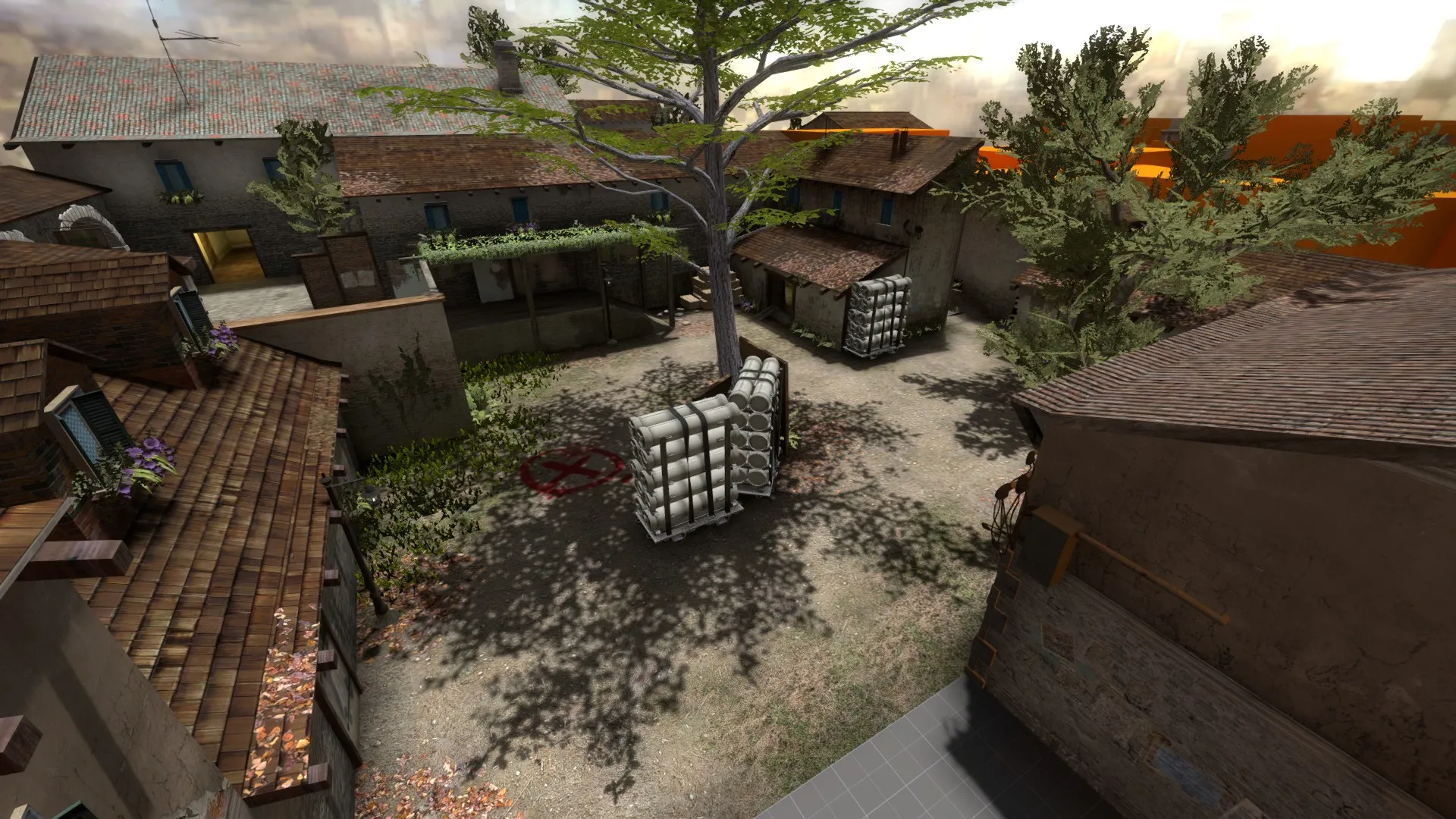
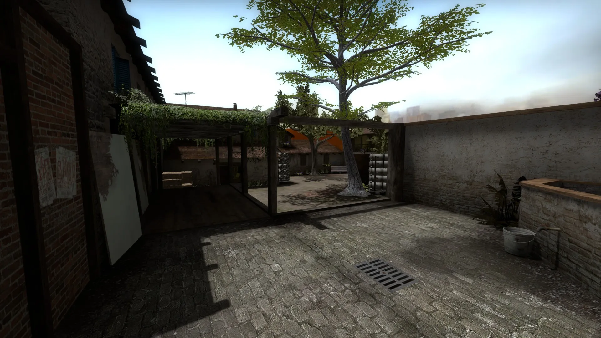
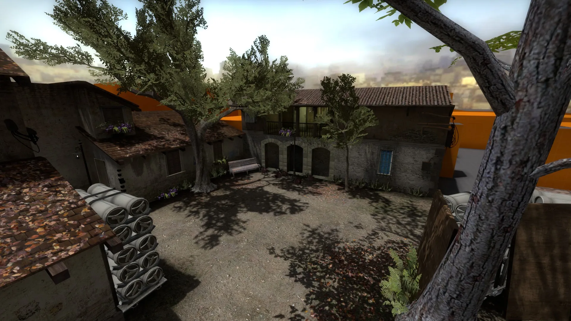
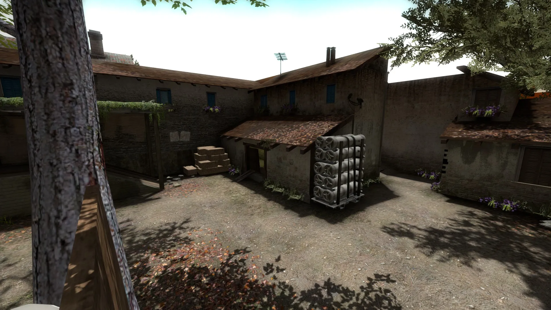
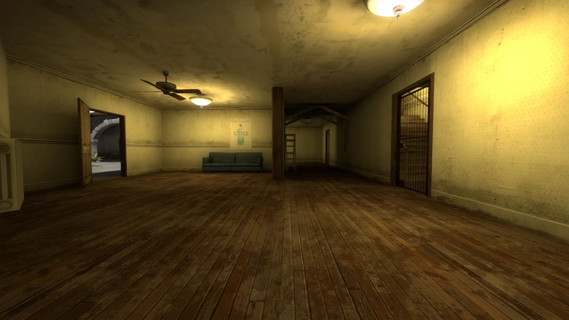
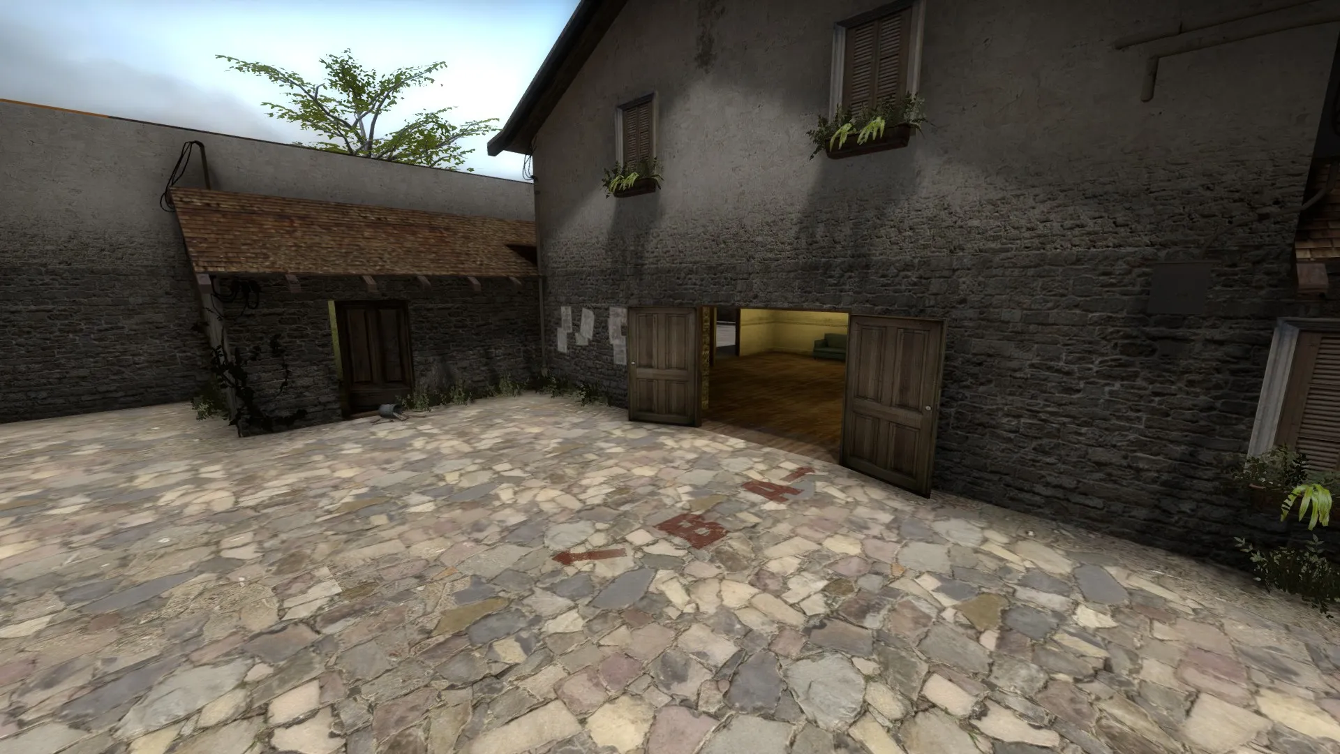
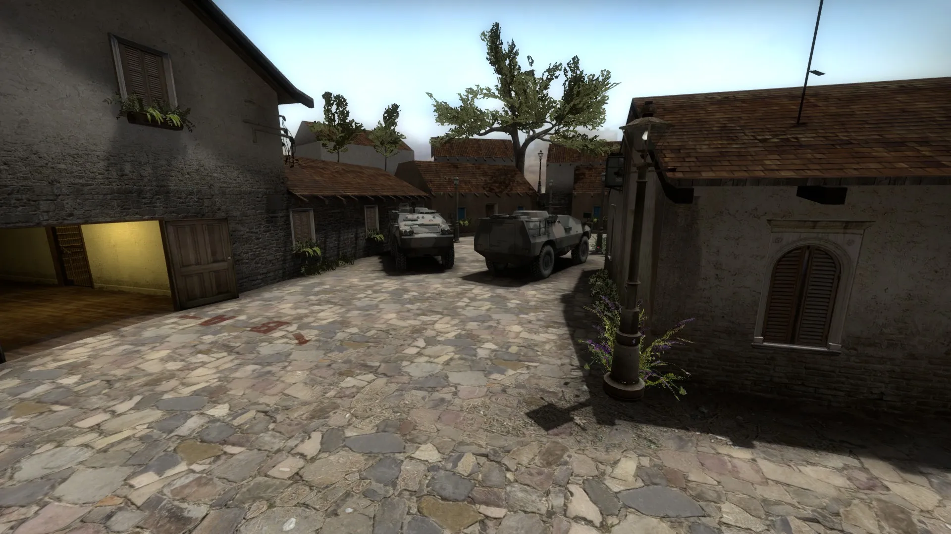
    so this is my first attempt at a "real" map, others than ones to mess around in with my friends. i have been tweaking the layout of the A bombsite for a few weeks now and have it how I like it now, so i started adding some detail.

    I know that I have gone with the generic Inferno theme, but personally i like a warm cosy map rather than cold clean one (i know its an unpopular opinion :P). i am looking for feed back on the aesthetics of the map, please be picky and tell me anything that you think that's wrong, no matter how small or large it is.

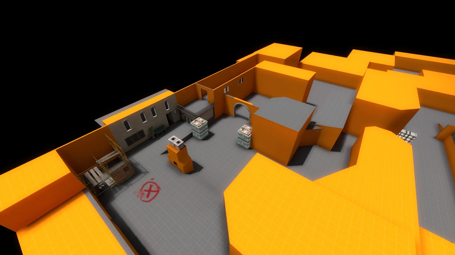
    BONUS , I have also included a screen of the current B bombsite layout, it atill needs a few tweaks to play better, bu if you see anything that stands out a s bad for game-play please let me know.

    Thanks :)

  • dux
    • May 29, 2015 at 4:36 PM
    • #2

    First thing I thought is that the shadows are too strong as I missed the B bomsite tag at first glance because of the tree casting it's shadow on it. The lighting is rather intense and sterile as well. I'd personally remove the tree over the B tag or do something to make it more clear because of the strong shadow casting over it. remember readability is very very important for a CS map and most CS:GO maps fail at this miserably in my opinion. You've got a good foundation to work off of though, good stuff!

  • Baggle
    • May 29, 2015 at 4:45 PM
    • #3
    Quote from dux

    First thing I thought is that the shadows are too strong as I missed the B bomsite tag at first glance because of the tree casting it's shadow on it. The lighting is rather intense and sterile as well. I'd personally remove the tree over the B tag or do something to make it more clear because of the strong shadow casting over it. remember readability is very very important for a CS map and most CS:GO maps fail at this miserably in my opinion. You've got a good foundation to work off of though, good stuff!

    thanks for the quick reply! but yea, at times it can be hard to spot a player model straight away in certain areas, especially on the raised walkway at the back, i put a few white boards against the wall to help, but more still needs to be done throughout the site. as for the shadows, do you think that changing the angle of the light will help, e.g have the central tree's shadow cast onto a roof or some where else?

  • dux
    • May 29, 2015 at 4:54 PM
    • #4

    I'd definitely try playing around with the lighting more. Usually having it casting straight down onto the ground with such an intense brightness that the lighting currently is isn't especially advisable. Play around, lots of light values available to try and tweak. I would be more focused on filling the rest of the map out first however before you start thinking about serious lighting though.

  • laminutederire
    • May 29, 2015 at 7:27 PM
    • #5

    Where it looks good, it also feels too noisy and hard to read as Dux said. However, I do think that I need to play it to be able to say more about it, screenshots only are often tricky to give an accurate judgement :)

  • blackdog
    • May 30, 2015 at 11:23 AM
    • #6

    What strikes me from the screens is that the map seems to sit on a completely flat surface. You can easily break up the floor/grounds with a few sets of steps here and there, raising some buildings up or down a bit (I don't mean taller buildings, but elevate or lower their base).

    Also create some clear rout using different floor textures, the open grounds are very alike, there's no path to guide the players.

    And adopt more explicable title

  • Baggle
    • May 30, 2015 at 2:45 PM
    • #7

    I made a few changes to the map, mostly changing the lighting and making a few areas more readable. i changed the angle of the light and brightened up a few dark areas. as far as verticality goes, i plan to make changes to the terrorist spawn.

    its been uploaded to the workshop now if anyone wants to have a run around. i am aware that it is too dark, but like dux said i am more focused on filling in the rest of the map before really having a sit down and getting the lighting sorted.

    http://steamcommunity.com/sharedfiles/fi…earchtext=keith

    ... and also i need to think of a name

Participate now!

Don’t have an account yet? Register yourself now and be a part of our community!

Register Yourself Login
Discord

The Mapcore Discord is our lively IRC channel of the 2000s reborn. Chat about level design, gaming, and more.

Latest Posts

  1. Tangerine

    Harry Poster
    July 18, 2026 at 11:10 AM
  2. Any of the old guard still around? D:

    Warby
    July 12, 2026 at 8:23 PM
  3. About our archived forums

    Thrik
    June 30, 2026 at 2:12 PM
  4. Mapcore Discord

    mason_fan123
    June 24, 2026 at 8:52 PM
  5. [CS2] Valley

    Serialmapper
    June 22, 2026 at 11:56 AM
  6. Free Music / SFX Resource - Over 2500 Tracks

    Eric Matyas
    June 18, 2026 at 12:32 PM
  7. Pango [WIP]

    Elowen
    June 11, 2026 at 10:13 AM
  8. [CS2] Dvina

    Jeremy Rivera
    June 11, 2026 at 10:03 AM
  9. Bridges 2.0 by NEXSIDE, MAP SHOWCASE. ( Steam Workshop )

    MrTrane18
    June 1, 2026 at 7:46 PM
  10. Classic Maps Reborn For CS2

    SillySpaceCat
    May 31, 2026 at 10:33 PM
  1. Privacy Policy
  2. Contact
Powered by WoltLab Suite™