 Quote from jd40
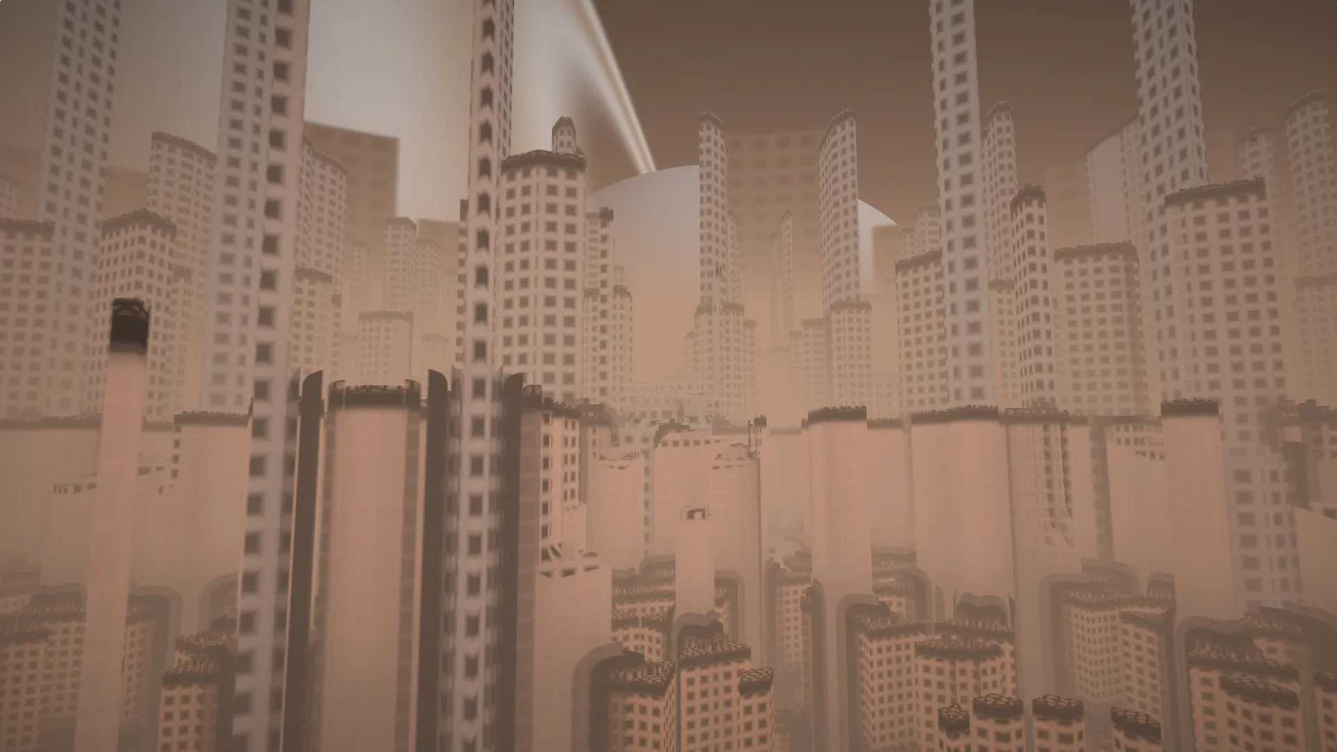
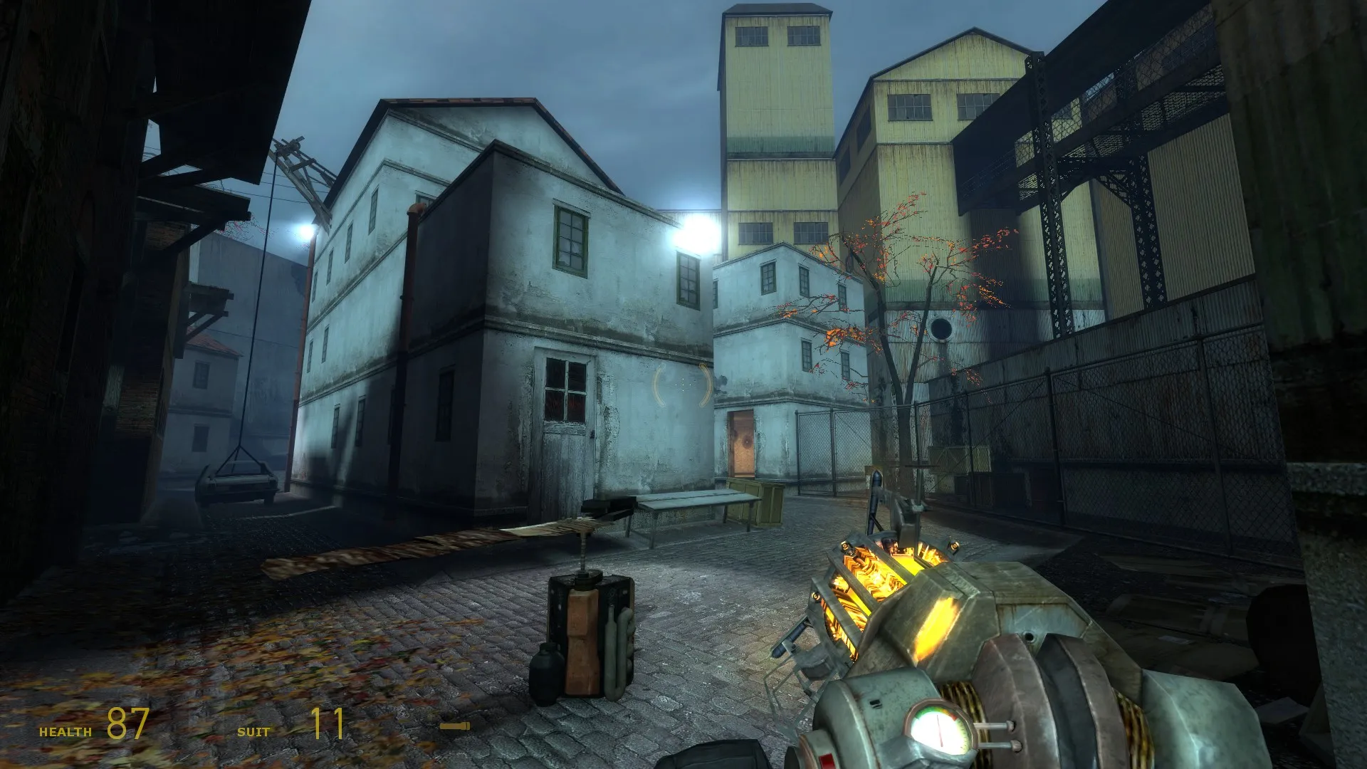
On 13/03/2017 at 1:03 PM, jd40 said: So the map is now fully detailed (workshop has been updated). I've got some problems getting these areas to look right anyone got any tips?
I think if you removed the lighting in the upper area, and increased the lights in the lower area (as well as use a lighter floor texture, these are so 2004) this would improve the look a lot. Some spots would be great. I haven't played the map yet so I don't know if the upper area is walkable or not. Usually area that aren't walkable should have less contrast and should be less lit. Here it's the same color/lighting everywhere so nothing really catch the eye. Just my 2 cents. The second screen is fine but some more rocks and grass wouldn't hurt I guess. EDIT: also add some leaves under the tree