



Really awesome, beautiful work. The way the up light hits the tree looks 😘
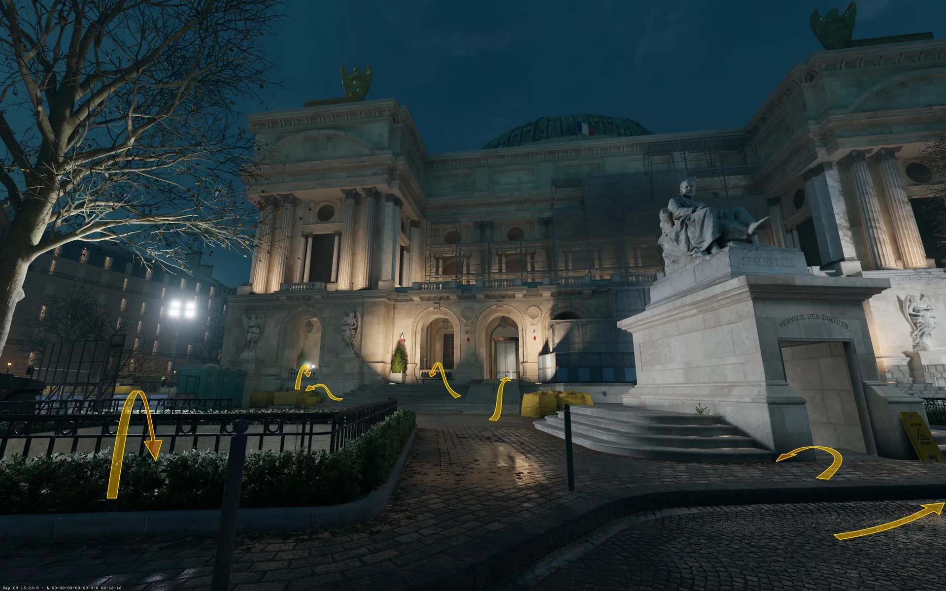
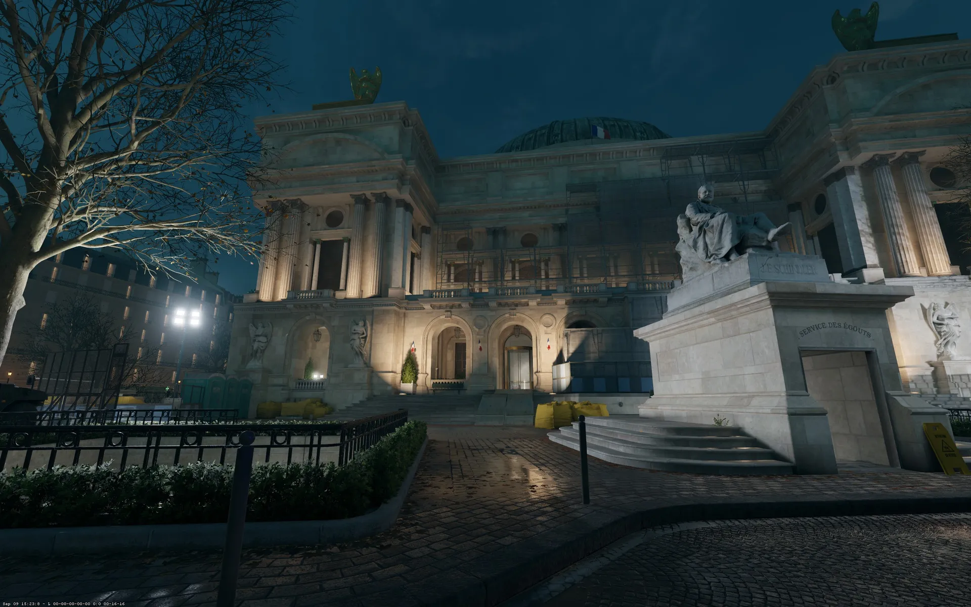
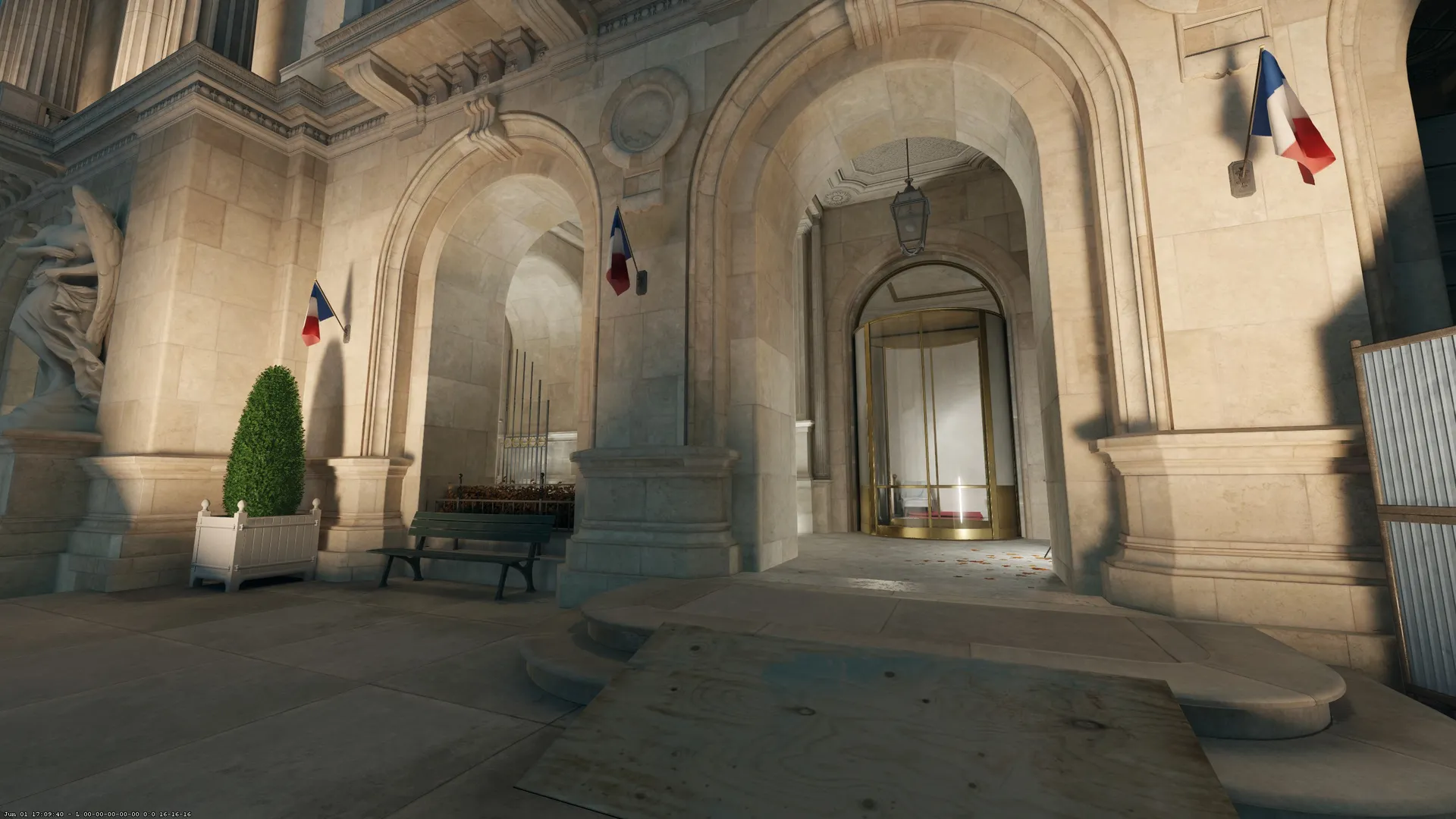
One thing regarding lighting that could be cool is to indicate a bit more clearly where the main route is, and where the secondary route is (if there's such a hierarchy). Maybe also use lighting to indicate a bit more where the entrances are. At first glance I'm not sure where to go here (other than the stairs going down of course).
Just some small feedback, the map looks really sick, love how readable it is!
I agree lighting still needs some tweaking here, and ground material is still too dark, we'll fix that.
This place is a challenge to make it clear where the player can go and avoid players camping in corners, we've tried to use more lights on entrances but it can sometimes make the image more noisy and in the end harder to read. Also, we obviously want to make the facade of the Opera stand out, so it has to be highlighted as well.
The way I'm designing the map is by following the rule "if it looks like you could go there, you can", so all these are paths. But you're right, the one in the middle is the main path, the ramp could clearly benefit from more highlight! Thanks !

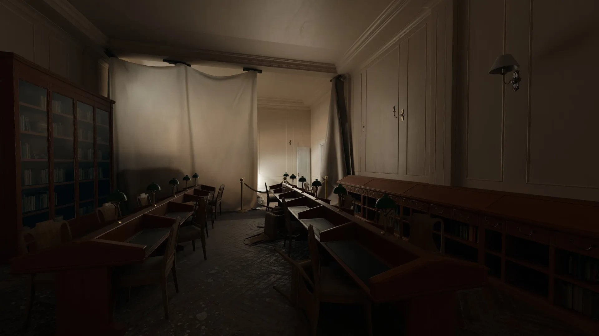
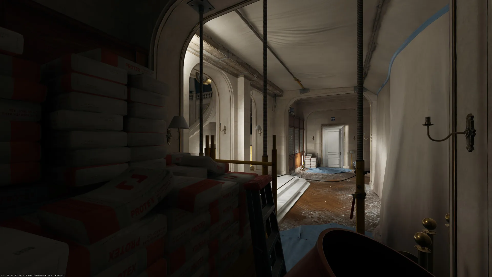
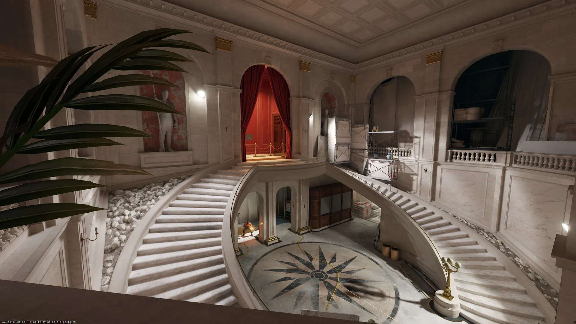
 And the map looks cool, nice lighting and colors, I will check it out. GG !


 ever thought about?