

I updated my portfolio, no particular reason just got bored of my old one and everyone had updated theirs ?

mr. FMPONE
-
-
great website overall, would be nice to get more insights into some of the projects but I understand the need to keep it concise. this however:
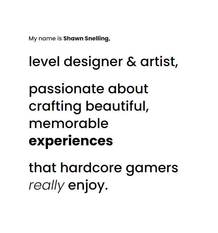
has vibes of:[Blocked Image: https://s2.r29static.com/bin/entry/ea9/960xbm,70/2158669/image.jpg]
-
I’ll look at it later, but from the screenshot above I would say to change the italic to bold to reduce visual noise. Rather have an underline if you feel really strong about it ?
-
Live
Laugh
Map
great feedback so far. I will add more insights to the upcoming work I post, and I’d like to add a blog section also.
-
Drop the side scrolling and just keep the images in a vertical order with the same size. And remove all the fluff text and statements, I scrolled right past it and recruiters will too. Just let your work do all the talking
-
 Quote from Pampers
On 11/28/2021 at 4:54 AM, Pampers said: Drop the side scrolling and just keep the images in a vertical order with the same size. And remove all the fluff text and statements, I scrolled right past it and recruiters will too. Just let your work do all the talking
I agree with Pampers. Its a bit hard to read. An overview page could help with that!
-
Damn that's a pretty good portfolio looking, you have fmpone

Participate now!
Don’t have an account yet? Register yourself now and be a part of our community!