

We have a hidden workshop entry, so we're just waiting on the rc1 to finish compiling now. 

We have a hidden workshop entry, so we're just waiting on the rc1 to finish compiling now.
Just took a look around the map, I really love the uniqueness of its visual style. Can't wait to see this map in the finals!
Updated the first post of the thread. The map has been released: https://steamcommunity.com/sharedfiles/fi…/?id=1980781825
We'll continue polishing the map, so stay tuned for more updates. ✌️
the map is awesome but all the roofs are clipped wrong xD
first there are a couple of zones underneath the map that dont kill you
Spoiler
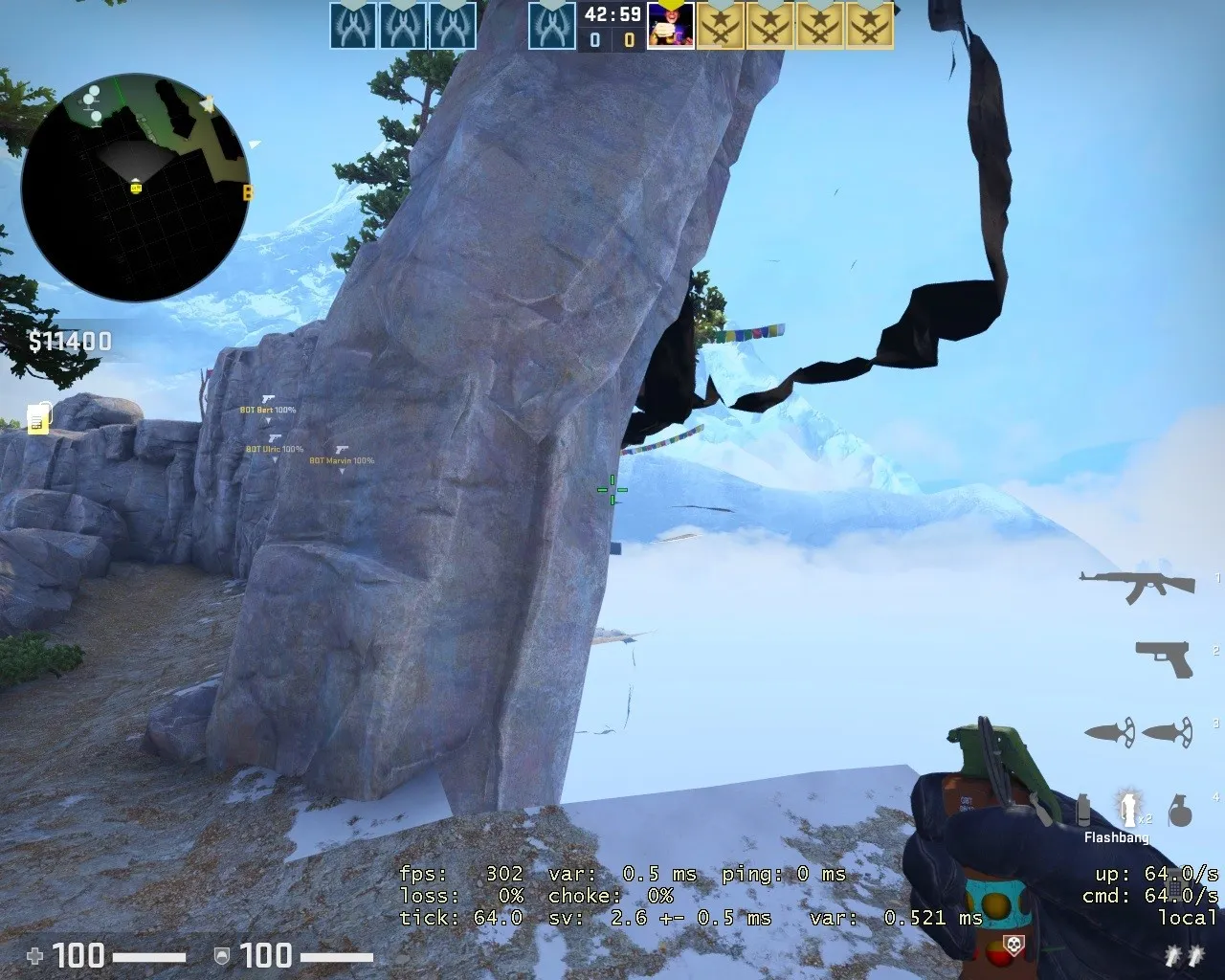
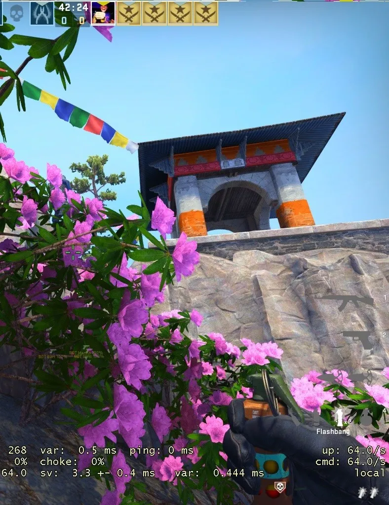
here are some of the boost spots, there alot more but i cant upload them all
Spoiler
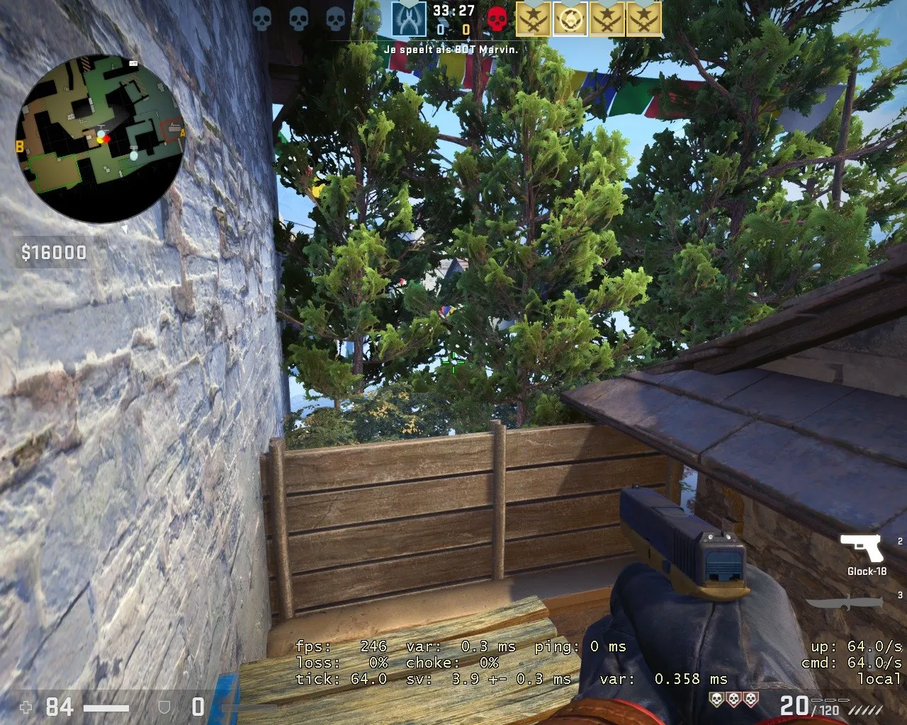
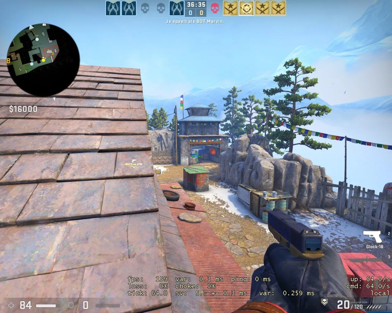
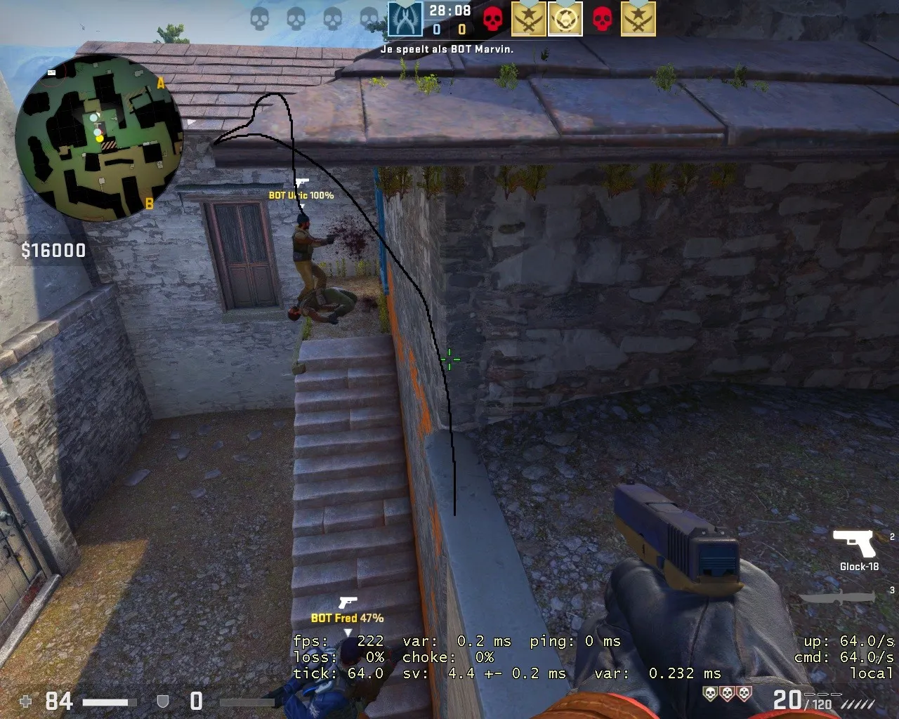
i have alot more images if you want i can send them aswell
I love the visual style of the map, I wish you luck and I came with feedback! I found a Bomb stuck Spot in middle.
Spoiler
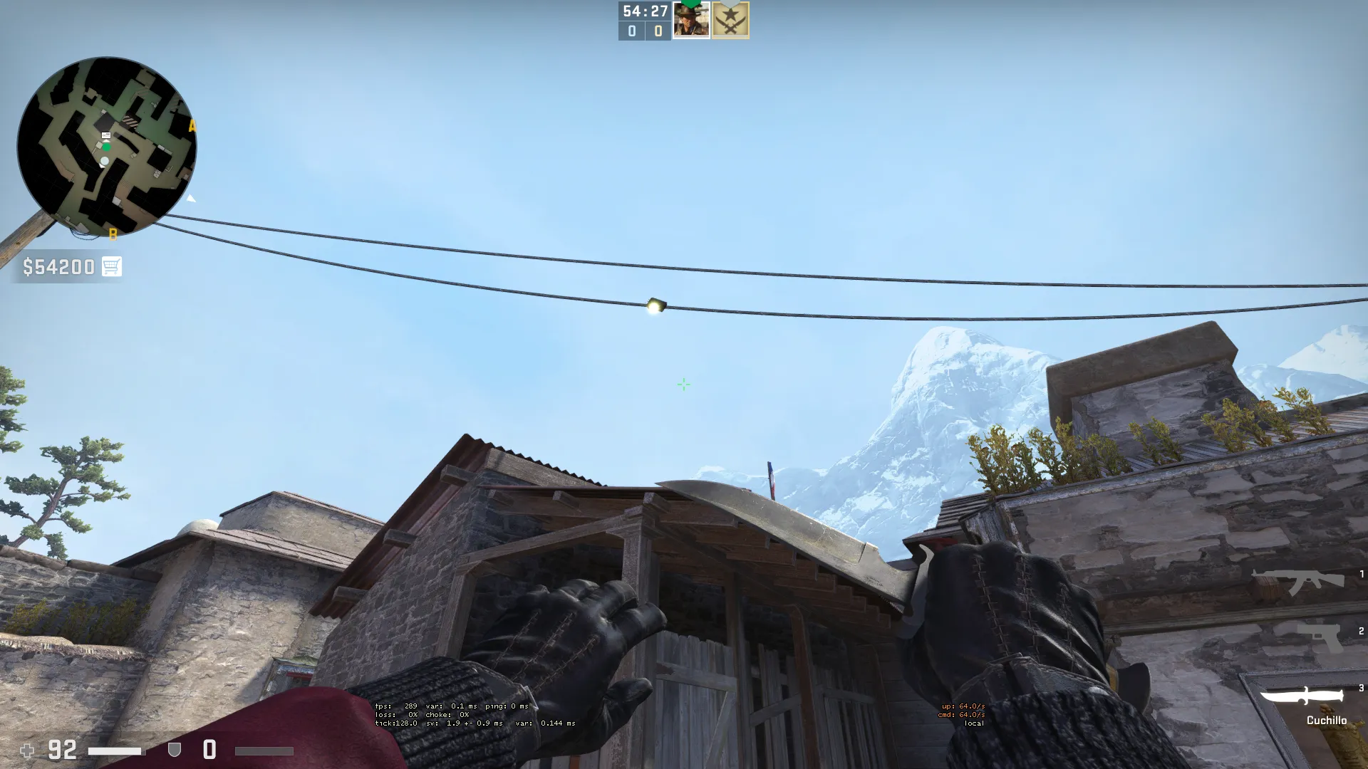
Wow, impressing work. Small feedback: You can fall from the cliffs, still not clipped, but U might already know that ?
This map actually put a smile on my face. I really love the visual style, and the layout might be the best one here. My only problems with the map are small nit-picks.
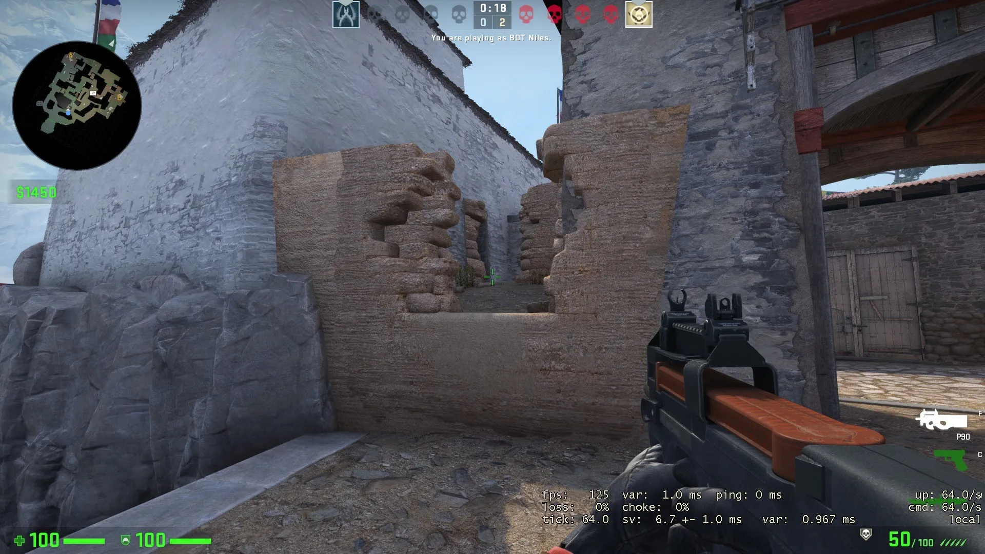
This prop looks very out-of-place, and I'd suggest replacing it entirely. Putting a ramp here may also be interesting.
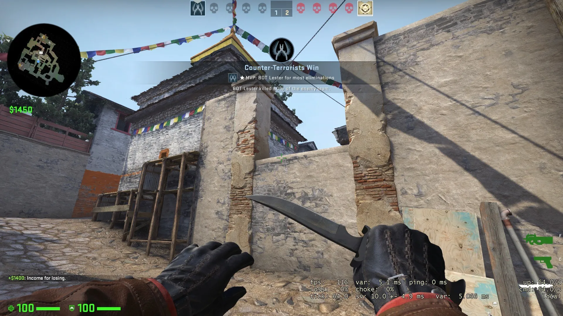
Changing the bricks on this prop to gray and adjusting the color a bit would look a lot more fitting.
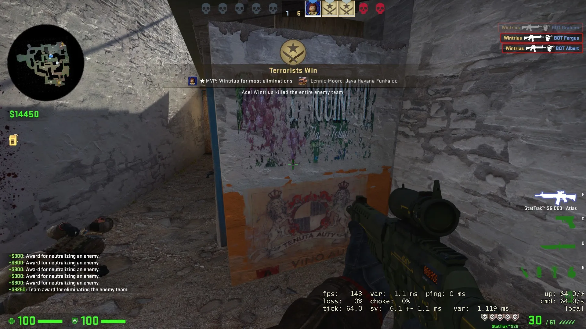
A custom graffiti here would be very fitting.
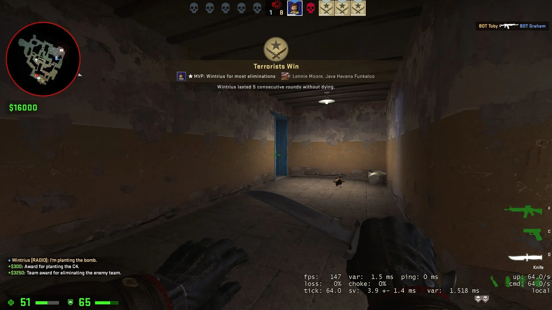
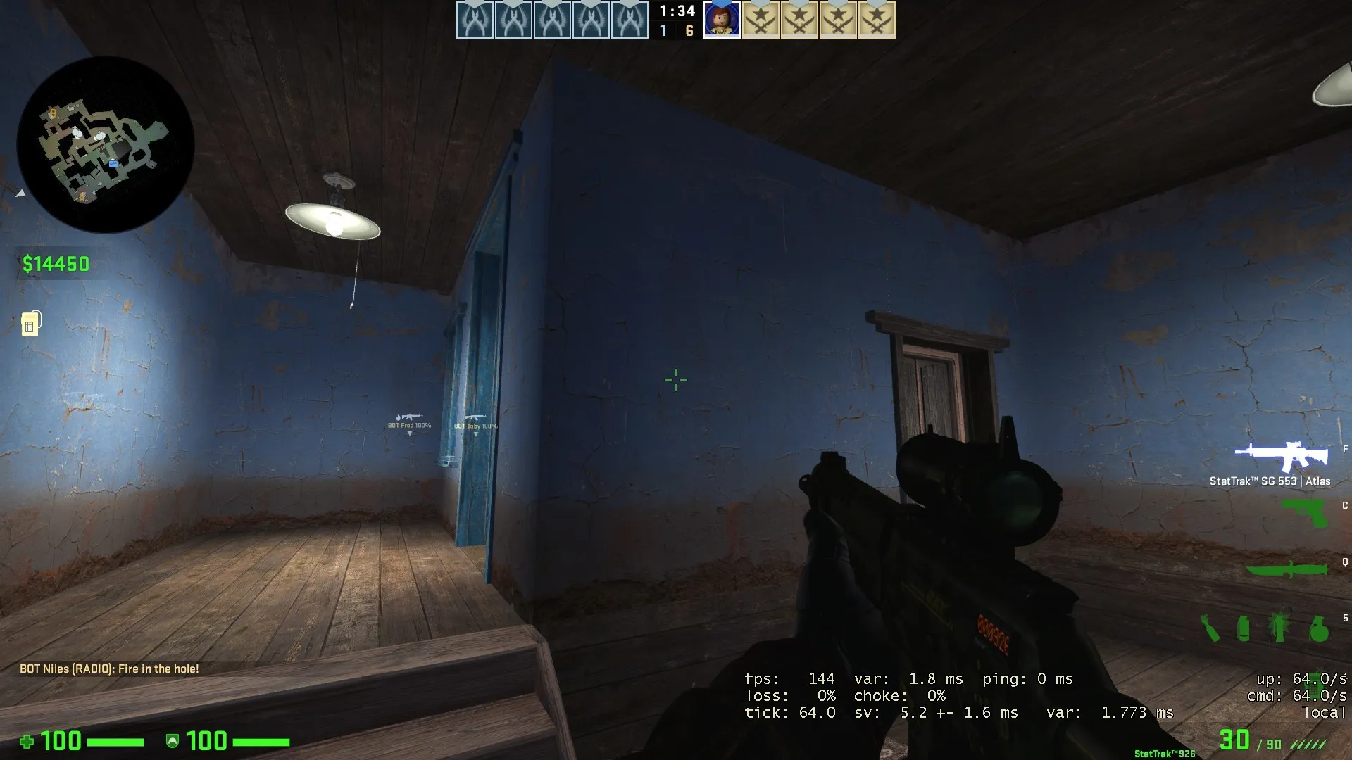
These rooms would look better with some new wall textures and details. Some custom paintings or furniture could also go a long way.
Anyway, this is surely one of the greatest entries. You won't even need me to wish you luck, because you've already secured the top three with this map.
Really awesome art! My only pet peeve is that some of the interiors look a bit empty, especially the indoors area in the back of A.
The layout looked a bit redundant from the radar image, but now that I ran around it, it's actually quite nice. I'm intrigued to see how mid is gonna play, especially with that see-through, not-go-through room. Besides that, I really like the bombsites, a lot of interesting angles everyone, especially with all the elevated areas around B.
I also have to give props for not clipping the cliffs. Great choice there, I'm sure you've spared a lot of players the annoyance of bumping into invisible walls, by providing them the liberty of plunging to their death, should they decide that life isn't worth living anymore.
And those trees are ?
 Quote from WintriusDisplay More
55 minutes ago, Wintrius said: This map actually put a smile on my face. I really love the visual style, and the layout might be the best one here. My only problems with the map are small nit-picks.
-snip-
This prop looks very out-of-place, and I'd suggest replacing it entirely. Putting a ramp here may also be interesting.
-snip-
Changing the bricks on this prop to gray and adjusting the color a bit would look a lot more fitting.
-snip-
A custom graffiti here would be very fitting.
-snip-
These rooms would look better with some new wall textures and details. Some custom paintings or furniture could also go a long way.
Anyway, this is surely one of the greatest entries. You won't even need me to wish you luck, because you've already secured the top three with this map.
Thanks! They're on the to-do ?
Thank you everyone who has been giving us feedback so far ? We're currently acting on it. In the meantime I'm expanding on- and polishing the art.
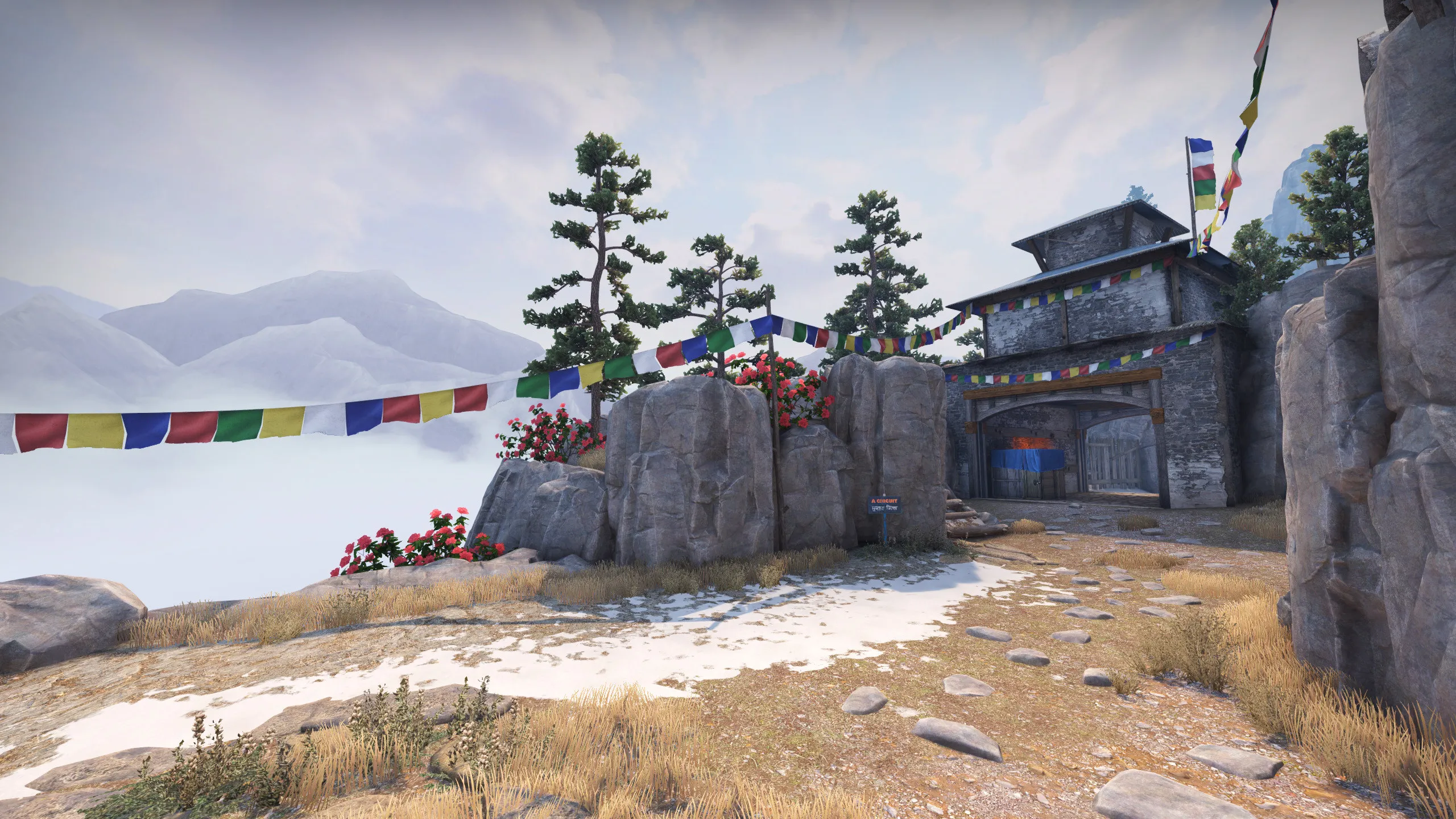
I knew this map was gonna be good the moment I saw the screenshots.
But when I saw those realistically animated banners actually swaying...

(P.S. Why hasn't anybody made any Mustang Sally jokes yet?)
There are a lot of connections everywhere, and while they may not be redundant, some add complexity unnecessarily. The areas are not really isolated enough from each other, and holding them is less valuable due to the sheer quantity of ways to get anywhere on the map (now that there is a split mid). I also tried a split mid before, but it left the CTs to thinly spread out and vulnerable to rushes. A also seems very hard to hold after plant there are 5-6 different ways to get to it depending on how you count the 2 house entrances. The art is well done and reminds me of Tibet for arms race.
edit: i did run around the map for like 20 mins
1:21-1:30 is a bug with the radar. Other from these bugs this map looks very good.
Hey guys. First thing I want to mention. It feels great to see wind on map. Most relaxing spawn I have ever seen in cs.
[Blocked Image: https://i.imgur.com/WKB97qq.jpg]
Layout is really complicated. I have played 4-5 matches and still don't know every route and angle to check. For example on Anubis I just needed 1 match to understand layout and probably 2-3 to better checking angles.
Here is general feedback. Ask if something isn't clear.
[Blocked Image: https://i.imgur.com/8Tjblxn.png]
More detailed feedback.
This spot is op. I would suggest to change truck with boxes to something with basic shape and some clear angles to pick from.
[Blocked Image: https://i.imgur.com/yAKaQxL.jpg]
You have some places with that clipping. Try to avoid that, it's not good for feeling map.
[Blocked Image: https://i.imgur.com/4fEIcvU.jpg]
[Blocked Image: https://i.imgur.com/0JBzN43.jpg]
Some idea. Maybe move entry to this place? I didn't analize this too much, but with entry here, you could make some cover for TT in old shop area.
[Blocked Image: https://i.imgur.com/Smt4TPu.png]
[Blocked Image: https://i.imgur.com/kH5E1nV.jpg]
For now A is too complicated. Like I said, after 4-5 matches I still don't know where I can expect CT's. Always I'm dying without seeing enemy. Maybe move bombsite closer to TT entry? Maybe at the top of rocks on the left? ?
[Blocked Image: https://i.imgur.com/viofFpQ.jpg]
Oh, and you can stuck on this wooden thing. Also seeing rocks here is something unrealistic(?) and I feels weird to me. Maybe if you will add some damgae to the roof and dirst under them it could work.
[Blocked Image: https://i.imgur.com/r8f3ZeY.jpg]
Map feels too big, but timings are fine ¯\_(ツ)_/¯
Overall map is cool and graphics are amazing. You did great job boys!
What I really want to know is why, in the year 2020, are map makers still using that T-Logo on their overviews. That one was in the CSGO beta for all of 5 minutes before they replaced it with the current one. They made that change about 8 years ago so you would think this wouldnt keep happening.
 Quote from fewseb
12 hours ago, fewseb said: [Blocked Image: https://steamuserimages-a.akamaihd.net/ugc/772866286594481316/2454D1B3B10824BC651CE0919D7285256F0DE8F2/?imw=637&imh=358&ima=fit&impolicy=Letterbox&imcolor=%23000000&letterbox=true]
What I really want to know is why, in the year 2020, are map makers still using that T-Logo on their overviews. That one was in the CSGO beta for all of 5 minutes before they replaced it with the current one. They made that change about 8 years ago so you would think this wouldnt keep happening.
I always use that one cause it's the same resolution as the CT logo (when you download it from the source wiki) and it's so much easier to just slap it onto the radar in Photoshop, knowing that they're both the exact same size.
Link of WarOwl Playing this map
Map has been updated with some experimental gameplay changes and new visuals.
Since my return from holidays and the top-10 announced, I've finally got the time to run around some of the maps. And, truth be told, when I saw maps like Anubis and Swamp I initially felt like Mustang would fall around third place judging solely from screenshot impressions. However as it stands now I can clearly tell that Mustang is by far the most impressive map in terms of visuals. I think what gives Mustang the edge over all the other maps is just the sheer atmosphere and feeling of actually being there. The colors and fine details in combination with the skybox make it feel like you're up in the mountains, in that cultural town of Nepal.
The optimization is also the best out of the three (although Anubis is practically on-par), and the subtle introduction of different colors, details and flora make this entire entry complete and worthy of first place. I love the tree models, and some of the soft edges on the fine woodwork. Very inspiring! Also great remix of some existing Valve-assets (such as the wooden arch of Dust2 CT-spawn for one of the connector gates).
I obviously can't speak for gameplay, since I haven't played with players, but I don't think that will be much of a problem. There are definitly enough options for both teams, and the flow of the map is very good. The only 2 small gripes I might have, are some of the rock formations being tough to read against when they're blending in with the same rocks a few ways up (T-spawn), and that the beautiful flags sway a bit too far back-and-forth to my taste.
Congratulations! Very jealous of this entry's quality ?
I noticed while running around (And admiring the flags) that the stair clips are missing the first step. I'm not sure if you're already aware of that, but I made this little gallery so you can find some of the stairs that are missing the first stair. I only wanted to mention it because it creates a noticeable jolt in your vision somewhat. https://imgur.com/a/M1M6YYY
Still though, I love the map! I could watch those flags sway all day long.
Don’t have an account yet? Register yourself now and be a part of our community!