1. Forums
  2. Discord
  3. About Mapcore
  4. Patreon Supporters
  • Login
  • Register
  • Search
This Thread
  • Everywhere
  • This Thread
  • This Forum
  • Articles
  • Pages
  • Forum
  • More Options
  1. Mapcore
  2. Discussions
  3. Level Design

de_asylum

  • Libertines
  • December 1, 2017 at 3:01 AM
  • Libertines
    • December 1, 2017 at 3:01 AM
    • #1

    Hello everyone!

    This is my entry for the contest, a 5v5 competitive bomb defusal map.

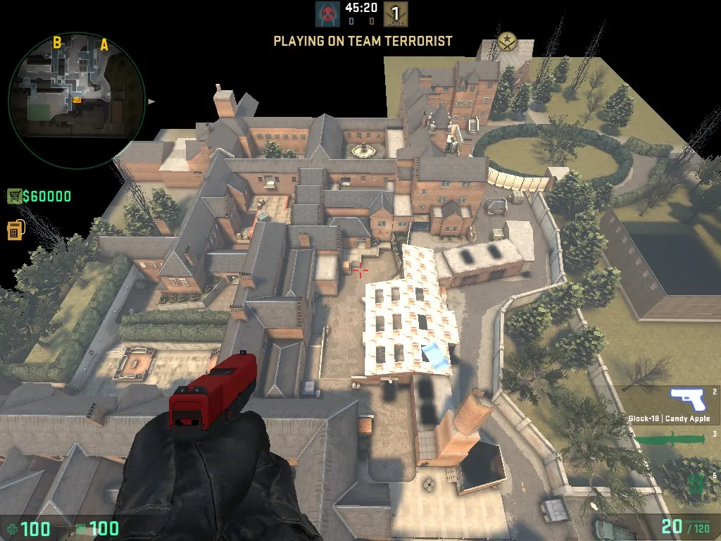
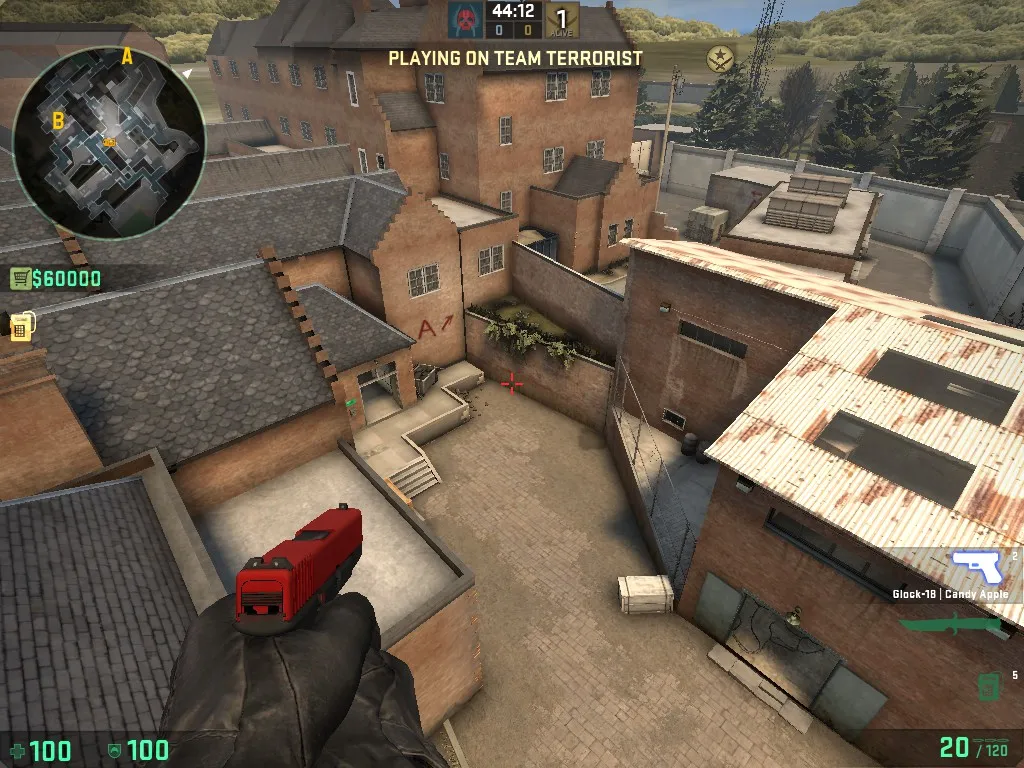
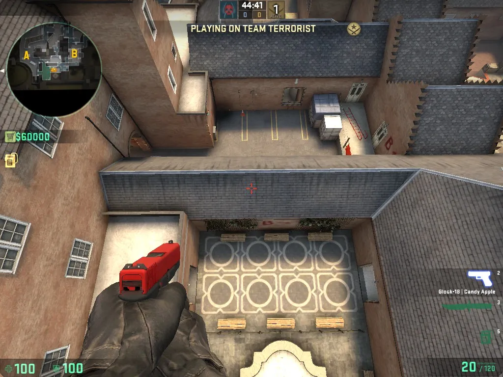
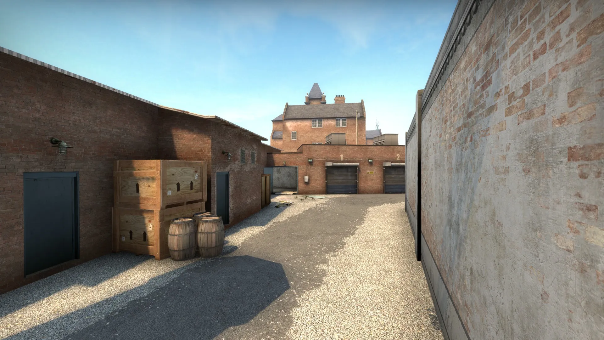
    It is set around an abandoned Victorian Lunatic Asylum in the UK.

    Screenshots:

    Spoiler

    [Blocked Image: https://i.imgur.com/3w9GcX0.jpg][Blocked Image: https://i.imgur.com/ZUhZcle.jpg][Blocked Image: https://i.imgur.com/00cCrhP.jpg][Blocked Image: https://i.imgur.com/LcXBjhY.jpg][Blocked Image: https://i.imgur.com/6nqDJ43.jpg][Blocked Image: https://i.imgur.com/Of6WzRY.jpg][Blocked Image: https://i.imgur.com/F3VRTRY.jpg][Blocked Image: https://i.imgur.com/bWDxDxW.jpg][Blocked Image: https://i.imgur.com/BfXoCRk.jpg][Blocked Image: https://i.imgur.com/0pjGXWv.jpg][Blocked Image: https://i.imgur.com/Hw2Mjqi.jpg]

    Steam Workshop Link :

    http://steamcommunity.com/sharedfiles/fi…s/?id=864761519


    I intend to keep improving the map after the contest, and would appreciate your opinion and feedback!

  • gav
    • December 3, 2017 at 8:22 PM
    • #2

    Haven't had a run around yet but I like what i can see on the screens

  • Ridders
    • December 4, 2017 at 2:26 PM
    • #3

    The overall aesthetic is really good. It feels like old Victorian architecture.

    However, I do feel you've missed a trick, your overall brush work is really pleasing, but theres a lot of opportunity to add detail to the plain, flat and boring walls that are everywhere. some variation in texture and maybe some adornments like drain pipes and the like.

    Overall really nice! Good luck.

  • Libertines
    • December 4, 2017 at 3:28 PM
    • #4
    Quote from Ridders

    55 minutes ago, Ridders said: The overall aesthetic is really good. It feels like old Victorian architecture.

    However, I do feel you've missed a trick, your overall brush work is really pleasing, but theres a lot of opportunity to add detail to the plain, flat and boring walls that are everywhere. some variation in texture and maybe some adornments like drain pipes and the like.

    Overall really nice! Good luck.

    Thank you!

    I agree that there is a lot of potential for detail, and specially due to the whole map happening around one main, big, building of similar texture, it is good to have some variation on the patterns.

    Unfortunately I did not have enough time to do everything I wanted. It is definitely something I want to take a closer look after the competition.

    I appreciate your feedback!

  • DRZ
    • December 7, 2017 at 5:23 AM
    • #5

    Theme, brush work and overall look is good. Your pathing is good and has purpose save for a few places (see below) but have you play tested it? I ran around in it today and here's some thoughts if you will (with pics):

    -Long A is bit too long. One CT with an awp and full utility can lock down what is otherwise the complete right side of the map and pick the terrorists apart. For the T's it's a heavy investment map control wise and with A halls so close by it's a much more manageable route to the site. You need to find a way to add an extra dimension to Long A or shorten it to incentivize the terrorists to go there.

    -Mid ends in a weird way. There's a sign that points to A but it's just a weird ladder thing that's easily punishable by the CT's and the B connector at the end does not create an alternate route. Rework lower Mid so that it rewards the T's for taking this area.

    -CT routes could use some imagination. There's only one way to rotate into B not counting heaven which has limited cover and is pretty exposed. Find a way to make these more dynamic and connect them to lower Mid.

    Hope this helps. Looking forward to seeing more!

  • Libertines
    • December 7, 2017 at 4:06 PM
    • #6
    Quote from DRZ

    10 hours ago, DRZ said: Theme, brush work and overall look is good. Your pathing is good and has purpose save for a few places (see below) but have you play tested it? I ran around in it today and here's some thoughts if you will (with pics):

    -Long A is bit too long. One CT with an awp and full utility can lock down what is otherwise the complete right side of the map and pick the terrorists apart. For the T's it's a heavy investment map control wise and with A halls so close by it's a much more manageable route to the site. You need to find a way to add an extra dimension to Long A or shorten it to incentivize the terrorists to go there.

    -Mid ends in a weird way. There's a sign that points to A but it's just a weird ladder thing that's easily punishable by the CT's and the B connector at the end does not create an alternate route. Rework lower Mid so that it rewards the T's for taking this area.

    -CT routes could use some imagination. There's only one way to rotate into B not counting heaven which has limited cover and is pretty exposed. Find a way to make these more dynamic and connect them to lower Mid.

    Hope this helps. Looking forward to seeing more!

    Display More

    Thanks for the feedback.


    -I have playtested the map a few times, but this version of the layout was not. The most recent change was the connection from mid to A. That is the reason it ends in a "weird" way, there was an idea to change it to the way it is here, but I couldn't actually test it. Here is a radar view of the earlier version.

    Spoiler [Blocked Image: https://i.imgur.com/a14Jcfr.jpg]


    -Long A is long, but CTs don't have a lot of cover, I think they can get slowly pushed back to site by the Ts with the use of grenades. Short A and Long A work together to give alternative routes to the site with shorter and longer fire ranges. It is a flank heavy map, so both teams need to be aware of that, either commit to a push or slowly retreat to safer positions. But, maybe different angles from the entrances to A are not worth the utility? (do you think they are not rewarding for a split A?)

    -Back to mid, as I mentioned, it was changed recently and I couldn't playtest it. It is a very risky path for the Ts to got up the ladder, but they can split both A and B site from the back, it is also very powerful. I need to playtest this layout, but one idea is to connect ladder to B and change/remove alternate mid and the second entrance to B. It is a big change an would make the layout more "standard".

    -It is and interesting idea to change the CTs entrances to B and also connecting them with lower mid. Similar to an idea I had, but more dynamic I think it is worth a test.

  • DRZ
    • December 10, 2017 at 5:58 PM
    • #7

    I think those are good ideas. Also, I think the earlier version of A is with the connection from Mid to A feels better. Move the A Long connector entrance up closer to where the driveway swings right, and now the CT's have another angle to worry about rotating T's. I think this will put emphasis on the angle into the site and solidify that choke point.

    Happy to help with play testing or anything else if you need just drop me a message.

    Also, congrats!!

  • gav
    • December 10, 2017 at 11:47 PM
    • #8

    Well done man . GL for the final

  • Libertines
    • December 18, 2017 at 9:02 PM
    • #9

    Workshop Update

    - Changed route for A connector in Middle to LongA, it is closer to CT now - Remove squeaky door in A connector - Changed entrance to bombsite A from connector to Middle, removed wall and added a ramp - Added a cubby near security cabin in bombsite A - Removed ladder near CT spawn, it is now a drop into Middle - Updated radar to adress these changes - Fixed various minor bugs and visual details

  • Libertines
    • January 8, 2018 at 8:55 PM
    • #10

    Workshop Update

    - Moved T Spawn closer to mid/A and farther from B - Simplified route to lower tunnels (alt mid) for terrorists - Changed textures on B bombsite to improve readability - Fixed spots where you could boost players outside the map and other unwanted spots (Thanks RUMME) - Improved optimization with hints, areaportals and props - Added minor details and decals - Fixed various minor bugs and visual details


    Thanks for all the feedback so far.

  • FMPONE
    • February 27, 2018 at 12:19 AM
    • #11

    I think a lot of our judges really liked this map because it seemed to put gameplay first and graphics second. The emphasis was really on creating a pure competitive experience, and so many judges seemed to gravitate towards that. My main criticism is just that the amount of color variety here seems a little low, there is a good amount of dated assets used throughout the level, and the amount of custom assets feels a bit low.

    Some good next steps might be to look for natural opportunities to use colors like green on walls that might be closer to vegetation, introduce some color variety and displacement blending with interesting blendmodulate textures on the brick walls, and overall look for opportunities to re-incorporate your theme into the level using custom assets. That's one area where I feel our judges picked up on some missing opportunities, visual flare. Teaming up with an artist or investing more time in custom stuff might be a good move to take this one to new heights.

Participate now!

Don’t have an account yet? Register yourself now and be a part of our community!

Register Yourself Login
Discord

The Mapcore Discord is our lively IRC channel of the 2000s reborn. Chat about level design, gaming, and more.

Latest Posts

  1. About our archived forums

    Thrik
    June 30, 2026 at 2:12 PM
  2. Mapcore Discord

    mason_fan123
    June 24, 2026 at 8:52 PM
  3. [CS2] Valley

    Serialmapper
    June 22, 2026 at 11:56 AM
  4. Any of the old guard still around? D:

    Thrik
    June 20, 2026 at 10:11 PM
  5. Free Music / SFX Resource - Over 2500 Tracks

    Eric Matyas
    June 18, 2026 at 12:32 PM
  6. Pango [WIP]

    Elowen
    June 11, 2026 at 10:13 AM
  7. [CS2] Dvina

    Jeremy Rivera
    June 11, 2026 at 10:03 AM
  8. Bridges 2.0 by NEXSIDE, MAP SHOWCASE. ( Steam Workshop )

    MrTrane18
    June 1, 2026 at 7:46 PM
  9. Classic Maps Reborn For CS2

    SillySpaceCat
    May 31, 2026 at 10:33 PM
  10. [CS2] Dvina

    Pulbusha
    May 29, 2026 at 5:54 PM
  1. Privacy Policy
  2. Contact
Powered by WoltLab Suite™