1. Forums
  2. Discord
  3. About Mapcore
  4. Patreon Supporters
  • Login
  • Register
  • Search
This Thread
  • Everywhere
  • This Thread
  • This Forum
  • Articles
  • Pages
  • Forum
  • More Options
  1. Mapcore
  2. Discussions
  3. Level Design

[Portal 2] Broken Path

  • PhelgeNanker
  • February 20, 2017 at 9:41 AM
  • PhelgeNanker
    • February 20, 2017 at 9:41 AM
    • #1

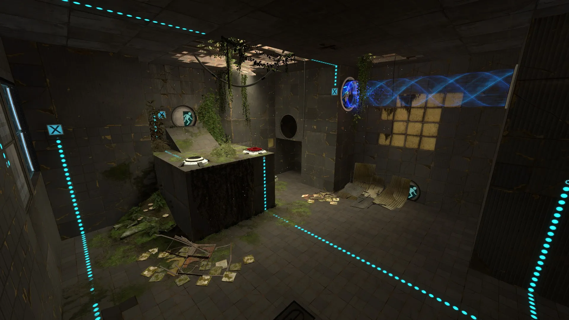
    I haven't really introduced myself here at mapcore, so to keep it short; I'm a level design student working on my portfolio, and this map is supposed to be in it.

    I've been working on the map for the last few weeks and would love to get any and all inputs on it.

    Link to the map: http://steamcommunity.com/workshop/filedetails/?id=865873640
  • Radu
    • February 20, 2017 at 2:12 PM
    • #2

    I played through your level and the puzzle is pretty neat. It took me a while to figure out, so good job on that!

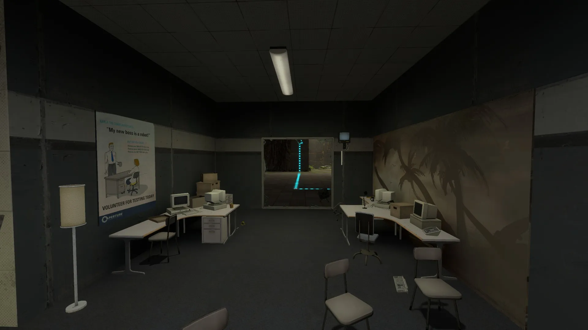
    I know these workshop levels don't necessarily focus on a story, but Portal 2 is a game about logic and the environment, which is by itself a small narrative, needs to reflect that. In the world of Portal 2 and Aperture science, test chambers are built to be solved by various subjects using the portal technology. Each test chamber has in it all the necessary elements to solve it. Your second test chamber does not and requires you to navigate back to the previous one in order to acquire an additional element. We also know that at the entrance/exist of each test chamber there is a material emancipation grill. That means that under normal circumstances, the test subjects would have never been able to solve the second chamber. Since we are currently in a point in time where the Aperture personnel is no longer present, we are able to navigate through one of the observation areas, avoid the material emancipation grill and solve the second chamber. You have two ways of fixing this issue. The first one, simplest solution, is to add a busted cube dispenser in the second chamber to avoid that minor plot hole. The second solution is to remove the observation area and compress the two chambers into a single one. Personally, I would compress the two chambers to get rid of the prop clutter from the observation area which would improve performance. Visually, the environment looks alright. There are some parts that are not particularly interesting to look at, but it does the job.

  • Deathy
    • February 20, 2017 at 2:43 PM
    • #3

    Overall, I like it - very well thought out. It has taken me a bit longer to finish stage 2 due to not actively playing Portal recently - but I didn't pay attention to the broken glass hint right from the start (despite the dead crow). And I like that idea, although I second the logical hole that Radu mentioned - if you implement it correctly (with the chamber design in mind) I find it quite nice to keep the two stages/chambers and also find something for the turrets that isn't just working anymore.

    Nonetheless, you make good use of the Portal 2 content and it has a very authentic feeling true to the original.

  • PhelgeNanker
    • February 20, 2017 at 7:47 PM
    • #4

    Hey, thank you both for replying.

    I do agree about the leap of logic in the second chamber, I would like to avoid plot holes as best I can! I'm actually quite fond of my observation area, so I'll see about your other suggestion to add a broken dispenser in the room.

    Radu, are there any parts in particular that you would like to see improved visually?

    Deathy, sorry that you missed the hint with the broken glass, is there a way you would suggest to make it clearer that the chambers are "connected"?

  • Stract
    • February 20, 2017 at 9:58 PM
    • #5

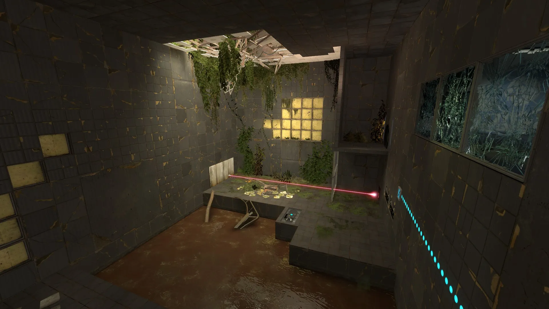
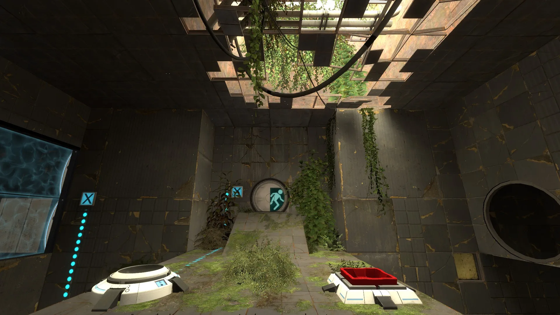
    It looks somewhat disappointing in terms of visuals, at least from what I see in the screenshots. One thing I'm immediately noticing is the lack of any actual chamber lighting other than the sun through the debris. There aren't really any glass light covers to make the lighting interesting at all, it's very bland. If it were me I'd have also have projected textures coming from the ceiling, to have crisp shadows.

    The observation room also has some kinks. First off, observation rooms aren't usually ground level. Maybe instead of just walking into the broken window, you could have some fling into it. Swivel chairs are also usually used rather than the cheap regular BTS chairs. The lighting is quite uninteresting, and the relaxation container mural, 50s props, and oversized posters add to this strange feeling. Also, perhaps you could make use of light to create a better focus on the fact that you need to go through the broken glass. Another thing, you could have some blue light at the funnel to add realism.

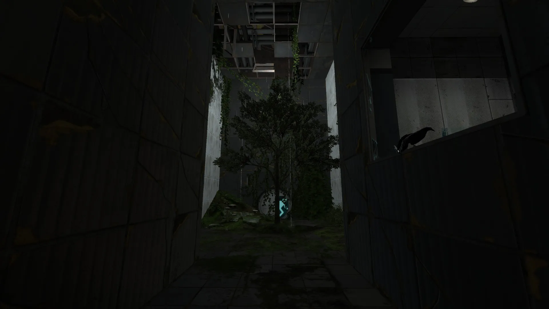
    One other thing I'd like to note is the tree in the middle of the ground. It's a bit peculiar, especially since there is no direct sunlight on it from what I can see.

    Overall biggest thing is to make the lighting more interesting, and perhaps geometry as well. You didn't use any glass light strips, even though they are so central to these chambers and their lighting. Still, better than most of what's on the Workshop! :P

    Sorry for this unorganized mess of feedback, but I hope it will help!

  • Radu
    • February 21, 2017 at 10:04 AM
    • #6
    Quote from PhelgeNanker

    20 hours ago, PhelgeNanker said: Radu, are there any parts in particular that you would like to see improved visually?

    The problem is that your chambers lack depth due to the very basic lighting as @Stract pointed out.

    Your first chamber could benefit from a similar light setup found in one of the official single player levels. You could also add more depth by expanding on the ceiling. Just two or three irregular shapes would go a long way.

    [Blocked Image: http://i.imgur.com/YFBpJyA.jpg]

    As for the second chamber, I don't really like the ramp leading to the door. You should lower the door to the platform level or add the standard aperture stairs.

    I also think it would be better if the lighting was a bit different compared to the first chamber. Maybe something like this:

    [Blocked Image: http://i.imgur.com/0AKHuUE.jpg]

    One last thing, try to get rid of some props from the observation area and also increase the light value so that it stands out more to players. I also feel like that tree doesn't add to anything. It's cool, but the player spends 2-3 seconds in its area before never returning.

    I look forward to your next iteration!

  • PhelgeNanker
    • February 22, 2017 at 11:56 AM
    • #7

    The thing that seems to come up most is the lighting, so I'll make sure to give that a second pass. I appreciate the pictures, it makes the whole thing a lot easier.

    The feedback has been really helpful, I have a lot to think about now!

Participate now!

Don’t have an account yet? Register yourself now and be a part of our community!

Register Yourself Login
Discord

The Mapcore Discord is our lively IRC channel of the 2000s reborn. Chat about level design, gaming, and more.

Latest Posts

  1. Why is data science needed

    shilpa
    July 17, 2026 at 12:39 PM
  2. Any of the old guard still around? D:

    Warby
    July 12, 2026 at 8:23 PM
  3. About our archived forums

    Thrik
    June 30, 2026 at 2:12 PM
  4. Mapcore Discord

    mason_fan123
    June 24, 2026 at 8:52 PM
  5. [CS2] Valley

    Serialmapper
    June 22, 2026 at 11:56 AM
  6. Free Music / SFX Resource - Over 2500 Tracks

    Eric Matyas
    June 18, 2026 at 12:32 PM
  7. Pango [WIP]

    Elowen
    June 11, 2026 at 10:13 AM
  8. [CS2] Dvina

    Jeremy Rivera
    June 11, 2026 at 10:03 AM
  9. Bridges 2.0 by NEXSIDE, MAP SHOWCASE. ( Steam Workshop )

    MrTrane18
    June 1, 2026 at 7:46 PM
  10. Classic Maps Reborn For CS2

    SillySpaceCat
    May 31, 2026 at 10:33 PM
  1. Privacy Policy
  2. Contact
Powered by WoltLab Suite™