

1. Forums
  2. Discord
  3. About Mapcore
  4. Patreon Supporters
  • Login
  • Register
  • Search
This Thread
  • Everywhere
  • This Thread
  • This Forum
  • Articles
  • Pages
  • Forum
  • More Options
  1. Mapcore
  2. Discussions
  3. Level Design

[CS:GO] SHIPPED

  • catfood
  • July 17, 2016 at 7:05 PM
  • Radix
    • July 19, 2016 at 10:24 AM
    • #21
    Quote from catfood

    11 minutes ago, catfood said: I'm glad that at least this JeffCSGO betting dude and his buddy have been banned from the workshop community. one step closer to a clean workshop again :D

    One step.

    Spoiler [Blocked Image: https://upload.wikimedia.org/wikipedia/commons/thumb/8/87/Potemkinstairs.jpg/1024px-Potemkinstairs.jpg]

  • Vaya
    • July 19, 2016 at 10:45 AM
    • #22

    more like[Blocked Image: http://i.imgur.com/SQ4l7pA.png]

  • kinggambit
    • July 20, 2016 at 3:22 PM
    • #23
    Quote from catfood

    On 7/18/2016 at 10:35 AM, catfood said: Pls don't get me wrong I can handle downvotes Im also pretty sure i can sleep tonite but this is getting out of hand and I just wanted to spread the word.

    Meanwhile MRW:

    [Blocked Image: http://i.imgur.com/WZ0GitL.jpg]

    [Blocked Image: https://s-media-cache-ak0.pinimg.com/236x/ea/16/c0/ea16c03438e4c6f1f6563671c3ee5c5e.jpg]

    [Blocked Image: http://www.gifbin.com/bin/2074yu4sw2.gif]

    [Blocked Image: http://i.imgur.com/2z9yyvm.jpg]

    [Blocked Image: https://s-media-cache-ak0.pinimg.com/564x/a5/77/2c/a5772cae0d6d8859e2ae08ccaacb5ff2.jpg]

  • 1234567890throwaway
    • July 20, 2016 at 8:09 PM
    • #24

    It seems a bit cluttered visually, especially on sites, and there are some OP site lines from CT spawn to each site. It looks absolutely stunning besides that. How did you get the shadows to look all green and nice looking? Great job

  • Minos
    • July 20, 2016 at 8:14 PM
    • #25

    Looks awesome, great job :)

  • holiestcows
    • July 20, 2016 at 11:07 PM
    • #26

    Beautiful map as always. I have not gone in game to play it(sadly it will be with bots) yet, but the first and only thing I could mention is that the map is one sided. What I mean in that is its a north vs south kind of push. Obviously that can be said the same for most maps, like Dust II but I just feel that this is a tad more stream lined. Clearly it could play totally different than what im envisioning via screen shots, so take this with a grain of salt. Overall very visually pleasing map CatFood, great job!

  • El_Exodus
    • July 21, 2016 at 11:53 AM
    • #27

    Ran a few minutes around on the release version. Imo you should allow players to suicide into the ocean. Atm i get a slight restricted feeling.

    Also there is a prop not rendering:

  • Radix
    • July 26, 2016 at 10:06 PM
    • #28

    Played de_shipped for a while today - I really enjoyed it! Layout is simple but with plenty of options to boost on containers etc. Really nice.

    But some polishing still to do. I've put some things I found together http://imgur.com/a/UrMJZ

    You are probably already aware of these things, but maybe it helps you.

  • Squad
    • July 26, 2016 at 11:16 PM
    • #29

    I'd consider removing the clip brushes surrounding the map and making it possible for players to fall to their death (like vertigo and agency). They feel a bit limiting, especially since they're moved a lot "inwards" in places, like here:

    [Blocked Image: http://i.imgur.com/ElhM36e.jpg]

    Spot the ladder :P Without bots using it, I would probably never had noticed the ladder.

    [Blocked Image: http://i.imgur.com/jDQ6kWK.jpg]

    Very shiny door, doesn't fit with the rather gritty look of the map.

    [Blocked Image: http://i.imgur.com/TnKTnbM.jpg]

    Weird shadows on this panel. Not sure what's causing it, but maybe "Ignore surface normals" could fix this, since these models are $nocull iirc. Just pointing it out, it's a very minor thing :)

    [Blocked Image: http://i.imgur.com/BnwrBWc.jpg]

    Overlapping materials.

    [Blocked Image: http://i.imgur.com/R10dESo.jpg]

    Same.

    [Blocked Image: http://i.imgur.com/X8iFbiT.jpg]

    Intentional spot?

    [Blocked Image: http://i.imgur.com/IdYzRpv.jpg]

    Last but not least, I think the readability was a bit poor in some areas. It really depends on the location a bit. For example, CTs are harder to spot in the covered (lowest level) parts of the map, while the Pirate models are sometimes hard to read in front of some of the upper deck areas (mainly containers and the like).

    [Blocked Image: http://i.imgur.com/zIofBrV.jpg]

    Improving readability on the map by changing lighting and textures is a lot of work, but maybe changing the player skins could go a long way. I think Phoenix and ST6 are the best alternatives for what you have now. Anyway, I'm not sure if that is just me, maybe other people have less trouble with it.

    [Blocked Image: http://i.imgur.com/HHcJV1F.jpg]

    Overall, you really nailed the theme, the visuals are stunning and you got a solid map right there :) Good job!

  • catfood
    • July 27, 2016 at 10:29 AM
    • #30

    love the the kind words guys thanks :) And thanks for the extensive feedback will make sure those issues will be fixed in the next build and @Squad that spot is intentional :) About the clip brushes on the sides of the ship I'm not sure what to do with them. Im afraid players will troll by constantly jumping of the ship but maybe ill need to have more confidence in csgo players

  • Logic
    • July 27, 2016 at 11:13 AM
    • #31
    Quote from catfood

    31 minutes ago, catfood said: @Squad that spot is intentional :)

    I don't think that specific spot is intentional. He's not standing on the crates, he's on the railings which is very easy to jump on to from the nearest site :)

    Quote from catfood

    33 minutes ago, catfood said: About the clip brushes on the sides of the ship I'm not sure what to do with them.

    IMO it's okay to clip off the sides so that players can't jump over, but it has to be done more accurately. The location below is weirdly clipped in such a way that it looks like the player can jump onto the spools (for instance), but can't.

    Quote from Squad

    11 hours ago, Squad said: [Blocked Image: http://i.imgur.com/ElhM36e.jpg]

    I think that it should be clipped somewhat like this:

    [Blocked Image: https://i.gyazo.com/65312b22f467d5b04f2c9004eac99225.png]

    Maybe you've already addressed this, but it sounded like you haven't yet, so here is my 2 cents :)

  • RA7
    • August 19, 2016 at 11:25 PM
    • #32

    Damn lovely map

  • Radix
    • November 6, 2016 at 12:43 PM
    • #33

    Some little issues: http://imgur.com/a/SdUsv

    Also looks buggy when you die from falling into the ocean...

  • Ivan22848
    • August 8, 2019 at 7:03 PM
    • #34

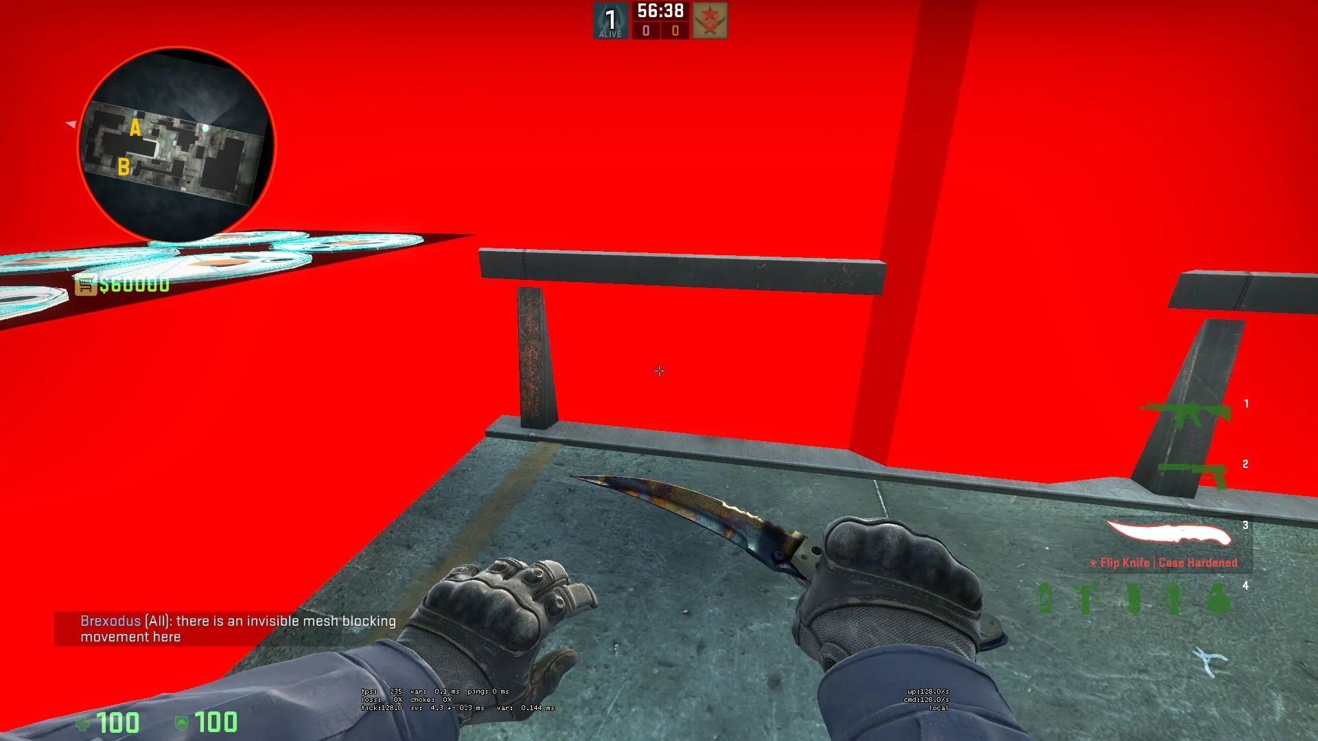
    Please make a "parkour" version of the map wit no invisible barriers (for example - next to the helicopter)

Participate now!

Don’t have an account yet? Register yourself now and be a part of our community!

Register Yourself Login
Discord

The Mapcore Discord is our lively IRC channel of the 2000s reborn. Chat about level design, gaming, and more.

Latest Posts

  1. Tangerine

    Harry Poster
    July 18, 2026 at 11:10 AM
  2. Any of the old guard still around? D:

    Warby
    July 12, 2026 at 8:23 PM
  3. About our archived forums

    Thrik
    June 30, 2026 at 2:12 PM
  4. Mapcore Discord

    mason_fan123
    June 24, 2026 at 8:52 PM
  5. [CS2] Valley

    Serialmapper
    June 22, 2026 at 11:56 AM
  6. Free Music / SFX Resource - Over 2500 Tracks

    Eric Matyas
    June 18, 2026 at 12:32 PM
  7. Pango [WIP]

    Elowen
    June 11, 2026 at 10:13 AM
  8. [CS2] Dvina

    Jeremy Rivera
    June 11, 2026 at 10:03 AM
  9. Bridges 2.0 by NEXSIDE, MAP SHOWCASE. ( Steam Workshop )

    MrTrane18
    June 1, 2026 at 7:46 PM
  10. Classic Maps Reborn For CS2

    SillySpaceCat
    May 31, 2026 at 10:33 PM

Users Viewing This Thread

  • 1 Guest
  1. Privacy Policy
  2. Contact
Powered by WoltLab Suite™