1. Forums
  2. Discord
  3. About Mapcore
  4. Patreon Supporters
  • Login
  • Register
  • Search
This Thread
  • Everywhere
  • This Thread
  • This Forum
  • Articles
  • Pages
  • Forum
  • More Options
  1. Mapcore
  2. Discussions
  3. Level Design

de_stolen (nearing release, seeking feedback)

  • wylde
  • May 23, 2016 at 8:15 AM
  • wylde
    • May 23, 2016 at 8:15 AM
    • #1

    Hi, guys!

    de_stolen is my first map nearing an "official" release. It is designed as a 5v5 competitive defusal map, but supports up to 16v16 players. It has a fairly generic abandoned electric/water plant setting. It borrows in its simple, compact layout from maps like cache and mirage (this is also how I came up with the name), measuring on the smaller side for a competitive map.

    There are likely some OP boost spots or weird angles I have overlooked in my eagerness to post this. The map, while under development, has been on the workshop for a month or two, but I've never publicized it before.
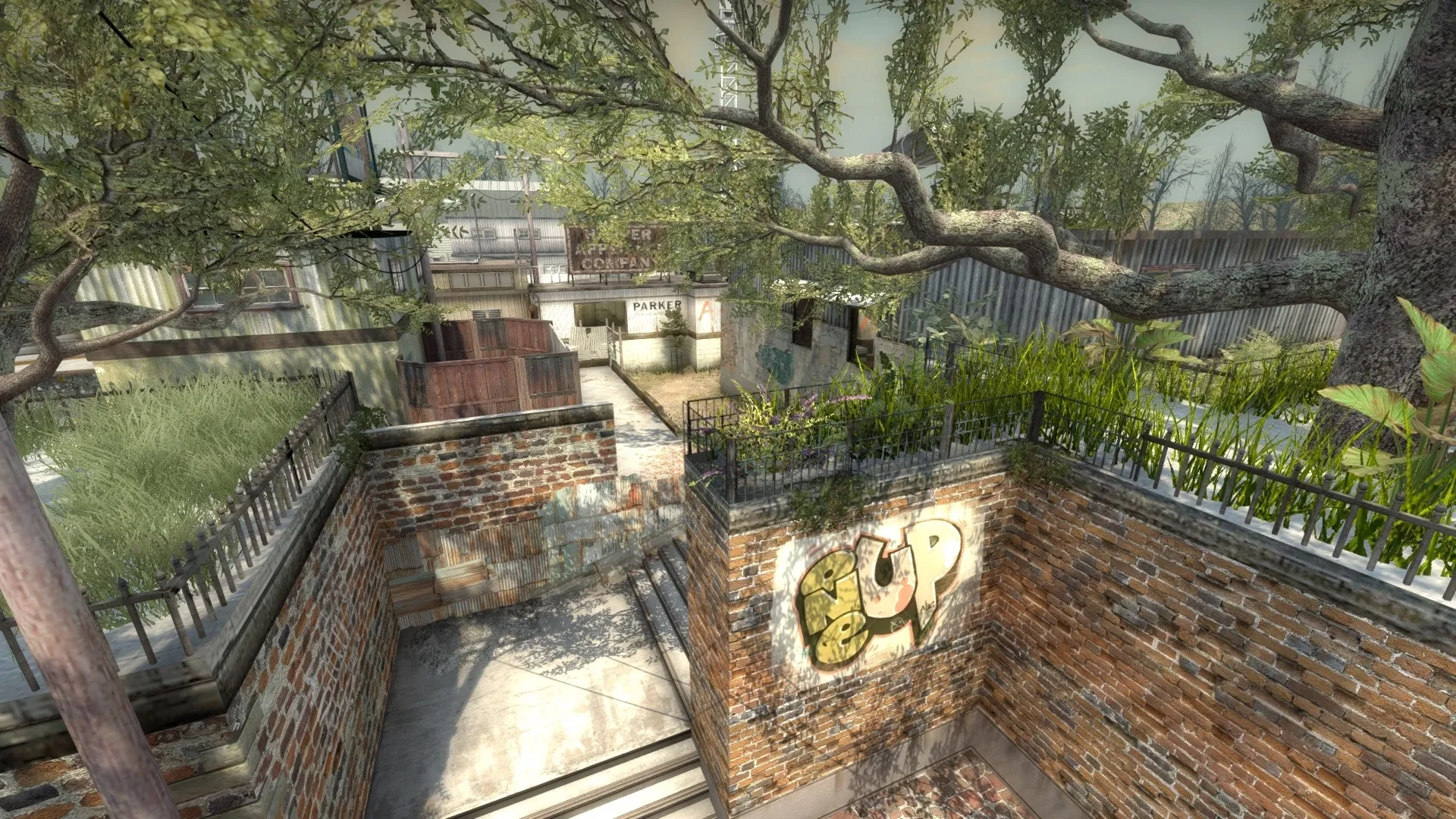
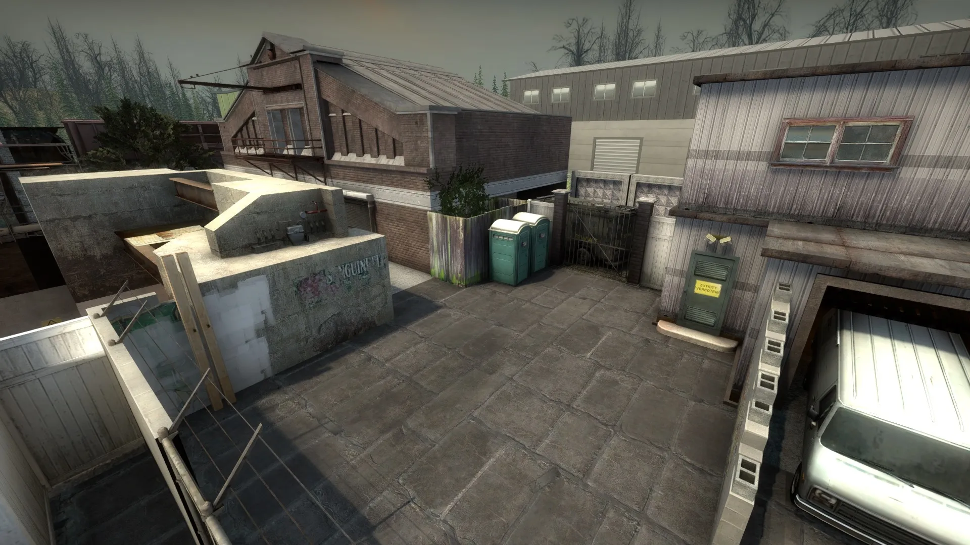
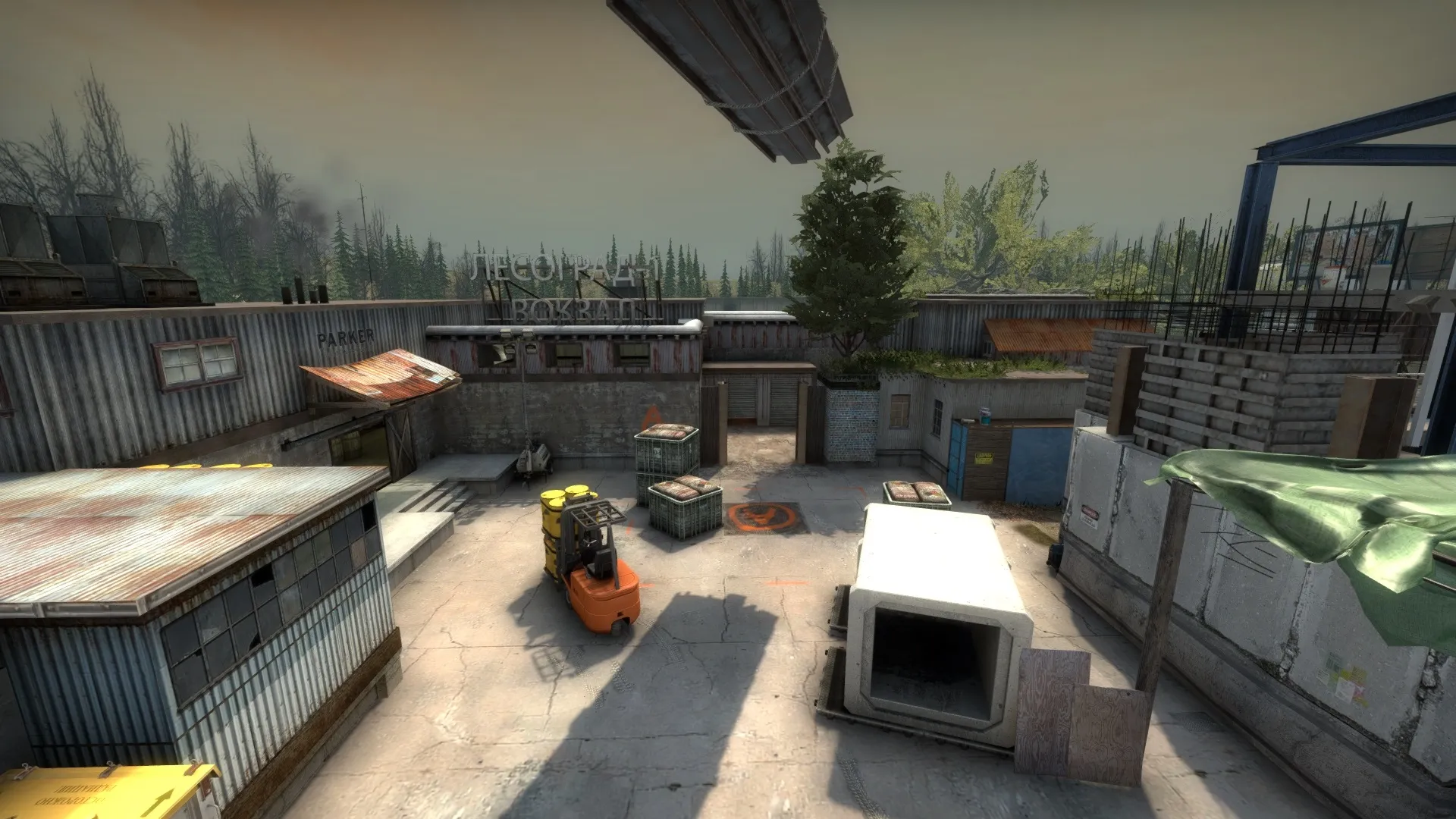
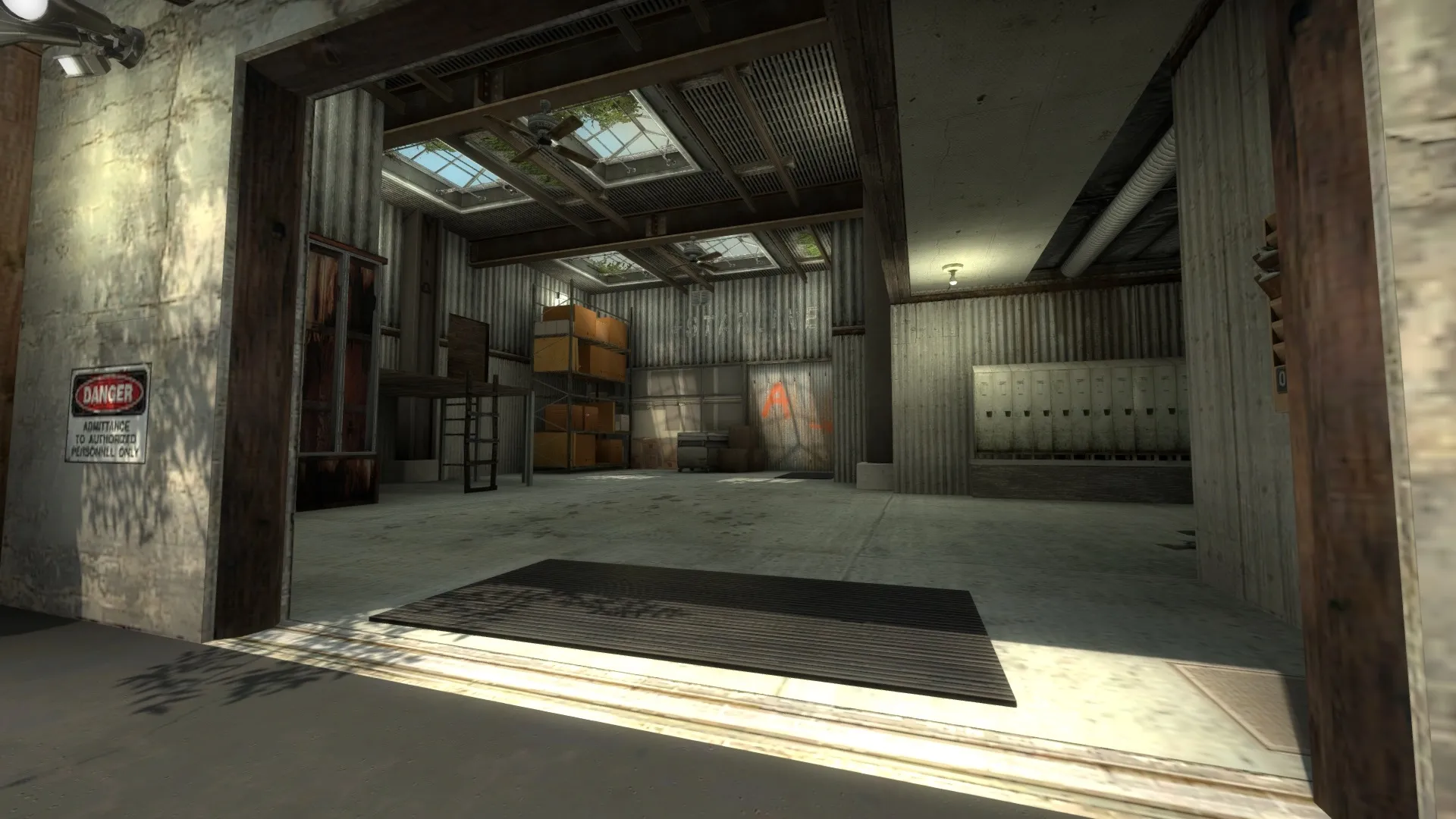
    Some Screenies:

    Overview: I'll work on adding icons soon, but CTs spawn very top middle, Ts spawn very bottom middle-left.
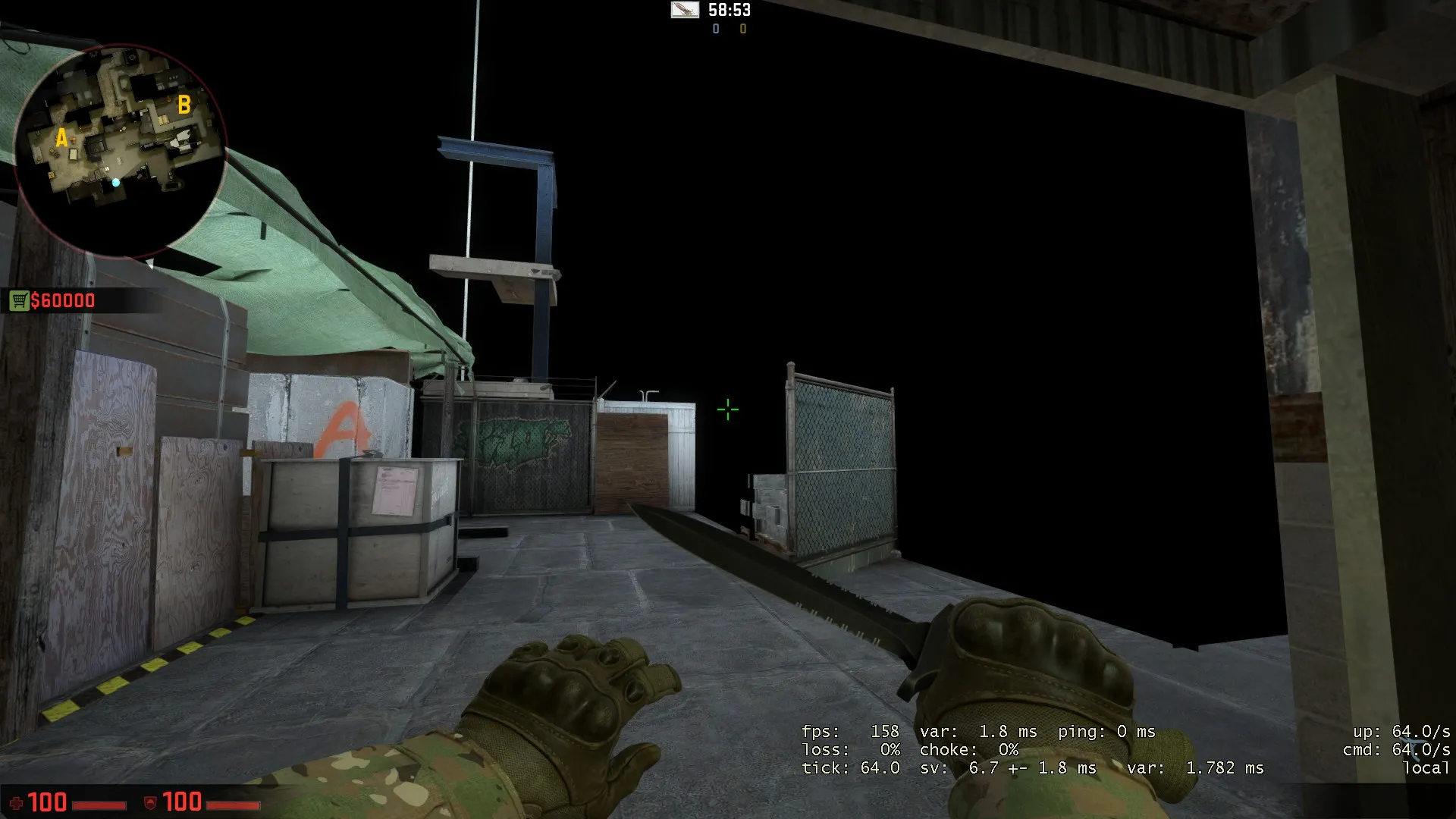
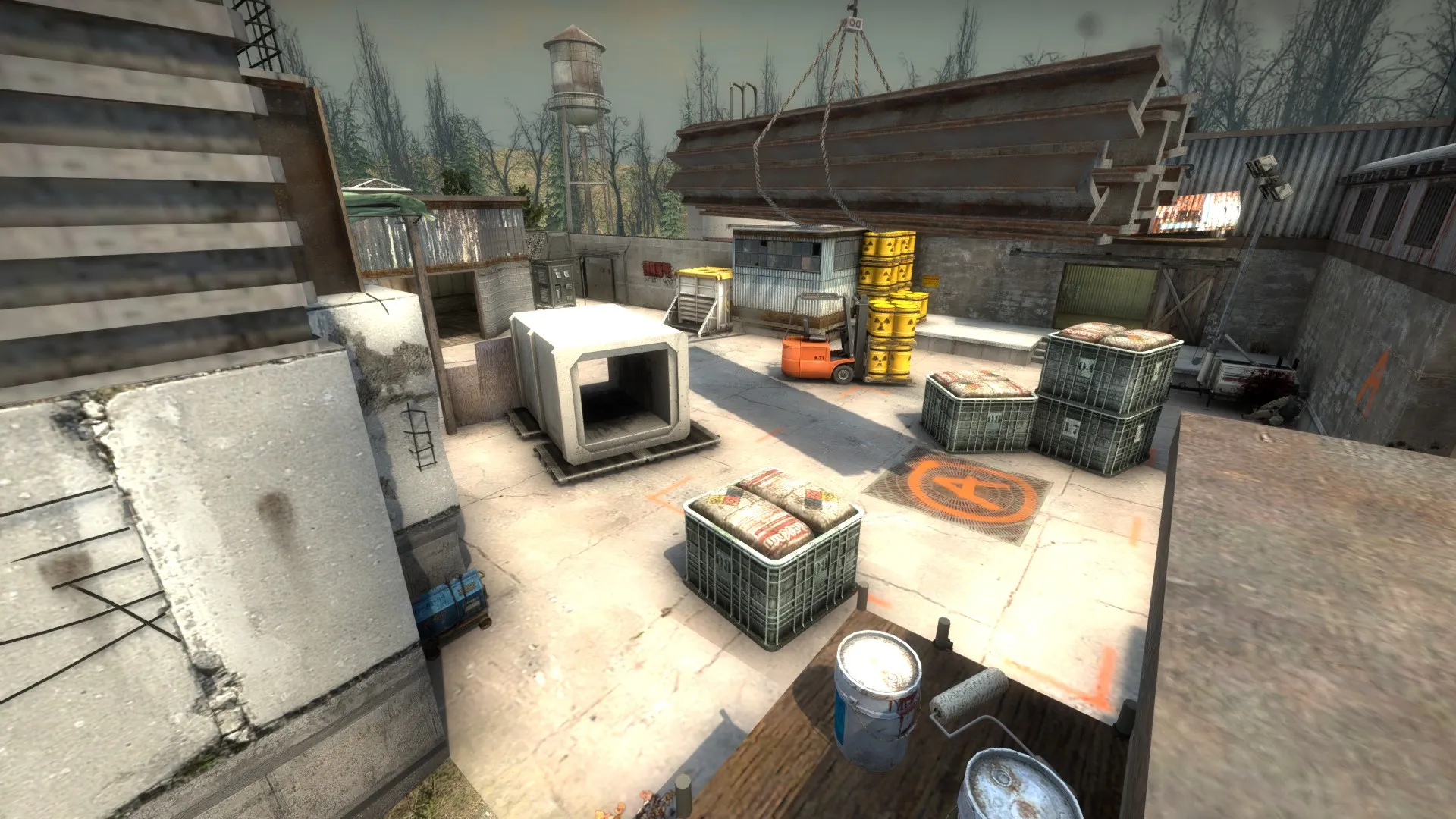
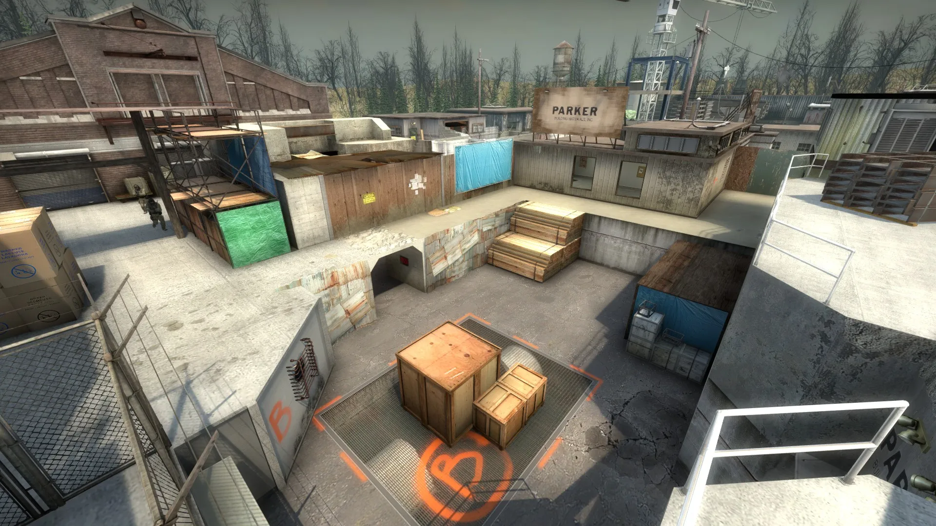
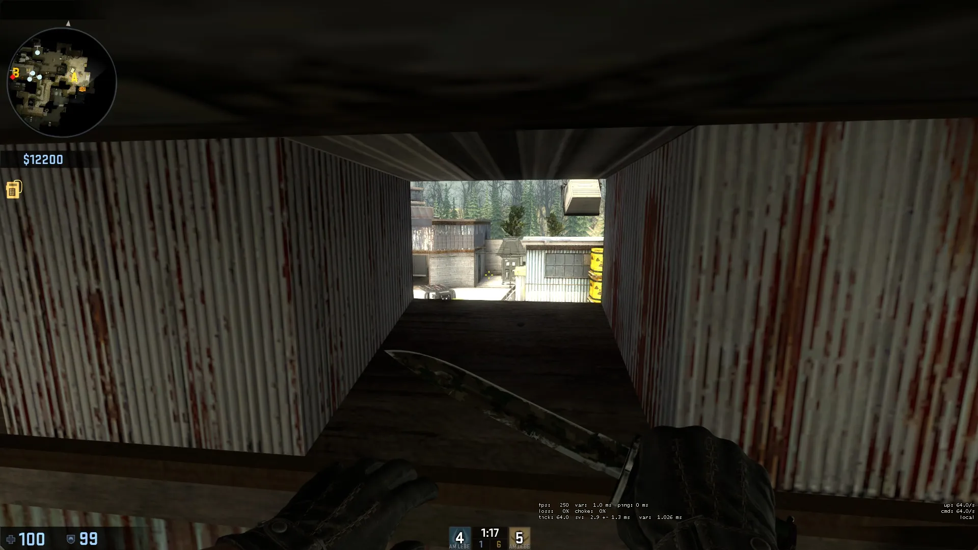
    Some highlights:

    Workshop link: https://steamcommunity.com/sharedfiles/fi…s/?id=549957925

    This map has taken about 3 months (on and off) of my mapping time so far. I have learned a lot while making it, though it is still rough around the edges. CT Spawn is still pretty boring and needs a lot of aesthetic work. There are no sounds yet, and lighting is very much a first pass.

    I am seeking as much feedback as possible as I near release, particularly regarding any major game play issues or aesthetic concerns with what is currently in the map. I have two new maps in the pipeline with more coherent themes in mind, but I am wanting to complete this one first.

    I'll be scheduling a 5v5 play test either here or on r/csmapmakers very soon!

    Thank you for your time!

  • MrRuck
    • May 23, 2016 at 3:27 PM
    • #2

    Downloading it right now, will give you feedback very soon!

  • MrRuck
    • May 23, 2016 at 4:51 PM
    • #3

    So I had not that much time I'm sorry but here are some things that I want to point out:

    -your clip brush work is (as you said) very poor. Even without any bots I can get out of the map way to easily. You should also use more clip brushes to make movement smoother

    -you should make the crane a little higher, the steel bars it carries (I hope you know what I mean) are too low and they're blocking smokes and flashes thrown to A site

    -open up the skybox around A site, it's not possible to throw smokes or flashes from T spawn to A site, that's kinda annoying

    -the upper route from CT to B site doesn't make sense to me, why would a CT go there to hold B site? There's no cover or anything. I would remove it and connect it to the other routes to B from CT (shown on the image below)

    -there are a few nodraw textures that you can see, e.g. one in front of A site coming from T spawn

    -both your bombsites seem to be too big and/or there's not enough cover. Nearly everywhere you can plant is way too open imo

    -not enough detail, use more decals and foliage props, also try to make frames for some windows (e.g. the windows near T spawn need frames imo)

    -too me it feels like there are too many routes to A (4 with CT if I'm not mistaken)

    -some walls seem to be too wide, looks not natural imo (e.g. the very right path leading to A site from T spawn, the building you have to enter has some really wide walls.

    Besides all these negative points I really like your map. I like the coloring and the layout. Since I played it only alone I can not say anything about the gameplay, I don't know whether it's too CT or too T sided (or just fine).

  • wylde
    • May 23, 2016 at 5:11 PM
    • #4

    Thanks for the detailed feedback!

    - I'll work on adding a majority of clips by the end of this week.

    - I can raise the girders from crane in A site.

    - I can open up the A site skybox (and elsewhere). I think my intention here was to force players to go into the A Main building and throw smokes through skylights or windows. Perhaps this is too artificial of a restriction.

    - I think upper CT B route is supposed to be a challenge to defend from, making the CT either commit to the site or play from afar and go for entry picks. I could be wrong about that though. CT spawn will likely be moved a second or two back, which would make it the fastest way into B site/peeking B Main.

    - Very possible that I need to remove a route to A, or vent to mid, or one of the two windows overlooking B (or all of these). It will be easier for me to remove them now then add them if they weren't there. I'll keep an ear out for any one else mentioning it. I also think this is why I have stopped adding detail to look for feedback, as I don't want to spend hours making window frames and rooflines if I need to rework a passageway entirely. I know I'm pretty close to a truly competitive layout, but I'm sure it isn't perfect. Is it the mid to A route that seems unnecessary?

    - I agree with the detail comments, I need a few more displacements and decals. I've been making some of my own textures from maxtextures.com and haven't gotten around to making my own decals yet, but they should be added in pretty soon. I'll work on the widths of my walls.

    Was there an image missing in your post? I see you referred to one.

    Thanks again!

  • MrRuck
    • May 23, 2016 at 5:26 PM
    • #5
    Quote from wylde

    11 minutes ago, wylde said: - I can open up the A site skybox (and elsewhere). I think my intention here was to force players to go into the A Main building and throw smokes through skylights or windows. Perhaps this is too artificial of a restriction.

    - I think upper CT B route is supposed to be a challenge to defend from, making the CT either commit to the site or play from afar and go for entry picks. I could be wrong about that though. CT spawn will likely be moved a second or two back, which would make it the fastest way into B site/peeking B Main.

    - Very possible that I need to remove a route to A, or vent to mid, or one of the two windows overlooking B (or all of these). It will be easier for me to remove them now then add them if they weren't there. I'll keep an ear out for any one else mentioning it. I also think this is why I have stopped adding detail to look for feedback, as I don't want to spend hours making window frames and rooflines if I need to rework a passageway entirely. I know I'm pretty close to a truly competitive layout, but I'm sure it isn't perfect. Is it the mid to A route that seems unnecessary?

    Was there an image missing in your post? I see you referred to one.

    Thanks again!

    -yes I saw the windows you mentioned and I really like them but anyways it should be possible to throw some smokes from further away imo

    -you're right I forgot the image here we go

    -either the one on the left or the middle one

    You're welcome man!

    The content cannot be displayed because it is no longer available.

  • lynx
    • May 24, 2016 at 5:57 PM
    • #6

    Hey there, very cool map! I like the theme and the layout, especially the middle area.

    I found some issues you might not have noticed.

    This ladder does look a bit weird to me. Some stairs would make for better gameplay and also look better.

    This little window is awesome for nades, but it could be abused by people with a scout.(Jumpscouting)

    This pathway does also look a bit weird. It looks like a river to me, but i dont really have a good idea what you could do there.

    I also think that you shouldnt be able to plant on the box on B site. There are so many good afterplant situations and i think CTs would have a very hard time retaking the site.

    Maybe some of the issues are neglible, just some thoughts. Other than that, awesome!

  • sevin
    • May 24, 2016 at 11:15 PM
    • #7

    Gives me a Siege vibe.

  • wylde
    • May 25, 2016 at 12:51 AM
    • #8
    Quote from sevin

    2 hours ago, sevin said: Gives me a Siege vibe.

    In a bad way?

    edit: Just realized there was a siege in GO. I was thinking of like 1.3 siege which was pretty ugly. Hopefully you meant the GO version, which I'd be pretty happy with a comparison to . Maybe I can learn a thing or two from its roofs.

  • MrRuck
    • May 25, 2016 at 1:47 AM
    • #9

    I made some screenshots for you to make it easier to find what i mean!

    -wall too wide

    Spoiler The content cannot be displayed because it is no longer available.

    -1. strange textures; 2. wall too wide, looks not natural; 3. detail (sth. like a window frame) is missing

    Spoiler The content cannot be displayed because it is no longer available.

    -here's a nodraw texture you can see

    Spoiler The content cannot be displayed because it is no longer available.

    -detail (rim, frame) missing. This is just an example, there are many spots like that on the map

    Spoiler The content cannot be displayed because it is no longer available.

    -this spot is very strange, 1. it's possible to go below it; 2.the ladder; 3. imo too op => I would remove it

    Spoiler The content cannot be displayed because it is no longer available.

    -image explains it all

    Spoiler The content cannot be displayed because it is no longer available.

    -strange texturing, this is not the only example on the map

    Spoiler The content cannot be displayed because it is no longer available.

    -spot too op imo

    Spoiler The content cannot be displayed because it is no longer available.

    -clip brush missing, 1. you can stand on these small edges; 2. very small window frames blocking player

    Spoiler The content cannot be displayed because it is no longer available.

    -props colliding with the world (this is not the only example)

    Spoiler The content cannot be displayed because it is no longer available.

    -again, I would completely remove this as shown here

    Spoiler The content cannot be displayed because it is no longer available.

    -1. the vents are unnecessary imo, you should remove them and they don't make sound when shot; 2. strange clips; 3. I would remove that path, otherwise the CTs would have to hold 3 different angles on A; and I don't know if it was intentionally that you can boost yourself up to window with that tree but I like it (if you remove the vents)

    Spoiler The content cannot be displayed because it is no longer available.


    Edit: Would be awesome if you could keep me updated on this map so I can download the latest versions!

  • sevin
    • May 27, 2016 at 1:23 AM
    • #10
    Quote from wylde

    On 5/24/2016 at 7:51 PM, wylde said: In a bad way?

    edit: Just realized there was a siege in GO. I was thinking of like 1.3 siege which was pretty ugly. Hopefully you meant the GO version, which I'd be pretty happy with a comparison to . Maybe I can learn a thing or two from its roofs.

    The GO version, in a good way. :)

    Siege in 1.3 was mostly underground, IIRC.

  • wylde
    • May 30, 2016 at 7:16 AM
    • #11

    Small update with clipping, decals, foliage, and a few new func_details.

    Still thinking about how to fix a couple issues that have been raised. For now, I removed one of the windows from the security hut overlooking B to remove a tiny AWP angle. Once I remove all tiny angles and am positive no one can boost out of the map, I'll schedule the playtest. With this update, I prioritized the spawns to try and work on meet-up times a bit. I think CTs are getting to B Main a little too early as is, so I might have to move CT spawn back a little.

    Thanks for all the feedback so far, please keep it coming!


    Some new foliage detail in A Main:

    New brick texture (needs some alignment):

    New texture and foliage in skylights:

    One less window in B security hut:

  • Logic
    • May 30, 2016 at 10:08 AM
    • #12

    I still think you need some additional detail in areas. This catwalk in particular could need some extra attention :)

  • wylde
    • June 3, 2016 at 4:56 AM
    • #13

    Fresh update! Many bug fixes, additional clips, and more detail. There are still one or two small bugs that I know of, but please keep the feedback coming!

    I think a playtest will happen as soon as I find a good time to schedule one.

  • [N]awbie
    • June 3, 2016 at 8:52 AM
    • #14

    Just a minor gripe but looking at the images I can see you have english, german and russian signs scattered around the map, which seems a bit weird as it's not realistic.

    Maybe consider uniforming the signage and use maybe only german or russian signs, it's really up to you :)

  • wylde
    • June 4, 2016 at 5:10 PM
    • #15

    Somebody posted this screenshot to r/csmapmakers, anyone have any idea what is causing it? I think at least two people have experienced this, but not everyone. The black lines don't seem to correspond with any clip/hint brushes or anything, and I haven't gotten any answer as to whether it moves with him or not. I also noticed his $60,000 and was a little confused. This has me very anxious!

  • Klassic
    • June 4, 2016 at 6:37 PM
    • #16
    Quote from wylde

    1 hour ago, wylde said: Somebody posted this screenshot to r/csmapmakers, anyone have any idea what is causing it? I think at least two people have experienced this, but not everyone. The black lines don't seem to correspond with any clip/hint brushes or anything, and I haven't gotten any answer as to whether it moves with him or not. I also noticed his $60,000 and was a little confused. This has me very anxious!

    I have seen this before as well, but have no idea what's causing it. As for the $60,000, he probably used sv_cheats for it.

  • wylde
    • June 4, 2016 at 6:48 PM
    • #17

    I'm doing a full recompile as we speak. I tried my first entity-only compiles with my last update which may have screwed things up?

  • wylde
    • June 4, 2016 at 8:19 PM
    • #18

    Should be fixed! I had my brother check it, but can anyone else confirm?

  • Sf Nastyy
    • June 6, 2016 at 8:25 PM
    • #19

    nice map

  • wylde
    • June 7, 2016 at 1:55 AM
    • #20

    Just did a fresh compile with many new clips in place and OP spots fixed/removed. I still have a few OP spots to work out (3-4 double boosts with an OP angle), but I'm pretty sure no one can get out of the map any more.

    One fairly big layout change - I removed the window from A main that peeked into middle, along with the entire elevated platform and ladder inside A main. Now instead there is a little more cover for Ts to hold A main from behind.

    Thanks for everyone who played in the playtest yesterday! Once I get the feedback I'll work on incorporating more changes. A tophattwaffle 5v5 playtest is coming up on the 17th at 6pm CST. Follow along here or at r/csmapmakers if you want to be involved.

    Big thanks to u/iizdat1n00b for compiling a list of 25+ OP boost spots with pictures! What a guy!!!

Participate now!

Don’t have an account yet? Register yourself now and be a part of our community!

Register Yourself Login
Discord

The Mapcore Discord is our lively IRC channel of the 2000s reborn. Chat about level design, gaming, and more.

Latest Posts

  1. About our archived forums

    Thrik
    June 30, 2026 at 2:12 PM
  2. Mapcore Discord

    mason_fan123
    June 24, 2026 at 8:52 PM
  3. [CS2] Valley

    Serialmapper
    June 22, 2026 at 11:56 AM
  4. Any of the old guard still around? D:

    Thrik
    June 20, 2026 at 10:11 PM
  5. Free Music / SFX Resource - Over 2500 Tracks

    Eric Matyas
    June 18, 2026 at 12:32 PM
  6. Pango [WIP]

    Elowen
    June 11, 2026 at 10:13 AM
  7. [CS2] Dvina

    Jeremy Rivera
    June 11, 2026 at 10:03 AM
  8. Bridges 2.0 by NEXSIDE, MAP SHOWCASE. ( Steam Workshop )

    MrTrane18
    June 1, 2026 at 7:46 PM
  9. Classic Maps Reborn For CS2

    SillySpaceCat
    May 31, 2026 at 10:33 PM
  10. [CS2] Dvina

    Pulbusha
    May 29, 2026 at 5:54 PM
  1. Privacy Policy
  2. Contact
Powered by WoltLab Suite™