1. Forums
  2. Discord
  3. About Mapcore
  4. Patreon Supporters
  • Login
  • Register
  • Search
This Thread
  • Everywhere
  • This Thread
  • This Forum
  • Articles
  • Pages
  • Forum
  • More Options
  1. Mapcore
  2. Discussions
  3. Level Design

[CS:GO] de_slate

  • laerth
  • March 29, 2016 at 4:37 AM
  • laerth
    • March 29, 2016 at 4:37 AM
    • #1

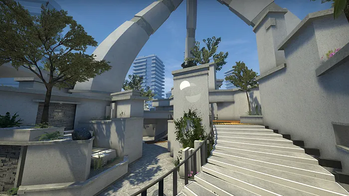
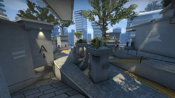
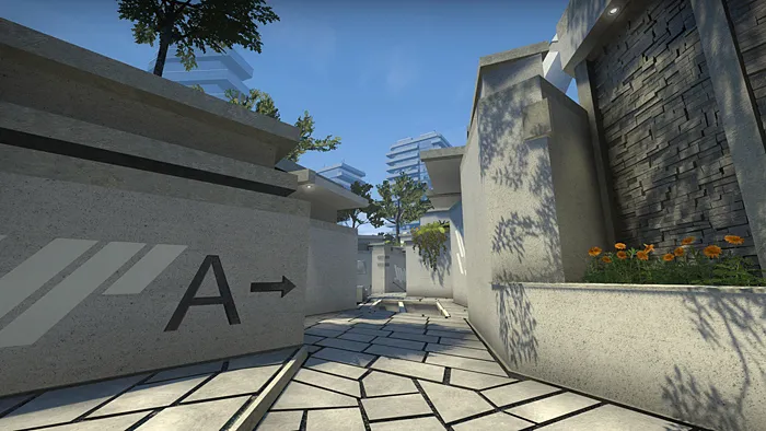
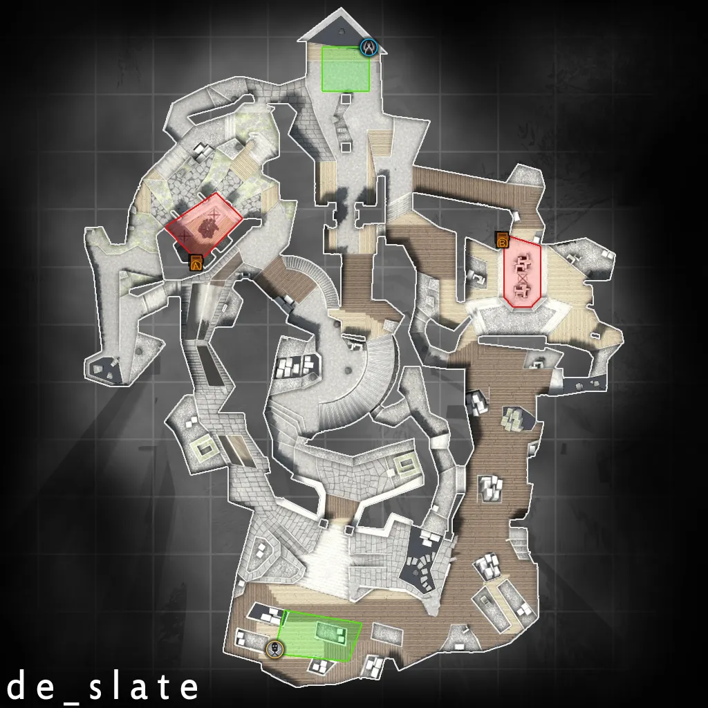
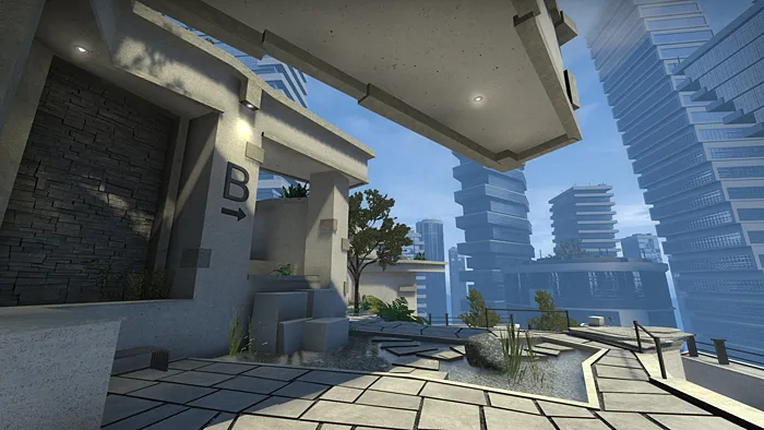
    I entered a very early version of this map in the last MapCore competition, but I couldn't finish it in time. I recently devoted a lot of time to polishing it up (and struggling with an assortment of Source headaches), as well as addressing some of the original feedback. So here it is! I'd love to hear what you think.

    Steam workshop: http://steamcommunity.com/sharedfiles/fi…s/?id=476209350
  • spence
    • March 29, 2016 at 2:33 PM
    • #2

    Yeah, this is the first thing that stands out to me as well, the geometry and shapes look great, but a little more color (aside from gray/blue/white) would work wonders.

  • El_Exodus
    • March 29, 2016 at 3:25 PM
    • #3

    Consider re-releasing it to maybe get into the Workshop spotlight. Now idea how it plays yet, but looks dope!

  • ics
    • March 29, 2016 at 10:51 PM
    • #4
    Quote from El_Exodus

    7 hours ago, El_Exodus said: Consider re-releasing it to maybe get into the Workshop spotlight. Now idea how it plays yet, but looks dope!

    I'd agree on this, because workshop has 7 day time to get into spotlight aka into steam client csgo launch page and get displayed there. Tons of views and whatnot. After 7 days is over, it's gonna sink down like a rock, never to get out even if posted on reddit or similiar.

  • ZULUMIDNIGHT
    • March 30, 2016 at 12:42 AM
    • #5

    As stated before, the geometry is fantastic. I really enjoy the futuristic style. The only thing is to spruce up the color palette. Maybe add some contrast to really bring out the blues and grays.

  • laerth
    • March 30, 2016 at 2:14 AM
    • #6

    Thanks for the feedback. Re: colors, yeah, I was going for a more monochromatic look, but you're right: some splashes of color here and there might help differentiate areas. I'll explore some ideas.

    Ah, I was not aware of the 7-day workshop spotlight time limit. I'll definitely consider re-releasing it.

  • Trashbang
    • March 30, 2016 at 3:18 AM
    • #7

    I actually kinda dig the monochromatic look. There's enough interplay between the light and the geometry to make even really big flat surfaces visually interesting, and there's plenty of foliage to spruce things up where that isn't the case. The texture quality is beautiful and the choice of theme also works really well with your geometry style; lots of nice quirky angles that would feel forced in any other setting.

    I guess my only real objection is that it's all a bit samey? There are plenty of distinct details (love the floor windows, by the way) but the end results still sort of blur together. There are lots of areas that I didn't even recognise at first because I entered them from a different direction than before, and while I appreciate that you've labelled each area, in a pinch I'm far more likely to yell out something like "he's behind the concrete planter!" or "he's by the sculpture!", which is hardly enough information when there are so many of both.

    Other things I really like:

    - Being able to platform your way across B from sniper's nest.

    - Not a crate in sight

    - Stairs you can hide under without just getting a free kill on whoever is walking down them

    - Sexy curved concrete tentacles looming over the entire map

  • laerth
    • March 30, 2016 at 5:26 AM
    • #8
    Quote from Trashbang

    1 hour ago, Trashbang said: I actually kinda dig the monochromatic look. There's enough interplay between the light and the geometry to make even really big flat surfaces visually interesting, and there's plenty of foliage to spruce things up where that isn't the case. The texture quality is beautiful and the choice of theme also works really well with your geometry style; lots of nice quirky angles that would feel forced in any other setting.

    I guess my only real objection is that it's all a bit samey?

    Other things I really like:

    - Not a crate in sight

    Yeah, walls often tend to provide most of the visual interest, but this time around I wanted to see how simple the walls could be while relying on shadows and sky/floor detail to create interesting spaces. Also, I guess I really just enjoyed how the foliage shadows looked against flat concrete, for which a rooftop garden is well suited. If I was a better modeler I would have made my own trees...

    And yes, I struggled with how similar everything looks. I tried to differentiate areas with slightly different overlay decals and flowers, but yeah, it kinda fails the squint-test.

    Haha, glad you noticed the absence of crates.

  • Logic
    • May 6, 2016 at 9:00 AM
    • #9

    Any updates/changes happening to this map?

Participate now!

Don’t have an account yet? Register yourself now and be a part of our community!

Register Yourself Login
Discord

The Mapcore Discord is our lively IRC channel of the 2000s reborn. Chat about level design, gaming, and more.

Latest Posts

  1. Any of the old guard still around? D:

    Warby
    July 12, 2026 at 8:23 PM
  2. About our archived forums

    Thrik
    June 30, 2026 at 2:12 PM
  3. Mapcore Discord

    mason_fan123
    June 24, 2026 at 8:52 PM
  4. [CS2] Valley

    Serialmapper
    June 22, 2026 at 11:56 AM
  5. Free Music / SFX Resource - Over 2500 Tracks

    Eric Matyas
    June 18, 2026 at 12:32 PM
  6. Pango [WIP]

    Elowen
    June 11, 2026 at 10:13 AM
  7. [CS2] Dvina

    Jeremy Rivera
    June 11, 2026 at 10:03 AM
  8. Bridges 2.0 by NEXSIDE, MAP SHOWCASE. ( Steam Workshop )

    MrTrane18
    June 1, 2026 at 7:46 PM
  9. Classic Maps Reborn For CS2

    SillySpaceCat
    May 31, 2026 at 10:33 PM
  10. [CS2] Dvina

    Pulbusha
    May 29, 2026 at 5:54 PM

Users Viewing This Thread

  • 2 Guests
  1. Privacy Policy
  2. Contact
Powered by WoltLab Suite™