


I have been working on this map for just under a week , so it is in very basic. The theme is a bit messy at the moment but once I work on it I hope to make it more defined. I also encourage you to look around the map in-game. All feedback is appreciated!
Workshop link:
http://steamcommunity.com/sharedfiles/fi…s/?id=649444790
Spoiler Radar (V1):

Radar (V2):

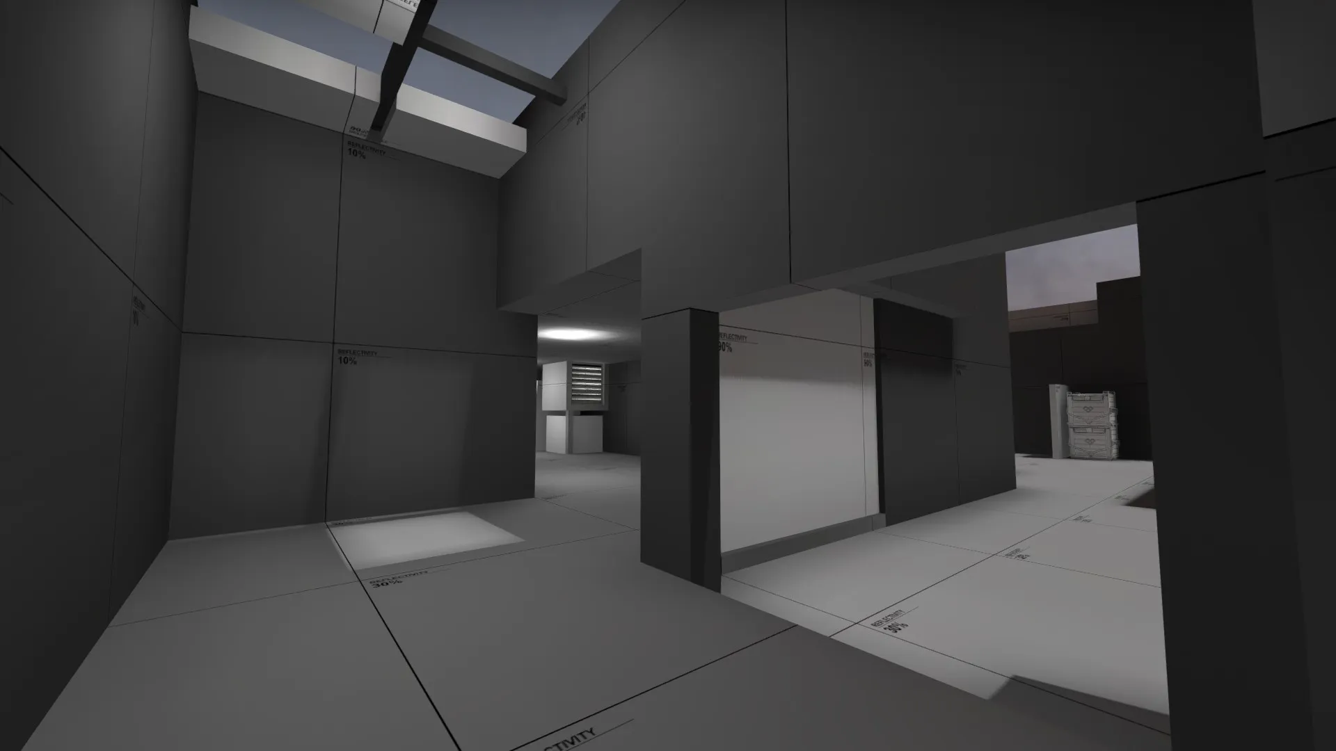
Mid:


T spawn:

A site:

CT spawn:

B site:

Connector:


 /emoticons/tongue@2x.png 2x" title=":P" width="15"> Hopefully I will have an update out by tomorrow for you guys to look at.
 /emoticons/biggrin@2x.png 2x" title=":D" width="15">
 /emoticons/smile@2x.png 2x" title=":)" width="15">


 /emoticons/wink@2x.png 2x" title=";)" width="15">