

Getting a measly amount of downloads and no feedback has just inspired me to double down and keep working on this until it starts turning some heads. Gonna upload an update to the workshop soon, stay tuned!

[WIP] De_Wulfe
-
-
Hey, I just wanted to give you my thoughts on this: I have had a long run around the map and gathered some pictures. So here we go!
 /emoticons/[email protected] 2x" title=":D" width="15">QuoteDisplay More
Spoiler
Just misplaced blocks:
this gate is black for me
The content cannot be displayed because it is no longer available. sew these displacements together
The content cannot be displayed because it is no longer available. this block sticks out in appartments
The content cannot be displayed because it is no longer available. Things I didn't like:
Theme: So I get that we are in a city somewhere, but somwhow the props and textures felt randomly picked out. I.e. look at the screenshot above, or at these:
too many different textures in one place (especially the concrete sticks out here)
The content cannot be displayed because it is no longer available. B site: an ancient ruin which is under construction atm ? I dunno... Also the pathways around B somehow felt off for me. I didn't really know what to do with that small ramp outside of the site, except to jump onto the modern looking block seen on the lfet of the second screenshot.
The content cannot be displayed because it is no longer available. The content cannot be displayed because it is no longer available. What does the watertower canister do up there ?
The content cannot be displayed because it is no longer available. What are these?
The content cannot be displayed because it is no longer available. gameplay:
imho you should remove that small fence. It obstructs vision and It felt weird shoting the bots through it
The content cannot be displayed because it is no longer available. Does this serve any purpose?
The content cannot be displayed because it is no longer available. Is that small peble supposed to be walkable ? (it gives a great view into mid)
The content cannot be displayed because it is no longer available. Also use another texture for the glass window in CT mid, before shoting once it's hard to make out anything.
Last but not least: What I liked:
The entire area from T side to A
The content cannot be displayed because it is no longer available. The content cannot be displayed because it is no longer available. A nice sightline for battleing in mid
The content cannot be displayed because it is no longer available. this is a cool jump
 /emoticons/[email protected] 2x" title=":)" width="15"> (but I think that there are too many oneway drops on the map. you could just make every one of them a normal path imho)
The content cannot be displayed because it is no longer available. Also I liked the garage on A. It felt good holding an afterplant from that position (ofc it's dangerous, you can be molotoved
/emoticons/[email protected] 2x" title=":D" width="15"> ).General feedback:
I would suggest to do a greybox of this stage of the map. It lets you concentrate much more on gameplay. You can work the visuals out later
/emoticons/[email protected] 2x" title=":)" width="15"> . I would stick with the look of T to A though, it's cool /emoticons/[email protected] 2x" title=":)" width="15"> !I hope this helps! Cheers!
PS: I somehow can't get rid of these two pictures

The content cannot be displayed because it is no longer available. The content cannot be displayed because it is no longer available. -
 Quote from Freaky_BananaDisplay More
1 hour ago, Freaky_Banana said: Just misplaced blocks:
this gate is black for me
sew these displacements together
this block sticks out in appartments
Things I didn't like:
Theme: So I get that we are in a city somewhere, but somwhow the props and textures felt randomly picked out. I.e. look at the screenshot above, or at these:
too many different textures in one place (especially the concrete sticks out here)
B site: an ancient ruin which is under construction atm ? I dunno... Also the pathways around B somehow felt off for me. I didn't really know what to do with that small ramp outside of the site, except to jump onto the modern looking block seen on the lfet of the second screenshot.
What does the watertower canister do up there ?
What are these?
gameplay:
imho you should remove that small fence. It obstructs vision and It felt weird shoting the bots through it
Does this serve any purpose?
Is that small peble supposed to be walkable ? (it gives a great view into mid)
Also use another texture for the glass window in CT mid, before shoting once it's hard to make out anything.
Last but not least: What I liked:
The entire area from T side to A
A nice sightline for battleing in mid
this is a cool jump
/emoticons/[email protected] 2x" style="vertical-align:middle;border:0px;" title=":)" width="15"> (but I think that there are too many oneway drops on the map. you could just make every one of them a normal path imho)Also I liked the garage on A. It felt good holding an afterplant from that position (ofc it's dangerous, you can be molotoved
/emoticons/[email protected] 2x" style="vertical-align:middle;border:0px;" title=":D" width="15"> ).Thanks for the feedback! I'll run through it all now.
The gate being black: Yeah, I have no idea what's up with that. For some reason, I can't get it to display properly. It's supposed to be the gate from Assault, but it isn't working.

Sew the displacements: Done that in the latest build. Thank you!
Block sticking out: Fixed in the latest build. Thank you!
Theming: Yeah, the theming started off with a clear-cut idea, but quite rapidly disintergrated into a mess. It was supposed to be an industrial city, with a warehouse taking up all of CT (hence the theming of A), but right now it's very bodged.
Too many different textures: What do you recommend for that? I quite personally like all them textures.
B Site: Yeah, I need to completely re-do everything about this, apart from the bomb site. Getting into the bomb site does not have adequate cover, the theming's off, and it just make sense considering the rest of the map.
Water Tower: That's supposed to be a landmark point so that everyone on the map can have a rough approximation of where they are. I was considering replacing that area with a mill of some kind, with a chimney coming out the top as the landmark instead.
"Those": They are supposed to be the company's logo - as you noticed, there's another set of them in a different colour at B Site, too. Removing them is optional.
Gameplay:
Small Fence: Removed. It served it's purpose in an earlier build of the map, but is no longer needed. Thank you!
Vent Thingy: Removed. It served it's purpose in an earlier build of the map, but is no longer needed. Thank you!
Small Pebble: Yes, that's supposed to be walkable. Gives T's more of a chance to get an opening on Mid, other than the coverless sniper box at the back of mid.
Glass Texture: Fixed, and replaced with a glass texture from the new Nuke. Thank you!
What you liked (yaaay!):
The entire T Side area to A: The layout's the same, but the Trash area's been moved further back and a bit more detail's been added in the later build. The weird curved wall's been removed for now - might get replaced with a custom prop sometime in the future, but for now it just looks messy, so I stuck a generic-ass warehouse in it's place. The reason for this is to remove a massive sniper line that ran all the way from T Spawn to A Site. I also modified T Spawn so that it was inside a shed. Thank you very much!
/emoticons/[email protected] 2x" title=":D" width="15">Mid Sightline: That area's been edited very slightly so as to provide some cover, and to make jumping back over the fence easier. Again, thanks!
/emoticons/[email protected] 2x" title=":D" width="15">Cool Jump: Yeaaaah! Someone finally acknowledges that jump! Thank youuuu!
/emoticons/[email protected] 2x" title=":D" width="15">One-way drops: The route which is now fenced off from T Spawn to Mid was originally open, as was the weird drop-down point before entering A Site. Those two could be edited, perhaps? The one at CT Sniper Box, the Dropdown into B, and the main Drop into A - those can't be altered. Anyway, thanks again!
A Garage: That whole garage is supposed to be a big ol' comfy space. You can actually save your weapons from the bomb in there, if you plant at the other side of the site, hide right at the very back of garage, and have a lot of health.
Thank you very much for all of it! Sorry about this being very "wall of text"-y... I'll have an update out for this map in the next few days. Thanks for playing!!!
-
Quote from Shima33
17 minutes ago, Shima33 said: The gate being black: Yeah, I have no idea what's up with that. For some reason, I can't get it to display properly. It's supposed to be the gate from Assault, but it isn't working.
Theming: Yeah, the theming started off with a clear-cut idea, but quite rapidly disintergrated into a mess. It was supposed to be an industrial city, with a warehouse taking up all of CT (hence the theming of A), but right now it's very bodged.
Too many different textures: What do you recommend for that? I quite personally like all them textures.
Water Tower: That's supposed to be a landmark point so that everyone on the map can have a rough approximation of where they are. I was considering replacing that area with a mill of some kind, with a chimney coming out the top as the landmark instead.
"Those": They are supposed to be the company's logo - as you noticed, there's another set of them in a different colour at B Site, too. Removing them is optional.
For the gate maybe try putting an info_lighting entity down? (Google it, there's good videos for how to use them)
Theming: Well get back to that clearcut idea then
 /emoticons/[email protected] 2x" title=";)" width="15"> !
I personally wouldn't use white brick textures outside. Maybe just stick to the classic plaster or metal.
Concerning the landmark: Go for the chimney
/emoticons/[email protected] 2x" title=":D" width="15"> ! It would 100 % fit the theme (but then remember that there shouldn't be an appartment below that, so maybe move it a bit further towards the B site.I would remove the logo for now, it was rather distracting imho. Things as bright as that in an otherwise rather sombre map just attract the eye and therefore take focus away, distracting from the actual gameplay.
Quote from Shima33Display More25 minutes ago, Shima33 said: What you liked (yaaay!):
The entire T Side area to A: The layout's the same, but the Trash area's been moved further back and a bit more detail's been added in the later build. The weird curved wall's been removed for now - might get replaced with a custom prop sometime in the future, but for now it just looks messy, so I stuck a generic-ass warehouse in it's place. The reason for this is to remove a massive sniper line that ran all the way from T Spawn to A Site. I also modified T Spawn so that it was inside a shed. Thank you very much!
/emoticons/[email protected] 2x" title=":D" width="15">Mid Sightline: That area's been edited very slightly so as to provide some cover, and to make jumping back over the fence easier. Again, thanks!
/emoticons/[email protected] 2x" title=":D" width="15">Cool Jump: Yeaaaah! Someone finally acknowledges that jump! Thank youuuu!
/emoticons/[email protected] 2x" title=":D" width="15">One-way drops: The route which is now fenced off from T Spawn to Mid was originally open, as was the weird drop-down point before entering A Site. Those two could be edited, perhaps? The one at CT Sniper Box, the Dropdown into B, and the main Drop into A - those can't be altered. Anyway, thanks again!
A Garage: That whole garage is supposed to be a big ol' comfy space. You can actually save your weapons from the bomb in there, if you plant at the other side of the site, hide right at the very back of garage, and have a lot of health.
Thank you very much for all of it! Sorry about this being very "wall of text"-y... I'll have an update out for this map in the next few days. Thanks for playing!!!
I would just remove the second route to the main T dropdown into A (but please leave that staircase, it jus looks so good
/emoticons/[email protected] 2x" title=":D" width="15"> ! I found the dropdown into B a rather inefficient route to take for any team. You didn't really have any chance to scan the area below before dropping and after dropping you had to check two different directions. To make the dropdown more viable, lower the height of the dropdown (so noone can look into B from there) and then make it a bit like the dropper in cobblestone, meaning that you can scan the area a bit but not entirely before dropping and making the spots you have to check after dropping being sweepable in one fluid movement (optimally have them in the same sightwindow).That with the garage is a cool little trick
/emoticons/[email protected] 2x" title=":D" width="15"> .I liked testing the map and giving feedback, it's what we do here on MapCore. No problem with walls of text btw
/emoticons/[email protected] 2x" title=";)" width="15"> . I'm looking forward to the update.Cheers!
/emoticons/[email protected] 2x" title=":)" width="15"> -
Not sure what to do with the radar for this map. Will it need a multi-levelled radar, or will the single picture suffice?
-
Quote from Shima33
9 hours ago, Shima33 said: Not sure what to do with the radar for this map. Will it need a multi-levelled radar, or will the single picture suffice?
Well a multilevelled radar could provide useful for CT sniper window, since it overlaps with lower CT mid. But Since that's a rather small area, I think for now a single image radar should be sufficient.
Try to make it look cleaner than the one you have though. Make all roofs and stuff around the actual map nodraw, so we can see the floor of every path. That would provide the player with a better overview of where he is and where he has to watch.
-
Looks like a mush of different texture sets. you need a clear theme/vision for the map and build using only that. 'A bit of this and a bit of that' will never give good results
The outside is really gloomy too. I would add more light entities to add depth.
-
Finally uploaded the update for this map! An awful lot of stuff has changed to the point where makinga list of everything wouls stretch on and on - instead, here's a few screenshots. Feel free to run around it yourself, too!
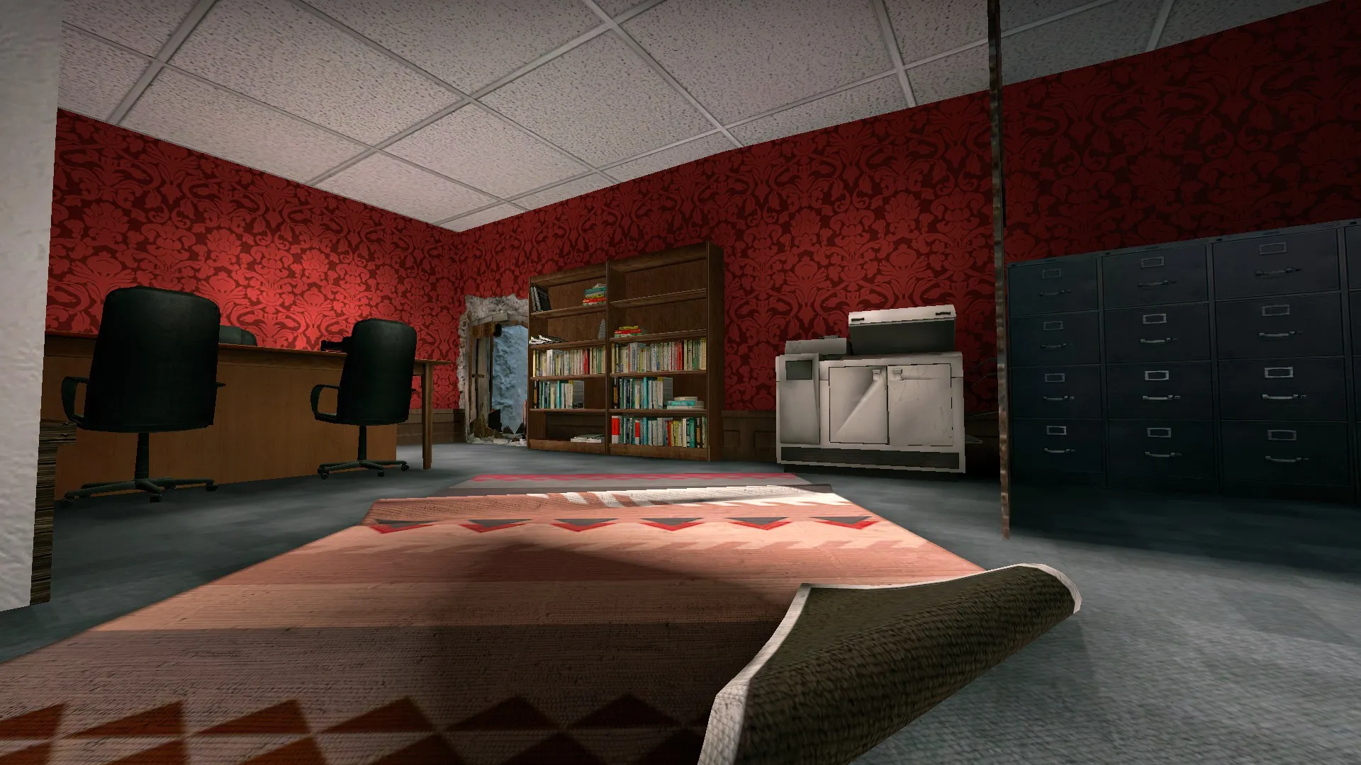
Office hasn't changed much, but I really like the look of this angle. Probably the best looking part of the map thus far.
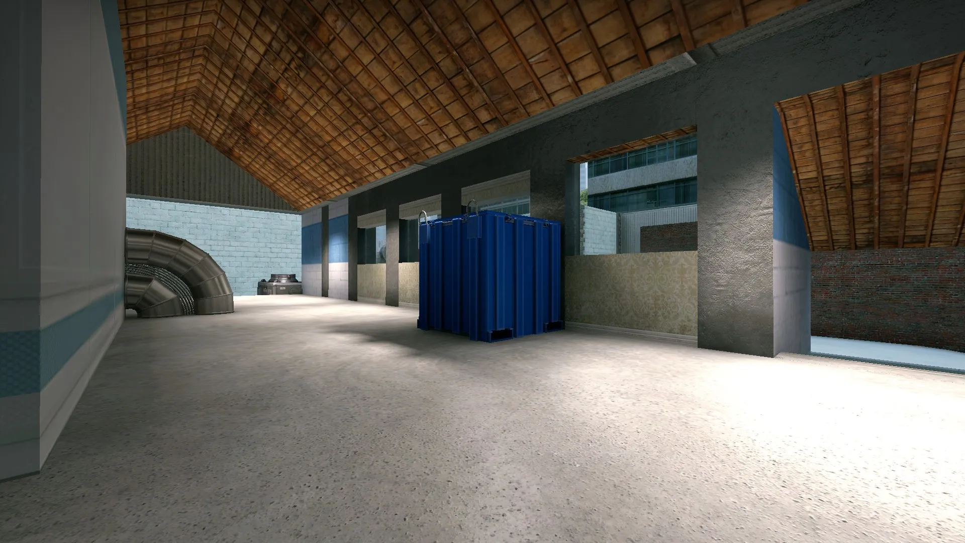
The new mill area, replacing where the apartments used to be before. It's also bigger, and expands slightly onto B.
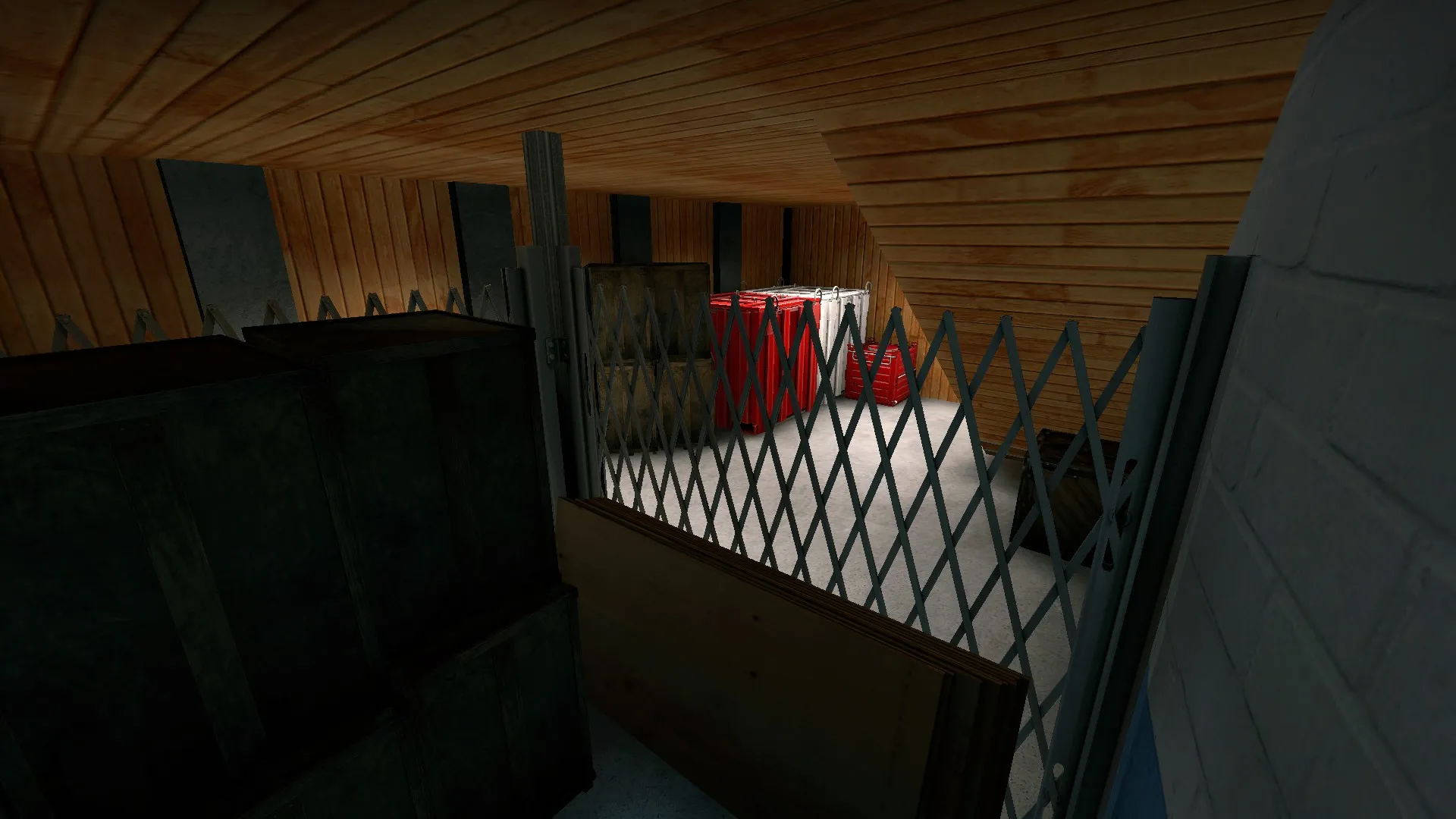
Underneath the new mill, at dropdown. All of the crates back there are inaccessible, but behind you is a newly revamped dropdown that I forgot to screenshot.
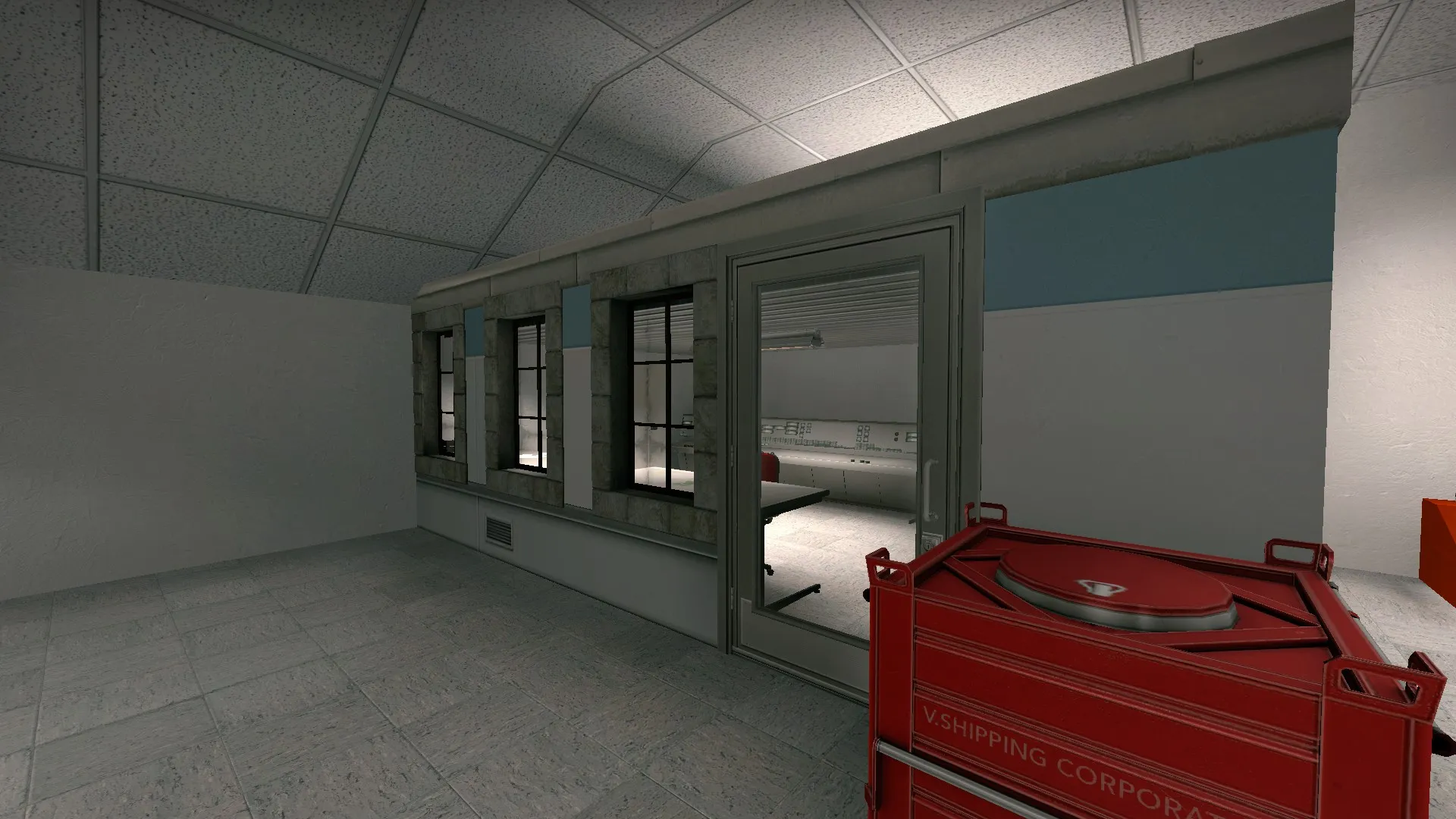
A little bit of decoration I worked on at CT because I was bored. Somehow looks better than about half of the map.
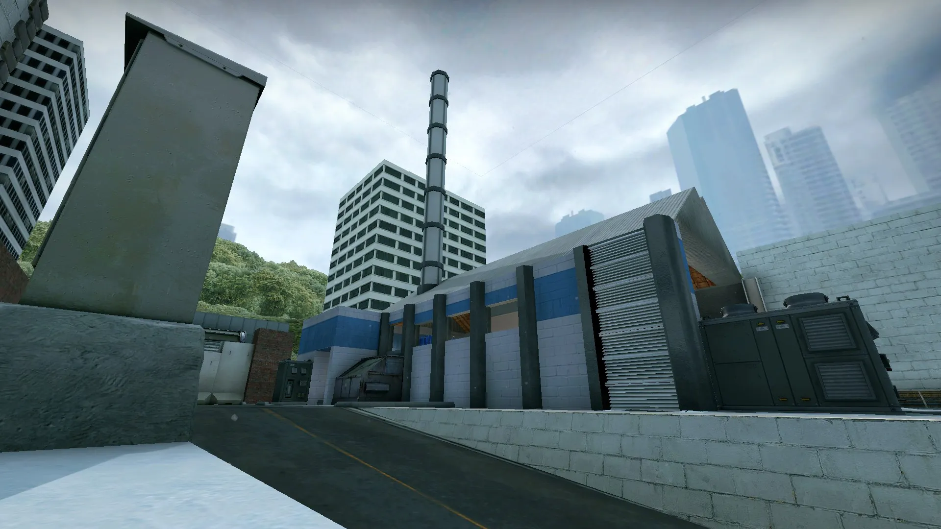
An overview of the new mill area from mid, showing how it's more open for CT's, and larger in general.
I also did the following:
Color Correction
Reworked every displacement
Redid a few textures
Screamed a little
Removed a few annoying parts
Listened to feedback
Hated that everybody's map looks better than mine
Replaced the Trash area in the middle of T to A with an inaccessible warehouse
Thought about replacing B Bombsite with an in-construction area (going to do that in the next update)
Drank a lot of cider
Made a much better radar image (seriously proud of the radar, looks really good)
Placed T spawn inside a shed
Stayed up until 9 in the morning trying to get the mill area looking decent
Reworked dropdown
Screamed a lot
Added more Beginner's Guide references
Added more detail to the non-playable areas of the map, to make it feel more alive
Fixed the Assault Door at CT Spawn
Screamed way too much
and removed the chainlink fence and weird run-up spot at B.
I hope you all enjoy the latest version! I'm submitting this version for playtesting - see you all there! As always, feedback, opinions and ideas are much appreciated.
-
same point as posted before
 /emoticons/[email protected] 2x" title=":P" width="15">
 -
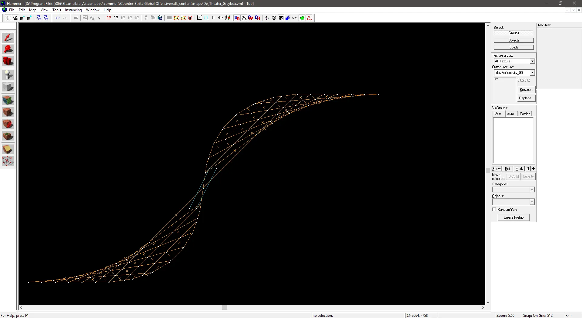
Just being doing some practice with advanced brushwork... Am I going too far with this?
-
Quote from Shima33
22 minutes ago, Shima33 said: Just being doing some practice with advanced brushwork... Am I going too far with this?
Are you sure the game wont just reject that? Surely there has to be a microbrush in there somewhere.
-
 Quote from Plat
10 minutes ago, Plat said: Are you sure the game wont just reject that? Surely there has to be a microbrush in there somewhere.
Actually, no - mainly because I've enlarged the brush since then.
However, I did continue messing around, and somehow came out with this-
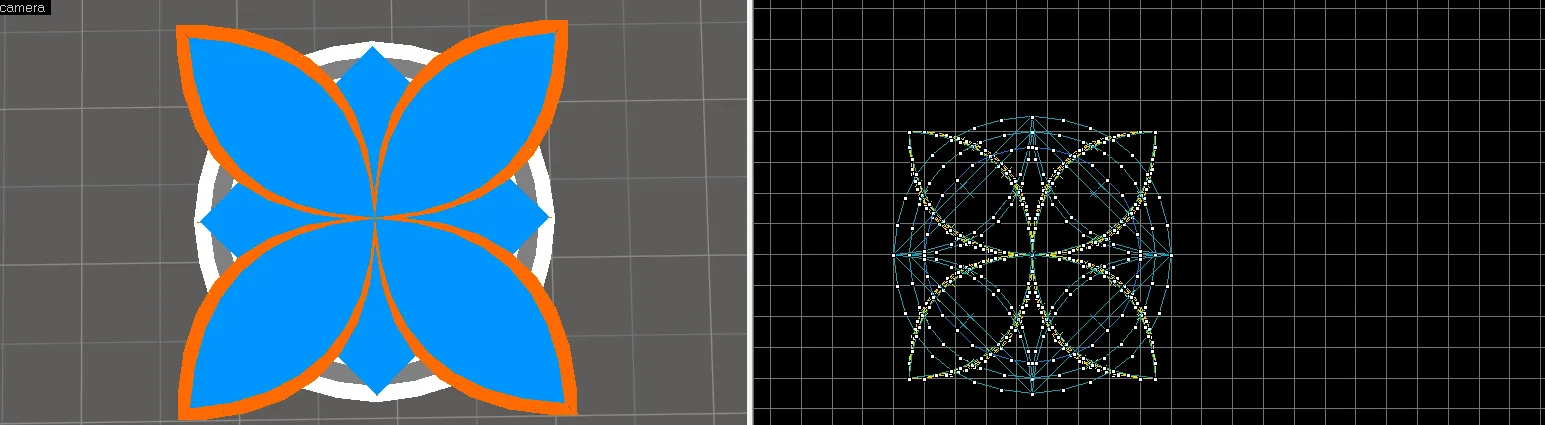
Let me know when stopping is an option.
-
Quote from Shima33
1 hour ago, Shima33 said: Actually, no - mainly because I've enlarged the brush since then.
However, I did continue messing around, and somehow came out with this-
Let me know when stopping is an option.
Very fancy. And it works in game with no issues?
-
Quote from Plat
Just now, Plat said: Very fancy. And it works in game with no issues?
Suprisingly, yes.
-
Quote from Shima33
1 minute ago, Shima33 said: Suprisingly, yes.
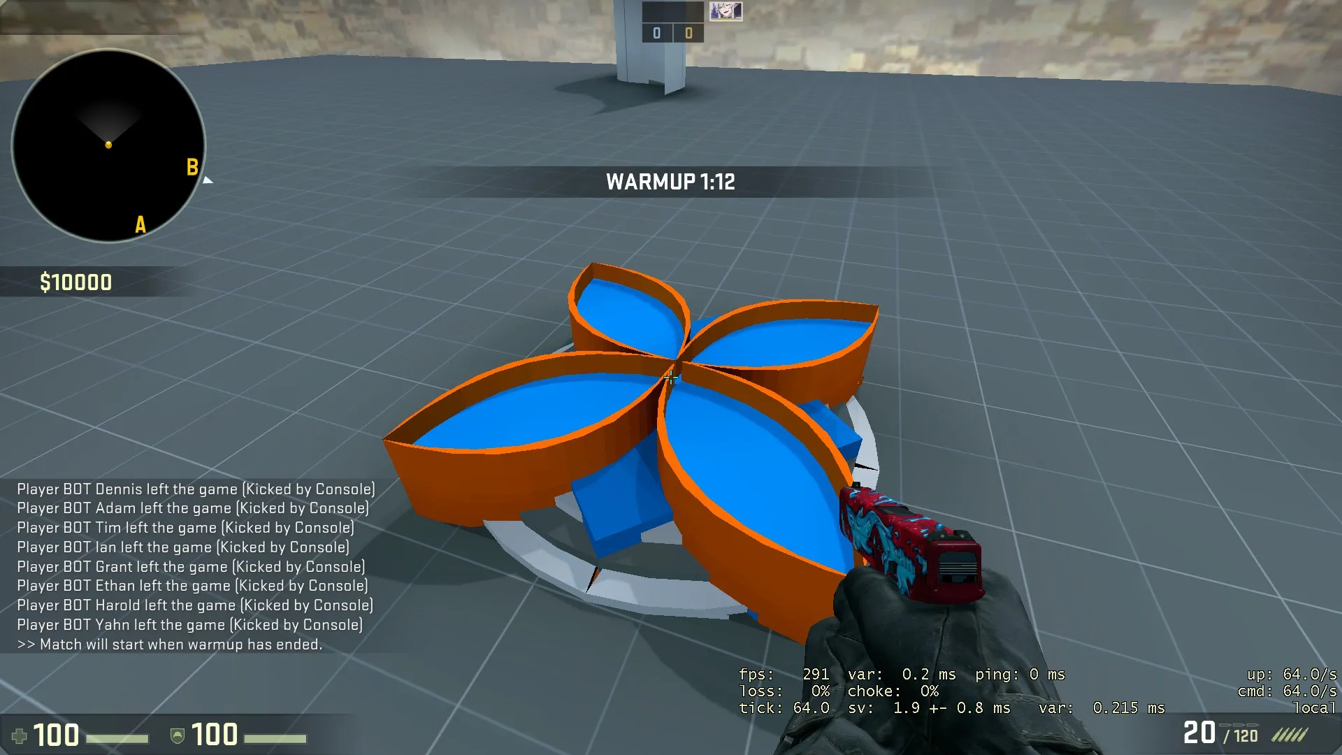
Impressive. Hammer always struggles with complex brush shapes. Could I get an ingame screenshot of it? perhaps give it a stoney texture.
-
Quote from Plat
30 minutes ago, Plat said: Impressive. Hammer always struggles with complex brush shapes. Could I get an ingame screenshot of it? perhaps give it a stoney texture.
Sure thing, here it is-
-
Quote from Shima33
2 hours ago, Shima33 said: Sure thing, here it is-
Is this the new logo ?
-
Quote from Freaky_Banana
5 hours ago, Freaky_Banana said: Is this the new logo ?
Henh, I wish. I was just messing around for the fun of it all. Besides, the logo has a floral style to it, and the map isn't all that floral.
-
I've finally thought of an aesthetic for this map, one that would work as well as be unique - a nightclub!
Here are the ideas for Club Wulfe so far:
Change B site to be an outdoor garden,
A site can be a dancefloor
All of CT can be a dancefloor too
Mill is a corner shop?
Boss Office is a toilet
CT warehouse is a VIP room
vending machines are a DJ Deck
A Dropdown is a DJ Deck
Regular Office is a Bar
Let me know what you think of this idea, as well as anything you imagine working with this aesthetic!
(There's gonna be layout changes to accomodate the aesthetic change, too - I'll post them at a later date.)
-
Quote from Shima33
6 hours ago, Shima33 said: I've finally thought of an aesthetic for this map, one that would work as well as be unique - a nightclub!
Why would the terrorists be blowing up a nightclub?
"LISTIN IVAN, IF VI KANNOT DANSE, THEN NOVONE CAN!"
-
Participate now!
Don’t have an account yet? Register yourself now and be a part of our community!