1. Forums
  2. Discord
  3. About Mapcore
  4. Patreon Supporters
  • Login
  • Register
  • Search
This Thread
  • Everywhere
  • This Thread
  • This Forum
  • Articles
  • Pages
  • Forum
  • More Options
  1. Mapcore
  2. Discussions
  3. Level Design

de_farm [WIP]

  • Dosentti
  • January 13, 2016 at 6:44 PM
  • Dosentti
    • January 13, 2016 at 6:44 PM
    • #1

    I have already published a thread for this map once but shortly after that I changed the name of the map so now I wanted to do a proper thread.

    I appreciate all feedback. I hope you'll comment everything that's good or bad or funny or crazy or whatever you have to say about it.

    The map has changed a lot after last update in thread de_urakka.

    - Middle area has been made smaller, routes have been added and removed. Also the ground was raised by 64 units in the middle because there was (pretty much) unnecessary elevation.
    - Some players also felt that the player was in "rats map". I tried to fix that by renewing the buildings a little and by making them smaller.
    - Some textures have been replaced, terrorist spawn point has been drawn further towards map borders.
    - I have also tried to optimize the map as much as I can. It's very hard for this kind of open skybox map with a lot of gabled buildings though.

    I have said the map is ready for too many times so I guess it's best not so say it again. Work is in progress at least until the next version after playtest.

    Workshop link <---------- you can find the layout and pictures here
    Additional pictures on Imgur <---------- Some updated pics

    Thank you in advance!
  • Dosentti
    • January 18, 2016 at 7:25 PM
    • #2

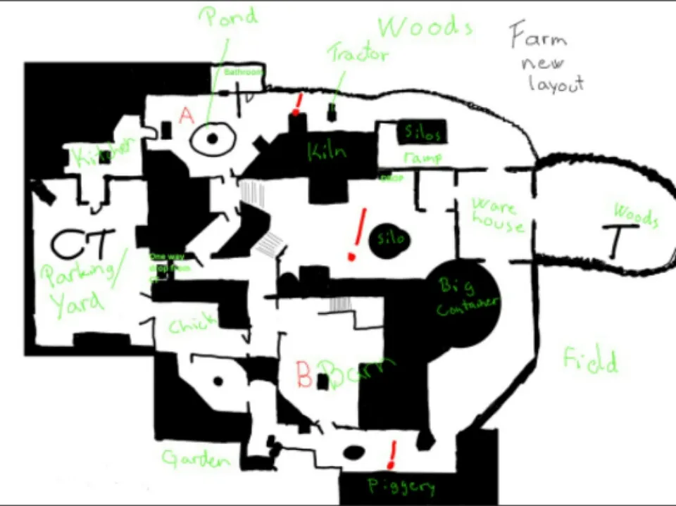
    This was fourth time that I created this map from all over and I messed it up again so I'm going to create it once more all over.
    I'm keeping same idea and most of routes but I want to create it well this time.

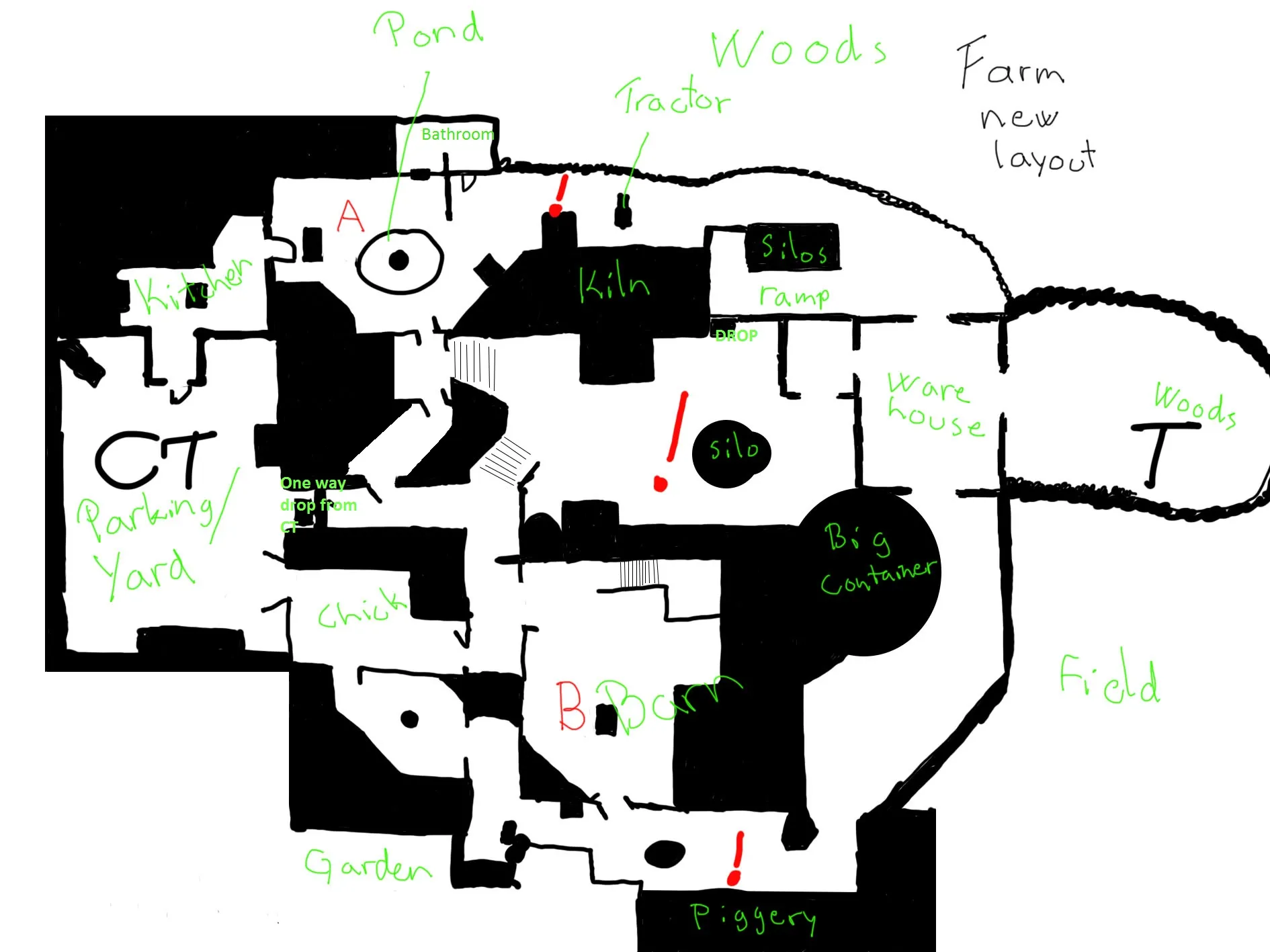
    Here is the new layout that I drew today. What do you think of it? Does these changes fix problems or create more of them?

    Quote

    I don't have as much experience as you guys so I hope you'll guide me a little. I value your opinions and tips very much. My projects seem to fail every time so I would like ask if I have learned everything right.
    I was thinking that this time I want to create this level thoroughly.

    1. draw layout few times and try to improve it every time.
    2. block in only floors and test the rough timings
    3. block the walls in and place the most crucial gameplay elements to the level
    4. First playtest(?)
    5. fix the layout and put it in playtest again. And repeat this as long as the layout seems to be good.
    6. refine the story and theme
    7. start working with textures and details
    8. test
    9. fix and optimize
    10. publish

    Is that a proper phasing? Did I miss something?

  • Vaya
    • January 18, 2016 at 11:40 PM
    • #3

    build your map as a greybox with little to no props. don't think TOO much about what area is going to be- you can do that later.

  • R.I.P 3.0
    • January 19, 2016 at 3:55 PM
    • #4
    Quote from Dosentti

    This was fourth time that I created this map from all over and I messed it up again so I'm going to create it once more all over.
    I'm keeping same idea and most of routes but I want to create it well this time.

    Here is the new layout that I drew today. What do you think of it? Does these changes fix problems or create more of them?

    Hidden Content

    I don't have as much experience as you guys so I hope you'll guide me a little. I value your opinions and tips very much. My projects seem to fail every time so I would like ask if I have learned everything right.
    I was thinking that this time I want to create this level thoroughly.

    1. draw layout few times and try to improve it every time.
    2. block in only floors and test the rough timings
    3. block the walls in and place the most crucial gameplay elements to the level
    4. First playtest(?)
    5. fix the layout and put it in playtest again. And repeat this as long as the layout seems to be good.
    6. refine the story and theme
    7. start working with textures and details
    8. test
    9. fix and optimize
    10. publish

    Is that a proper phasing? Did I miss something?

    Display More

    So, the layout is too complex. Can you make it simplified?

  • Dosentti
    • January 19, 2016 at 4:44 PM
    • #5
    Quote from R.I.P 3.0

    So, the layout is too complex. Can you make it simplified?

    I can try. Which areas are the most complex? CT side of middle?

  • jackophant
    • January 19, 2016 at 6:04 PM
    • #6

    I highly advise you do some reading on multiplayer level design.

    I didn't notice the CT ladder up into the A window room until right at the end of the map when I was dead. Not only is it extremely fatal to try and get to having to jump out of a window and cross a T controlled mid, but there's nothing highlighting it's existence as it's almost the same colour as the underlying texture.

    CTs have to jump through so many windows and doors and drop downs, it's honestly very unenjoyable. The number of times I died when Ts just appeared on A because they have so much cover only to die trying to get into a doorway or window was unacceptable.

    There needs to be balance. If you've got a route that streamlines Ts to a bombsite with barely any chance for CTs to stop them, then the bombsite needs to be hard to enter or attack (think B dust2), but if you give them a more open route (close to your A long) then you can make your bombsite easier to plant in. However, your A route is very hidden to CTs, and if a CT dare peek, they get their head blown off from a lot of angles,including the side of their head from the windows Ts can push.

    Less objects to run over would be nice, and try and make the spaces believable. That mid window for CTs is a drop from a super narrow staircase into a room with only a fireplace, window and vent.

  • R.I.P 3.0
    • January 19, 2016 at 6:11 PM
    • #7
    Quote from Dosentti

    I can try. Which areas are the most complex? CT side of middle?

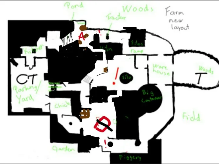
    You can try to working on this. Big red cube is a train, brown is a crates

  • Dosentti
    • January 19, 2016 at 9:44 PM
    • #8
    Quote from jackophant

    I highly advise you do some reading on multiplayer level design.

    I didn't notice the CT ladder up into the A window room until right at the end of the map when I was dead. Not only is it extremely fatal to try and get to having to jump out of a window and cross a T controlled mid, but there's nothing highlighting it's existence as it's almost the same colour as the underlying texture.

    CTs have to jump through so many windows and doors and drop downs, it's honestly very unenjoyable. The number of times I died when Ts just appeared on A because they have so much cover only to die trying to get into a doorway or window was unacceptable.

    There needs to be balance. If you've got a route that streamlines Ts to a bombsite with barely any chance for CTs to stop them, then the bombsite needs to be hard to enter or attack (think B dust2), but if you give them a more open route (close to your A long) then you can make your bombsite easier to plant in. However, your A route is very hidden to CTs, and if a CT dare peek, they get their head blown off from a lot of angles,including the side of their head from the windows Ts can push.

    Less objects to run over would be nice, and try and make the spaces believable. That mid window for CTs is a drop from a super narrow staircase into a room with only a fireplace, window and vent.

    Okay. Thank you for this. I'll try to solve these problems in next layout/version. The reason why I have places there so much windows and doors is that I have tried to make it realistic. But I guess those aren't practical enough.

    Do you agree with R.I.P in the matter that my new layout still seems too complex?


    Quote from R.I.P 3.0

    You can try to working on this. Big red cube is a train, brown is a crates

    There's definitely some potential in this layout that you drew but the changes are so huge that I can't change it that much.
    B bombsite changes I don't like in your layout but I for example the solution on A long looks better than mine. Also I don't like very much this route from CT spawn to A bombsite but middle looks great.

    I will remake the layout and post the layout picture again. Thank you for your effort, I appreciate it.

  • jackophant
    • January 20, 2016 at 10:44 AM
    • #9
    Quote from Dosentti

    Okay. Thank you for this. I'll try to solve these problems in next layout/version. The reason why I have places there so much windows and doors is that I have tried to make it realistic. But I guess those aren't practical enough.

    Do you agree with R.I.P in the matter that my new layout still seems too complex?

    Having windows is fine, but a lot of yours don't even have glass in them. Using an opaque glass texture and some wooden boards on one/both sides is a good way to create something that feels realistic and is partially penetrable to offer interesting wallbangs. But please, make sure both teams have at least one route that doesn't require them to jump to get into each bombsite. It might sound picky but it makes things run a lot smoother. Try not to get caught up being too realistic because maps play well when they're well designed

    I don't think the layout as a whole should be binned, you just need to adjust it. I would definitely test it with us in greybox if you do remake a lot of it so you can make changes much faster.

  • Logic
    • January 20, 2016 at 12:53 PM
    • #10

    Don't trash the whole thing. Overpass was a mess before they changed the routes around and adjusted a lot of angles :v

  • Vaya
    • January 20, 2016 at 1:24 PM
    • #11

    you could delete and rebuild mid as a start. Something like RIP's mid looks much better. Less extreme elevation is the first goal imo

  • Dosentti
    • January 20, 2016 at 6:37 PM
    • #12
    Quote from jackophant

    Having windows is fine, but a lot of yours don't even have glass in them. Using an opaque glass texture and some wooden boards on one/both sides is a good way to create something that feels realistic and is partially penetrable to offer interesting wallbangs. But please, make sure both teams have at least one route that doesn't require them to jump to get into each bombsite. It might sound picky but it makes things run a lot smoother. Try not to get caught up being too realistic because maps play well when they're well designed

    I don't think the layout as a whole should be binned, you just need to adjust it. I would definitely test it with us in greybox if you do remake a lot of it so you can make changes much faster.

    The first layout is ready now. Should I block in the ceilings too before you guys testing it or is it enough if there's only sky as a roof for now?

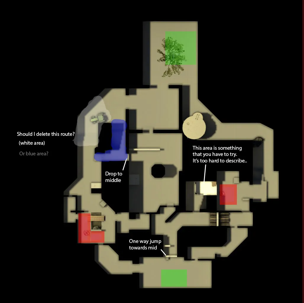
    The layout changed as much as I thought it would when I try to make it again. But I also tried to make routes more obvious.

    Here it is. Better?

    And And here's the .bsp if you could be so kind and check it through

  • Dosentti
    • January 22, 2016 at 8:17 PM
    • #13

    I will create few different versions of this layout and submit all of them in here when they are done. After that people can say which is the best.

  • Logic
    • January 23, 2016 at 10:40 AM
    • #14
    Quote from Dosentti

    Here it is. Better?

    You probably shouldn't remove the blue or white area. The map looks a lot cleaner this time around :)

    Quote from Dosentti

    I will create few different versions of this layout and submit all of them in here when they are done. After that people can say which is the best.

    I think you should focus on one version and let people give you feedback on that one. We can't really tell how things play out in game based on a couple of overviews, so it's better to present one version and have people play that instead. I know this isn't that helpful, but you should try to develop a layout that YOU think will work, and then let others try it out, not the other way around :v

  • MadsenFK
    • January 23, 2016 at 3:34 PM
    • #15

    Nice, keep up the good work!

  • Dosentti
    • January 23, 2016 at 10:35 PM
    • #16
    Quote from Logic

    You probably shouldn't remove the blue or white area. The map looks a lot cleaner this time around

    I think you should focus on one version and let people give you feedback on that one. We can't really tell how things play out in game based on a couple of overviews, so it's better to present one version and have people play that instead. I know this isn't that helpful, but you should try to develop a layout that YOU think will work, and then let others try it out, not the other way around

    Too bad I read this now that I have finished 6 different versions :D

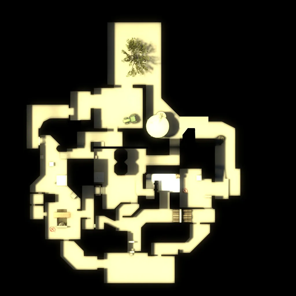
    Not really.. I mean I did create 6 versions but it actually just evolved every time further leaving me with 2 a bit different versions of T side of middle. And I like both very much. I know it's hard to judge by picture only but which one of these 2 seems better? Here are the layouts:

    Version 5.

    .

    Version 6.

    And Here is the link to files if someone wants to test both versions.

  • Dosentti
    • January 30, 2016 at 9:42 AM
    • #17

    I decided to continue with version 6. It's more traditional choice, but anyways..

  • Vorontsov
    • January 30, 2016 at 2:32 PM
    • #18

    It's great that you're remaking this map for the 4th time, that's quite some dedication right there. I also respect that you took it back to the greyboxing stage, what I would recommend is keep it there until you feel that the layout is fun and solid gameplay wise. You can think about detailing and the theme after you've got it down to how you like it. Hope to see an improved version in a playtest again, even if the last one was kind of bitter.

  • Dosentti
    • February 9, 2016 at 9:46 PM
    • #19

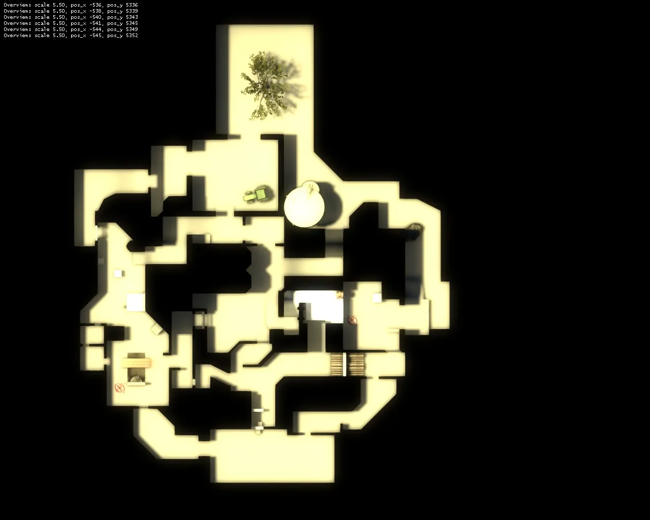
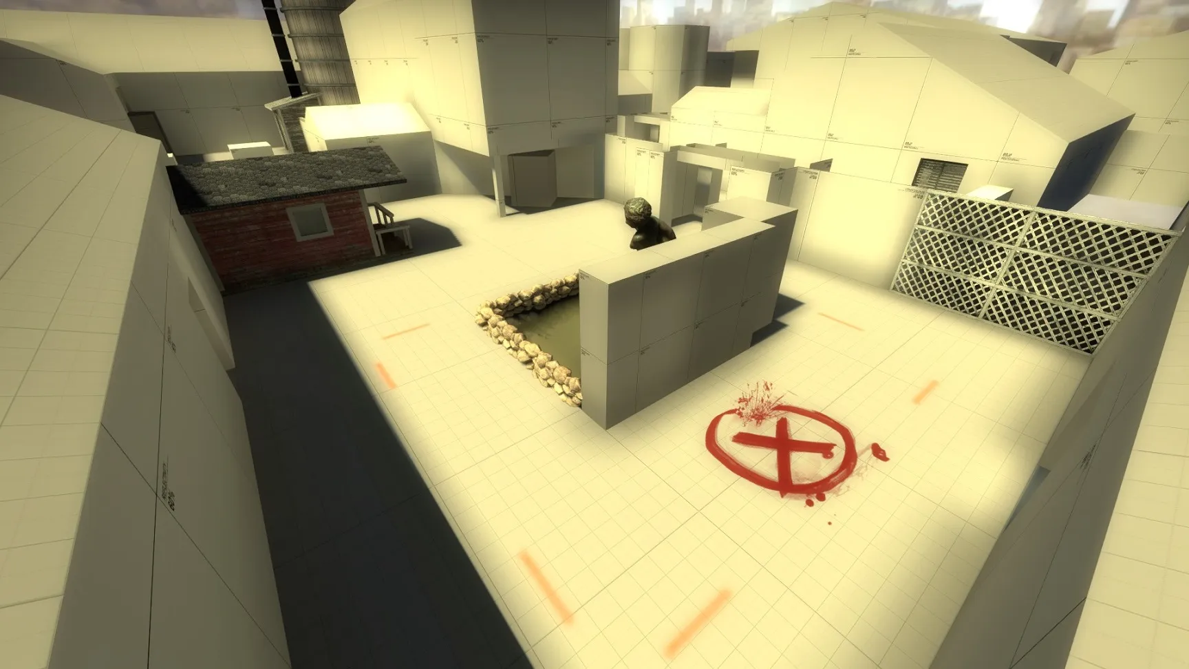
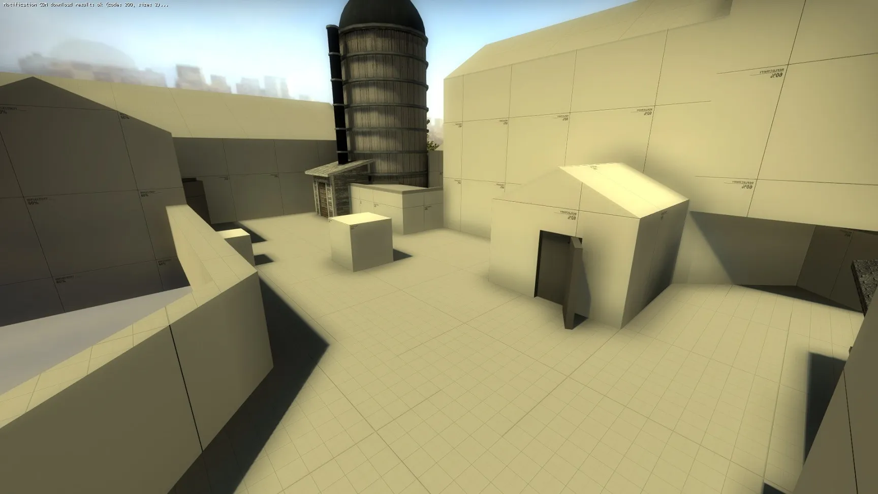
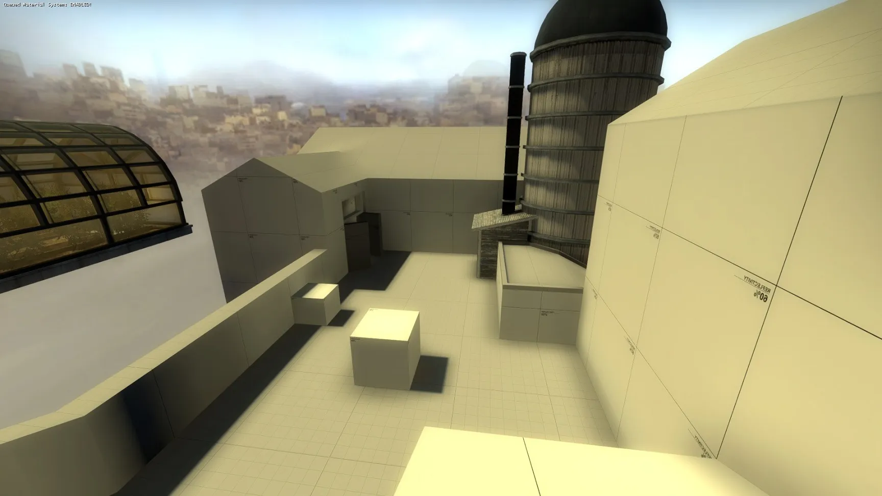
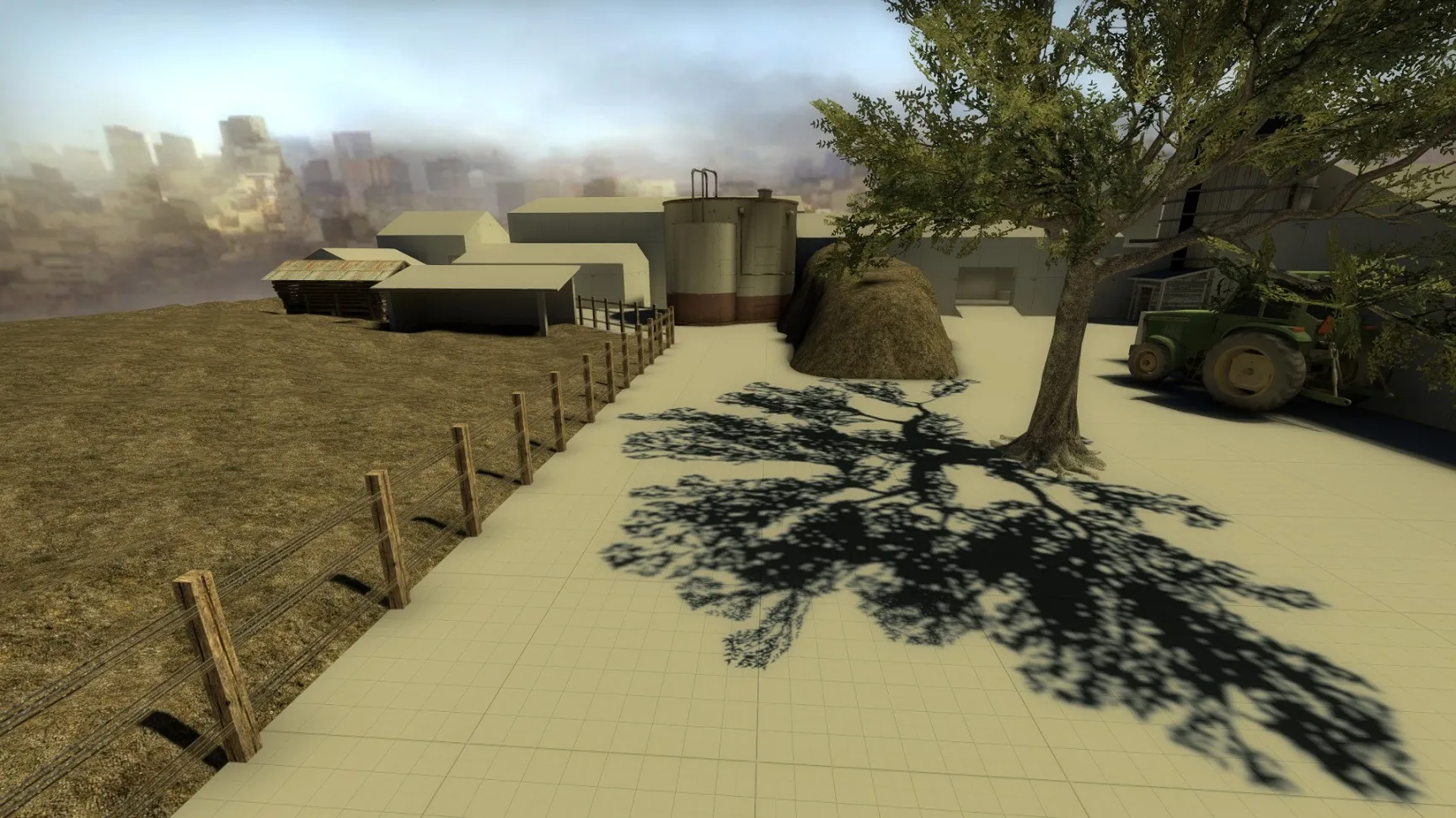
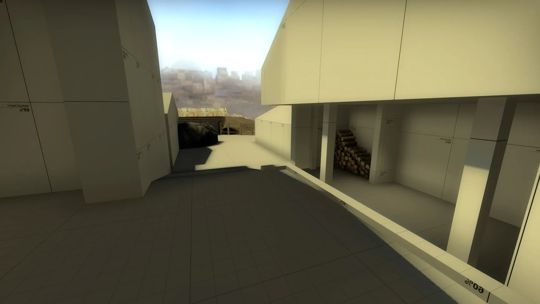
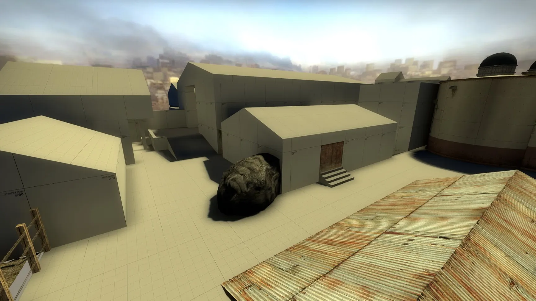
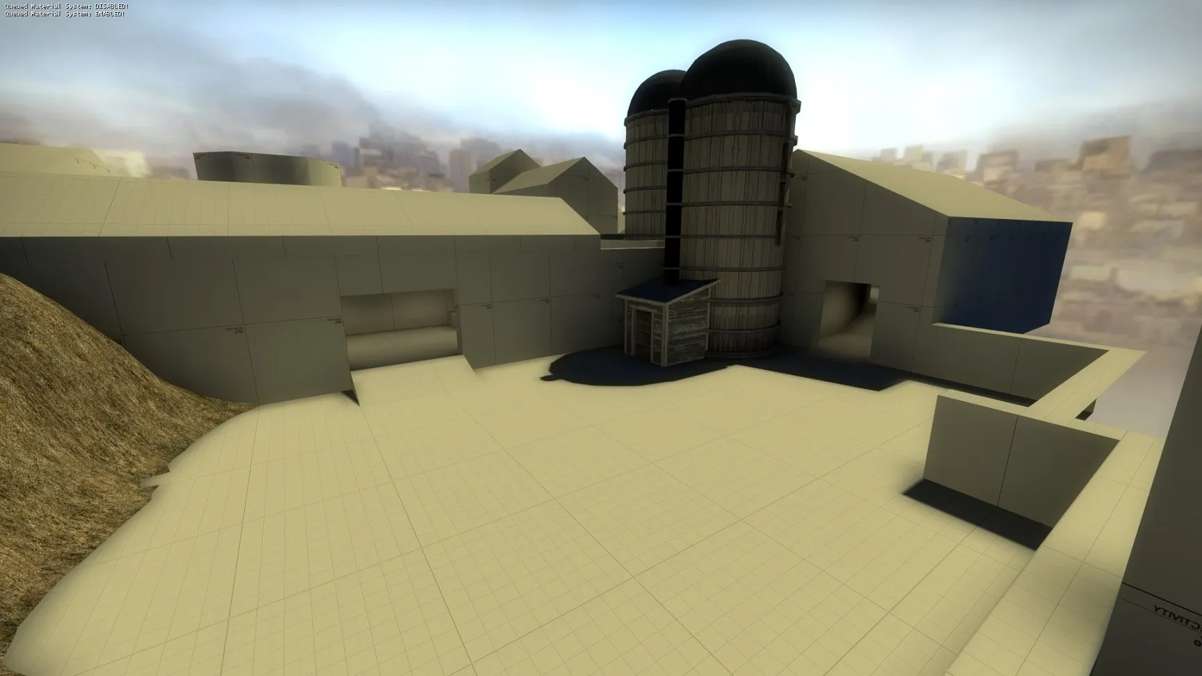
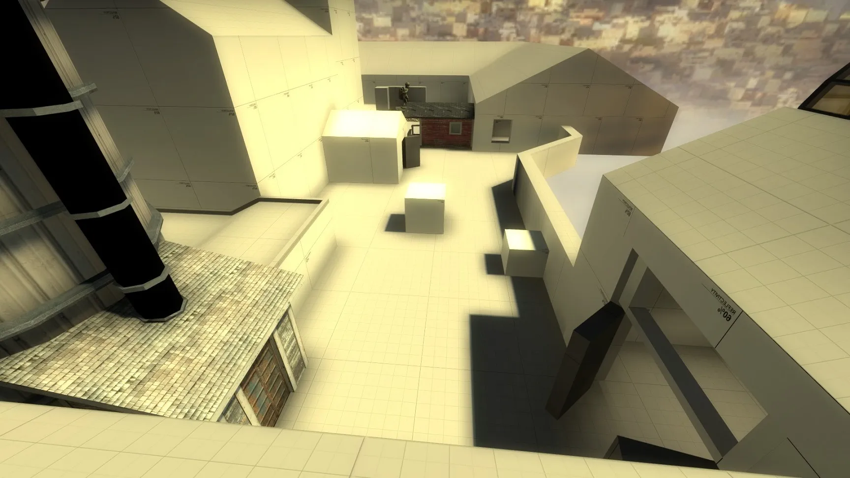
    I got the first layout playtest version ready today. I already created few detailed buildings too as a prefabs. The layout is very much alike with previous version so there's no new layout pic, but here are few pictures from the map:


    And here's link to the map if someone want's to test it.

  • Dosentti
    • February 21, 2016 at 9:00 PM
    • #20

    Feedback from the playtest:

    - Both bombsites have too many angles to check.

    - Some spots were too complex (I guess it was mainly CT side of middle)

    - Mid to B route was weird because it lead to heaven instead of bombsite.

    - Bombsite A had too few possible routes.

    - connector from T-side of middle to A long didn't "have a point" or didn't "make sense" or "was irrelevant somehow".

    - The map had too many buildings for a farm (didn't feel like a farm)

    - There were some irrelevant hiding spots that confused players.

    - A house was "cramped"

    - CT to A route through a living house wasn't good and it was suggested that I alter it a bit.


    I tried to focus to all feedback even though some said that the layout was good. This is because the vote result in the end looked like this:

    Code
    Neutral, selected 7/13 times (53.84%)
    Like, selected 3/13 times (23.07%)
    Dislike, selected 4/13 times (30.76%)

    So basically either it was "kind or bad-ish" or people didn't know what to think about it..

    So here's the new layout:

    Quote

    What I did:


    - Put a big box in the middle of B bombsite and changed angles so that it's easier to access but on the other hand easier to defend.

    - A statue and a pond on A bombsite were replaced with crates.

    - CT side of middle was simplified. A window and vent have now separate routes.

    - Mid to B-heaven route and CT to B site route were switched. So now it's mid to B and CT to B heaven.

    - Tried to delete some irrelevant weird corners and make routes a bit more straightforward.

    - route from CT to A was moved a little towards middle and the route isn't inside of building anymore. The living house will be places later outside of CT spawn.

    - A house was made a lot bigger. Also both entrances of A house were made bigger.

    - Created whole new route through the kiln to A bombsite. It's accessible only by taking a small risk. Also.. Kiln isn't possible to access from the A bombsite (kind of a drop).

    - T spawn to A long route was changed. It doesn't go through a building anymore but there's a kind of "pit" where terrorists can awp.

    - Also the nearest building from CT to B (the rightmost route) was deleted.

    - In the middle I deleted the silo placeholder blocks and changed the spare space in there to a sheep yard.

    - Added a self-made custom 2D skybox.

    - Detailed one building T side of B long to be an old shed.


    I made a temporary publication to workshop because it's easier to share it that way.

    Thanks especially Bevielis, JustFredrik, Vaya and Onebit.

Participate now!

Don’t have an account yet? Register yourself now and be a part of our community!

Register Yourself Login
Discord

The Mapcore Discord is our lively IRC channel of the 2000s reborn. Chat about level design, gaming, and more.

Latest Posts

  1. Why is data science needed

    shilpa
    July 17, 2026 at 12:39 PM
  2. Any of the old guard still around? D:

    Warby
    July 12, 2026 at 8:23 PM
  3. About our archived forums

    Thrik
    June 30, 2026 at 2:12 PM
  4. Mapcore Discord

    mason_fan123
    June 24, 2026 at 8:52 PM
  5. [CS2] Valley

    Serialmapper
    June 22, 2026 at 11:56 AM
  6. Free Music / SFX Resource - Over 2500 Tracks

    Eric Matyas
    June 18, 2026 at 12:32 PM
  7. Pango [WIP]

    Elowen
    June 11, 2026 at 10:13 AM
  8. [CS2] Dvina

    Jeremy Rivera
    June 11, 2026 at 10:03 AM
  9. Bridges 2.0 by NEXSIDE, MAP SHOWCASE. ( Steam Workshop )

    MrTrane18
    June 1, 2026 at 7:46 PM
  10. Classic Maps Reborn For CS2

    SillySpaceCat
    May 31, 2026 at 10:33 PM

Users Viewing This Thread

  • 1 Guest
  1. Privacy Policy
  2. Contact
Powered by WoltLab Suite™